What is NieR: Automata?
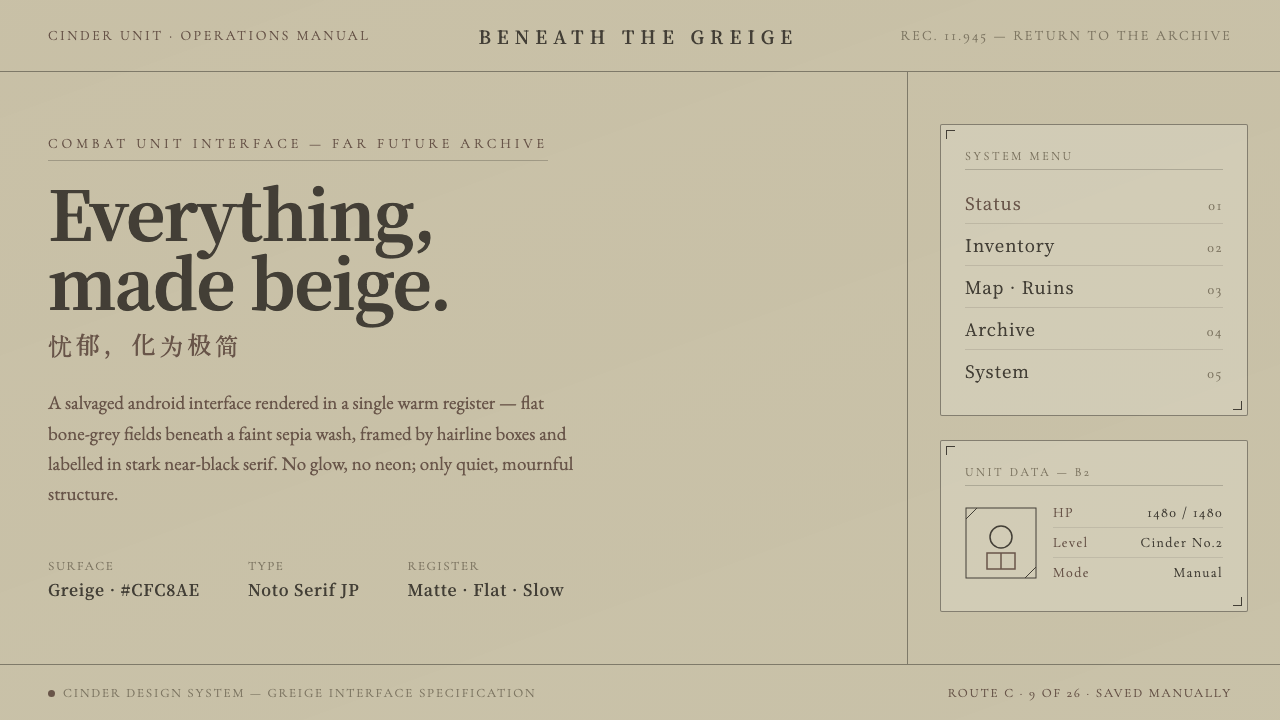
NieR: Automata imagines science fiction after the glow has gone out: quiet greige surfaces, sepia restraint, and an interface that treats melancholy as a system rather than a mood.
NieR: Automata in brief
NieR: Automata is a 2017 action role-playing game from PlatinumGames and Square Enix, directed by Yoko Taro. Its visual identity is inseparable from the YoRHa android interface: an unusually restrained science-fiction language built from flat bone-white and soft greige fields, a faint sepia wash, thin enclosing boxes, and near-black serif labels. It is sci-fi without the expected neon spectacle.
The style gains its force through refusal. Rather than presenting technology as chrome, luminous circuitry, or a dark command center, the interface appears warm-grey, pale, and almost archival. It belongs beside desaturated ruins without trying to overpower them. The result feels functional, but not triumphalist; orderly, but never emotionally blank.
This is not simply a beige interface. Cream would suggest comfort, and neon would suggest speed or fantasy. NieR: Automata instead uses muted greige and bone-white to create distance, fragility, and quiet concentration. Generous empty space lets labels, rules, and boxed regions feel deliberate, as though the system is carefully preserving information in a world where almost everything else has decayed.

Where does NieR: Automata come from?
The style emerged with NieR: Automata in 2017, a Japanese game set in a far-future post-apocalypse. That setting matters because the interface does not behave like a fresh technological future. Its pale, weathered visual atmosphere sits alongside a world of desaturated ruins, making the display feel less like a promise of progress than a surviving layer of order.
Yoko Taro directed the game, while PlatinumGames and Square Enix brought it to release. Within the approved visual material, the YoRHa interface is the clearest expression of the project’s design stance: technology is represented through restraint rather than excess. Flat fields, thin boxes, serif labels, and sepia-muted warmth form a coherent alternative to the dark, glowing science-fiction screen.
The resulting language can be understood as minimalist game UI joined to melancholy desaturated sci-fi. Minimalism supplies the reduction: few visible ingredients, spacious composition, and strong framing. Melancholy supplies the emotional temperature: the palette is muted rather than cleanly clinical, and the near-black type feels like a mark made against fading paper rather than light projected into darkness.
Its most distinctive move is the YoRHa beige interface itself. In a genre where futuristic systems often seek contrast through dark grounds and luminous color, NieR: Automata makes a light, warm-grey surface carry the burden of futurity. That inversion gives the interface an almost paradoxical quality: it is clearly technological, yet it feels aged, subdued, and closely bound to the game’s damaged world.
What defines the NieR: Automata look?
Greige Atmosphere
The foundation is flat bone-white and soft greige, held under a faint sepia wash. The palette is neither sterile white nor cozy cream. Its warmth is subdued and dusty, producing the feeling of an interface that has endured the same quiet erosion as the world around it.
Quiet Contrast
Near-black serif type supplies contrast without introducing visual noise. Against pale fields, it reads as an inscription rather than a glow. The contrast is firm enough to organize information, yet restrained enough to preserve the interface’s contemplative, mournful character.
Hairline Enclosures
Thin boxes frame information without turning every region into a heavy panel. Their role is archival and structural: they preserve boundaries, guide the eye, and make the screen feel measured. The line is not decoration; it is a quiet declaration that each piece of information has a place.
Flatness Over Glow
The interface relies on flat fields rather than simulated illumination. This is the decisive break from familiar sci-fi conventions. Without luminous gradients, chrome effects, or a dark theatrical backdrop, the system feels less like a machine performing for the viewer and more like a restrained tool quietly doing its work.
Negative Space
Empty space is active material in the YoRHa language. Pale areas are allowed to remain pale and open, so labels and frames never need to compete with dense ornament. The calm comes not from adding softness, but from refusing unnecessary visual occupation.
Melancholy Futurism
The style makes futurity feel weathered rather than triumphant. Its warm-grey restraint connects interface and ruin: both are desaturated, quiet, and visibly distant from spectacle. This emotional alignment is what prevents the visual system from becoming generic minimalism.
Who shaped NieR: Automata?
Yoko Taro directed NieR: Automata. The approved material places the game’s striking YoRHa interface within a far-future post-apocalyptic world, where quiet, boxed, warm-grey systems become an essential part of its visual identity rather than a neutral overlay.
PlatinumGames is credited as the game’s developer. In the style’s public description, the studio is associated with a 2017 action role-playing game whose restrained interface stands apart from more familiar dark-ground science-fiction treatments.
Square Enix is credited alongside PlatinumGames on NieR: Automata. The game’s public visual language establishes a memorable YoRHa beige interface: pale greige fields, sparse black serif labelling, and thin framing used to make science fiction feel subdued and reflective.
How do you use NieR: Automata today?
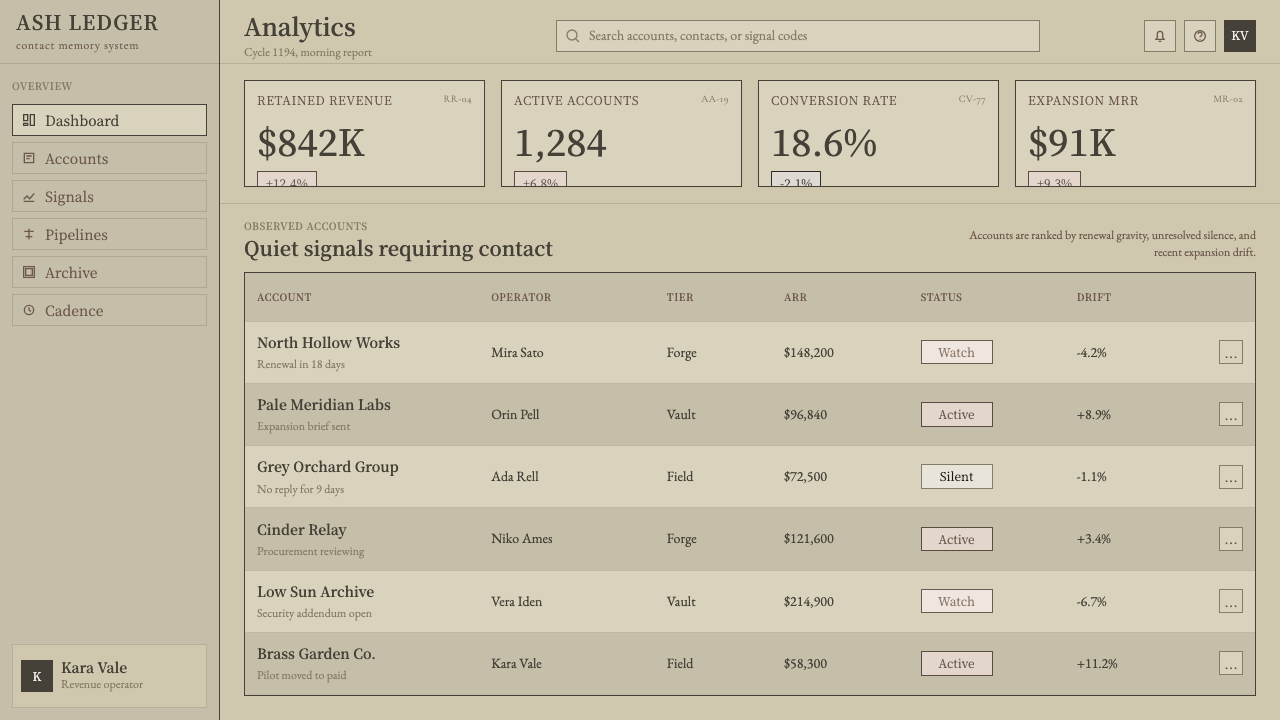
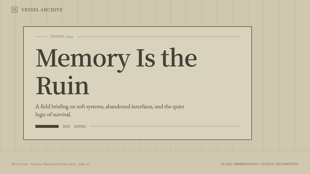
For presentation covers, use a broad pale greige field as the stage and let a thin framed region or a single severe serif title establish focus. Avoid treating the style as vintage paper or luxury stationery; its warmth should remain technical and subdued. On content slides, preserve generous open areas, use boxes only where they clarify grouping, and let near-black typography carry the hierarchy.
Data slides benefit from the style when charts are treated as calm instruments rather than visual celebrations. Keep the overall field pale and desaturated, use quiet contrast for labels, and separate findings through thin rules or enclosed regions. The goal is not to make every measure loud; it is to make comparison feel deliberate and readable within a restrained system.
For web interfaces, this language suits dashboards, account areas, utilities, and pricing pages where calm hierarchy matters. Use greige grounds to reduce visual fatigue, near-black serif labels for a distinctive editorial authority, and thin borders to distinguish controls, groups, and states. Interactions should preserve the same composure: a clearer frame or a measured tonal shift is more faithful than a sudden burst of luminous color.
In editorial and marketing work, the style is useful for subjects involving archives, technology, speculative culture, games, or reflective storytelling. A pale field with boxed metadata can make an article feel catalogued without becoming cold. Marketing compositions should leave room around the message and let a small amount of structural framing create tension, instead of filling the page with decorative sci-fi signals.
The common mistake is reducing the style to beige plus thin borders. That produces a generic neutral interface if the emotional logic is missing. Do not add neon accents, glossy depth, dense widgets, or cheerful cream softness merely to make the result feel more exciting. The visual system works because its muted surfaces, serif contrast, framing, and empty space all agree on the same idea: technology can be quiet, worn, and deeply melancholy.
NieR: Automata — FAQ
Is this simply a beige interface style?
No. The distinction is emotional as well as visual. The approved description emphasizes bone-white and soft greige under faint sepia, not cozy cream. Thin boxes, stark near-black serif labels, desaturated surroundings, and generous negative space make the palette feel restrained and post-apocalyptic rather than domestic or decorative.
Why does the style avoid neon when so much sci-fi depends on it?
Avoiding neon is the point of its science-fiction identity. NieR: Automata places its YoRHa system in a desaturated ruined world and answers that setting with pale, warm-grey order rather than spectacle. The absence of glow allows melancholy, fragility, and silence to become more visible than technological bravado.
Can this visual language work on a dark background?
A dark adaptation may be possible, but it moves away from the defining public description: flat bone-white and soft greige fields under a faint sepia wash. Dark grounds also risk returning the work to the standard sci-fi convention this style deliberately resists. Preserve pale warmth if the goal is recognizability.
What makes the typography feel appropriate to the style?
The key cue is stark near-black serif labelling on pale fields. It should feel measured, legible, and slightly archival, with enough empty space around it to avoid becoming editorial ornament. The type works as a quiet record within the interface, while thin boxes provide the structural support around it.
Related design styles
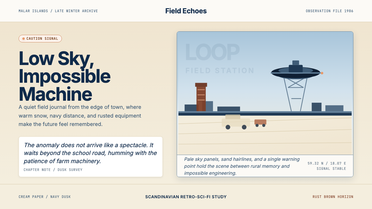 Simon Stålenhag — Tales from the LoopMelancholy makes the future quiet. Cream snow, low sky panels, navy type, one…
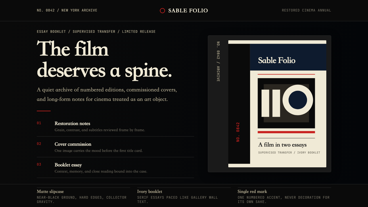 Criterion CollectionMuseum-grade cinema. Matte black, ivory serif, and one red numbered spine set…
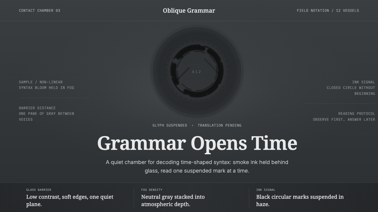 Arrival LogogramFirst contact turns quiet. Fog gray, serif notes, and smoke-black rings decod…
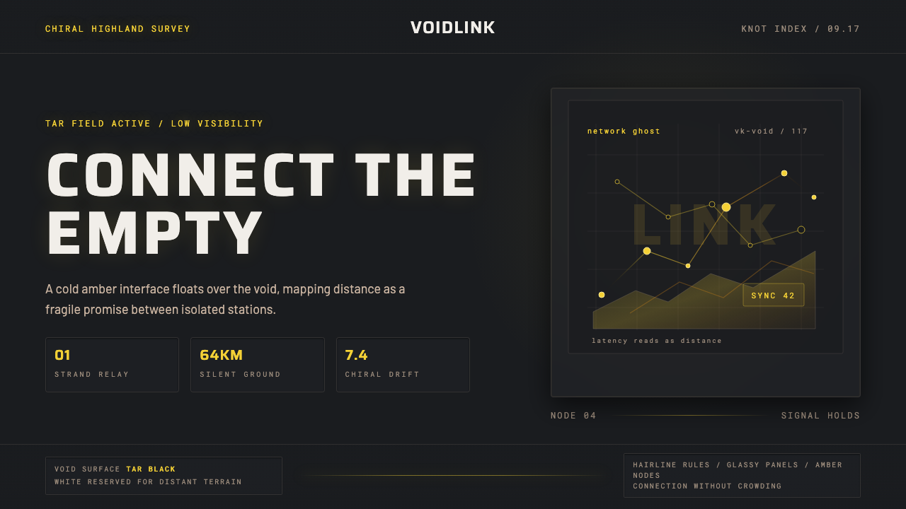 Death StrandingLonely connection, made visible. Amber HUD lines hover over a tar-black void.
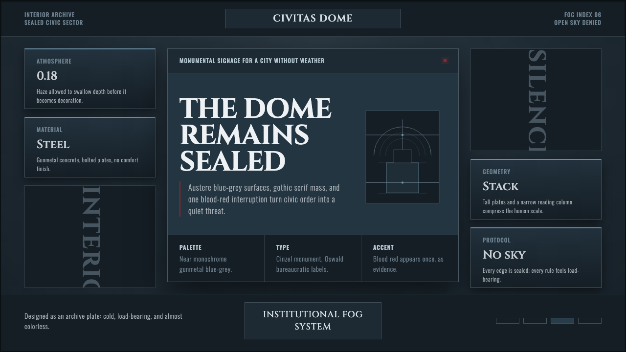 Ergo Proxy Romdo DomesCold order becomes dread. Gunmetal fog, gothic serif mass, one blood-red mark.
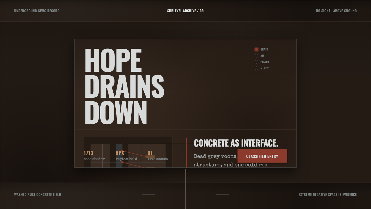 Texhnolyze Lux UndergroundHope drains into concrete. Rust-red grafts cut through dead grey negative spa…