What is Return of the Obra Dinn?
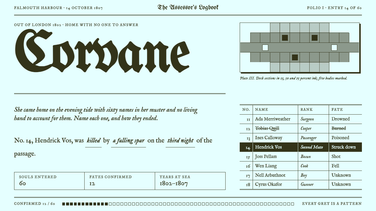
Return of the Obra Dinn draws the world in just two inks, olive-black on pale cyan-white paper, and builds every shade, edge and interface from the discipline of dithering.
Return of the Obra Dinn in brief
The Return of the Obra Dinn style is a two-colour, dithered visual language taken from Lucas Pope's 2018 deduction game. Everything is olive-black ink on pale cyan-white paper. There are no greys in the true sense: every tone between the two inks is made from patterns of tiny dots, and every edge is a hard step with no softening, no blur and no rounded corner.
The game's premise gives the style its shape. In 1807 a merchant ship drifts into Falmouth with all sixty of its crew dead or missing. The player is an insurance investigator armed with a ship's logbook and a pocket watch that lets them replay the moment of each death, and the job is to fill in who each person was and what happened to them. The interface is therefore a document: a ledger, a muster roll, a sheet of fill-in sentences, and engraved plans of the decks.
Translated into a design system, this becomes a strict set of rules. Ruled columns carry the structure, blackletter titles supply the voice of an old record, sentences with blanks replace form fields, and shading is always texture rather than gradient. It is an austere style, but not a cold one, because the constraint itself makes the page feel handmade and deliberate.

Where does Return of the Obra Dinn come from?
Return of the Obra Dinn was released on 18 October 2018 and made by Lucas Pope, who built the game largely on his own. The story is set between 1802 and 1807, in the age of the East India merchant ships, but its look does not come from the nineteenth century. It comes from 1986 and the Macintosh Plus, a small computer whose screen could show only two states per dot, black or white. Pope took that limit not as a handicap but as a rule of authorship.
The technical lineage behind the look is the history of one-bit graphics. When a display can only turn a dot on or off, shades have to be simulated by arranging dots, so artists and programmers developed dithering: ordered patterns, scattered patterns and, in later years, blue-noise methods that spread dots evenly so that no visible grid or clump appears. Those techniques were once a workaround for weak hardware. In Obra Dinn they became the aesthetic, with texture, grain and shimmering hatching standing in for light and form.
The game also draws on a second tradition, that of the first-person deduction game, in which the player pieces together a story from fragments. Rather than telling the story, the game hands over documents and frozen moments and trusts the reader to infer. This is why the interface has the character of a clerk's working file: a logbook, a list of names, a diagram of the ship and a set of sentences that must be completed correctly.
The combination of the old Macintosh screen and the nineteenth-century ledger is what gives the style its unusual tension. It feels simultaneously like a computer from the eighties and a ship's papers from the age of sail, and the two feel at home together because both are products of strict, material constraint. That is what a designer is borrowing when they reach for it.
What defines the Return of the Obra Dinn look?
Two-ink colour
The palette is exactly two inks: a deep olive-black and a pale cyan-white paper. Nothing else is introduced, not even a single accent. Hierarchy has to come from weight, density, position and pattern instead of from colour, which forces clearer decisions than any wide palette would.
Dithered shade
Every tone between ink and paper is a pattern of dots. Light areas use sparse dots, darker areas denser ones, and large flat regions of mid-tone are filled with fine, even texture. Soft gradients and drop shadows are forbidden; the closest thing to a shadow is a block of stipple with hard edges.
Hard-edged geometry
Every edge is a hard step. There is no anti-aliasing blur, no rounded corner and no translucency. Boxes, rules and shapes are drawn with exact lines, which gives the page a stamped or engraved quality. Spacing is generous enough for the dot patterns to remain legible.
Blackletter titles
Titles are set in blackletter, which brings the voice of a formal nineteenth-century record to an otherwise plain page. Body text is a clean, compact face suited to dense columns. The contrast between the ornate heading and the austere body is one of the system's most recognisable gestures.
Ledger structure
Layouts are built from ruled columns and rows, like a muster roll or logbook. Names, roles and fates sit in tables; each entry has a number, a line of identity and a status. The grid is visible, because the rules are part of the artwork rather than a hidden scaffold.
Fill-in sentences
Facts are written as sentences with blanks, such as who someone was and how they died. The form asks the reader to complete the record rather than merely read it. In an interface this suggests a way of turning inputs into prose, which feels less like paperwork and more like detective work.
Engraved plans
Spatial information is shown as engraved-looking plans: cross-hatched decks, outlined rooms and labelled positions. These diagrams use line and stipple only, and are the natural way to present maps, floor plans, flow diagrams and architecture drawings within the style.

Who shaped Return of the Obra Dinn?
Pope is the designer and developer behind Return of the Obra Dinn, which he made in 2018. His decision to treat a two-tone display as a creative rule, rather than a limitation to hide, is the origin of this entire style, from the dithered shade to the ledger-like interface.
How do you use Return of the Obra Dinn today?
The Obra Dinn style rewards designers who enjoy working under constraint. Its power does not come from decoration but from the discipline of two inks, and it works best when you commit fully: every grey is a pattern, every edge is hard, and every piece of structure is a rule or a table.
In presentation slides, a cover can be almost purely typographic: a blackletter title on pale paper, a thin frame, and a small engraved vignette in dot texture. Content slides work well as ruled ledgers, with a numbered list of entries, a label column and a status column. Data slides suit tables and stipple-shaded bar charts, where the difference between values is expressed by pattern density rather than by colour.
In web and product design, the style fits investigative tools, archives, casework dashboards, audit logs, game wikis, museum and library catalogues, and any interface where records are central. Forms can borrow the fill-in sentence idea, so a user completes a statement instead of filling scattered boxes. Because the style is so distinctive, it is also well suited to a landing page for an independent game or a narrative project.
In editorial and marketing work, it gives zines, case-study pages, posters and printed-looking reports an unmistakable character. Because the palette is just two inks, material is easy to reproduce in print as well as on screen, and a single ink can carry the whole identity.
The most common mistake is to use the colours without the discipline. Setting a pale cyan background and dark olive text, then adding smooth gradients, soft shadows or rounded cards, loses the point of the system. Equally, using blurry downscaled textures instead of crisp dot patterns will look like a filter rather than a style. Keep the edges hard, the grey as pattern, and the colour count at two.

Return of the Obra Dinn — FAQ
What is the Return of the Obra Dinn design style?
It is a two-colour, dithered visual language from Lucas Pope's 2018 game: olive-black ink on pale cyan-white paper, with every shade made from dot patterns, hard-edged geometry, blackletter titles and a ledger-like layout of tables, rolls and fill-in sentences.
Why does it look like an old Macintosh screen?
The look follows the one-bit graphics of the 1986 Macintosh Plus, where each dot could be only on or off. Artists simulated shades by arranging dots into patterns, a technique called dithering, and the game turns that workaround into its central aesthetic.
What is dithering, and which kind does this style use?
Dithering simulates tones with patterns of dots when only two colours are available. The style draws on both ordered dithering, which uses regular patterns, and blue-noise dithering, which scatters dots evenly so no visible grid or clump appears. Either way, tones are textures and not gradients.
Where does it work, and where should I avoid it?
It fits archives, case files, audit logs, catalogues, game pages, zines and anything built around records and documents. Avoid it for photography-heavy brand pages, soft consumer apps or places where accessibility requires fine tonal differences that dot patterns cannot express.
Can I add an accent colour?
Not without changing the style. The identity rests on exactly two inks, and the constraint is what forces clear hierarchy through weight, pattern and position. If you add colour, you are designing something adjacent to it, not the style itself.
Related design styles
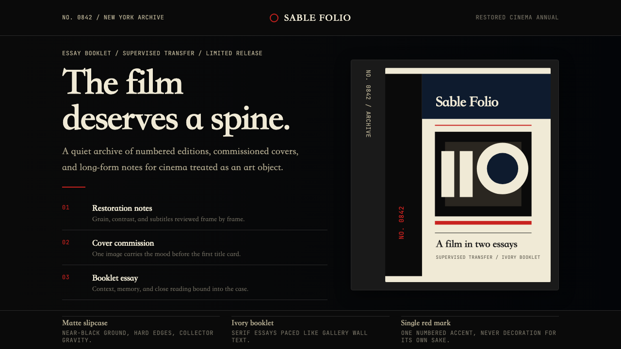 Criterion CollectionMuseum-grade cinema. Matte black, ivory serif, and one red numbered spine set…
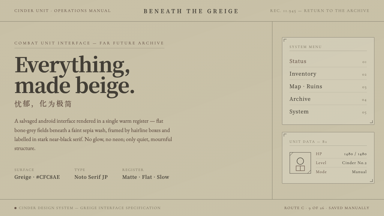 NieR: AutomataSci-fi that refuses neon. Flat greige fields under sepia wash, hairline boxes…
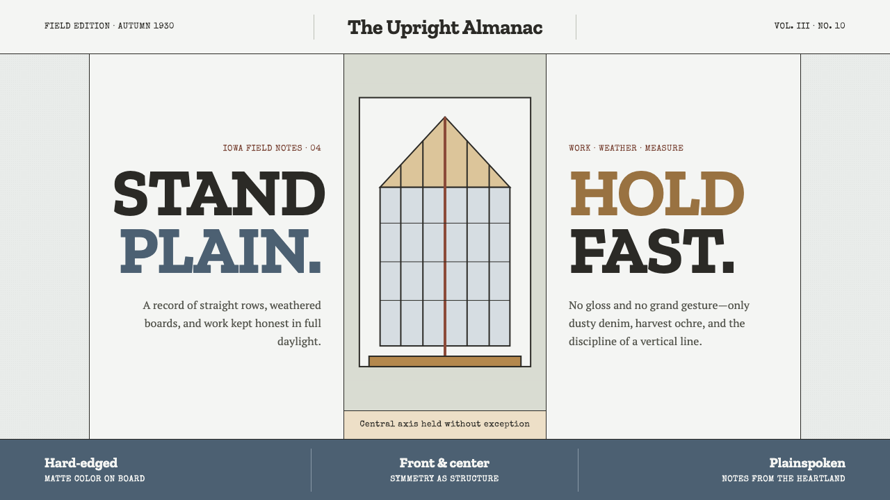 Grant Wood American Gothic (1930)Plainness stands firm. Dusty denim and ochre align on a strict central axis.
 Ansel Adams Zone SystemOnly light remains. Deep shadow, serif captions, and one white moon mark the…
 Broadsheet LetterpressAuthority in ink. Lampblack serif decks lock into tan paper with strict ruled…
 Cherokee SyllabaryLiteracy as inked record. Carbon type, muted red rules, and syllabary on tan…