What is WALL·E?
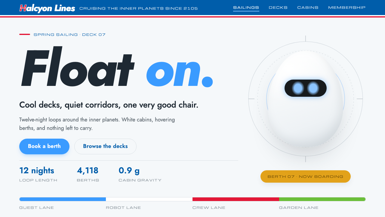
A cool-white, glossy vision of the future borrowed from the Axiom, the Buy n Large starliner in Pixar's WALL·E, with one small warm robot to remind you of Earth.
WALL·E in brief
The WALL·E style is a design system drawn from the Axiom, the Buy n Large starliner in Pixar's 2008 film. It is built on cool white space-age optimism: glossy egg-shaped shells, rounded capsules, soft floating shadows, and a single brand bar in red and blue across the top.
Three colour roles organise it. The ground is cool white, like EVE's shell and the sterile decks of the ship. EVE's LED blue handles every interaction. The red and blue of Buy n Large appear only on the wordmark bar and the signage, in the same way a real superstore would use its brand colours. A single warm yellow, taken from WALL·E himself, appears once per page.
The shapes follow the same logic. Eggs, capsules and ovals dominate, and the structure borrows the white ribbed arches associated with Calatrava-style architecture. Shadows are soft and sit under objects that seem to hover. The combined feeling is clean, friendly, slightly corporate and quietly ironic: a future that is comfortable and a little too perfect.

Where does WALL·E come from?
WALL·E was released in June 2008 by Pixar Animation Studios, based in Emeryville, California, and won the Academy Award for Best Animated Feature in 2009. Andrew Stanton directed it. The film's first act is almost wordless, following a lonely waste-compacting robot on an abandoned Earth; its second act moves to the Axiom, a vast spaceship on which humanity has lived for generations, served by machines and absorbed in screens.
The look of the Axiom is deliberately a double image. On one side it is attractive: clean, bright, orderly, comfortable. On the other it is the world of a corporation that has taken over every function of daily life, and the film asks the audience to feel the sterility beneath the polish. That ambiguity is why the style works so well in design. It presents a polished, trustworthy surface and also carries a faint irony about how perfect that surface is.
Several people are associated with that look. Ralph Eggleston, the film's production designer, is named among the key figures for shaping its visual language; Ben Burtt is credited for the sound design that gave the robots their personalities; and Jonathan Ive is listed because EVE's smooth, white, minimal industrial design is commonly linked to the approach of consumer-electronics design at the time. Together they explain why the film's technology looks like a product line, not a prop.
The wider influences are named as 1960s space-age retro-futurism, Disneyland Tomorrowland and mid-century corporate identity. The first supplies the capsule shapes and the faith that the future would be smooth and bright. Tomorrowland supplies the theme-park cheerfulness, where optimism is staged for visitors. Mid-century corporate identity supplies the idea of a single brand mark and colour bar that covers an entire world, from signage to uniforms. That is why a fictional retailer can feel so credible: it speaks in the visual language of real postwar companies.
What defines the WALL·E look?
Cool white ground
The page is a cool, slightly bluish white with a glossy feeling, like moulded plastic. It is not a warm paper white. It reads as clean, sterile and engineered, and it makes every other colour look like a deliberate signal rather than decoration.
LED blue for action
Interaction belongs to one glowing blue, the colour of EVE's eyes. Links, active states, focus indicators and primary actions all use it. Because blue is reserved for things you can do, users learn quickly that the glow means touch here.
The brand bar
Buy n Large's red and blue appear only on a bar across the top and on signage-like elements, the way a retailer would use its identity colours. Keeping them confined makes the page feel like it belongs to a world with a single corporate owner, which is exactly the film's joke.
Eggs, capsules and ribs
Containers are egg-shaped or capsule-shaped with generous rounding, and decorative structure borrows the long white ribs of Calatrava-style arches. The geometry is smooth and engineered, with no hand-drawn wobble and no sharp corners.
Floating shadows
Shadows are light, soft and diffuse, and they sit under objects as though the objects were hovering a little above the floor. They suggest anti-gravity hardware rather than furniture resting on the ground, and they keep the surface bright rather than heavy.
One yellow per page
A single warm yellow, taken from WALL·E himself, appears once on a page. It is the only touch of rust and warmth in an otherwise cold, bright system, and it reminds the viewer that there is still a small robot working down on Earth.

Who shaped WALL·E?
Director of WALL·E. His film set up the contrast between a lonely, handmade robot on Earth and a polished corporate starliner.
Production designer, associated with the film's overall visual language, including the sterile look of the Axiom.
Sound designer credited with giving the robots their voices and personalities, which strengthens the feeling that the machines are characters.
Industrial designer whose minimal, white consumer-electronics approach is often connected with EVE's glossy shell.
How do you use WALL·E today?
In slide decks, the style is a natural fit for consumer technology, product launches and anything that wants a clean, friendly, slightly futuristic tone. A cover can carry the red and blue brand bar across the top, a white field below, and a large capsule-shaped title block. Content slides stay mostly white, with one blue accent for the key action or number. Data slides benefit from the calm white ground: charts can use the blue sparingly and let rounded containers organise the information.
In web interfaces, it suits smart hardware, membership services, subscription products and brands with a slightly nostalgic vision of the future. Buttons become pills in LED blue, cards become soft capsules, and the brand bar anchors the header. The floating shadow gives a light hover effect on interactive elements. For dashboards, keep the glossy shapes but reduce the ornament, so the system remains legible at density.
For editorial and marketing work, it works for product pages, launch announcements and campaign sites with a gently ironic edge. The retro-futurist background gives you a story: a corporate utopia that is clean and convenient. The yellow accent is useful as the one point of human warmth, such as a testimonial, an illustration or a call to a real person.
A good habit is to treat colour as a set of assigned roles. White is the world, blue is the action, red-and-blue is the brand, yellow is the human touch. If you keep each role in its place, the page reads clearly and keeps the film's quiet joke.
The common mistakes are using the brand red and blue as general decoration, which destroys the signage logic, and using the blue for non-interactive elements, which teaches users to ignore it. A third mistake is making the surface too sterile: without the one yellow touch, the page loses its human counterpoint and looks merely cold.

WALL·E — FAQ
What is the Axiom?
The Axiom is the Buy n Large starliner in Pixar's WALL·E. It is the setting for the film's second act, a vast, clean, comfortable ship that has housed humanity for generations. Its sterile decks, white shells and signage are the direct source of this design style.
Why is blue used for interaction and red only for the brand?
Because that mirrors how the world of the film works. EVE's LED blue is the colour of active, intelligent things, so it handles actions. Buy n Large's red and blue belong to the corporation, so they appear only on the wordmark bar and signs. Splitting the roles keeps the interface clear and stays faithful to the source.
What are the real-world influences behind the look?
The look draws on 1960s space-age retro-futurism, the optimism of Disneyland's Tomorrowland, and mid-century corporate identity. Those give it capsule shapes, a theme-park cheerfulness, and a single-brand world. Jonathan Ive's consumer-electronics approach is also listed among the references for EVE's polished design.
Why only one yellow element per page?
The yellow represents WALL·E himself, the one worn, warm presence in a clean, cold environment. Limiting it to one use per page keeps it meaningful. If it appears everywhere, it becomes ordinary decoration and loses its role as a human counterpoint.
Is the style suitable for serious or financial products?
It can work for friendly consumer fintech or membership services, but its playful, glossy shapes and ironic undertone may feel wrong for conservative, legal or medical contexts. It suits products that want to feel approachable and a little futuristic, not those that need heavy authority.
Related design styles
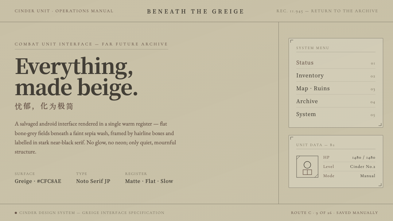 NieR: AutomataSci-fi that refuses neon. Flat greige fields under sepia wash, hairline boxes…
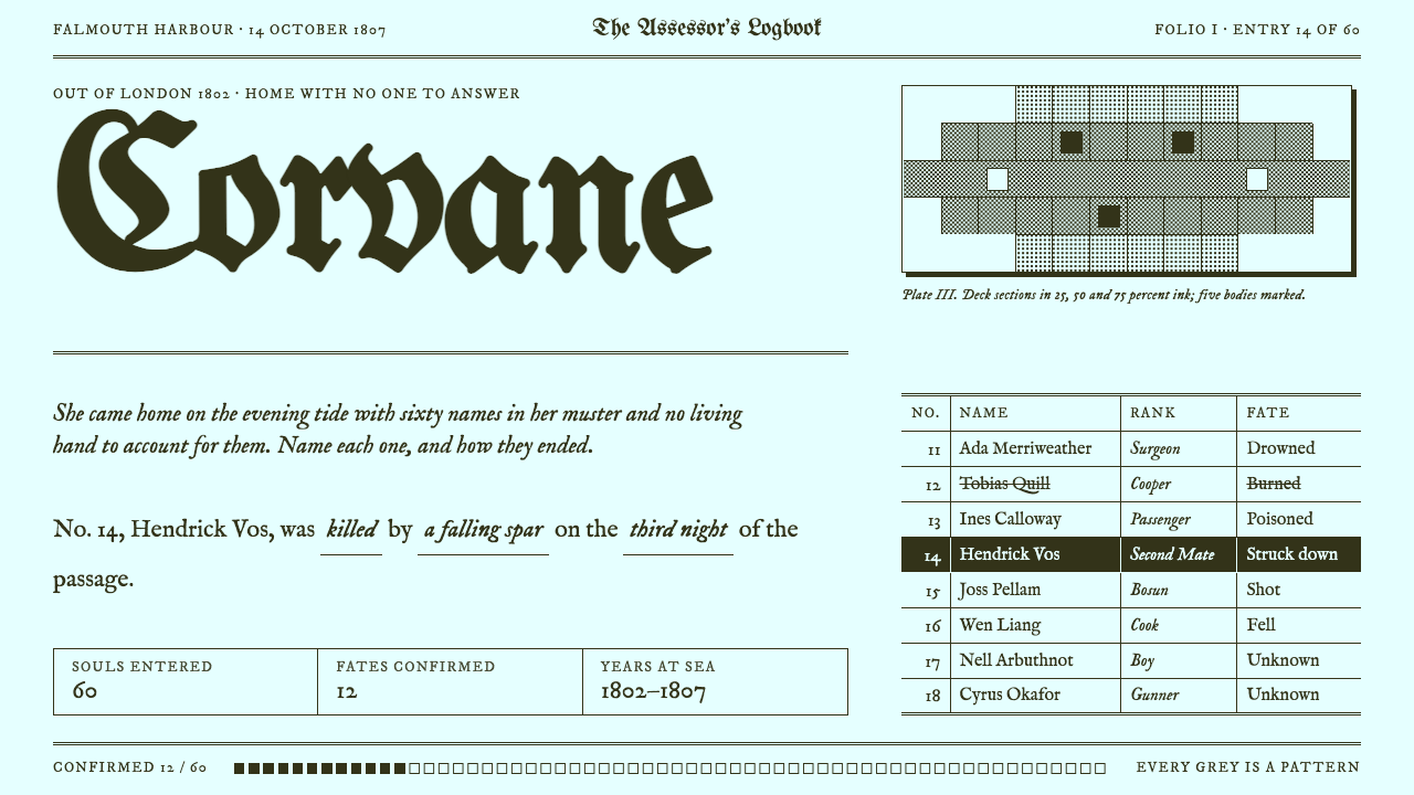 Return of the Obra DinnTwo inks, zero greys. Olive ink on cyan-white paper, blackletter titles, dith…
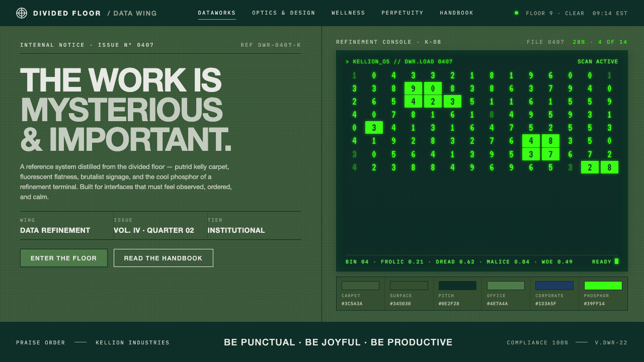 Severance LumonCorporate dread, distilled. Putrid kelly carpet, brutalist signage, CRT phosp…
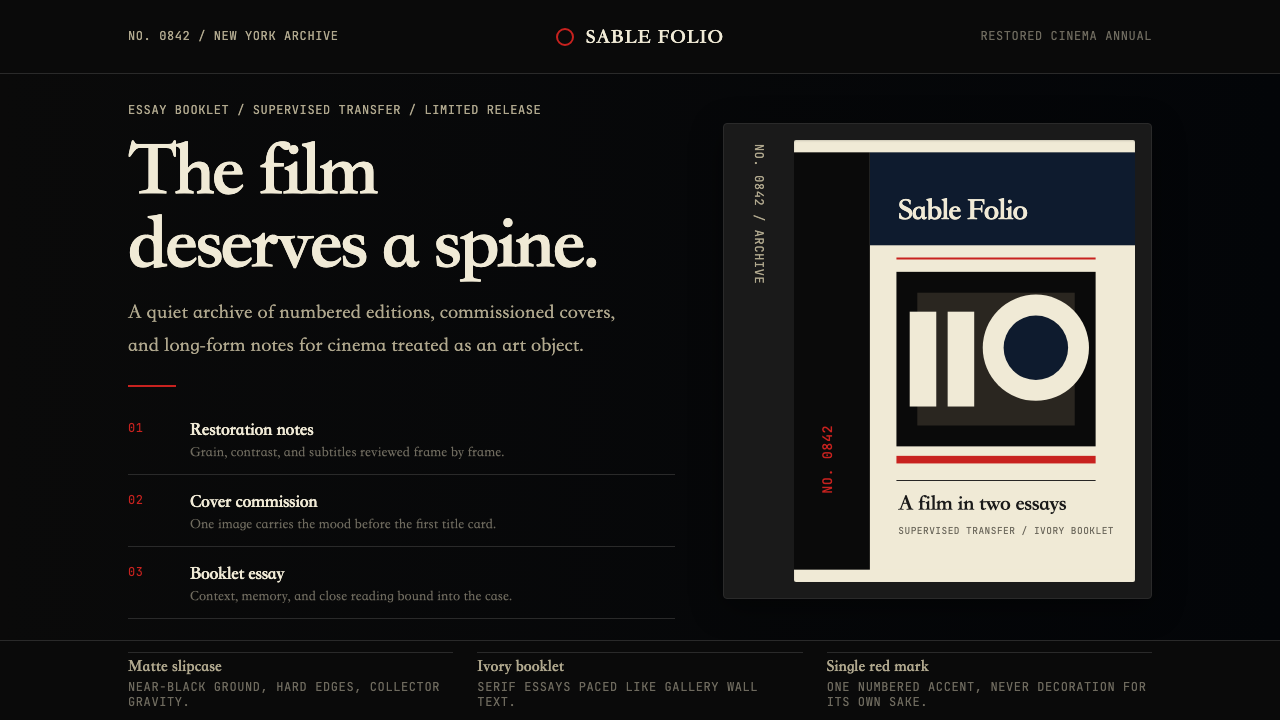 Criterion CollectionMuseum-grade cinema. Matte black, ivory serif, and one red numbered spine set…
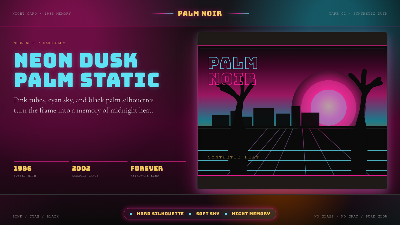 GTA Vice City (2002)Neon-noir nostalgia. Pink-cyan dusk, chunky type, and palm silhouettes.
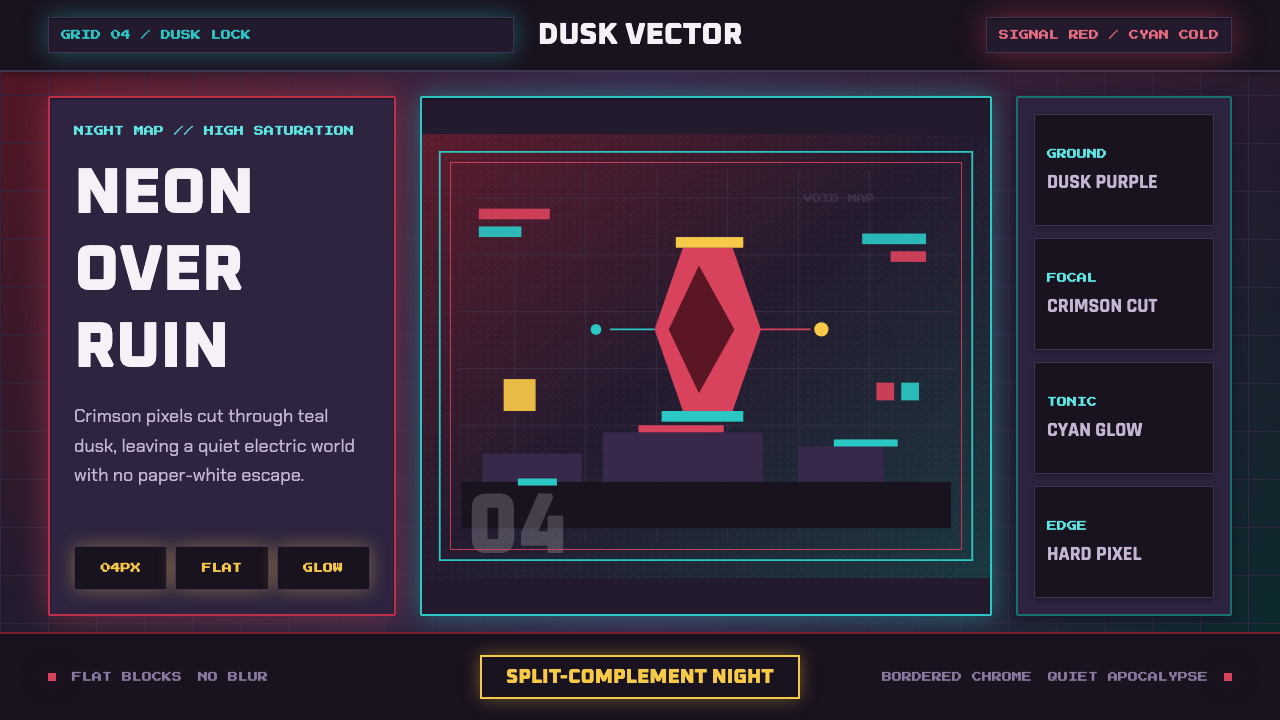 Hyper Light DrifterBeautiful ruin glows. Dusk purple holds crimson pixels and cyan grid light.