What is Newar Tundal Strut Carving?
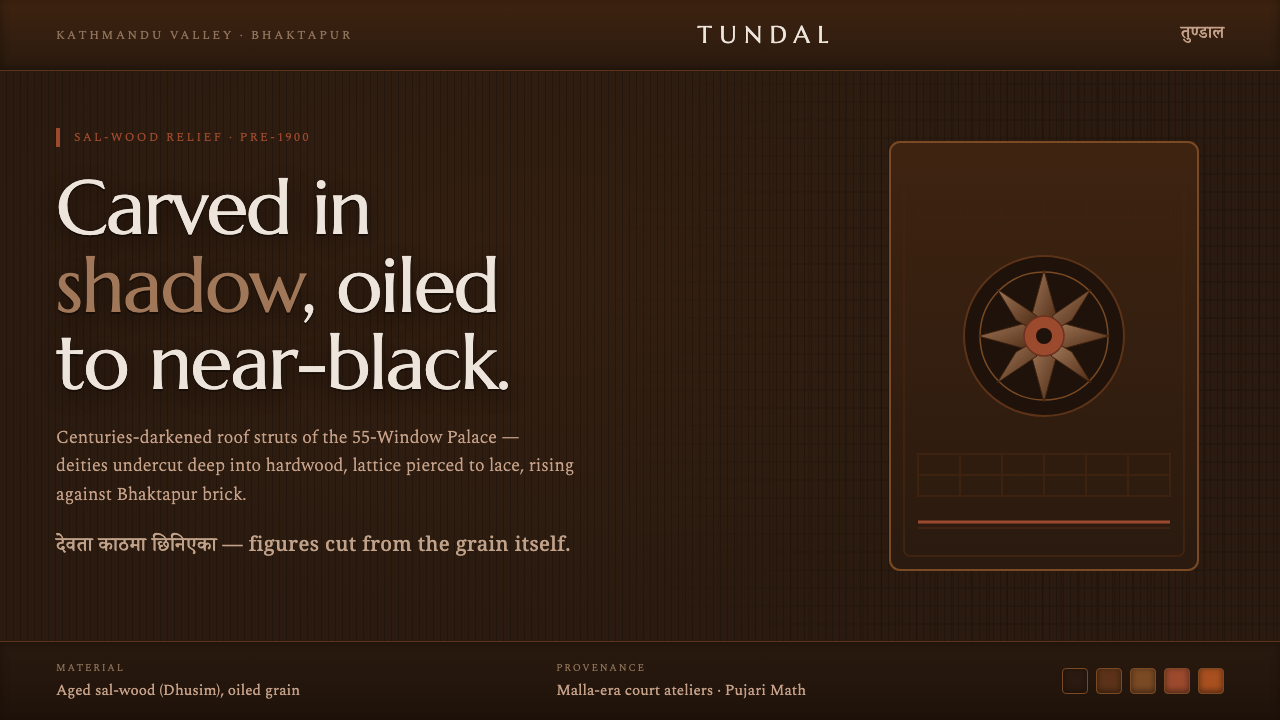
Newar tundal carving turns aged sal wood into architecture alive with shadow: deities, lattice, and deep-cut relief emerging from the near-black grain of Bhaktapur.
Newar Tundal Strut Carving in brief
Newar tundal strut carving is the deeply worked roof-strut woodcraft of Nepal’s Kathmandu Valley, especially associated with Bhaktapur. A tundal is not merely a supporting architectural member. It is a carved presence beneath a roofline: sal wood shaped into deity relief, ornamental structure, and dense shadow, where the practical task of holding the eaves is inseparable from the task of making sacred and civic architecture visually alive.
The tradition is visible at Bhaktapur’s 55-Window Palace and the Pujari Math, where carved struts and pierced wooden lattice sit against the city’s brick masonry. Over centuries, oiling and age darken sal wood until it appears almost black. The carved forms do not announce themselves through bright color or smooth illustration; they emerge through undercut planes, recessed crevices, softened edges, and the changing contrast between worn high points and protected dark interiors.
As a digital design language, Newar tundal carving begins with that material relationship: an aged-hardwood ground, mid-brown carved forms, lattice-like framing, and restrained brick-red accompaniment drawn from Bhaktapur masonry. Its central effect is relief rather than flatness. Surfaces should feel cut, pierced, framed, and weathered, as if information has been revealed from within a dark wooden body rather than placed on top of a neutral screen.
Where does Newar Tundal Strut Carving come from?
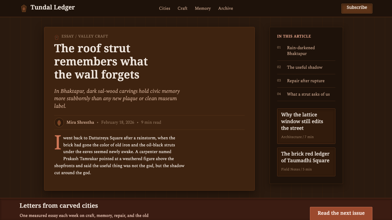
The tradition belongs to the Kathmandu Valley’s Newar architectural culture, where tiered pagoda-temple architecture gave wood a prominent structural and visual role. Rooflines required struts, and the strut became an opportunity for intensive carving. Rather than concealing construction, the carved tundal makes support visible, treating the space below an eave as a threshold where architecture, craft, and devotional imagery meet.
Its strongest historical setting in the supplied record is Bhaktapur, a city identified with Malla-era court ateliers and peak woodcraft before 1900. The 55-Window Palace, dated around 1700 in the source material, stands as a key reference for the environment in which elaborate wooden windows, carved supports, and brick architecture formed a unified public expression. The palace is important not as an isolated decorative object, but as evidence of a whole visual system in which wood, shadow, masonry, and repetition work together.
Newar woodcarvers worked through a Kathmandu Valley guild tradition. That phrase matters because the style should not be reduced to an individual signature or a single ornamental motif. Its continuity rests in shared knowledge: how sal wood accepts cutting, how a support can carry relief, how a lattice can create both enclosure and permeability, and how dense carving remains legible when it is viewed from beneath a projecting roof.
The material itself shaped the tradition’s visual character. Sal wood, also identified as Dhusim in the source material, carries the accumulated evidence of exposure and care. Age and oiling bring the surface toward a dark, almost black appearance while carved figures and edges retain readable warmth. This is why the aesthetic is best understood as a language of depth, patina, and selective emergence. The contrast is not a graphic trick; it is the visible consequence of carved timber enduring in architectural life.
What defines the Newar Tundal Strut Carving look?
Aged Hardwood Ground
The dominant field should feel like centuries-darkened sal wood: almost black, warm rather than neutral, and materially dense. It is not an empty backdrop. Fine grain, subdued variation, and protected dark recesses give the surface the sense that it has history before any text or image arrives. The visual mood is enclosed and architectural, like standing beneath a carved roof rather than looking at a decorative wood sample.
Undercut Relief
Forms are defined by carving depth. A figure, emblem, or content panel should appear to rise from surrounding darkness through cut edges and recessed channels, not through glossy rendering or atmospheric blur. Dark interior shadows establish the deepest planes; warmer raised surfaces identify what has been carved and touched. The result should remain tactile and directional, with every highlight implying an edge shaped by a tool.
Carved Figure and Presence
The source tradition centers on deity struts and relief, so figurative forms carry gravity even when adapted abstractly. Digital motifs should feel upright, framed, and held within a structural field rather than casually illustrated. Silhouette matters more than fine pictorial realism. A carved presence is read through posture, contour, and the way surrounding darkness makes the form feel sheltered beneath an eave.
Pierced Lattice Framing
Pierced lattice provides the system’s rhythm of enclosure and opening. It can frame a page edge, divide sections, contain an image, or create a partial screen between information layers. The key is permeability: a lattice should suggest that the field continues beyond it. Repetition should feel hand-ordered rather than mechanically decorative, and negative space should be treated as a carved opening with equal importance to the wood around it.
Brick and Timber Contrast
Muted brick red is the supporting complement, recalling Bhaktapur masonry without competing with the wood. It works best as a grounded accent: a field behind a carved frame, a sectional interruption, a marker of navigation, or a restrained signal of action. Against the near-black timber ground, it should feel earthen and architectural, never synthetic or celebratory. The relationship is one of masonry supporting shadowed wood, not color decoration seeking attention.
Patina and Restraint
Authenticity depends on controlled variation. The style is rich because surfaces imply oiling, wear, age, and repeated touch, not because every area is covered in effects. Keep bright surfaces rare, reserve the clearest relief for focal information, and allow dark zones to remain genuinely dark. Excessively polished wood, uniformly repeated motifs, or busy ornamental overlays erase the sense of time that gives the tradition its force.

Who shaped Newar Tundal Strut Carving?
The source material identifies Newar woodcarvers working through a Kathmandu Valley guild tradition as the essential makers behind this visual language. Their importance lies in the continuity of shared craft knowledge rather than in a named individual authorship: carving sal wood, shaping deity relief, producing pierced lattice, and making structural struts carry visual meaning. Any contemporary use should recognize that the style originates in practiced architectural craft, not in an interchangeable ornamental pattern.
Bhaktapur’s Malla-era court ateliers are identified as the institutional setting for peak woodcraft in the source material. They matter because court architecture brought carving into a coordinated environment of roof structure, window systems, brick surfaces, and ceremonial presence. The result was not a detached object culture: carved wood was integrated into how a building faced the city, received people, and organized the visual experience of its exterior.
The sal-wood tundal is the tradition’s defining architectural actor. It joins structural support with carved expression, carrying deity relief beneath a roofline while participating in the larger rhythm of pagoda-temple architecture. Centuries of age and oiling give it the near-black depth central to the theme. In design terms, it is a model for elements that must work and signify at once: a frame that is also an image, a support that is also a story.
How do you use Newar Tundal Strut Carving today?
For presentation covers, treat the screen as a shadowed architectural face. Let a dark wood-like field carry the composition, then introduce one carved focal form or lattice-framed title area with substantial breathing room around it. The cover should feel entered rather than scanned. On content slides, retain that atmosphere but make information legible through clearly cut hierarchy: headings emerge as raised bands or carved labels, body copy sits in calmer recessed fields, and dividers behave like structural rails instead of ornamental flourishes.
Data slides should borrow the tradition’s logic of relief, not its sacred imagery literally. Charts can use warm carved tones for primary values, deep recesses for secondary context, and a restrained brick-red accent to call out a decisive point. Bar, comparison, and process graphics should look embedded in a timber field or contained by lattice-derived framing. Keep the information plane clean enough to read immediately; texture belongs around the data and in the hierarchy, never across the marks that carry exact meaning.
For web interfaces, this style suits cultural archives, editorial collections, premium storytelling products, and dashboards that benefit from a sense of crafted gravitas. A dashboard can use dark recessed modules, raised summary panels, carved-edge tabs, and lattice-inspired separators to establish zones without relying on generic glassy cards. A pricing or membership page can make tiers feel like framed chambers within a larger wooden structure, using brick red sparingly to distinguish a selected path or important commitment.
In editorial and marketing work, use the style to build atmosphere before persuasion. Long-form pages can begin with a deep carved hero, then move through quieter reading surfaces framed by timber borders or occasional pierced-lattice breaks. Product stories work best when photography, illustration, or feature callouts are treated as inset panels rather than floating stickers. Brick-red interruptions can echo masonry between dark sections, giving a campaign the cadence of moving from street-facing wall to shaded wooden threshold.
The common mistake is to treat Newar carving as a surface texture to paste onto any dark interface. Random wood grain, repeated deity-like symbols, or aggressive embossed effects reduce a living architectural craft to mood-board decoration. The more faithful approach is structural: use darkness to create depth, use framing to organize attention, use relief to establish hierarchy, and use ornament only where it carries the logic of carving, support, enclosure, or transition.
Newar Tundal Strut Carving — FAQ
Is Newar tundal carving simply a dark wood aesthetic?
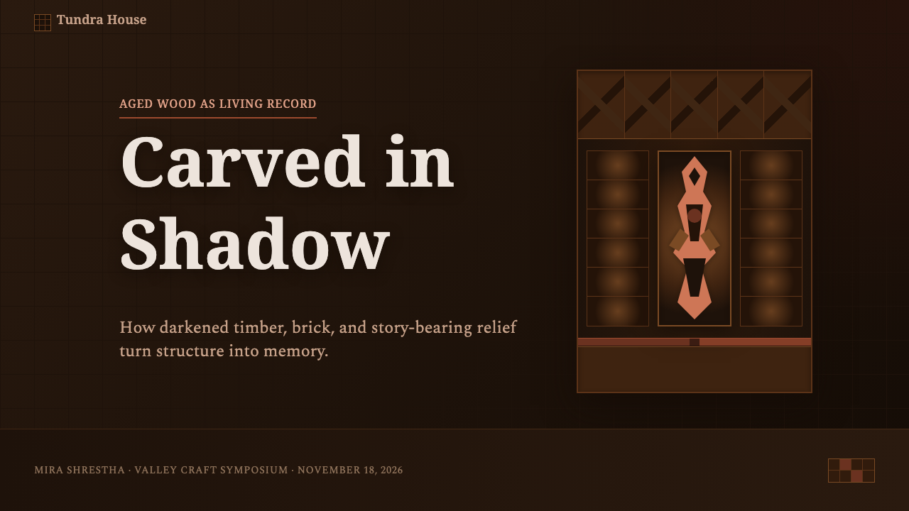
No. The darkened wood is important, but it is the result of age, oiling, sal timber, and architectural exposure. The tradition is defined equally by its role as roof support, its deep-cut relief, its deity carving, and its relationship to pierced lattice and Bhaktapur brick. A dark background without relief, structural framing, or a sense of carved depth captures only the most superficial part of the language.
How should a digital design use deity-related carving respectfully?
Use the structural and material principles before borrowing sacred-looking motifs. Depth, framed support, pierced openings, timber patina, and the relationship between shadowed wood and masonry can communicate the tradition without turning deity relief into a casual decorative asset. When figural reference is necessary, avoid arbitrary recombination and preserve a sense of placement, gravity, and architectural context rather than treating the form as an interchangeable icon.
Can this style support readable dashboards and data-heavy pages?
Yes, provided relief is used to organize rather than obscure. Dark recesses can separate context from priority, carved panels can group related information, and a limited warm accent can direct attention. The essential discipline is to keep numbers, labels, and chart marks visually calm. The interface should borrow the hierarchy of carved architecture, not reproduce every grain and shadow inside the data layer.
Why is brick red used so sparingly in this design system?
Its purpose is to recall Bhaktapur masonry and establish an architectural counterpart to dark sal wood. If it appears everywhere, the relationship between shadowed timber and brick loses its force, and the interface becomes a general warm-colored composition. Used selectively, brick red can mark a transition, frame a focal area, or signal a decision while allowing the aged wood and carved depth to remain the central experience.
Related design styles
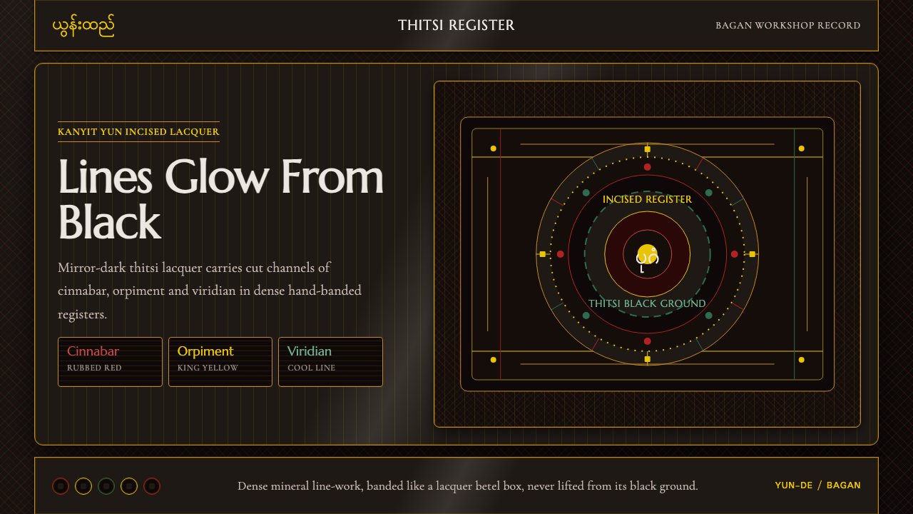 Burmese Yun LacquerwareLacquer glows in cut lines. Cinnabar, orpiment and viridian band a mirror-bla…
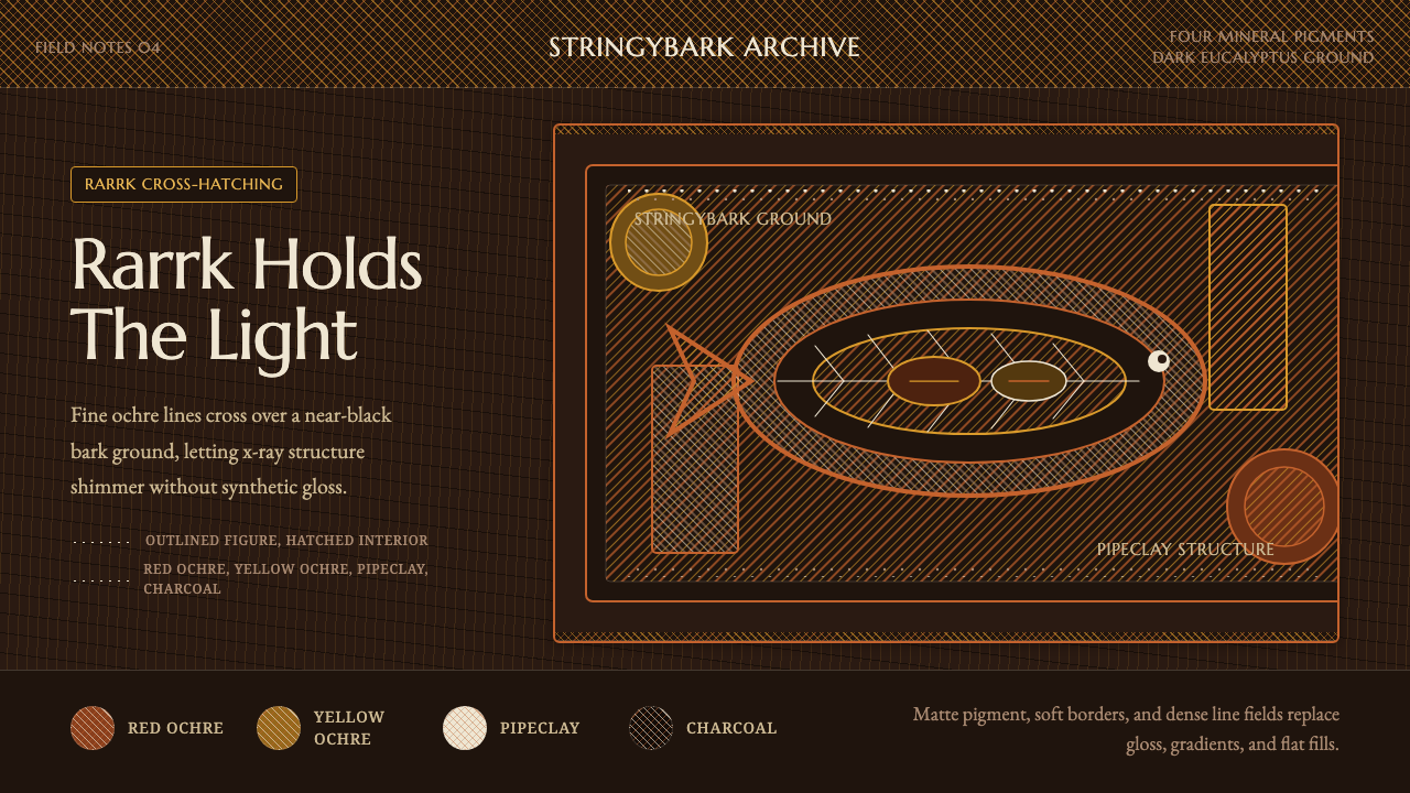 Arnhem X-Ray Bark PaintingShimmers without gloss. Ochre rarrk lines vibrate on dark stringybark.
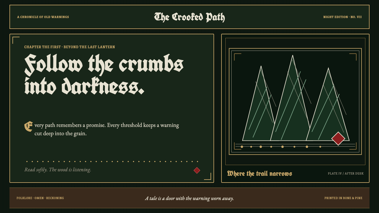 Grimm Fairy Tales (Black Forest Woodcut)The dark wood closes in. Bone-white cuts and aged-gold frames score a pine-bl…
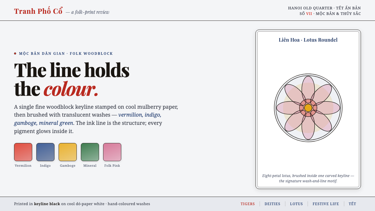 Hàng Trống Folk PrintBright folk colour, never loud. Translucent vermilion-indigo washes held insi…
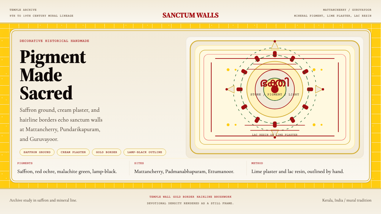 Kerala Mural TempleDevotional density over space. Saffron ground and cream panels, edged in gold.
 Macedonian Ohrid Fresco (Byzantine)Sacred darkness breathes. Tarnished gold rings, cinnabar folds, and plaster g…