What is Hàng Trống Folk Print?
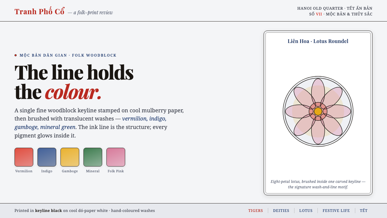
Hàng Trống folk print turns colour into a held breath: luminous washes, devotional symmetry, and one fine black keyline that keeps every form composed.
Hàng Trống Folk Print in brief
Hàng Trống folk prints are a Vietnamese folk-print tradition associated with the print shops of Hàng Trống street in Hanoi’s Old Quarter. Their visual character begins with a precise division of labour between line and colour. A fine black keyline, printed from a carved woodblock on cool mulberry paper, establishes the full drawing before colour arrives. Vermilion red, indigo blue, gamboge yellow, and soft mineral green are then applied by hand as translucent washes, so the image never loses the delicacy of its underlying drawing.
This is not a style built from flat colour alone. The pigment appears to float inside the contour, allowing the paper ground and the black line to remain visibly active. The result is bright without becoming noisy: colour carries warmth and invitation, while the keyline supplies discipline. Every floral curve, devotional motif, framed panel, and symmetrical passage is held by the same graphic logic.
As a contemporary visual system, Hàng Trống translates into a cool paper-white field, clear folk pigments with visible lightness, and black outlines that are treated as indispensable structure rather than decoration. Its rhythm comes from ornate framing, centred or balanced compositions, and motifs that feel ceremonial without needing visual excess. The style is most convincing when the viewer can sense both the carved source line and the hand-applied wash.
Where does Hàng Trống Folk Print come from?
Hàng Trống belongs to Vietnamese folk woodblock printing, known broadly as tranh dân gian, and developed as a religious and decorative print school in Hanoi’s Old Quarter. Its location on Hàng Trống street matters because the tradition is inseparable from workshop practice: prints emerged from local print shops rather than from a single named academy or individual author. The available account places the mature tradition before 1900, within the Nguyễn-era devotional folk-art world and with roots in earlier centuries.
The making process explains much of the style’s lasting visual authority. Instead of relying on a separate printed block for each colour, the workshop begins with one carved black keyline. That printed outline carries the drawing’s details, boundaries, and ornamental rhythm. Hand-colouring follows afterward, allowing translucent pigment to vary gently while remaining contained by the line. The print is therefore both reproducible and visibly handmade.
Cool mulberry paper, known as dó paper, is part of the system rather than a neutral support. Its pale ground gives the pigments room to remain radiant and gives the keyline a clean field on which to register. Vermilion, indigo, gamboge, and mineral green are not merely a decorative palette; in this process, they are washes whose transparency makes the black drawing and paper presence legible together.
The named makers in the source material are Hàng Trống workshop families, anonymous carver-painters, and Lê Đình Nghiên as a modern tradition-bearer. That grouping is revealing. The style should be understood as a lineage of shared craft knowledge, not as the signature vocabulary of one celebrated designer. Its contemporary relevance comes from this continuity: a disciplined method can preserve delicacy, ornament, colour, and devotional composure without reducing any of them to surface effect.
What defines the Hàng Trống Folk Print look?
Keyline Black
The black outline is the governing structure of Hàng Trống. Fine, carved, and visibly present, it defines every shape before colour is added. It should remain crisp enough to separate neighbouring forms and quiet enough to let the washes glow. Removing it produces colourful decoration; retaining it preserves the print’s craft logic.
Translucent Folk Colour
Vermilion, indigo, gamboge, and soft mineral green are inviting because they read as washes rather than opaque slabs. Colour is saturated but breathable, with the paper ground still perceptible through the application. The effect is luminous and handmade, never heavy or digitally sealed.
Cool Paper Ground
The pale dó-paper ground creates distance around the pigments and gives ornament somewhere to rest. It is not empty background. Its cool, quiet presence makes the warm vermilion and gamboge feel more alive, while giving indigo and black enough clarity to remain precise.
Symmetry and Devotion
Symmetry gives the style its ceremonial stillness. Forms may be centred, mirrored, or balanced around a strong axis, so the eye experiences the image as an ordered offering rather than an accidental arrangement. This quality should feel composed and reverent, not mechanically rigid.
Ornate Framed Panels
Ornate frames are active compositional devices. They enclose the central image, repeat its line rhythm, and turn the edge of a panel into part of the artwork. The frame should support a clear interior hierarchy rather than compete with the principal motif for attention.
Hand-Coloured Variation
Because pigment is applied by hand after the keyline is printed, the colour layer carries softness and slight variation without abandoning order. This is a useful distinction for contemporary work: irregularity belongs inside a stable outline. Expression comes from the wash, while legibility comes from the carved drawing.
Who shaped Hàng Trống Folk Print?
The workshop families of Hàng Trống street represent the tradition’s local and collective foundation. Their print shops joined carving, printing, paper, pigment, and hand-colouring into one craft system. Understanding the style through these families prevents it from being reduced to a generic ornamental look: its restraint comes from a reproducible line process and a manual colour process working together.
The anonymous carver-painters are central precisely because the source tradition is carried by craft practice rather than individual authorship. Their work joined a carved black keyline with hand-applied translucent colour. That combination remains the clearest lesson for designers: drawing provides the structure, while colour provides the living variation.
Lê Đình Nghiên is identified in the source material as a modern tradition-bearer. His presence makes clear that Hàng Trống is not only a historical reference but a practice with a continuing line of stewardship. In a contemporary design context, that continuity asks for fidelity to method and visual relationships, not merely the reuse of bright folk colours.
How do you use Hàng Trống Folk Print today?
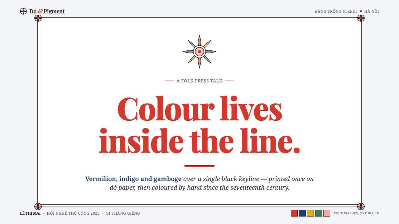
For presentation covers, use the style as a framed act of arrival. Set a concise title within or against an ornate panel, then establish a clear central or symmetrical anchor. A cool paper field should remain generous around the composition. Choose one dominant wash-led colour relationship and allow the black keyline to define the image, rather than filling every open area with competing motifs.
Content slides benefit from the distinction between structure and wash. Treat the keyline as the system for headings, panels, dividers, icons, and diagram boundaries; let translucent folk colour identify emphasis, categories, or highlighted ideas. On data slides, charts should remain direct and readable, while colour can sit inside outlined segments and framed labels. The result should feel illustrative and ordered rather than like a decorative filter placed over analytical information.
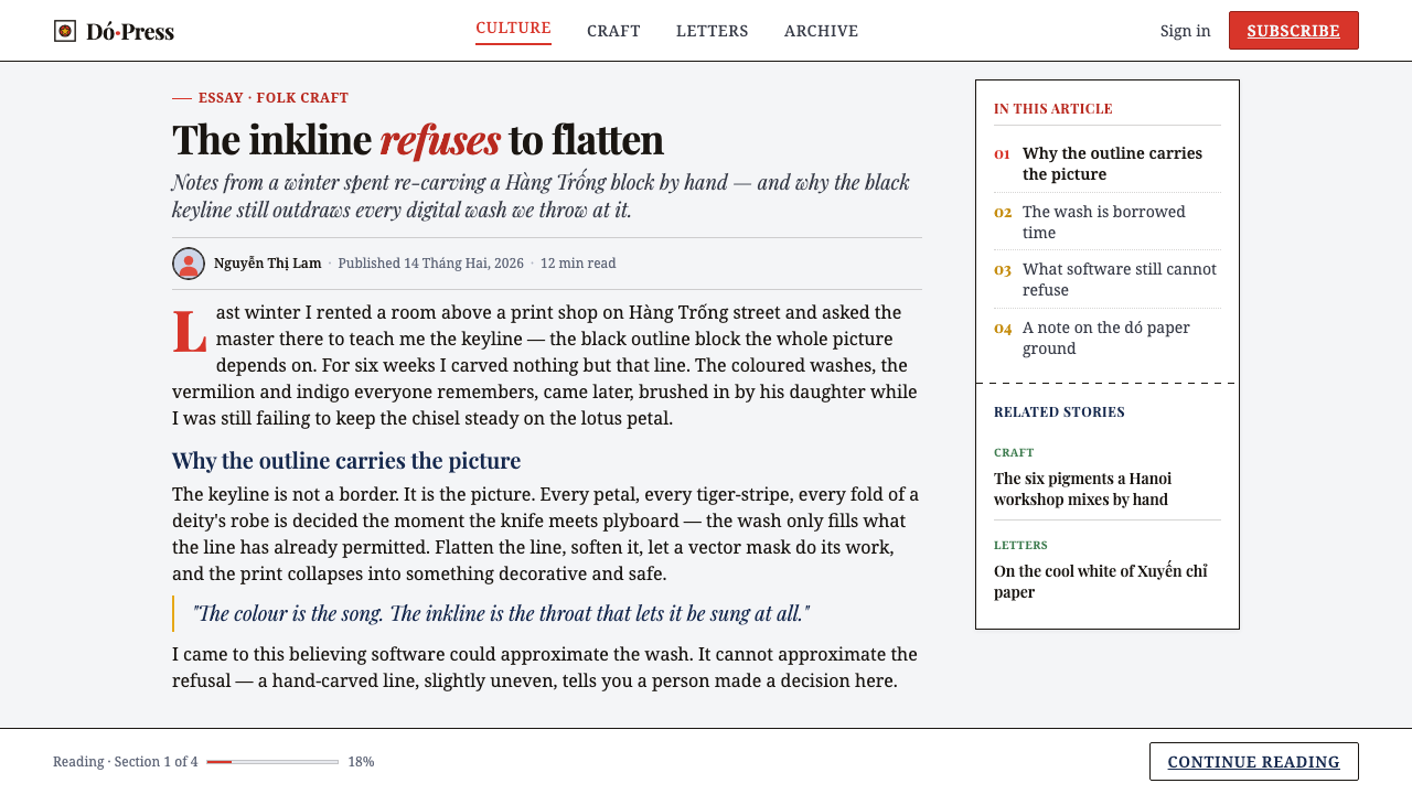
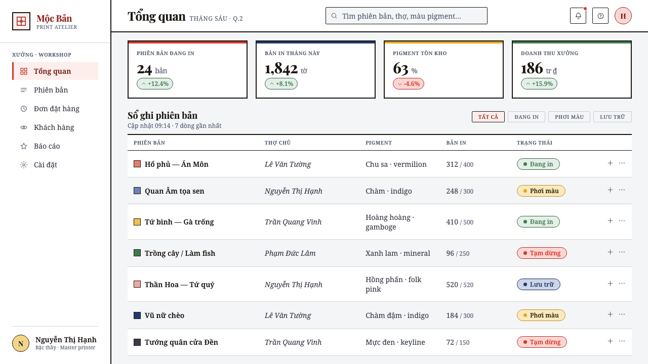
For web interfaces, Hàng Trống is especially useful when a dashboard, collection browser, cultural program, or pricing page needs warmth without losing hierarchy. Use pale paper-like grounds, decisive black boundaries, and framed modules to make navigation and content regions legible. Folk pigments work well for states, categories, featured cards, and calls to action when each remains contained by a shared line language.
Editorial and marketing layouts can use the tradition’s ornate panels to create strong moments of entry and pause. An article can open with a framed title field, use line-led ornaments to separate sections, and place supporting facts inside contained callouts. Marketing pages should preserve breathing room between panels so the decorative rhythm never becomes visual congestion. A devotional or celebratory mood is strongest when the central message remains visibly honoured by the composition.
The common mistake is to borrow vermilion, indigo, yellow, and green while discarding transparency, paper ground, and the black keyline. That produces a loud palette, not Hàng Trống. Another mistake is treating every edge as ornate; framed detail only works when a clear interior field gives it purpose. Keep colour inside a disciplined outline, make symmetry intentional, and let the paper-white space moderate the whole composition.
Hàng Trống Folk Print — FAQ
Is Hàng Trống defined mainly by its bright palette?
No. Its palette is important, but the decisive relationship is between translucent hand-applied washes and the fine black woodblock keyline beneath them. Vermilion, indigo, gamboge, and mineral green become recognizably Hàng Trống when they remain contained by that drawing and are allowed to retain a sense of paper and lightness.
Why is the black keyline so necessary?
The keyline is the print’s structural record. It is stamped first from the carved woodblock and establishes the image before colour is applied. In visual terms, it holds form, separates washes, and carries ornamental detail. Without it, the style loses the relationship between reproducible print structure and hand-coloured variation.
Should a contemporary Hàng Trống interface use strict symmetry everywhere?
Not everywhere. Symmetry is valuable because it creates ceremonial balance and supports devotional motifs, framed panels, and focal content. But the deeper requirement is composure. A contemporary interface can use balanced modules and a clear axis where it matters, while preserving practical reading order and interaction hierarchy elsewhere.
Can the style work without ornate decorative panels?
It can, provided the core system remains intact: cool paper ground, fine black contour, translucent folk pigments, and a composed relationship between motif and space. Ornate framing is a defining rhythm of the tradition, but it should be used where it clarifies or honours content. A restrained panel can be more faithful than indiscriminate ornament.
What is the clearest way to avoid a superficial imitation?
Begin with process rather than palette. Build the drawing in a consistent black line, preserve a cool and open paper-like ground, then add translucent colour as a contained layer rather than a full-bleed surface. Use symmetry, devotional calm, and ornament as compositional choices. The goal is not to decorate a screen with folk motifs, but to let print structure and hand-coloured light shape the entire visual order.
Related design styles
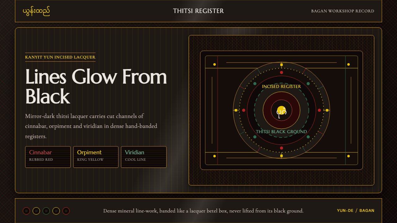 Burmese Yun LacquerwareLacquer glows in cut lines. Cinnabar, orpiment and viridian band a mirror-bla…
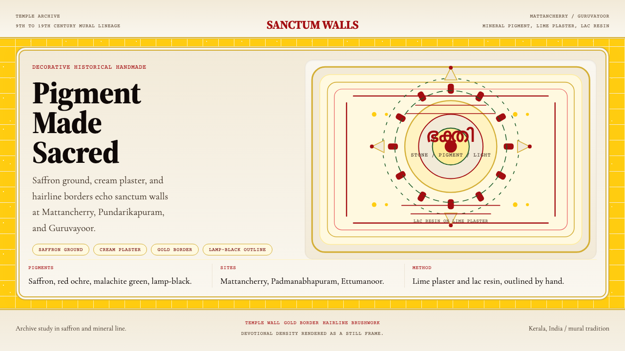 Kerala Mural TempleDevotional density over space. Saffron ground and cream panels, edged in gold.
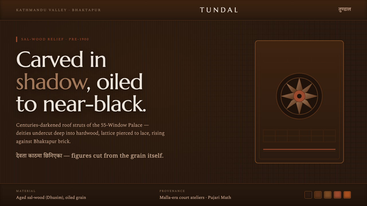 Newar Tundal Strut CarvingCenturies-darkened sal-wood. Carved deities and pierced lattice in mid-brown…
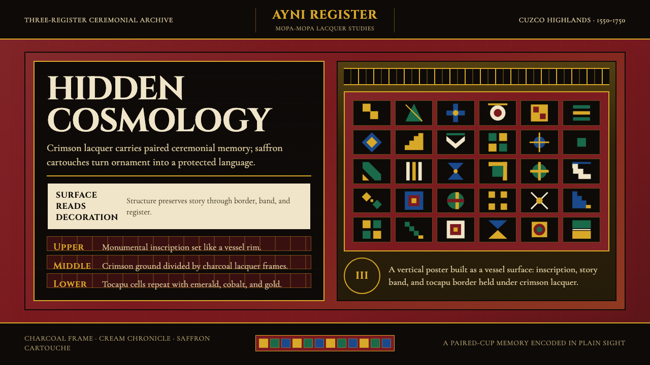 Peruvian Quechua Keros (Andean Cup)Hidden cosmology glows. Crimson lacquer and saffron tocapu grids frame the st…
 PNG Huli WigmanBody as ceremony. Red ochre, cream bone, and feathered geometry hold a fronta…
 Yemeni Sana'a Old City Tower-HouseVertical memory, densely framed. Brick orange, gypsum white, and blue rosette…