What is Neubrutalist Web Design?
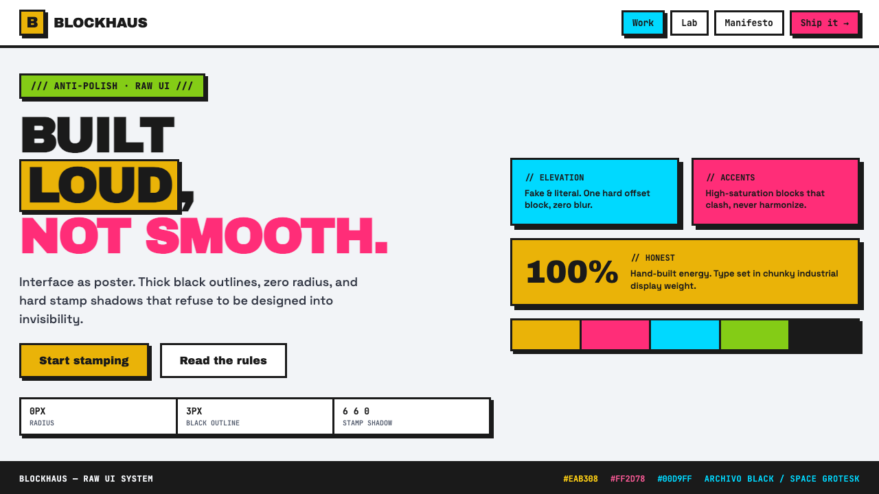
Neubrutalism makes the interface feel printed, stamped, and argued into existence: loud color, black outlines, and no attempt to look frictionless.
Neubrutalist Web Design in brief
Neubrutalist Web Design is an early-2020s revival of raw, anti-polish interface design. It rejects the visual cues associated with softened contemporary product UI: gradients, diffuse shadows, pill-like controls, translucent surfaces, and carefully blended neutral palettes. In their place come flat blocks, square corners, thick solid-black boundaries, and shadows that read as deliberate offsets rather than simulations of natural light.
The style is descended from brutalist web design and the broader anti-design backlash against interchangeable SaaS polish. Its roughness is not an accidental lack of finish. It is a chosen visual position: the interface should announce its structure, show its seams, and resist the expectation that every digital product must appear quiet, premium, and frictionless. A button looks like a button because it is a sharply bounded object; a card looks placed on the page because its shadow is visibly displaced.
At its strongest, Neubrutalism treats an interface as a poster system rather than a sheet of glass. Electric yellow, hot pink, cyan, and lime can collide on a bright flat canvas, while black type and outlines hold the composition together. The result can feel energetic, candid, humorous, and handmade. It is visually forceful, but the force needs hierarchy: harshness without a reading order quickly becomes noise.
Where does Neubrutalist Web Design come from?
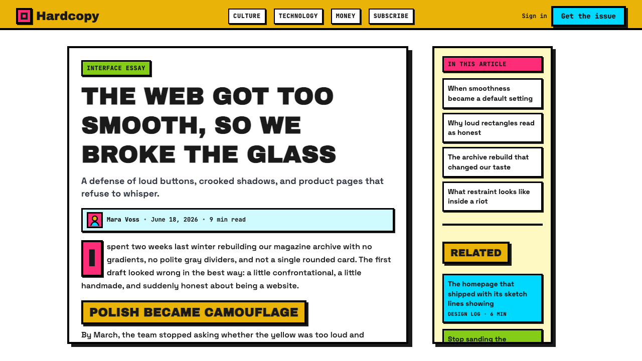
Neubrutalism emerged globally through the internet from around 2021 onward, as a web-focused revival of brutalist design principles. Its name signals continuity with brutalist web design, but its application is more explicitly interface-oriented: product pages, forms, dashboards, storefronts, and landing pages use raw visual contrast to make digital components feel concrete and immediate.
The movement developed alongside dissatisfaction with generic SaaS polish. As many web products converged on rounded panels, soft atmospheric shadows, muted surfaces, and carefully restrained accents, an opposing visual impulse gained appeal. Neubrutalism answers that sameness with visible outlines, assertive color, and flat construction. It does not ask a component to disappear into an elegant system; it asks the component to state what it is.
Its development is associated with indie web designers, design agencies, and the Gumroad redesign team. These are not a formal academy or a single authored doctrine. They represent the distributed character of an internet-born style: designers circulate recognizable decisions, adapt them to new products, and establish a shared vocabulary through repeated use rather than through one manifesto.
That vocabulary is often described through related terms: Neubrutalism, Brutalist web design, Anti-design, and Raw UI. The terms overlap but do not mean exactly the same thing. Neubrutalism is the specific contemporary interface expression in the source material: bright, flat, outlined, shadow-stamped, and intentionally anti-polished. Its historical significance lies less in a single canonical object than in its refusal of default product-design manners.
What defines the Neubrutalist Web Design look?
Black Outline
Thick solid-black outlines are the style’s structural grammar. They separate panels, controls, illustrations, and type-led blocks with immediate certainty. Unlike delicate borders meant to recede into a polished interface, these boundaries are graphic statements. They make the page readable as a set of placed objects and give even simple forms a printed, poster-like authority.
Square Construction
Corners remain square and components retain a blunt, block-like silhouette. This removes the friendly cushioning associated with rounded product UI and replaces it with directness. A field, card, or button does not melt into the surrounding surface; it occupies a definite area. The visual message is mechanical and declarative rather than soft or atmospheric.
Stamp Shadow
Shadows are hard, flat, and visibly offset, as if a second solid shape has been stamped slightly out of register beneath the first. They do not describe depth through gradual darkening. Instead, they add another graphic layer and reinforce the sense that each component is physically placed on the page. Consistency of direction matters more than realism.
Clashing Accent Color
Electric yellow, hot pink, cyan, and lime are used as loud accents against a flat high-key canvas. Their purpose is not subtle harmony; it is interruption, signaling, and emotional voltage. Black outlines keep these collisions legible. The palette works best when color has a job—marking action, category, emphasis, or a focal object—rather than merely filling every available surface.
Flat Surface
Neubrutalism strips away gradients, glass-like translucency, and soft tonal modeling. Surfaces read as flat fields of color or plain canvas, which makes hierarchy depend on outline, placement, scale, and contrast. The absence of atmospheric polish is central to the style’s honesty: a panel is a panel, not a simulated material object floating in illuminated space.
Deliberate Roughness
The style weaponizes deliberate harshness. It is loud where conventional product design is quiet, visibly constructed where conventional polish tries to disappear, and hand-built in character where generic systems often feel anonymous. This should not be mistaken for carelessness. The composition still needs disciplined alignment, clear language, accessible contrast, and a hierarchy strong enough to let users act without hesitation.
Who shaped Neubrutalist Web Design?
Indie web designers are identified in the source material as key figures in Neubrutalism’s development. Their role is best understood as distributed authorship: independent practitioners carry raw UI decisions from one project to another, making thick outlines, flat color blocks, square components, and stamped shadows recognizable as a shared web language rather than the property of a single studio.
Design agencies are another named contributor to the style’s circulation. Agency work can translate a raw visual attitude into coherent product surfaces, campaigns, and launch pages. In the context of Neubrutalism, that means giving anti-polish decisions a repeatable system: outlines establish structure, loud accents establish emphasis, and hard shadows establish a recognizably physical graphic rhythm.
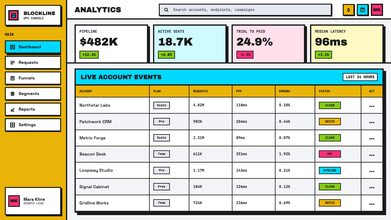
The Gumroad redesign team is named in the source material among the style’s key figures. Its relevance reflects how Neubrutalism travels through visible product redesigns, where a complete interface can demonstrate that raw UI is not merely an illustration style. It can organize commerce, navigation, calls to action, and content while retaining a loud, direct, anti-polish character.
How do you use Neubrutalist Web Design today?
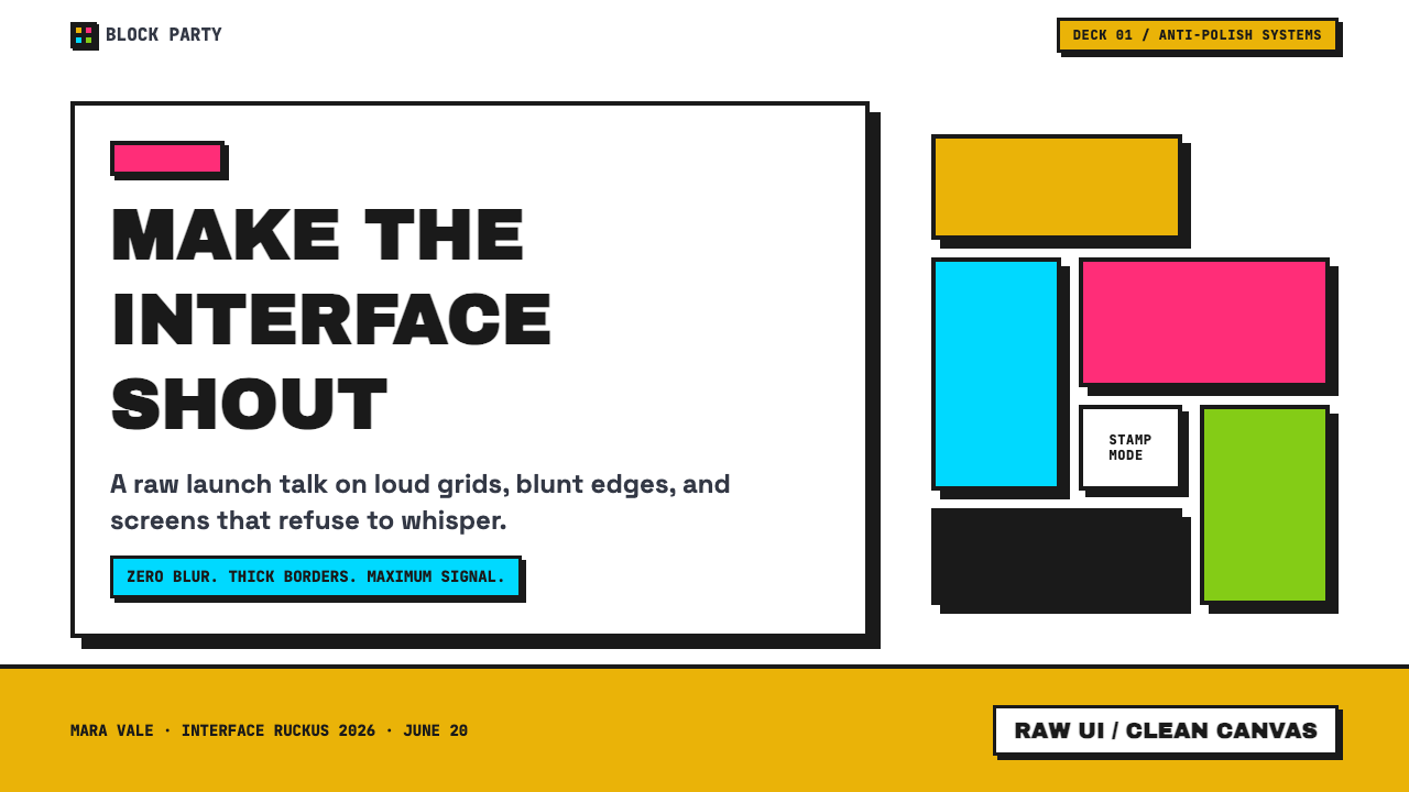
For presentation covers, use Neubrutalism as a declaration of intent. Put a concise title inside a sharply outlined block, let one loud accent color carry the emotional charge, and use a hard offset shadow to make the cover feel physically assembled. Content slides should become orderly poster layouts: distinct text blocks, explicit separators, and strong contrast between headline, explanation, and annotation. The visual aggression belongs around the information, not on top of it.
Data slides can benefit from the style’s graphic clarity when charts are treated as direct objects rather than polished illustrations. Use flat bars, sectors, labels, and callouts with clear black boundaries; reserve bright accents for the value or comparison that matters most. Avoid decorative dimensional effects. A Neubrutalist data slide should feel emphatic and easy to scan, not like a crowded collage of competing colors.
On the web, the style suits dashboards, pricing pages, creator tools, storefronts, and campaign landing pages when the product wants to feel outspoken and immediately legible. Build interfaces from consistently outlined panels, visibly bounded inputs, assertive buttons, and high-contrast status or category markers. Pricing can use large plan blocks and direct calls to action; dashboards can use strong grouping so that controls, results, and alerts never blur together.
For editorial and marketing work, Neubrutalism is useful when a message needs poster energy and a point of view. A feature story can use large type-led section breaks, flat image frames, and colored callout blocks; a marketing page can alternate calm canvas areas with bursts of accent color. The common mistake is treating loudness as the whole system. Using every bright color, every shadow, and every black outline at once removes hierarchy. Choose a dominant emphasis, keep text comfortable to read, and allow unoccupied space to make the confrontational elements land.
Neubrutalist Web Design — FAQ
Is Neubrutalism the same as brutalist web design?
They are closely related, but the source material presents Neubrutalism as an early-2020s web revival of brutalist principles rather than a separate historical movement with a single origin point. Its recognizable interface vocabulary is especially specific: thick black outlines, square corners, flat bright surfaces, and hard offset shadows. Brutalist web design is the broader lineage; Neubrutalism is a contemporary raw-UI expression within that lineage.
Does Neubrutalism mean an interface can ignore usability?
No. The style rejects polish, not comprehension. Its strongest devices—high contrast, explicit outlines, visibly separate controls, and direct calls to action—can improve scanability when used with discipline. The risk appears when visual confrontation overwhelms labels, reading order, or feedback. A raw-looking interface still needs unambiguous actions, readable text, and clear grouping.
Why are hard offset shadows so important to the style?
They replace soft atmospheric depth with a graphic construction cue. A diffuse shadow asks the viewer to imagine a realistic light source; a hard offset shadow reads as an intentional second shape. That distinction supports the style’s poster-like, hand-built character. The shadow gives a component presence without turning the interface into glass, chrome, or simulated material.
Can Neubrutalism use restrained color?
Yes. Electric yellow, hot pink, cyan, and lime describe the style’s potential intensity, not an obligation to display every accent simultaneously. A restrained version can use a bright color only for action and emphasis while relying on a flat light canvas and black structure elsewhere. What matters is that the chosen color remains assertive and functional, not that the page becomes uniformly saturated.
Where does Neubrutalism work poorly?
It struggles when a product depends on calmness, discretion, or a nearly invisible interface. Constant high-saturation contrast and stamped depth can make long reading, dense monitoring, or emotionally delicate communication feel tiring or needlessly confrontational. The style is most credible when its visual directness matches the product’s voice; it is less convincing when applied as a decorative costume over a product that needs quiet reassurance.
Related design styles
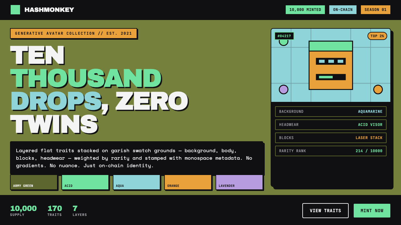 NFT PFP ArtTen thousand apes, zero twins. Layered flat traits on garish swatches, blocky…
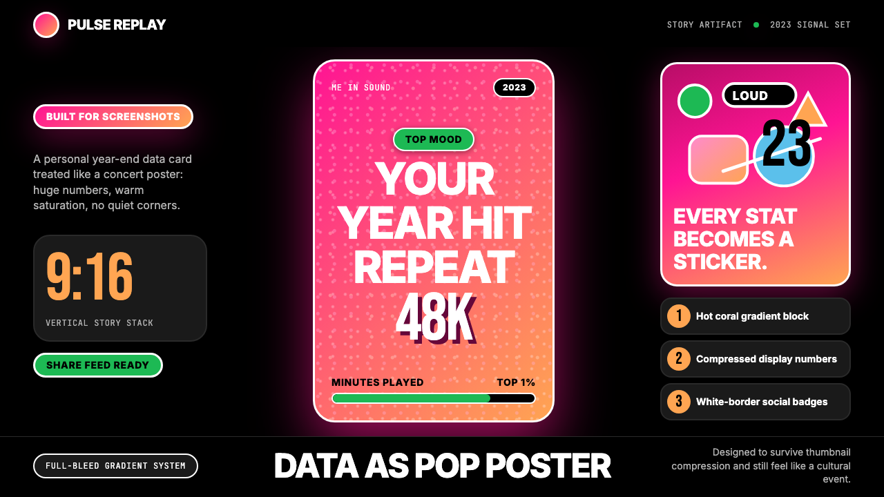 Spotify Wrapped 2023Social data goes neon. Hot pink-orange gradients, huge Inter stats, sticker b…
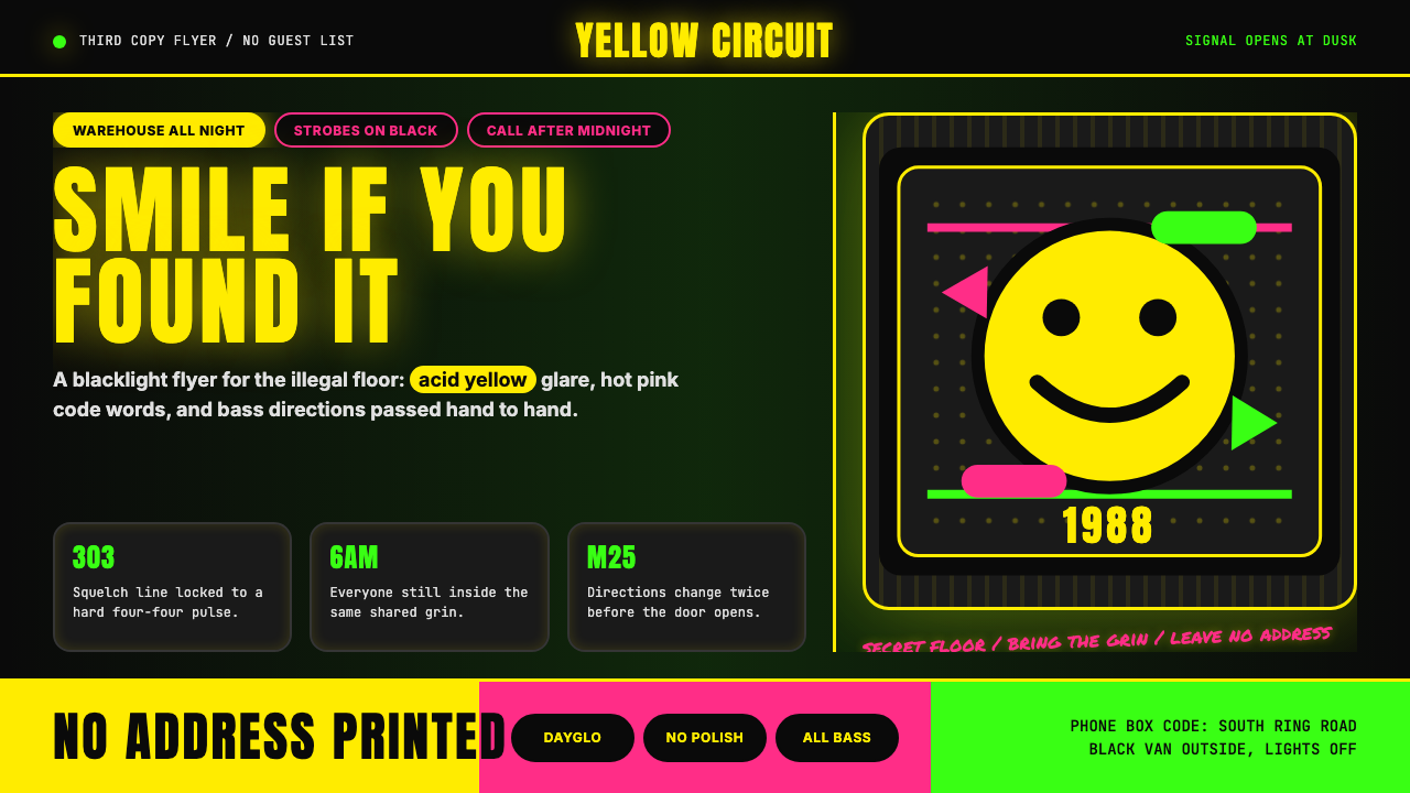 Acid House Smiley (1988)Rave energy hits first. Acid yellow on black, Anton caps, smiley glow.
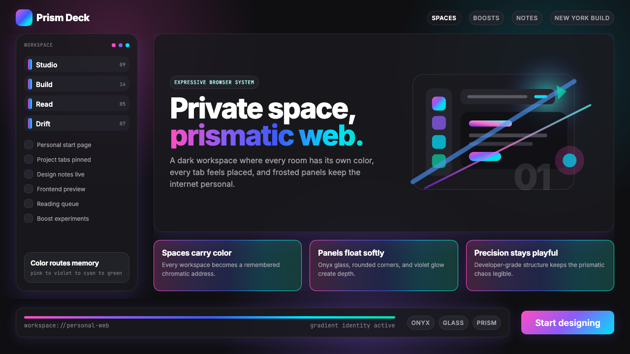 Arc Browser Prismatic (2023)Color is architecture. Pink-violet-cyan ribbons glow over onyx glass and roun…
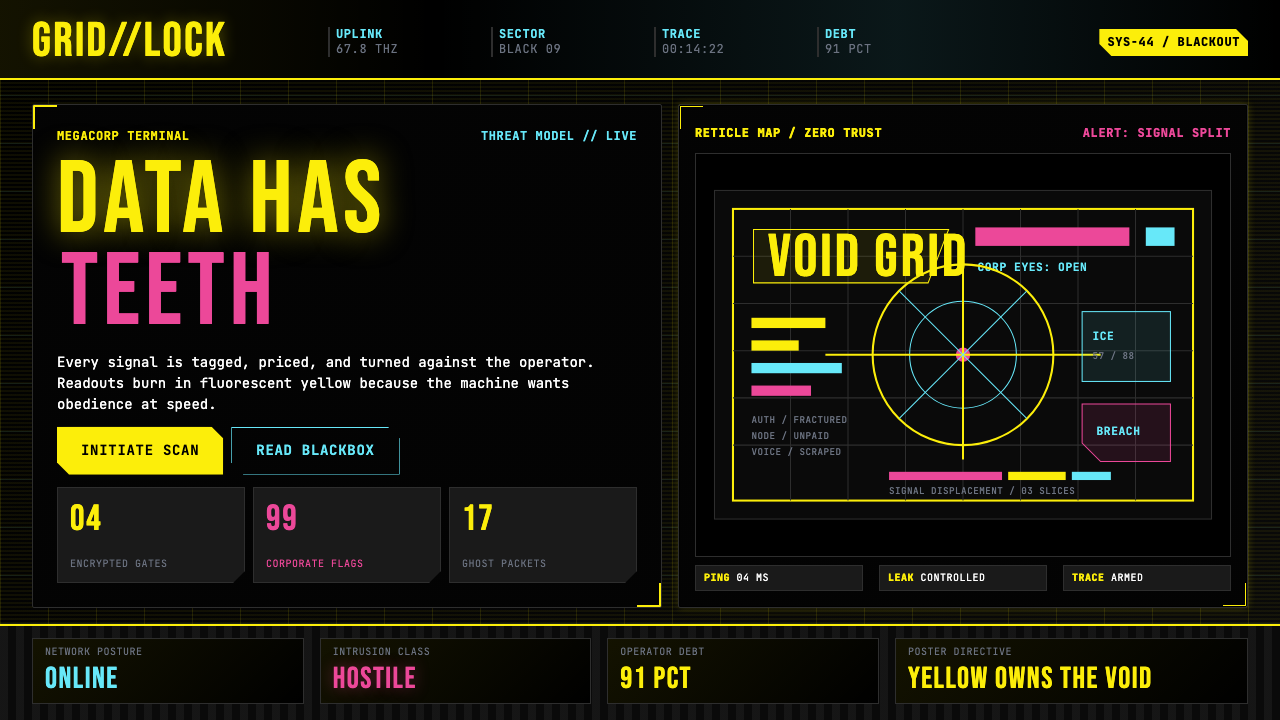 Cyberpunk 2077 (Screen UI)Weaponized terminals. Fluorescent yellow on black, scanlines and bracketed HU…
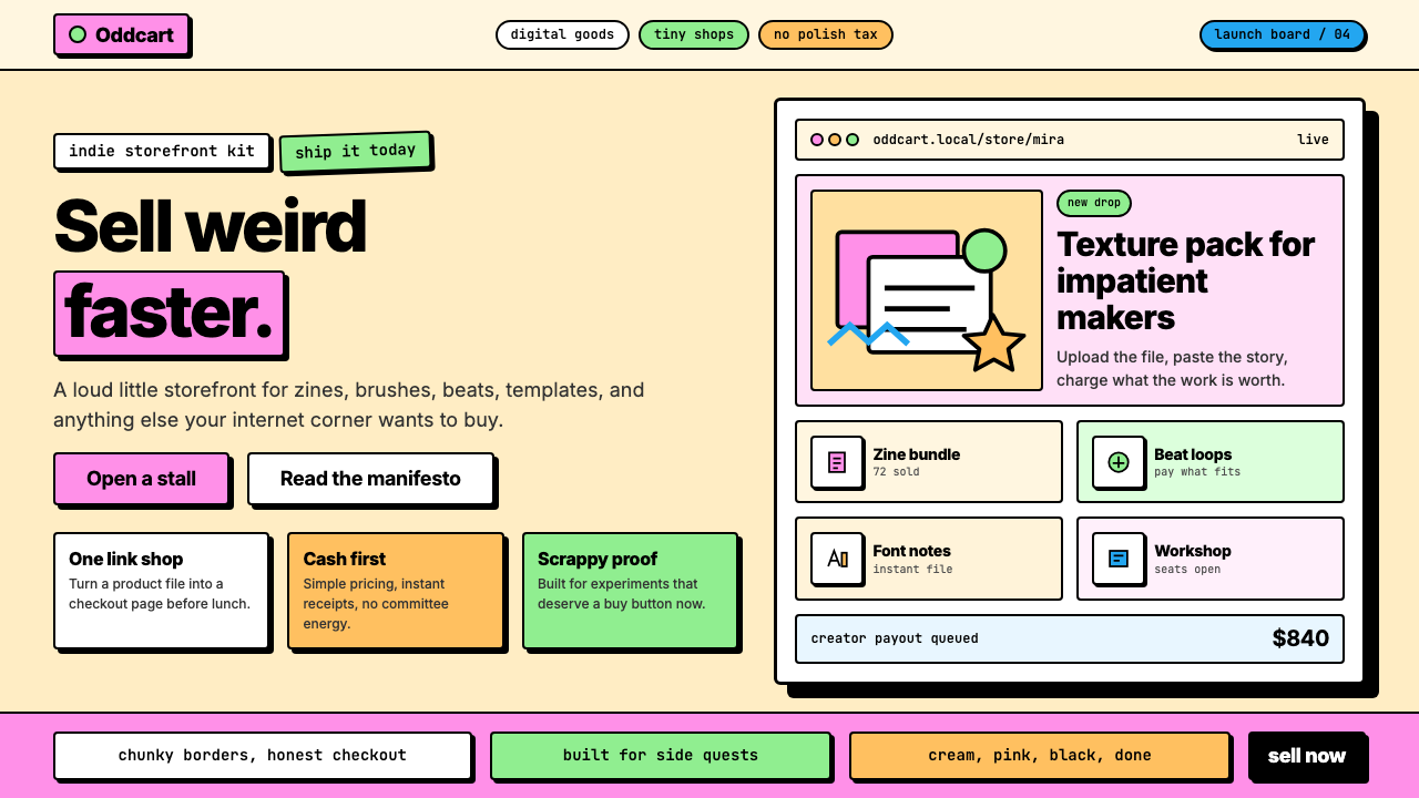 Gumroad CreatorGeoCities by way of Memphis. Hot pink, chunky black borders, hard offset shad…