What is CRED NeoPOP?
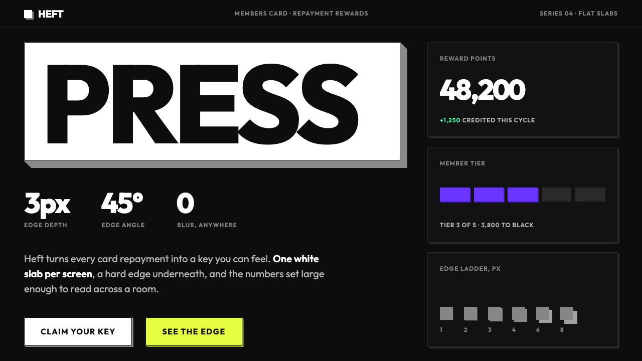
NeoPOP gives fintech the weight of a physical keyboard: near-black screens, flat slabs with a hard diagonal edge, one white key per screen, and numerals set large enough to feel like the point.
CRED NeoPOP in brief
NeoPOP is the design language of CRED, a Bangalore app for paying credit card bills and earning rewards. It is the company's fourth design system, and it was open-sourced in 2022 as neopop-web and neopop-android. The ground is a near-black canvas. On it, every button, card and chip is a flat slab: a plain rectangle with a hard, solid-coloured edge along its lower right that makes it read as a physical block you could press. The result is an interface that looks engineered rather than drawn, which suits an app whose business is precision with money.
Its colour logic is unusual for a dark interface. The loudest thing on a screen is usually not a neon accent but a pure white face with a black label and a black edge, the primary action, one per screen. Neon colours do exist, in a ramp named poliPurple, neoPaccha, orangeSunshine, parkGreen and pinkPong, but they play supporting roles and speak one at a time. Type is heavy, geometric and capitalised, and numbers such as points, bill amounts and card digits are set large and weighty.
The overall impression is calm, crisp and a little theatrical, like a precision machine for members. There is no blur, no gradient and no glow. Everything is flat and hard-edged, and depth comes from a single mechanical gesture: the slab and its edge.

Where does CRED NeoPOP come from?
CRED was founded in Bangalore in 2018 by Kunal Shah as a members' app where paying credit card bills earns rewards. Its positioning has always been exclusive and design-led: an invitation to people with strong repayment habits, wrapped in a product that feels like a collectible. NeoPOP, introduced as the company's fourth design system and released as open source in 2022, is the clearest statement of that attitude. The visual expression most people know dates from roughly 2022 to 2024. The habit of treating each generation of the design system as a company milestone helps explain the confidence of NeoPOP.
The system's name points to two lineages. Neo-pop is the art-world label for a bold, glossy, consumer-culture-aware style that treats mass imagery with polish and a touch of irony. Applied to interface design, it gives NeoPOP its confidence with big flat colour, strong outlines and a willingness to be playful about luxury. The capitals in the name stress that pop inheritance.
Neubrutalism is the second lineage. In recent web design it names an approach built on flat saturated colour, heavy outlines and hard offset shadows, a deliberate reaction against soft gradients and glassy blur. NeoPOP shares the hard edge but disciplines it. Where neubrutalist pages are often loud and chaotic, NeoPOP restricts itself to a near-black ground, one dominant white key and a few measured neon accents. The earlier shift from glossy skeuomorphism to flat design had left many interfaces smooth but weightless; hard-edged slabs reintroduce a sense of mass without returning to the shiny, textured surfaces of earlier eras.
The third strand, hard-shadow skeuomorphism, explains why the slab matters. Skeuomorphic design imitates physical objects; here the imitation is stripped to one cue, the solid edge that makes a rectangle look thick. A keyboard key, an arcade button and a stamped plate all work the same way. Because the shadow is a solid shape rather than a blur, it stays crisp on modest screens and during animation, and it makes the pressed state obvious. That the code was released as packages for web and Android shows the system was conceived as something engineered, not only illustrated.
What defines the CRED NeoPOP look?
Near-Black Canvas
The ground is almost, but not quite, pure black. This lets white and neon read with maximum contrast and gives surfaces a rich depth, while avoiding the dead emptiness of absolute black. The darkness is not a theme toggle; it is the premise on which every other rule depends.
The Slab
Every control is a flat rectangle with a solid-colour edge along its lower right, drawn at a steady diagonal. There is no blur, no gradient and no soft shadow. The geometry makes a card or button read as a physical block with thickness, and it gives the pressed state an obvious meaning: the face sinks toward its edge. Cards, chips and tags share the same construction at different sizes, so the whole interface is built from one repeated object.
The White Key
The primary action is a pure white face with a black label and a black edge, and there is one per screen. Because white is the brightest value on a near-black ground, it automatically outranks every colour. This is the system's central hierarchy device: nobody has to ask what to press.
Restrained Neon
A neon ramp of poliPurple, neoPaccha, orangeSunshine, parkGreen and pinkPong supplies colour for secondary slabs, tags, status and illustration. Used one at a time and in small quantities, the neons feel charged rather than chaotic. When several appear together, they should belong to a single moment, such as a reward reveal. Neon is best treated as information about state or category rather than as mood.
Heavy Geometric Capitals
Typography is a heavy geometric sans-serif, set in capitals for labels and headings. The weight matches the weight of the slabs: letters look as solid as the buttons they sit on. Spacing is tight and decisive, and copy stays short.
Giant Numerals
Points, bill amounts and card digits are set big and heavy. Numbers are the product's currency and its main emotional payload, so they receive the scale that other designs give to photographs. A single large figure on a dark ground can carry a whole screen by itself.
Cool Precision
Spacing, tone and interaction feedback are calm and controlled. The system aims for the feeling of a precision machine for members: no wobble, no bounce for its own sake, no cute illustrations. The mood is exclusive without being loud, closer to a vault door than a carnival.

Who shaped CRED NeoPOP?
Founder of CRED, which he started in Bangalore in 2018. His idea of a members' app that rewards good repayment behaviour is the commercial premise behind NeoPOP: if the product is for people who pay on time, the interface should feel like the vault, not the supermarket.
The in-house team that carried the company through four generations of design system and released NeoPOP as open source in 2022. Naming design engineers alongside designers is important here, because the slab, the edge and the pressed state are as much a coding system as a visual one.
Not a single person but a loose community of web designers who popularised flat saturated colour, heavy outlines and hard offset shadows in recent years. NeoPOP draws on that shared vocabulary while holding it to a stricter standard of one dominant action and a calm dark ground.
How do you use CRED NeoPOP today?
NeoPOP translates well to products that want to feel premium, tactile and decisive on a dark screen: finance, memberships, rewards, ticketing and gaming. The discipline lies in saying less. One white key, one neon voice, one large number.
On slides, a cover works with a near-black field, an enormous number or a three-word title in heavy capitals, and a single white slab as the call to action or section tag. Content slides use slab cards on the dark ground, each with a solid edge and no gradients. Data slides make the key metric huge, with supporting figures in smaller slabs and one neon highlight. Avoid decorative stock photography; if a photograph is needed, crop it inside a slab.
For dashboards, fintech, rewards and membership products, make every control a slab, reserve the white key for the single primary action and give secondary actions neon or outlined slabs. Balances and points belong at hero scale. Keep touch targets generous, show a clear pressed state in which the face moves toward its edge, and check that neon text and borders stay legible for users with colour-vision deficiencies and in low-light settings. Empty states and loading screens can show a slab skeleton with its edge, keeping the visual language consistent when no data is present.
Campaign pages, launch announcements and invitation-only product reveals benefit from the style's theatrical confidence. Use full-bleed dark panels, headline numerals and short capitalised lines. A single white button, repeated at the end of each section, becomes a rhythm that tells readers where the page wants them to go.
The leading mistake is multiplying white keys: when three buttons are all pure white, none of them is primary and the central hierarchy device is lost. The second is softening the system with rounded corners, glows, blur or gradients, which turns a tactile slab into a generic dark interface. The third is spending neon freely; five bright colours on one screen cancel one another and reduce the white key to just another colour. Finally, avoid large blocks of bright white body text that compete with the key, and set long reading in a slightly dimmer tone.

CRED NeoPOP — FAQ
Is NeoPOP the same thing as Neubrutalism?
They are related but not identical. Neubrutalism is a broad movement of flat colour, heavy outlines and hard offset shadows, often on light grounds and often loud. NeoPOP shares the hard edge but sets it on a near-black canvas with a single dominant white key, a much narrower neon palette and a calm tone. It is a disciplined branch rather than the whole tree.
Does it work in light mode?
Not straightforwardly. The dark canvas is the premise of the system, and the white key works because white is the brightest thing on screen. A light variant would have to invent a new top-of-hierarchy device, since a white key on a white ground disappears. If a light surface is unavoidable, keep it to a small panel inside a dark layout.
What does it mean that NeoPOP is open source?
CRED released the system in 2022 as neopop-web and neopop-android, so developers can inspect how the principles were turned into components. This article describes the visual language and its logic; it does not reproduce those packages, and teams who want the exact implementation should consult the official repositories.
Why only one white key per screen?
Because hierarchy depends on scarcity. White is the strongest signal available on a near-black ground, and a signal repeated is a signal diluted. One white key tells the user the single most important thing to do; everything else is deliberately a step quieter. A secondary action can still be a slab, only in a neon colour or as an outline.
Is the style only suitable for fintech?
No. Any product that benefits from a premium, tactile, high-contrast dark interface can use it, including membership programmes, ticketing, music and gaming tools. It struggles where warmth, softness or sensory richness are the point, such as food, wellness or children's products, because its mood is cool and exact.
Related design styles
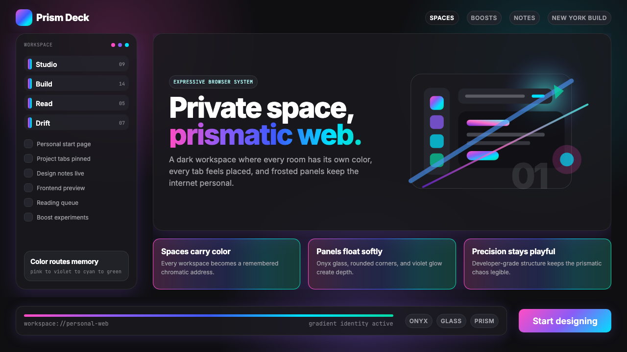 Arc Browser Prismatic (2023)Color is architecture. Pink-violet-cyan ribbons glow over onyx glass and roun…
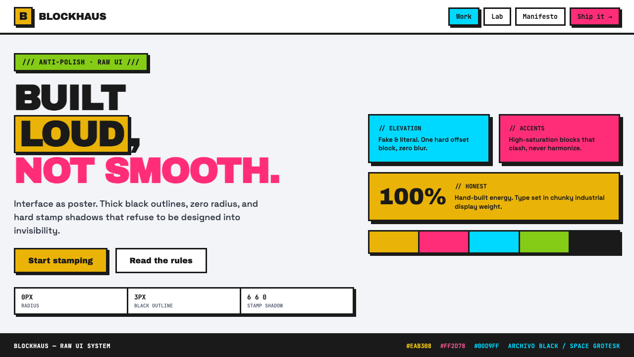 Neubrutalist Web DesignAnti-polish, on purpose. Black outlines, zero radius, hard stamp shadows, cla…
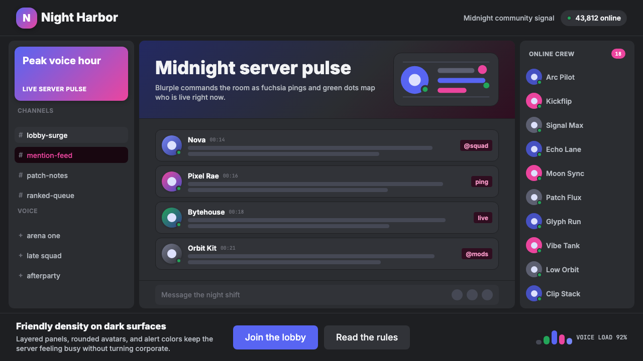 Discord Blurple Server (2020)Midnight server energy. Blurple panels, fuchsia pings, and green status dots…
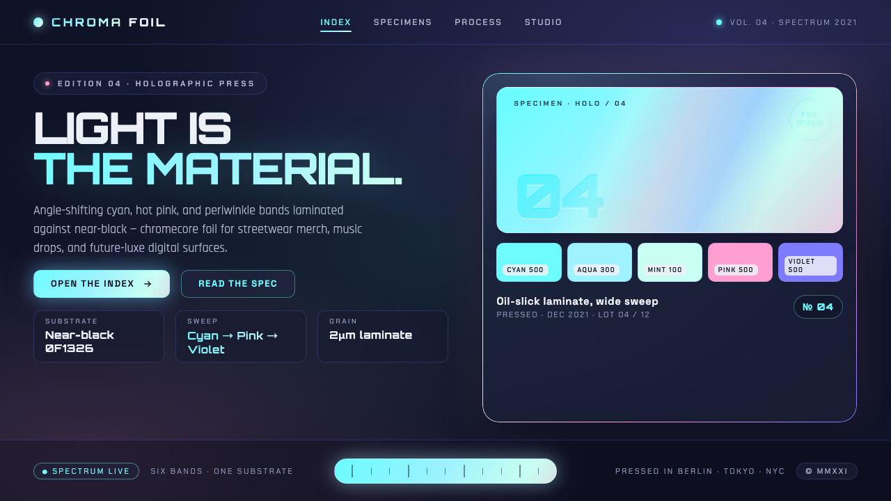 Holographic IridescentLight as material. Cyan-pink-violet foil sweeps anchored against near-black,…
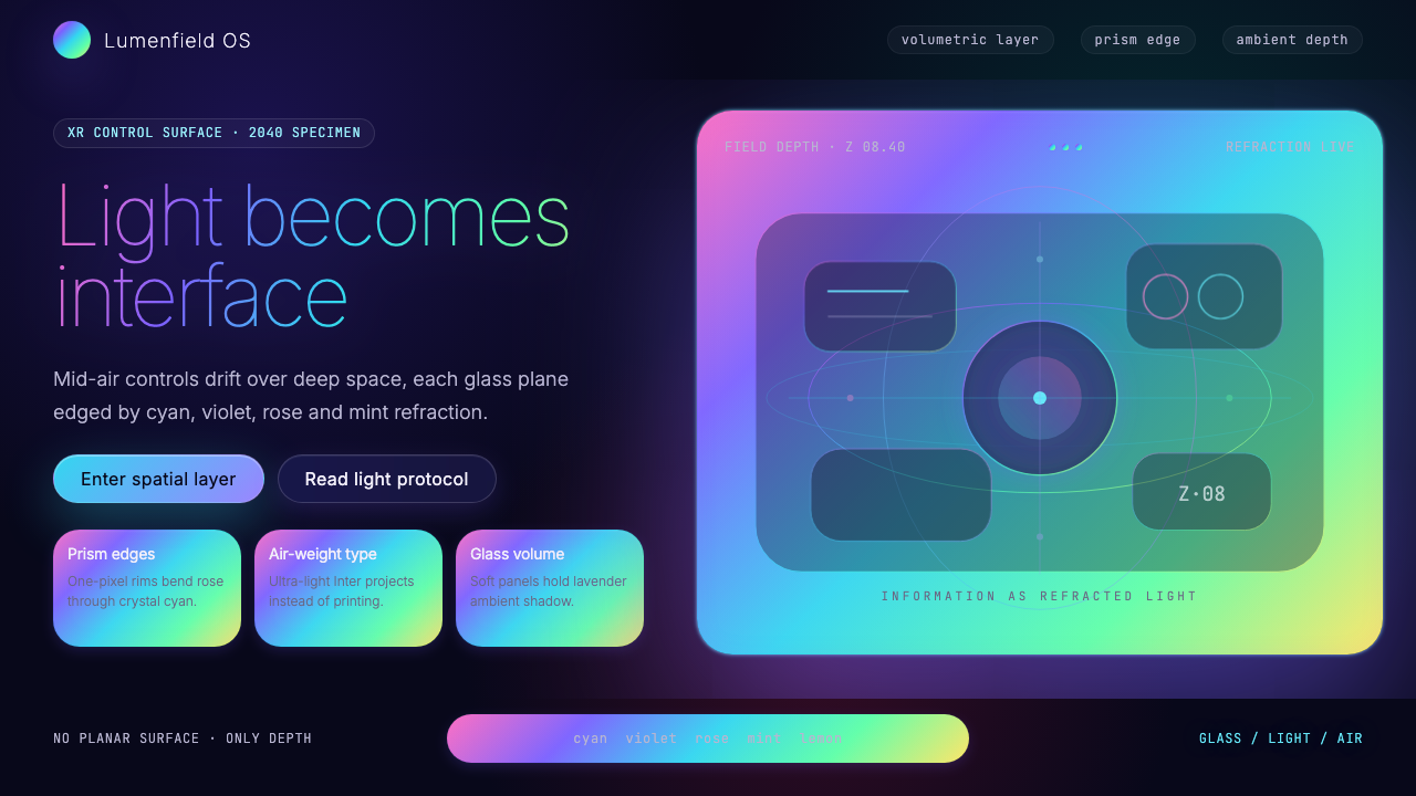 Holographic UI 2040Information made of light. Deep-space black, ultra-light Inter and prismatic…
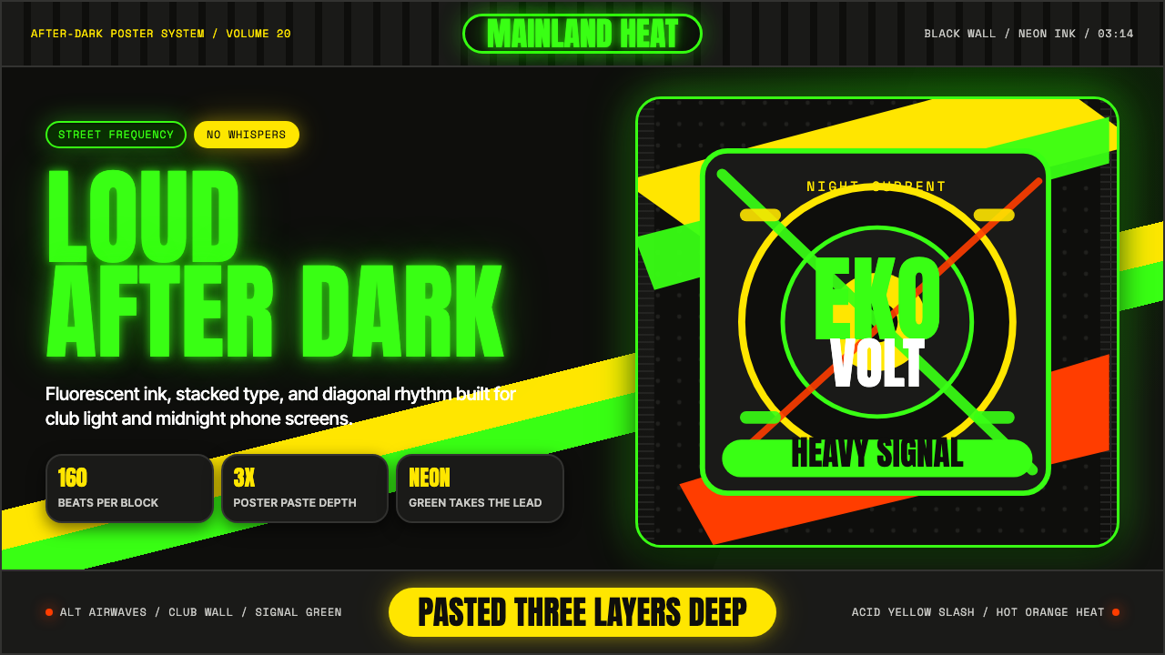 Afrobeats LagosLoud after dark. Neon green type and yellow diagonals hit black like pasted s…