What is NFT PFP Art (Bored Ape era)?
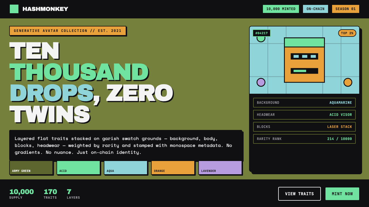
NFT PFP art turned the profile picture into a collectible system: loud flat traits, serial variation, and crypto-native identity condensed into a square avatar.
NFT PFP Art (Bored Ape era) in brief
NFT profile-picture art, often shortened to PFP art, is the visual language associated with large generative avatar collections that surged during the 2021 NFT boom. Its defining public example is Bored Ape Yacht Club, which minted 10,000 avatars on Ethereum in April 2021. Rather than treating every image as an individually painted scene, the system builds a collection from reusable visual layers. A background sits behind a body; clothing, eyes, facial details, and headwear are added above it; the resulting combination becomes one member of a larger visual set.
The appeal is not subtle illustration. PFP art is designed to register immediately at avatar scale. Strong, often garish color fields establish contrast before the viewer notices detail. Bodies and accessories are rendered as flat, outlined shapes with hard boundaries. A glance should reveal the category of image, while a second look reveals the individual combination of traits. The collection therefore balances repetition and difference: every avatar belongs to the same world, but no two are presented as the same configuration.
Its interface language is as important as its character art. Blocky, monospace-like metadata, trait labels, serial identifiers, and rarity badges make the image feel connected to a system rather than a standalone illustration. This produces a distinctly Web3-facing look: synthetic, catalogued, and openly procedural. The style does not hide the fact that it is assembled. Its layers, labels, and repeated components are the point.
Where does NFT PFP Art (Bored Ape era) come from?
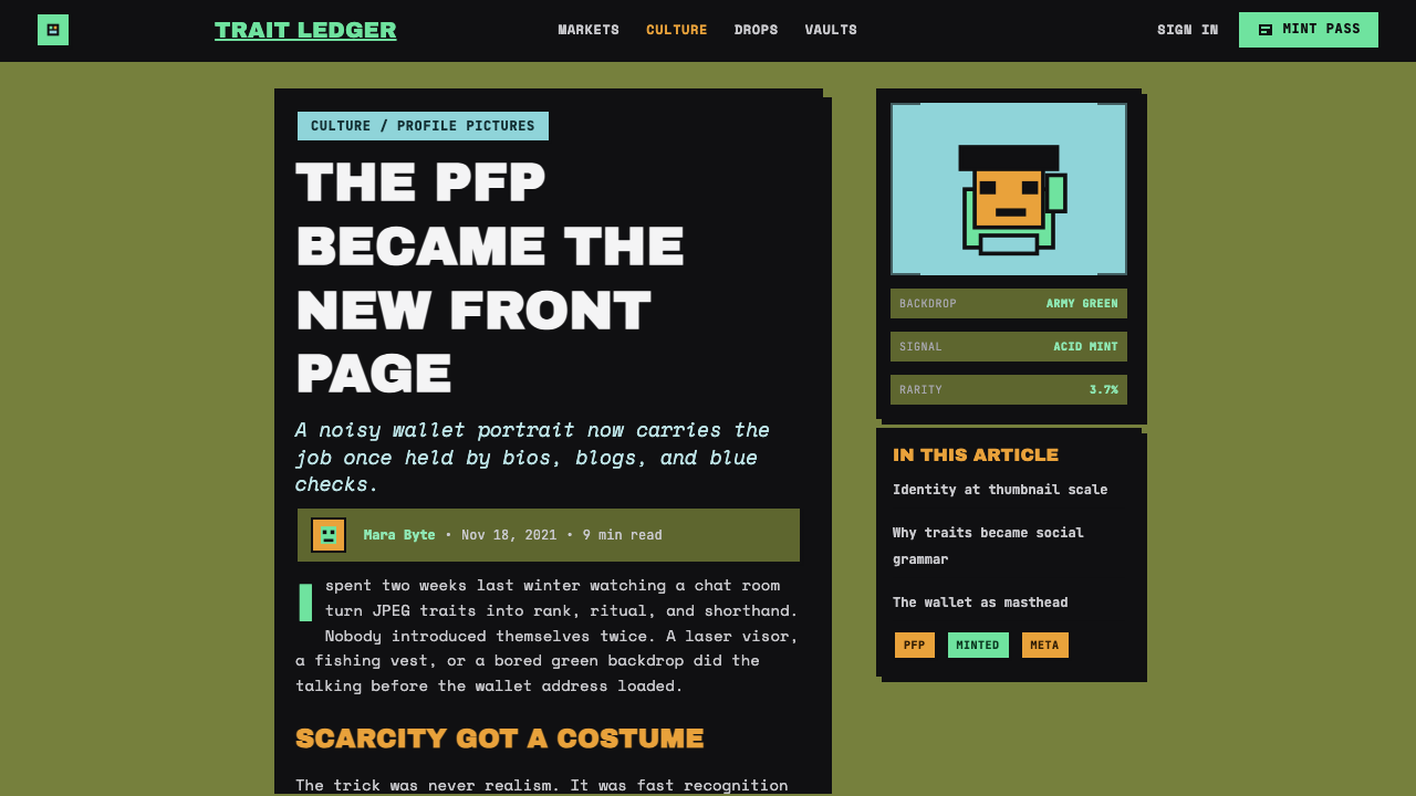
The visual context is the 2021 NFT boom, when NFT profile-picture collections became a highly visible form of crypto-art on the internet. Bored Ape Yacht Club minted 10,000 generative avatars on Ethereum in April 2021, giving the format a particularly recognizable public reference point. The collection model joined image-making to a numbered, repeatable release structure: a shared visual grammar could yield a large field of distinct-looking avatars without abandoning consistency.
This was a global internet phenomenon rather than a style rooted in one physical city or traditional school. Its setting was Ethereum, Web3 culture, and the fast-moving social environment around crypto art. Within that environment, an avatar had to work both as an image and as a recognizable token of membership in a collection. A PFP needed enough sameness to be legible in a crowded feed and enough variation to reward close comparison between one image and another.
The underlying method was a trait-layered avatar system. Background, body, clothing, eyes, and headwear could be treated as separate components, then assembled algorithmically. That construction method explains many of the aesthetic choices that followed. Flat shapes remain easy to distinguish when stacked. Clean edges keep accessories readable. Repeated trait families establish order, while distribution across the collection turns ordinary visual details into information a viewer can compare.
Greg Solano, Wylie Aronow, and Yuga Labs are named in the approved account of this Bored Ape-era context. Their presence anchors the style in a specific NFT moment, but the visual language outgrew any single image: generative PFP collections, crypto-art subculture, and layered avatar systems became mutually reinforcing ideas. Across its most recognizable period, roughly 2021 to 2023, the look stayed committed to its central proposition: an avatar can be both a graphic character and an indexable unit within a larger on-chain collection.
What defines the NFT PFP Art (Bored Ape era) look?
Layered Traits
The image is organized as a visible stack. A bright background swatch provides the base; body, apparel, eyes, and headwear sit above it in a fixed visual order. Each layer must remain independently legible, because the identity of the final avatar depends on viewers being able to recognize both the shared base character and the added traits. The style rewards clean silhouettes, controlled overlap, and components that read without illustration-heavy explanation.
Garish Flat Color
Color arrives as a swatch, not atmosphere. Acid-green fills and hot-pastel grounds create an intentionally synthetic, high-contrast field behind the avatar. The palette should feel assertive rather than naturalistic: color identifies zones, separates traits, and gives the collection an immediate feed-level signature. Nuanced tonal modeling is not the goal. A color is chosen to declare itself, then held as a stable flat surface.
Hard-Edged Chrome
The visual finish is blocky and hard-edged, with a chrome-like synthetic emphasis rather than soft material realism. Boundaries are decisive. Shapes meet, overlap, or stop cleanly; they do not dissolve into one another. This gives the work a crisp, screen-native presence and helps it survive reduction to a profile image. Even when a component suggests shine or polish, the effect remains graphic and categorical rather than painterly.
Trait Readability
A PFP collection depends on viewers noticing differences across a repeated visual framework. Clothing, eyes, and headwear therefore need clear category boundaries and recognizable silhouettes. A trait should not merely decorate the ape; it should communicate that a different configuration is present. The strongest applications preserve this comparison logic, making each addition easy to identify while preventing the stack from becoming visually noisy.
Crypto-Mono Metadata
Monospace-like type, compact labels, serial information, and rarity markers give the style its infrastructural voice. Text is not treated as an editorial flourish; it behaves like a readout from a collection system. The blocky presentation reinforces the sense that the avatar has a place, a record, and a set of comparable properties. Metadata belongs near the image as a deliberate visual companion, not as an invisible technical afterthought.
Collection Logic
The individual image is only half the design. The other half is the collection-wide pattern created by evenly distributed traits and repeated visual rules. Consistency makes variation meaningful: when every avatar shares the same basic construction, a changed background or accessory becomes immediately noticeable. This is why the aesthetic feels serial, catalogued, and on-chain. Its visual energy comes from seeing one image as evidence of a much larger set.
Who shaped NFT PFP Art (Bored Ape era)?
Greg Solano is named in the approved Bored Ape-era source material as a key figure in the context from which this PFP aesthetic became widely recognizable. In an article about the style, that significance is best understood through the collection moment itself: a generative avatar format on Ethereum made layered traits, serial identity, and loud profile-scale graphics central to a global internet visual language.
Wylie Aronow is likewise identified in the source material as a key figure in the Bored Ape-era context. The aesthetic associated with that moment made the repeated avatar more than a generic cartoon portrait. Its tightly controlled trait system encouraged viewers to read an image as one variation within a recognizable collection, with visual differences carrying attention inside a shared synthetic world.
Yuga Labs is named in the source material alongside Ethereum and the global internet setting of Bored Ape Yacht Club. For the design language, this reference matters because it locates the look within Web3 generative PFP collections rather than conventional character illustration. The image, its traits, and its metadata are designed to be read together as parts of a collection identity.
How do you use NFT PFP Art (Bored Ape era) today?
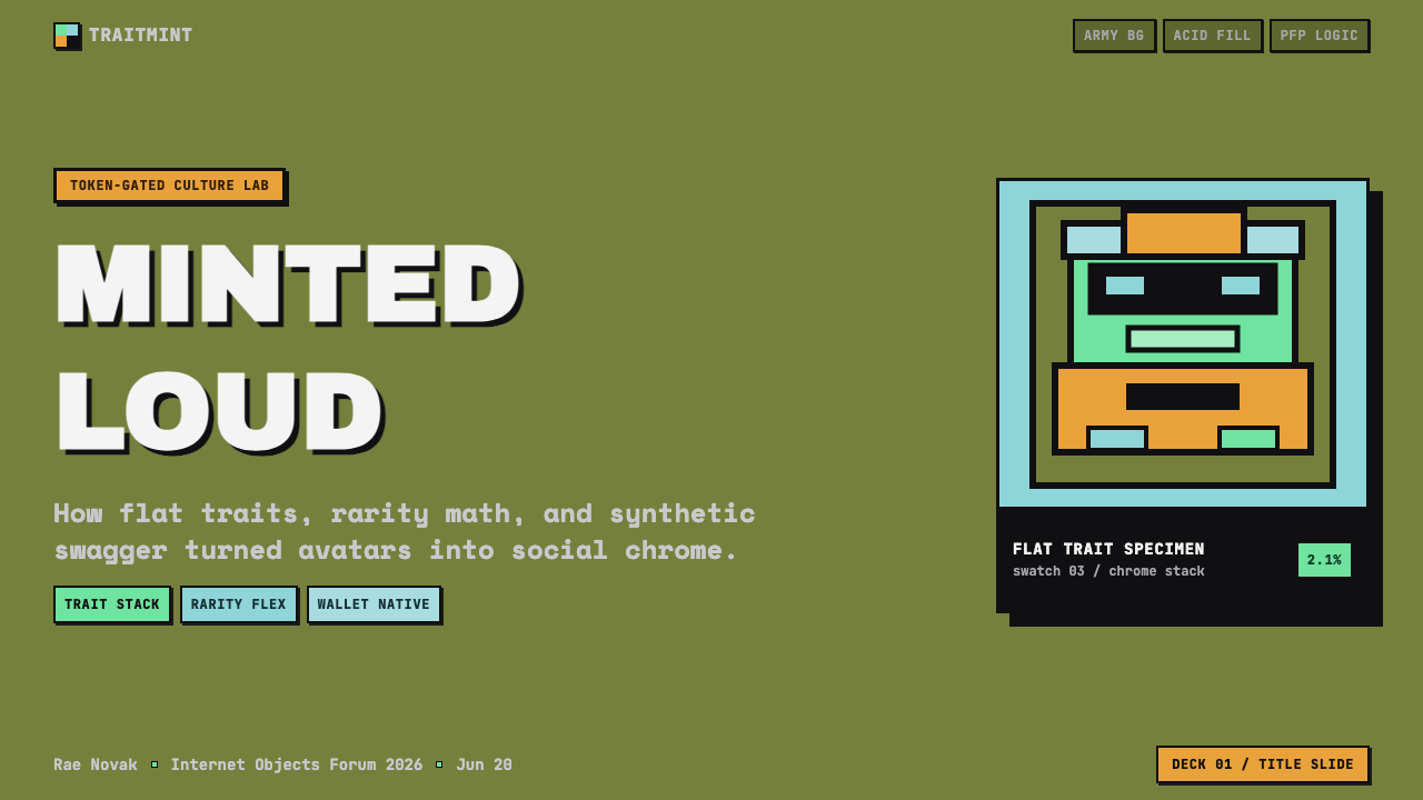
For presentation slides, use NFT PFP art as a system of stacked evidence rather than as a decorative cartoon treatment. A cover can center one oversized avatar crop on a forceful flat swatch, with a compact mono-style title and a small identifier-like subtitle. Content slides should separate the trait stack into clear bands: background or context, core object, then supporting labels. Keep the visual field dark and synthetic, but leave enough empty space for the avatar and its metadata to remain unmistakable.
Data slides are especially effective when they borrow the collection logic rather than merely placing avatars beside charts. Treat categories as traits, use repeated avatar silhouettes or badge-like markers as comparison units, and present labels as catalog entries. A chart should feel like an inventory of variations across one consistent system. The important distinction is clarity: the slide can be loud in color and attitude while still making comparison effortless.
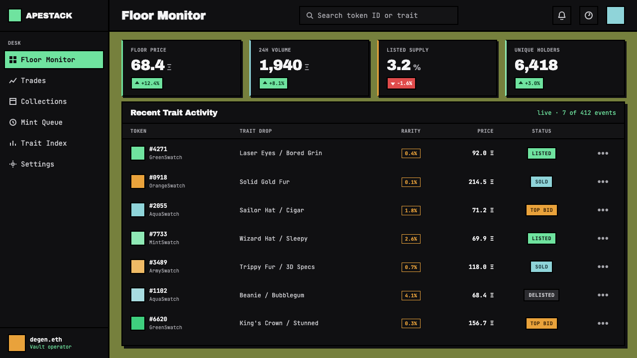
For web interfaces, the style suits collection browsers, creator dashboards, rarity-oriented catalogues, and pricing or access pages that need a crypto-native visual identity. Begin with a dark field, then use vivid flat swatches to distinguish categories, states, or featured items. Cards should look like framed asset records rather than soft lifestyle panels. Monospace-like labels, visible trait chips, and concise identifiers can organize browsing, while the actual avatar art remains the dominant focal point.
For editorial and marketing work, use the look to explain seriality, generative systems, or internet-native collecting. A feature page can alternate between large cropped character art and close inspection of a single trait layer. Campaign material benefits from the style's confrontational directness: a swatch, a character, a bold label, and a clear action can carry more conviction than a dense illustrated scene. The system works best when the text acknowledges the image as part of a larger set rather than pretending each asset is wholly isolated.
The common mistake is to copy the superficial loudness while losing the collection logic. Random neon color, arbitrary badges, and a monospace font do not create a convincing PFP-art application if the components do not behave like readable, repeatable traits. Avoid gradients, soft atmospheric shading, overly intricate scenery, and accessory piles that blur together. Choose a limited family of strong components, give each a clear role in the stack, and make the metadata support comparison instead of becoming visual clutter.
NFT PFP Art (Bored Ape era) — FAQ
Is NFT PFP art simply any cartoon used as a profile picture?
No. A cartoon avatar can resemble the surface of the style, but NFT PFP art is defined more specifically by collection logic. The image is usually one outcome of a trait-layered system, with shared components, visible variation, and metadata that situates it inside a larger set. The relationship among many images is essential; a single expressive character illustration without that serial structure belongs to a different visual category.
Why are the backgrounds so bright and flat?
A bright flat swatch creates immediate separation between the avatar and its surroundings. It also gives a collection a repeatable field of variation without requiring a different illustrated scene for every image. In this visual language, the background is a trait with structural value: it announces the image quickly, supports the silhouette, and becomes one more attribute viewers can compare across the collection.
Should a contemporary interface reproduce the style's loudness everywhere?
Usually not. The style is strongest when loud visual signals are assigned to meaningful roles: featured avatars, traits, rarity markers, interaction states, or collection categories. If every surface competes at the same intensity, the system loses the comparison clarity that makes PFP art useful. Preserve a quieter structural field around the focal asset, then let flat swatches and blocky metadata carry the intended energy.
What role does metadata play in the aesthetic?
Metadata turns a character image into a record within a collection. Trait labels, identifier-like text, and rarity badges make the system of comparison visible, connecting the avatar to its layered construction and on-chain identity. Visually, the compact mono-style treatment also sharpens the synthetic Web3 tone. It should be readable and purposeful, however: metadata supports the image's logic rather than replacing the image with a wall of labels.
Why do gradients and detailed scenery feel out of place in this style?
The central visual grammar is built from discrete, stackable traits. Gradients and elaborate scenery introduce atmospheric continuity, which can obscure the hard boundaries that let viewers identify one trait from another. Flat color and simple fields keep the construction readable at profile scale and across a large collection. The point is not that detail is inherently bad; it is that detail must not weaken the visible logic of layers, variation, and comparison.
Related design styles
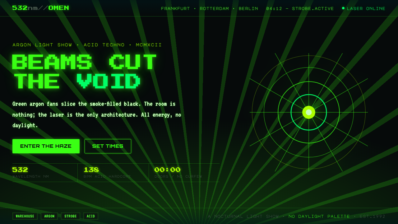 Acid Rave Laser Show 1992Beams cut the void. Argon green on pitch-black smoke, pixel marquee type, add…
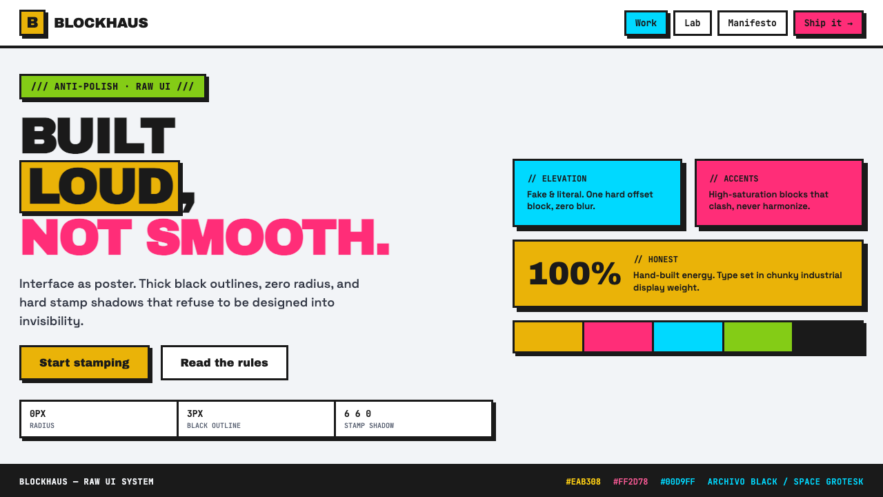 Neubrutalist Web DesignAnti-polish, on purpose. Black outlines, zero radius, hard stamp shadows, cla…
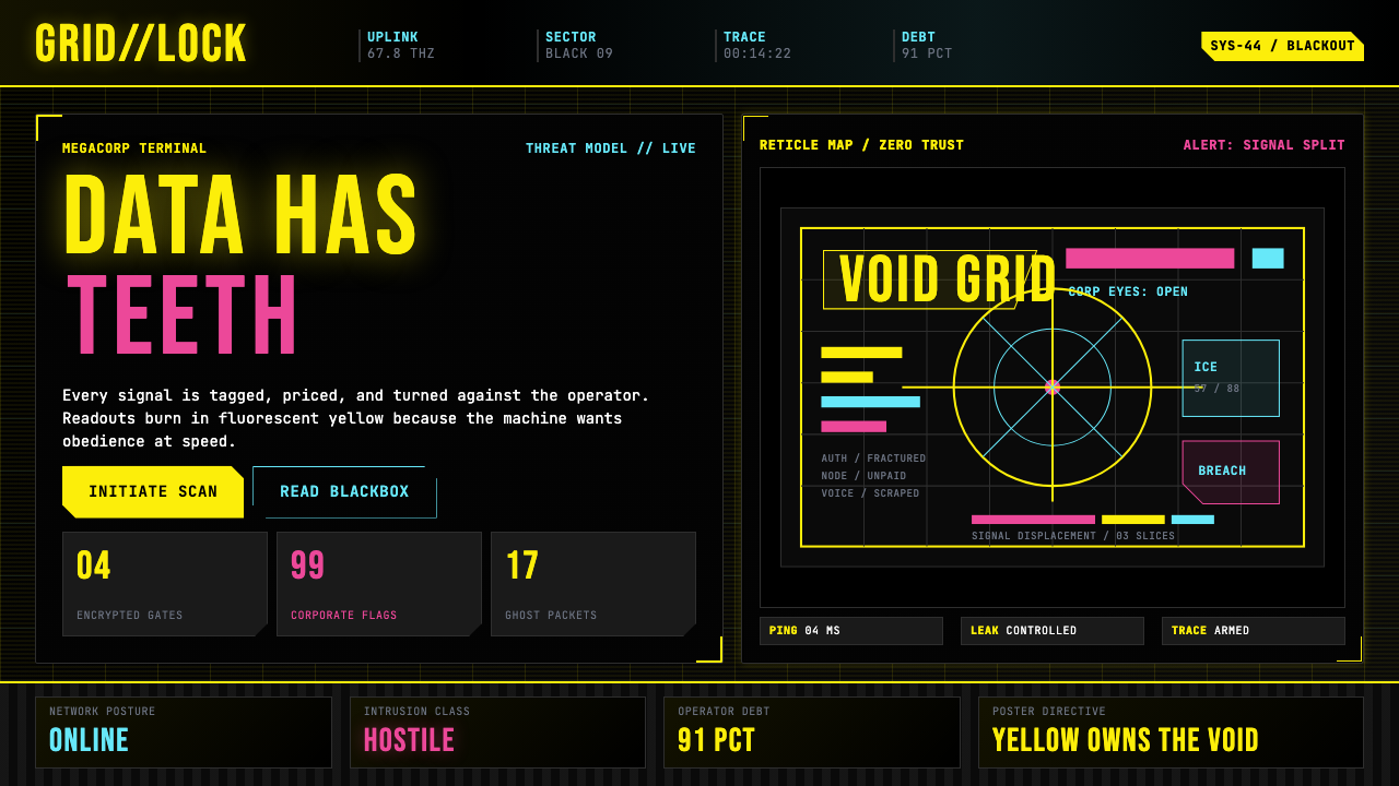 Cyberpunk 2077 (Screen UI)Weaponized terminals. Fluorescent yellow on black, scanlines and bracketed HU…
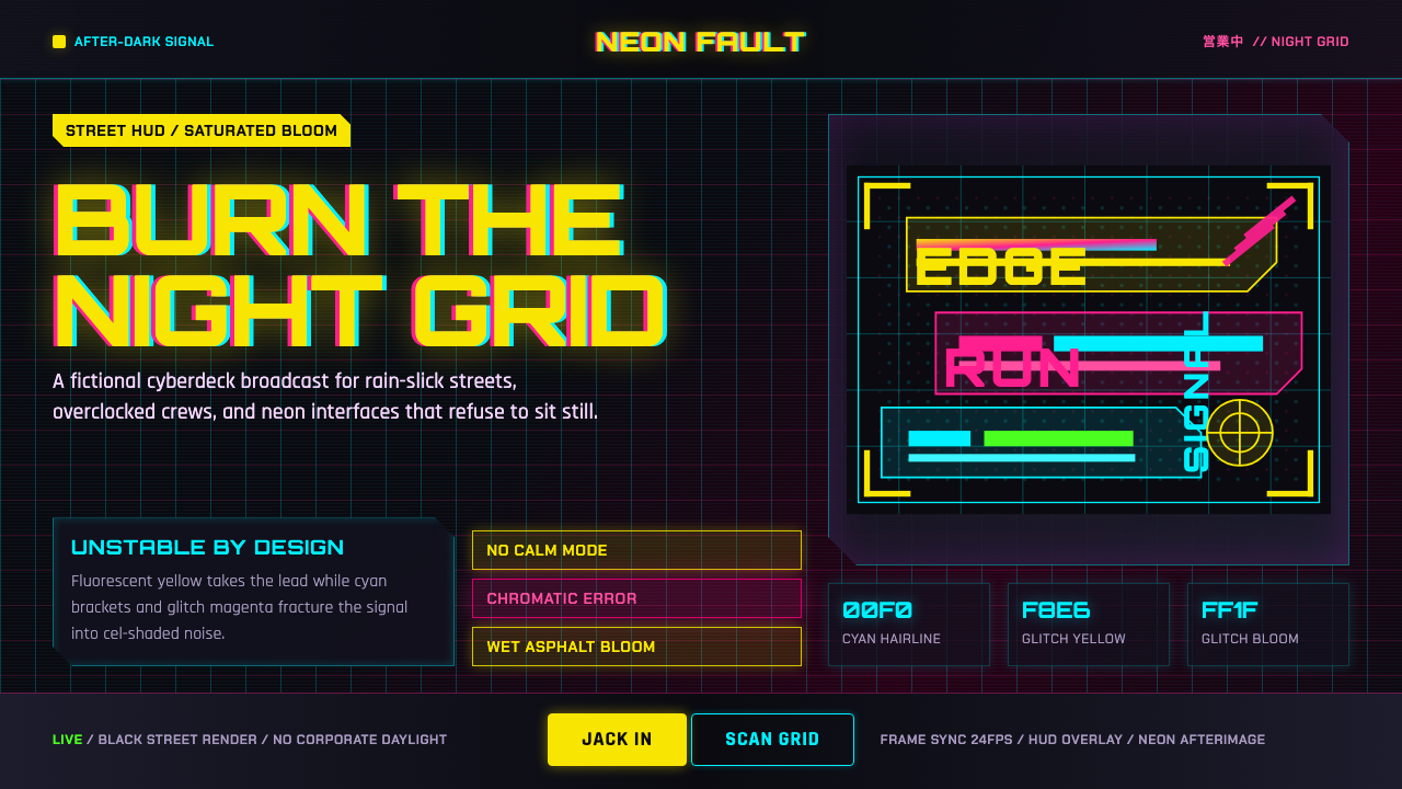 Edgerunners NeonNeon overload. Fluorescent yellow, cyan HUD grids, and magenta glitches burn…
 Ghostrunner Dharma TowerHostile precision at speed. Blue-black steel grids cut by red neon and cyan g…
 The Ascent ArcologyNeon suffocates the dark. Magenta and cyan signage stacks over wet black-viol…