What is nendo?
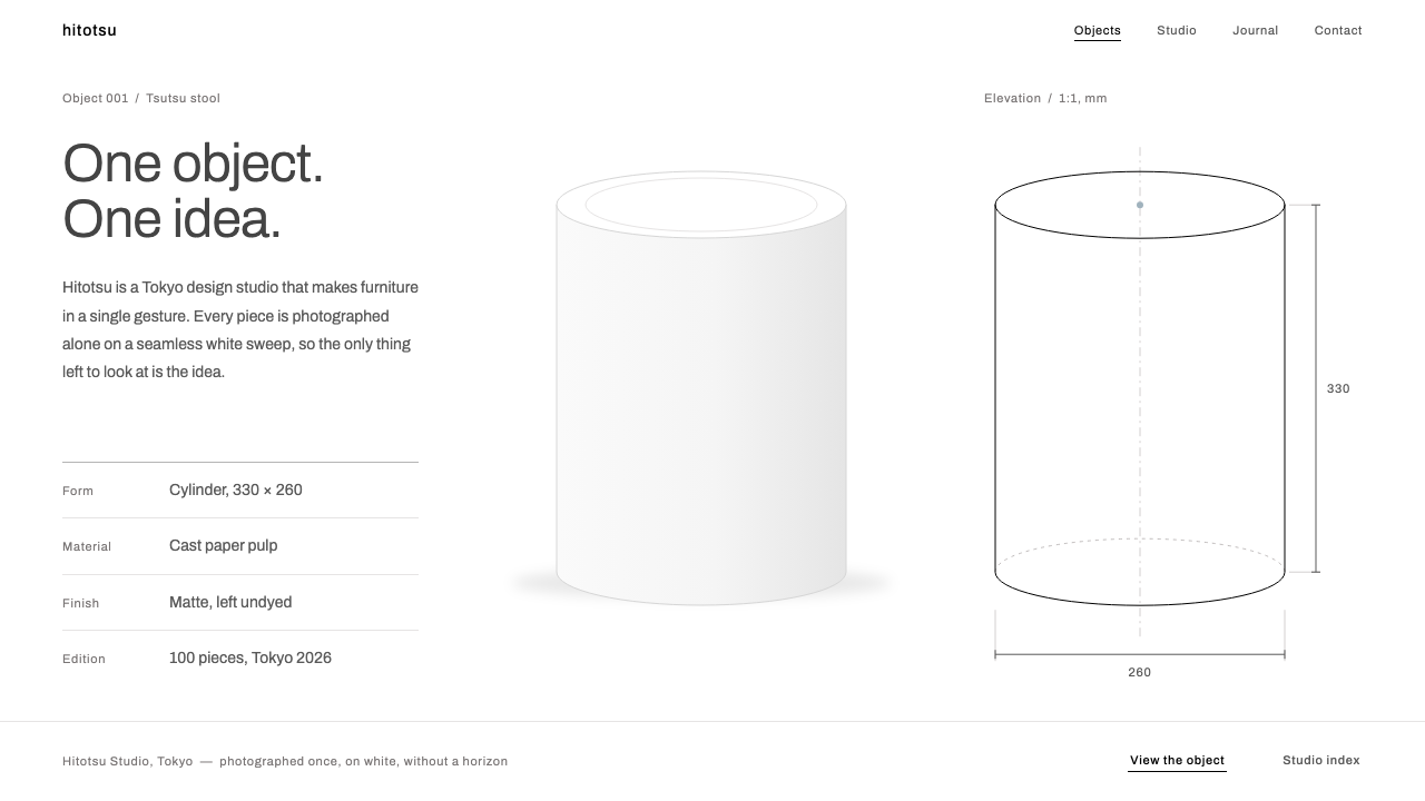
The nendo look lets a single object speak: a pure white page, soft grey type, hairline rules and one muted slate dot, with everything else left empty on purpose.
nendo in brief
The nendo style is a web and presentation language taken from the way the Tokyo design studio nendo shows its work. Every object is photographed alone on a seamless white sweep, with no horizon and almost no shadow, and the site that presents those photographs follows the same logic. Nothing on the page is there to decorate. The object, and the empty space around it, do all of the talking.
Its parts are few and quiet. The page is pure white. Body copy is set in soft grey rather than black, so that even text recedes. Panels, where they exist, are pale grey fields. Dividers are hairline rules. A single muted slate accent appears once on the whole page, like a dot of colour placed with care. Type is small, with no large headlines and no heavy weights competing for attention.
The style rewards confidence. It works for brands that have one thing worth showing and trust the viewer to look at it. It is a poor choice for products that need to explain many features at once, because it deliberately gives up the usual devices of emphasis. What it offers in return is calm, clarity and a feeling that whatever sits in the middle of the page has been chosen with great care.

Where does nendo come from?
nendo is a design studio founded in Tokyo in 2002 by Oki Sato, and its name comes from the Japanese word for clay. The studio opened a Milan office in 2005, and the combination of a Japanese home base and a European satellite helped it become known to an international audience. Its work ranges across furniture, lighting, products, interiors and architecture, and the only constant is a particular way of thinking. In the studio's own words, the goal is to give people a small exclamation mark in everyday life, a moment of mild surprise at an ordinary object.
That way of thinking is reductive. Each project is built around a single idea, and the final object tends to express that one idea without extras. A chair might be defined by nothing more than a single line tracing its outline. A lamp might be little more than a sheet of paper folded once. This approach sits within the traditions of Japanese minimalism, conceptual furniture and reductive industrial design, and it explains why the studio's visual presentation is as spare as its objects.
The photographic habit is the most direct source for the style. Objects are shown alone on a seamless white sweep. With no horizon, the viewer has no sense of where the object sits in a room; with almost no shadow, there is no suggestion of a stage or lighting set. The object floats in neutral space, and the eye is allowed to rest on its form. A website for the studio inherits that approach: the page behaves like the sweep, and each item is the only thing on it.
The visual identity described here reflects the studio's more recent presentation, in the period around 2020 to 2025 and often associated with the nendo2025 site theme. Akihiro Ito is among the names connected with the studio, alongside Oki Sato himself. The style translates the studio's physical method into screen terms: white as a sweep, soft grey as a gentle voice, hairlines as the thinnest possible dividers, and a single slate dot as the only accent. It has since become useful far beyond design studios, wherever a brand wants to sound confident by speaking quietly.
What defines the nendo look?
Seamless white ground
The page is pure white from edge to edge, with no tinted bands, no textures and no photographic backdrops. It plays the role of the studio's seamless sweep: a neutral field with no horizon, so nothing placed on it is tied to a particular place. Large areas of unbroken white are treated as content, not as unused space, and they are what give the single object its presence.
Soft grey type
Body copy is set in a soft grey instead of black. The softness lowers the volume of the text so that it never competes with the object. The typeface is a clean, neutral grotesque, small in size and light in weight, with plenty of space between lines. Reading is a quiet activity here, closer to a caption beside an exhibit than to a block of marketing copy.
Pale grey fields
When a surface needs to be distinguished from the page, it is a very light grey field rather than a bordered box or a coloured card. The difference from the white ground is barely visible, which is exactly the point. Panels read as gentle changes in the atmosphere, and they group information without adding visual weight or implying a heavy interface structure.
Hairline rules
Dividers and borders are drawn as the thinnest line the screen can show, in a pale grey. They separate lists, tables and sections without ever becoming a feature. A hairline implies structure the way a pencil mark on a drawing does: present, precise and easy to ignore. Heavy rules, boxes and shadows are all avoided.
A single slate dot
A muted slate blue-grey is the only accent, and it is used once on a page, often as a dot, a small marker or a single link. Because the rest of the palette is white and grey, this one touch is enough to guide the eye. Repeating it across a page would turn it into decoration and destroy its power, so discipline matters more here than anywhere else in the system.
One object, no crowding
Each view contains one subject. A product photo, a single line of text and a few small details are enough. Galleries show items individually or in a loose, widely spaced row, never in dense mosaics. The restraint is not about minimalism as a fashion, but about giving a single idea the room it needs, which is the same principle the studio applies to its objects.

Who shaped nendo?
Oki Sato founded nendo in Tokyo in 2002 and leads the studio. The idea that an everyday object should offer a small exclamation mark of surprise is his, and the reductive habit of building each project around one thought is the root of the whole visual language. The style described here is, in effect, his design method translated into web layout.
Akihiro Ito is another name linked with the nendo studio. Alongside Oki Sato he belongs to the group associated with the studio's work and its careful, quiet presentation, in which each project appears alone on a white field and the viewer is left to look.
How do you use nendo today?
The nendo style is best used by brands with a small number of things worth showing: objects, furniture, products, ceramics, stationery, architecture or art. It also suits personal portfolios, gallery sites and quiet editorial pieces. It should be avoided where a page must carry many competing calls to action, because it deliberately lacks tools for loud emphasis.
For presentation slides, give each slide one subject. A cover is a white page with the studio or project name in small grey type, placed with generous margins, and the single slate dot as a marker. Content slides hold one image or object, one short caption and a hairline rule, nothing more. Data slides should be plain: a small chart in grey with one element in the slate accent, and direct labels. Resist the urge to fill spare areas with icons or decorative lines.
For web interfaces, treat the page like a gallery wall. Keep navigation minimal, set in small grey text, with a hairline below it. Product pages show one large object on pure white with a short description in soft grey beside or below it. Cards, if used at all, are pale grey fields with no border and no shadow. Forms use hairline underlines instead of boxed inputs. Reserve the slate accent for the single most important action on the page.
For editorial and marketing work, the style suits catalogues, interviews and launch pages for single products. An article can run in a narrow column of soft grey type with ample margins, and images appear one at a time on white, with captions kept small. Marketing pages should avoid banners, badges and stacked offers. A single image, a single sentence and a single link communicate confidence far more effectively than a busy hero section.
A frequent mistake is to read the style as simply white and thin, then add a gradient, a drop shadow or a big headline to compensate for the quiet. Each of these breaks the logic of the sweep. Another mistake is using the slate accent repeatedly, which turns it into a brand colour and flattens the hierarchy. A third is crowding the page with several objects at once; the style only works when one thing is allowed to be the subject.

nendo — FAQ
What is the nendo design style?
It is a minimalist web and presentation style taken from the Tokyo studio nendo, founded by Oki Sato in 2002. It consists of a pure white seamless page, soft grey type, pale grey fields, hairline rules and one muted slate accent used once, with small type and a great deal of empty space.
Why is the text grey instead of black?
Soft grey lowers the visual volume of text so that it does not compete with the object on the page. The style imitates a photograph of an object on a seamless white sweep, where the object is the subject and everything else is quiet. Black text on white would be louder than the system wants.
How should the single accent colour be used?
Use the muted slate once per page, often as a dot, a small marker or a link, to guide the eye to the most important thing. Repeating it across the page turns it into decoration and removes its power. Discipline with this one colour is the most important rule in the whole system.
Which typeface suits the style?
A clean, neutral sans-serif works best, with Archivo being a good example. Keep it small and light, in soft grey, with generous line spacing. Avoid decorative faces and heavy weights, since the system relies on the type staying quiet beside the object.
Is it too empty for a commercial website?
It depends on what the site sells. For brands with a single clear product or a small collection, emptiness signals confidence and lets the product carry the page. For catalogues with hundreds of items or pages that need many calls to action, it is too sparse, and borrowing only its colour and type while adding more structure would be a safer choice.
Related design styles
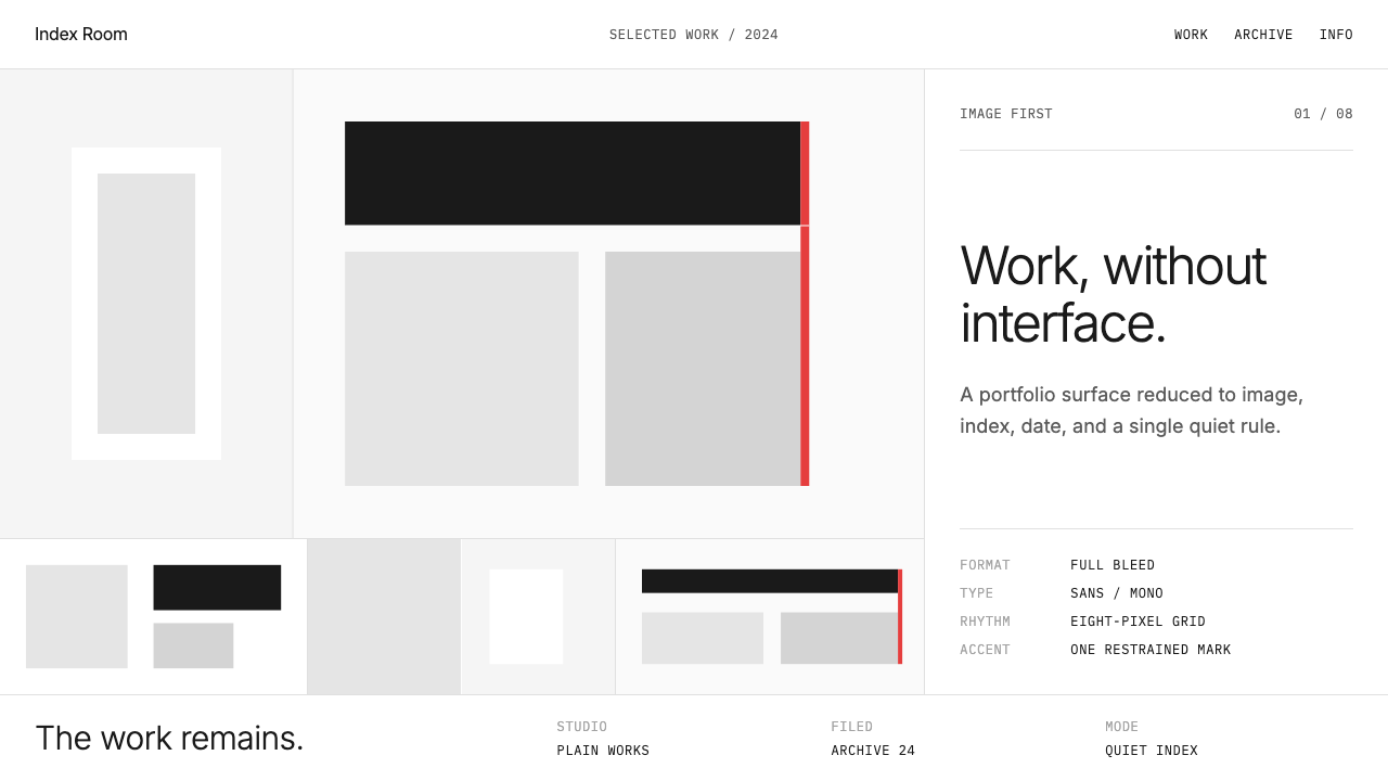 Cargo Collective PortfolioInterface disappears. White space, full-bleed blocks, mono metadata and hairl…
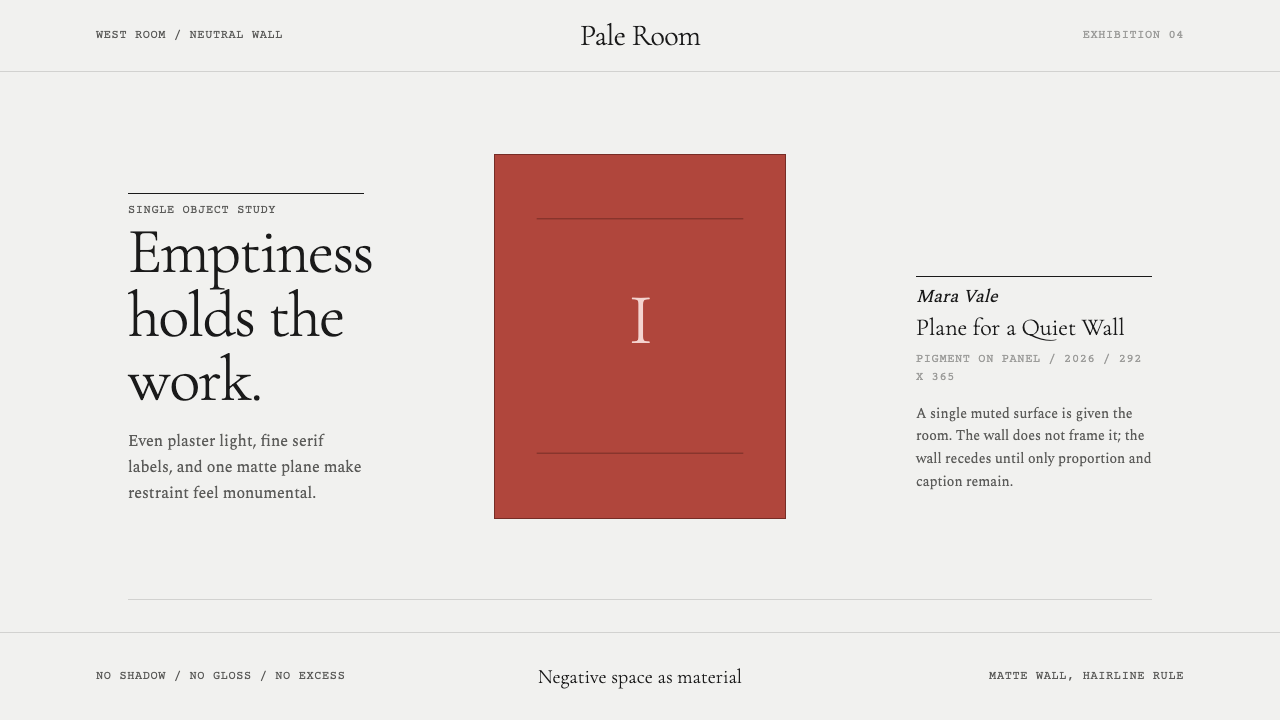 White Cube GalleryEmptiness is the medium. Cormorant labels and one terracotta plane hold the w…
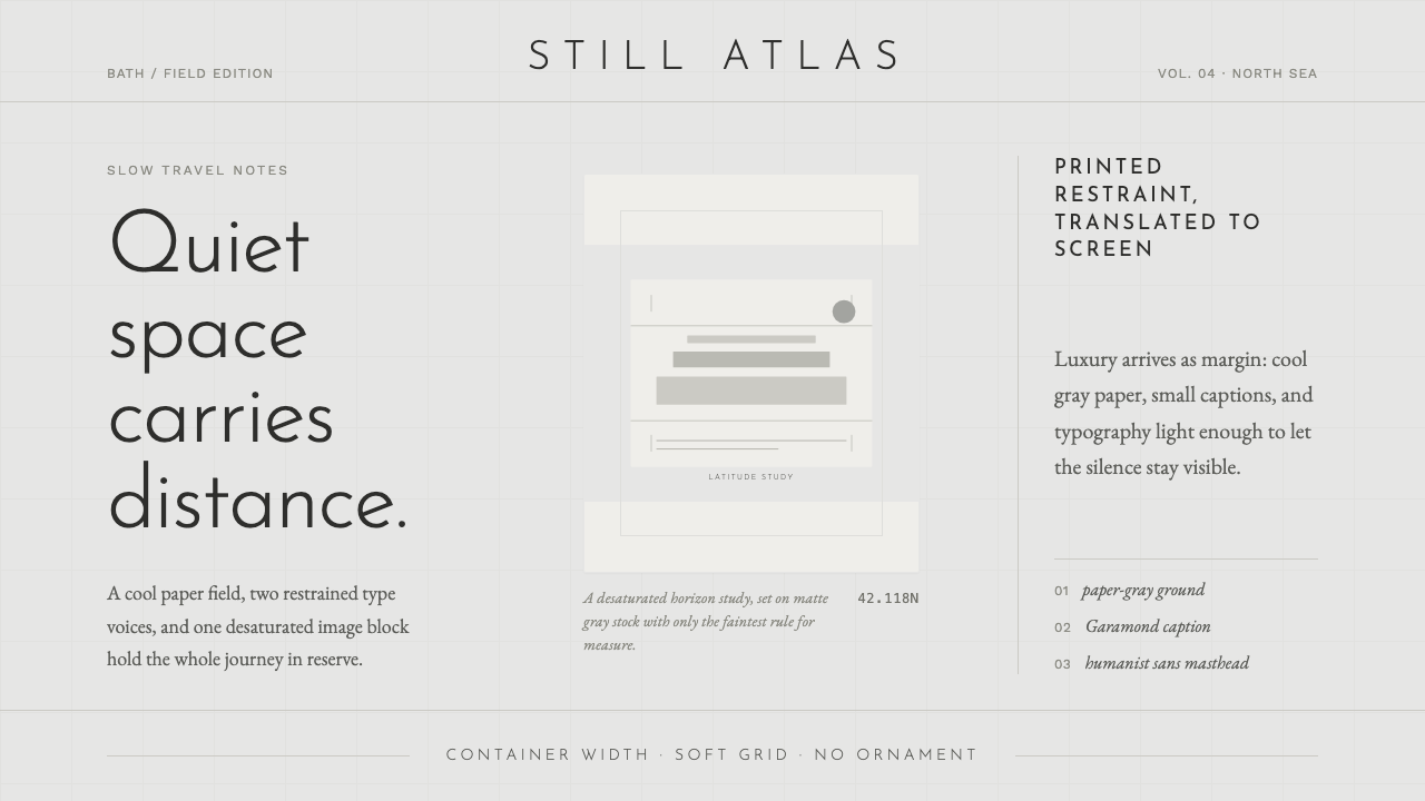 Cereal Magazine MinimalLuxury as margin. Cool paper-gray, light sans, and Garamond captions hold the…
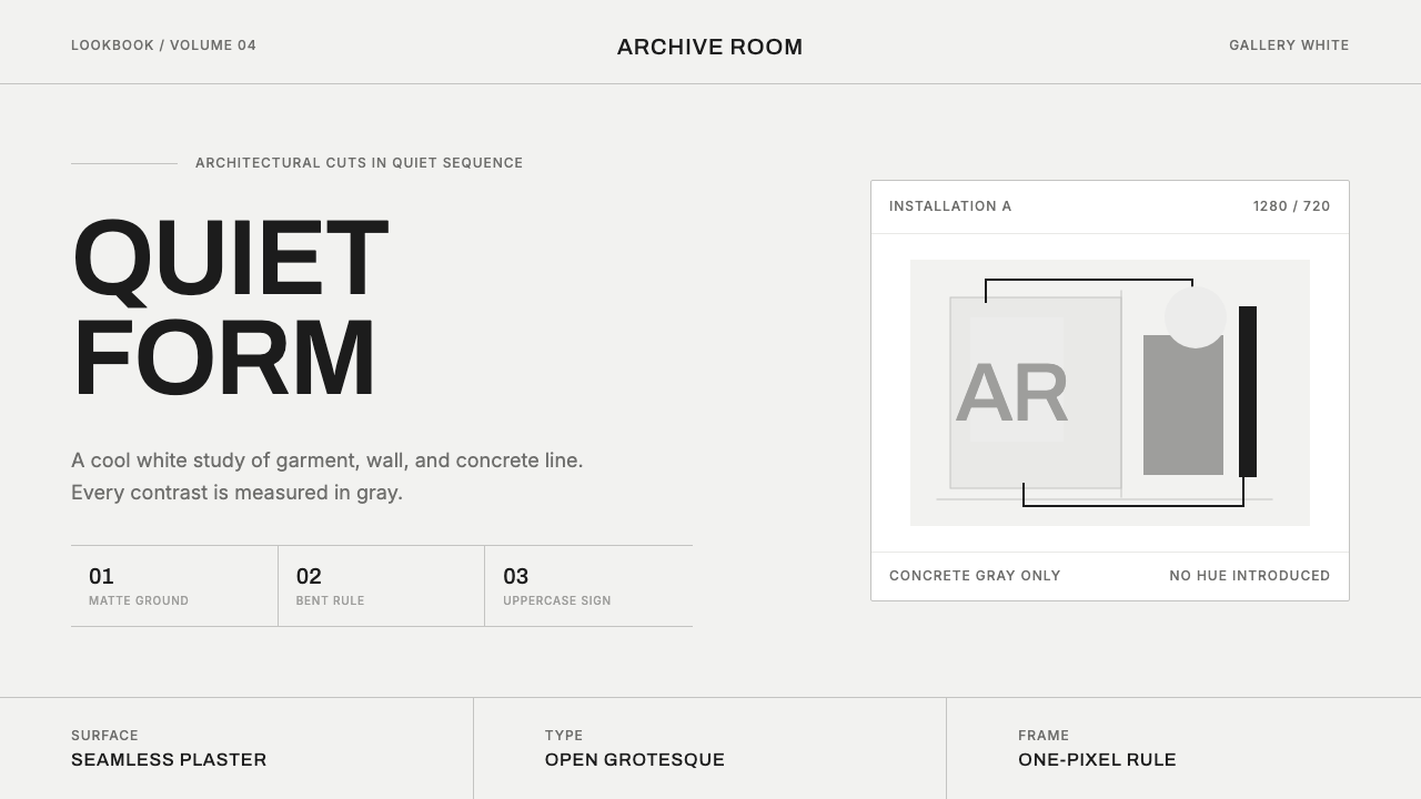 COS Gallery MinimalSilence has structure. Cool gallery white, Archivo uppercase, and concrete-gr…
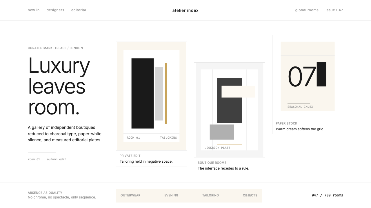 FarfetchLuxury as absence. Charcoal type, white canvas, and hairline editorial plates.
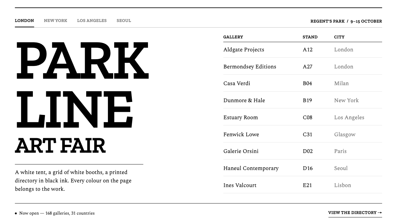 Frieze Art FairColour belongs to the art. Tight slab capitals and a hairline directory grid,…