What is Nelly Rudin Concrete?
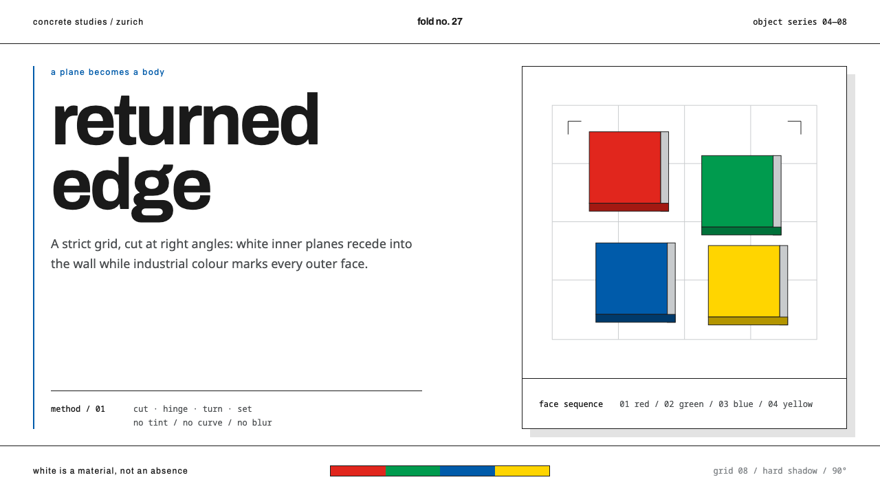
Nelly Rudin Concrete takes the Swiss grid off the poster and puts it on an object — flat planes cut, hinged and turned until they become bodies, painted in four industrial colours.
Nelly Rudin Concrete in brief
Nelly Rudin Concrete is a design style drawn from the work of the Swiss artist Nelly Rudin, a second-generation figure of Zurich Concrete art. Its language is flat colour planes that gain physical force: panels with visible side faces, hard returned edges and hard shadows; four industrial colours, red, green, blue and yellow, used in a fixed order; white inner faces that dissolve into the wall; lower-case headings set in a grotesque sans; and a strict grid underneath it all.
The conviction behind it is that colour and form can be made concrete, a thing in the world rather than a picture of a thing. Rudin's picture-objects develop volume out of the flat surface: a plane is cut, hinged, turned and set into itself until it becomes a body. In interface terms, a panel is not a metaphor for a card. It is a card with a thickness, a side face and a shadow.
Nothing is tinted, nothing is blended and nothing is rounded. The restraint is the style. Where other systems soften, this one states.
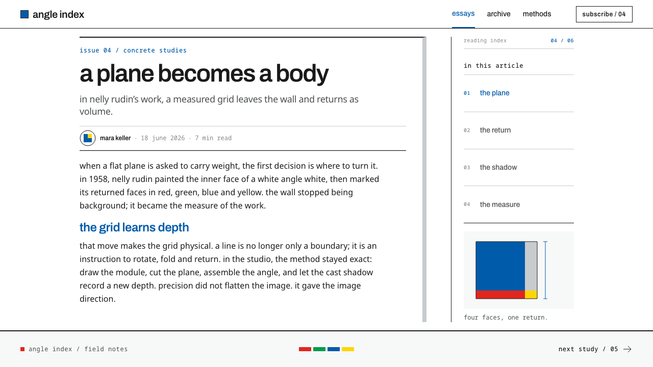
Where does Nelly Rudin Concrete come from?
Nelly Rudin trained at the Basel Kunstgewerbeschule, the city's school of applied arts, and drew for the Geigy pharmaceutical studio. She also worked in the Zurich studio of Ernst Heiniger and Josef Müller-Brockmann. That last connection places her inside the Swiss International Typographic Style, in which the strict grid was the working method for posters and printed matter. Her training was therefore in the discipline of order, proportion and clear hierarchy, applied to commercial work.
What she did next is the point of the style. She did not apply the grid to another sheet of paper; she turned it on objects. Her tradition, Zürcher Konkrete or Zurich Concrete art, held that a work should be a thing in its own right, built from its own means of colour, plane and proportion, rather than a depiction of something else. Max Bill, the best-known name among the Zurich Concretes, stands behind the tradition she inherited.
Her work of the era from 1950 to 1990 is dated by material. The aluminium Rahmenobjekte, or frame objects, begin in 1976; the Acrylglasobjekte, the acrylic-glass objects, in 1981; the Winkelobjekte, the angle objects, in 1985. Across the series one operation repeats: a flat plane is folded at right angles, turned and nested, and volume appears. The exhibition booklet of the Zurich museum of Concrete art records the colour rule exactly. In her cross-shaped angle objects, the inner faces are painted white and the outer faces take red, green, blue and yellow in a fixed order, and three industrial aluminium angle pieces were allowed to merge into the white wall.
Those facts become the system's rules. White inner faces dissolve into the wall, so the ground itself becomes part of the composition. The four hues come in sequence and are never mixed, tinted or softened. Every panel keeps a real side face and throws a real, hard-edged shadow, because the object is real. And the headings are lower-case, in the plain, restrained grotesque spirit of Swiss typography, with Archivo as the typeface.
What defines the Nelly Rudin Concrete look?
Four industrial colours in sequence
The palette is red, green, blue and yellow, and they appear in a fixed order rather than at the designer's whim. Each is a flat, fully saturated industrial colour, never tinted, mixed or lightened. Sequence is the organising idea: when a viewer has seen the order once, they can predict the next block, and the layout reads as a system instead of a collection.
White inner faces, the wall as ground
The inner faces of the folds are white and dissolve into the wall, so the ground participates in the composition. A form is defined partly by what is not painted. In interface terms, the page background is a working element, not a neutral container, and the white areas are the other half of every coloured plane.
Hard returned edges
Every panel has a real side face where the plane turns back on itself. The edge is a hard, square return, never rounded or softened, and it gives the plane thickness. Components should therefore show their depth honestly: a visible edge, a distinct side tone, a clear step between layers. Panels are things with a cross-section, not lines drawn on glass.
Real, hard shadows
Each panel throws a real shadow with a sharp edge, falling in one consistent direction. These are not ambient glows; they describe how a physical object sits against a wall. In design, a shadow is a solid shape with a clear boundary, and it appears only where an element is physically raised above what lies beneath it.
No gradient, no rounding, no blending
Nothing is tinted, blended or rounded. Colours are flat and corners are square. Where other styles use transition to suggest softness or depth, this style states each fact once and moves on. The discipline is the whole appeal: every missing effect leaves the planes and their relations to do the work, and nothing can hide a poor proportion.
Grid, grotesque and lower-case
Beneath the objects runs the Swiss grid Rudin learned in Zurich. Type is Archivo, a grotesque sans, set in lower-case headings that avoid any claim of ceremony. Text is flush and plain, held to the same grid as the colour planes, so words and objects feel like parts of one construction. The grid is not shown, but everything lines up with it.
Cut, hinge, turn, nest
Rudin's characteristic operation is to take a flat plane and fold it at right angles, turn it, and set it into itself until it becomes a body. Compositions in this style follow the same logic. Layouts are built from rectangles that step, overlap and return, so a page feels folded rather than stacked, and the eye is carried along an edge from one plane into the next.
Who shaped Nelly Rudin Concrete?
The Swiss artist at the centre of the system, a second-generation figure of Zurich Concrete art. She trained at the Basel Kunstgewerbeschule, then took the discipline of the Swiss grid from posters to objects. Her aluminium, acrylic-glass and angle objects, made from 1976 onward, are the source of every rule here.
The best-known name among the Zurich Concretes and part of the lineage Rudin inherited. He stands for the Concrete conviction at the heart of her work: a work built purely from colour, form and proportion is a thing in its own right and needs no subject.
The Zurich designer in whose studio Rudin worked, and a defining figure of the Swiss International Typographic Style. Through him the strict grid entered her practice, and she then turned it from poster to object, from page to wall.
A name on the Zurich studio, alongside Müller-Brockmann, in which Rudin worked. His name marks the professional design environment she came from, a working culture of order, proportion and clear hierarchy that she later turned toward the object.
How do you use Nelly Rudin Concrete today?
Nelly Rudin Concrete suits work that wants to feel built rather than drawn. It rewards clarity, rhythm and material honesty, and it sits well with products and brands that value precision, art-world seriousness or a quiet industrial confidence. Apply its rules literally: sequence, hard edges, real shadows and a grid you can feel. Because the style depends on proportion and spacing rather than on ornament, it also tolerates very little clutter; give each plane room, and let the white wall do part of the work.
For presentation slides, a cover can be a few flat colour planes stepped across a white field, each with a visible side edge and a sharp shadow, with a lower-case title set plainly in the grid. Content slides use white as the dominant ground and the four colours as an ordered code for sections. Data slides assign the colours to series in the fixed order, never as a gradient, and let bars and blocks have a real, solid thickness.
For web interfaces, cards and panels get a visible side face and a hard shadow, and buttons are square-cornered planes in one of the four colours. Pricing pages can present tiers as a row of colour planes in sequence; dashboards use white as the working field and the four hues as a categorical code. Inputs are crisp rectangles, focus is a hard line, and nothing blurs or rounds off.
For editorial and marketing work, the style fits galleries, design studios, architecture, cultural institutions and products that sell precision. Long text sits in a plain grotesque in lower-case headings, with colour used only as a marker for sections or sequence. A campaign page can be a single arrangement of planes on white, and the system's rules do the persuading.
The common mistake is to soften it: adding a gradient to a plane, a rounded corner on a card or a blurred shadow because it feels friendlier. Each of these dissolves the object quality that gives the style its force. The second mistake is to treat the four colours as a free palette. They are a sequence, and they lose their meaning the moment they are scattered, tinted or mixed.
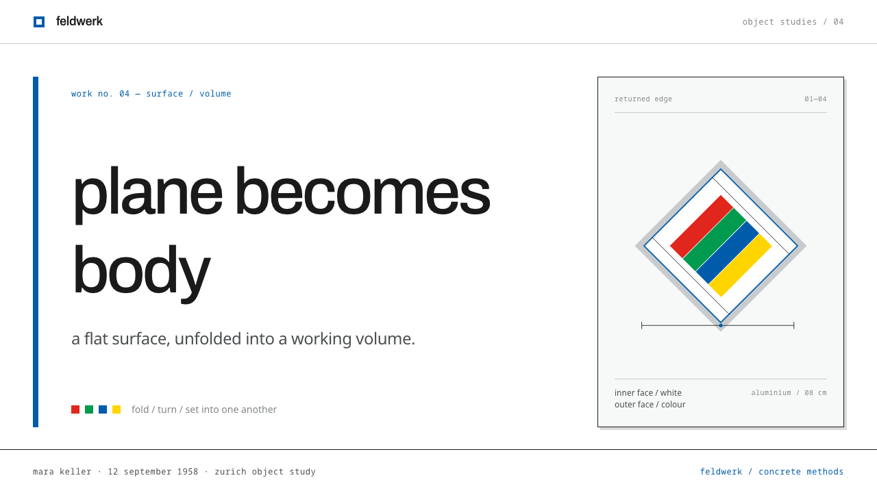
Nelly Rudin Concrete — FAQ
How does this differ from Bauhaus or the Swiss International Style?
It shares their rationality, but its subject is the object, not the page. The Swiss grid is here, because Rudin worked in Müller-Brockmann's Zurich studio, and so is the Concrete art conviction that a work is a real thing built from its own means. The distinctive step is that planes have thickness, side faces and hard shadows, and that the four colours run in a fixed sequence.
Why are the headings lower-case?
Lower-case removes ceremony. Capitals imply a ranked, formal voice, while a plain lower-case grotesque speaks at the level of the objects themselves. It is consistent with the system's refusal of effect: headings sit in the grid like another plane, with no flourish. The typeface is Archivo, a grotesque sans with the plain, industrial feel the system wants.
How should the four colours be sequenced?
In the fixed order the source records: red, green, blue and yellow, applied to the outer faces. Choose a starting point and keep it, so a viewer learns the order by seeing it. Use the sequence for sections, series, tiers or steps, and do not reorder it for visual variety. Nothing should be tinted or blended between them.
What does a real shadow mean in a flat interface?
It means a solid shape with a sharp edge that falls in one consistent direction and appears only when an element is genuinely raised above another. It is not a soft glow used for decoration. The aim is to describe how a physical panel sits against a wall, so the shadow carries information about layering and depth instead of mood.
Related design styles
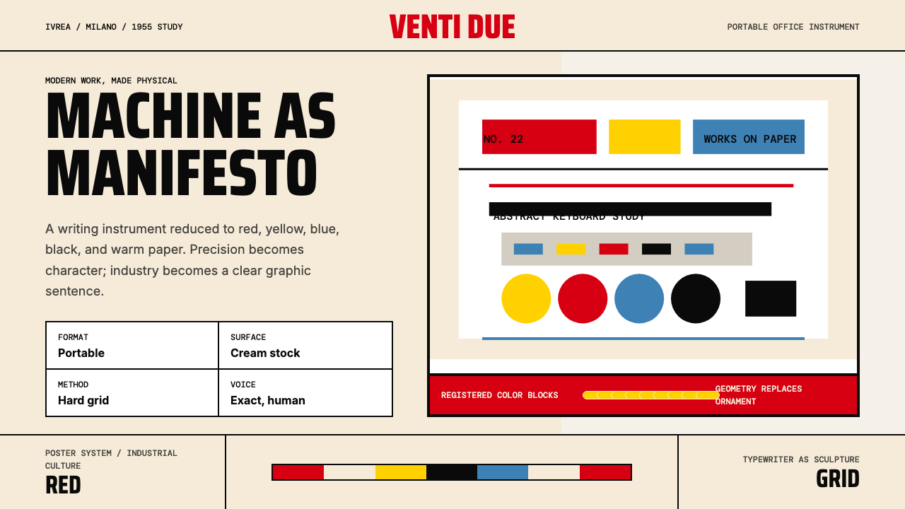 Olivetti Pintori (1955)Industry becomes poetry. Cream paper, machine red, and hard geometry abstract…
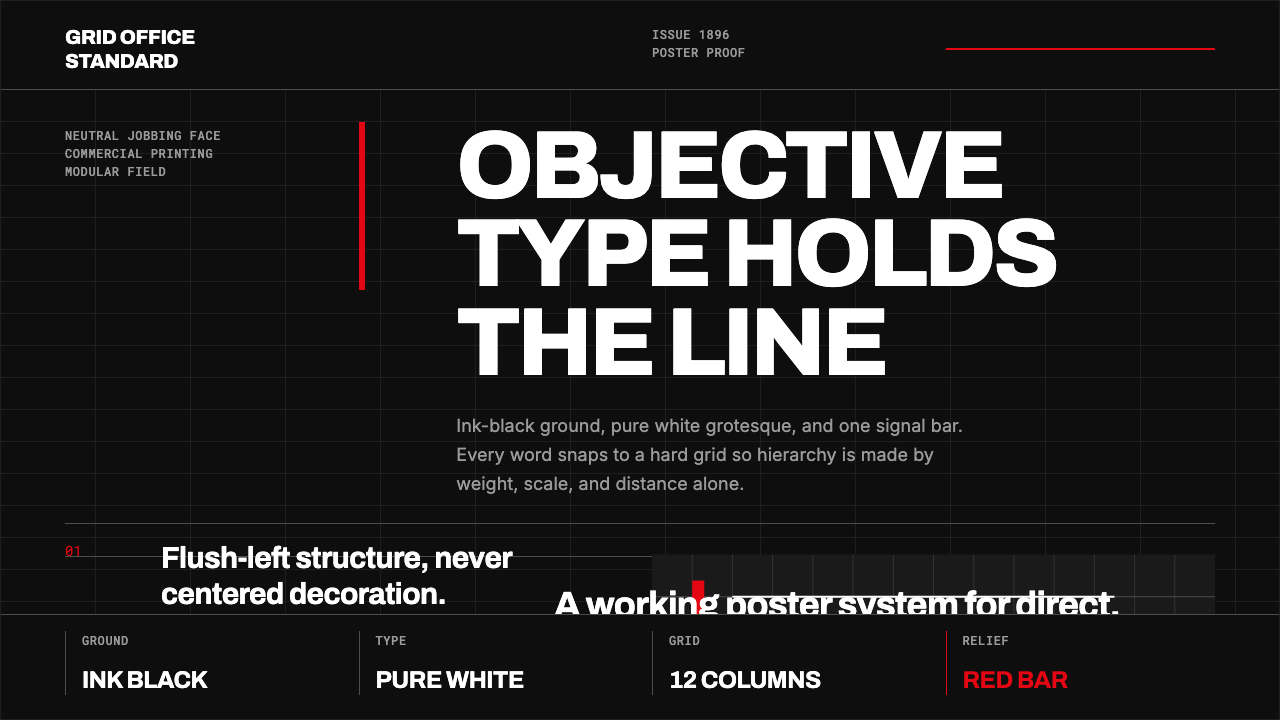 Akzidenz-Grotesk BertholdObjectivity in black ink. White grotesque type, hard grid, one rationed red b…
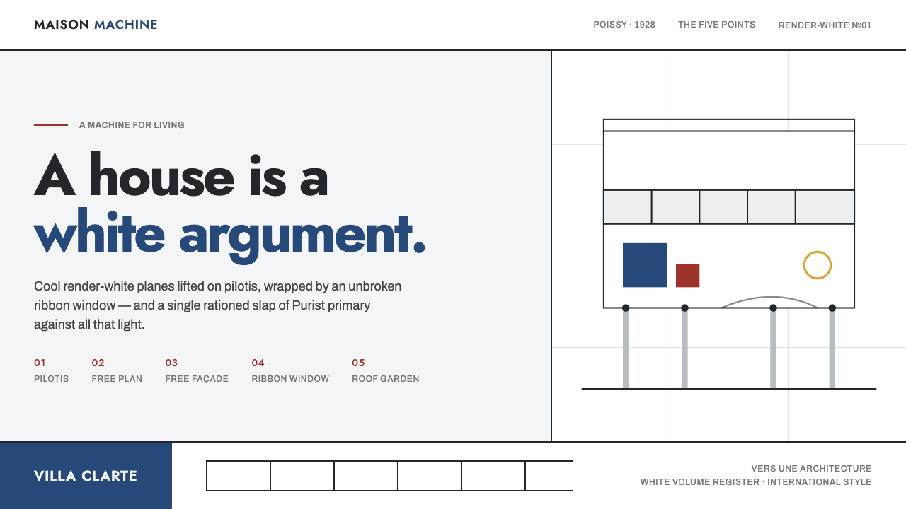 Le Corbusier Purist WhiteA house is a white argument: render-white planes, ribbon windows, one slap of…
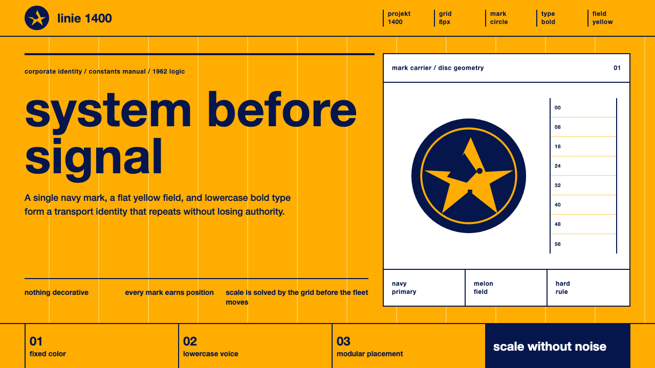 Lufthansa (Aicher)Systems speak first. Melon yellow, navy disc mark, lowercase Helvetica on a h…
 Niemeyer Brasília CurvesEmptiness makes the monument. Concrete-white arcs cut across a saturated coba…
 Otl Aicher Munich OlympicsFriendly rigor. Sky-blue grids and straight-line pictograms make public infor…