What is Le Corbusier Purist White?
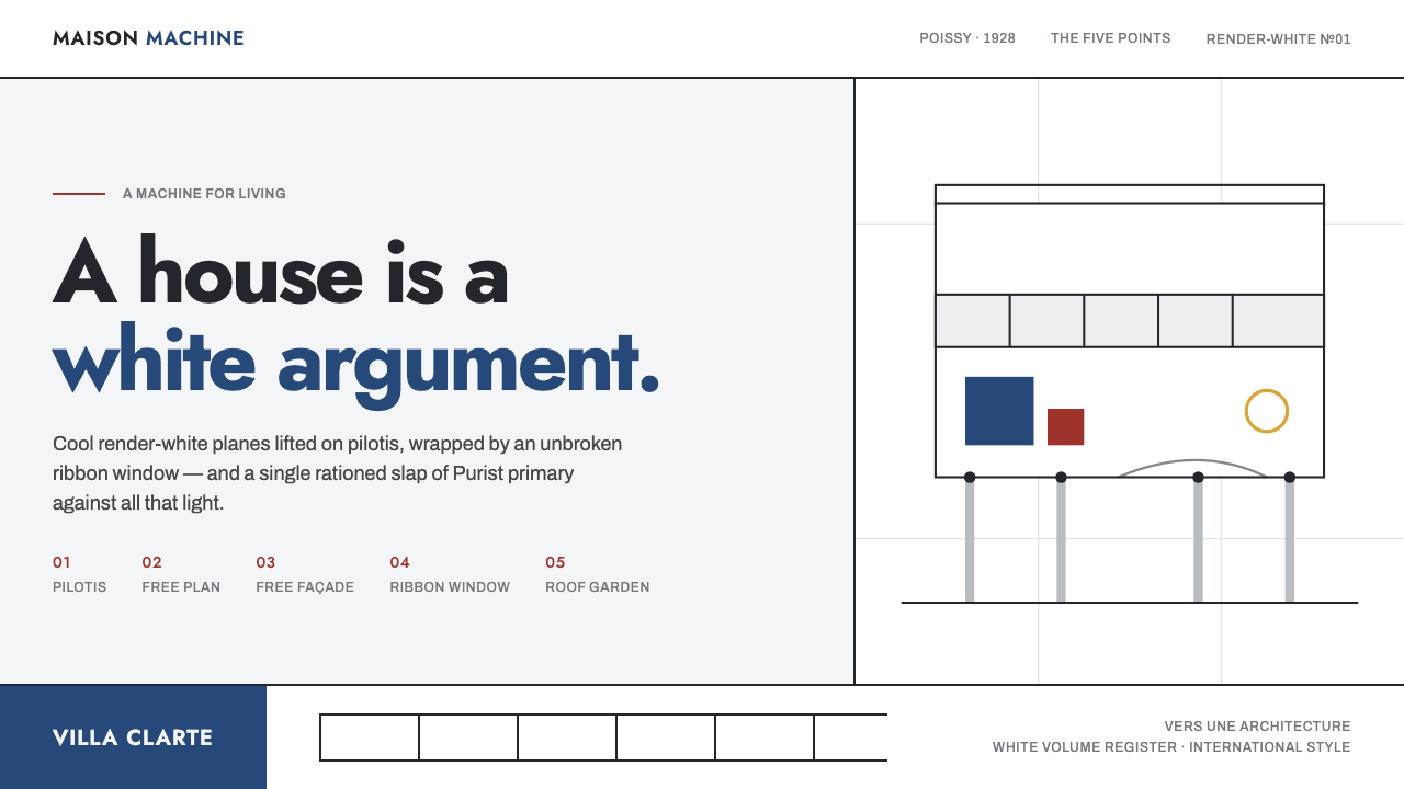
Le Corbusier Purist White treats the interface as a white architectural argument: lifted planes, horizontal light, structural rhythm, and one rare note of primary color.
Le Corbusier Purist White in brief
Le Corbusier Purist White is a digital design language derived from the Purist and modernist architectural vocabulary associated with Le Corbusier, especially Villa Savoye in Poissy. Its central image is not a decorated room or a picturesque facade, but a clean rendered-white volume raised from the ground on pilotis, opened by a continuous ribbon of windows, and completed by a roof garden. The style makes whiteness active: white is not empty background, but the field against which structure, movement, light, and proportion become legible.
The system translates that architectural grammar into screens. Cool white grounds act as render; slate-black text, rules, and panels establish construction; orthogonal alignment suggests a disciplined plan. Long horizontal bands recall ribbon windows, while repeated vertical divisions create the rhythm of pilotis. Components should read as planes placed in light rather than as soft objects floating above a page. The result is spacious and exacting, with a sense that every surface has a structural reason to be present.
Purist White is rational and anti-decorative, but it is not neutral in the bland sense. Its drama comes from restraint. A ramp-like reading path can guide attention through a composition, a dark structural plane can interrupt a large white field, and an isolated primary accent can make a state, action, or idea feel deliberate. The visual language is therefore architectural rather than merely minimal: it organizes experience through mass, circulation, interval, and contrast.
Where does Le Corbusier Purist White come from?
The historical frame is Western Europe in the 1920s through 1931, centered on France, Poissy, and Paris. In this period Purism, modernist architecture, and what would be recognized as the International Style converged around a desire for clarity, geometry, and an architecture suited to modern life. The relevant visual ambition was not to make buildings appear richer through applied ornament, but to make their order visible through proportion, planar surfaces, openings, and circulation.
Le Corbusier, born Charles-Édouard Jeanneret, is the defining figure in this source tradition. His 1923 text Vers une architecture and Villa Savoye, built in Poissy from 1928 to 1931, provide the two principal reference points: one states an architectural position, while the other gives it a built grammar. Villa Savoye is presented as a white box elevated on pilotis, wrapped by ribbon windows, and crowned by a roof garden. Its force comes from the coordination of these elements rather than from decorative detail.
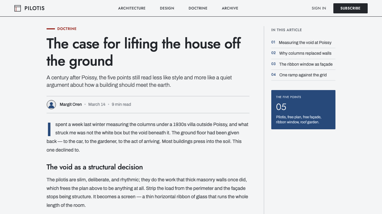
The Five Points of a New Architecture organize that grammar. In this style they are understood not as historical quotations to paste onto a screen, but as a discipline of separation and continuity: structure can be read independently from enclosure; horizontal openings can establish a calm visual band; the roof can become an inhabitable plane; circulation can be made explicit. The ramp is especially useful as a conceptual model because it turns movement into a compositional sequence rather than a simple change of level.
Pierre Jeanneret and Amédée Ozenfant belong to the named constellation around this source material, alongside Le Corbusier. Their presence places the style within Purism rather than reducing it to a generic white modernism. For contemporary use, that distinction matters. The goal is not simply an empty white interface or an imitation of historical architecture; it is a controlled system in which white render, black structure, orthogonal order, and rare primary color make a lucid argument.
What defines the Le Corbusier Purist White look?
Render White
The dominant field is a cool, rendered white rather than a glossy digital blank. It should feel like a continuous architectural surface that receives light evenly and gives dark elements a precise edge. White carries the composition, so it needs generous uninterrupted areas; filling every interval with cards, controls, or texture weakens the argument. The page should feel constructed from white planes before it feels decorated.
Pilotis Rhythm
Repeated vertical supports create a measured rhythm across a layout. In digital work, this may appear as aligned columns, recurring separators, navigation intervals, or a stable baseline of modules. The repetition should never become ornamental striping. Its purpose is to make the upper planes appear supported, to establish cadence, and to give content a legible structural order.
Ribbon Bands
Long horizontal bands are the style's clearest compositional device. They can contain navigation, a headline, a data series, a caption, or an image crop, but they should preserve the sensation of an opening running through a wall. Horizontal continuity is more important than box-by-box enclosure. A band should extend visual space, allowing information to read as a view across the interface rather than as a stack of isolated widgets.
Orthogonal Plan
The layout follows an orthogonal grid: edges align, divisions are calm, and rectangles behave like architectural planes. Diagonal gestures are reserved for directional movement, especially ramp-like sequences, rather than used as restless decoration. The system gains authority from exact alignment and from the contrast between long horizontals and disciplined vertical supports.
Flat Light Planes
Depth is conveyed through adjacent planes, cropping, overlap, and contrast, not through atmospheric shading. Surfaces should appear flat, sunlit, and crisply separated. This is not an invitation to make everything lifeless; it asks the designer to create depth structurally. A dark plane against white render can establish a strong spatial event without pretending that the screen contains a softly lit miniature room.
Rare Primary Accent
Primary color is a decisive interruption, not a palette to spread everywhere. The source material specifically evokes a rare slap of Corbusier blue against white light; that principle can govern all accents. Use a primary note to identify an important action, a selected state, a critical datum, or a conceptual pivot. When accents become frequent, they lose the force of an architectural event and turn into decoration.
Anti-Decoration
Every visible element should contribute to orientation, structure, content, or movement. Decorative patterns, sentimental texture, gratuitous icons, and ornamental framing work against the system because they compete with the white argument. The appropriate richness comes from proportion, sequence, and the changing pressure between white field and dark structure. Restraint is an active compositional choice, not an absence of craft.
Who shaped Le Corbusier Purist White?
Le Corbusier, born Charles-Édouard Jeanneret, is the central figure of this style source. The reference system draws on his Purist and modernist architectural position, his 1923 text Vers une architecture, and Villa Savoye in Poissy. In digital adaptation, his importance lies in the coherence of the grammar: white planes, pilotis, ribbon windows, roof garden, ramp, and the Five Points are treated as parts of one argument rather than as separate visual motifs.
Pierre Jeanneret is named in the source material as a key figure within the historical constellation of Le Corbusier Purist White. His inclusion is a reminder that the style belongs to a wider modernist and Purist context, not to an anonymous collection of white boxes. When using the language today, retain that sense of disciplined architectural authorship: systems, alignments, and relationships matter more than superficial resemblance.
Amédée Ozenfant is likewise identified as a key figure in the source material and anchors the theme in Purism. That connection clarifies why the visual language values reduction without becoming vague: forms are pared back so their relationships can be judged more clearly. For designers, the useful lesson is to remove visual noise while preserving the specific structural decisions that make a composition intelligible.
How do you use Le Corbusier Purist White today?
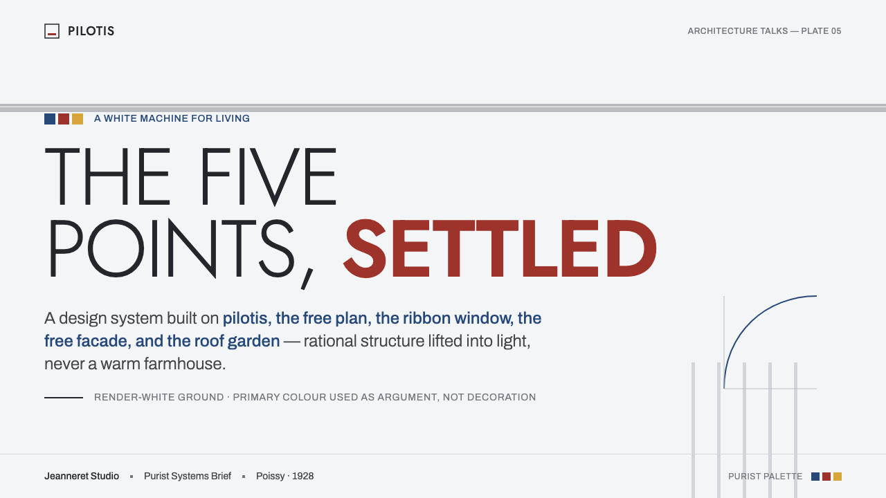
For presentation covers, treat the slide as a facade and an approach sequence. Let a large field of render-white carry the title, introduce a dark horizontal or vertical plane to establish structure, and reserve a rare primary accent for the central proposition. Avoid turning the cover into an architectural collage. The strongest result usually reads as one volume, one opening, one direction of movement, and a title placed with the calm certainty of signage on a wall.
For content slides, use ribbon-window thinking. Group related text into long horizontal reading bands and let repeated vertical alignments provide support. Headings should establish a clear entry point, while body copy remains restrained and legible against the white field. Keep dividers structural: a rule, a shift of plane, or a change in alignment can do more than decorative section markers. The aim is to make the audience feel that information occupies a planned spatial sequence.
For data slides, make the underlying order visible before adding emphasis. Use consistent baselines, long horizontal comparison fields, and dark structural marks so charts feel integrated with the architecture of the page. A primary accent should identify the decision, exception, or focal series rather than color every category. Tables work particularly well when their columns echo pilotis rhythm and their most important values sit inside a calm band of visual continuity.
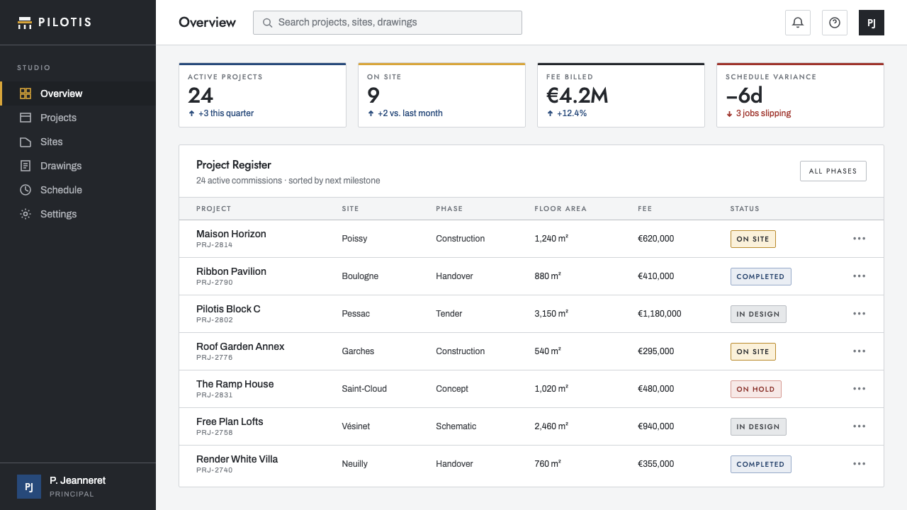
For web interfaces, this style is well suited to analytical dashboards, pricing pages, product overviews, and information-heavy services that benefit from authority and clarity. Build pages around a stable orthogonal grid, use broad white surfaces to separate sections, and allow navigation or metrics to run in horizontal bands. Controls should feel precise and planar. Panels should communicate grouping through borders, adjacency, and contrast instead of soft atmospheric elevation.
For editorial and marketing work, use the style to turn a narrative into an architectural promenade. A lead section can open with an expansive white field, later sections can shift through dark planes and horizontal image or text bands, and a single accent can mark the intended conversion point. The common mistake is to mistake white space for the style itself. A sparse page without pilotis rhythm, ribbon continuity, structural black, or deliberate color hierarchy is merely empty; Purist White must still make a disciplined argument.
Le Corbusier Purist White — FAQ
Is Le Corbusier Purist White simply a minimalist white interface?
No. Minimalism can remove elements without establishing a strong underlying order. Purist White depends on a specific architectural grammar: render-white planes, slate-black structure, orthogonal alignment, ribbon-window bands, pilotis rhythm, flat light, and rare primary emphasis. If white merely creates emptiness, the style has lost its argument. The important question is not how little is visible, but whether what remains expresses structure and movement.
How should primary color be used in this style?
Use it rarely and decisively. The source material describes a rare slap of Corbusier blue against extensive light, which is a useful model for all primary accents. Color should identify a meaningful action, selected state, key datum, or conceptual turn. It should not be distributed evenly across buttons, charts, labels, and decorative shapes. Its scarcity is what allows it to interrupt the white field with force.
Can the style use shadows, gradients, or glossy surfaces?
The source grammar favors flat, lit planes and is anti-decorative by conviction. Depth should therefore come from the relationship between surfaces, cropping, adjacency, overlap, and structural contrast rather than from atmospheric effects. Gloss, soft visual haze, and decorative gradients tend to make the interface feel like a styled object rather than an architectural proposition. Keep the light clear and the planes intelligible.
Which products benefit most from this visual language?
It is strongest where clarity, rationality, hierarchy, and a sense of considered construction support the product's purpose: dashboards, pricing experiences, product documentation, editorial systems, and presentation narratives are natural fits. It may be less suitable where the main promise is softness, ornament, sensory abundance, or informal intimacy. The style asks users to read structure, so it works best when structure is genuinely valuable.
How can a digital layout evoke the ramp and roof garden without copying a building?
Treat them as organizational ideas. A ramp becomes a gradual reading route that carries the user through a sequence of planes, headings, and revealed content. A roof garden becomes a final open zone: a generous, breathable area where summary, reflection, or action can sit above the denser structure below. The reference remains successful when it shapes experience, not when it becomes a literal illustration of architectural parts.
Related design styles
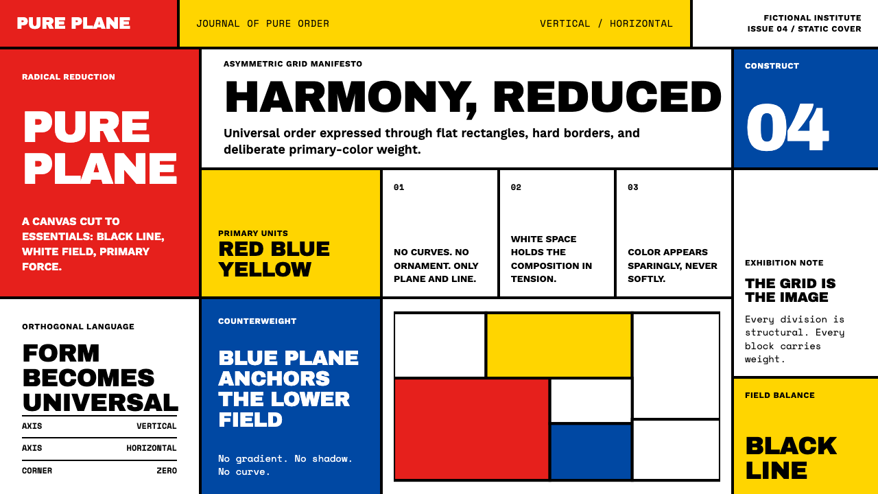 De StijlPrimary colors, locked in a black grid. Mondrian's compositions, in thick bor…
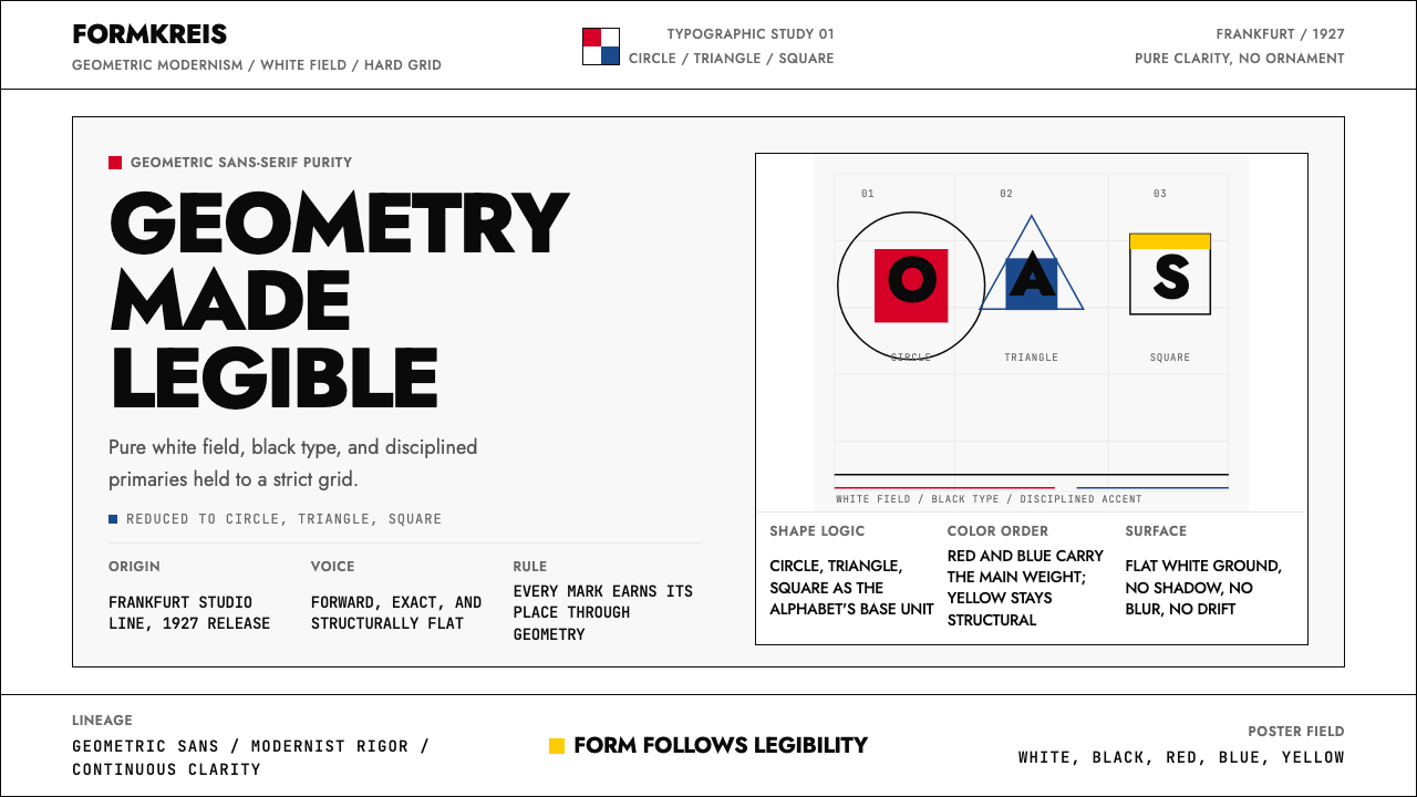 Futura Typeface (Renner, 1927)Geometry is legible. Black type and white fields, with red-blue-yellow anchor…
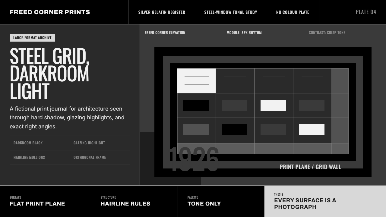 Dessau GrayscaleAustere monochrome authority. Darkroom black, glazing gray, and a steel-windo…
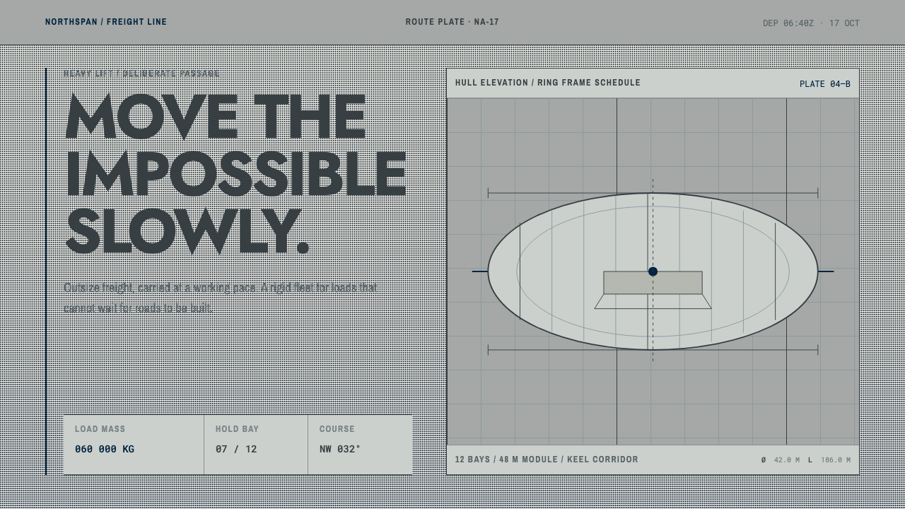 Hydrogen Airship FreightSlow freight is a capability. Matte aluminium grey, DIN grids, and a measured…
 Niemeyer Brasília CurvesEmptiness makes the monument. Concrete-white arcs cut across a saturated coba…
 Olympics Five Rings (1912)Ceremony without noise. Saturated five-ring color on pure white, locked to a…