What is Napier Art Deco Rebuild?
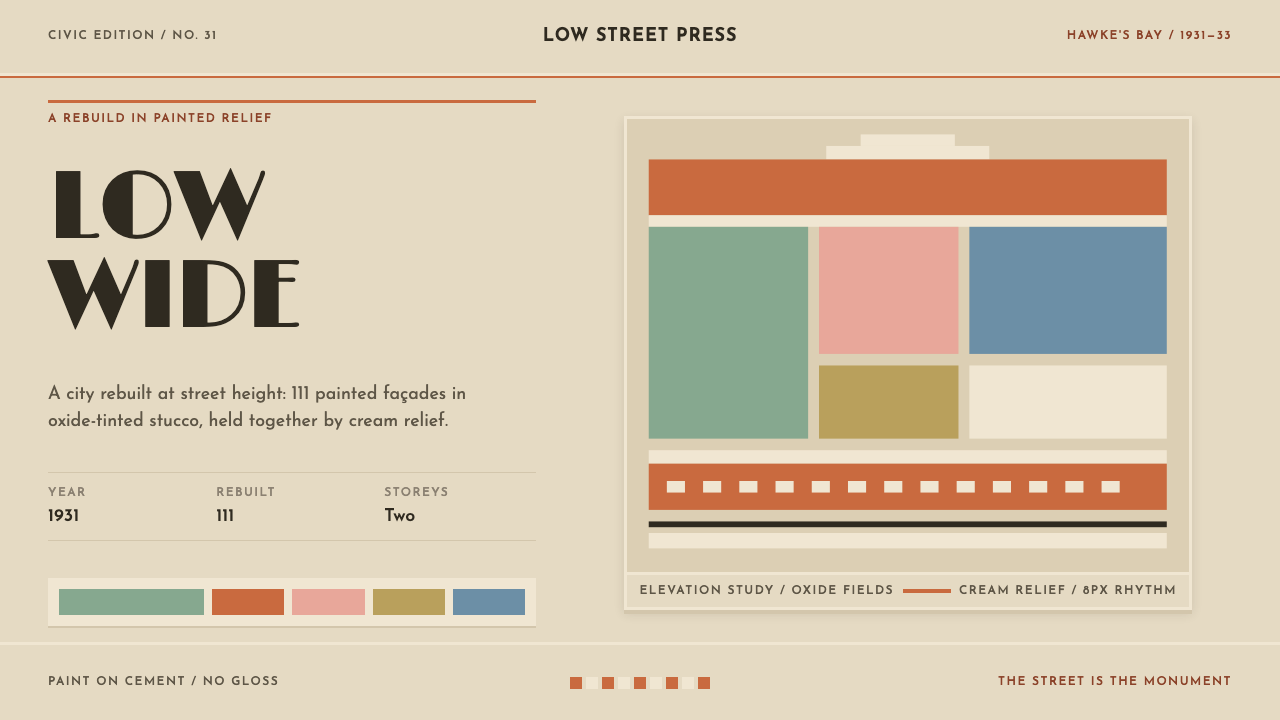
Napier's Art Deco is the style of a town rebuilt in two years — low, wide and painted in oxide colours, with cream relief and Māori koru curves pressed into the cornice.
Napier Art Deco Rebuild in brief
Napier Art Deco Rebuild takes its look from the centre of Napier, a town on the coast of Hawke's Bay in New Zealand. The earthquake of 3 February 1931 brought the town centre down on a Tuesday morning, and by 1933 it was back: 111 buildings, almost all of them in Art Deco, almost all of them two storeys. Nobody in Hawke's Bay wanted height again, and that memory is written into the proportions of the whole town.
This is Art Deco at street height. The better-known version of the style is vertical — setbacks, spires, towers reaching for the sky. Napier's is horizontal: wide fronts, low rooflines and ornament placed where a person walking past can see it. The result is a streetscape that feels friendly rather than imposing, and a design language that suits interfaces which need to feel substantial but not overbearing.
Visually, the surface is oxide-tinted cement stucco. Fields of biscuit and ochre carry panels of pink, green and powder-blue; cream relief ornament picks out the edges; and kowhaiwhai koru curves from Māori rafter painting are pressed into the cornice bands. The overall effect is low, wide and painted — and still standing.

Where does Napier Art Deco Rebuild come from?
The origin is a single morning. The Hawke's Bay earthquake struck on a Tuesday, 3 February 1931, and flattened the centre of Napier. The reconstruction ran from 1931 to 1933, and in two years 111 buildings went up. Because the town was rebuilt in one short campaign rather than piece by piece over decades, a whole commercial centre was designed in the same period and the same idiom, which is why it reads today as a single design statement rather than an accumulation.
The architects who made it are named in the sources: Louis Hay, E. A. Williams and the firm of Finch & Westerholm. They worked in the Art Deco of the early twentieth century — the sources give the broad era as 1900 to 1950 — but not in Art Deco alone. Spanish Mission and Stripped Classical are listed among the movements at work, and the mixture is visible in the street: Spanish Mission suggests the broad, painted stucco wall; Stripped Classical suggests ordered, restrained facades with the ornament pared back; Art Deco supplies geometric ornament and a sense of modernity.
The local note is the one that lifts the style out of the generic. According to the sources, the generation of architects around Louis Hay pressed koru curves from Māori kowhaiwhai rafter patterns into the cornice bands of Deco buildings. A koru is the spiral of an unfurling fern frond; kowhaiwhai are the painted patterns that run along the rafters of Māori meeting houses. Set on the same cornice as European Deco geometry, the two traditions sit side by side — a European geometry and a local curve on a single moulding.
Why the buildings stayed low is the other half of the story, and the source states it plainly: nobody in Hawke's Bay wanted height again. Colour is the third. The palette seen today is maintained by the Napier Art Deco Trust, and it is an echo of the original oxide pigments rather than a replica of them. That distinction matters for the design language: it is not frozen history but a living interpretation of a palette whose logic begins in the mineral pigments of the render.
What defines the Napier Art Deco Rebuild look?
Oxide Colour Fields
The large fields are earthy, mineral colours: biscuit and ochre, the tones of iron-oxide pigment mixed into cement stucco. They are warm, slightly chalky and sun-faded in character, never glossy. In a design these become the main grounds and section backgrounds, and they carry most of the identity without any ornament at all.
Pastel Panels
Pink, green and powder-blue are used as inset panels set into the biscuit and ochre fields. They are accents with edges, not grounds: each sits inside a frame, like a panel in a facade, and the colours are soft and slightly dusty rather than saturated. Used this way they give the surface a confectionery lightness while keeping it grounded.
Cream Relief Ornament
Ornament is cream-coloured and raised, standing slightly off the coloured ground so that real sunlight draws its shadows. This is relief, not a pattern printed flat: an edge that catches light on one side. In flat interface terms, it asks for pale frames, borders and motifs on the coloured fields, with only the gentlest shadow to suggest that they stand proud.
Low and Wide Proportion
The composition is horizontal. Buildings are two storeys, fronts are wide, and ornament runs along the length of the frontage rather than up its height. In layouts this means broad bands, wide content blocks and a generous horizontal rhythm. Tall, narrow stacks and strongly vertical hero elements work against the language.
Kowhaiwhai Koru Curves
Spiral koru forms are pressed into the cornice band, where they run as a repeating frieze. They are the only organic curve in an otherwise geometric vocabulary, and they are placed with discipline — in the band at the top, as a rhythm, not scattered. They are a cultural motif of the place and should be treated as such.
Flat, Painted Plane
Surfaces are matte and flat: stucco with a fine, slightly rough grain, painted in single colours. There are no gradients, no glass-like gloss and no heavy drop shadows. Depth comes only from relief, from the change between one colour field and the next, and from the line where a cornice meets the sky.
The Cornice as Signature
The top edge of each facade is where the character concentrates. A cornice band, a stepped or curled moulding finishes the composition, and the eye reads the rest of the wall below it. In a page, the equivalent is a strongly resolved header or section edge with the ornament on the line, and a calm field below.

Who shaped Napier Art Deco Rebuild?
The architect most closely associated in the sources with pressing koru curves into Art Deco cornices; the source speaks of his generation of architects. His name stands for the Napier street as an act of design: a European modern idiom adapted to a local pattern language.
Named among the architects of the rebuild. The rebuild was the work of several practices working in compatible idioms at the same time, which is why the town reads as coherent; his name is a reminder that the style is a collective achievement rather than one authorial voice.
An architectural practice listed in the sources among the designers of the new Napier. As a firm rather than an individual, it stands for the working method of the period: offices producing, quickly, buildings that shared a vocabulary of stucco, relief and geometry.
The body that maintains the town's palette today. Its role in the style is that of a custodian: the colours seen now answer the original oxide pigments rather than replicate them, and the Trust's upkeep is the reason a design language from the early 1930s still reads as a living streetscape.
How do you use Napier Art Deco Rebuild today?
Napier Art Deco Rebuild is a friendly, grounded cousin of the more glamorous Deco. It suits work that wants character and optimism without the cold sheen of luxury or the sharpness of a technical aesthetic.
For slides, a cover can use a large biscuit or ochre field with one pastel panel holding the title, and a cream relief frame or a cornice band across the top; the horizontal band is the identity. Content slides use wide, low blocks: a title band, then a wide row of content in cream-edged panels. Data slides are well served by horizontal bars, with the pastel colours assigned to categories against the biscuit ground; avoid tall, narrow column charts as the hero.
On the web, the style suits hospitality, boutique retail, regional tourism, heritage and cultural institutions, architecture and real-estate sites, and local-government pages. Build with wide sections, a strong horizontal header band carrying the ornament, and pastel inset cards on warm grounds. Dashboards work if kept calm: panels as insets, cream borders, and a restrained use of the pastel set as a status code. Pricing tiers can be three wide inset panels in different pastels, each with a cream relief frame.
For editorial and marketing, it fits travel guides, festival and event posters, walking-tour maps, heritage trails, restaurant and café identities, and architecture publishing. Posters can be strongly horizontal, with an ornament band along the top. Photography of low-rise streets and painted facades is native to the style; images should be warm and sunlit.
The common mistakes are these. Reaching for gold and black, the colours of the more glamorous Deco, which belong to a different world. Making the layout tall and narrow. Sprinkling koru curves across a page as a decorative pattern, when they belong in one band at the top, as they do on the buildings. And saturating the pastels until they turn to candy; the tones should stay dusty and sun-worn.

Napier Art Deco Rebuild — FAQ
How is Napier Art Deco different from the Art Deco of skyscrapers and cinemas?
It is Art Deco at street height. Napier's buildings are almost all two storeys, because nobody in Hawke's Bay wanted height again after the 1931 earthquake. The palette is earthy oxide colour with pastel panels and cream relief rather than gold and black, and the ornament runs horizontally along cornices. It keeps Deco's geometry and sense of modernity but loses its vertical ambition.
Why are the colours earthy and soft rather than gold and black?
Because the palette begins in the material. The buildings are oxide-tinted cement stucco, so biscuit and ochre come from mineral pigment, and the pink, green and powder-blue panels are painted into the same surface. The colours seen on the street today are maintained by the Napier Art Deco Trust as an echo of the original pigments, not a copy. The result is warm and chalky, never glossy.
Is it appropriate to use the koru curves?
With care. The koru and kowhaiwhai are Māori motifs, and the original buildings used them in a disciplined way, in a single band along the cornice. Treat them as a cultural pattern rather than generic decoration: keep them in one place, do not scatter them as wallpaper, and consider whether the project has any real connection to Aotearoa New Zealand. A geometric cornice alone still carries the style.
Does it work in a dark theme?
It is a sunlit style, and the light ground is where it belongs: the cream relief reads as raised only against a lighter colour field. A dark variant is possible if it stays earthy, using a deep oxide brown for the ground with cream relief and a restrained single pastel. Avoid black, which pulls the palette toward the glamour Deco this style deliberately avoids.
Where does the style struggle?
It struggles where sleekness, extreme precision or an austere technical mood is wanted: developer tools, security products and high-density data terminals. It also resists tall, narrow, strongly vertical layouts. It is strongest where warmth, local character and a calm, optimistic confidence are the point.
Related design styles
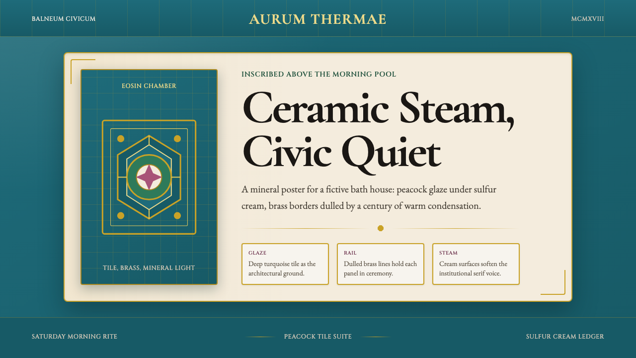 Budapest Thermal Bath Art DecoCivic steam, made ceremonial. Peacock turquoise, brass borders, and Garamond…
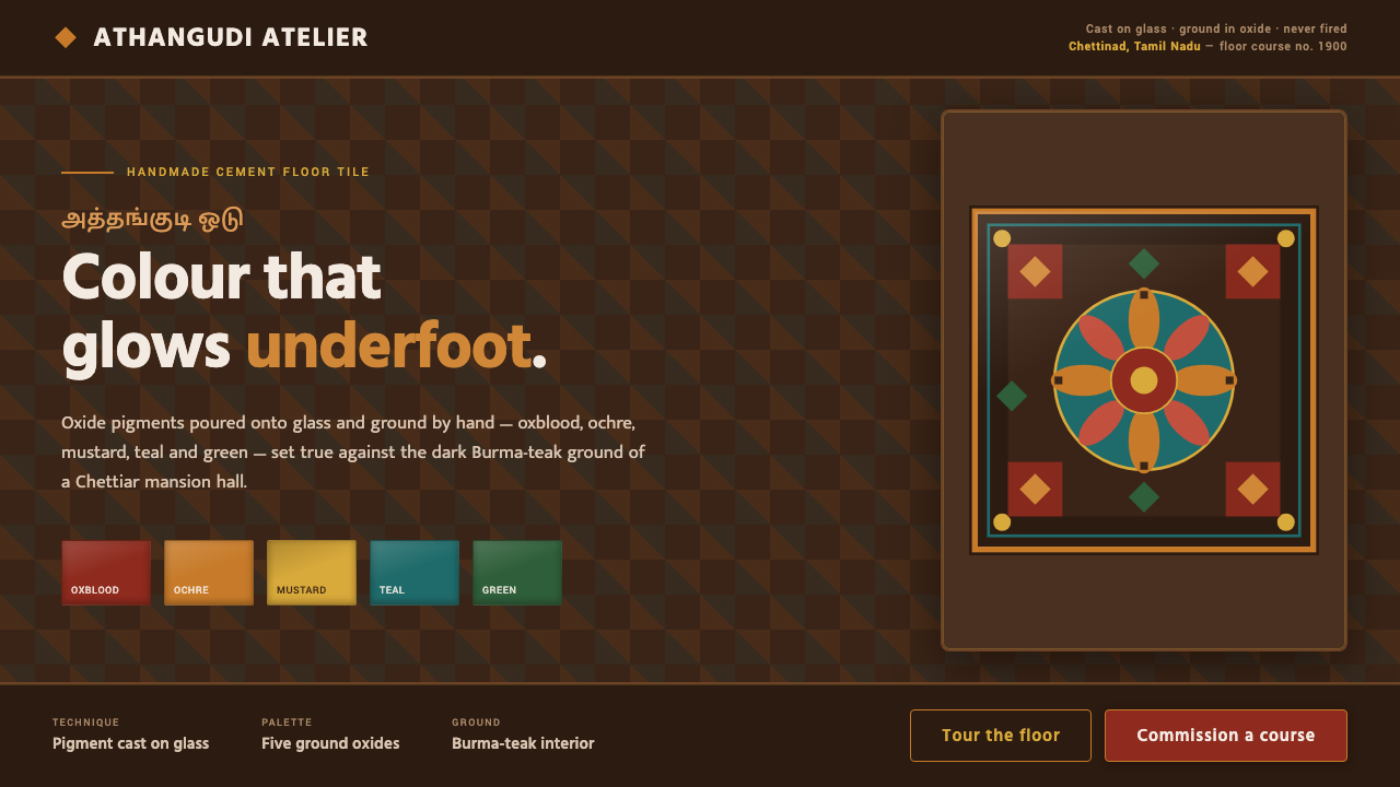 Chettinad Athangudi TilesColour that glows underfoot. Five ground-oxide tones on dark teak in bordered…
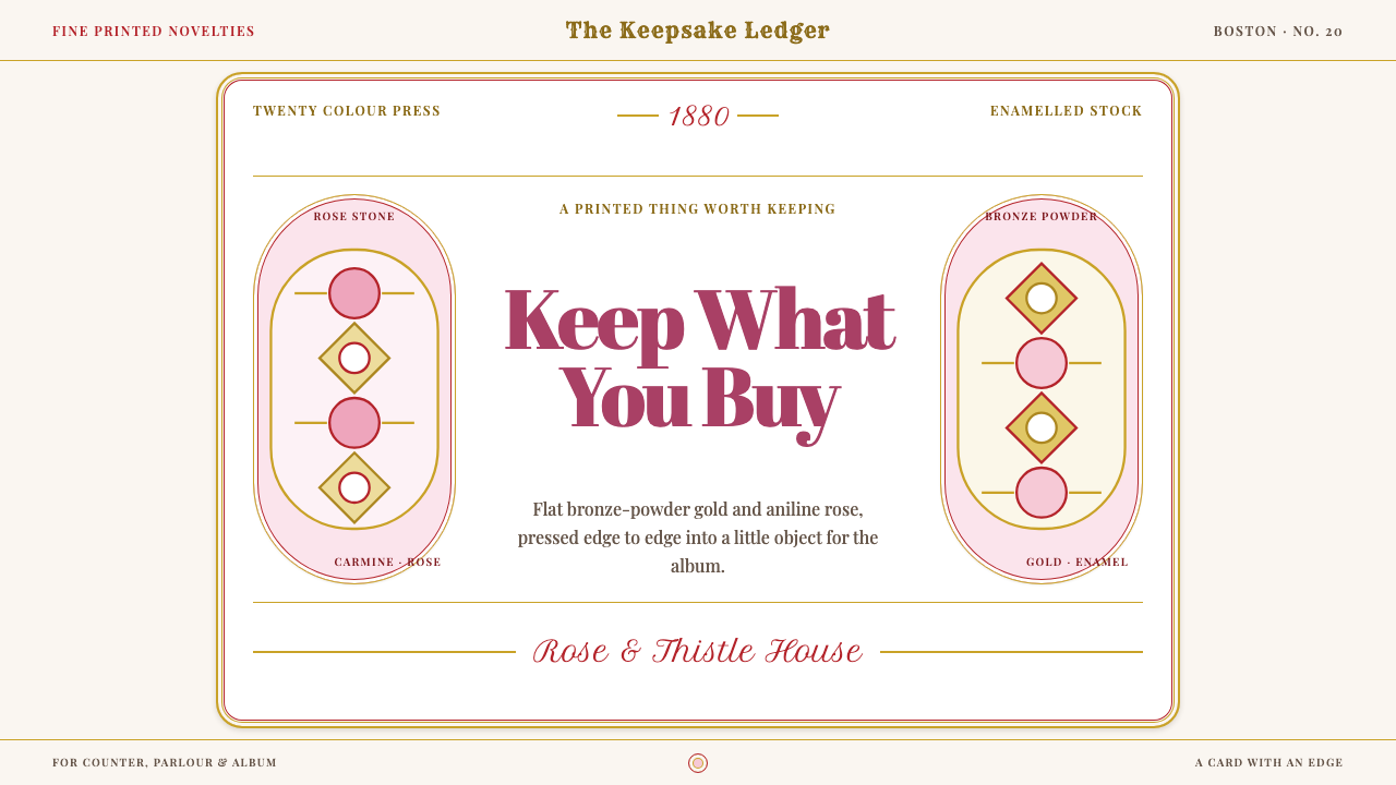 Victorian Chromo Trade CardAdvertising made collectible. Flat bronze gold and aniline rose fill an ename…
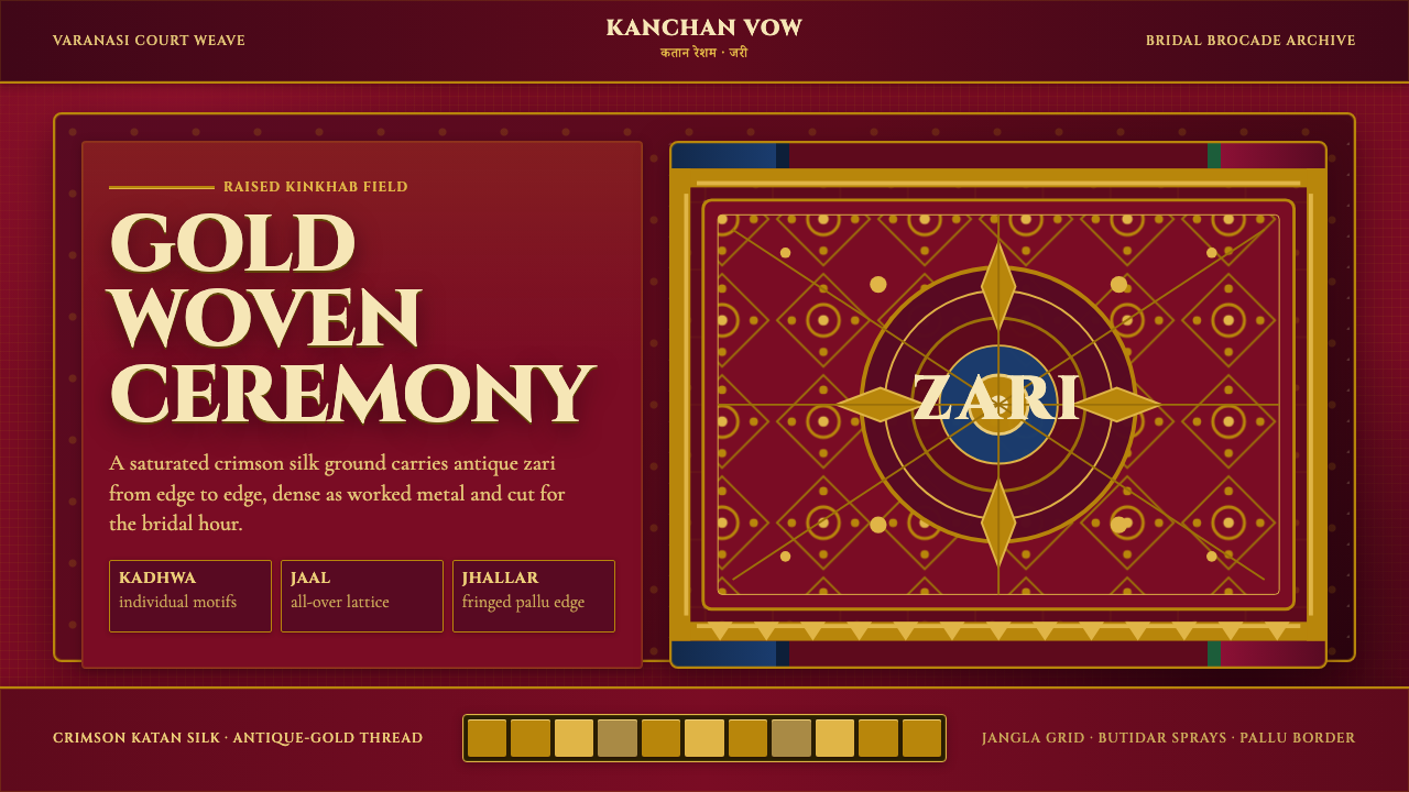 Banarasi Brocade SareeBridal maximalism, woven dense. Crimson silk grid carries raised antique-gold…
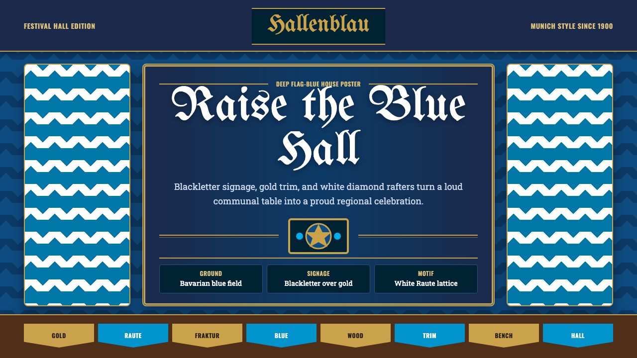 Bavarian Beer HallHearty regional ceremony. Deep flag-blue, Fraktur signage, gold trim, and whi…
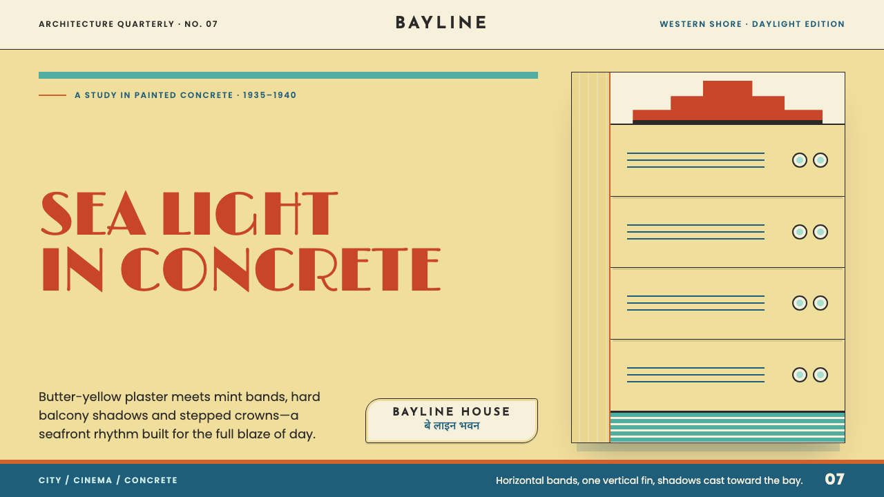 Bombay Marine Drive DecoDeco built for daylight. Butter-yellow plaster, mint bands and stepped crowns…