What is Nagani Book Club?
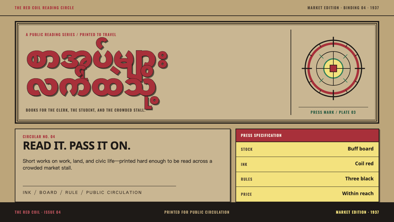
Nagani printed urgency in rules and ink — buff board, fat outlined Burmese titles boxed in triple frames, and a solid black bar at the foot carrying the imprint in white.
Nagani Book Club in brief
Nagani Book Club — နဂါးနီ, 'Red Dragon' — was a Burmese-language publishing enterprise that operated from a stall in Scott Market, Rangoon, from November 1937 until the Japanese occupation closed it in 1941. In under four years it put somewhere between seventy and a hundred Burmese titles into readers' hands, printed on cheap kraft board and priced so that a clerk or a student could afford one, and it also issued a monthly newsletter. This style takes its entire look from those covers.
The look is what a jobbing press could do fast. Nothing about it is a designer's flourish; it is the visible result of a small printing operation working to a deadline and a budget, with a heavy hand on the ink and a vocabulary of rules and bars that any typesetter's case could supply. The introduction puts the principle in one line: nothing is decorative that is not also structural.
Visually, the covers are unmistakable. The wrappers are buff, the Burmese titles are fat and outlined and boxed in triple rules, the imprint is knocked out white from a solid black bar at the foot, and a coiled, flaming naga is stamped in orange-red. Ink coverage is heavy and uneven, and the corners carry the marks of a tropical climate. The cover argues at a glance, in the tone of a pamphlet that wants to be read today.

Where does Nagani Book Club come from?
The club began in Rangoon in November 1937, in a stall in Scott Market. Its founders were U Nu and Tun Aye, and they ran it on the model of the Left Book Club in London: a mechanism for putting inexpensive books of political and general education in front of readers who would otherwise not have had them. The sources place it within what they call Burmese anti-colonial publishing and the Thakin-era translation libraries — an era of Burmese-language reading projects associated with the nationalist Thakin movement, where translated and original books were published for ordinary readers rather than for collectors.
The name itself carries the programme. Nagani joins the naga — the coiled serpent-dragon of Burmese tradition — to the word for red, and the emblem makes the name visible: a coiled, flaming naga stamped in orange-red, the single colour on an otherwise black-and-buff cover. A stamp can be applied to a cover in seconds, which suits a press that needed a recognisable identity quickly.
Economy shaped everything else. The books were sold from a market stall to clerks and students, so the price had to be low, which meant cheap kraft board for the wrappers and printing done fast. Between November 1937 and the Japanese occupation in 1941, the club issued seventy to a hundred titles — enough for a recognisable house look to form. The covers had to announce a title and a publisher across a stall, in one or two inks, on a surface that took ink unevenly. Fat outlined type, heavy rules and a black bar are the answers to that problem.
The sources name three reference points: U Nu and Tun Aye as founders, and the scholar Hans-Bernd Zöllner among the figures through whom the club's history is approached. The club's active life was short and its world did not survive the occupation, but its covers remain a recognisable look: anti-colonial print in the cheapest possible form, where urgency is carried by structure — rules, bars and boxes — rather than by ornament.
What defines the Nagani Book Club look?
Buff Board Ground
The ground is the colour of kraft board: a warm, yellowish tan, flat and unglamorous. It is the cheapest stock a market-stall publisher could use, and the style treats it as the identity rather than an apology. Everything else sits on it in black and a single orange-red; white appears only where ink is knocked out of the black bar.
Fat Outlined Burmese Titles
Titles are set very large and very heavy, and each letter is outlined, so that the round, looping forms of Burmese script read as solid shapes with a visible edge. The outline does two jobs: it adds weight where a single dark ink would otherwise thin out, and it keeps the script legible when the ink spreads unevenly. The title is the loudest thing on the cover by a wide margin.
Triple Rule Frame
The title block is boxed in three rules, which pen it in like a notice board. The frame is not a decorative border; it is a container that stops the heavy title from bleeding into the rest of the page and gives the cover its poster-like authority. The repetition of three lines is the only ornament in the system, and it is still structural.
The Black Imprint Bar
At the foot sits a solid black bar, and the imprint — the club's name — is knocked out of it in white. This anchors the composition like a signature line and gives the cover a heavy base. Reversed type in a black bar is also the cheapest way to make small text stand out, which is why it recurs: structure and economy agree.
The Red Naga Stamp
A coiled, flaming naga is stamped in orange-red, the only colour beyond black and buff. It reads as a stamped impression, slightly independent of the layout beneath it. One accent, one place, one meaning: the emblem is the club's signature, and it is never repeated as a pattern.
Heavy, Uneven Ink
Ink lies heavily on the board and does not cover evenly: dense in places, thin in others, with the grain of the stock showing through the solids. In the corners the board carries tropical foxing. These marks are evidence of how the object was made and kept, so they sit in the paper and the ink and never over the lettering. A style that adds the mould for effect has missed the point.
Hierarchy at a Glance
Everything on the cover is ranked in one look: the title first, the frame second, the black bar third, the naga last. There are no subtle tones to decode. The effect is urgency — a cover that argues for the book before the reader has picked it up — and it comes from contrast of weight and position, not from decoration.

Who shaped Nagani Book Club?
Co-founder of the club, known in the nationalist circles of the period as Thakin Nu. Together with Tun Aye he ran Nagani on the London model, and the programme the covers advertise — cheap books, plainly packaged, aimed at clerks and students — reflects that founding idea more than any individual design decision.
Named alongside U Nu as co-founder in November 1937. Because the covers are the product of a working press rather than an art director, the founders' contribution to the look is best understood as the brief: low prices, fast turnaround and a recognisable emblem. The design followed from the brief.
A scholar of Burma whose name appears among the reference figures for the club. Where the founders are the makers, he stands for the later reader: someone who has examined the club as a historical subject, which is how an ephemeral market-stall press stays visible long after it closed.
The London enterprise after which Nagani was modelled. What the Burmese club took from it was the model — books of political and general education offered cheaply to a reading public — and the visual language here is its own: Burmese script, a naga and a market stall's materials.
How do you use Nagani Book Club today?
Nagani is a style for work that has to be read quickly and taken seriously: campaigns, manifestos, launches with a point of view. Its principle — urgency built from structure — transfers to any context in which a message needs to land before the reader has decided to pay attention.
For slides, a cover can be a large outlined title in a boxed triple-rule frame on a buff ground, with the presenter's or organisation's name reversed out of a black bar at the foot and a single orange-red mark in one corner. Content slides keep the frame idea, using a single boxed headline and plain body text, with the black bar repeated at the foot as a running footer. Data slides do well in black and buff with the orange-red reserved for the one number the audience must remember; bars and columns should be heavy, flat and outlined rather than shaded.
On the web, the style suits campaign sites, petition and advocacy pages, event pages, newsletters and landing pages with a single argument. A hero can use a boxed, heavy headline on a buff field; the footer or a sticky bar can be a solid black band with reversed text; calls to action should be plain rectangles with strong outlines rather than soft pills. For dashboards and pricing it works best in small doses: a heavy title block for each section and a restrained use of the accent for the highlighted tier or alert.
For editorial and marketing work it fits pamphlets, zines, series covers, book jackets, reading-list posters and publisher identities, especially for non-fiction and translation lists. A series can be unified by keeping the frame, the bar and the emblem fixed and changing only the title. Printed texture can come from stock and ink behaviour, so long as it stays subtle and consistent.
The common mistake is to treat the style as a distressed vintage filter: piling on stains, scratches and fake mould, or tinting everything sepia. The wear on the original is a by-product of cheap stock and a humid climate, not a decoration. Another is to use the orange-red everywhere; the emblem works because it is the only colour on the page. A third is to set thin type in the title block — the outlined, heavy title is the heart of the look, and a light face dissolves the frame around it.

Nagani Book Club — FAQ
What does Nagani mean?
Nagani, written နဂါးနီ in Burmese, means Red Dragon. The name joins the naga — a coiled serpent-dragon from Burmese tradition — to the word for red, and the club's emblem is a coiled, flaming naga stamped in orange-red. The club operated from a stall in Scott Market, Rangoon, from November 1937 until the Japanese occupation closed it in 1941.
Is this a political style?
Its origin is. The club belongs to Burmese anti-colonial publishing and to the Thakin-era translation libraries, and it was modelled on a left-leaning book club in London. The look does not require a political message, but borrowed for something trivial it can read as glib. It works best on work that has an argument to make, and a short credit to the original is a good habit.
Can I use it with Latin type?
Yes, with care. The heavy outlined title was made for Burmese script, whose round looping forms carry an outline well. In Latin, choose a heavy, sturdy letterform and keep the outline; avoid thin or delicate faces, which dissolve inside the frame. Where real Burmese text is present, set it in a typeface that supports the script properly rather than imitating it.
How much texture should I add?
Very little. Uneven ink coverage and foxing in the corners are authentic, but they belong to the paper and the edges, never to the lettering. Keep the text clean enough to read at a glance, and either apply texture consistently across a whole piece or leave it out. A surface that looks randomly dirty is closer to a filter than to a press.
Which colours belong in this style?
Three: the buff of the board, black for type, rules and the imprint bar, and a single orange-red for the emblem or one key accent. White appears only where type is knocked out of the black bar. Resist adding a fourth colour; the cover argues at a glance precisely because there is so little to decode.
Related design styles
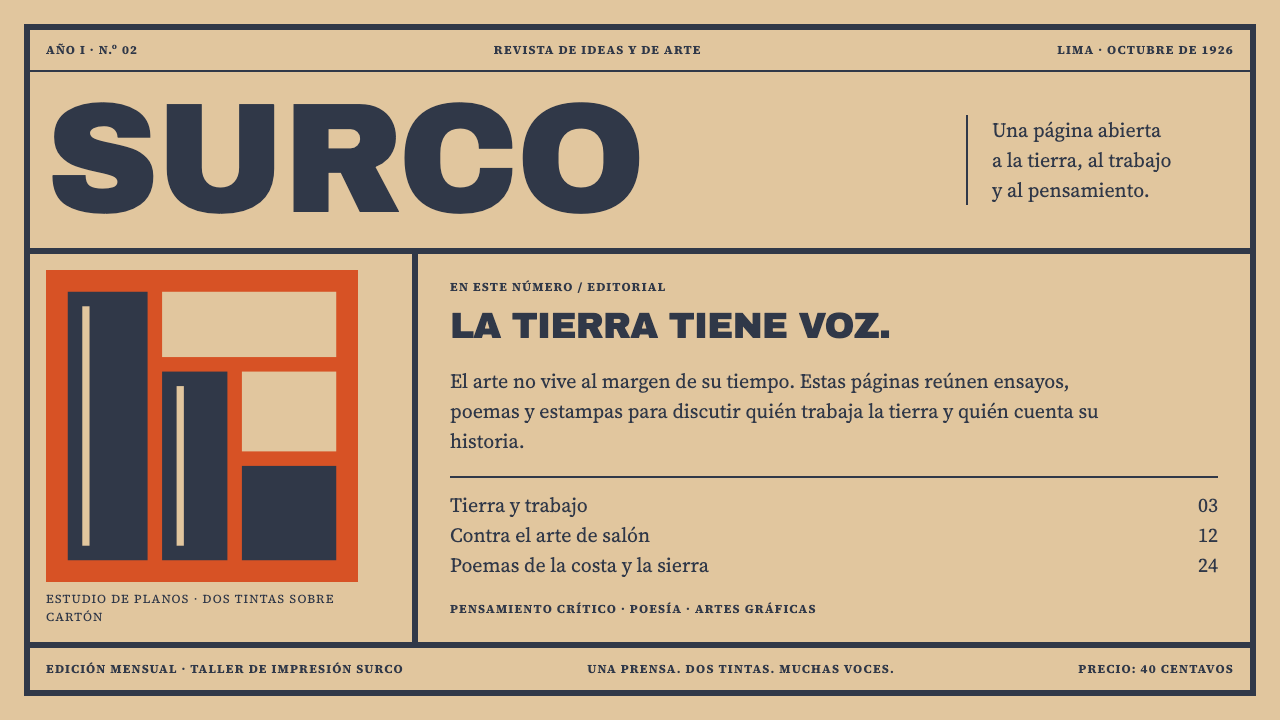 Amauta MagazinePrint with conviction. Vermilion blocks and heavy slate-navy type bite into b…
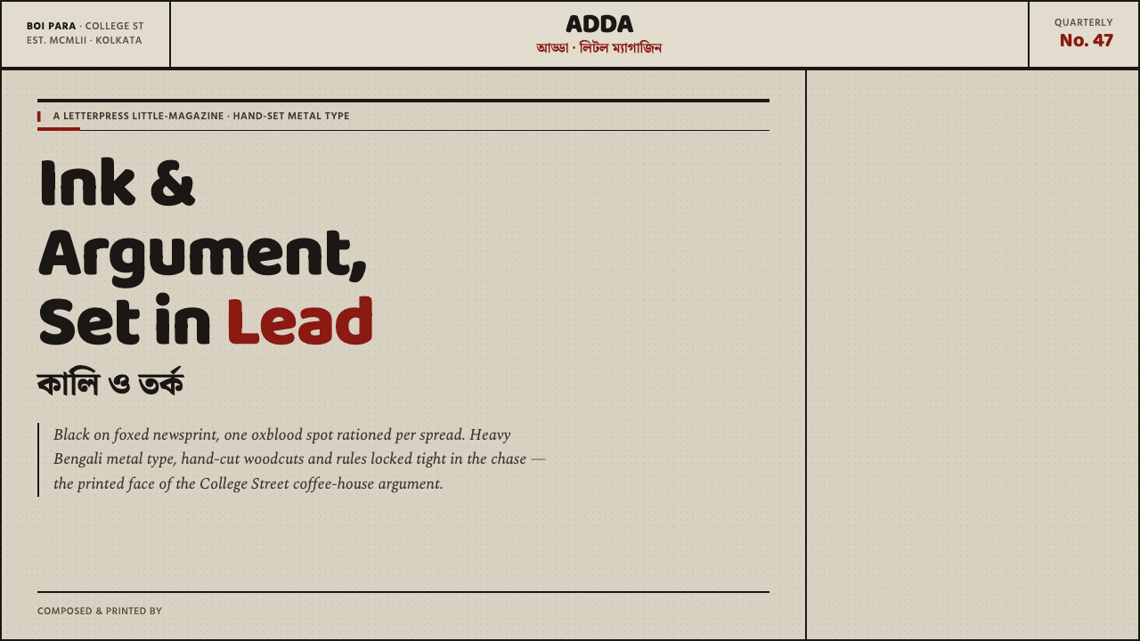 Kolkata Adda LetterpressAustere print, alive with argument. Baloo Bengali type and oxblood rules bite…
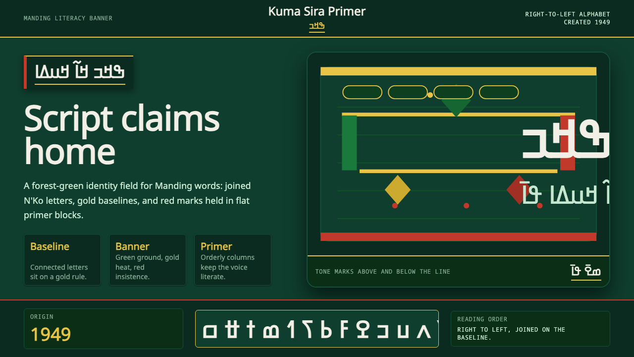 N'Ko ScriptIdentity writes itself. Forest green and gold baselines anchor joined N'Ko le…
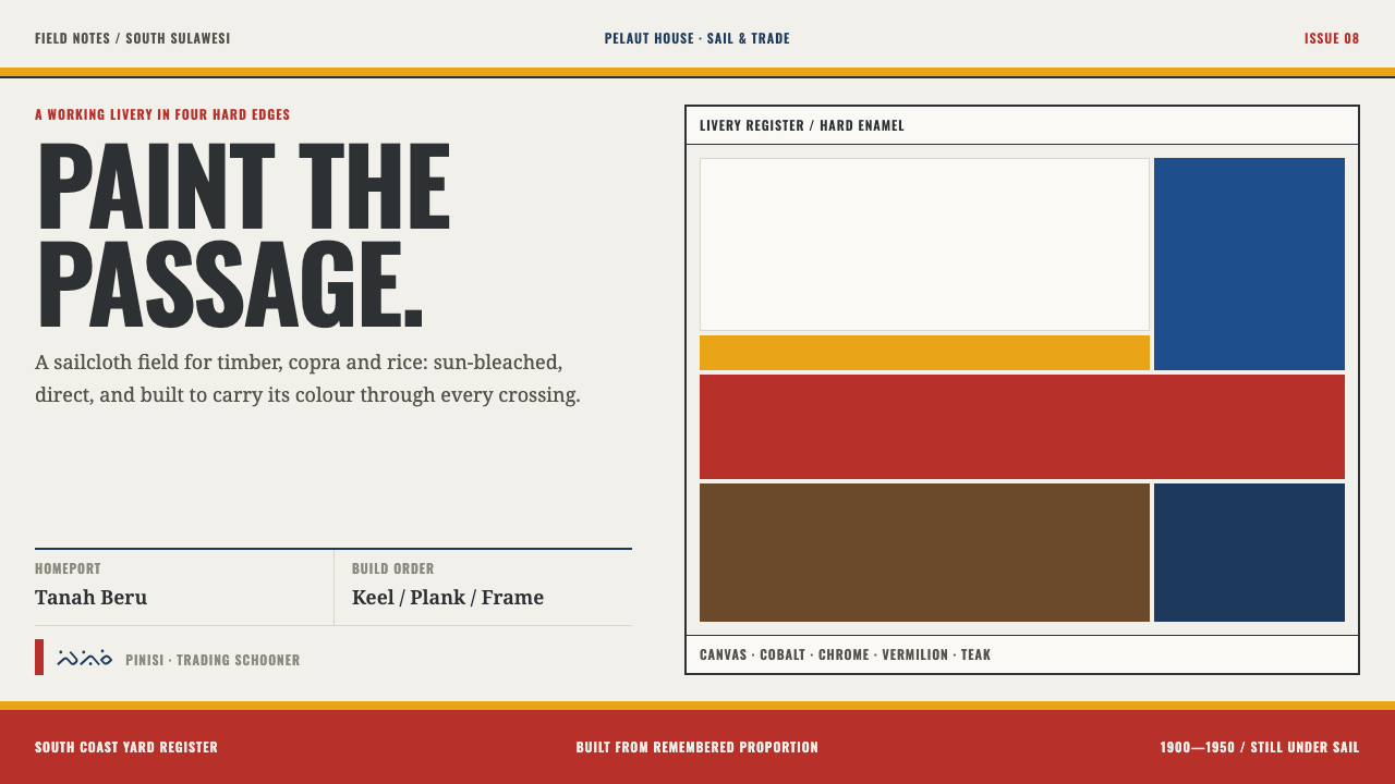 Bugis PinisiSailcloth made resolute. Vermilion, chrome and cobalt bands cut a warm white…
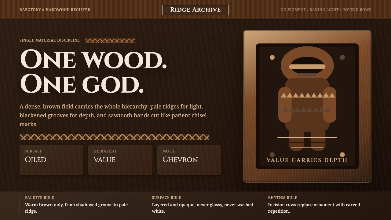 Cook Islands Tangaroa CarvingOne-material gravity. Warm browns, sawtooth rows, and raking light carve hier…
 Orwell 1984 (Ministry Propaganda)Authority never blinks. Monumental black type and rationed red ink command a…