What is Mysore Ganjifa Playing Cards?
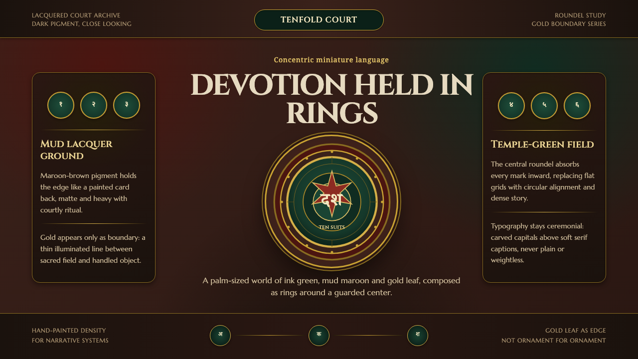
Mysore Ganjifa turns a playing card into a held shrine—dark green devotion enclosed by mud-maroon lacquer, gold boundaries, and the quiet authority of the circle.
Mysore Ganjifa Playing Cards in brief
Mysore Ganjifa is a courtly playing-card tradition from eighteenth-century Mysore in South India. Painters worked in miniature to create circular cards for the Dashavatara game, with each disc devoted to one avatar of Vishnu. The result is not merely a decorated game object. Each card operates as a compact sacred image, a small world whose subject is held within a disciplined field of color, line, and enclosure.
Its visual language begins with a dark ink-green center, surrounded by gold line-work and contained within a deep maroon-brown border made from local mud pigment. The green field carries the sense of a temple interior or sacred ground; the gold marks a threshold; the earth-colored border returns the image to material substance. The palette is dark, mineral, and ceremonial rather than bright or decorative.
The central principle is concentric containment. Devotion sits inside the circular field, the field sits inside a gold boundary, and the boundary sits inside the lacquered border. This sequence gives the cards their unusual calm and intensity. Nothing is allowed to disperse. Every color, line, and figure is gathered toward the center, creating a design language that feels intimate in the hand and authoritative at close range.

Where does Mysore Ganjifa Playing Cards come from?
The tradition belongs to the eighteenth-century Wadiyar court of Mysore, in the region now known as Karnataka in South India. Its setting matters because the cards combine the intimacy of a hand-held object with the refinement of courtly miniature painting. They are small enough to be handled as playing cards, yet composed with the concentration of an illuminated image.
Mysore court painters produced the cards through a miniature practice that treated the circular format as a complete visual world. The disc was not an incidental shape surrounding an illustration. It established the field from the beginning, asking the painter to organize the sacred figure, the surrounding color, and the enclosing line as parts of one contained composition.
The subject was shaped by Dashavatara Ganjifa, the courtly form of the game in which the cards are devoted to Vishnu and his avatars. This devotional structure gives the deck its internal logic. Each card can carry a distinct sacred subject, but every card belongs to the same family because the subject is presented through the same circular architecture and the same disciplined relationship between center, boundary, and border.
The material character of the style comes directly through its pigments and mark-making. Ground earth pigments created the mud-red-brown border, temple-green ink filled the sacred field, and gold line-work separated the divine figure from the material world around it. The result is a visual system in which color is not a surface choice added after composition. Color establishes spiritual location, material presence, and the boundary that lets the image remain concentrated.
What defines the Mysore Ganjifa Playing Cards look?
Concentric Containment
The defining structure is a sequence of enclosures: sacred image, green field, gold boundary, and mud-maroon border. Each ring creates another level of attention without turning the composition into ornament. The eye is guided inward, and the card feels complete because nothing needs to escape the circle.
Ink-Green Sacred Field
The central green is not a casual accent. It establishes the sacred field in which the avatar appears. Its darkness gives the figure visual gravity, while its ink-like character keeps the image tied to the hand-painted surface. Green should feel deep, still, and enveloping rather than fresh or playful.
Mud-Maroon Materiality
The outer border carries the character of ground earth pigment and lacquered mud-red brown. It provides a material counterweight to the sacred green and prevents the card from feeling weightless or purely symbolic. This border should read as dense, earthen, and quietly warm.
Gold as Boundary
Gold is used as a boundary rather than a general embellishment. Its line separates the divine figure from the material field, making the threshold visible. The effect is precise and ceremonial: gold does not flood the composition, but appears where distinction and reverence need to be made clear.
Circular Iconography
The circular card is both container and meaning-bearing form. It removes the directional certainty of a rectangular page and replaces it with a centered, inward-looking composition. Every surrounding element must acknowledge the circle, so the design feels balanced through enclosure rather than through a conventional page grid.
Miniature Illumination
The scale invites concentration. A small surface receives careful color placement, fine boundary work, and a subject treated as worthy of sustained looking. The style is intimate rather than expansive: detail is not scattered across a broad field, but concentrated so that the card rewards close attention.
Dark Courtly Atmosphere
The overall mood is dark, composed, and ceremonial. Its richness comes from pigment depth and controlled contrast, not from a crowded range of effects. The visual voice should feel collected and formal, allowing the green, maroon, and gold to establish atmosphere through restraint.

Who shaped Mysore Ganjifa Playing Cards?
The Wadiyar court painters are the makers who translated courtly Dashavatara Ganjifa into a disciplined visual language. Their contribution lies in treating every circular card as a complete miniature world, where sacred subject, pigment, gold line-work, and enclosing border remain inseparable. They represent the courtly refinement and focused handcraft at the center of the style.
The Ganjifa card-painting families carry the practice as a living making tradition rather than an isolated decorative motif. Their role is expressed through continuity of craft: the circular format remains usable as a card, while the visual treatment preserves the concentrated relationship between sacred field, gold boundary, and earth-colored border.
Vishnu and his avatars provide the devotional subjects around which the cards are organized. They are not placed into a neutral decorative system; the entire design exists to contain and honor the sacred figure. The central field, boundary, and border therefore function as a visual act of devotion as much as a system of composition.
How do you use Mysore Ganjifa Playing Cards today?
For presentation slides, the style is strongest when the cover behaves like a single card: a dark field, a centered subject, a gold boundary, and a deep earth-colored surround. Content slides should preserve that logic rather than copying the entire palette everywhere. Give each page one contained visual field, keep headings and body copy subordinate to the central image, and use data slides as nested diagrams in which the main insight sits inside a clearly defined boundary.
For web interfaces, Mysore Ganjifa suits dashboards and pricing pages that need a sense of depth, ritual, and deliberate hierarchy. A dark ink-green surface can hold the primary content area, maroon-brown can define panels or surrounding structure, and gold can identify active states, thresholds, or essential distinctions. Cards should feel enclosed rather than floating. Controls and labels should be quiet, so the boundary system carries the visual organization.
For editorial and marketing work, the style supports stories about craft, culture, heritage, material process, and considered luxury. Use a centered feature image or emblematic subject within a dark field, then let the surrounding maroon-brown frame create a sense of objecthood. Gold rules can mark transitions between sections or distinguish captions from the main narrative. Marketing compositions should feel held and intentional, not lavish through accumulation.
For a broader identity system, the most transferable idea is not the literal playing-card illustration but the relationship between center and enclosure. A product mark, collection cover, campaign tile, or information panel can establish one meaningful focal point and surround it with progressively quieter boundaries. This creates recognition through structure: the audience learns that important content is protected, centered, and materially framed.
The common mistake is to treat the style as a generic dark theme with green, brown, and gold applied to unrelated components. That approach keeps the colors but loses the design language. Avoid scattered metallic accents, excessive ornament, and multiple competing focal points. The green should establish a sacred or primary field, the maroon should provide grounded containment, and the gold should appear only where a boundary or distinction truly matters.

Mysore Ganjifa Playing Cards — FAQ
What makes Mysore Ganjifa different from a generic dark green and gold style?
Its identity comes from containment, not from the palette alone. The dark green is a central sacred field, the gold is a boundary, and the mud-maroon border returns the image to earth and material substance. If those roles are not preserved, the result may look rich but will no longer express the visual logic of Mysore Ganjifa.
Why is the circular format so important?
The circle makes the image feel complete and inward-looking. It removes the usual directional cues of a rectangular page and asks every element to acknowledge the center and the surrounding boundary. Because the cards are circular playing cards, the form is also part of the object itself, not merely a frame applied to an illustration.
How should gold be used in a contemporary application?
Gold should mark distinction, threshold, or reverence. It works best as a controlled line or boundary that separates an important field from its surroundings. Using it across every label, panel, and ornament weakens its meaning. The style depends on gold remaining selective enough to make the protected subject feel significant.
Can the style work without depicting Vishnu or an avatar?
Yes, but the application should preserve the devotional structure rather than borrow sacred imagery casually. A contemporary subject can occupy the central field, provided it is treated as the primary focus and enclosed through deliberate rings, boundary work, and a grounded outer frame. The important transfer is the relationship between subject, containment, and material atmosphere.
What should be avoided when adapting Mysore Ganjifa?
Avoid treating every surface as equally important. The style needs a hierarchy between sacred center, gold threshold, and earth-colored surround. It also loses force when ornament becomes more prominent than the contained subject, when the palette becomes bright and casual, or when the circular structure is replaced by unrelated panels. Restraint is what allows the small image to feel consecrated.
Related design styles
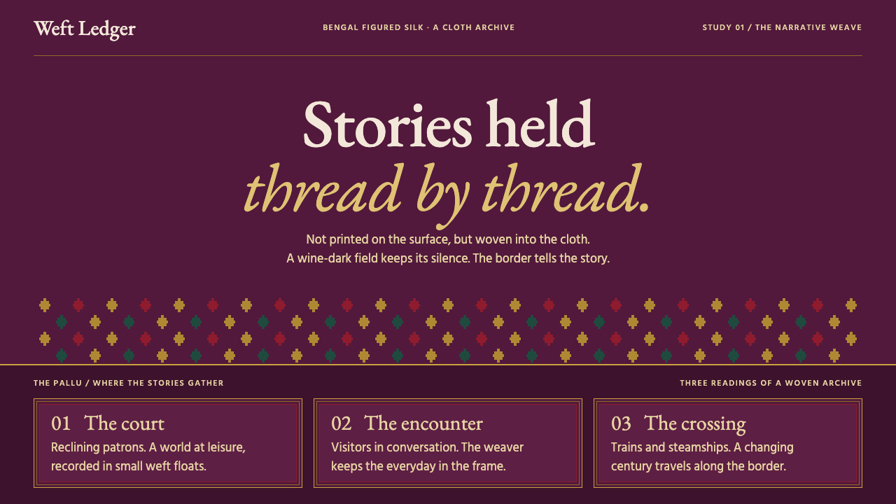 Baluchari SareeStories woven, never printed. Wine silk, stepped motifs and gold frames hold…
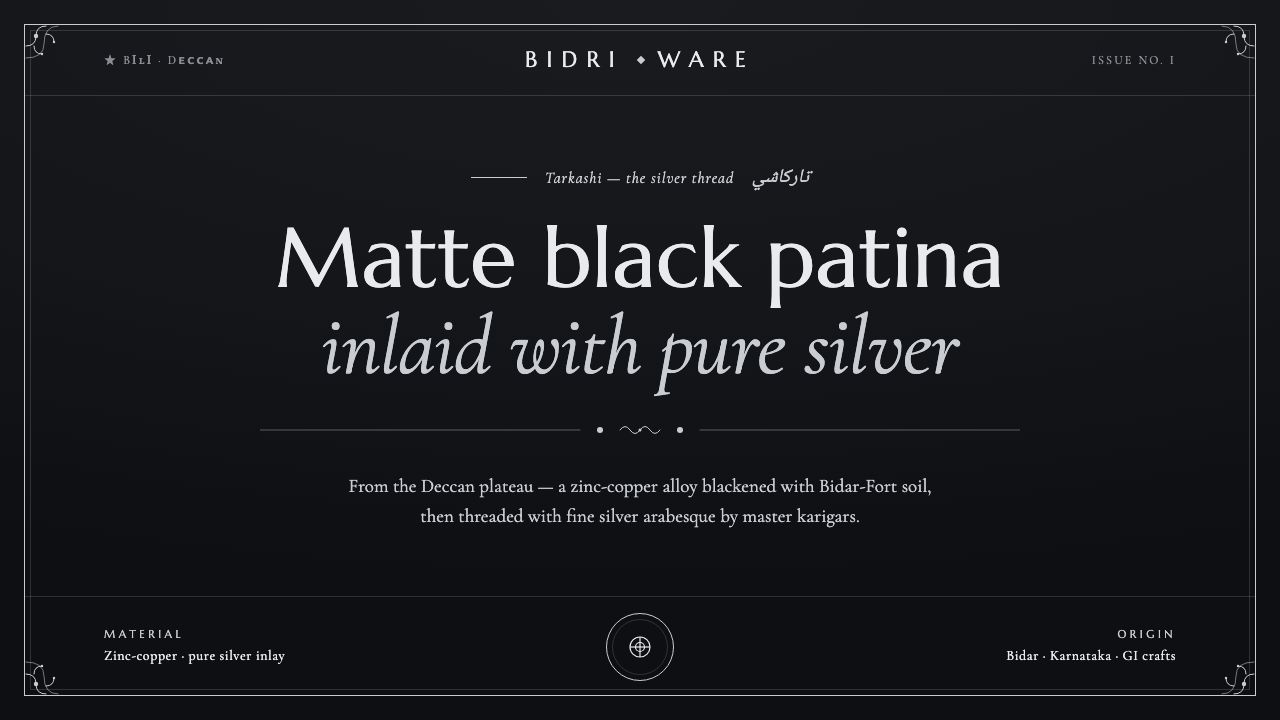 Bidriware Black MetalMonochrome luxury, hammered by hand. Matte-black Deccan patina threaded with…
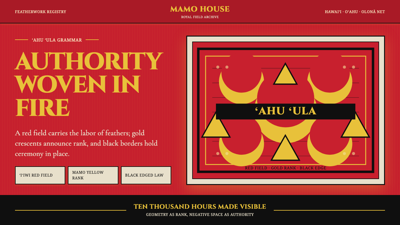 Hawaiian Feather Cape (ʻAhu ʻUla)Ceremony has weight. Red feather fields, mamo yellow crescents, black borders.
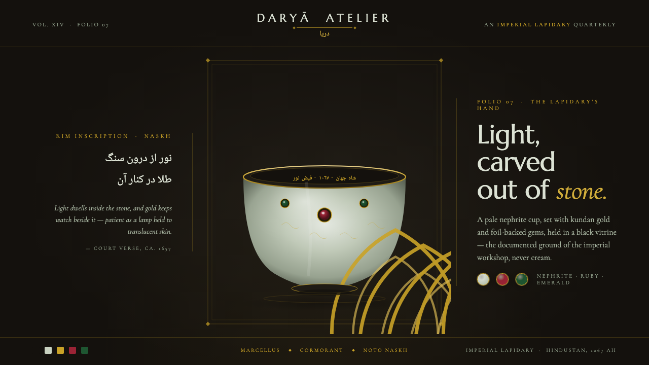 Mughal Jade CarvingImperial luxury, lit from inside. Pale nephrite glows on black, kundan gold f…
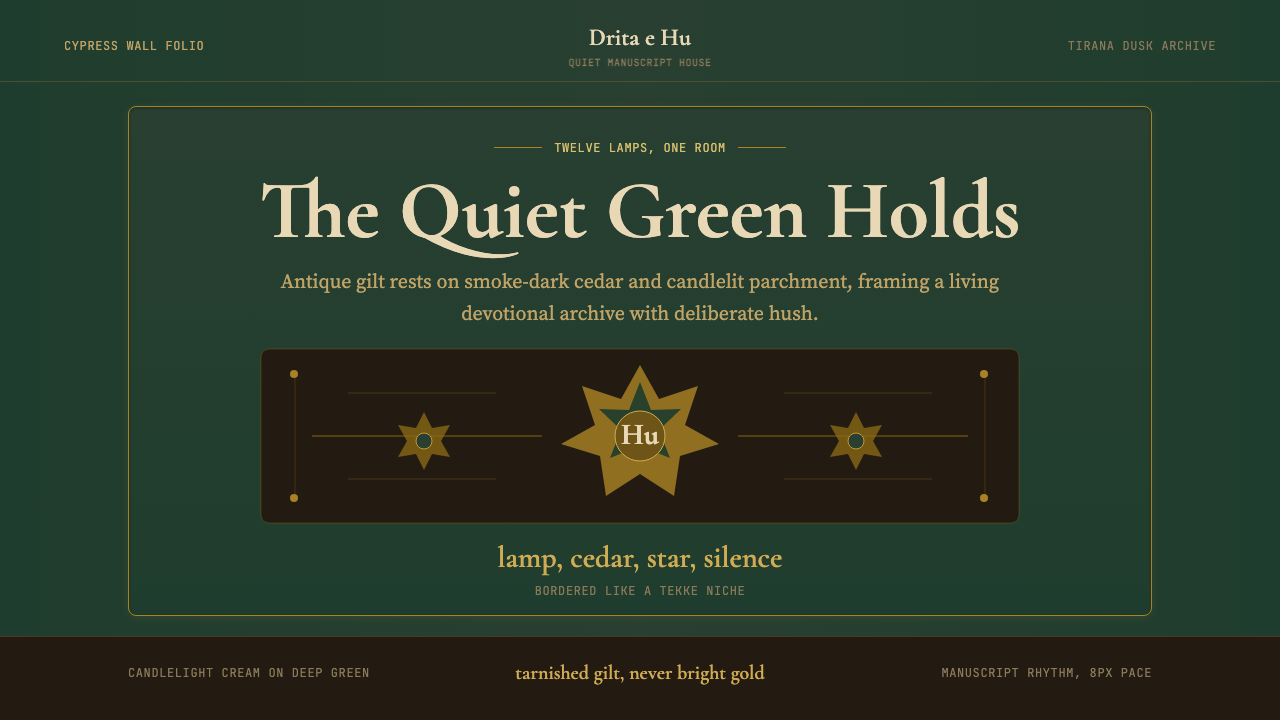 Albanian Bektashi Sufi (Tekke)Sacred quiet in cypress green. Gilt stars and Cormorant type frame a dusk tek…
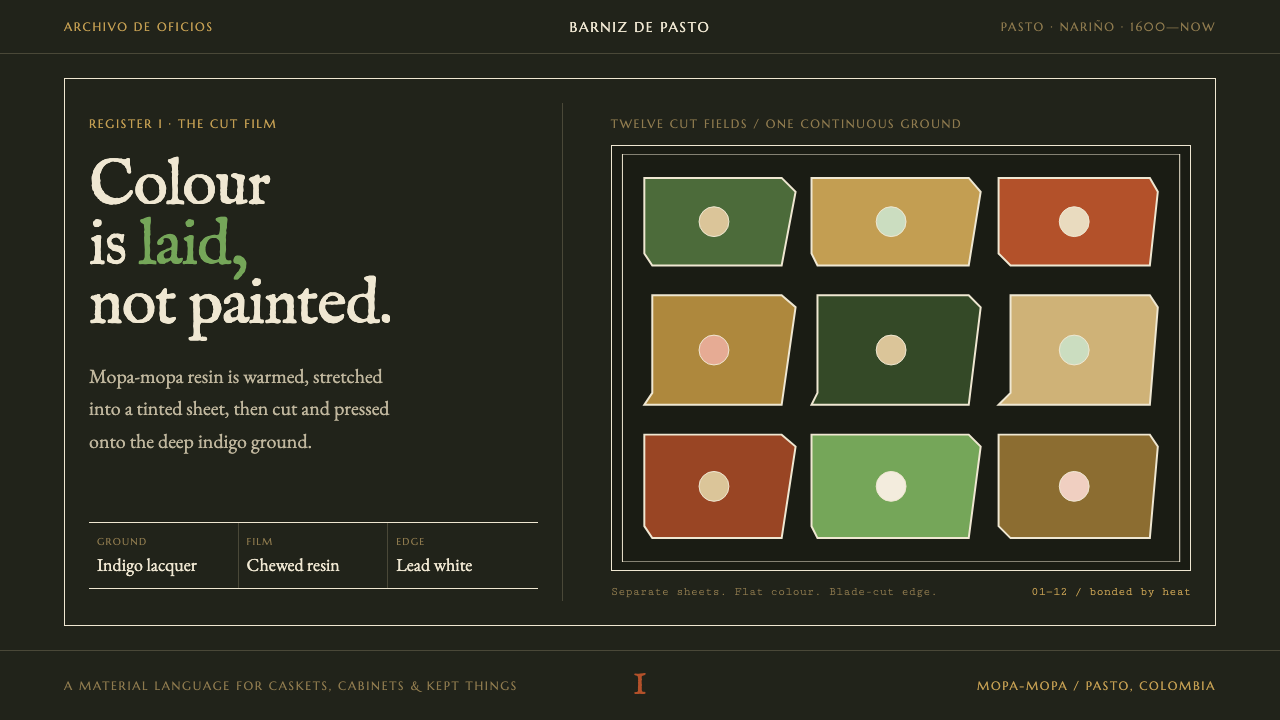 Barniz de PastoColour is laid, not painted. Cut green, gold, and red resin sheets glow on in…