What is Barniz de Pasto?
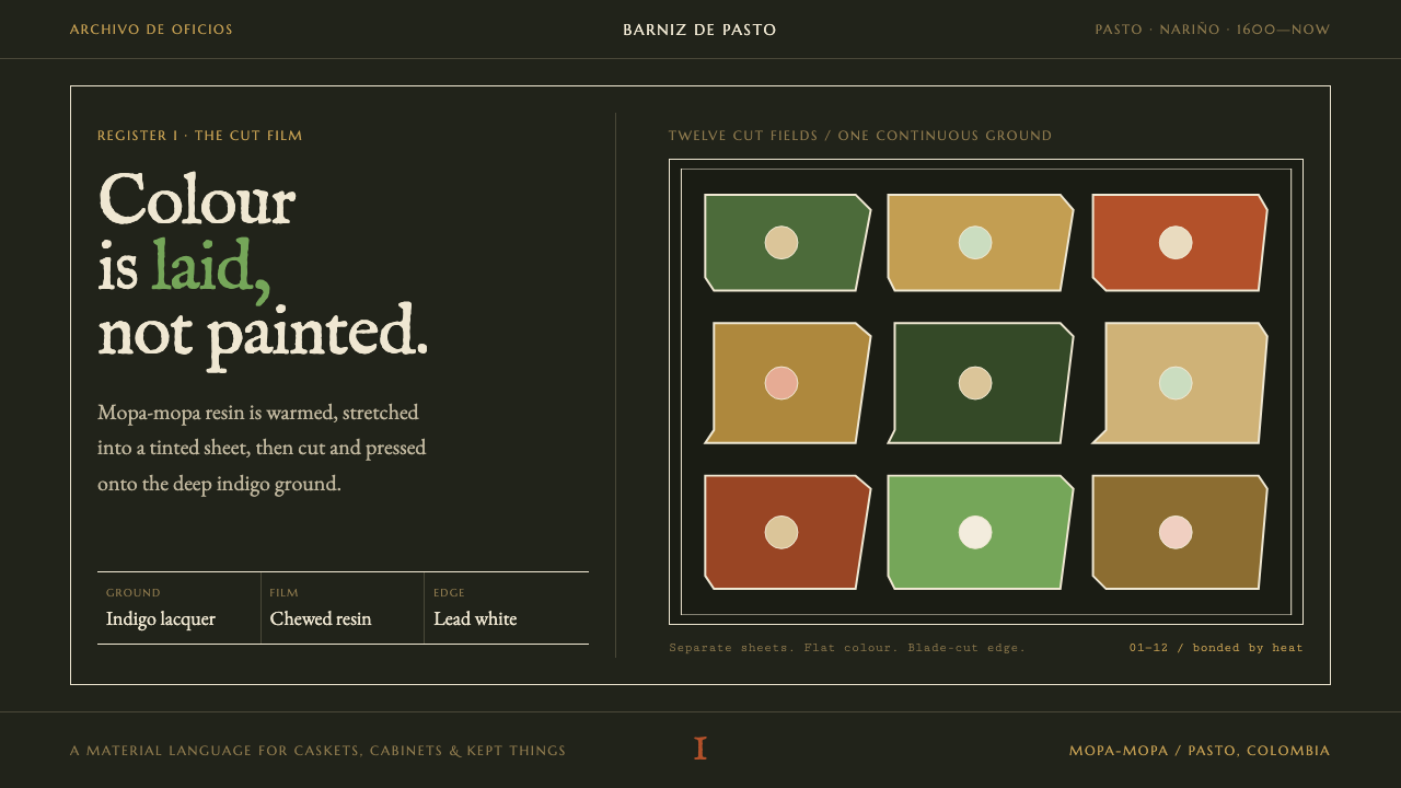
Barniz de Pasto turns an Andean lacquer craft into a design language: colour is laid, not painted, as flat cut sheets of translucent resin set on a warm near-black indigo ground.
Barniz de Pasto in brief
Barniz de Pasto is a design style drawn from the lacquer craft of the same name, practised in the city of Pasto in southwestern Colombia. The craft is unusual because it uses no brush. A natural resin called mopa-mopa is warmed, stretched into a translucent film, tinted, cut with a blade and heat-bonded onto wood. Every colour in a finished piece is a separate sheet laid on the surface, never a stroke of paint.
The design system inherits that logic. The page is the burnished indigo ground that the caskets and trays were built on, a warm near-black rather than a neutral one. Colour arrives as flat cut fields in green, gold and red, each bounded by a fine lead-white hairline, never as shading inside a shape. Depth comes from the stacking of films and from the glint of silver leaf showing through where the resin runs thin.
The overall effect is jewel-like and deliberate. Colours glow against the dark ground because they are translucent and laid over metal; edges are crisp because they were cut by a blade; and the imagery has the crowded, layered quality of a cabinet piece in which Andean animals share one frame with imported ornament. It suits subjects that value craft, provenance and material truth.
Where does Barniz de Pasto come from?
Barniz de Pasto belongs to the city of Pasto, in the Nariño department of southwestern Colombia. Its material is mopa-mopa, a natural resin gathered from the buds of a tree botanists name Elaeagia pastoensis, which grows in the forested lowlands of Putumayo, on the far side of the mountains from Pasto. Indigenous knowledge of working the resin is older than the colonial workshops, and the craft's classic period, the one the surviving pieces document, falls between about 1600 and 1750. It has been practised continuously ever since.
The process explains the look. A craftsperson takes a piece of the resin, chews and warms it until it turns elastic, then pulls it by hand into a thin, translucent film, thin enough to let light and metal behind it show through. The film is coloured with natural dyes. Green comes from indigo chewed together with a yellow root; red from cochineal and annatto; gold is laid over silver leaf. The coloured film is then cut with a blade into the shapes of the design and heat-bonded onto a wooden base finished in a dark, concentrated indigo lacquer. One colour, one sheet: there is no brush, and so no brushstroke.
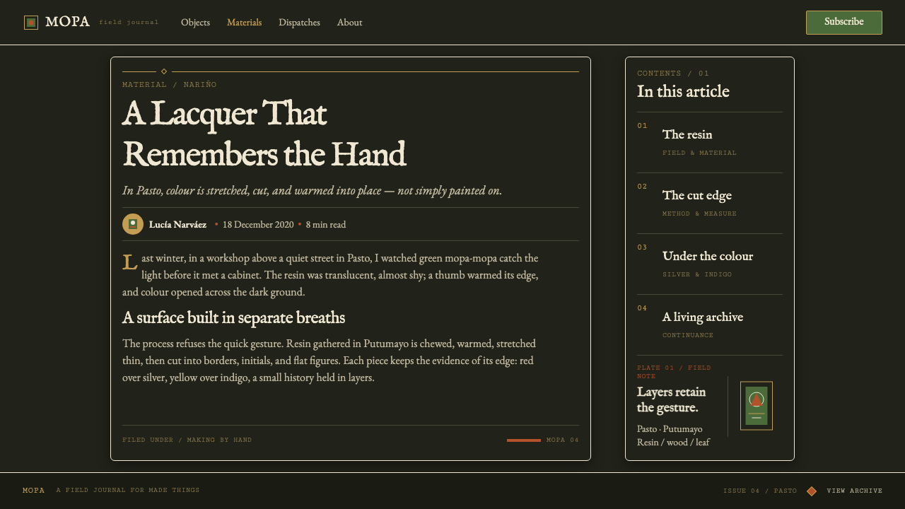
The surviving colonial caskets, tables and trays show a hybrid imagery that art historians group under viceregal Andean decorative arts. Parrots, monkeys, jaguars and armadillos from the Andean forests share one framed field with Spanish heraldry and with borders borrowed from Nanban lacquer, the Japanese export lacquer made for Portuguese traders, which reached Spanish America through the Pacific trade. Three worlds meet in a single box lid, and the framing line that holds them together is precisely the kind of structure this design system keeps.
In December 2020 UNESCO inscribed the craft on its list of Intangible Cultural Heritage, recognising the traditional knowledge of harvesting, preparing and applying mopa-mopa. That recognition matters for design reference as well: it reminds us that this is a living practice with living masters, not a lost style, and that borrowing its visual logic carries a duty to name its source.
What defines the Barniz de Pasto look?
Burnished Indigo Ground
The page is a warm, deep near-black with a blue-brown undertone, the colour of concentrated indigo lacquer rubbed to a sheen. It is deliberately not a neutral black. The warmth lets the translucent colours glow rather than glare, and it gives the surface the feel of a polished object rather than a screen. Everything else in the system sits on this ground the way resin films sit on wood.
One Colour, One Sheet
Every colour is a flat field with crisp, blade-cut edges and no tonal variation inside it. A leaf is green, a petal is red, a border is gold; none of them is shaded from light to dark. This is the system's central discipline, and it follows directly from the craft: you cannot blend a sheet of resin, so the design does not blend either.
Lead-White Hairline
A fine lead-white line runs around the coloured fields, separating them from one another and from the ground. It plays the role the cut seam plays in the original, where two films meet on the wood, and it gives each shape a clean, drawn edge. The line is thin and consistent; it is a boundary, not a decoration, and it does the work that shading does in other styles.
Depth from Stacking and Silver Glint
Depth is achieved by stacking films and by letting metal show through where the resin is thin, so that silver leaf glints beneath a translucent layer. In the style this means overlapping flat fields, and a sparing metallic highlight under or beside a colour rather than a soft shadow around it. The effect reads as material depth, not as simulated light.
Natural-Dye Palette
The palette is limited to what the craft can produce: a green made from indigo and yellow root, a gold laid over silver, and a red from cochineal and annatto, all against the indigo ground. These are saturated but never neon. They look like dyed translucent material because they are meant to, and they stay in a family because they share a source.
Hybrid Ornament in One Frame
Andean animals, Spanish heraldry and Nanban border patterns are set within the same framing line, side by side, without any of them being subordinate. The composition is dense and layered, with a clear outer frame and a crowded interior. The discipline of the frame is what allows the variety inside it, and it is a useful model for any design that has to combine several voices.
No Gradient, No Shadow, No Brush Texture
Gradients, soft shadows and painterly texture are absent, because none of them can occur in the original technique. Where the page needs emphasis it uses a brighter sheet or a metallic glint, never a glow. This is why the style feels crafted and precise, and why adding decorative blur or brush texture would break it immediately.
Who shaped Barniz de Pasto?
The Prussian naturalist travelled through the Andes of what is now Colombia around the turn of the nineteenth century, recording plants, minerals and the materials people made from them. He stands here as an early foreign witness of the region's material culture, one of the European observers whose writing carried news of Andean crafts beyond the mountains and into the scientific conversation of the time.
Mora-Osejo was a Colombian botanist, and his name is associated with the scientific identification of the resin tree as Elaeagia pastoensis. Botanical naming might seem remote from design, but it is what lets the craft be described, protected and discussed precisely. His work connects the workshop in Pasto to the herbarium, and reminds us that every flat field of colour in the style traces back to a particular plant.
Muñoz Lora is a master of the craft in Pasto, associated with sustaining and teaching barniz de Pasto in the contemporary period. Masters like him are the reason the technique is a living practice: the chewing, stretching, cutting and bonding are skills carried in the hands, and they survive only when someone teaches them. He represents the continuity that the UNESCO recognition acknowledges.
The mopa-mopa resin is harvested in Putumayo, on the far side of the mountains from the Pasto workshops, and the whole craft depends on those who gather it. Their work is easy to overlook because it happens before the first sheet is cut, yet the quality and supply of the resin determines everything that follows. They are the unseen first step in the chain from forest to finished surface.
How do you use Barniz de Pasto today?
Barniz de Pasto is among the most distinctive dark-ground styles available, and it rewards subjects with a story about material, place and handwork: craft goods, cultural heritage, hospitality, gifts, cosmetics, publishing and anything that wants to feel precious without being glossy. It is not a style for neutral utilities.
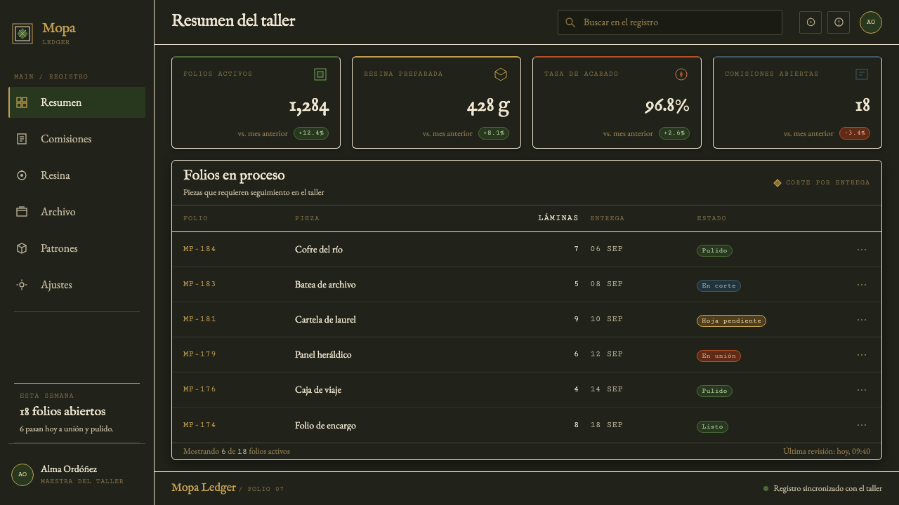
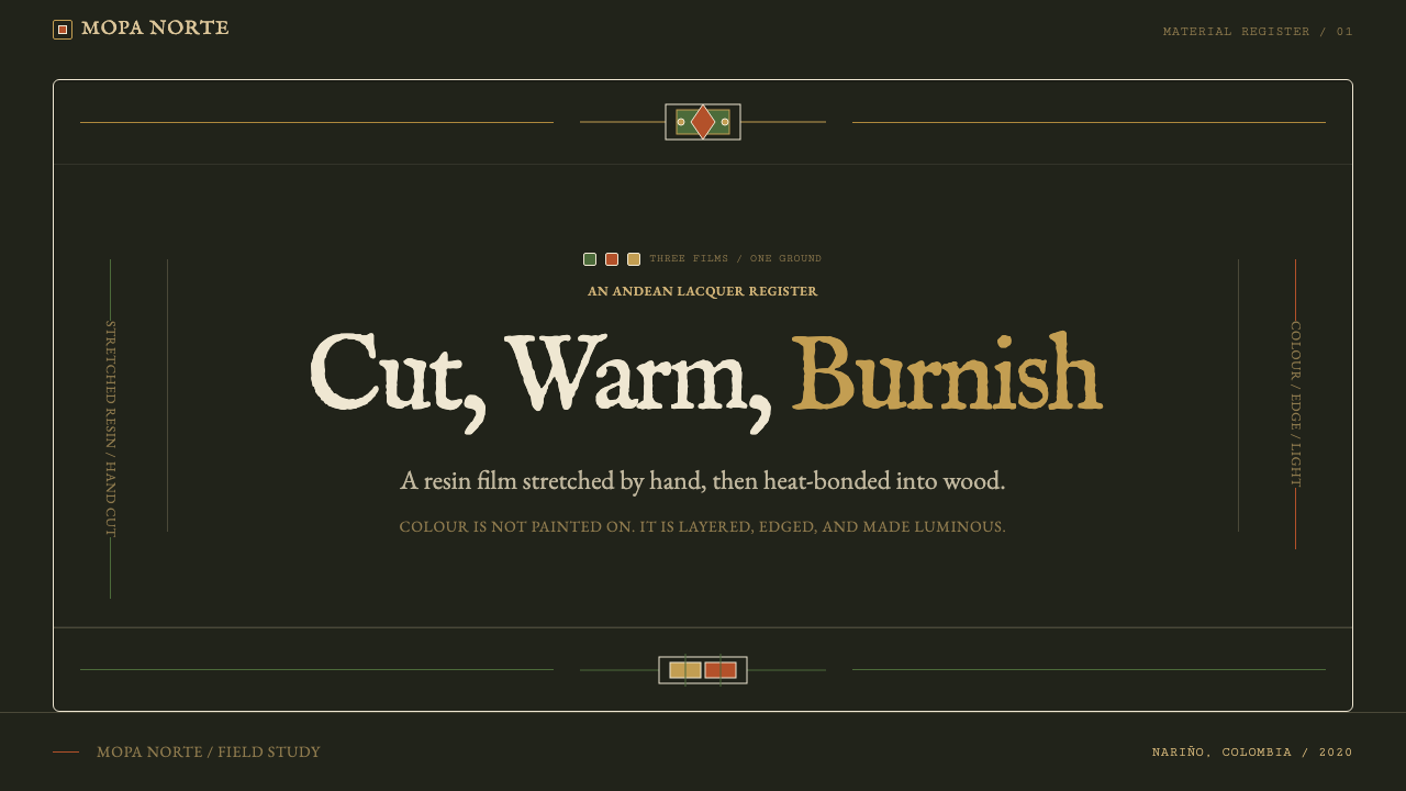
For presentation slides, the cover should feel like the lid of a casket. A deep indigo-black field, a framed border in one or two flat colours separated by the lead-white hairline, and a title set in a restrained, high-contrast face. Content slides can use the frame as a recurring device, with one flat colour field per idea and generous dark space between. Data slides suit the one-colour-one-sheet discipline: bars, segments and legend chips as flat cut fields with hairline edges, each in a single hue and without gradients, so charts look inlaid rather than rendered.
For web interfaces, the style is better suited to storefronts, collection pages, booking and gift products than to dense dashboards. Cards become framed panels on the indigo ground, with a thin lead-white outline instead of a shadow, and primary buttons take a flat gold or red field. Keep text high-contrast on the dark ground and use colour sparingly for emphasis. Pricing pages work well as small inlaid panels, one per tier, each with its own flat accent colour and hairline border.
For editorial and marketing work, the style makes a strong poster. A single framed image or illustration, rendered as flat cut shapes, can anchor a page or a campaign; long-form articles can open with a framed hero and use the hairline as a section divider. Photography works best when it is cropped into the frame as a plain rectangle and treated as one more inlaid element, not allowed to bleed softly into the dark ground.
The most common mistake is to treat the style as a generic dark mode with gold accents. Without flat cut fields, hairline edges and the warm indigo undertone, the result is just a dark page. A second mistake is adding gradients, glows or soft drop shadows, which contradict the craft logic outright. A third is to use the motifs as decoration without credit: this is a living Colombian tradition, and work that borrows its look should say where it comes from.
Barniz de Pasto — FAQ
Is this the same as Japanese lacquer?
No, although the two are historically connected. Japanese urushi lacquer is a tree sap applied in many layers with a brush and then polished. Barniz de Pasto uses mopa-mopa resin stretched into a film, cut with a blade and heat-bonded, with no brush at all. The connection is through Nanban lacquer, the Japanese export ware whose borders influenced Pasto ornament, but the technique and the look are distinct.
Why a warm near-black rather than a neutral black?
Because the original ground is a concentrated indigo lacquer, which sits between black and deep blue-brown. A neutral black would flatten the translucent colours and make the page feel like a screen. The warm undertone lets green, gold and red glow as if lit from within, and it keeps the surface feeling like a polished object. The difference is subtle, but it is what separates this style from a generic dark theme.
Can the style work on a light background?
It is built around the dark ground, because the translucent colours and silver glint only read as glowing against it. On a light background the flat cut fields would look like ordinary paper cut-outs and the lead-white hairline would disappear. If you need a light variant, treat it as a different design rather than an inversion, and keep the one-colour-one-sheet and hairline logic.
Why are there no gradients or soft shadows?
Because the technique cannot produce them. Each colour is a single sheet of resin, and a sheet has one tone throughout. Edges are cut with a blade, and separation comes from the seam between sheets rather than from blur. Respecting those limits is what gives the style its precision, and the constraints are the design: add a gradient and the page no longer looks cut and laid.
Is it respectful to borrow this look?
It can be, if it is done with care. Barniz de Pasto is a living tradition recognised by UNESCO as intangible cultural heritage, not a lost style that belongs to nobody. Name the craft and its place of origin, avoid using its motifs as casual decoration for unrelated products, and favour subjects where craft, provenance or Colombian culture are part of the story. Credit is the minimum, and collaboration with practitioners is better.
Related design styles
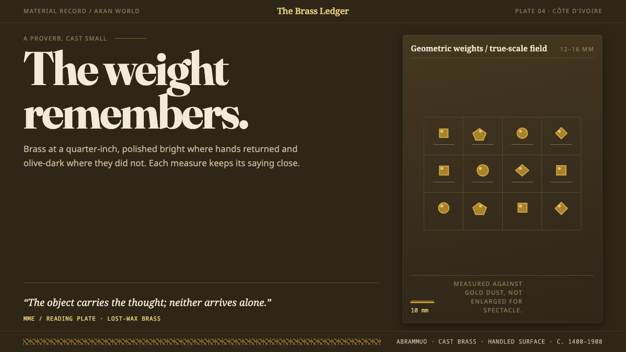 Baule GoldweightWear is the ornament. Burnished brass and olive recesses make every small wei…
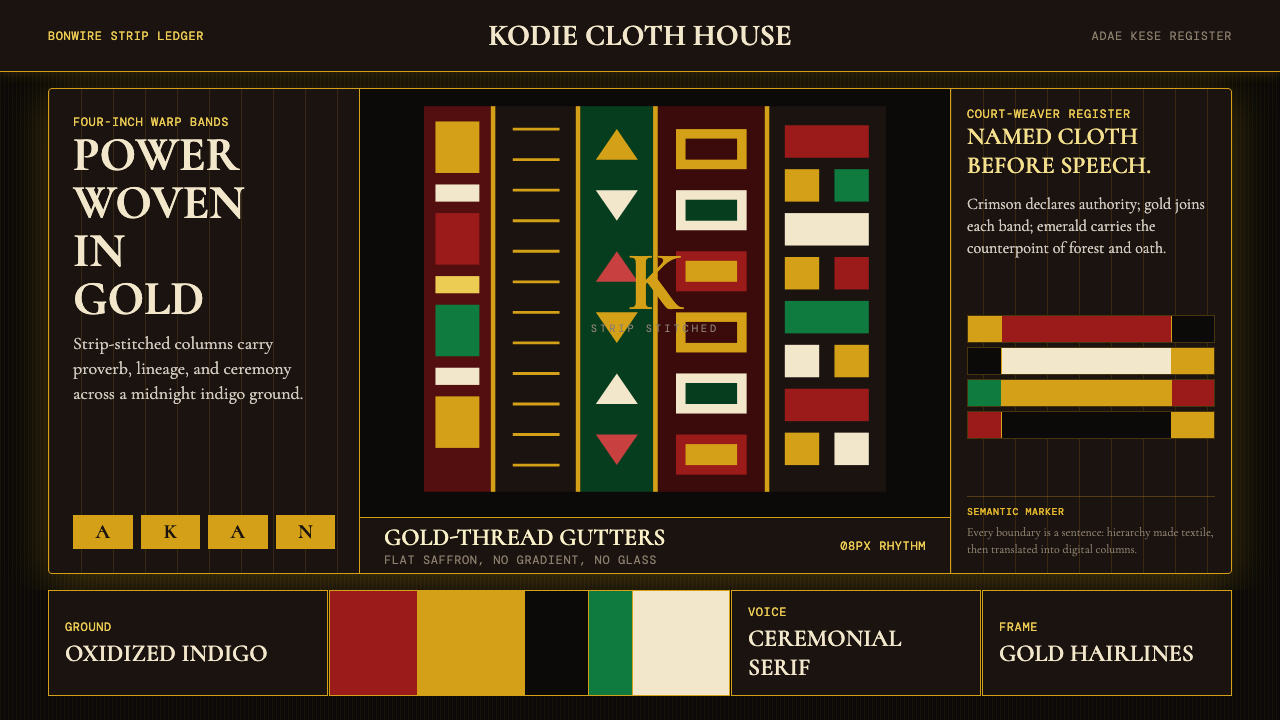 Ghanaian Kente (Asante Royal Gold)Royal authority, woven dark. Gold gutters stitch crimson and indigo strips in…
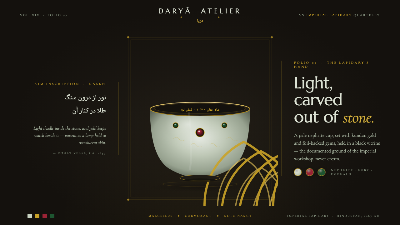 Mughal Jade CarvingImperial luxury, lit from inside. Pale nephrite glows on black, kundan gold f…
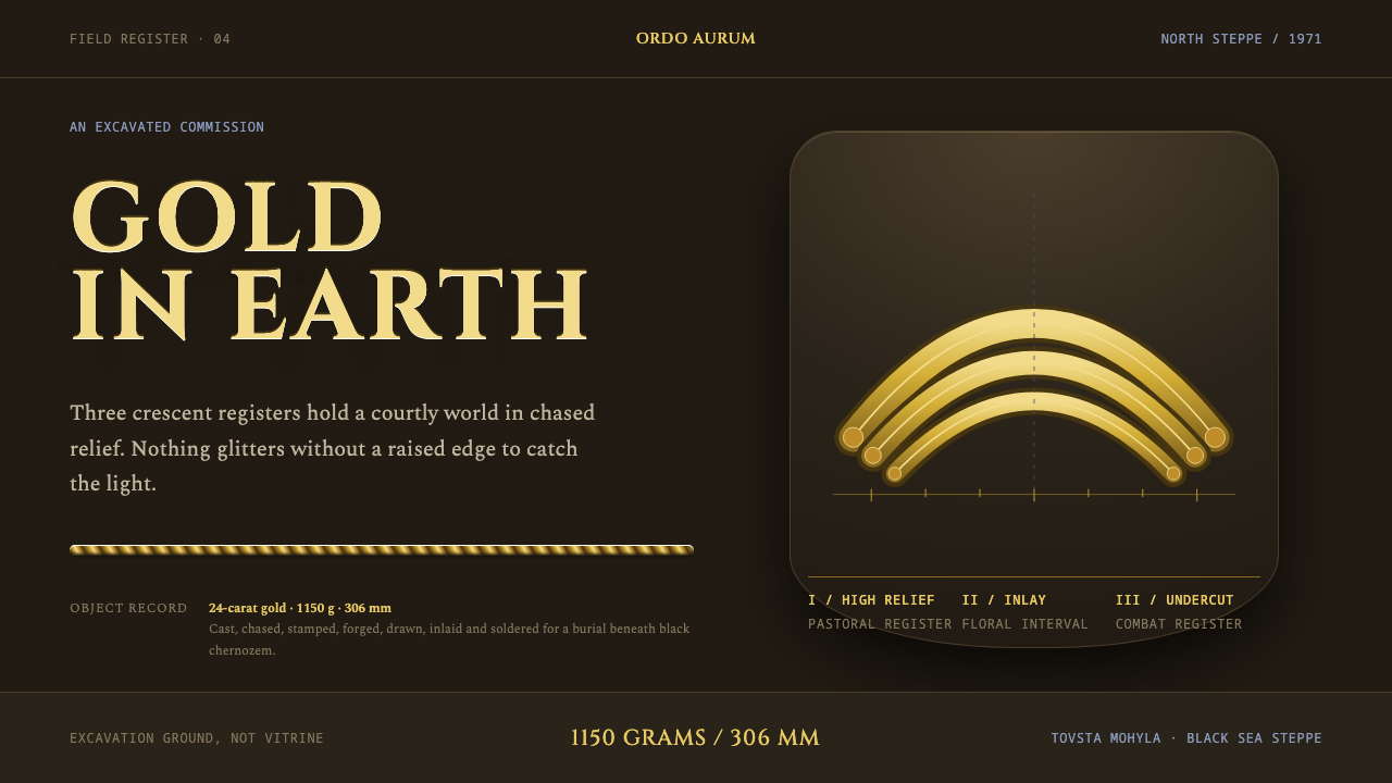 Scythian GoldGold remembers the earth. Three chased crescent registers rise from chernozem…
 Solomon Shell Money & Pearl InlayDignity inlaid in darkness. Pearl cream and nautilus blue form strict shell-s…
 Tuareg Agadez Cross SilverSilver refuses warmth. Cool chased geometry cuts across ebony-dark surfaces.