What is Mughal Jade Carving?
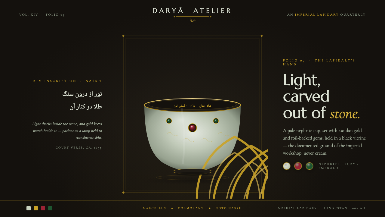
Imperial luxury, lit from within: Mughal jade pairs pale translucent nephrite, floral carving, and jewel-set gold with the absolute darkness of a museum ground.
Mughal Jade Carving in brief
Mughal Jade Carving is a courtly visual language from seventeenth-century Mughal India, shaped by imperial lapidary work, kundan gem-setting, and Indo-Persian court calligraphy. Its touchstone is Shah Jahan’s 1657 wine cup: pale luminous nephrite carved into floral relief, presented against black so the stone’s translucent mutton-fat body becomes visible.
The central drama is contrast. A deep black gallery ground absorbs the surrounding light; pale grey-green jade appears to glow from inside; narrow gold accents catch the eye; foil-backed rubies and emeralds flash as concentrated points of imperial color. Nothing is loud in isolation. The richness comes from the meeting of darkness, translucency, metal, stone, and inscription.
As a digital design system, the style should feel like a precious object under controlled display lighting rather than a generic dark luxury theme. Surfaces remain quiet, edges remain deliberate, and decoration is tied to material logic: floral carving becomes relief, kundan becomes jewel-like emphasis, and rim inscriptions become paired serif-and-Naskh headings.
Where does Mughal Jade Carving come from?
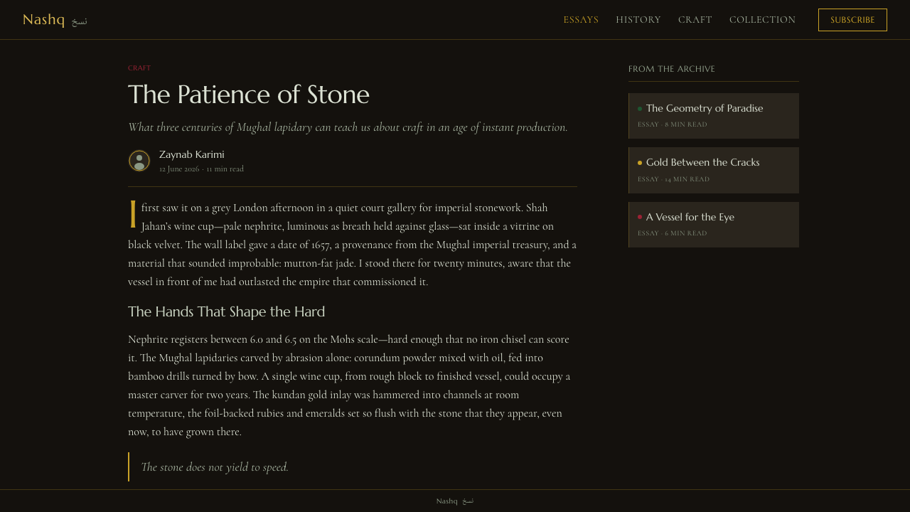
The reference belongs to pre-1900 Mughal India, specifically the imperial workshops of Hindustan in South Asia. Its peak belongs to the reign of Shah Jahan from 1628 to 1658, when courtly luxury is represented through refined stone, floral relief, gold, jewels, and calligraphy rather than through a broad decorative surface.
The object begins with pale luminous nephrite. Its value is visual as much as material: the stone is carved into floral relief and its translucent body is revealed by a black museum ground. The mutton-fat quality is not a flat cream color; it is a soft, pale grey-green presence that seems to hold light within its depth.
Kundan gem-setting introduces the second layer of richness. Gold strips and foil-backed rubies and emeralds are inset into the jade, producing a controlled exchange between opaque metal, translucent stone, and saturated jewel color. In digital use, this means gold and gems should punctuate the composition, not spread across it as a general metallic coating.
Indo-Persian court calligraphers complete the object’s identity through Naskh inscriptions running along the rims. The inscription is both language and ornament, but its ornament is disciplined by the vessel’s edge. The digital system carries this relationship into paired serif-and-Naskh headers, allowing typography to feel like an integral part of the artifact rather than a label placed afterward.
What defines the Mughal Jade Carving look?
Black Gallery Ground
Black is the canonical ground and the system’s deepest structural decision. It should feel like a museum presentation field: quiet, absorbing, and strong enough to reveal the translucency of the jade. Cream or pure white grounds break the reference’s identity. The darkness is not merely a mood; it is the condition that makes every pale and metallic element legible.
Luminous Nephrite
The stone palette is pale grey-green, softened by translucency rather than rendered as a flat neutral. It should appear to carry a muted light from within. Avoid sterile white, cold silver, or glossy green. The correct impression is mineral, quiet, and bodily warm: a stone whose surface is gentle because its depth is doing the visual work.
Floral Relief
Floral carving supplies the primary ornamental vocabulary. In digital form, it should be suggested through restrained relief, tonal separation, or carefully layered silhouettes rather than busy illustration. The motif belongs to the stone and should feel carved into a precious body. Botanical complexity is welcome only when the overall surface remains controlled and ceremonial.
Kundan Jewel Points
Gold, rubies, and emeralds function as concentrated points of attention. Gold should read as a fine inset or hairline, while red and green jewels appear foil-backed, bright, and deliberate. Their scarcity matters. A few sharp jewel accents create more authority than a field of continuous sparkle, because each point feels placed by a lapidary rather than sprayed on as ornament.
Rim and Hairline
The style benefits from narrow linear accents that recall the rims of carved vessels. These lines can frame a panel, underline a title, or mark a transition, but they should remain delicate and intentional. Broad metallic bands weaken the jade reference. Linework is most convincing when it feels inset, engraved, or drawn along an existing edge.
Serif and Naskh
Typography should honor the object’s paired textual registers. Serif Latin headings provide an editorial and imperial presence; Naskh introduces the script character of the court inscription. They need not compete for attention. Use contrast in script, scale, and placement to establish hierarchy, while keeping body copy quieter so the headings retain their ceremonial authority.
Controlled Depth
Depth should come from translucency, relief, inset jewels, and the black field—not from generic glossy effects. A surface may glow softly from within, but it should not become a luminous interface. Shadows are subordinate and quiet. The desired result is the visual depth of an exhibited artifact: material layers are sensed, while the composition remains still.
Who shaped Mughal Jade Carving?
Shah Jahan anchors the style historically and materially. His reign from 1628 to 1658 is the reference period’s peak, and his 1657 wine cup provides the defining image: pale nephrite, floral carving, translucent mutton-fat body, and presentation against black. In the design system, his name signals the connection between imperial patronage and the refinement of the object.
The Mughal imperial lapidaries represent the workshop discipline behind the visual language. Their domain is the pale nephrite body, its floral relief, and the precise setting of gold, rubies, and emeralds. They are the reason the style should feel carved, inset, and materially resolved rather than merely decorated with luxury signals.
The Indo-Persian court calligraphers supply the textual identity through Naskh inscriptions along the rims of the objects. Their presence explains why typography is structural in this system. Script should follow an edge, carry ceremonial rhythm, and make language feel inseparable from the vessel’s form.
How do you use Mughal Jade Carving today?
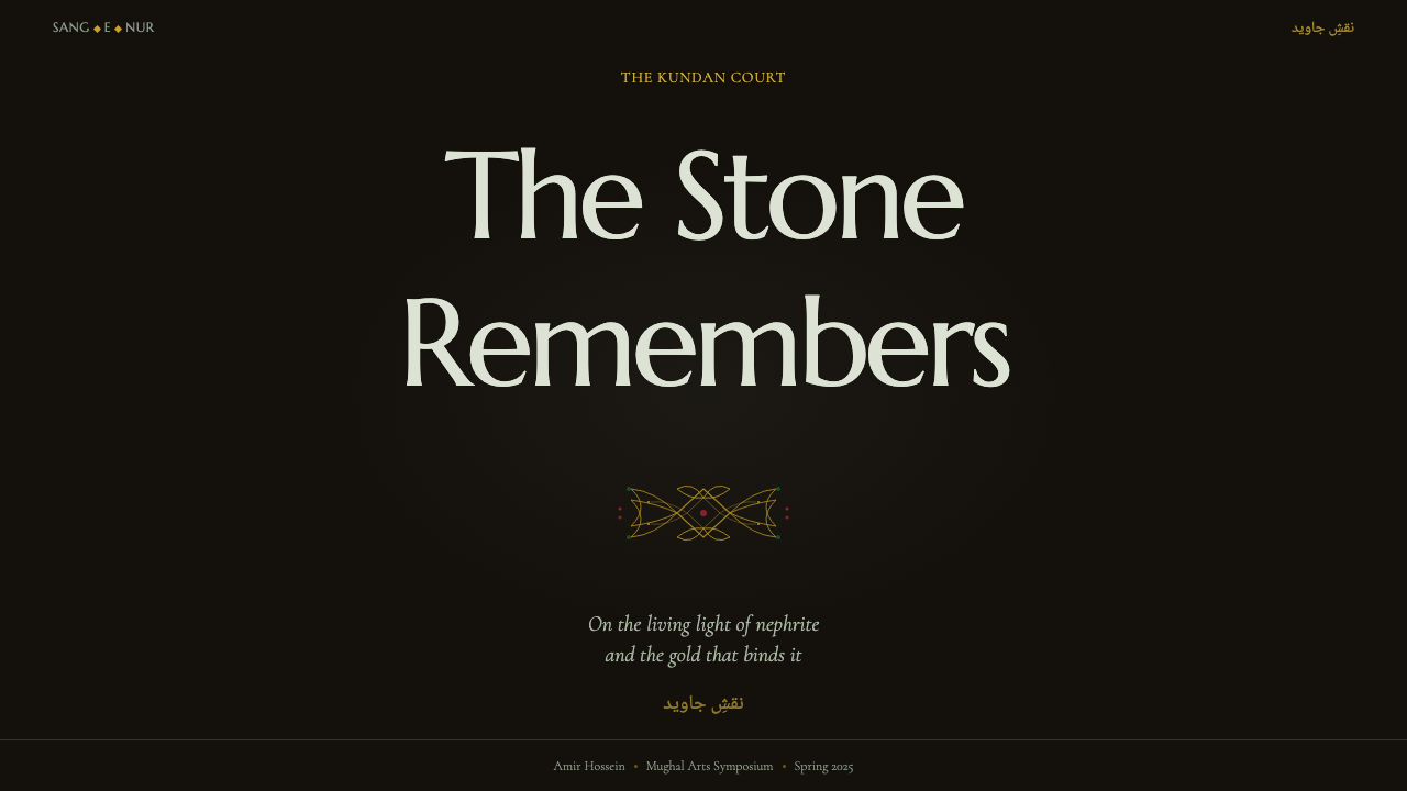
For presentation covers, use the black ground as a gallery wall and let one pale jade form or carved floral fragment occupy the visual center. Set the title in a dignified serif, with a restrained Naskh companion where appropriate. A narrow gold line can establish the rim-like frame, while a ruby or emerald accent gives the cover a single controlled flash.
For content and data slides, keep the composition quiet and object-like. Use pale stone tones for primary information, gold for dividers or key labels, and jewel colors only for the most important comparison or signal. Charts should feel inset into a dark display field, with clear hierarchy and generous surrounding darkness rather than multiple decorative surfaces.
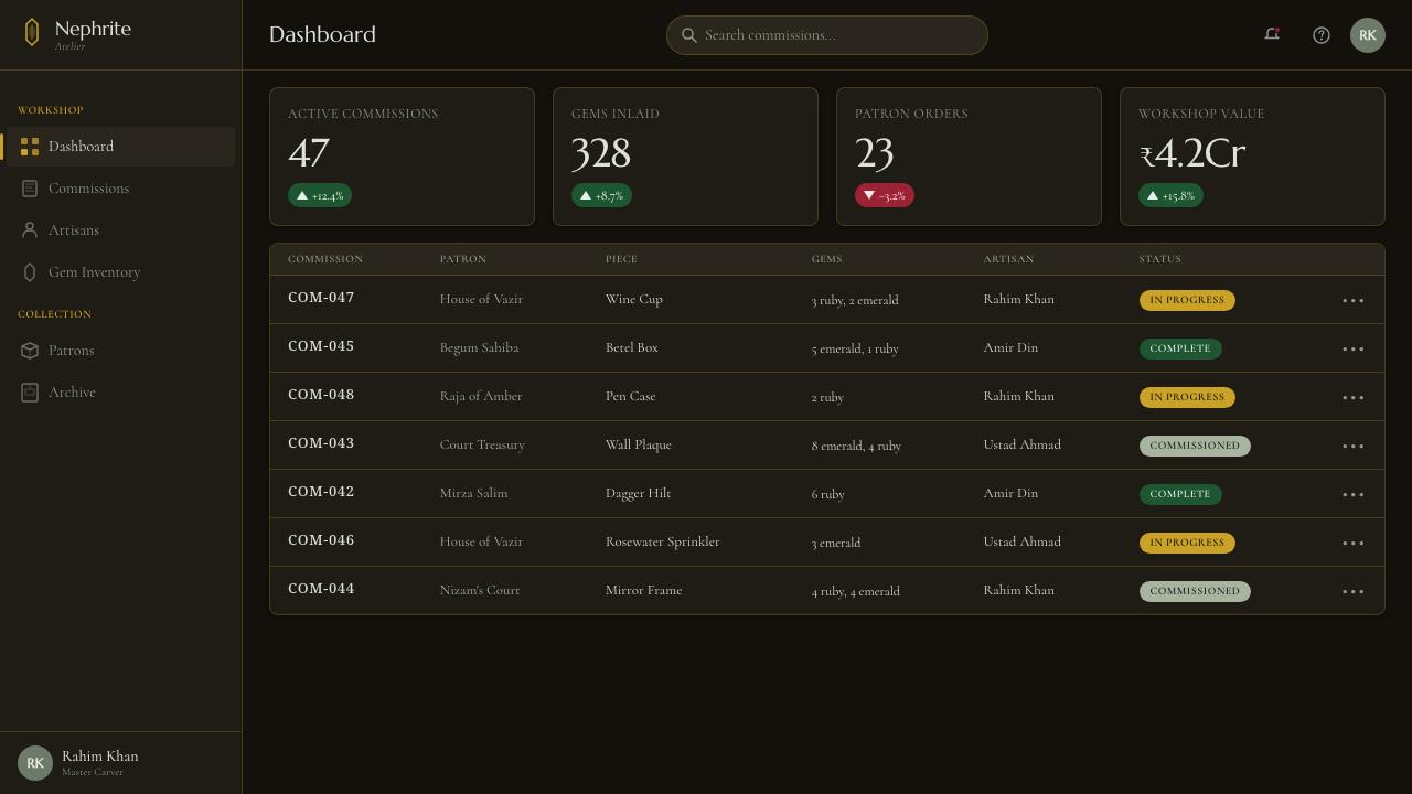
For web dashboards and pricing pages, the system works when hierarchy is calm and premium. Use black as the persistent gallery ground, pale grey-green for cards or primary content, and gold for selected states, borders, or purchase emphasis. Avoid making every component glow. A dashboard should feel like a collection of catalogued objects; a pricing page should make the chosen tier read like a jewel setting.
For editorial and marketing work, combine narrow text measures with generous black space and occasional floral relief. Feature stories can open with a large pale stone title block, a fine gold rule, and a Naskh detail that behaves like a rim inscription. Marketing pages can use jewel accents for calls to action, but the brand voice should remain measured, ceremonial, and materially specific.
The common mistake is turning Mughal jade into a generic black-and-gold luxury theme. Gold gradients, constant sparkle, bright white backgrounds, and excessive jewel color erase the source logic. Another mistake is using Naskh as an exotic texture without giving it a structural role. Every accent should suggest carving, setting, inscription, or controlled display; if it cannot, it probably does not belong.
Mughal Jade Carving — FAQ
Is Mughal Jade Carving simply a black-and-gold luxury style?
No. Black and gold are only part of the language. Its identity depends on the relationship between black display space, pale translucent nephrite, floral relief, kundan-set jewels, and Naskh inscription. Remove the jade’s internal glow or the material logic of carving and setting, and the result becomes generic luxury rather than Mughal jade.
Why must the background remain black?
Black is the museum ground that reveals the stone’s pale translucency and mutton-fat body. A cream or white background changes the contrast completely and makes the jade read as an ordinary light surface. The darkness also gives gold and jewel accents their rarity, so black is both a historical reference and a functional compositional condition.
Can the style work without actual jade imagery?
Yes, if the material behavior is preserved. Pale grey-green surfaces should suggest depth and inner light; floral elements should feel carved rather than printed; gold should appear inset; and jewel colors should remain concentrated. The system relies on the relationships among these qualities, not on a literal photograph of a vessel.
How should Naskh be used in a modern interface?
Use it as a structural companion to serif typography: in a title pairing, a rim-like label, a section marker, or a carefully chosen inscription. It should feel integrated with the layout and carry cultural presence without becoming a decorative pattern. When the script is treated only as texture, the connection to court calligraphy disappears.
Where does this style work best, and where can it struggle?
It works best for cultural institutions, luxury objects, heritage stories, editorial features, premium dashboards, and pricing experiences that benefit from ceremony and restraint. It can struggle where immediate informality, playful brightness, or broad everyday accessibility is the main goal. Its value lies in precision, rarity, and controlled display, so the product should have room for those qualities.
Related design styles
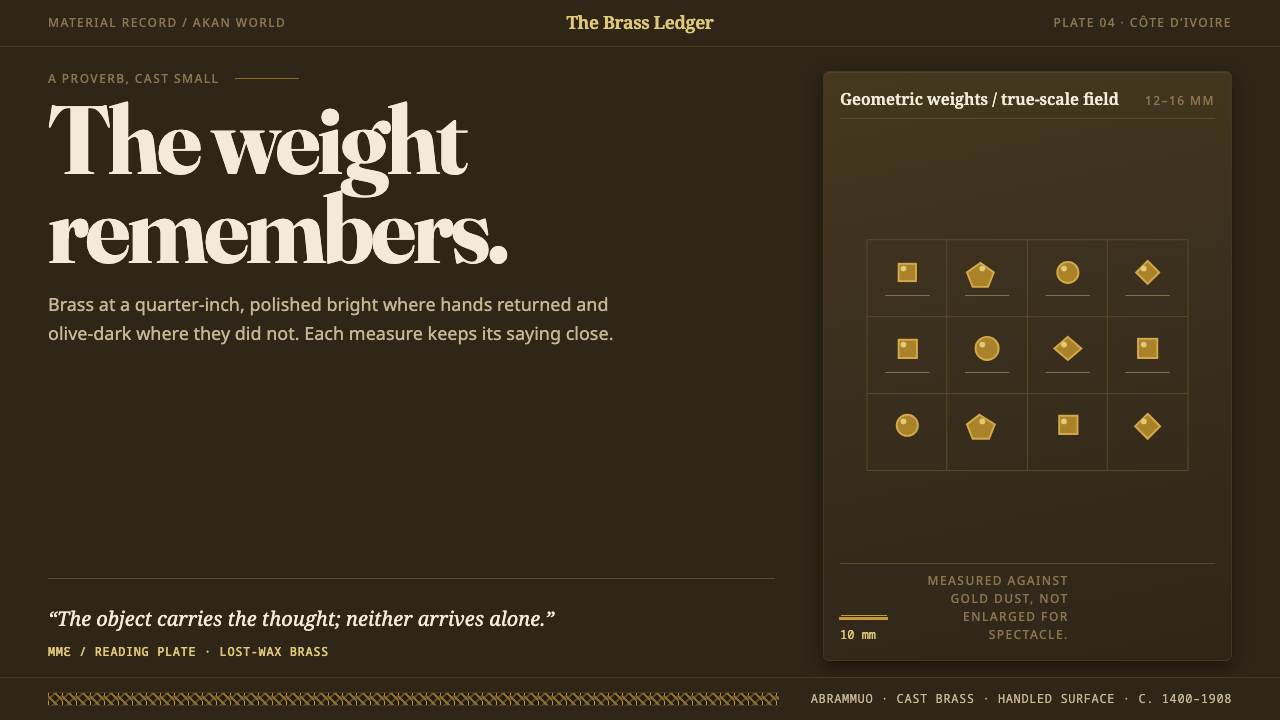 Baule GoldweightWear is the ornament. Burnished brass and olive recesses make every small wei…
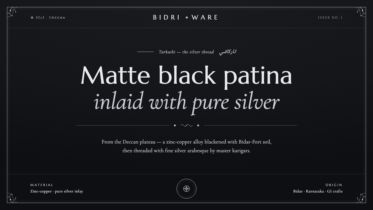 Bidriware Black MetalMonochrome luxury, hammered by hand. Matte-black Deccan patina threaded with…
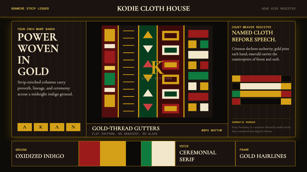 Ghanaian Kente (Asante Royal Gold)Royal authority, woven dark. Gold gutters stitch crimson and indigo strips in…
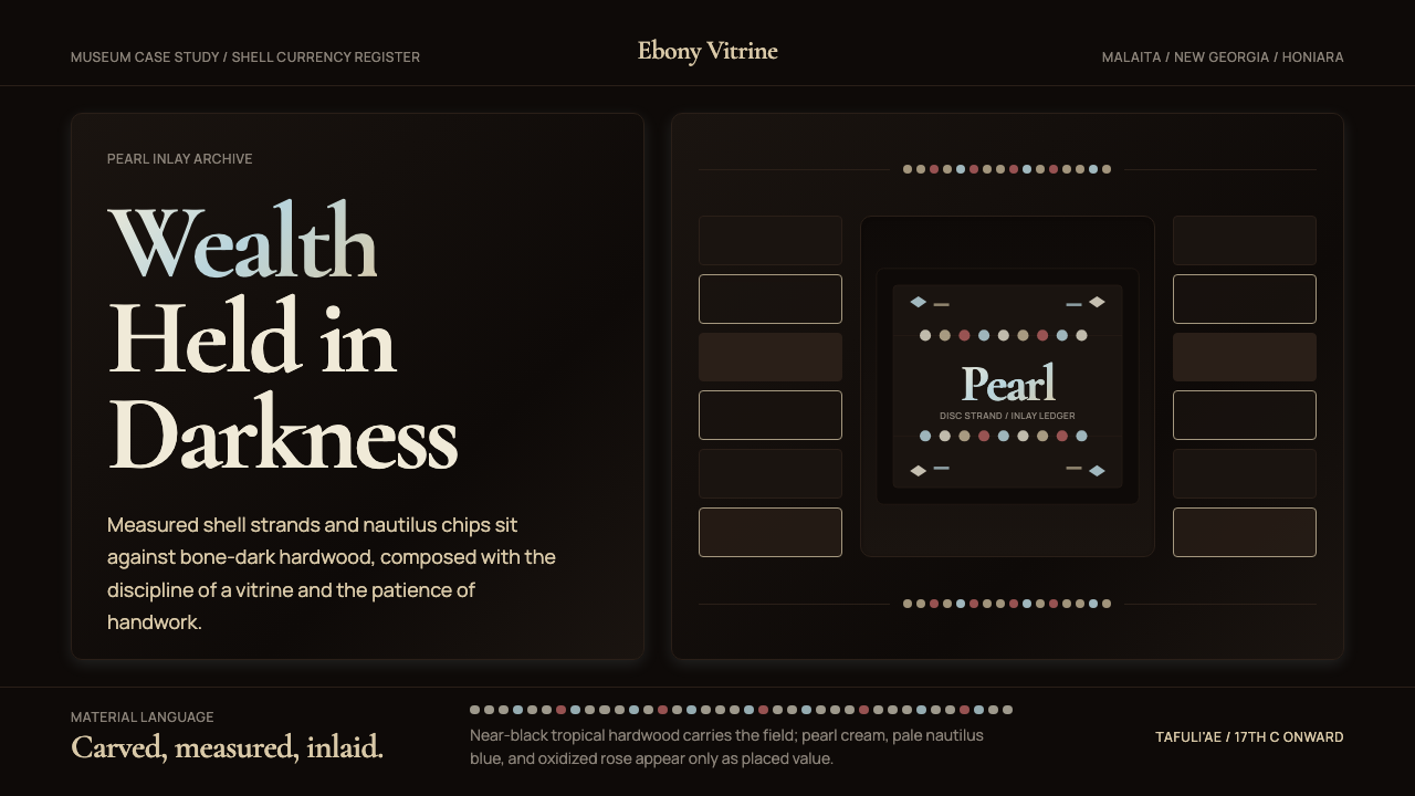 Solomon Shell Money & Pearl InlayDignity inlaid in darkness. Pearl cream and nautilus blue form strict shell-s…
 Tuareg Agadez Cross SilverSilver refuses warmth. Cool chased geometry cuts across ebony-dark surfaces.
 Albanian Bektashi Sufi (Tekke)Sacred quiet in cypress green. Gilt stars and Cormorant type frame a dusk tek…