What is Bidriware Black Metal?
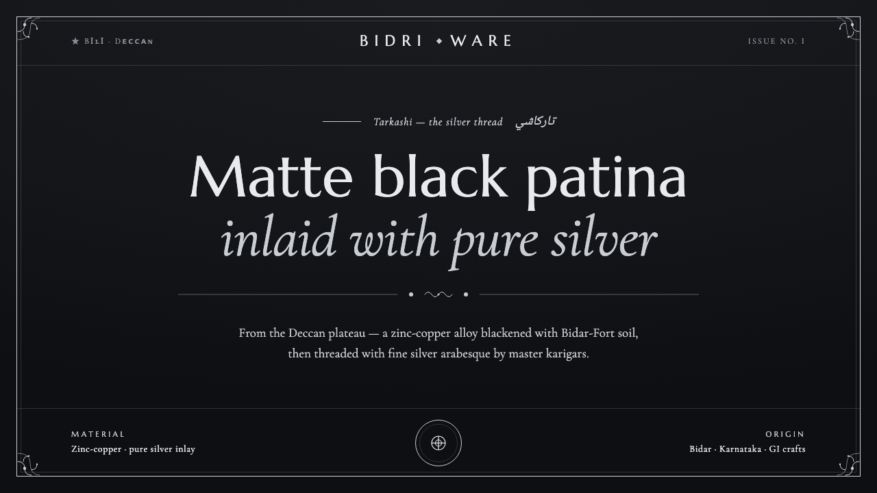
Bidriware Black Metal lowers luxury to a quiet register — a matte Deccan-black ground where cool silver arabesque catches the light.
Bidriware Black Metal in brief
Bidriware Black Metal is a screen interpretation of Bidriware, a centuries-old metalcraft from Bidar in the Deccan. Its visual identity comes from a deliberate opposition: a zinc-copper alloy darkened to a deep matte black, crossed by fine threads of pure silver that remain bright against the treated ground. The result is monochrome, high-contrast, and unmistakably tactile even when translated into a digital interface.
The style is luxurious through restraint rather than abundance. Black provides depth, silence, and visual weight; silver supplies the glint, edge, and moment of emphasis. The silver line is not a general-purpose decoration but an inlay, so every flourish should feel placed with intention. The governing mood is unhurried elegance: dense dark space interrupted by controlled arabesque.
Its signature pattern language comes from Mughal-Persian floral scrollwork, known in the craft as Tarkashi. Curves, stems, and leaves should feel continuous and hand-guided, never mechanically repetitive. In a digital composition, the pattern works best as a border, frame, reveal, or quiet field detail that supports hierarchy while preserving the sense of a dark object patiently worked by hand.

Where does Bidriware Black Metal come from?
Bidriware developed in Bidar, in Karnataka, India, within the Deccan region. Its historical setting reaches back to the Bahmani Sultanate and to a period beginning in the fourteenth and fifteenth centuries. The craft belongs to a material tradition in which the character of the object is created through the interaction of alloy, soil, chemical treatment, hammering, and inlay rather than through applied surface color alone.
The defining ground is a zinc-copper alloy treated with soil from Bidar Fort and ammonium chloride. This process blackens the metal into a deep matte patina. The dark surface is not a printed color laid over a neutral base; it is the visible result of transformation. That distinction gives the material its visual authority and explains why the digital style depends on a dark ground that feels dense and mineral rather than glossy or illuminated.
Against this ground, master karigars hammer threads of pure silver into the surface. The silver resists the blackening and remains bright, producing a precise contrast between the worked black metal and the cool inlay. The pattern is fine Mughal-Persian floral scrollwork, or Tarkashi: an arabesque vocabulary of winding stems and botanical movement whose delicacy is made more legible by the surrounding darkness.
The craft was shaped by several linked communities: Bidri master karigars, Deccan inlay metalworkers, and Bahmani court artisans. This design system does not treat them as decorative historical references but as the source of its central logic: disciplined handwork, material contrast, and ornamental form held inside a dark structural field. The screen language extracts those principles into layout, type, borders, and interaction without pretending that a digital surface can reproduce the physical object.
What defines the Bidriware Black Metal look?
Blackened Ground
The ground is deep, matte, and visually absorbent. It should feel like treated metal rather than a generic dark interface: quiet, dense, and resistant to glare. Near-black fields create the primary atmosphere, while softer dark variations may separate panels or establish depth without introducing shine. The surface is luxurious because it refuses spectacle.
Cool Silver
Silver is the active light of the system. It appears as a cool bright line, a restrained highlight, or a narrow field of emphasis against black. Silver should not become a second background or a loud metallic gradient. Its strength comes from scarcity and adjacency: placed beside darkness, even a fine line can carry considerable visual presence.
Material Contrast
Bidriware Black Metal is built on the opposition between a blackened zinc-copper alloy and pure silver inlay. Digitally, that opposition becomes a hierarchy between quiet mass and precise detail. Large dark areas hold the composition; silver marks boundaries, key information, controls, and moments of discovery. Contrast should feel embedded, not pasted on.
Tarkashi Linework
The pattern language is floral arabesque: winding stems, curling leaves, and continuous ornamental movement. Lines should be elegant and deliberate, with enough irregularity to suggest hand guidance. The pattern is strongest when it frames or accompanies information rather than competing with it. Its role is to make the dark field feel worked, not to fill every available space.
Typography
Typography should provide calm authority against the ornamental line. Clean, legible forms create the structural counterweight to arabesque, while generous spacing allows silver details to remain distinct. Chinese interfaces and non-Latin Persian text are carried by Noto Naskh Arabic in the supplied system, giving the typographic layer a calligraphic presence without turning every text element into ornament.
Quiet Depth
Depth comes from surface relationship rather than soft lighting. Matte black can recede, silver can sit forward, and an inlaid border can create a sense of crafted enclosure. If shadow appears, it should remain restrained and structural. The interface should suggest a precious object resting in darkness, not a glossy product floating in a simulated spotlight.

Who shaped Bidriware Black Metal?
The master karigars represent the hand-led intelligence at the heart of Bidriware. Their role in the source material is defined by the precise hammering of pure-silver threads into a blackened zinc-copper ground. In the design system, their presence is felt through controlled irregularity, patient linework, and the sense that every flourish has been placed rather than automatically generated.
The Deccan inlay metalworkers embody the material discipline of the craft. Their contribution is expressed through the meeting of alloy and silver, dark patina and bright line, structural surface and ornament. For digital work, this becomes a lesson in contrast: details gain authority when the field around them is quiet enough to let the inlay remain legible.
The Bahmani court artisans locate Bidriware within the cultural setting named by the source material: the Bahmani Sultanate and the Deccan. Their association gives the style a composed, ceremonial quality without requiring theatrical decoration. In contemporary applications, that quality appears through measured framing, cool metallic emphasis, and an atmosphere of deliberate refinement.
How do you use Bidriware Black Metal today?
Bidriware Black Metal works best when the composition begins with darkness and lets detail arrive slowly. For presentation covers, use a broad matte-black field with a restrained silver title or a single arabesque flourish entering from an edge. The cover should feel like an object being revealed, not a poster covered in ornament. On content slides, keep the reading structure calm and let silver lines organize sections, frame a quotation, or identify the active topic.
Data slides should treat information as an inlay. Use the dark field as the quiet mass of the page, then reserve cool silver for primary figures, key labels, chart edges, or a selected series. Supporting information can recede into softer dark tones. Charts should remain clean and legible; the Tarkashi pattern belongs at the margin or as a subtle framing device, never behind dense data where it would compromise reading.
For web interfaces, the style suits dashboards, analytics tools, and pricing pages that want to communicate authority and considered value. Panels can sit as dark crafted surfaces, with silver used for active states, selected plans, important metrics, and focused controls. Borders should feel inlaid rather than generic. A pricing page can use arabesque framing to distinguish tiers, but the hierarchy must remain typographic and immediate.
Editorial and marketing layouts benefit from Bidriware's contrast between a quiet field and a highly worked edge. Articles can pair a dense black opening with a narrow silver rule, a restrained floral flourish, and spacious text. Campaign pages can alternate dark sections with silver-led moments of emphasis, using the pattern as a recurring signature across covers, pull quotes, product statements, and calls to action. The result should feel crafted and ceremonial without becoming ornamental clutter.
The common mistake is confusing Bidriware Black Metal with generic luxury styling. Glossy black gradients, abundant metallic effects, bright decorative borders, and repeated arabesque wallpaper destroy the material logic. Another mistake is treating silver as ordinary white: it should feel cooler, rarer, and more deliberate. Keep the pattern selective, preserve large areas of darkness, and allow typography to carry the information while the inlay carries the atmosphere.
Bidriware Black Metal — FAQ
What is Bidriware Black Metal?
It is a digital design language derived from Bidriware, the metalcraft associated with Bidar in the Deccan. Its defining relationship is between a deep matte-black zinc-copper ground and bright pure-silver inlay shaped into Mughal-Persian floral arabesque, or Tarkashi. Applied to screens, the style becomes monochrome, high-contrast, tactile, and quietly luxurious.
Why is the palette limited to black and silver?
The restriction follows the craft's material contrast. Bidriware begins with an alloy blackened by Bidar-Fort soil and ammonium chloride, then introduces pure silver that resists the blackening and remains bright. The digital system preserves that relationship instead of adding color for decoration. Dark ground establishes depth, while silver marks the places where attention should land.
How should Tarkashi arabesque appear in an interface?
Use it as a selective framing or supporting element: an edge flourish, a border, a reveal, or a quiet background detail around important content. Its winding floral movement should feel continuous and hand-guided, but it should never compete with dense information. The pattern is most convincing when large areas of darkness remain visible around it.
Can the style use bright white or glossy metallic effects?
Bright silver is central, but it should not become generic white or a glossy special effect. The source material describes silver as a cool line that remains luminous against a matte-black ground. Preserve that distinction through restraint: use clean highlights, quiet metallic presence, and sharp adjacency to darkness. Gloss, shine, and decorative light effects weaken the sense of inlay.
What kinds of products suit Bidriware Black Metal?
It is well suited to dashboards, analytics tools, pricing pages, editorial features, and marketing systems that need authority, focus, and a sense of considered value. It is less suited to interfaces whose identity depends on bright variety, playful softness, or abundant surface energy. The style succeeds when the product can support a quiet dark field, precise emphasis, and ornament used as a meaningful structural accent.
Related design styles
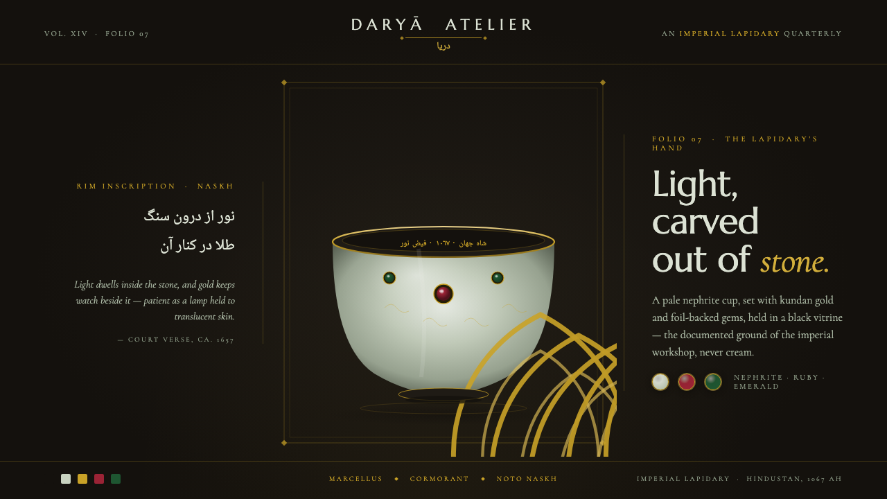 Mughal Jade CarvingImperial luxury, lit from inside. Pale nephrite glows on black, kundan gold f…
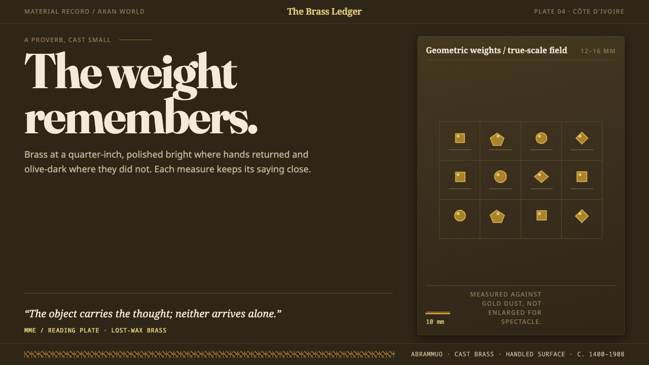 Baule GoldweightWear is the ornament. Burnished brass and olive recesses make every small wei…
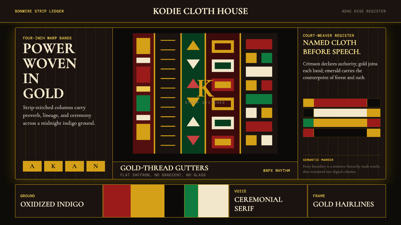 Ghanaian Kente (Asante Royal Gold)Royal authority, woven dark. Gold gutters stitch crimson and indigo strips in…
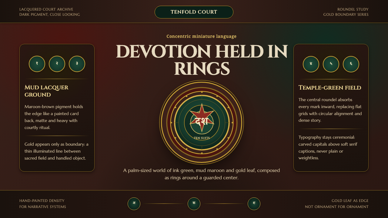 Mysore Ganjifa Playing CardsDevotion held in rings. Ink green centers, mud-maroon lacquer and gold bounda…
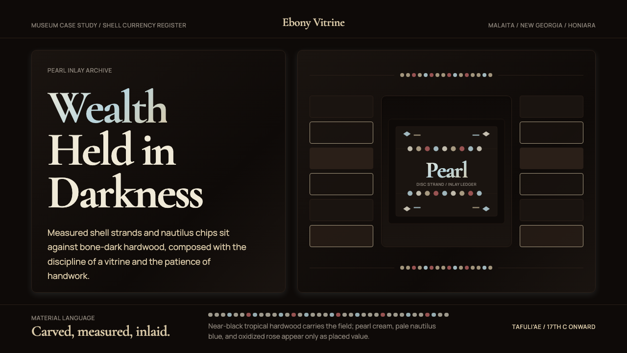 Solomon Shell Money & Pearl InlayDignity inlaid in darkness. Pearl cream and nautilus blue form strict shell-s…
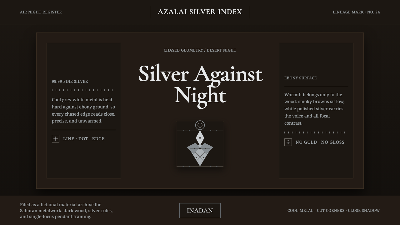 Tuareg Agadez Cross SilverSilver refuses warmth. Cool chased geometry cuts across ebony-dark surfaces.