What is Muriel Cooper MIT?
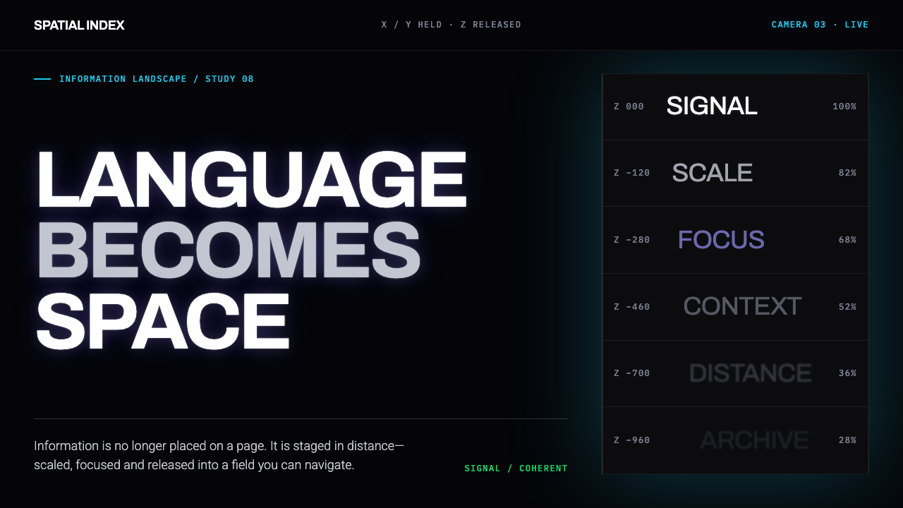
At MIT, Muriel Cooper took the printed page apart and rebuilt it as a place to fly through — white type suspended in glowing black, its size telling you what matters.
Muriel Cooper MIT in brief
Muriel Cooper MIT Visible Language is named for its researcher and her MIT laboratory: Cooper, longtime design director of MIT Press, who founded the Visible Language Workshop in 1975 and later carried it into the Media Lab. The system captures the look her group reached by 1994, demonstrated publicly at TED5 as Information Landscapes — typography let loose from the flat page into navigable three-dimensional space.
Visually, the system reads as white grotesque type suspended in a velvety, near-total black. Words are set on transparent planes at different depths: some near and crisp, others further back and softened, the way a lens holds one distance in focus while the rest dissolves. Hierarchy comes from scale and proximity rather than weight or color — the biggest, nearest word is simply the most important, and everything else recedes toward a horizon.
Underneath sits a stated premise: a screen produces emissive, additive light, not the reflected, subtractive ink of a printed page, and the system is built from that difference rather than around it. With no page edge holding anything in place, structure is carried by motion instead of a static grid, revealed as the viewer moves through the information rather than read at a glance.
Where does Muriel Cooper MIT come from?
The discipline behind the system did not begin on a screen. Cooper's design leadership at MIT Press dates back to 1952, and the sensibility she brought to it is rooted in two modernist traditions named among the system's influences: the grid-governed rigor of Swiss International Style, and the workshop-based pedagogy pioneered at the Bauhaus, where form was learned through structured exercise rather than inherited convention. Decades spent applying that grid discipline to printed books — where every relationship between size, column, and margin had to be decided with intention — gave her a method that treated a layout as an argument, not a container.
In 1975, Cooper founded the Visible Language Workshop at MIT, a research group whose name was itself a claim: language made visible was not limited to ink on paper, and the discipline that governed a well-set book could, in principle, govern any medium that displayed language, including a screen. The workshop treated typography as a subject of research rather than a finished craft, asking what hierarchy or structure could mean once language was no longer bound to a flat, static surface.
That research found its setting in 1985, when the workshop moved into MIT's newly founded Media Lab, joining a culture organized around computation and new media rather than print production. There, the workshop's typographic questions could be tested against a screen's actual behavior — its capacity for layered transparency, depth, and movement over time — pushing the group toward what came to be called dynamic information design: information treated as something with motion and depth, not only position.
The clearest public statement of that research arrived in 1994, when the workshop — Cooper working alongside collaborators including David Small, Suguru Ishizaki, Lisa Strausfeld, and Earl Rennison — demonstrated the resulting work, Information Landscapes, at the TED5 conference. A research question about whether typography could leave the page now had a working answer: text that moved, receded, and advanced, its meaning shaped by the viewer's own passage through it rather than by a fixed position on a rectangle. That demonstration is the moment this system is drawn from, and it set the terms — light instead of ink, depth instead of layout, motion instead of a static grid — that the visual language still carries.
What defines the Muriel Cooper MIT look?
Emissive Ground
The background is not a white page waiting for ink; it is a near-total, velvety black, treated as the resting, off state of a light-emitting surface rather than as pigment covering paper. Type does not sit on top of the ground the way ink sits on paper — it appears to come from within it, as light rather than pigment. The whole system starts from what a screen actually is, not from the print conventions a screen happens to inherit.
White Grotesque Type
The letterforms are a plain, humanist grotesque — sans-serif, unadorned, carrying none of the flourishes print typography accumulated over centuries. Set white against black, the type reads as legible light rather than a printed shape. The choice continues the reductive instinct of Bauhaus pedagogy and Swiss International Style, redirected: where those traditions stripped ornament from ink on paper, this strips it from light on a screen.
Depth of Field
Type is not confined to one plane. Some words sit close and sharp, in high contrast; others sit further back, softened the way distant objects soften when a lens holds a nearer subject in focus. This borrowed optical logic — focus and blur standing in for near and far — gives the composition real spatial depth rather than the flat layering of a printed page.
Transparent Layering
Multiple type planes overlap at varying opacity rather than stacking as opaque blocks that hide whatever sits behind them. A reader looks through one layer to glimpse another beneath it, the way overlapping panes of glass let light and shape pass through at reduced intensity. The field holds far more information than an opaque layout could, at the cost of rewarding looking over scanning.
Scale as Hierarchy
Importance is signaled by size and proximity rather than boldness, color, or a bounding box. The largest, nearest word in the field reads as the most important one, exactly as a nearer object looks larger to the eye in physical space. This replaces an arbitrary visual convention — bold means important because a guide says so — with a perceptual one the viewer already understands.
Motion as Structure
The organizing logic of the composition is revealed over time rather than laid out on a fixed grid taken in at a glance. Planes drift, approach, and recede; structure is something that happens as the viewer moves through the information, not something printed once and read statically. A single screenshot captures an instant of it; the system's actual argument is made across a sequence.
The Page Becomes a Landscape
The overarching move is conceptual as much as visual: typography is released from the bounded rectangle of a page and treated as a landscape the viewer travels through, with words occupying positions in navigable space rather than fixed coordinates on a surface. Every other characteristic — depth of field, layered transparency, scale-based hierarchy — follows from taking that one idea seriously.
Who shaped Muriel Cooper MIT?
Cooper is the researcher this system is named for. Design director of MIT Press from 1952, she brought a modernist, grid-based print discipline to book design for decades before founding the Visible Language Workshop in 1975 and later carrying it into the MIT Media Lab. Information Landscapes, demonstrated at TED5 in 1994, is the clearest public statement of where her research had arrived: typography no longer confined to a printed page but set loose into navigable, light-based space.
Small worked within the Visible Language Workshop alongside Cooper, part of the team whose research produced Information Landscapes. His place among the collaborators put him within the group that turned the workshop's questions about hierarchy, depth, and structure — once language was no longer fixed to a flat page — into the working demonstration shown publicly in 1994.
Ishizaki was part of the same Visible Language Workshop circle that carried Cooper's research from print-based typographic discipline into the dynamic, computational territory the group's work is associated with. His presence in the team situates him within the broader shift toward dynamic information design — treating language on screen as something with behavior over time, not only position.
Strausfeld was among the collaborators credited alongside Cooper in the workshop's Media Lab-era research, contributing to the body of work that became Information Landscapes. Her place in the group reflects how the workshop's typographic experiments depended on a team rather than a single designer working alone, spanning both design judgment and the computational tools needed to make navigable, layered typographic space actually function.
Rennison was another named member of the Visible Language Workshop's Media Lab-era research group, part of the collaborative effort that carried Cooper's typographic principles into the interactive, three-dimensional territory shown as Information Landscapes in 1994. His inclusion among the workshop's key figures underscores that the system captured here is the output of a research group, not one author's isolated style.
How do you use Muriel Cooper MIT today?
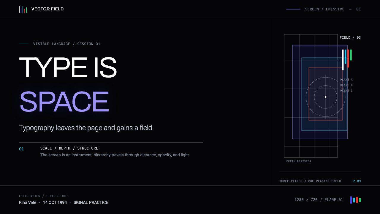
This system translates directly into presentation software, partly because it was first demonstrated as a presentation. A cover slide works best committed fully to the near-black ground, with a single title in white grotesque type set large and near, while supporting words recede behind it at smaller scale and softer contrast. Content slides should resist laying everything flat on one plane; let a primary heading sit forward and sharp while captions sit smaller and slightly softened, so hierarchy reads without a single bold weight or accent color doing the work.
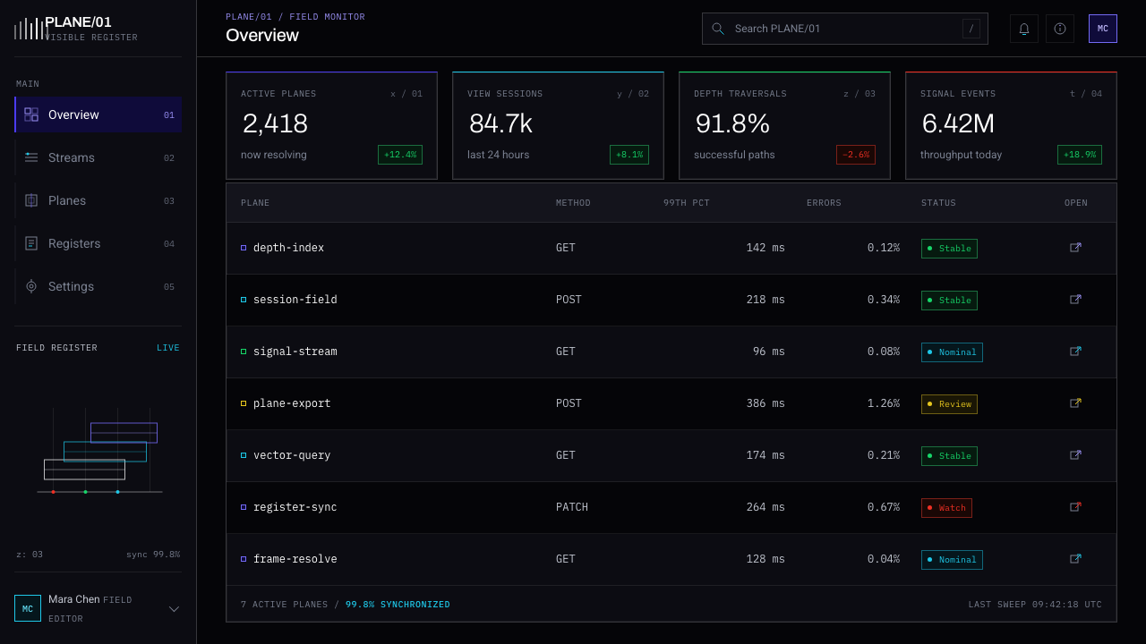
For web interfaces, the system fits dashboards, developer tools, and any product built around dense, layered information meant to be explored rather than scanned once. A near-black canvas should be the actual foundation, not an optional dark mode, with white grotesque type carrying nearly all text. The single most urgent metric or alert should sit large and near; secondary context — timestamps, tooltips, minor detail — recedes in scale and fades in contrast rather than shrinking to a smaller font at full opacity. Pricing pages can borrow the same logic: the recommended tier sits forward and bright, the others recede.
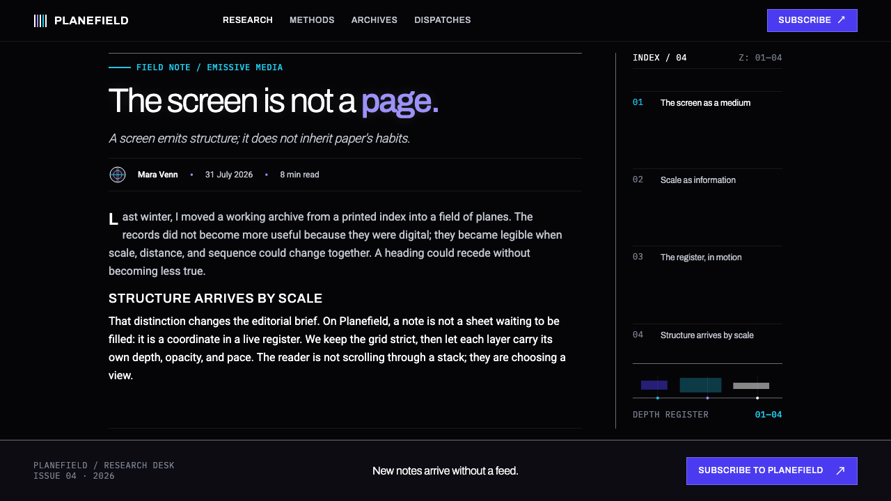
In editorial and long-form marketing, the system suits stories about research, computation, or the history of digital media, where information having depth and behavior is part of the content itself. A feature layout can set a pull quote large and near in white grotesque type, with body copy receding slightly behind it at reduced contrast, so the reading experience performs the article's own argument about hierarchy and depth. Marketing pages for developer or research-facing products benefit from a hero where a single phrase sits close and luminous against black, with supporting copy staged further back.
The system's most natural home is any interface that is itself about navigating information over time rather than reading a fixed page: knowledge bases, research tools, data-exploration software, anywhere the metaphor of moving through a space of information fits better than turning a page. There the full logic — depth of field, layered transparency, scale standing in for hierarchy, motion revealing structure — can run at full strength, matching the product's actual behavior instead of fighting it.
The most common mistake is treating this system as a static dark theme — black background, white text, a drop shadow or two for depth — while ignoring the logic that makes it work. Without a real difference in scale and softness between near and far elements, layered type on black becomes cluttered rather than spatially organized. A second error is keeping print-derived habits, such as bold weight or a bright accent color to mark importance, on top of the black ground; hierarchy here comes from scale and depth, and reintroducing print's tools for it just adds noise.
Muriel Cooper MIT — FAQ
Is this the same as the frosted-glass, glassmorphism look popular in modern app design?
No, even though both use transparency. Glassmorphism typically layers translucent panels over a light or colorful background as a decorative surface effect, borrowing the look of physical frosted glass. This system starts from the opposite premise: a near-black, light-emitting ground where transparency encodes literal spatial depth and hierarchy — what is near, what is far, what matters most — rather than a decorative texture on an otherwise ordinary layout. It also predates the glassmorphism trend by decades, developed as research rather than a passing interface style.
Why does the system insist on a black background instead of white?
Because its premise treats a screen as a source of emissive, additive light rather than a surface covered in reflected, subtractive ink. On a printed page, white is the resting state and ink is added to create meaning. On a light-emitting screen, black is the resting, off state, and light is what gets added — so white type on black reads as light being switched on, not pigment placed on a background. Reversing the system onto a white ground would keep the layout but lose the logic that makes its depth and hierarchy feel physically believable.
Does the scale-based hierarchy really replace the need for bold text or color coding?
Within this system, yes, and that substitution is one of its central arguments. Scale and proximity draw on a perceptual habit every viewer already has from moving through physical space — closer things look bigger — so importance reads without learning an arbitrary convention like bold text means important. Reintroducing bold weight or bright accent colors on top of the scale-and-depth logic tends to compete with it rather than reinforce it, producing two hierarchy systems instead of one clear one.
Does the system require actual motion or three-dimensional navigation to work, or can it be used in a static image?
It can be approximated in a static image — depth of field, layered opacity, and scale-based hierarchy all read clearly in a single frame — but its full argument is built across time rather than within one frame. Information Landscapes, the research this system is drawn from, was demonstrated as a navigable space the viewer moved through, with structure revealed by that movement. A static application captures the look convincingly but gives up the experience of structure being revealed through motion, which was the point of the original research.
What kind of products suit this style, and where does it struggle?
It suits products where information is genuinely dense and layered, and where depth or exploration is a real part of the task: research tools, developer platforms, data-exploration software, and dashboards carrying more information than a single flat view could comfortably hold. It struggles where warmth, simplicity, or maximum legibility for a broad, non-specialist audience matters most — retail products, children's applications, or long-form reading where a reader benefits from one stable plane rather than layered depth. There, the demand to look through and past information, rather than read it once and move on, becomes friction instead of a feature.
Related design styles
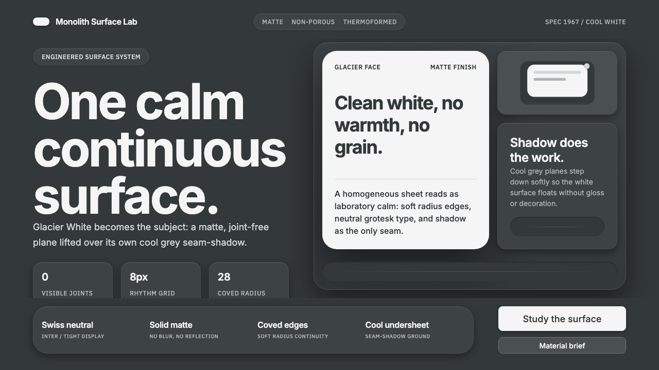 Corian Solid SurfaceSeamless matte calm. Glacier White floats over cool grey shadow with neutral…
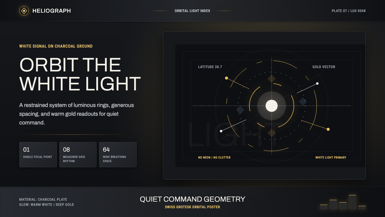 DestinyLuminous restraint. White-gold rings orbit charcoal plates in clean grotesk t…
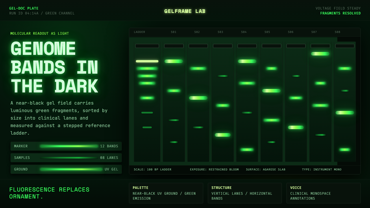 DNA Gel ElectrophoresisLab output becomes light. Green fluorescent bands stack down a near-black gel…
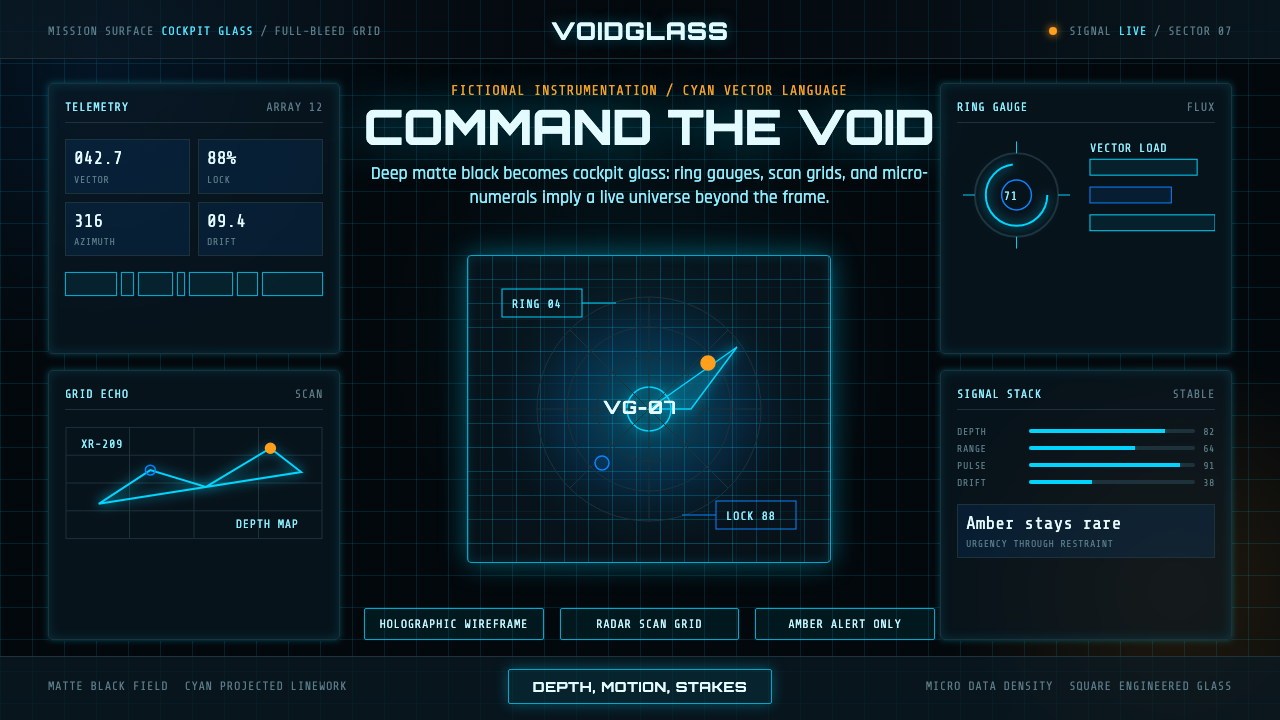 FUI Sci-Fi HUDBlack until it glows. Cyan wireframes, ring gauges, and radar grids sell live…
 Gravitational Wave ChirpData makes the drama. Near-black grid, mono Hz ticks, and a viridis-hot chirp…
 IBM Plex Mono DevColor used like syntax highlighting. Carbon Gray 100 canvas, IBM Plex Mono th…