What is Padshahnama Court Scene?
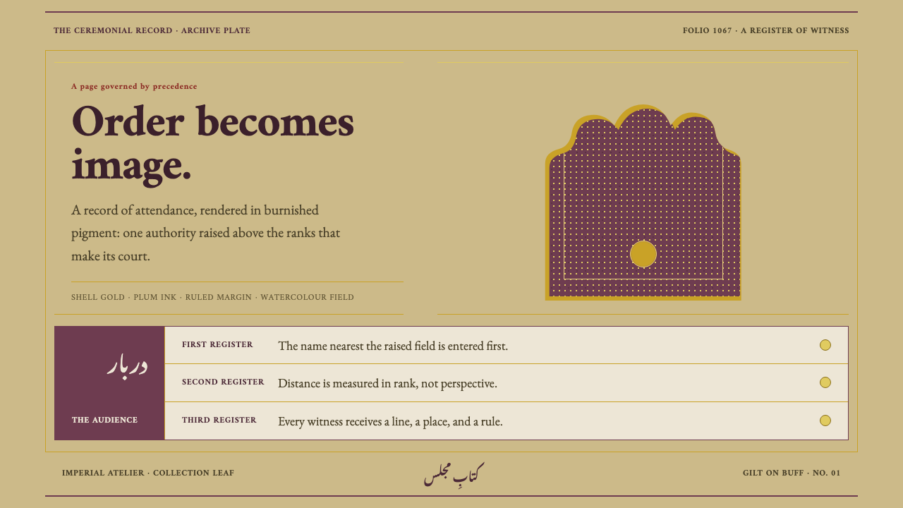
The Padshahnama Court Scene turns imperial rank into layout — one figure raised alone beneath a pointed arch, everyone else ranked in ruled gold bands on burnished buff paper.
Padshahnama Court Scene in brief
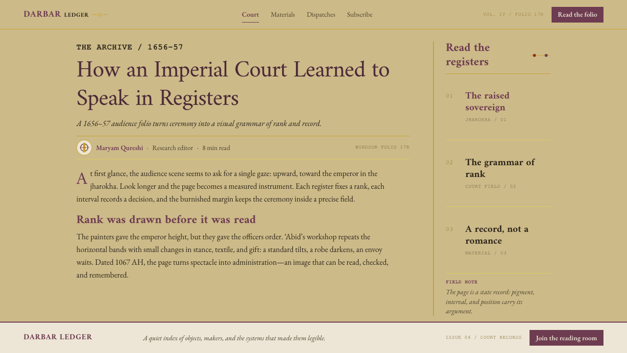
Padshahnama Court Scene is a design style drawn from the Windsor Padshahnama, the illustrated official chronicle of Shah Jahan's reign (1628–1658), copied in 1656–7. Its visual language is that of a Mughal manuscript page: burnished buff paper, a margin of hairline gold arabesque, a picture field worked in mineral watercolour until it gleams like enamel, ruled rectangles in place of soft frames, plum as the dominant colour, and no shadow anywhere.
The idea underneath is that a state record can also be beautiful, and that its beauty is part of how it governs. A court chronicle exists to say who stood where in front of the emperor. The page therefore never announces authority; it arranges it. One element is raised alone and the rest are ranked in horizontal bands beneath it, so importance is read from position rather than from size, proximity or ornament.
Visually the style is warm, dense and very still. The ground is a gilded khaki, closer to aged paper than to white. Plum carries the weight, shell gold supplies fine lines and small accents, and vermilion, malachite green and lapis appear only in small, deliberate quantities. Edges are drawn, never blurred, and depth comes from line, burnishing and the thickness of pigment rather than from simulated light.
Where does Padshahnama Court Scene come from?
A padshah is an emperor and a nama is a book, so the Padshahnama is, in plain terms, the Book of the Emperor: the official record of a reign, composed to be kept. The reign is Shah Jahan's, which ran from 1628 to 1658. The Windsor copy is regarded as the finest of the manuscripts, and it is dated 1067 in the Islamic calendar, which corresponds to 1656–7. That double dating is itself a clue to the object's world. It belongs to the Persianate culture of the Mughal court, where a book was an instrument of state as much as a work of art.
Such a book was a collaboration of specialists, and the Windsor volume shows the division of labour clearly. The text was copied by the calligrapher Muhammad Amin Mashhadi in fine nastaliq, the flowing Persian script favoured for court manuscripts. The audience scenes were painted by court artists, among them 'Abid and Balchand. Behind them stood the imperial atelier of Mughal India, associated with Agra, Delhi and Lahore. Each specialist worked inside the same rules of the page, and the unity of the result is the unity of a studio sharing one standard.
The materials explain the look. The paper is burnished until it is smooth and faintly glossy, and its buff colour is the colour of the whole page. The margins carry gold arabesque painted by hand at hairline weight, with no motif repeated mechanically. Inside them the audience field is built from mineral colours laid over a white ground in watercolour, layer on layer, then burnished again, which is why the surface reads like enamel instead of paint. The system's plum is the purple-brown of the gold-woven robe Shah Jahan wears in the scene.
The composition is the last inheritance, and the most useful. An audience, or darbar, is a ceremony of ranking. The emperor sits alone and high inside a pointed-arch window; everyone else is arranged by rank in horizontal bands, and who matters is told by position, not by how near a figure stands. The page needs no shadows, no glows and no scale tricks to establish power. A single raised figure and a stack of ruled registers are enough, and the system keeps exactly that grammar: one thing lifted, everything else counted off beneath it.
What defines the Padshahnama Court Scene look?
Burnished buff ground
The page ground is a gilded khaki, the colour of burnished paper rather than of a white screen. It is warm, slightly golden and uniform, and everything else sits on it as if painted there. White is not used as the ground; it would turn the gold to yellow and the plum to a flat purple, and the page would lose the stillness of old paper.
Plum and shell gold
Plum, a deep purple-brown, is the colour of authority. It takes the weight of headings, primary panels and the single raised element. Shell gold is its partner, used for fine lines, rules and small accents, never for large fills. Vermilion, malachite green and lapis enter in small doses to mark secondary distinctions, so the palette reads rich without ever becoming loud.
Ruled rectangles
Frames are made of ruled lines. A rectangle is drawn with a thin gold or plum line and the corners stay square; soft cards, pill shapes and rounded containers are absent. The effect is that of an administrative document. Every unit of content is a registered field, bounded and countable, and the border itself is evidence of order.
Registers and the raised element
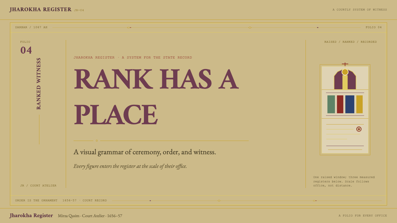
Hierarchy is stated the way a darbar states it. One element is raised alone — larger, higher, or set inside an arched or inset frame — and everything else is stacked in horizontal bands ranked beneath. Rank is read from position in the stack. Size and colour support that reading but never replace it, so a viewer finds the most important thing without being told.
Gold arabesque margins
The page edge is a border of hand-drawn gold arabesque at hairline weight, enclosing the content. Its job is to frame, not to fill: it is thin, continuous and never repeated with mechanical exactness. On screen this becomes a delicate edge treatment, a fine ornamental line or corner motif, while the interior stays calm. The ornament lives at the margin; the content field stays clean.
Flat enamel surface
There is no shadow anywhere and no gradient glow. The picture field is built from layers of mineral colour that are then burnished, so the finished surface is smooth and level, like enamel. Depth is suggested by line, by overlap and by how dense a colour looks, never by simulated light. A panel does not float above the page; it is simply a ruled field on it.
Calligraphic type
Text here is calligraphy before it is typography: evenly set, flowing and subordinate to the page. A digital translation prefers a quiet, high-contrast serif or a gently calligraphic face for headings, set in plum, with body text in a darker neutral at a comfortable measure. Lettering is never decorative for its own sake. It sits in bands, aligned to the ruling, as a scribe's line would.
Who shaped Padshahnama Court Scene?
The emperor whose reign (1628–1658) the Padshahnama records, and the figure at the centre of every audience scene. His gold-woven plum robe is the source of the system's dominant colour, and his position — alone, raised, framed by an arch — is the source of its layout logic.
One of the court painters who produced the audience scenes of the Windsor manuscript. His work stands for the picture field the system imitates: mineral colour built in layers and burnished to a gleam, with every figure assigned a fixed place in the order.
Another of the court painters credited with the Windsor audience scenes. Alongside 'Abid, he shows that the page's consistency came from a shared studio standard rather than from a single hand.
The calligrapher who copied the Windsor text in fine nastaliq in 1656–7. His even, flowing script is why the system treats lettering as part of the page's order and keeps it subordinate to the picture field and its ruled bands.
The court workshops of Mughal India, associated with Agra, Delhi and Lahore, where calligraphers and painters worked to a common standard. The system inherits its discipline: many hands, one rule set, and no element on the page without a stated place.
How do you use Padshahnama Court Scene today?
Padshahnama Court Scene suits any context where hierarchy is the message: ranked, ceremonial, authoritative or archival. Applying it well means borrowing the grammar of the page, not its surface. The grammar is one raised element, ranked bands beneath it, ruled frames and an unlit, flat finish.
For presentation slides, a cover works as a single raised block on a buff ground: the title in plum, a fine gold rule beneath it, a hairline border around the whole slide. Content slides become registers, each horizontal band holding one idea and ranked top to bottom by importance. Data slides favour ranked lists and tables over decorative charts; the leading row can be set in solid plum while the rest sit in ruled bands.
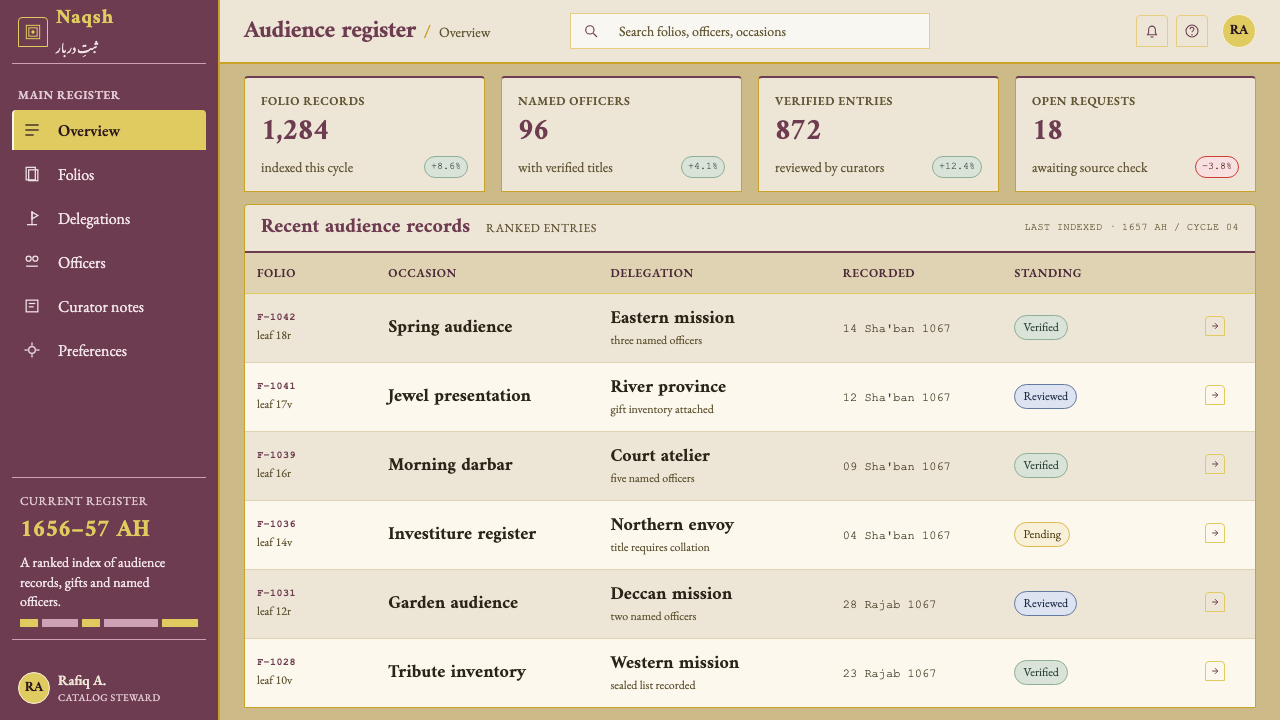
For web interfaces, dashboards and pricing pages take well to the register model. A pricing page can stack plans as horizontal bands, with the recommended plan raised alone above them in an arched or inset frame. Cards become ruled rectangles with square corners and no drop shadow. Buttons are plain rectangles in plum with a shell-gold hairline, and focus states are drawn as ruled lines rather than glows.
For editorial and marketing work, the style gives archives, heritage brands, cultural institutions and annual reports a credible, official voice. Set text in bands aligned to the ruling, keep a thin ornamental margin at the page edge, and let one image or statement sit raised above the rest. Captions and metadata read like the notes of a scribe: small, regular and exact.
The common mistake is to treat the style as generic luxury and scatter gold flourishes everywhere. Shell gold is a thin, flat tone, not a glossy metallic gradient, and ornament belongs at the margin, not across the content. The second mistake is to raise everything: if every card is lifted, nothing is. A single raised element is what gives the rest of the page its rank.
Padshahnama Court Scene — FAQ
Is this the same as Persian miniature or generic Mughal style?
No. Mughal court painting and Persianate manuscript illumination are the traditions it comes from, but the system takes its rules from one specific page: the Windsor Padshahnama of 1656–7. It does not collect motifs from the whole tradition. It takes a ground, a palette, a framing habit and a way of ranking figures, and it leaves out the figurative scenes themselves.
How do I get gold onto a screen without a metallic gradient?
Treat gold as a flat tone and use it in thin quantities. The original is shell gold applied in hairline weight on a burnished ground, so the right translation is a fine rule, a corner motif or a small accent in a warm, slightly muted gold. Large gold fills and glossy highlights would contradict the enamel-flat surface the whole page depends on.
Why is there no shadow at all?
Because the surface is meant to read as polished and level. The painted field is built in mineral layers and burnished, so its depth comes from line and pigment, not from light. A shadow would suggest a light source and a raised card, and that would contradict the page's own logic, in which rank comes from position rather than from apparent height above the surface.
Does it need Persian or Arabic-script calligraphy to work?
No. The original text was copied in nastaliq, but what carries over is the discipline of the lettering: evenly set, subordinate to the page, aligned to the ruling. Latin and Chinese text can follow the same discipline with a quiet serif or a gently calligraphic face. If you do use real Arabic-script lettering, it should be set by someone who reads it, not used as decoration.
Does the style work on a dark background?
It is built on a light ground. The burnished buff paper is the page, and the gold and plum are tuned to read against it. A dark version is possible, but it loses the paper-and-enamel quality that gives the system its stillness. If you need one, keep the ruled frames, the single raised element and the restrained palette, and treat it as a variation rather than the canonical form.
Related design styles
 Thai Temple MuralDevotional density. Vermilion panels, plaster cream, and 1.5px gold borders m…
 Bhutanese Drukpa Kagyu ThangkaDevotion made cobalt. Gold frames, Cormorant serif, and vermilion marks hold…
 Bhutanese Dzong (Fortress Red)Monumental red holds the page. Cobalt frames and gold bands lock the fortress…
 Book of Kells Celtic (800)Sacred and precise. Vellum cream, lapis, vermilion, and gold knotwork.
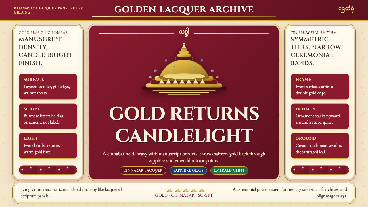 Burmese Shwedagon Gold-LacquerOpulence catches fire. Gold-leaf gradients on cinnabar panels frame a stupa s…
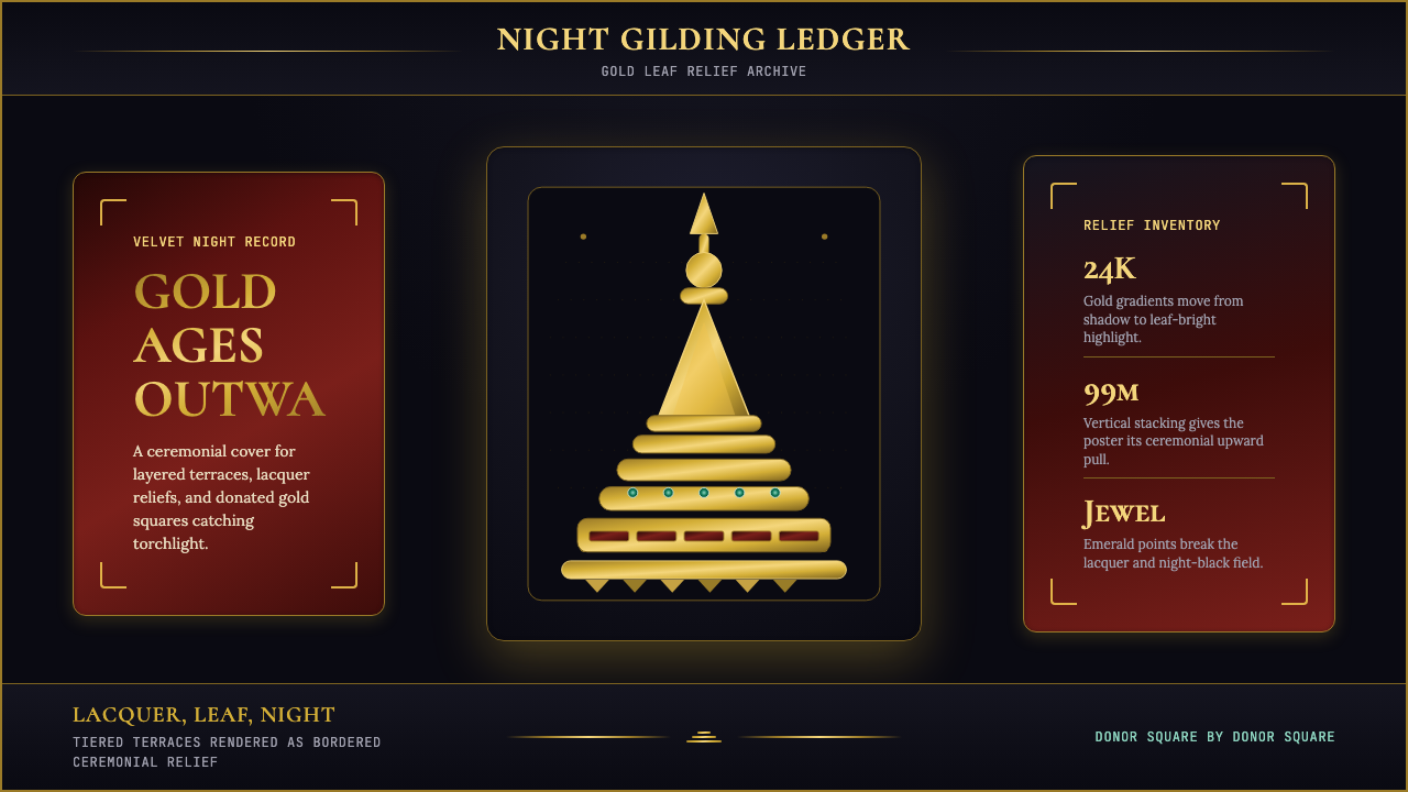 Burmese Shwedagon Stupa ReliefGold refuses restraint. Velvet black, teak-red lacquer, and tiered gradients…