What is Mother-of-Pearl Nacre?
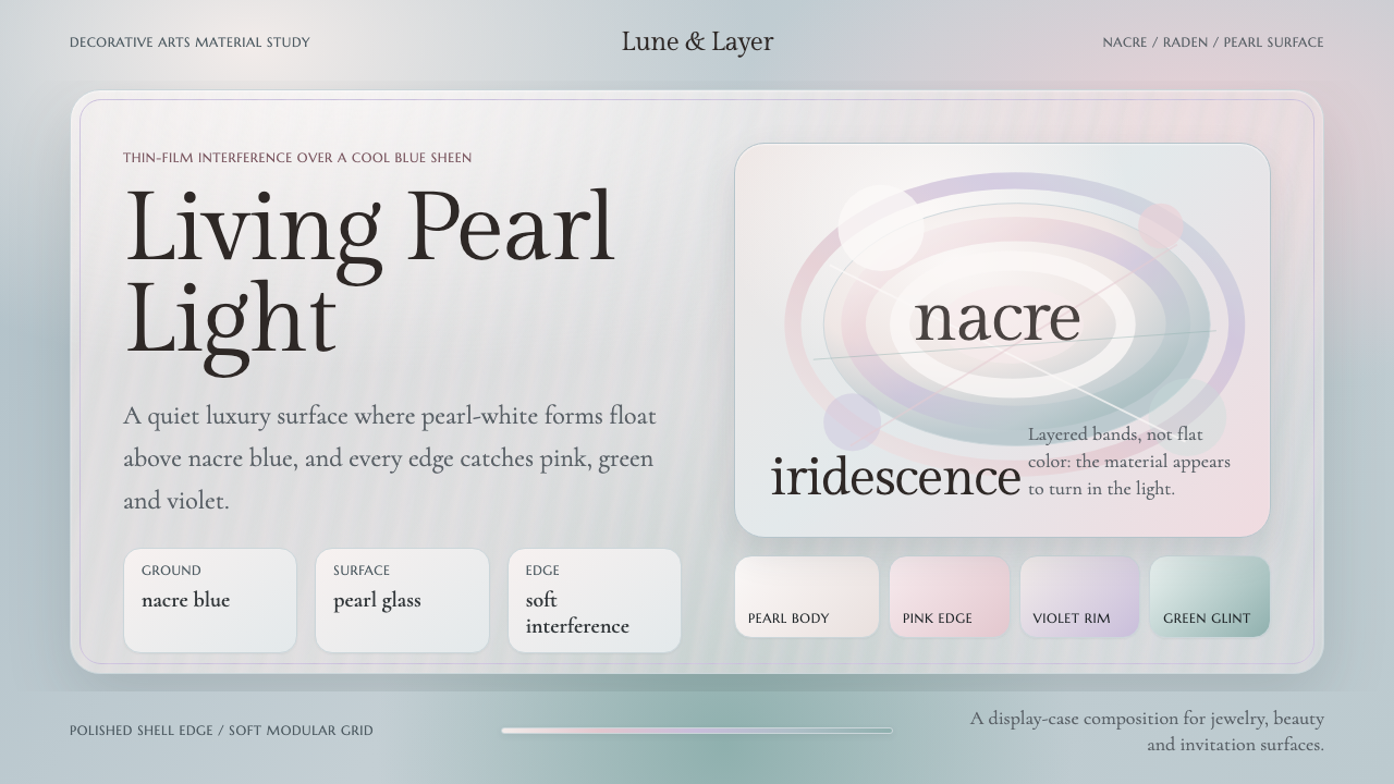
Mother-of-pearl turns quiet light into luxury: a nacre-blue ground, pearl-white forms, and iridescent rims that move through pink, violet, and green.
Mother-of-Pearl Nacre in brief
Nacre, or mother-of-pearl, is the iridescent inner lining of oyster and abalone shells. Nature builds it in layers, creating a surface that bends and shifts light rather than reflecting a single fixed color. Its body is a soft pearl white, while its characteristic sheen moves across cool blue-gray, pale pink, blue, green, and violet.
This design system treats nacre as a complete brand language rather than a decorative effect. The page begins with a nacre-blue sheen instead of cream or plain white. Pearl-white panels carry the principal forms, while interference tints appear lightly along edges and transitions. The result feels expensive through material suggestion, not through visual excess.
Its typographic voice comes from jewelry and the decorative arts: high-contrast display serif type, carefully framed forms, and a composed sense of rarity. The style should feel luminous but controlled. Its color is not painted onto the surface; it appears to travel through the surface as the viewer moves.

Where does Mother-of-Pearl Nacre come from?
The lineage of Mother-of-Pearl Nacre belongs to the decorative arts and jewelry traditions that existed before 1900. Its source is not an invented pigment or a synthetic gloss, but shell material whose layered inner surface naturally produces a pearlescent response. The design language therefore begins with an observed physical quality: softness, depth, and light that changes without becoming loud.
Its regional history is global because shellcraft appears across the world. The approved lineage includes worldwide shellcraft, mother-of-pearl and raden inlay, pearlescent surface craft, jewelry, and shell-inlay furniture. These practices share an interest in turning shell into a visible surface, but they also preserve the material's own irregular and shifting character.
Japanese raden inlay is a named expression within this broader shellcraft lineage. In the design system, raden functions less as a literal historical reconstruction than as a reference for precision, patience, and the meeting of hard craft with delicate luminosity. The association supports a surface that feels assembled and precious, while remaining visually quiet.
The modern system translates that craft lineage into a repeatable visual structure. Instead of reproducing a shell object, it assigns material roles to the interface: nacre-blue becomes the atmospheric ground, pearl white becomes the principal body, and pink, violet, blue, and green become edge phenomena. The historical lineage supplies the sensibility; the system supplies the discipline.
What defines the Mother-of-Pearl Nacre look?
Nacre Blue Ground
The background carries a cool blue-gray pearlescent sheen. It should never read as plain white, cream, or a flat corporate blue. Its role is atmospheric: a restrained field of light that gives pearl-white forms somewhere to emerge from. The ground may feel subtly alive, but it should remain calm enough for type and information to stay legible.
Pearl-White Forms
Primary panels, cards, surfaces, and containers are pearl white rather than stark white. This difference matters because pearl white suggests a material body with softness and depth. Forms should be clean and composed, with enough contrast against the nacre-blue ground to establish hierarchy without looking cut from a separate visual world.
Interference Edges
Pink, violet, green, and blue belong primarily to edges, rims, seams, and moments of transition. They should appear as a restrained interference effect, not as unrelated accent blocks. The eye should discover the colors gradually, as though light were sliding across a shell. Their value comes from placement and restraint more than saturation.
Crafted Panels
The system favors framed surfaces that feel assembled, polished, and precious. Panels can organize content or isolate an image, but their presence should imply craft rather than generic interface modularity. A panel is strongest when its boundary, inner light, and relationship to the blue ground are all legible without heavy ornament.
Display Serif Typography
Typography uses high-contrast display serif forms associated with jewelry and decorative arts. Large titles may feel elegant and sculptural, while supporting text should stay quiet and readable. The contrast between refined display type and restrained informational type creates the sense of a catalog, atelier, or carefully curated collection.
Soft Depth
Depth should be suggested through tonal separation and material relationships rather than hard dimensional effects. Pearl panels can appear to rest above the nacre-blue field, but the transition should remain gentle. The design is dimensional in impression, not theatrical in execution; it evokes layered shell instead of polished plastic.
Quiet Luxury
Luxury is expressed through finish, spacing, and selective detail, not through abundance. The palette should leave room around its most luminous elements. Repeating every interference tint everywhere weakens the illusion of rarity. The strongest compositions let the blue ground, pearl forms, and a few colored edges carry the entire mood.

Who shaped Mother-of-Pearl Nacre?
Raden inlay artisans represent the Japanese branch of the approved mother-of-pearl lineage. Their relevance to this system is the idea of shell as a carefully placed surface: precise, layered, and valuable because the material's own light remains visible through the craft.
Mother-of-pearl jewelers connect the material to the language of rarity and adornment. Their place in the system explains the use of pearl white, controlled luminosity, refined display serif type, and accents that feel discovered rather than loudly announced.
Shell-inlay furniture makers extend nacre from small adornment to architectural surface. Their contribution suggests that panels and broad fields can carry the material language at scale, provided the composition remains calm and the shell-like shimmer is treated as structure rather than decoration.
How do you use Mother-of-Pearl Nacre today?
For presentation slides, use the nacre-blue ground as the consistent stage across cover, content, and data pages. A cover can place a large pearl-white panel or title field against the blue sheen, with a restrained interference rim providing the moment of discovery. Content slides should favor generous breathing room and clear display-serif hierarchy. Data slides work best when charts are treated as crafted panels, with a quiet body and selective pearlescent accents rather than a rainbow of competing colors.
For web interfaces, the system suits dashboards, pricing pages, catalogs, and premium service portals where trust and distinction matter. Use pearl-white surfaces to separate functional groups from the blue field, and reserve pink, violet, green, or blue shifts for active states, boundaries, or meaningful transitions. Navigation should remain composed and typographic. The interface can feel luxurious, but every luminous detail still needs an informational role.
For editorial and marketing work, Mother-of-Pearl Nacre supports the language of collections, ateliers, jewelry, interiors, and carefully made objects. A feature article can pair a quiet blue field with a pearl-white reading surface and use iridescent edges to mark sections or pull quotes. Marketing pages benefit from a catalog-like rhythm: restrained headlines, polished panels, selective imagery, and enough open space for the surface quality to remain visible.
For product storytelling, let material and narrative reinforce each other. A product introduction might begin with the blue sheen, reveal the pearl-white form, and reserve color movement for close details or transitions. This sequence makes the page feel like an object being turned in light. It is especially effective when the content concerns craft, rarity, finish, collectability, or the relationship between natural material and refined making.
The common mistake is treating pearlescence as permission to add shine everywhere. Saturated gradients, constant rainbow borders, excessive gloss, or decorative sparkle make the system feel synthetic and noisy. Another mistake is replacing the nacre-blue ground with cream or plain white, which removes the material's identity. Keep the shimmer selective, keep the forms calm, and let rarity come from what is withheld.

Mother-of-Pearl Nacre — FAQ
Is Mother-of-Pearl Nacre the same as a pearlescent gradient?
No. A gradient is a color transition, while this system refers to the layered inner surface of oyster and abalone shells and the way that surface bends light. The visual language uses color movement sparingly, especially along edges and transitions. If every surface displays a continuous rainbow, the result loses the quiet material character that defines the style.
Why must the ground be nacre blue instead of white?
The blue-gray sheen establishes the identity of the material. Pearl white then reads as a form emerging from nacre rather than as an ordinary white card on a neutral page. Cream and plain white remove the cool atmospheric layer that makes the pink, violet, green, and blue edge effects feel like interference light.
How should the iridescent colors be distributed?
Use them as edge phenomena: rims, seams, borders, transitions, or selected details. They should not become equal competing fields. Pink, violet, green, and blue can appear in related families, but the composition should still have a dominant nacre-blue ground and pearl-white body. The eye should notice the color as a shift in light, not as a set of loud badges.
What kind of typography belongs to this style?
High-contrast display serif typography is the clearest fit because it carries the register of jewelry and the decorative arts. Use it for titles, collection names, and moments that require elegance. Supporting text should remain restrained and readable. The contrast between sculptural display type and quiet information gives the system a curated, catalog-like voice.
Can this style work for functional interfaces, or only for luxury brands?
It can work for functional interfaces when the material language remains subordinate to clarity. Dashboards, pricing pages, catalogs, and premium service portals can use pearl-white panels and selective edge color to create distinction without sacrificing navigation or legibility. It struggles when every control is made luminous or ornamental. The style succeeds when luxury is expressed through finish and restraint, not when function is hidden beneath decoration.
Related design styles
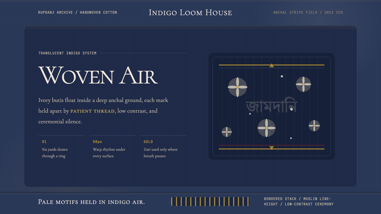 Bengali Jamdani MuslinBreathes like woven air. Indigo ground, ivory butis, and threadline borders s…
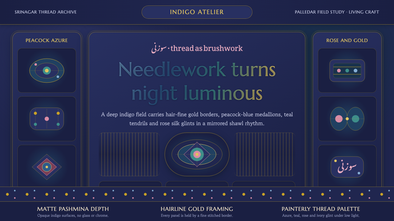 Kashmiri Sozni Shawl EmbroideryNight made luminous. Indigo ground, gold hairlines and silk medallions stitch…
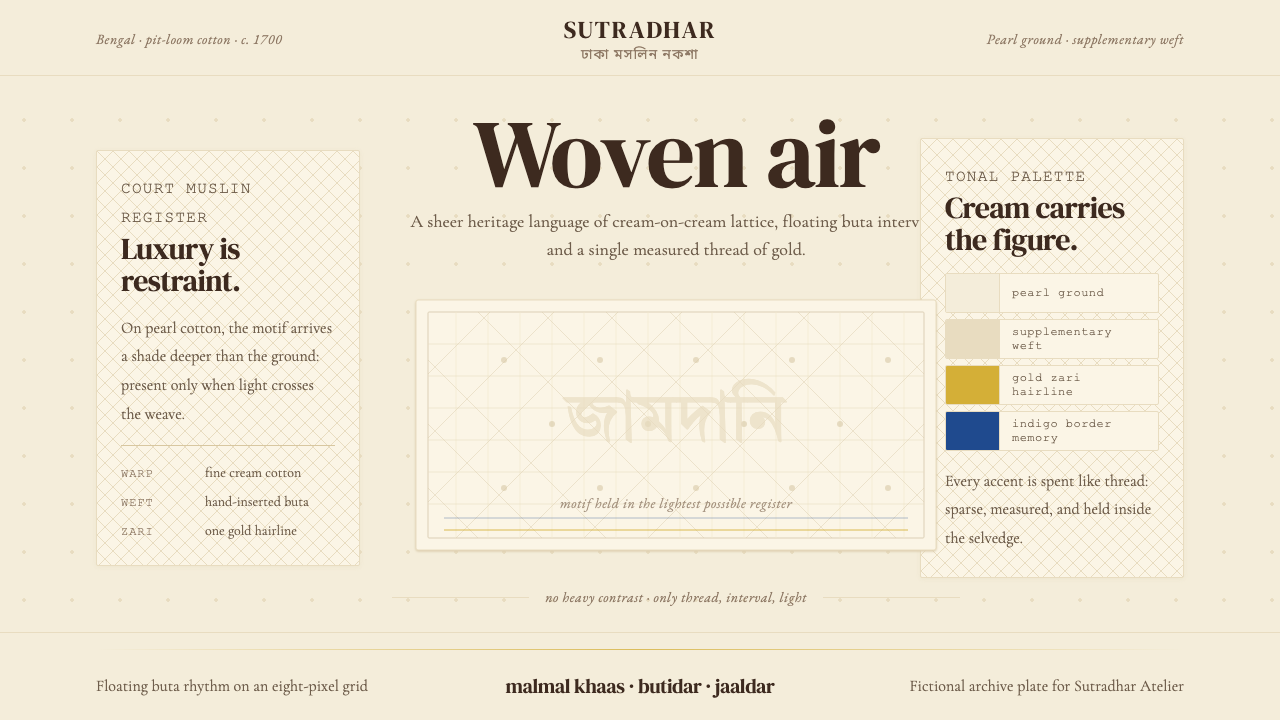 Bengali Jamdani WeavingLuxury whispers. Pearl cream, tonal buta, and one gold hairline make woven ai…
 Celtic KnotworkEverything is connected. Gold Cinzel interlace frames forest-green vellum.
 Danish Skønvirke SilverThe drawing is done in shadow. Amarante on soft silver, with amber held in bi…
 Georgian Minankari CloisonnéJewel-deep and wire-fenced. Lapis enamel, gold seams, emerald cells, glossy s…