What is Danish Skønvirke Silver?
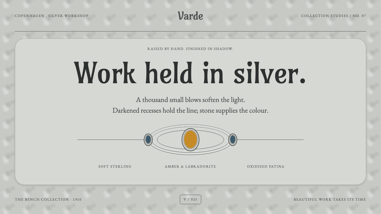
Skønvirke is Denmark's answer to Art Nouveau, made at the bench rather than on the printing stone — hammered silver, drawn in shadow, with colour arriving only as stone.
Danish Skønvirke Silver in brief
Skønvirke, which translates roughly as 'beautiful work', is the Danish branch of the turn-of-the-century movement known elsewhere as Art Nouveau or Jugendstil. Between about 1895 and 1915 it produced brooches, belt clasps, beakers and bowls raised by hand from sterling silver sheet in Copenhagen workshops. Where French and Belgian Art Nouveau is often remembered for posters, glass and ironwork, Skønvirke is remembered above all for silver, and for the way the metal itself carries the design.
The look is soft rather than glittering. Every surface is planished with a rounded hammer, leaving a fine pattern of facets that scatters light the way fog sits on water. The silver is a gentle grey, not a mirror. Into this surface the maker chases tendrils, buds and curving stems, and darkens the recesses so that the drawing is done by shadow: raised planes stay bright, hollows sink into depth, and form is read from tone instead of from an outline.
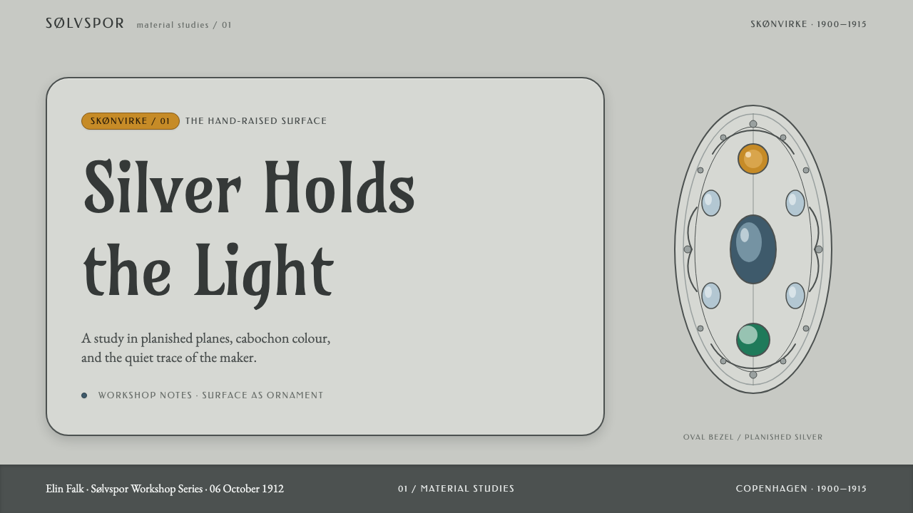
Colour enters the work in one way only, as stone. Chrysoprase, amber, moonstone, labradorite, carnelian and malachite are set as smooth domes at the points where a tendril turns, usually two or three to an object. The composition is organised along a central axis and is broadly symmetrical, but each stroke carries a slight deviation from the hand that made it. That mixture of order and tremor is the movement's signature.
Where does Danish Skønvirke Silver come from?
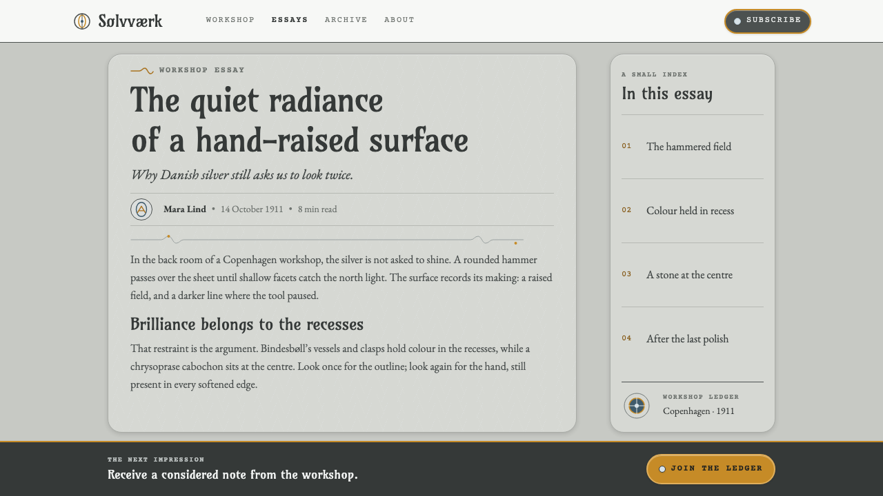
Skønvirke emerged in Denmark in the years around 1895, and the movement, together with its own journal, is usually dated to about 1895–1915. Its name captures a particular stance: beauty was something produced by work, at the bench, rather than something printed or pasted onto an object. Danish designers took the curving, plant-derived language of Art Nouveau but tied it to the Arts and Crafts conviction that good design begins in the workshop, with materials a maker can feel in the hand.
The movement was centred on Copenhagen. The architect and ornamentist Thorvald Bindesbøll and the painter-turned-metalworker Mogens Ballin are two of the central names, alongside Georg Jensen and Siegfried Wagner, and around them clustered the workshops that produced the work. These were small shops where one person or a few people shaped a piece from beginning to end. That scale is part of the style's character: its surfaces show a human hand at every stage, and no two pieces are quite alike.
The technique is the heart of the matter. A flat sheet of sterling silver was raised into a form by hammering, then planished all over with a rounded hammer until the whole surface was covered in tiny, soft facets. Ornament was chased into the metal, and a liver-of-sulphur solution was used to patinate it, darkening the recesses to a grey-green depth while the raised planes were left bright. The stones were then bezel-set, held by a thin rim of metal, usually at the places where the design turned or branched.
Danish makers did not simply copy the whiplash line made famous in France and Belgium. They worked within the broader European network of Nordic Art Nouveau, but what became recognisably Danish was a quieter, more tactile idea of ornament: soft light, shadow as drawing, and colour confined to a few precious points. Later Danish silver would be admired worldwide for its calm and craftsmanship, and the Skønvirke years are where much of that reputation was first assembled.
What defines the Danish Skønvirke Silver look?
Soft Silver Ground
The base is a pale, slightly warm silver-grey, never a pure white and never a chrome-bright mirror. It is the colour of planished metal catching fog-like light. Large areas stay quiet and matte, so that the few darker or more saturated marks stand out without being forced.
Hammered Texture
The surface is described as a field of tiny soft facets rather than a smooth plane. This gives the metal a granular glow and prevents harsh highlights. In a digital interpretation the equivalent is a restrained, almost imperceptible grain: texture that suggests handwork while staying light enough not to compete with the content.
Drawing in Shadow
Patina darkens the chased recesses while raised planes stay bright, so the design is drawn by tone, not by line. Edges are soft transitions from light to deeper grey-green rather than outlines in a different colour. Shapes feel carved into the surface and depth is built from value shifts.
Amarante Accent and Organic Serif
Text and key marks appear in amarante, a deep reddish purple, set on the soft silver ground. Letterforms are serif and organic: they have the slight swelling and tapering of a stem in the act of growing, matching the tendril motifs. The pairing feels more crafted than a standard black-on-white, without becoming decorative.
Colour Only as Stone
Chrysoprase green, Baltic amber, moonstone, labradorite, carnelian and malachite are the only sources of true colour. Each is cut as a smooth dome and set at a node where a tendril turns. Translated to a layout, colour appears as small, deliberate jewels such as a status dot, a selected tab or a single highlighted word, never as large flooded areas.
Bilateral Curves
Compositions run along a central axis and mirror themselves in broad outline, with branching tendrils, buds and spirals curving outward on either side. Amber sits within these curves, held between their arcs. The symmetry is never perfectly mechanical, because the hand introduces small variations that make the whole feel alive.
Workshop Scale
Objects are small, personal things: a brooch, a clasp, a beaker, a bowl. The design language therefore favours intimate proportions, close-up detail and a calm pace rather than monumental gestures. It rewards being looked at slowly.
Who shaped Danish Skønvirke Silver?
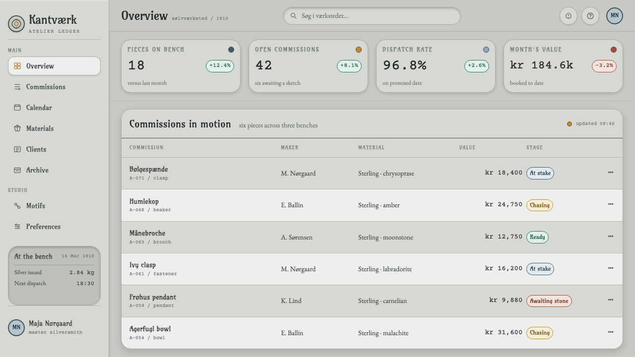
A Danish architect who became one of the era's most inventive ornamentists, Bindesbøll is a central name in Skønvirke. He worked across silver, ceramics and printed ornament, and his surface patterns are known for moving away from literal plant copying toward free, flowing abstraction. His example helped make decoration at the bench seem as serious as architecture.
Ballin came to metalwork from painting and became one of the movement's key workshop figures in Copenhagen. His path shows how Skønvirke drew artists into craft: the painter's sensitivity to tone and surface carried over into hammered silver, where shading is done by patina rather than by paint.
Jensen is among the names the source material places at the centre of Skønvirke, and he went on to found the silversmithy that carries his name. His career is the clearest example of how the workshop culture of these years later became the foundation of Danish silver's international reputation.
Wagner is counted among the principal Copenhagen makers associated with the movement. His inclusion alongside Bindesbøll, Ballin and Jensen is a reminder that Skønvirke was a network of makers rather than the work of a single master, and that its style came from shared habits at the bench.
How do you use Danish Skønvirke Silver today?
Danish Skønvirke Silver is a light, calm, handmade-feeling style. It suits projects that want to feel crafted, intimate and quietly precious without being flashy. The principle to carry across is restraint with warmth: large soft quiet areas, a few small jewel-like points of colour, and an overall rhythm that looks hand-adjusted rather than machine-perfect.
For presentation slides, use the soft silver-grey as the slide ground and keep covers spare. Set the title in an organic serif in amarante and add a single curved, bilaterally symmetrical flourish along the central axis, with one small amber-like accent where it turns. Content slides work as calm single-column layouts with generous space, and any chart should use tonal variation of grey-green and silver for the bulk, with the one key series picked out in a stone-like colour. Avoid heavy boxes and borders; let shadow and tone organise the page.
For web interfaces, the style fits boutique commerce, jewellery and craft brands, portfolios, gift services, hospitality and wellness products. Use soft tonal depth in place of drop-shadow stacks, keep buttons and badges small and gently curved, and reserve colour for the few elements that deserve attention: a selected state, a price, a status. Icons should be drawn as organic, slightly irregular curves, never as rigid geometric glyphs.
For editorial and marketing work, the best results come from symmetrical layouts built along a central axis, a calm serif for headlines, and generous margins that let each image breathe. Product photography of small objects, especially those with soft reflections, fits naturally. A small ornament, such as a tendril divider drawn with a slightly uneven line, can mark section breaks and echo the hand-chased metalwork.
A frequent mistake is to read the style as 'silver gradient' and apply a shiny metallic effect, which produces the glossy chrome look Skønvirke avoids. Another is to add many gemstone colours at once; the original rule is two or three stones to an object. Finally, do not make the symmetry perfectly rigid. A slight softness in alignment, a curve that is a little unequal, keeps the work from looking machine-made.
Danish Skønvirke Silver — FAQ
What does Skønvirke mean, and how does it relate to Art Nouveau?
Skønvirke means roughly 'beautiful work'. It is the Danish branch of the Art Nouveau or Jugendstil movement, active from about 1895 to 1915. It shares the curving, plant-inspired vocabulary, but it is more rooted in the Arts and Crafts idea that good design is made at the bench. Its best-known medium is hand-raised silver rather than posters or architecture.
Why is the palette so restrained?
Because in the original work colour arrives only as stone. The metal itself is a soft silver-grey patinated to deeper grey-green in the recesses, and the only true colour comes from a few gems such as chrysoprase, amber, moonstone, labradorite, carnelian and malachite. Treating colour as precious and scarce is the whole logic, and flooding a layout with it would break the system.
Is it a symmetrical style?
Broadly yes. Compositions are organised on a central axis with curves mirrored on either side. But the symmetry is hand-made rather than mechanical: each stroke carries a small natural deviation. In design terms, aim for balanced layouts where the two sides echo each other without being exact copies.
Can I use it for a dark theme?
The system is built on a light, soft silver ground, and its sense of 'drawing in shadow' relies on bright raised planes against darker hollows. A dark version would need to invert that logic carefully, and it risks losing the fog-like softness. If you need a dark page, use deep patina grey-green as the ground and keep the same restraint with colour, but treat it as an adaptation rather than the core style.
What kinds of products suit it best?
Products that value craft, intimacy and quiet luxury: jewellery, small-batch goods, design portfolios, cultural institutions, hospitality and wellness brands, and editorial projects about objects. It is less suited to dense data dashboards or loud, high-energy consumer apps, where its soft tones and sparse colour would be underpowered.
Related design styles
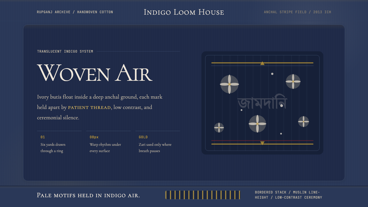 Bengali Jamdani MuslinBreathes like woven air. Indigo ground, ivory butis, and threadline borders s…
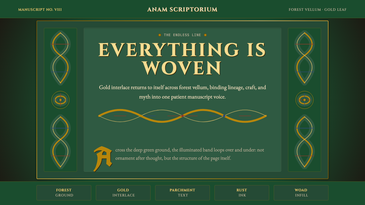 Celtic KnotworkEverything is connected. Gold Cinzel interlace frames forest-green vellum.
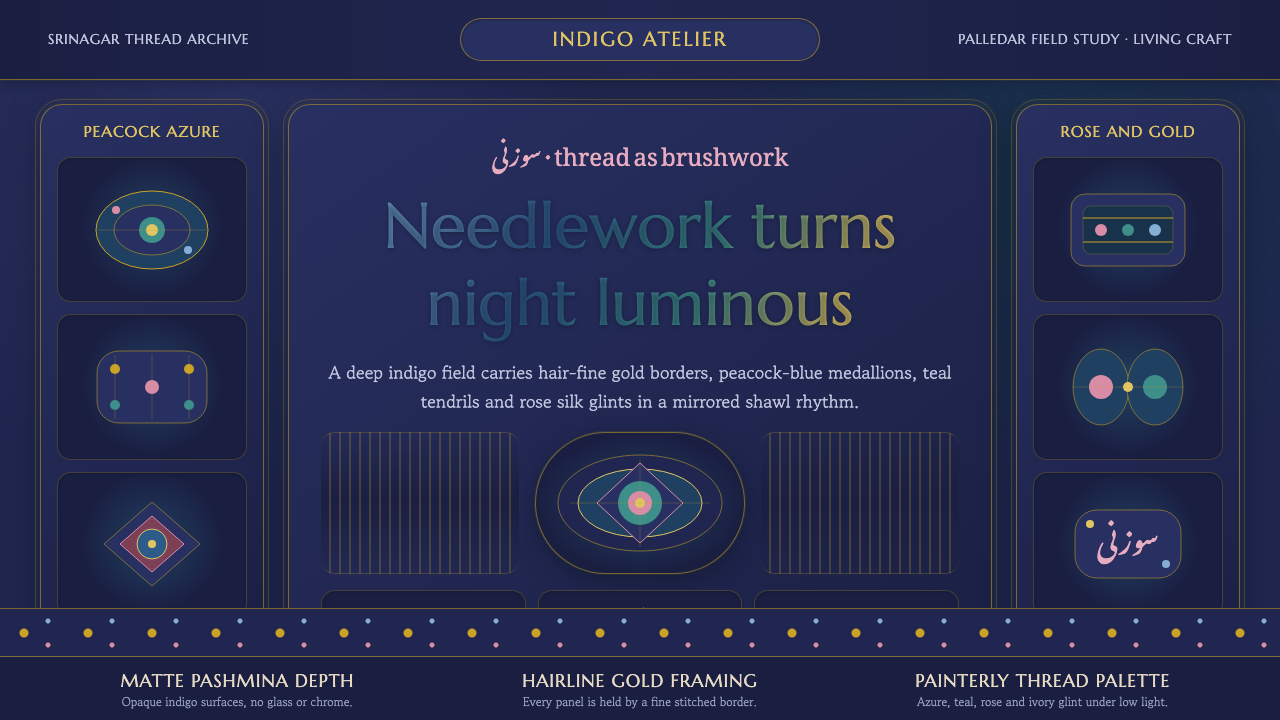 Kashmiri Sozni Shawl EmbroideryNight made luminous. Indigo ground, gold hairlines and silk medallions stitch…
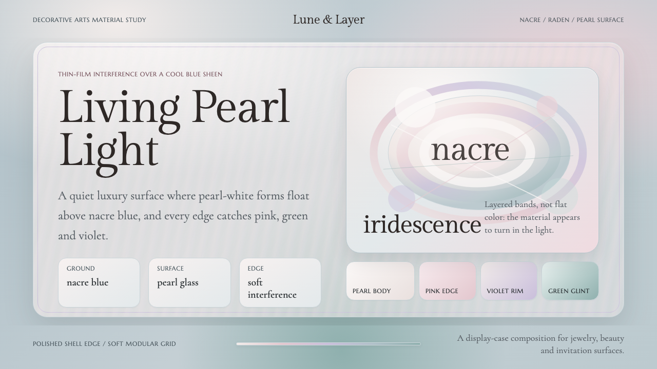 Mother-of-Pearl NacreQuietly expensive shimmer. Nacre blue ground with pearl panels and pink-viole…
 Absinthe Art Nouveau Green (1875)Ornate and verdant. Chartreuse field, gold filigree, vine-script type, and lo…
 Art Nouveau (Mucha)Mucha's whiplash arabesques. Botanical halos, muted lithograph palette, no ma…