What is Monument Valley?
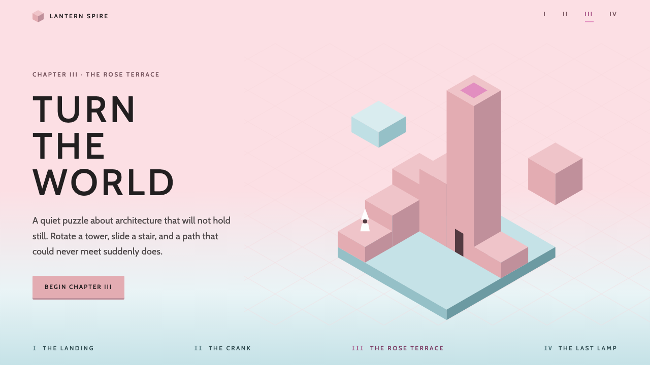
Monument Valley turned impossible architecture into a calm interface language: pale misty skies, rose towers lit in three flat shades, and wide-set capital labels that never raise their voice.
Monument Valley in brief
Monument Valley is a visual style drawn from the 2014 puzzle game of the same name, made by ustwo games in London. In the game, a silent princess in a white pointed hat walks through architecture that should not hold together: towers rotate, stairs slide, and paths that cannot meet suddenly do. The style that surrounds this play is just as memorable as the puzzles, and it has become a reference point for anyone who wants a digital surface to feel quiet, deliberate and a little dreamlike.
As a design language, it is built from a short list of decisions. The sky is a pale, misty pink. Buildings are rose-coloured and each block is lit in exactly three flat shades, one for the face that catches the light, one for the side, and one for the face turned away. A blue-mint haze pools at the base of the towers. Every label is set in a wide uppercase sans-serif with generous letter-spacing, and body text stays unobtrusive. There are no outlines, and there are no gradients inside a face.
What ties these choices together is restraint. The style assumes the architecture is the star, so the interface must step back and let structure speak for itself. Space around objects is generous, controls are light, and nothing competes with the shape of a tower or the path of a small figure walking across it. That is why the look translates so well from a game world into slides, landing pages, portfolios and any product that wants to feel gentle rather than loud.

Where does Monument Valley come from?
Monument Valley was released for iOS in April 2014 by ustwo games, a studio based in London, United Kingdom. It arrived as a small, tightly authored mobile puzzle game at a time when most touch-screen games competed through noise, speed and constant rewards. Monument Valley went the other way. It asked players to slow down, rotate a structure with a finger, and notice that a path which looked broken from one angle was whole from another. The names most often associated with the project include Ken Wong, Neil McFarland and Stafford Bawler, and the game's art direction became the thing most people remembered about it.
The visual lineage is easy to read once you know where to look. The impossible figures of M.C. Escher are the obvious ancestor: staircases that loop, walls that become floors, and a viewpoint that refuses to settle. The second ancestor is the Japanese woodblock print, with its flat fields of colour, clean edges and deliberate empty space. The third is isometric illustration, the old technique of drawing three-dimensional objects at a fixed oblique angle so that parallel lines never converge. Isometric drawing is precisely what makes an impossible structure possible on screen, because with no vanishing point the eye cannot tell which edge is nearer, and a gap can be read as a connection.
The game continued to grow after launch. A set of additional chapters titled Forgotten Shores followed in November 2014, and Monument Valley 2 arrived in 2017. Across these releases the style stayed recognisable while the palettes shifted from chapter to chapter, which is part of why designers talk about it as a system rather than a single picture. The style used here takes the pink castle chapters as its ground: the pale misty sky, the rose towers and the blue-mint haze at their feet.
Its influence outside games is a story of translation. Designers noticed that the same ingredients that made a puzzle world feel serene could make a website feel serene. Flat planes need no ornament. Three tones per object give enough depth to feel solid without simulating light. Wide capital labels read as signage in an imagined place. The result is an interface that feels like a quiet museum of small buildings, which is a very different promise from the glossy dashboards that dominate software today.
What defines the Monument Valley look?
Three-tone surfaces
Every block is lit in exactly three flat shades: a light face, a mid side and a darker face turned from the light. The three tones are enough to make a form feel solid and to tell the viewer which way the light falls, yet none of them blends into another. This is the signature of the style. Inside any one face the colour is perfectly even, so surfaces read like cut paper or printed blocks instead of rendered materials.
Misty rose palette
The ground of the style is a pale, misty pink sky with rose-coloured towers standing in it. A cooler blue-mint haze gathers at the base of structures, giving the warm palette one cool counterweight. The overall mood is soft and low in contrast between neighbours, which keeps the eye calm. Accent colours are used sparingly and tend to belong to the same dreamy family rather than jumping out as alerts.
Wide uppercase labels
Titles and labels are set in a friendly humanist sans-serif, in capitals, with wide letter-spacing. The effect is closer to signage on a quiet building than to a headline in a magazine. Because the capitals are generously spaced they feel unhurried, and because they are kept small relative to the artwork they never overpower it. Body text stays plain and soft so that the labels remain the only typographic accent.
No outlines, no gradients
Edges are made by the meeting of two flat colours, never by a drawn line. Likewise no gradient fills a face. This is a discipline inherited from woodblock printing and isometric illustration, where form is carried by the arrangement of flat planes. In an interface it means buttons, cards and panels look like small architectural volumes instead of glossy objects, and the page stays quiet even when it contains many elements.
Isometric, impossible geometry
The game's structures are drawn at a fixed oblique angle with no vanishing point, which lets stairs, bridges and towers connect in ways that perspective would forbid. In design work this becomes a taste for stacked blocks, stepped diagrams, offset tiles and layouts where one element seems to lead into another across a gap. It is a playful geometry, but always a precise one: angles are consistent, and every illusion is built from clean, repeatable shapes.
Generous calm space
Space around objects is wide, and the empty sky is treated as part of the composition rather than a gap to fill. Elements are few and given room to breathe, which is why a small figure on a long stair can feel monumental. For an interface, this means fewer items per screen, loose spacing between groups and a refusal to crowd the main subject with decoration.

Who shaped Monument Valley?
Ken Wong is one of the names most closely associated with Monument Valley. The game's art direction, with its pink castles, flat tonal blocks and quiet staging, is the most remembered part of the project, and his name is often cited when designers discuss why the look feels so coherent.
Neil McFarland is credited among the people behind the game at ustwo games in London. His name belongs to the small team that shaped the original release in 2014 and its follow-ups, which together define the visual vocabulary this style borrows.
Stafford Bawler is another name linked with the Monument Valley project. Like the others, he is part of the story of how a small studio turned a handful of flat colours and impossible stairs into a design reference that outlived the game's first release.
The Dutch graphic artist M.C. Escher is the conceptual ancestor of the whole style. His impossible figures, with staircases that loop and surfaces that change orientation, supply the logic that the game turns into something you can touch and rotate. Designers who use this style are borrowing his idea that a structure can be perfectly drawn and still be impossible.
How do you use Monument Valley today?
The Monument Valley style is best understood as a mood with rules. It suits any project that wants to feel gentle, curious and slightly otherworldly without becoming childish. It works for creative portfolios, small games, meditation or wellbeing products, educational stories, studio sites and presentations that need to explain something intricate without shouting. It is a poor fit for dense, data-heavy tools that depend on strong contrast and many competing signals.
For presentation slides, begin with the cover. Let the pale misty sky fill the page, place one simple stack of rose-coloured blocks to one side, and set the title in wide capital letters with generous spacing. Content slides should hold only one idea each, with a single illustration or diagram built from the three-tone blocks and plenty of empty sky around it. For data slides, make bars and segments flat blocks with the same three-tone treatment, avoid gridlines that clutter the page, and label directly rather than through a legend.
For web interfaces, apply the system to dashboards, pricing pages and onboarding flows that benefit from calm. Cards become flat volumes with no outline and no gradient, separated by space instead of borders. Buttons are simple flat shapes with a clear, soft hover change that swaps one tone for the next. Navigation and section headings take the wide capital style, kept small. Use the cool blue-mint haze at the foot of a section as a gentle divider, and reserve any stronger accent for a single call to action.
For editorial and marketing work, think of each section as a small scene. A long article might open with a quiet isometric illustration, then proceed in narrow, comfortable columns with ample margins. Product pages can use stacked blocks to represent features or steps, with the path between them implied by alignment rather than drawn arrows. Campaigns benefit from the style's storytelling instinct, because the viewer feels invited to walk through the layout rather than being pushed down a funnel.
The most common mistake is to add effects that the original deliberately lacks. Drop shadows, glows, glossy highlights and gradient fills will instantly break the spell, as will switching from the three-tone rule to four or five tones on a single block. A second mistake is crowding: the style works because there is little on screen, so packing many items into the frame removes the very calm that makes it special. Finally, keep labels in the wide capital style consistent, and avoid mixing several typefaces.

Monument Valley — FAQ
What is the Monument Valley design style?
It is a calm visual language taken from the 2014 puzzle game Monument Valley by ustwo games. Its hallmarks are a pale misty pink sky, rose towers shaded in exactly three flat tones, a cool blue-mint haze at their base, wide-set uppercase labels, and a total absence of outlines and gradients. The result is a quiet, spacious look that lets structure do the talking.
Which art movements influenced Monument Valley?
Three sources are usually named: M.C. Escher's impossible figures, Japanese woodblock prints, and isometric illustration. Escher gives the logic of staircases and paths that connect where they should not. Woodblock prints give the flat fields of colour and the confident use of empty space. Isometric drawing gives the fixed oblique viewpoint with no vanishing point, which makes impossible connections readable on a flat screen.
Why does the style use exactly three tones per surface?
Three tones are the smallest set that can describe a solid block lit from one direction: a face that catches the light, a side, and a face turned away. Using fewer would flatten the form, while using more would drift toward realistic shading and lose the printed, paper-cut quality. Keeping the count fixed also makes the system easy to apply consistently across illustrations, charts and interface components.
Is the style suitable for serious products like dashboards?
It can be, if the product values calm over urgency. Wellbeing tools, learning platforms and creative dashboards benefit from the soft contrast and generous spacing. Tools that rely on dense tables, strong status colours and rapid scanning will struggle, because the palette is deliberately low in contrast between neighbours. In those cases it is better to borrow the spacing and label style while keeping stronger functional colours for status.
How is it different from generic flat design?
Generic flat design removes depth entirely. The Monument Valley style keeps a strict kind of depth: every solid has three fixed tones that describe light direction, and forms are arranged on an isometric angle. It also carries a specific mood, with misty pink skies, haze at the base of structures and wide capital labels, instead of the neutral, utilitarian feel of many flat interfaces.
Related design styles
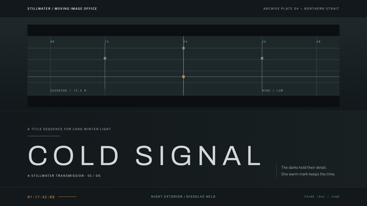 Nordic Noir TitlesThe grade carries the drama. Cold blue-green plates and low tracked caps hold…
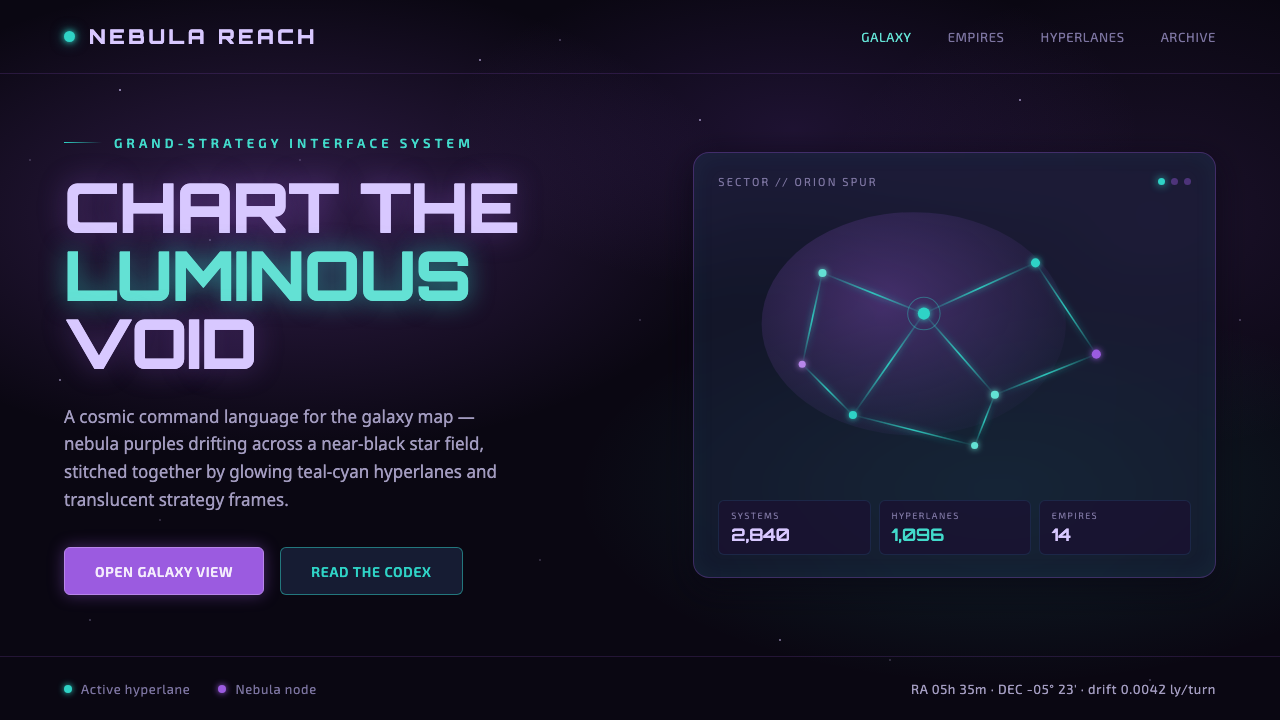 StellarisQuietly grand cosmic command UI. Nebula purples on near-black void, teal-cyan…
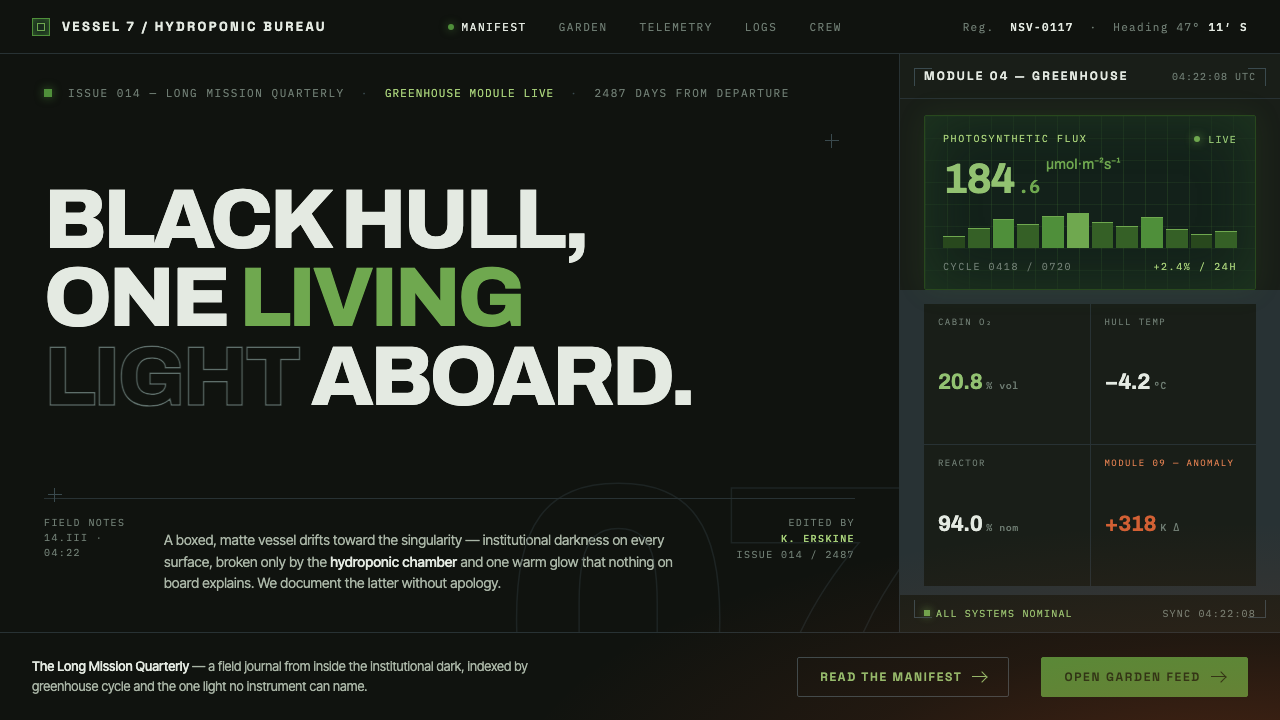 High Life (2018)Institutional dark, one living light. Matte-black hull, hydroponic green, one…
 Norwegian Fjord TourismMonumental, not loud. Fjord blue, glacier-white panels, and one stave-red acc…
 Sunshine (2007)Ship with no key light. Solar gold blooms to white from near-black void — squ…
 Wordle (2021)Quiet becomes addictive. Olive green, dusty gold, and gray score a strict gri…