What is 新中式国潮 Guofeng?
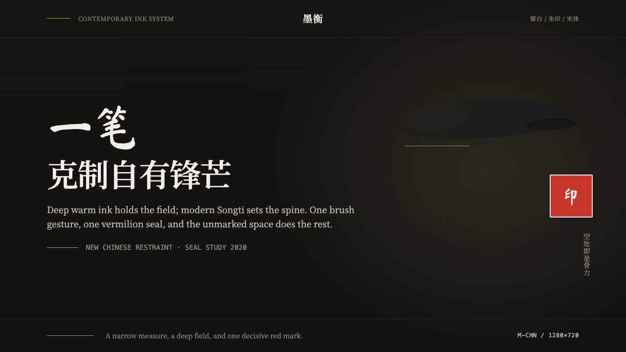
Guofeng proves that restraint, not ornament, is what makes a design feel unmistakably Chinese — one ink gesture, one red seal, and a field of deliberate emptiness.
新中式国潮 Guofeng in brief
Modern Chinese Guofeng — literally 'national trend' — is a contemporary design language that reinterprets classical Chinese visual culture for present-day branding. It is emphatically modern, not a museum reproduction: it strips centuries of ornamental vocabulary down to two decisive moves, a single ink-wash gesture and one square vermilion seal, set against a deep warm-ink ground with vast negative space.
The system's discipline is best understood through what it removes rather than what it adds. Where earlier commercial uses of 'Chinese style' leaned on dragons, dense cloud patterns, and faux-aged parchment textures, Guofeng treats that vocabulary as costume rather than substance. Restraint is the actual technique, and 留白 — the deliberately empty field — is treated as carrying as much visual weight as the mark or the seal itself.
Type does most of the remaining work. Modern Songti headlines — a contemporary reworking of the serif forms first standardized for woodblock printing — hold the page with calm, high-contrast structure, while a brushed calligraphic stroke appears only once, reserved for a single emphatic gesture and never used as running text. The result reads as a confident, current brand that happens to carry Chinese visual heritage, not a historical costume.
Where does 新中式国潮 Guofeng come from?
Guofeng's visual grammar draws on two much older traditions that long predate its 2010s emergence as a branding movement. The first is ink-wash painting, or shuimo, a tradition that developed across more than a thousand years of Chinese scroll and album painting, in which a single controlled brushstroke — varying in ink density from wet and dark to dry and pale within one continuous gesture — could suggest a mountain ridge, a bamboo stalk, or a bird in flight without ever tracing a hard outline. Guofeng borrows the economy of that gesture rather than its subject matter: one confident stroke, not a full landscape.
The second inherited element is the seal. In Chinese painting and calligraphy, a red seal impression — carved from stone in a script distinct from the surrounding text — has served for centuries as a mark of authorship, ownership, or connoisseurship, appearing in a corner of a scroll alongside or instead of a signature. Its square, contained form and its singular red against a monochrome ground made it a natural anchor point for a modern brand mark: compact, authoritative, and instantly legible as 'this belongs to someone specific,' which is precisely what a brand mark needs to do.
Songti, the typeface family behind the system's headlines, has its own long lineage: the style originates in the regularized serif letterforms cut into woodblocks for mass book printing centuries ago, forms later formalized into the metal and then digital type families used throughout the Chinese-speaking world for body text and headlines alike. Contemporary Guofeng designers favor modern, high-contrast reworkings of Songti specifically because the style already carries an association with printed authority and literary tradition, without requiring any brush-calligraphy flourish to signal cultural rootedness.
The movement itself crystallized as 'guofeng' or 'guochao' branding gained commercial momentum through the 2010s and into the 2020s, as Chinese consumer brands — in tea, cosmetics, fashion, and technology alike — sought a visual identity that read as confidently domestic rather than derivative of Western minimalism or of an older, more ornamental 'Chinoiserie' aesthetic aimed at export markets. The defining move of this generation of designers was subtraction: keep the ink gesture, keep the seal, discard almost everything else, and let empty space do the work that pattern and ornament used to do.
What defines the 新中式国潮 Guofeng look?
Color
The ground is a deep, warm ink tone — closer to a rich near-black with a warm undertone than a cool neutral gray — against which a single square vermilion seal provides the system's one saturated color moment. A muted gold is permitted, but strictly rationed to a hairline rule or a tiny accent; it never fills a shape or a field.
The Ink-Wash Gesture
A single brushed stroke — never a full illustration, never repeated as a pattern — appears once per composition, its ink density shifting within the one gesture from dark and wet to pale and dry. This economy is the point: the stroke carries the entire weight of 'handmade, considered mark-making' that would otherwise require an illustrated scene.
The Seal
A single square vermilion seal, rendered with the slightly irregular edge of a carved stone impression rather than a perfectly clean digital shape, functions as the system's signature mark. It is always small relative to the composition and always isolated in negative space — never embedded in a busy corner or repeated as a motif.
留白 Negative Space
Empty space is not a gap to be filled but an active compositional element carrying as much visual weight as the mark and seal themselves. A composition may leave the majority of the page unmarked, trusting that the ink gesture and seal are strong enough anchors to hold a large empty field without the layout feeling incomplete.
Typography
Headlines are set in modern Songti — a high-contrast serif with calm, deliberate stroke construction — used as the structural backbone of the composition. Body text, where present, stays quiet and small in scale relative to the headline, reinforcing hierarchy through restraint rather than decorative contrast.
Zero Ornament
Cloud patterns, dense borders, dragon or phoenix motifs, and faux-aged textures are entirely absent. What earlier commercial 'Chinese style' treated as necessary cultural signaling, Guofeng treats as costume — the discipline is to prove cultural rootedness through precision and restraint rather than through recognizable historical props.
Composition Balance
The ink stroke, the seal, and the type block are positioned in careful, asymmetric relation to one another — never centered symmetrically, but balanced through weight and distance, echoing the compositional habits of classical scroll painting where a single mark could anchor a mostly empty page.
Who shaped 新中式国潮 Guofeng?
The design studios and in-house teams behind China's guofeng branding wave of the 2010s and 2020s — working across tea, cosmetics, fashion, and technology brands — established the movement's core discipline of reducing classical Chinese visual vocabulary to a single ink gesture, one seal, and disciplined negative space.
The type designers who developed contemporary, high-contrast reworkings of Songti for digital and branding use gave Guofeng its typographic backbone — a headline system that reads as literary and authoritative without relying on brush-calligraphy flourish.
The broader network of Chinese graphic design studios working under the guofeng banner refined the movement's compositional habits — the isolated seal, the single ink gesture, the warm dark ground — into a repeatable, teachable visual system rather than a one-off aesthetic experiment.
How do you use 新中式国潮 Guofeng today?
Guofeng is a restraint-driven system, and applying it correctly means resisting the reflex to add more Chinese visual signifiers rather than fewer. The discipline is subtraction: one ink gesture, one seal, a calm typographic headline, and a large field of considered emptiness — every additional decorative element works against the style rather than for it.
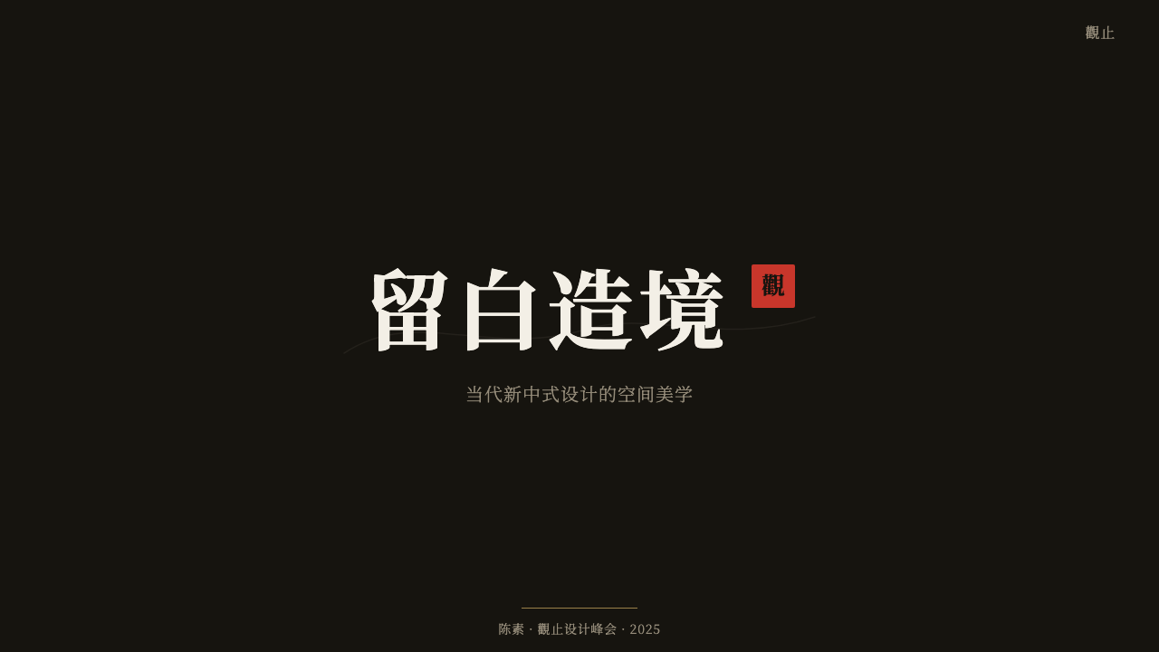
For presentation slides, a cover works well with the ink gesture placed off-center against the deep warm-ink ground, the seal isolated in a corner, and the title set in modern Songti with generous surrounding space. Content slides should stay quiet: a single organizing rule, restrained typographic hierarchy, and empty space treated as a real design element rather than something to be filled with supporting graphics.
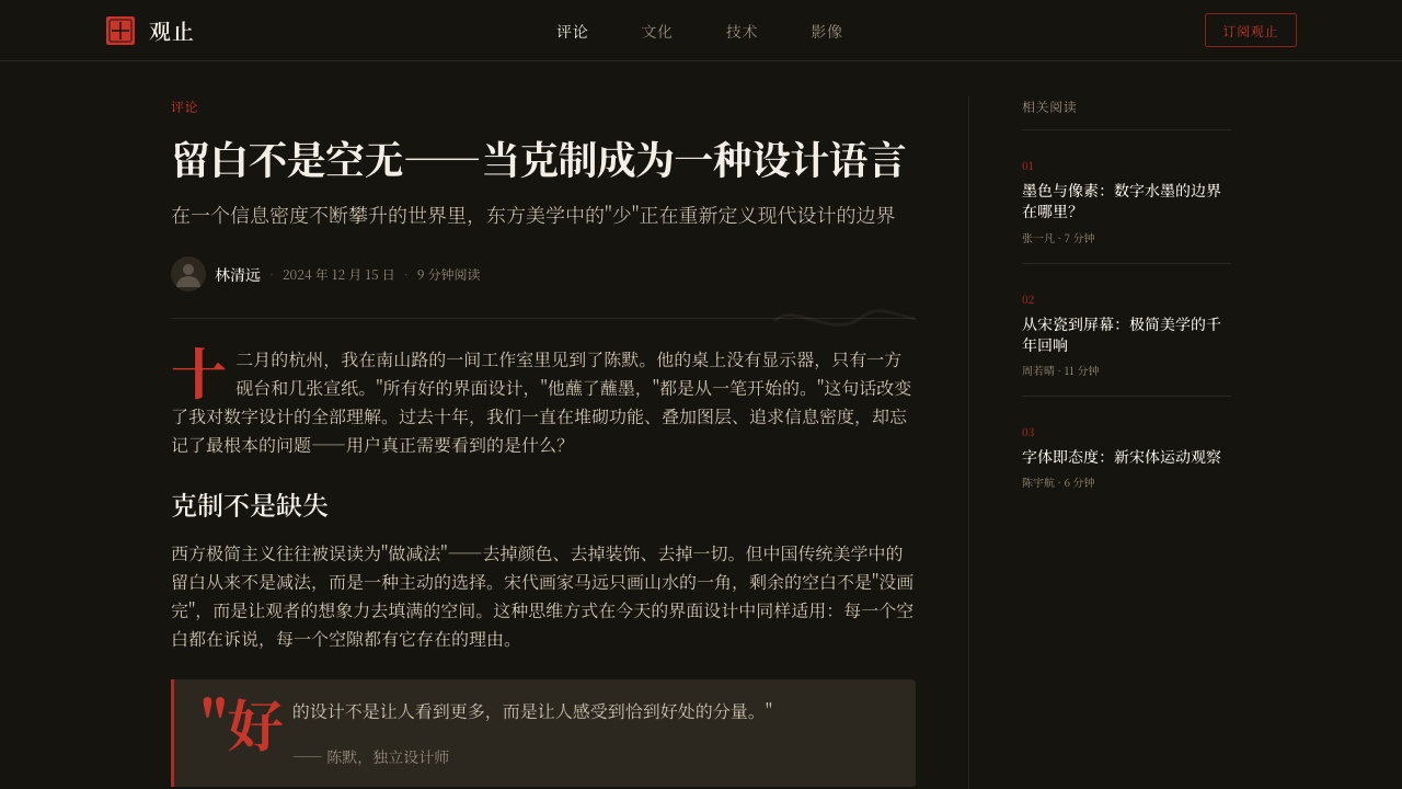
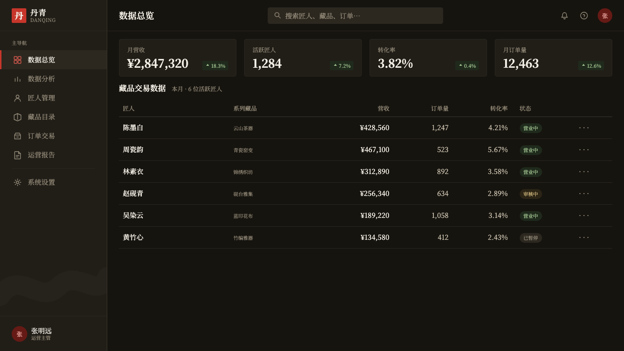
For web interfaces, the system suits brand pages, editorial features, and premium product pages more naturally than data-dense dashboards, since its core strength is atmosphere and identity rather than information density. A dark, warm-toned hero section with a single ink-gesture graphic, a seal-mark logo treatment, and Songti-based headlines captures the system's authority without needing photography or pattern.
For editorial and marketing work, the style rewards confidence: a masthead or headline in modern Songti, a pull quote treated as its own quiet moment rather than boxed in a colored panel, and section breaks marked by empty space rather than rules or dividers. Product marketing pages benefit from letting a single hero image or ink gesture occupy most of the frame, with the seal-style mark doing the work a full logo lockup would otherwise do.
A common mistake is treating Guofeng as license to add dragons, cloud-pattern borders, or aged-parchment textures — this reintroduces exactly the costume-like 'Chinese style' the movement was built to move past. A second common mistake is repeating the ink gesture or the seal multiple times across a composition; both are meant to appear once, as a considered mark, not as a repeating decorative pattern.
新中式国潮 Guofeng — FAQ
Is Guofeng the same as traditional 'Chinoiserie' or export-market 'Chinese style' design?
No, and the distinction is central to the movement. Older commercial 'Chinese style,' often aimed at export or tourist markets, relied on dense ornament — dragons, cloud patterns, faux-aged parchment textures. Guofeng is a domestic, contemporary reaction against exactly that vocabulary, built instead on subtraction: one ink gesture, one seal, and deliberate emptiness, aimed at reading as a confident modern brand rather than a historical costume.
Why is negative space treated as so important in this style?
留白 draws on a much older idea from Chinese scroll and album painting, where an artist might leave the majority of a composition unmarked, trusting a single mountain peak or bird to anchor the whole page. Guofeng inherits that trust in emptiness directly: a large unmarked field is not a lack of content, it is the space that lets the one ink gesture and the one seal carry their full weight.
Why is the seal always red and always square?
Both conventions come directly from centuries of Chinese seal-carving practice, in which artists and collectors stamped a carved stone seal — typically square, typically inked in vermilion — onto paintings and calligraphy as a mark of authorship or ownership. Guofeng preserves the seal's exact traditional form rather than reinterpreting its shape or color, because the seal's recognizability depends on staying faithful to that convention.
Can Songti be replaced with a brush-calligraphy typeface throughout a design?
Doing so breaks the system's core logic. The whole point of pairing modern Songti headlines with a single, separate brush stroke is contrast: type carries structure and legibility, while the brush gesture carries the one moment of handmade expression. Setting body text or headlines entirely in brush calligraphy collapses that distinction and tends to read as decorative rather than disciplined.
Does Guofeng suit brands outside China or outside East Asian markets?
The underlying compositional discipline — one confident gesture, one anchoring mark, generous negative space — transfers well to any brand seeking calm authority. But the specific visual elements, the ink-wash stroke and the seal, are culturally specific signifiers rooted in Chinese painting and calligraphy tradition; using them meaningfully requires an actual connection to that heritage, rather than borrowing the look without the context it comes from.
Related design styles
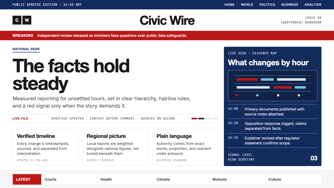 BBC NewsPublic trust, stripped bare. Red alerts, deep navy and hairline grids make ur…
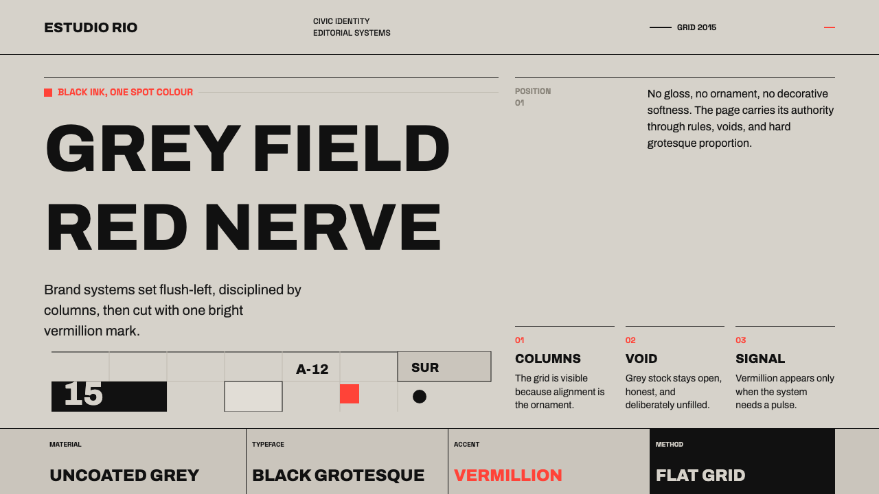 Buenos Aires Branding StudioRigour with nerve. Black grotesque on warm grey, pierced by one vermillion ma…
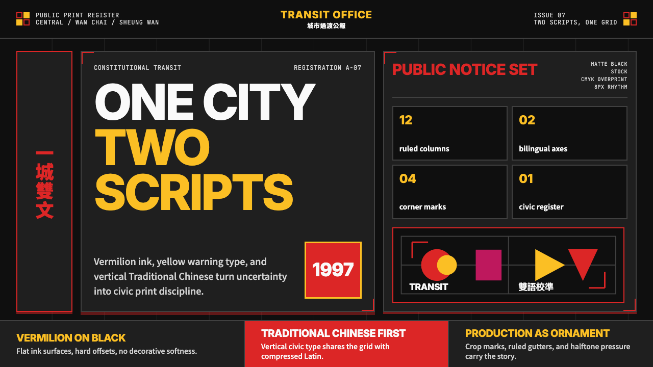 Hong Kong Handover 1997 PosterCivic pressure, printed loud. Vermilion on black, yellow type, bilingual grid…
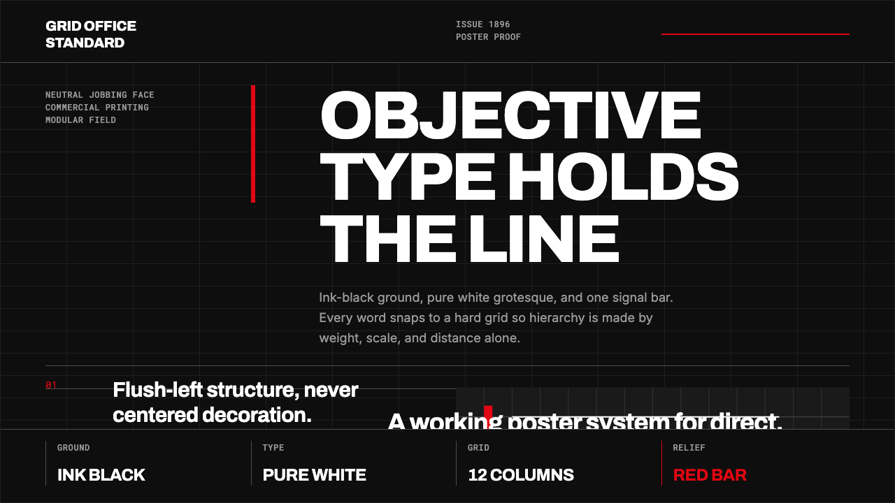 Akzidenz-Grotesk BertholdObjectivity in black ink. White grotesque type, hard grid, one rationed red b…
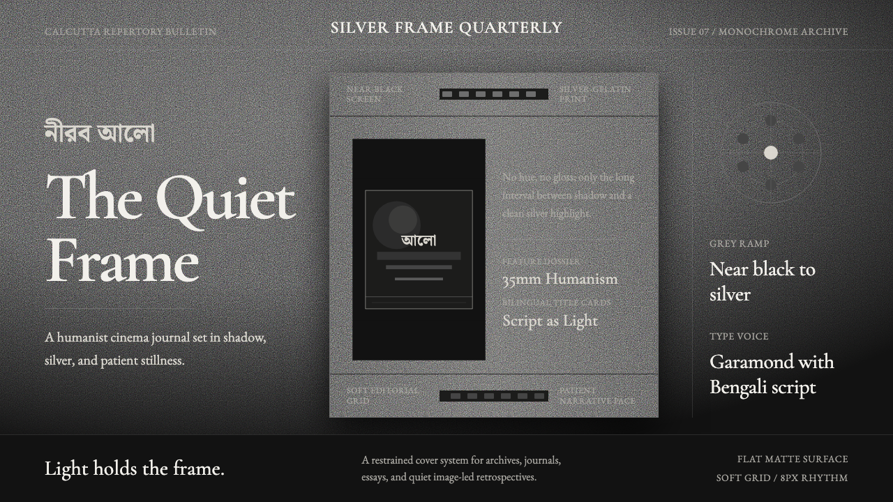 Bengali Art-House CinemaLight becomes restraint. Near-black ground, silver serif, and Bengali script…
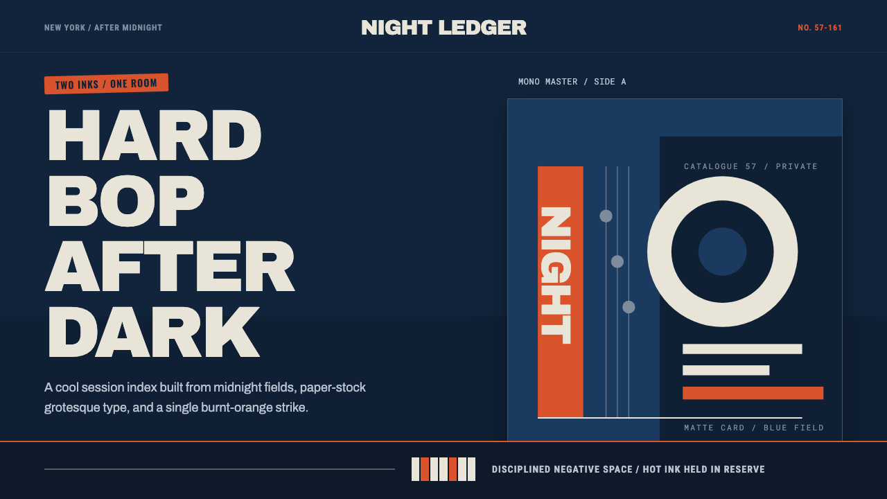 Blue Note JazzCool intelligence, printed flat. Midnight blue, paper type, and one burnt-ora…