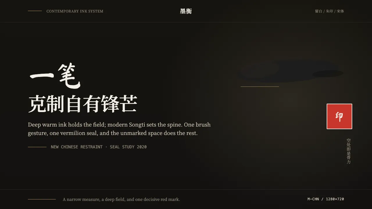
About 新中式国潮 Guofeng
Guofeng is the contemporary new-Chinese look — emphatically modern, not a museum reproduction. It strips classical ornament down to two moves: a single decisive ink-wash gesture and one square vermilion seal, set against a deep warm-ink ground with vast negative space. Restraint is the discipline; 留白 (the empty field) carries as much weight as the mark itself.
Type does the rest. Modern Songti headlines hold the structure with calm, high-contrast serifs, while a brushed calligraphic stroke appears once, never as body copy. A muted gold is rationed to a hairline or a tiny accent. The result reads as a confident modern brand that happens to be Chinese — not a costume of dragons and faux-aged parchment.
- Origin
- China; East Asia
- Era
- 2010–now; contemporary 新中式 guofeng revival
- Key figures
- Contemporary Chinese brand designers · Modern Songti type designers · Guofeng graphic studios
- Movements
- 新中式 new-Chinese branding · Guofeng revival · Minimalist ink-wash graphic design
新中式国潮 Guofeng design spec
Colors
Typography
The other 11 sections — buttons, cards, spacing, motion, techniques and more — open once you unlock. Download the DESIGN.md or send it to your AI in one click. Unlock once, yours forever.
Sign up nowStyles similar to 新中式国潮 Guofeng
Also inspired by design movements, with a close feel.
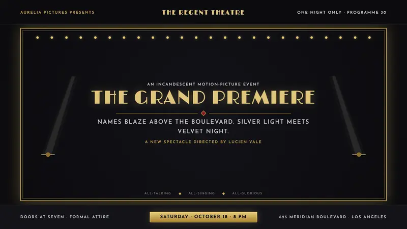 Hollywood Golden Age (1930)Black-and-gold spectacle commands the night. Marquee bulbs frame monumental Deco type.
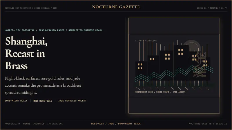 Shanghai Bund Art Deco RevivalNight-black Deco luxury. Rose-gold lines, jade accents, and broadsheet type set the mood.
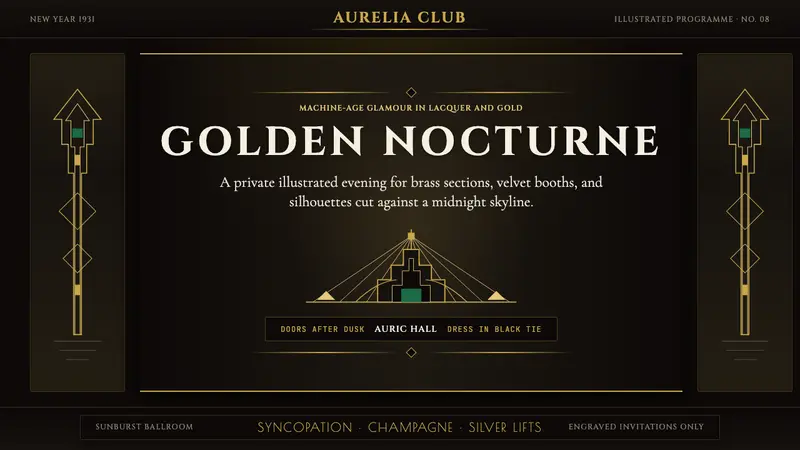 Art Deco Jazz AgeJazz Age glamour. Sunburst rays, stepped ziggurats, gold on black — Chrysler Building lobby in CSS.
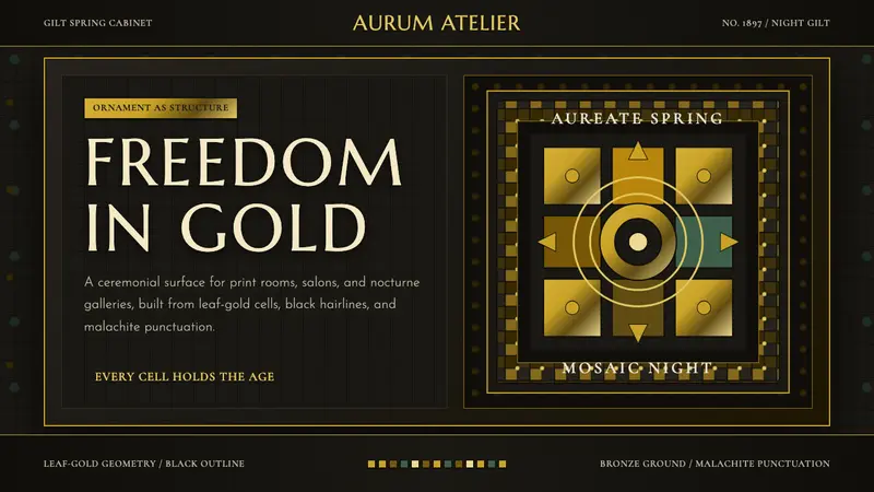 Vienna Secession 1897Ornament is structure. Leaf-gold grids and black hairlines glow on bronze night.