What is Moche Portrait Vessel?
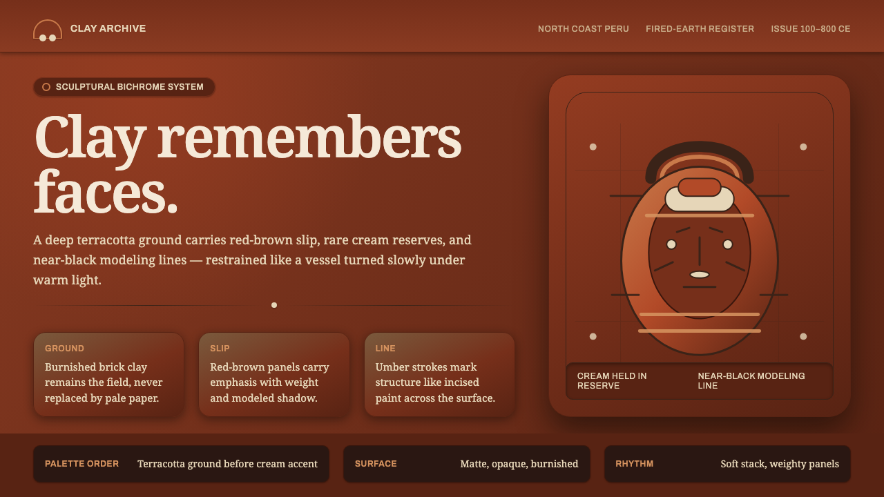
Moche portrait vessels make fired clay carry a human presence — warm terracotta ground, red-brown slip, restrained cream, and black marks that read like memory carved into the surface.
Moche Portrait Vessel in brief
The Moche Portrait Vessel style translates the sculptural logic of Moche ceramic portraiture into a visual system for interfaces and editorial surfaces. Its foundation is not a pale canvas but the deep, warm body of the clay itself: a brick-terracotta ground that feels burnished, matte, and earthen. Red-brown slip carries the primary visual weight, cream is reserved for small areas of emphasis, and near-black lines perform the work of drawing.
The style is rooted in Moche ceramic sculpture from the north coast of Peru between 100 and 800 CE. Moche ceramicists molded fired-clay heads with startling individuality: prominent cheekbones, specific noses, and particular scars. That specificity matters. The design language should feel modeled rather than printed, observed rather than generic, with marks that suggest a face, a surface, or a remembered identity.
Its visual discipline comes from limitation. The palette stays close to terracotta, red-brown, cream, and black; contrast comes from placement, surface, and line rather than from a parade of colors. Interfaces built in this language should feel warm, tactile, and composed. They may be dark, but they should not feel glossy or technological. The intended impression is burnished earthenware: substantial, quiet, and deliberately made.

Where does Moche Portrait Vessel come from?
The source of this style is Moche culture, active on the north coast of Peru during the Early Intermediate Period from approximately 100 to 800 CE. Its defining medium here is fired clay, and its defining subject is the human head. Rather than treating the vessel as a neutral container, Moche ceramicists modeled portrait heads whose features could be sharply individual: cheekbones, noses, and scars were given enough presence to make the clay appear to remember a particular person.
The portrait-head vessel begins with the clay body as its visual ground. The body is formed, fired, and burnished before the painted system is completed. This order creates an important hierarchy: the terracotta is not an empty background waiting to be covered. It remains present beneath the surface treatment, giving the object its warmth and material authority. In a digital translation, this means the deepest brick-terracotta field should remain visible and should carry the identity of the whole composition.
Moche ceramic sculpture is joined here by stirrup-spout portrait-head vessels and bichrome slip painting. The painted logic is controlled rather than pictorially lush. Red-brown slip is placed over the burnished terracotta body, cream is held for small zones, and black line defines war paint and face markings. The result is neither a full naturalistic rendering nor a purely abstract pattern. It is a structured encounter between volume, color, and identifying mark.
The source tradition is attributed not to a single celebrated designer but to anonymous Moche ceramist-portraitists working through coastal valley workshops. That anonymity is part of the style’s character. It points away from individual signature and toward a shared workshop intelligence: molded form, disciplined slip, and carefully placed line. A contemporary application should preserve that collective, material feeling instead of turning the style into a decorative signature or a collection of exotic motifs.
What defines the Moche Portrait Vessel look?
Terracotta Ground
The clay body is the true ground, not a neutral surface beneath the design. It should read as deep brick-terracotta, warm and matte, with enough visual presence to remain visible around every other element. Cream should never become the default field. The composition begins from earthen warmth and builds upward, preserving the sense that the interface is a shaped object rather than ink placed on paper.
Red-Brown Slip
Red-brown is the principal carrier of action and emphasis. It can organize controls, active regions, selected states, or broad painted zones, but it should remain related to the terracotta ground rather than behaving like a separate digital accent. Its role is comparable to slip laid over clay: it adds a stronger layer while allowing the material identity beneath it to remain legible.
Cream Restraint
Cream functions as a rare light note rather than a general-purpose background. It is most effective when kept to small labels, highlights, facial zones, or moments that need to emerge from the dark field. Because it appears sparingly, it gains authority. Enlarging it across the whole composition would reverse the hierarchy and make the work feel like a pale design with terracotta decoration.
Black Line Drawing
Near-black lines provide structure and recognition. They can outline a face, separate painted zones, mark a scar, or suggest war paint and other facial markings. The line should feel drawn and intentional, not like a soft outline added for polish. In a digital layout, black line work can define borders, dividers, icon-like symbols, and text groupings while preserving the sense of a hand-guided mark.
Modeled Surface
The visual field should imply volume even when the medium is flat. Forms may feel pressed, molded, burnished, or raised through broad tonal relationships and firm contours, not through glossy effects. Depth belongs to the object’s imagined body. Avoid anything that makes the surface feel like polished plastic, luminous glass, or a paper poster detached from material.
Disciplined Individuality
Moche portraiture is distinctive because its individuality appears inside a controlled system. The face is specific, but the palette and marking language remain disciplined. Contemporary work should follow the same balance: allow a portrait, card, symbol, or content block to have a singular character, while keeping the surrounding visual grammar consistent. Identity should come from form and mark, not from adding more colors or effects.

Who shaped Moche Portrait Vessel?
The central makers of the tradition are anonymous Moche ceramist-portraitists who molded fired-clay heads with unusually specific features. Their importance lies in the union of observation and discipline: a face can carry prominent cheekbones, a particular nose, or an individual scar, yet still belong to a coherent ceramic and bichrome slip system. In design terms, they represent the possibility of expressive identity without abandoning formal restraint.
The coastal valley workshops provide the collective setting behind the style. Rather than framing the work as the invention of one isolated author, they suggest a shared production intelligence built around clay, molding, firing, burnishing, slip, and line. This workshop character encourages designers to think in systems: repeated visual rules can produce varied results when the material ground and marking discipline remain stable.
Stirrup-spout portrait-head vessels represent the point where container, sculpture, and likeness become one object. Their relevance to the style is structural: the design is not merely placed on a vessel, because the vessel’s body and the modeled head already establish the composition. A contemporary interface can borrow this logic by treating the whole page or card as a body, with text, controls, and marks shaped as parts of that body rather than decorations applied afterward.
How do you use Moche Portrait Vessel today?
For presentation slides, use the terracotta field as the organizing ground across the cover, content, and data pages. A cover can introduce a single modeled portrait or face-like form, with the title carried by restrained cream and structure drawn in near-black. Content slides should keep a firm reading order: red-brown for the active subject, cream for essential labels, and black line for separation. Data slides should feel like marked clay tablets or painted vessel surfaces. Charts need not imitate pottery literally; they should use broad forms, strong contours, and a limited palette so the information remains tactile and legible.
For web interfaces, the style suits dashboards, catalogues, and pricing pages that need warmth without losing hierarchy. Keep the deep brick-terracotta ground continuous, use red-brown for selected states and primary actions, and reserve cream for the most important text or small indicators. Near-black lines can replace soft ornamental effects by defining cards, table rows, navigation groupings, and input boundaries. Pricing tiers should be differentiated through composition and labeling rather than a rainbow of colors. The interface should feel like a coherent vessel with articulated parts.
For editorial and marketing work, the portrait logic supports pages that need to communicate character, provenance, or human specificity. A feature article can pair a large face-like form with a narrow column of text and black linear annotations. Campaigns can use a single distinctive mark, scar-like line, or modeled contour as a recurring identity device. Product sections should alternate broad red-brown fields with exposed terracotta ground, while cream appears only where a message must surface. The result is atmospheric but still controlled, allowing the material story to carry the brand.
The common mistake is treating the palette as a collection of decorative colors rather than a hierarchy of materials. Covering the entire layout in cream, adding glossy depth, or using red-brown as a loud accent detached from the terracotta ground breaks the logic. Another mistake is over-randomizing facial marks in the name of authenticity. The source style is not visual noise: its individuality is disciplined, its black lines are purposeful, and its warmth comes from the clay body remaining present throughout the composition.

Moche Portrait Vessel — FAQ
Is this style meant to look like an archaeological replica?
No. Its purpose is to translate a set of material and compositional principles into contemporary visual work. The relevant qualities are the terracotta ground, molded presence, restrained bichrome slip logic, cream used sparingly, and black line used for recognition and structure. Literal imitation of an artifact can become theatrical. The stronger application preserves the hierarchy of clay, slip, light accent, and mark while allowing the content to remain contemporary.
Why should cream remain a minor accent?
Because the clay body is the ground of the system. Cream is valuable precisely because it appears against that dark, warm field as a concentrated light note. If cream becomes the dominant background, the hierarchy reverses: the work starts to read as a pale layout decorated with terracotta rather than as an earthen object carrying lighter marks. Restriction gives the accent its authority.
Can the style include portraits or facial imagery?
Yes, and portraiture is one of its strongest structural references. The source material emphasizes faces with specific cheekbones, noses, and scars rather than anonymous generic heads. A contemporary portrait should therefore have a clear identifying feature or mark, but it should remain integrated into the shared palette and linear system. The face should feel modeled and materially present, not like a photographic sticker placed on top of an unrelated interface.
What makes this different from a generic dark earthy interface?
The difference is the disciplined relationship between ground, slip, accent, and line. A generic earthy interface may use brown tones, texture, and soft depth without a clear hierarchy. The Moche Portrait Vessel system begins from the clay body, lets red-brown carry action, keeps cream scarce, and uses near-black lines to draw identity and structure. Its warmth is not produced by adding rustic decoration; it comes from preserving a coherent material logic.
Related design styles
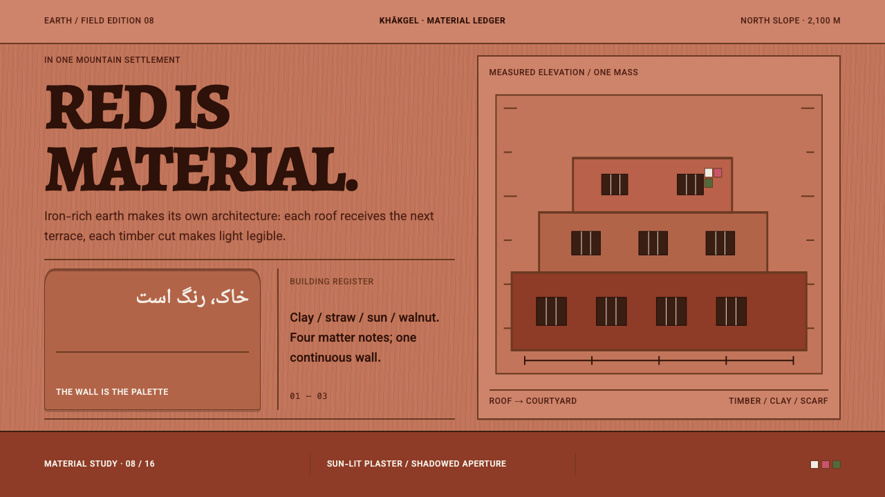 Abyaneh Red VillageRed is material, not decoration. Stepped clay bands and dark timber apertures…
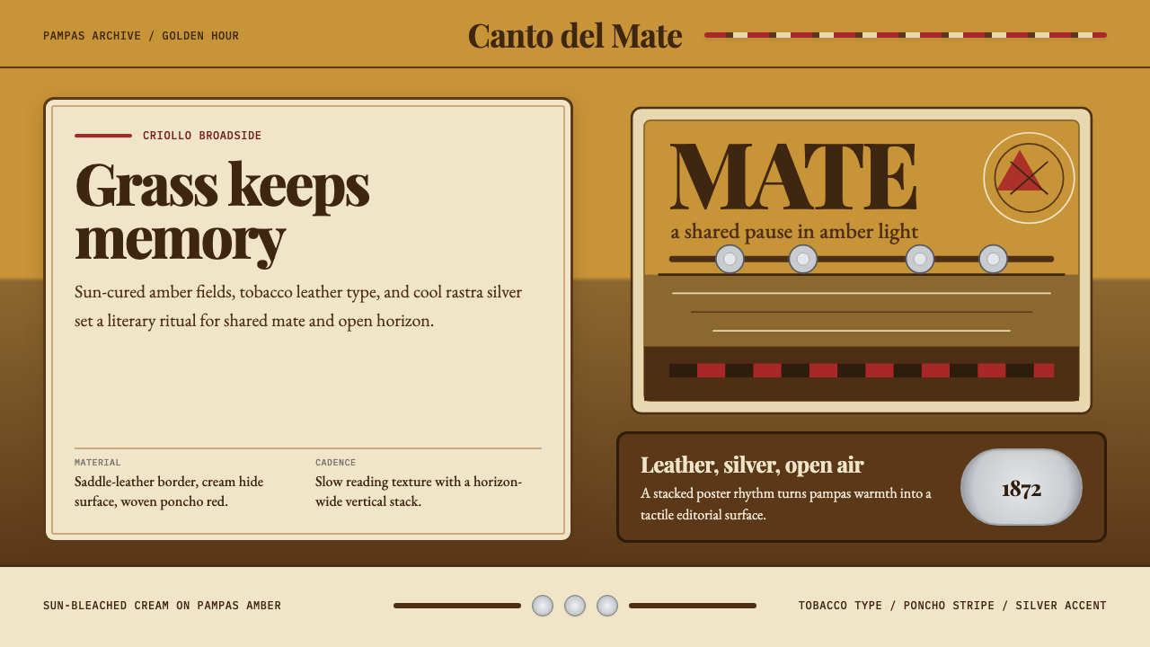 Argentine Gaucho (Pampas Mate Culture)Open grassland, printed warm. Amber fields, Playfair serif, and silver rastra…
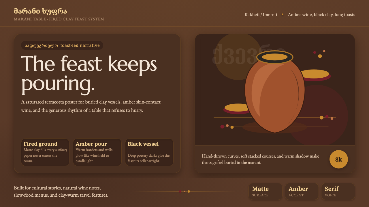 Georgian Qvevri Supra FeastHospitality made earthen. Terracotta ground, amber wine, Georgian serif curve…
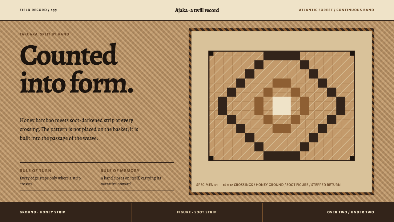 Guaraní Takuara BasketPattern is a record, not garnish. Honey bamboo and soot strips lock into a co…
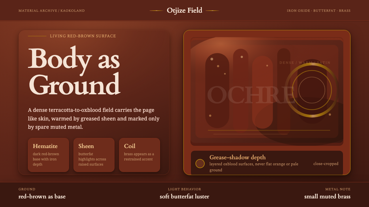 Himba Otjize Ochre NamibiaDense and ritual-warm. Oxblood ground, butterfat sheen, and sparse brass coil…
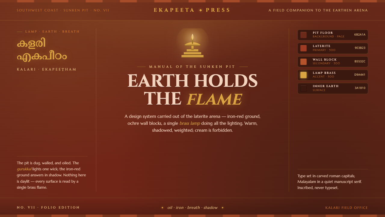 Kalaripayattu Kalari ArenaEarth holds the flame. Iron-red laterite, ochre wall blocks, a single brass l…