What is Mixtec Turquoise Mosaic?
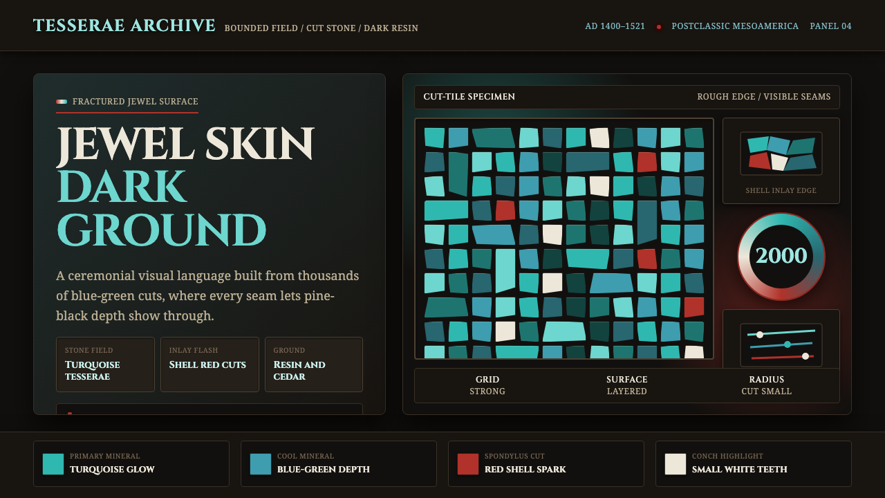
Darkness becomes a jewel skin: fractured turquoise mosaic glints with shell-red and shell-white across a near-black ritual ground.
Mixtec Turquoise Mosaic in brief
Mixtec Turquoise Mosaic is a visual language built from contrast between darkness and mineral brilliance. Its central image is the turquoise mosaic mask or effigy: a carved cedar form covered with individually cut blue-green stone, fixed piece by piece into pine resin, then interrupted by red thorny-oyster shell and white queen-conch shell. The result is neither a painted surface nor a smooth field of color. It is a constructed skin, assembled from thousands of small decisions.
The style depends on the near-black substrate remaining visible. Dark wood and resin appear through the seams between tesserae, giving the turquoise surface a fractured rhythm and a sense of depth without relying on soft modeling or atmospheric effects. Each stone fragment carries its own edge, angle, and slight variation. Together, these interruptions create a surface that feels dense, precious, and deliberately made rather than mechanically uniform.
Visually, the system is recognizable through a narrow material vocabulary: blue-green turquoise against darkness, with red and white shell used as flashes of definition. The turquoise supplies the continuous field; the shell accents sharpen mouths, teeth, borders, or focal details. The overall impression is intense but controlled. Ornament is not added on top of a design. Ornament is the design’s entire structure.

Where does Mixtec Turquoise Mosaic come from?
Mixtec Turquoise Mosaic belongs to the visual world of Postclassic Mesoamerica, in the Mixteca region of Mexico and within the broader history of Mesoamerican ritual regalia. Its historical setting is approximately AD 1400–1521, extending into the Aztec period. The design language is therefore inseparable from objects made for ceremonial use, where material rarity, skilled fabrication, and visual intensity were brought together in a single object.
The source tradition centers on Mixtec lapidary mosaic craftsmen. They produced turquoise masks and effigies whose surfaces were constructed rather than merely colored. These objects later passed into Aztec ritual use, creating a cultural path in which Mixtec craft practice and Aztec regalia became visually connected. The movement is best understood as Mixtec-Aztec turquoise mosaic: a material and ornamental system shaped by making, exchange, and ritual context.
The British Museum’s double-headed serpent is the clearest exemplar named in the source material. Its body is carved from cedar and sheathed in roughly 2,000 individually cut turquoise tesserae, each set tile by tile in pine resin. Red thorny-oyster shell marks the gums, while white queen-conch shell forms the teeth. The object’s force comes from the relationship among those materials: darkness at the base, blue-green stone across the body, and shell color concentrated at the points of expression.
As a contemporary design system, the style should preserve that logic rather than imitate the artifact superficially. The essential inheritance is the jewel skin stretched over darkness, the visible seam between small units, and the deliberate hierarchy among stone, wood, resin, and shell. A successful adaptation does not turn the source into a generic tropical palette. It keeps the construction legible: a dark ground, a field of fractured turquoise, and rare shell-colored interruptions that make the surface feel assembled by hand.
What defines the Mixtec Turquoise Mosaic look?
Dark Substrate
The ground is near-black, evoking the cedar body and resin beneath the mosaic. It should feel dense and stable rather than merely empty. Darkness gives the turquoise its luminosity and allows the seams between tesserae to remain part of the composition. In an interface or layout, the dark field acts as the structural body over which the brighter materials are stretched.
Turquoise Tessellation
Turquoise is not used as a single uninterrupted color. It appears as a field of blue-green fragments whose edges and joins remain visible. The pieces may vary in shape and density, but they should read as related units within one continuous skin. This creates a rhythm between repetition and difference: the eye sees a whole surface while continually noticing the small stones that compose it.
Fractured Seams
The dark seams are active lines, not imperfections to be concealed. They separate the tesserae, reveal the substrate, and keep the surface from becoming a flat turquoise block. Their irregular distribution introduces tension and direction. A good adaptation lets these gaps organize the field, creating pauses, breaks, and visual breathing room without weakening the overall density.
Shell Accents
Red thorny-oyster shell and white queen-conch shell provide the sharpest accents in the system. Red is concentrated and expressive, while white acts as a hard glint against both turquoise and darkness. Neither should become a broad secondary palette. Their power comes from scarcity and placement, especially when they define a focal feature or interrupt a long field of blue-green.
Material Layering
The aesthetic depends on distinct material roles: cedar gives the object its body, pine resin holds the mosaic in place, turquoise supplies the jewel surface, and shell defines selected details. Even in a digital interpretation, these roles should remain distinguishable. Surfaces can be flat and graphic, but they should not collapse into one undifferentiated color treatment.
Handmade Irregularity
The mosaic should feel assembled by patient hands. Slight variation among individual pieces gives the surface its lived character, while the repeated act of setting tile by tile creates discipline beneath the irregularity. The goal is not random noise. It is controlled variation: enough difference to reveal making, enough continuity to preserve the object’s visual authority.
Ritual Presence
The style carries the concentrated presence of ritual regalia. It should feel intentional, precious, and slightly otherworldly, even when applied to a contemporary page. This does not require theatrical symbols or added exotic decoration. Presence comes from the dark ground, the mineral surface, the careful accents, and the sense that every visible piece has been placed for a reason.

Who shaped Mixtec Turquoise Mosaic?
The Mixtec lapidary mosaic craftsmen are the primary makers named in the source material. Their work is defined through patient assembly rather than surface painting: individually cut turquoise tesserae are set into pine resin over a carved cedar body, with shell reserved for decisive details. Their contribution is the craft logic itself, in which material skill, repetition, and irregularity become the visual language.
The Aztec ritual-regalia workshops represent the later ritual setting into which Mixtec turquoise mosaic objects passed. The source does not name individual artists, but it identifies these workshops as part of the design history. Their significance lies in the continued life of the objects as ceremonial regalia, where the dark jewel surface and concentrated shell accents retained their visual force.
The British Museum double-headed serpent is the exemplar through which the source material makes the system concrete. Its carved cedar body, roughly 2,000 turquoise pieces, pine-resin setting, red thorny-oyster gums, and white queen-conch teeth show how the palette and construction operate together. It is not merely a reference image; it is the complete material argument behind the style.
How do you use Mixtec Turquoise Mosaic today?
Mixtec Turquoise Mosaic works best when the material hierarchy remains visible. Begin with darkness as the structural field, establish turquoise as the dominant surface, and reserve shell-red and shell-white for moments that need definition. The style is especially effective when a page or object needs to feel precious, ceremonial, tactile, or built from deliberate craft rather than assembled from generic interface parts.
For presentation slides, the cover can use a near-black field with a concentrated turquoise mosaic mass that appears to break open at one edge, allowing red and white shell accents to establish the visual focus. Content slides should treat the mosaic as a framing or grounding device rather than covering every available area. Data slides can turn charts, markers, or highlighted values into turquoise tessellated forms, while dark seams separate categories and shell colors mark the most important comparison or conclusion.
For web interfaces, the system suits dashboards and pricing pages that need a strong, memorable surface. Use the dark ground for the main workspace, panels, or navigation zones, then let turquoise identify active structure, selected states, or primary information. Shell-red can signal a critical condition or decisive action, while shell-white can provide sharp text or focal contrast. Cards should feel layered and assembled, with visible boundaries and restrained irregular texture instead of soft, anonymous surfaces.
For editorial and marketing work, the style supports a dramatic relationship between image, headline, and material field. A feature article can place a pale or shell-white text block against darkness, with turquoise fragments acting as a visual threshold into the story. Campaign pages can use a large mosaic field as a hero, then repeat a smaller tessellated motif through section markers, product details, or calls to action. The rhythm should alternate between dense jewel surfaces and clear dark pauses.
The common mistake is to treat the style as a turquoise color palette with a few red and white decorations added afterward. That reverses the logic. The identity comes from visible construction: fragments, seams, a dark substrate, and carefully placed material contrasts. Another failure is making every tile perfectly identical, which removes the sense of patient hand assembly. Keep the variation controlled and let the dark gaps remain legible.

Mixtec Turquoise Mosaic — FAQ
Is Mixtec Turquoise Mosaic simply a turquoise color palette?
No. Turquoise is only one part of the system. Its identity depends on the relationship between blue-green tesserae, a near-black cedar-and-resin ground, visible seams, and rare red and white shell accents. If those construction relationships disappear, the result may still be attractive, but it no longer communicates the specific mosaic language described by the source.
Can the style work on a light background?
It can be adapted, but the dark ground is central to its character. A light background removes the contrast that makes the turquoise feel luminous and makes the seams less structurally important. If a light version is necessary, retain a concentrated dark inset, border, or panel so the jewel skin still reads as something stretched over darkness rather than as a loose collection of blue-green marks.
How should the red and white shell accents be used?
Use them as concentrated signals, not as equal partners to turquoise. Red can draw attention to a decisive point, while white can create a hard glint or clarify a focal detail. Broad, evenly distributed use weakens their force. Their role is strongest when the eye encounters them after moving through the darker field and the repeated blue-green fragments.
Should the mosaic tiles be perfectly regular?
No. The source object is defined by individually cut tesserae set tile by tile, so controlled variation is essential. Perfect repetition makes the surface look manufactured in a generic digital sense and removes the evidence of making. Variation should remain coordinated, however. Random noise, careless distortion, or uncontrolled gaps would replace crafted irregularity with visual disorder.
Can gradients or soft effects be added to make the surface feel richer?
They are usually counterproductive. The style gains its richness from the accumulation of small material units, not from smooth atmospheric shading. Gradients can make the turquoise read as a single synthetic surface, while soft effects blur the distinction between stone, seam, shell, and substrate. If more depth is needed, build it through layered fragments, contrast, spacing, and the visible return of darkness between pieces.
Related design styles
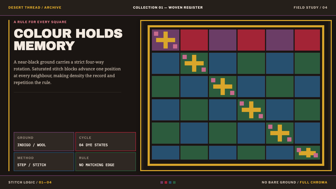 Paracas MantleDensity is the memory. Indigo-black ground drives a four-colour stitched chec…
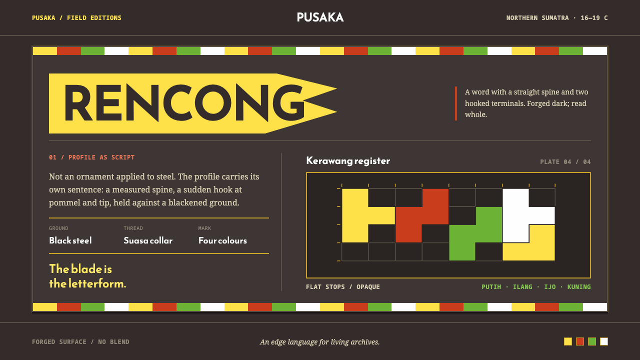 Acehnese Rencong MotifA blade that reads as a word. Flat kerawang red, white, green and yellow lock…
 Fijian Masi (Bark Stencil)Stencil memory stays sharp. Soot black and burnt coral strike bark-fibre band…
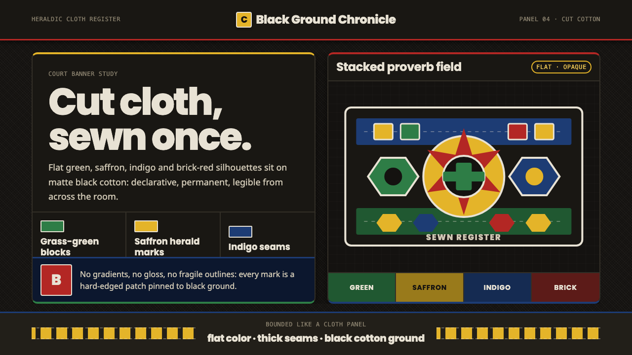 Fon Applique Banner AbomeyRoyal cloth speaks plainly. Flat saffron, green and indigo silhouettes on bla…
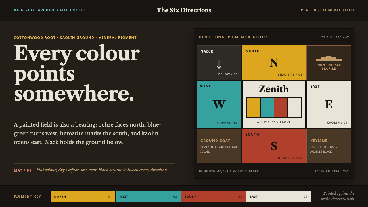 Hopi Katsina TihuEvery colour is a direction. Matte mineral fields meet in smoke-black keyline…
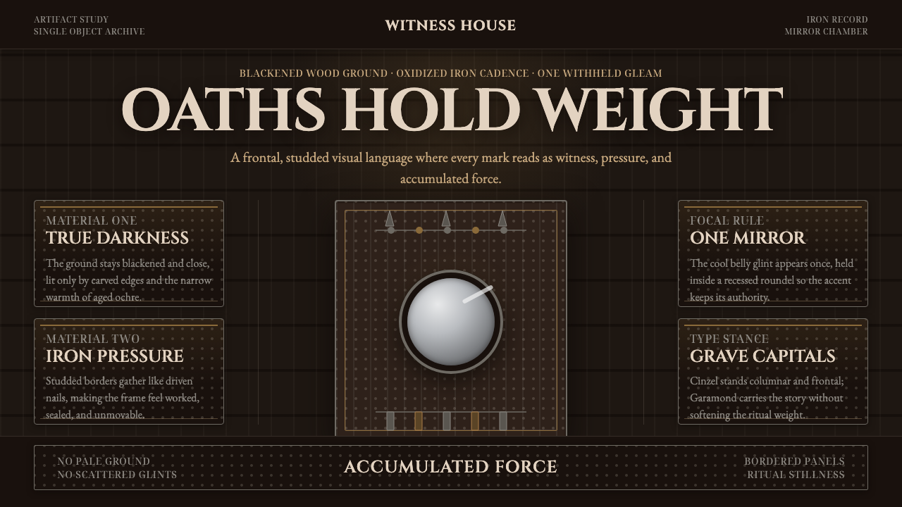 Kongo Nkisi Nkondi FigurePower accumulates in darkness. Black wood, iron studs, and one mirror glint h…