What is Paracas Mantle?
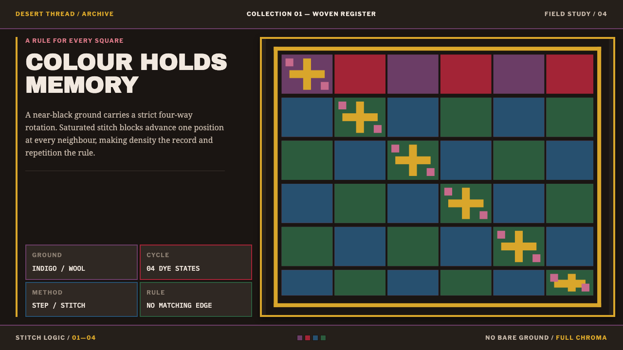
The Paracas mantle is two thousand years of dense memory in thread: an indigo-black ground, a checkerboard of stitched figures, and four saturated colours that never repeat beside themselves.
Paracas Mantle in brief
The Paracas mantle style comes from the embroidered burial textiles of the Paracas Necropolis on the south coast of Peru, made around the first century A.D. and wrapped around mummy bundles. Its look is unmistakable: a near-black ground covered almost completely by small stitched figures in saturated crimson, violet and golden yellow, cycling through four colours in all, arranged in a regular field of square modules.
What distinguishes it from other pattern-heavy styles is that the pattern is a system, not a surface. Each module holds one figure, and colour rotates through a fixed four-way cycle so that no neighbouring module repeats. The rotation is the layout engine: the grid decides where each colour goes, and the viewer reads rhythm across the whole cloth rather than any single motif.
Density is the language. Almost no ground is left empty, curves are built from stepped stitch units rather than smooth lines, and the colours appear at the strength the dyers intended, because the desert preserved them. As a design style it asks for patience, repetition and a willingness to let a field of small things add up to something monumental.
Where does Paracas Mantle come from?
The textiles come from Wari Kayan, a burial ground on the Paracas peninsula in the Ica region of Peru's south coast. There the dead were prepared as mummy bundles and wrapped in layer after layer of cloth, with large embroidered mantles among them. The practice belongs to the Andean mummy-bundle tradition, in which textiles were not incidental to the burial but central to it, and the density of the stitching shows how much work went into them.
The mantles date to around A.D. 50 to 100, in the phase archaeologists call Early Intermediate Period Phase 1B, and the look is known as the Paracas Necropolis block-colour style. The ground is plain-woven camelid wool dyed with an indigo-type plant until it is almost black. Everything on top is embroidery, worked in close stitches that lock the edges of each shape and fill its surface smoothly. The recurring figure is a bird-impersonator with a back-bent body, shown in flight and carrying a trophy head.
Their survival is part of the story. The textiles were left in the driest desert on earth, where almost nothing decays, so the reds and violets still read at full strength two thousand years later. What a modern viewer sees is close to the original dye-vat colour, not a faded antique tone. Excavation began in 1927, and the names tied to it in the record are the Peruvian archaeologist Julio C. Tello and Toribio Mejía Xesspe. Their work brought the mantles to light.
The wider context is the Paracas–Nasca textile continuum, a long south-coast tradition of cloth-making in which these mantles sit at an early and exceptionally coloured stage. The system built on them keeps their structural logic, a field of modules with a rotating colour code, and treats that logic as the thing worth borrowing. It leaves the interpretation of the figures to scholars and takes from the cloth how it is organised.
What defines the Paracas Mantle look?
The Ground
The ground is camelid wool dyed to a near-black indigo. It is the deepest value on the page and it never competes: every colour above it is stitched, so the ground behaves like a held breath that makes the thread glow. In interface terms this is a dark background whose job is to give four saturated hues something to push against.
The Four-Colour Cycle
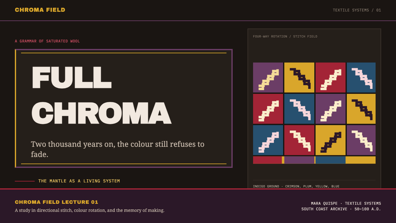
Four saturated hues, among them crimson, violet and golden yellow, rotate through the field in a fixed order. No two neighbouring modules share a colour, so the eye reads a steady rhythm instead of blocks of the same hue. The palette is closed: a fifth colour would break the cycle, so none is added.
The Module Field
The structure is a checkerboard of square modules, each holding one figure. The module is the unit of everything: size, spacing and colour assignment. Because every cell has the same footprint, the cloth reads as a system of equals rather than a hierarchy of one hero image and supporting detail.
The Repeating Figure
The recurring figure is a bird-impersonator with a back-bent body, in flight and carrying a trophy head. It is drawn as a flat, outlined silhouette and repeated while its colours rotate through the cycle. Repetition turns a single strange picture into texture, and the strangeness survives at the level of each individual cell.
Stitch-Unit Curves
Curves are built from steps of stitch, not from smooth vector arcs. Diagonals become staircases and circles become stepped polygons, much as early pixel graphics did. This is a constraint of thread and weave, and the style keeps it visible as the mark of its medium: smooth bezier edges would be a lie about how the cloth was made.
Density
Almost no ground is left unworked. Negative space, the quiet resource of most modern layouts, is nearly absent, and the density itself is the message: the amount of labour is legible at a glance. Hierarchy comes from rhythm and colour, not from isolation.
Dye-Vat Colour
The colours are shown as saturated as they were when the cloth was new, thanks to the dry desert burial. They are not the muted, sepia tone people often expect of ancient things. In design terms this licenses full-strength colour on a dark ground, while insisting that the colours stay few and systematic.
Who shaped Paracas Mantle?
Tello is the Peruvian archaeologist whose name is attached to the excavations that began at the Paracas Necropolis in 1927. The mantles reached the wider world through that work, and the Wari Kayan burials he opened are the reason a southern Peruvian cloth tradition now serves as a reference for designers.
Mejía Xesspe is the second name the record links to the 1927 work at Paracas. Fieldwork of this kind is what brought the mummy bundles, and the mantles wrapped round them, out of the desert, and it is documented fieldwork like this that lets a style claim a real place and a real date.
No individual dyer or embroiderer is named in the record; what survives is the work. Their choices, a dark dyed ground, a closed set of four colours, a module grid and stepped stitch curves, are the design decisions the style reproduces, which is why it is better read as a system than as a signature.
How do you use Paracas Mantle today?
Paracas Mantle is a style for density, rhythm and repetition, so it works best where a design has many equal units to organise. Think of galleries, card grids, schedules and collections rather than single hero statements. Applying it well means adopting the system behind the look, a module grid with a rotating colour code, and not simply laying a bird-figure pattern over a layout.
For presentation slides, a cover can use the indigo-black ground with a field of identical modules filling the slide edge to edge, with the title set in a clean block cut out of the pattern so the text stays readable. Content slides should drop the pattern to a narrow border or a corner band and let the black ground carry the text. Data slides suit categorical comparison: four series map directly onto the four-colour cycle, so a chart can borrow the palette without inventing a fifth.
For web interfaces, the style fits portfolio walls, product catalogues, collection pages and dashboards of many equally weighted tiles. Build a square-module grid, assign card accents by rotating through the four colours so that no neighbours match, and keep text on the dark ground where it has the strongest contrast. Avoid it for dense reading interfaces, forms or long tables, where a field this busy fights the content.
For editorial and marketing work, it supports cultural, textile, archaeology and craft stories: exhibition microsites, collection catalogues, heritage-product brands. A section header can be a single band of modules, and pull quotes can sit on solid dark blocks. Keep photography of real textile objects close to the pattern, because the best justification for this visual language is the object it came from.
The most common mistake is to treat the style as a texture and scatter its colours at random. The rotation rule is the style: if neighbours repeat or a fifth colour creeps in, the rhythm collapses. A second mistake is smoothing the curves into vector arcs or adding drop shadows and gradients, which contradicts a medium made of thread. The third is making it light and airy; the density and the dark ground are not optional.
Paracas Mantle — FAQ
What is a Paracas mantle?
A Paracas mantle is a large embroidered cloth made on the south coast of Peru around A.D. 50 to 100 and wrapped around a mummy bundle. Examples from the Necropolis at Wari Kayan have a near-black camelid-wool ground covered with small embroidered bird-impersonator figures in rotating saturated colours.
Why do the colours look so vivid after two thousand years?
Because the textiles were buried in the driest desert on earth, where decay is minimal, the reds and violets have kept close to the strength the dyers produced. That is why the style uses full-strength colour and not an aged palette: the colour you see is nearer to the colour that was made.
How do I use the four-colour cycle in a design?
Assign each of the four colours a place in a fixed sequence and step through it across the grid, so that adjacent modules always differ. On a web card grid that means rotating accent colours by position, not by content, and never introducing a fifth. For charts, limit categorical series to four or group the rest.
Can the style work on a light background?
It can be adapted, but the character changes. The original relies on a near-black ground to make the stitched hues glow, so a light version loses its contrast logic and tends to look like a generic folk pattern. If you need light, keep the module grid and the rotation, use a deep indigo panel for the pattern zone, and set text on a pale surface.
Is it appropriate to use a burial textile as a visual reference?
Yes, with care. The style borrows structure and colour logic, not sacred content: the figures and their meanings belong to a funerary context and should be credited rather than used as casual decoration for trivial products. Cultural, craft and educational contexts are natural fits; flippant ones are not.
Related design styles
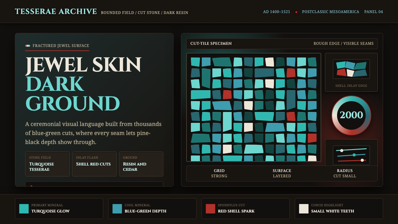 Mixtec Turquoise MosaicDarkness wears a jewel skin. Turquoise tesserae crack open with red and shell…
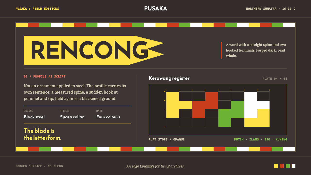 Acehnese Rencong MotifA blade that reads as a word. Flat kerawang red, white, green and yellow lock…
 Fijian Masi (Bark Stencil)Stencil memory stays sharp. Soot black and burnt coral strike bark-fibre band…
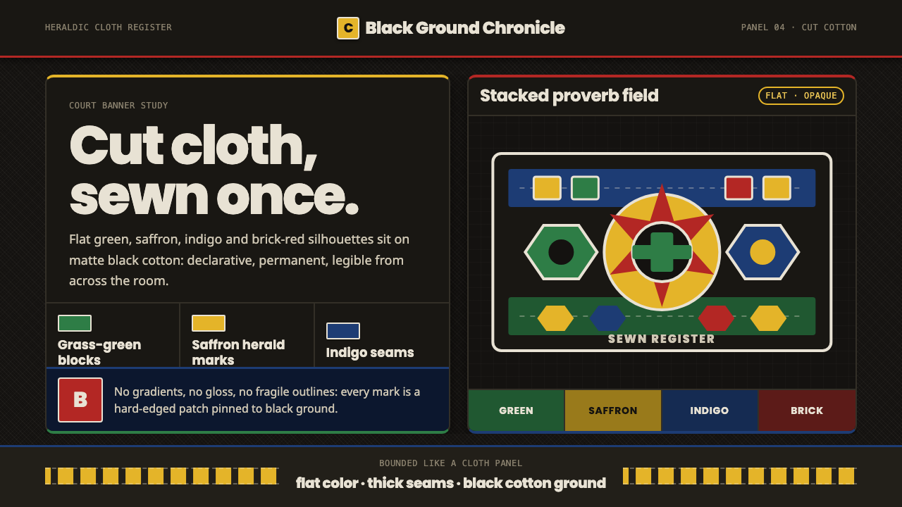 Fon Applique Banner AbomeyRoyal cloth speaks plainly. Flat saffron, green and indigo silhouettes on bla…
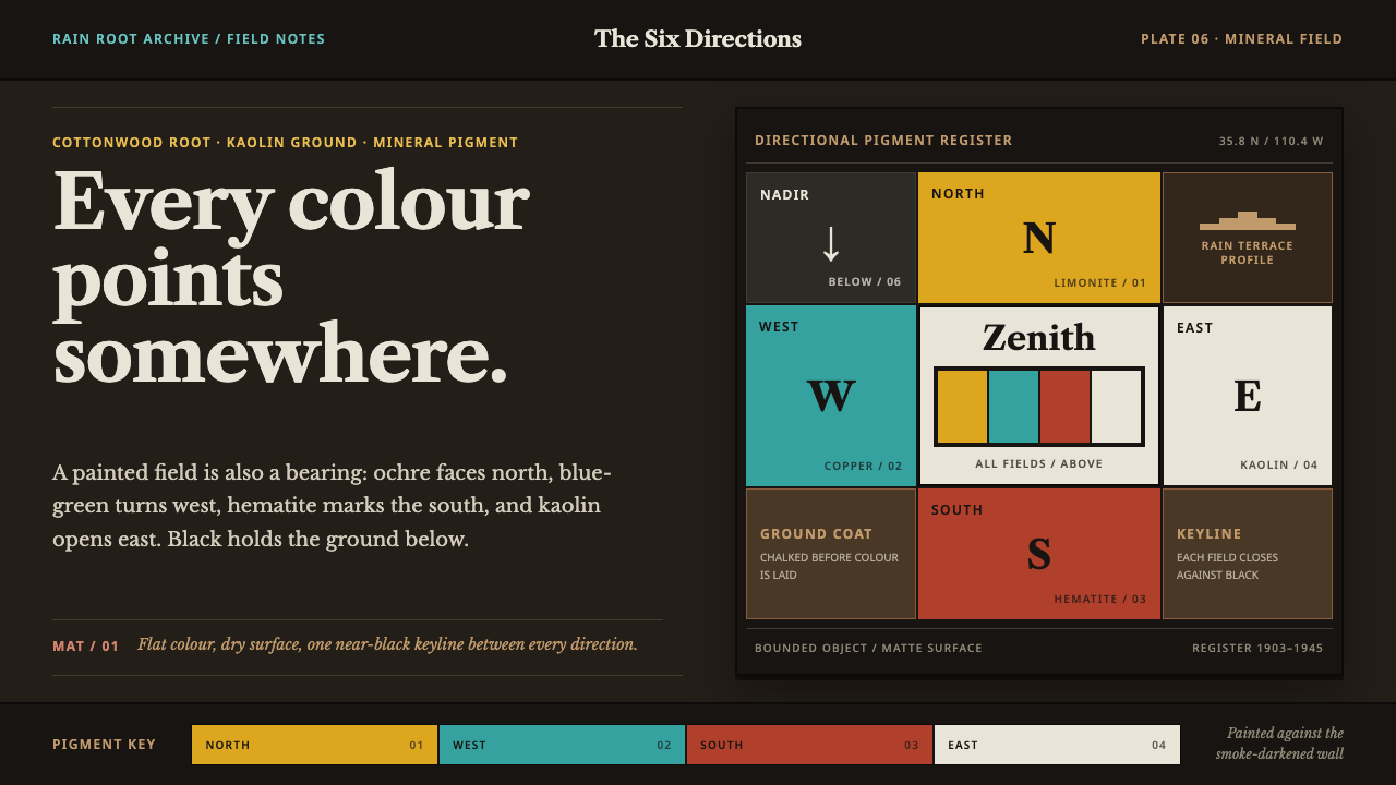 Hopi Katsina TihuEvery colour is a direction. Matte mineral fields meet in smoke-black keyline…
 Kongo Nkisi Nkondi FigurePower accumulates in darkness. Black wood, iron studs, and one mirror glint h…