What is Milka Lilac (1901)?
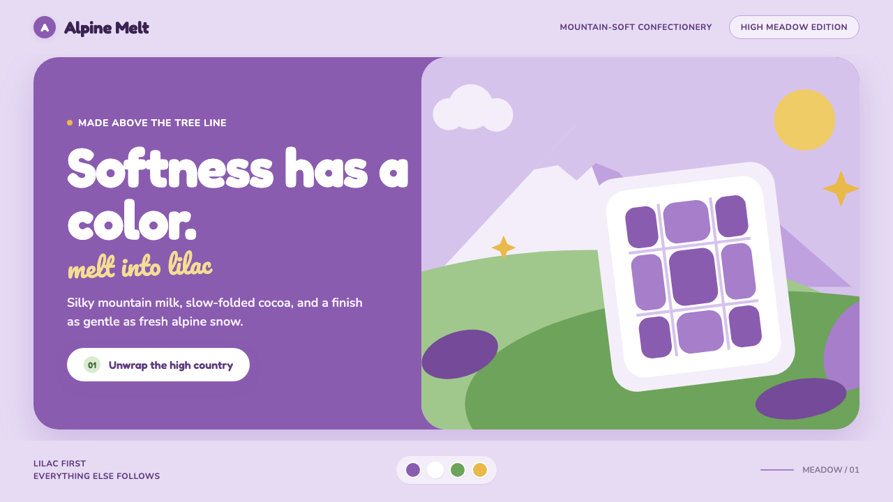
Milka Lilac turns chocolate into a landscape of softness: one unmistakable purple, snow-bright air, meadow freshness, and letters that seem whipped rather than printed.
Milka Lilac (1901) in brief
Milka Lilac is a confectionery identity built around an unusually strong proposition: color does much of the work normally assigned to a logo. Since Suchard combined Milch and Kakao into the name Milka in 1901, lilac has become the system’s immediate signal. The color arrives before the wordmark, establishing chocolate through recognition, softness, and repetition rather than through dense packaging information.
Its visual world joins a lilac field with alpine snow white and a single fresh meadow green. The combination is not merely decorative. Lilac supplies the brand memory, white gives the composition a clean foil-like brightness, and green opens the scene toward pasture, freshness, and the rolling Swiss landscape named in the brand story. Together they make a package or page feel light, cool, and melt-soft rather than dark, heavy, or indulgently dramatic.
The aesthetic is deliberately rounded and gentle. Type should feel plump, smooth, and generous, while cow-spot blobs, soft curves, snow-capped peaks, and pastoral hills carry the storytelling. Surfaces evoke the inside of a foil wrapper: matte in character, seamless in feeling, and free of sharp visual aggression. This is sweetness expressed as atmosphere, not as clutter.
Where does Milka Lilac (1901) come from?
The story begins with Philippe Suchard, who founded Suchard in 1826. The Milka name appeared in 1901, when Milch and Kakao were fused into one word. That naming move is central to the identity: milk and cocoa are not presented as separate ingredients but as a single compact promise, one that can be carried by a package, a wordmark, and eventually a color.
Lilac was gradually cemented as a trademark across the twentieth century. Its power comes from concentration. Instead of asking each campaign, product, or surface to establish a new visual personality, the system returns to the same lilac recognition field. The color becomes a durable container for changing images, products, and messages while preserving an immediate sense of continuity.
The geographic imagination is Swiss and alpine: Neuchâtel and Lörrach, the Bern–Lausanne alpine belt, snow-covered peaks, broad pastures, and meadow green. This pastoral setting gives the palette emotional structure. White reads as mountain snow, green as open grassland, and lilac as the transformed, fantastical signature that makes the landscape belong unmistakably to Milka.
The brand later expanded across Europe, while keeping its single-color trademark strategy and alpine pastoral advertising language. The lilac cow mascot, introduced in 1972, made that language even more legible. It turned the pastoral world from background scenery into a memorable character system, allowing the color, animal, mountain, and chocolate promise to operate as one visual sentence.
What defines the Milka Lilac (1901) look?
Lilac Recognition
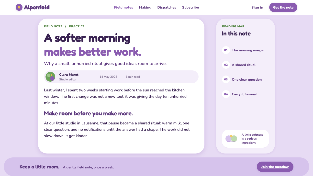
Lilac is the dominant recognition device, not a supporting accent. It should appear as an expansive, calm field that gives the brand room to be recognized before copy, imagery, or product detail enters. Its effect is most convincing when the composition trusts the color rather than competing with it.
Alpine White
White supplies the crisp counterpoint to the lilac wash. It suggests snow, foil brightness, and clean air while keeping the overall mood light. Use it as open space, soft product framing, or clear lettering ground, never as a clinical emptiness detached from the mountain story.
Meadow Green
Meadow green is a restrained note of freshness rather than a second dominant brand color. It belongs to rolling pasture, landscape transitions, and small natural cues. Against lilac and white, it prevents the system from becoming sugary or enclosed, bringing in the open-air quality of the alpine setting.
Whipped Typography
Typography should look rounded, plush, and easy to touch. The voice is closer to cream, chocolate, and soft wrapping than to industrial print. Compact sharp forms, severe spacing, and rigid visual rhythm weaken the impression; generous curves and a buoyant silhouette preserve its melt-soft character.
Pastoral Storytelling
Snow-capped peaks, Swiss pastures, and the cow create a compact alpine story. These motifs work best as broad, simplified scenery and friendly symbols, not as documentary detail. Their purpose is to make chocolate feel mountain-fresh and pastoral while leaving lilac as the clearest visual memory.
Soft Blob Forms
Cow-spot blobs and rounded contours replace hard geometric assertion. Their irregularity should feel friendly and edible, like soft chocolate shapes spreading gently across a wrapper. They can separate content areas or frame product imagery, but should remain sparse enough for the lilac field to stay calm.

Who shaped Milka Lilac (1901)?
Philippe Suchard founded Suchard in 1826, establishing the company from which the Milka story later emerged. In this identity, his importance is historical rather than decorative: the soft, highly recognizable system rests on a confectionery lineage that began before the Milka name and lilac trademark were formed.
Carl Russ-Suchard is named among the key figures in the supplied origin record. His presence places the identity within the Suchard lineage and its European confectionery context, reminding designers that the visual language is not an isolated pastel style but part of a continuing brand history.
Introduced in 1972, the lilac cow mascot gave the single-color strategy a living, pastoral emblem. It connects the trademark color to milk, pasture, and the alpine world without requiring a detailed explanation. As a figure, it makes the brand’s fantasy feel immediate, gentle, and easy to recognize.
How do you use Milka Lilac (1901) today?
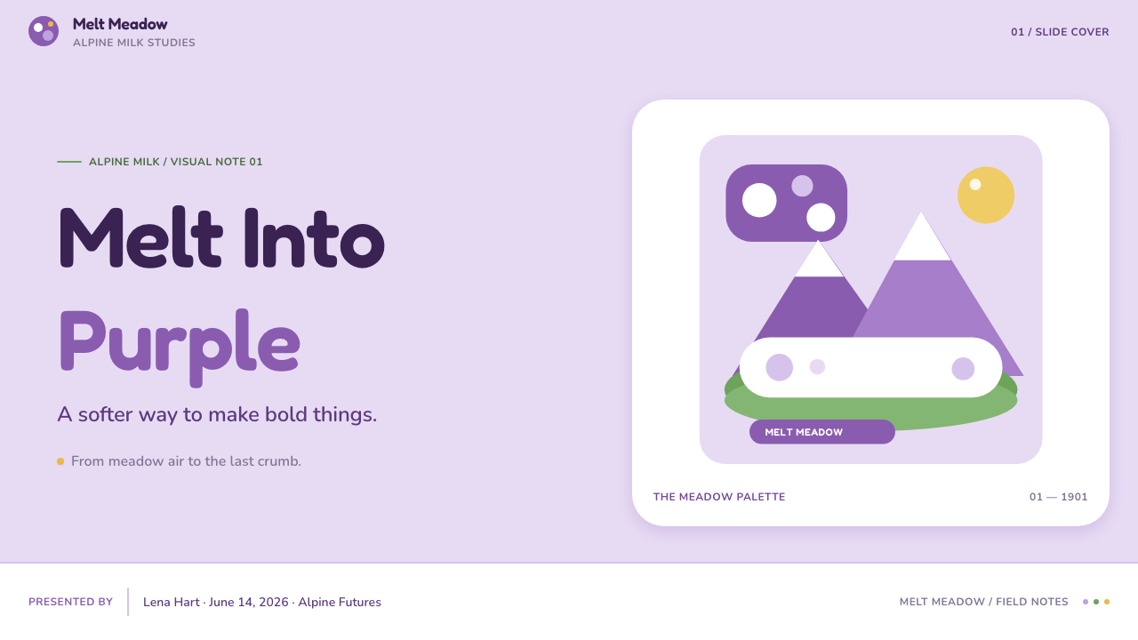
For presentation covers, let lilac establish recognition immediately, then place a rounded title against generous white breathing room. A small alpine cue, a soft cow-spot form, or a meadow-green sweep can introduce the story without overexplaining it. Content slides should remain especially calm: rounded section markers, short copy blocks, and white spaces that feel like smooth wrapper surfaces. For data slides, keep charts simple and legible, using lilac as the principal visual signal and green only for a fresh secondary distinction.
For web interfaces, this language suits product discovery, gifting, loyalty, and editorial commerce experiences more naturally than dense operational dashboards. A product page can use lilac to create an unmistakable environment, white to clarify product details, and softly rounded panels to preserve the tactile mood. Pricing or offer pages should avoid aggressive urgency; the best hierarchy feels generous and reassuring, with product imagery and concise information given room to breathe.
For editorial and marketing work, use the alpine world as a recurring narrative thread. A feature article can move between broad lilac sections, snowy white reading fields, meadow imagery, and occasional soft blob interruptions. Campaign pages can frame chocolate as a small moment of mountain-fresh softness, using the cow or a distant peak as a friendly memory cue rather than filling every surface with illustration.
The common mistake is to treat lilac as a generic pastel and add unrelated cute details until the identity becomes busy. Milka Lilac depends on discipline: one dominant color memory, a limited alpine story, rounded forms, and a calm foil-like surface. Too many competing hues, sharp type, glossy visual drama, or overly detailed scenery makes the system feel like confectionery decoration instead of a distinct brand world.
Milka Lilac (1901) — FAQ
Why is lilac more important than the wordmark in Milka Lilac?
The supplied brand history describes Milka as a rare case where color functions as the logo. Lilac was cemented as a trademark across the twentieth century, so it can trigger recognition before letters are read. The wordmark still matters, but the lilac field carries the fastest and most distinctive part of the visual memory.
Can the style use colors beyond lilac, white, and meadow green?
Additional colors can appear when content requires them, but they should not challenge the core relationship. Lilac remains the recognition field, alpine white provides clarity, and meadow green supplies freshness. If extra color becomes equally prominent, the single-color trademark strategy loses the concentration that makes the system recognizable.
How should the lilac cow be used?
Use the cow as a concise pastoral cue, not as decoration applied everywhere. Introduced in 1972, it connects color, milk, pasture, and the alpine setting in one figure. It is strongest when it gives a composition personality or orientation while leaving space for product, typography, and the lilac field.
What makes a Milka Lilac layout feel wrong?
The style loses credibility when it becomes hard, noisy, or unrelated to its alpine softness. Severe typography, crowded information, sharp forms, excessive visual gloss, and generic pastel ornament all work against the intended effect. A successful layout feels smooth, rounded, mountain-fresh, and confident enough to let lilac do the remembering.
Related design styles
 Instagram 2010s FilterWhen photos felt like memories. Faded warmth, dark vignettes, cream-tinted Po…
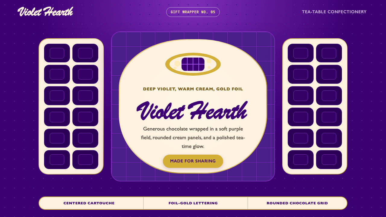 Cadbury Dairy MilkEveryday indulgence feels generous. Deep violet fields cradle cream cartouche…
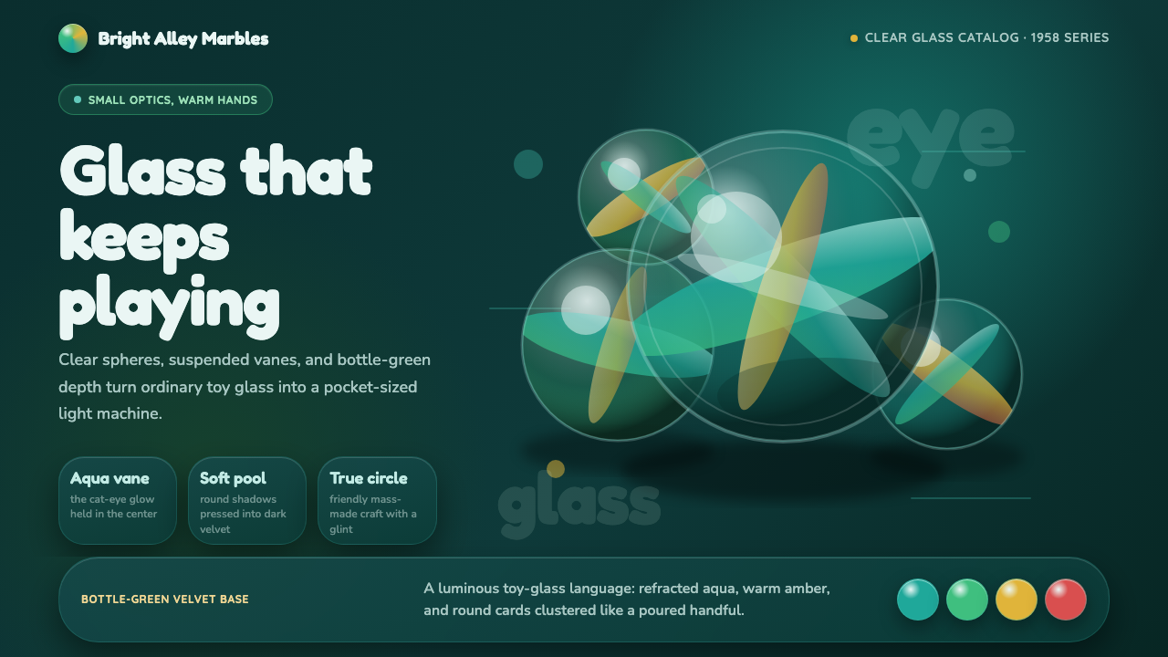 Cat's Eye MarblesMass-made glass feels magical. Aqua vanes glow inside round forms on bottle-g…
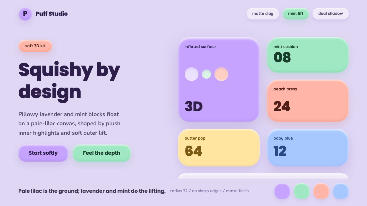 ClaymorphismSquishy, not flat. Lilac clay surfaces puff up with mint and lavender dual sh…
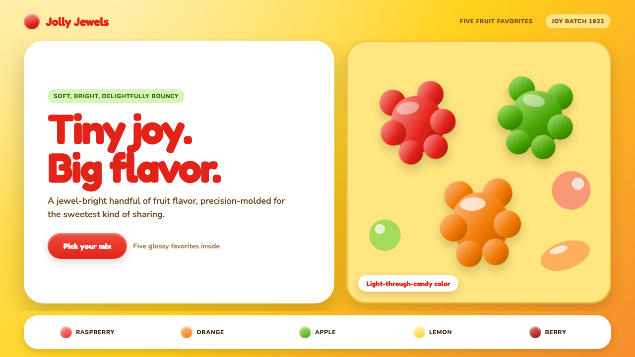 Haribo Goldbears (1922)Childhood joy, precision-molded. Glossy fruit colors tumble across a foil-gol…
 HeadspaceOptimism makes calm approachable. Sunrise orange and wobbly rounded forms bre…