About Milka Lilac (1901)
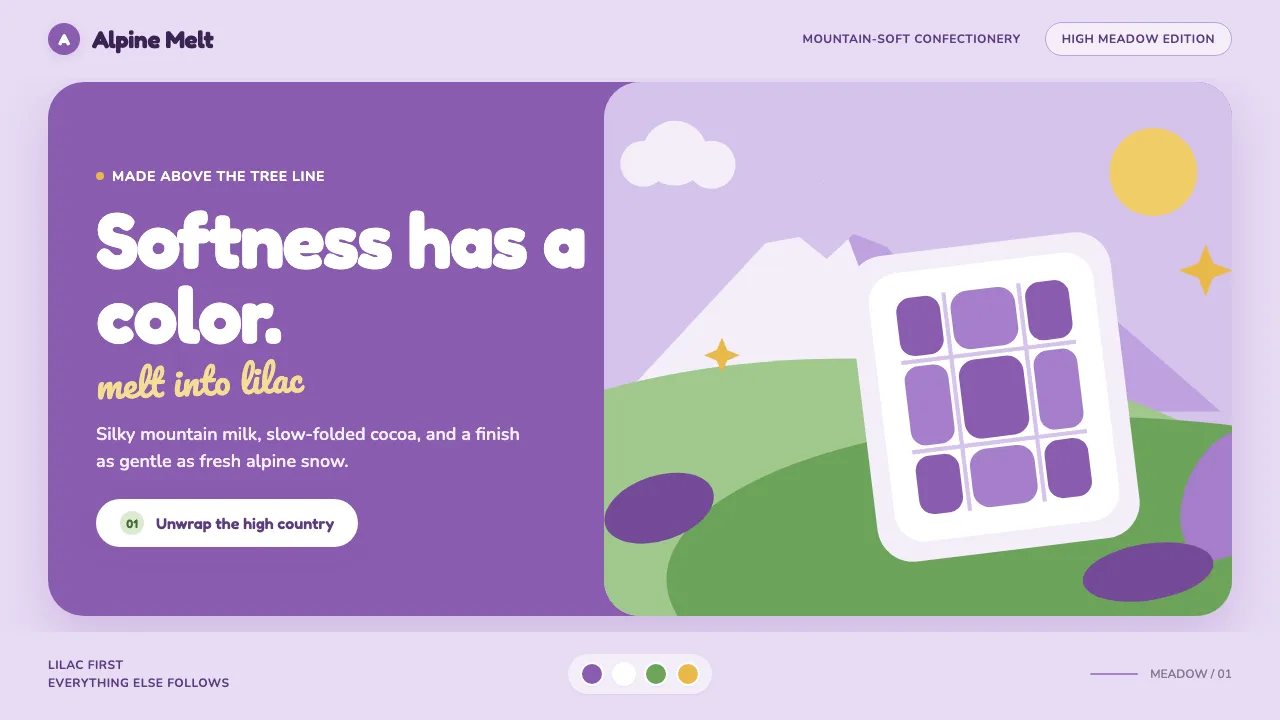
Milka is the rare brand where the color is the logo. When Suchard fused Milch and Kakao into one word in 1901, it also began cementing a single lilac so thoroughly that the purple now reads as "chocolate" before any letter is drawn. This system lives inside that idea: a lilac wash, alpine-snow whites, one fresh meadow green, and a rounded, whipped-not-printed voice. Every surface should feel like the inside of a foil wrapper — smooth, matte, generously rounded, impossibly gentle. Rolling Swiss pastures, a snow-capped peak, and soft cow-spot blobs do the storytelling. Melt-soft, mountain-fresh, and purple to the last crumb.
- Origin
- Switzerland (Neuchâtel / Lörrach, Bern–Lausanne alpine belt); later pan-European
- Era
- 1901 launch (Suchard); lilac trademark cemented across the 20th century; lilac cow mascot from 1972
- Key figures
- Philippe Suchard · Carl Russ-Suchard
- Movements
- European confectionery branding · single-color trademark strategy · alpine pastoral advertising
Milka Lilac (1901) design spec
Colors
Typography
The other 11 sections — buttons, cards, spacing, motion, techniques and more — open once you unlock. Download the DESIGN.md or send it to your AI in one click. Unlock once, yours forever.
Sign up nowStyles similar to Milka Lilac (1901)
Also inspired by brands & products, with a close feel.
 Xiaohongshu (RedNote) 2024Warm notes feel trusted. Cream-pink masonry cards glow with signature red accents.
 HeadspaceOptimism makes calm approachable. Sunrise orange and wobbly rounded forms breathe on cream.
 LINE Messenger GreenChat feels like a sticker. Bright green, pill bubbles, and rounded Nunito keep it warm.
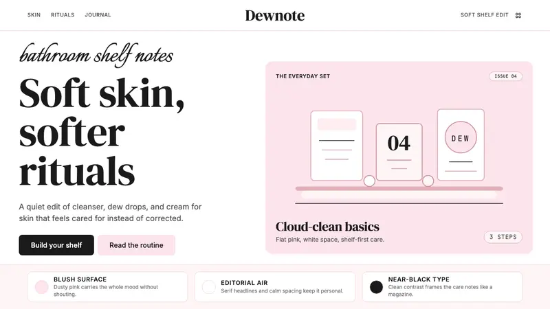 GlossierBeauty as a friend's conversation. Dusty pink (never bubblegum), editorial serif, whitespace.