What is Cadbury Dairy Milk?什么是 Cadbury Dairy Milk?
Cadbury Dairy Milk wraps a century of everyday indulgence in the world's most recognized purple — generous, centered, and unmistakably warm.吉百利牛奶巧克力用全球最具辨识度的紫色,包裹一个世纪的日常甜蜜——慷慨、居中、无可替代的温暖。
Cadbury Dairy Milk in briefCadbury Dairy Milk 速览
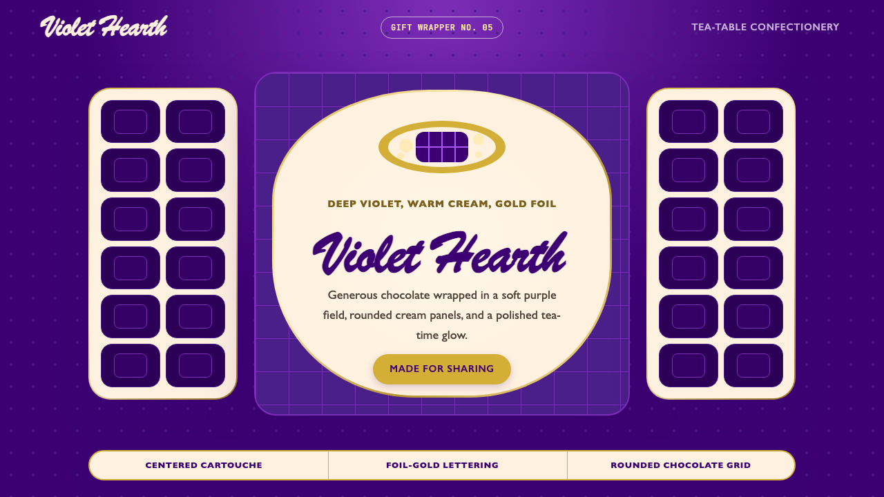
Cadbury Dairy Milk is a British confectionery brand whose visual identity has become one of the most globally recognized examples of food packaging design. Its signature is a deep, saturated violet — a purple so specific and so consistently applied that Cadbury successfully trademarked the color in several markets. Around that dominant hue, the brand has assembled a grammar of warmth: gold-foil lettering in a flowing cursive script, rounded cartouche shapes that suggest embrace rather than boundary, milk-splash illustrations rendered in a gouache-like style, and the enduring promise of 'a glass and a half' of fresh milk in every bar.吉百利牛奶巧克力是一个英国糖果品牌,其视觉形象已成为全球最具辨识度的食品包装设计案例之一。它的标志是一种深邃、饱和的紫罗兰色——这种紫色如此独特、应用如此一贯,以至于吉百利在多个市场成功注册了该颜色的商标。围绕这一主色调,品牌建立起一套传递温暖的视觉语法:流动花体的金箔字母、暗示拥抱而非边界的圆形徽章轮廓、以水粉画风格呈现的牛奶飞溅插画,以及历久弥新的承诺——每块巧克力中都含有「一杯半」新鲜牛奶。
What distinguishes Cadbury's visual language from most luxury confectionery is its insistence on generosity over restraint. Where premium chocolate brands often use austerity — matte black, thin serif type, wide margins — to signal exclusivity, Cadbury's design is centered, symmetric, and abundant. The purple is saturated rather than muted. The gold is warm rather than cold. The lettering is cursive and hand-drawn in spirit rather than geometric and precise. The overall effect is closer to a grandmother's kitchen than to a boutique atelier: richly colored, familiar, and deeply reassuring.吉百利视觉语言区别于大多数高端糖果品牌之处,在于它对慷慨感而非克制感的坚持。高端巧克力品牌往往用简朴——哑光黑色、纤细衬线字体、宽阔留白——来传递专属性,而吉百利的设计是居中的、对称的、丰盛的。紫色饱和而非暗淡,金色温暖而非冷峻,字体在精神上是手写花体而非几何精确。整体效果更接近祖母的厨房,而非精品工坊:色彩浓郁、亲切熟悉、令人深感安慰。
The brand's design DNA is governed by a few consistent principles: symmetry, roundness, and the pairing of deep jewel-toned backgrounds with cream or gold foreground elements. Unlike design systems that rely on typography or negative space as primary tools, Cadbury leads with color — purple is the message before any word is read. This makes the brand instantly legible at any scale, from a full-size bar wrapper to a small square of foil on an individual piece.品牌的设计基因由几条一贯原则统领:对称性、圆润感,以及深宝石色背景与奶油或金色前景元素的配对。与那些以字体排印或留白为主要工具的设计系统不同,吉百利以色彩为先导——在任何文字被阅读之前,紫色本身已是信息。这使品牌在任何尺寸下都能被瞬间识别,从完整的巧克力条包装到单片的小块锡纸。
See the Cadbury Dairy Milk design system查看 Cadbury Dairy Milk 完整设计系统
Where does Cadbury Dairy Milk come from?Cadbury Dairy Milk 从何而来?
The Cadbury story begins in 1824 when John Cadbury, a young Quaker, opened a shop at 93 Bull Street in Birmingham, England, selling tea, coffee, and a small range of drinking chocolates. The Quaker faith shaped the enterprise from the start: Quakers were temperance advocates who believed chocolate and cocoa offered a wholesome alternative to alcohol, and John Cadbury framed his product as a vehicle for moral and physical improvement. This origins story — of a principled man selling a nourishing product to working people — would come to color every aspect of the brand's later visual identity, emphasizing sincerity, abundance, and care.吉百利的故事始于1824年,年轻的贵格会教徒约翰·吉百利在英国伯明翰公牛街93号开了一家店铺,出售茶、咖啡和少量饮用巧克力。贵格会信仰从一开始就塑造了这家企业:贵格会是禁酒运动的倡导者,相信巧克力和可可提供了一种有益健康的酒精替代品,约翰·吉百利将他的产品定位为道德与身体改善的载体。这个起源故事——一个有原则的人向劳动者出售营养食品——后来给品牌的全部视觉形象涂上了底色,强调真诚、丰盛与关怀。
The transition from John to his sons Richard and George Cadbury in 1861 proved pivotal. George Cadbury, a visionary entrepreneur and committed social reformer, recognized that the company's existing factory in the center of Birmingham was inadequate for growth. In 1879 he purchased fourteen acres of land south of the city and built not just a factory but an entire model village for his workers — Bournville. The village included cottages with gardens, schools, and recreational grounds, but conspicuously no public houses. Bournville became internationally famous as an experiment in Quaker industrial paternalism, and the name attached to the brand with lasting cultural weight. When the Cadbury wrapper says 'Bournville,' it invokes not just a factory address but an entire philosophy of dignified labor and social responsibility.1861年从约翰移交给儿子理查德和乔治·吉百利的那次传承至关重要。颇具远见的企业家兼社会改革者乔治·吉百利意识到,公司位于伯明翰市中心的旧工厂已无法满足发展需要。1879年,他在城市南部购买了十四英亩土地,不仅建起了工厂,还为工人建造了一整座示范村——伯恩维尔。村子里有带花园的住宅、学校和休闲场所,但显眼地没有酒馆。伯恩维尔作为贵格会工业家长主义的实验,在国际上声名远播,这个名字以持久的文化分量附着于品牌之上。当吉百利包装上印着「伯恩维尔」,它召唤的不仅仅是一个工厂地址,而是一整套关于有尊严的劳动与社会责任的哲学。
The Dairy Milk bar was launched in 1905 and represented a genuine technical achievement: a higher proportion of fresh milk than had previously been possible in solid chocolate, giving it a creamier, more approachable texture than continental rivals. The launch prompted Cadbury to develop the visual language that would eventually become canonical — the purple and gold pairing that distinguished Dairy Milk from the brand's other chocolate lines. By the 1920s, the purple had become the dominant brand color, and the flowing cursive lettering that characterized the wordmark was settling into the form still recognizable today.牛奶巧克力棒于1905年推出,代表了一项真实的技术成就:比此前固体巧克力中所能实现的更高比例的新鲜牛奶,赋予其比欧陆竞品更为顺滑、更易亲近的质地。这次上市促使吉百利发展出最终成为经典的视觉语言——紫色与金色的搭配,将牛奶巧克力与品牌其他巧克力产品线区分开来。到1920年代,紫色已成为主导品牌色,标志性的流动花体字母也逐渐稳定为今天仍可辨认的形态。
The twentieth century brought significant developments to both the product and the brand's visual life. In the mid-century era of food packaging, the Cadbury wrapper evolved through the conventions of lithographic printing — rich flat colors, bordered cartouches, illustrated vignettes — that gave British confectionery packaging its characteristic warmth. The 'glass and a half' illustration, depicting fresh milk pouring into a bar of chocolate, became one of the most recognizable images in British advertising history, codifying the brand's promise in a single, recurring image. Later brand updates, including work by the design consultancy Bulletproof in the early 2000s, refined the visual system while preserving its essential character: the purple, the gold, the cursive, and the reassuring roundness of the overall composition.二十世纪为产品和品牌的视觉生命带来了重大发展。在食品包装的中世纪时代,吉百利包装通过石版印刷的惯例演进——饱满的平面色彩、有边框的徽章、插图小品——赋予了英国糖果包装其特有的温暖感。那幅「一杯半」插画——描绘新鲜牛奶倾入一块巧克力——成为英国广告史上最具辨识度的图像之一,以单一的反复出现的形象将品牌承诺编码化。后来的品牌更新,包括设计咨询公司Bulletproof在2000年代初的工作,在保留其本质特征的同时精炼了视觉系统:那紫色、那金色、那花体,以及整体构图令人安心的圆润感。
What defines the Cadbury Dairy Milk look?Cadbury Dairy Milk 的视觉特征是什么?
Color色彩
The defining visual element is a deep, jewel-toned purple — not a pale lavender or a cool blue-violet, but a fully saturated, warm-leaning violet that reads as rich and enveloping. This purple is paired almost invariably with warm gold, which appears in lettering, borders, and foil accents. Cream and white function as relief colors for text and illustration fields. The overall palette is opulent rather than minimal: colors are pushed to their fullest saturation, and the pairing of complementary warm-cool hues — violet against gold — creates visual energy without visual tension.定义性的视觉元素是一种深邃的宝石色紫罗兰——不是淡薄的薰衣草色或冷调的蓝紫色,而是完全饱和、偏暖的紫色,读来富贵而包裹感强。这种紫色几乎总是与暖金色搭配,后者出现在字母、边框和箔面强调色上。奶油色和白色作为文字和插图区域的缓和色。整体色板是奢华而非极简的:色彩被推至最充分的饱和度,互补暖冷色相——紫罗兰对应金色——的搭配产生视觉能量而无视觉张力。
Typography字体排印
The wordmark lettering is cursive in spirit — flowing, connected strokes with a distinctly hand-drawn quality, despite having been standardized into a consistent logotype. The letterforms are rounded at their terminals and generous in their spacing, projecting confidence and approachability simultaneously. Supporting type on packaging tends toward rounded, legible display styles rather than precise geometric sans-serifs or sharp serifs. The overall typographic register is warm and personal, reinforcing the brand's domestic rather than institutional character.标志字体在精神上是花体的——流动的、相连的笔画带有明显的手写质感,尽管已被规范为一致的标准字形。字母末端圆润,间距慷慨,同时传递自信与亲近感。包装上的辅助字体倾向于圆润、易读的展示风格,而非精确的几何无衬线字或锐利的衬线字。整体字体基调温暖而个人化,强化了品牌的家庭感而非机构感。
Composition构图
Cadbury compositions are centered and symmetric — a marked contrast to the asymmetric grid-based layouts that dominate contemporary design. The central element is typically a cartouche or shield shape containing the wordmark, with secondary information arranged symmetrically above and below. This symmetry signals stability, tradition, and trustworthiness, and echoes the composition of Victorian-era trade labels and apothecary packaging that were part of Cadbury's formative context. The centered arrangement also maximizes legibility on a rectangular chocolate bar wrapper viewed at any orientation.吉百利的构图是居中的、对称的——与当代设计中占主导地位的非对称网格布局形成鲜明对比。中心元素通常是包含标志字的徽章或盾形,次要信息在其上下对称排列。这种对称性传递稳定感、传统感和可信度,呼应了维多利亚时代商品标签和药剂包装的构图——那是吉百利形成期的视觉语境。居中排列也在任何方向观看矩形巧克力条包装时都能最大化易读性。
Roundness and Softness圆润与柔和
Every element in the Cadbury visual system tends toward roundness: the cartouche corners are curved, the letterforms are rounded, the illustration style favors soft contours, and even the product itself — a chocolate bar — is associated with a grid of rounded, yielding squares. This pervasive roundness is not coincidental. It is a deliberate signal of tactile pleasure, abundance, and maternal care. Hard corners and angular geometry would introduce tension; Cadbury consistently chooses the softer, more embracing form.吉百利视觉系统中的每个元素都倾向于圆润:徽章四角是弯曲的,字母形态是圆润的,插画风格偏爱柔和轮廓,就连产品本身——巧克力棒——也与一格格圆润、柔软的方块相关联。这种无处不在的圆润感并非偶然,而是触感愉悦、丰盈与母性关怀的刻意信号。硬角和有棱角的几何形会引入张力;吉百利始终选择更柔和、更具包裹感的形态。
Illustration and Ornament插画与装饰
Unlike design systems that eliminate illustration in favor of pure geometry or photography, Cadbury makes illustration a central brand element. The milk-splash image — fresh milk pouring from a glass into a chocolate bar — is the most iconic instance, but the broader visual language includes decorative scroll work, illustrated vignettes, and bordered panels that recall the rich ornamental traditions of Victorian and Edwardian printed ephemera. Ornament here is not considered waste, as it would be in a functionalist design philosophy; it is itself the message, signaling that the brand has time for beauty, detail, and generosity.与那些为了纯几何或摄影而消除插画的设计系统不同,吉百利将插画作为核心品牌元素。牛奶飞溅图像——新鲜牛奶从玻璃杯倾入巧克力棒——是最具标志性的案例,但更广泛的视觉语言还包括装饰性涡卷纹、插图小品和有边框的面板,令人联想到维多利亚和爱德华时代印刷品丰富的装饰传统。在这里,装饰不被视为功能主义设计哲学所认为的浪费;它本身就是信息,传递着品牌有时间去追求美丽、细节与慷慨。
Gold as Signal金色作为信号
Gold functions as the brand's secondary language, marking elements of particular importance: the wordmark border, key typographic elements, and the foil wrapping of the bar itself. Cadbury's gold is warm and slightly amber-toned rather than cool or platinum-adjacent, which keeps it in register with the purple rather than contrasting against it too harshly. The use of actual gold foil as a material element in the product packaging reinforces the visual code at a tactile level — this is a brand whose visual promises are backed by material choices.金色作为品牌的第二语言,标记特别重要的元素:标志边框、关键字体元素,以及巧克力棒本身的金箔包装。吉百利的金色是温暖的、略带琥珀色调的,而非冷调或接近铂金色,这使其与紫色保持在同一音调上,而非过于剧烈地对比。在产品包装中实际使用金箔作为材料元素,在触感层面强化了视觉代码——这是一个用材料选择来背书视觉承诺的品牌。
Symmetry as Trust对称作为信任
The consistent use of bilateral symmetry in Cadbury packaging is a design argument, not merely a stylistic preference. Symmetry has been associated across cultures and centuries with stability, fairness, and institutional reliability. For a food brand making an implicit promise about consistency — every bar will taste the same, every purchase will deliver the same pleasure — symmetrical composition reinforces that promise at a subliminal level. The viewer's eye finds balance immediately, and that effortless balance reads as confidence and dependability.吉百利包装中对双侧对称的一贯使用是一个设计论证,而非仅仅是风格偏好。对称性在跨文化、跨世纪的语境中始终与稳定性、公平性和机构可靠性相关联。对于一个关于一致性做出隐含承诺的食品品牌——每块巧克力口味相同,每次购买带来相同的愉悦——对称构图在潜意识层面强化了这一承诺。观者的眼睛立即找到平衡,而这种毫不费力的平衡被解读为自信与可靠。
See the Cadbury Dairy Milk design system查看 Cadbury Dairy Milk 完整设计系统
Who shaped Cadbury Dairy Milk?谁塑造了 Cadbury Dairy Milk?
John Cadbury founded the business in Birmingham in 1824 as a tea and coffee merchant who also sold drinking chocolate. His Quaker faith gave the enterprise its moral framing: chocolate was positioned as a wholesome alternative to alcohol, a product that could improve the lives of working people rather than diminish them. This founding ethical stance — earnest, generous, socially conscious — became the invisible substrate of the brand's entire visual language, which has always communicated warmth and sincerity rather than cold luxury.约翰·吉百利于1824年在伯明翰创立了这家企业,最初是一家同时出售饮用巧克力的茶咖啡商。他的贵格会信仰赋予了企业道德框架:巧克力被定位为酒精的健康替代品,一种能够改善而非损害劳动者生活的产品。这一创始的伦理立场——真诚、慷慨、具有社会意识——成为品牌整个视觉语言的无形底色,始终传递温暖与诚挚,而非冷漠的奢华。
George Cadbury, who took over the business with his brother Richard in 1861, is responsible for the two decisions that most shaped the brand's cultural identity: the construction of Bournville, the model factory village south of Birmingham that became internationally famous as a Quaker experiment in dignified labor, and the continued investment in product quality that led to the Dairy Milk bar's development. Bournville gave Cadbury a story — not just a product — and that story of principled generosity saturates the visual identity as fully as the purple saturates the packaging.1861年与兄弟理查德接管公司的乔治·吉百利,对品牌文化形象影响最深远的两个决策负有责任:建设伯恩维尔(伯明翰南部的示范工厂村,作为贵格会有尊严劳动实验而举世闻名),以及持续投资产品质量,最终促成牛奶巧克力棒的诞生。伯恩维尔赋予了吉百利一个故事——而不仅仅是一款产品——这个关于有原则的慷慨的故事,像紫色浸透包装一样完全渗透了视觉形象。
Newbould was among the commercial artists who contributed to Cadbury's mid-century visual language during the era when British poster and packaging art reached its high-water mark. His understanding of color, composition, and the conventions of lithographic printing informed the brand's characteristic pairing of rich flat backgrounds with carefully bounded foreground elements — a technique that gave Cadbury packaging its sense of organized abundance rather than visual chaos.纽鲍尔德是在英国海报和包装艺术臻于巅峰的时代,为吉百利中世纪视觉语言做出贡献的商业艺术家之一。他对色彩、构图和石版印刷惯例的理解,影响了品牌将丰富平面背景与精心界定的前景元素配对的特色手法——这种技巧赋予了吉百利包装有组织的丰盛感,而非视觉混乱。
Bulletproof, a London-based brand design consultancy, undertook a significant visual refresh of the Cadbury Dairy Milk identity in the early 2000s. The work is an instructive case study in brand stewardship: Bulletproof modernized the system's production values and tightened its visual logic without abandoning the purple, the gold, the cursive lettering, or the centered symmetry that had made the brand instantly recognizable across generations. The challenge — updating a beloved mark for contemporary media without erasing the memories of millions of consumers — required a clear-eyed understanding of which elements were structurally essential and which were incidental to period production techniques.Bulletproof是一家伦敦品牌设计咨询公司,在2000年代初对吉百利牛奶巧克力形象进行了重大视觉焕新。这项工作是品牌管理的教科书级案例:Bulletproof在不放弃紫色、金色、花体字母或居中对称的前提下,现代化了系统的制作品质、收紧了其视觉逻辑——正是这些元素使品牌跨越几代人被瞬间识别。这一挑战——为当代媒体更新一个深受喜爱的标志而不抹去数以百万计消费者的记忆——需要对哪些元素是结构性不可或缺的、哪些只是时代制作技术的附带产物有清醒的判断。
How do you use Cadbury Dairy Milk today?今天怎么用 Cadbury Dairy Milk?
Cadbury Dairy Milk's visual language is among the most specific and emotionally loaded of any confectionery brand, which makes it powerful as a design reference but demanding in its application. The style communicates warmth, generosity, everyday pleasure, and trusted familiarity — values that are genuinely useful for food and beverage brands, gifting and celebration contexts, children's products, loyalty programs, and any product or service that wants to feel approachable and abundant rather than exclusive and austere. Applied carelessly, the same elements that make the style feel warm can make it feel nostalgic to the point of datedness, or indulgent to the point of excess.吉百利牛奶巧克力的视觉语言是所有糖果品牌中最具特殊性和情感分量的之一,这使其作为设计参考强而有力,但在应用上也颇为讲究。这种风格传递温暖、慷慨、日常愉悦与可信的熟悉感——这些价值观对食品饮料品牌、礼品与庆典语境、儿童产品、忠诚度计划,以及任何希望感觉亲近丰盛而非排他简朴的产品或服务都真正有用。若应用不当,让这种风格感觉温暖的那些元素,同样可能让它显得怀旧到陈旧,或放纵到过度。
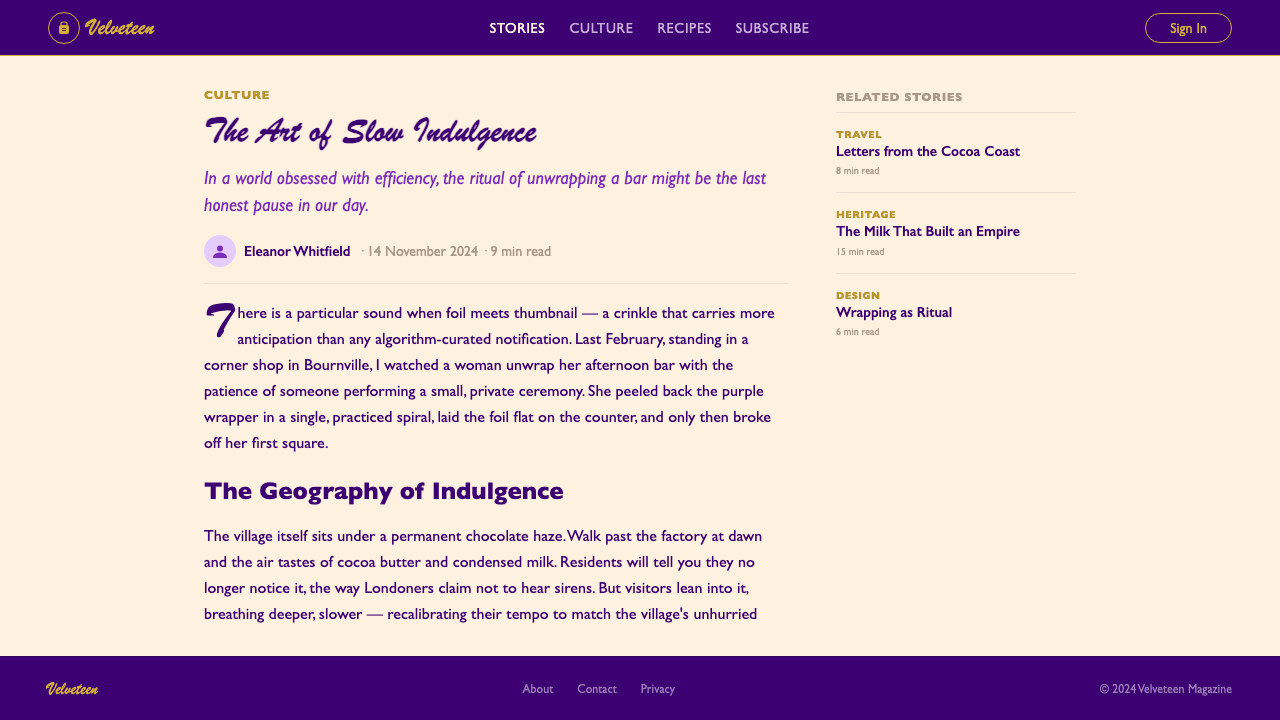
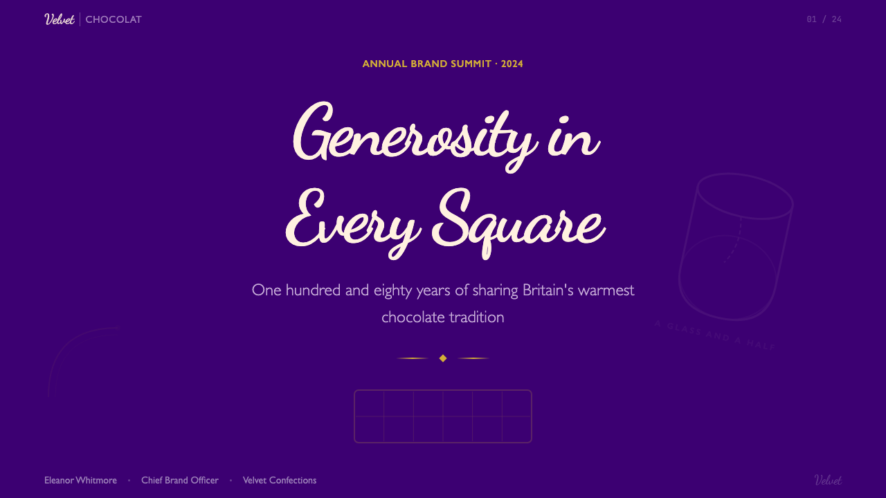
For presentation slides, the Cadbury approach works best on cover pages and section dividers where bold identity is the goal. A cover in this style leads with a deep violet background, positions the title in warm gold or cream lettering at center, and frames the composition with a simple rounded border or cartouche. Content slides should be handled more lightly — a strong accent color in the heading, a cream or off-white field for body text, and restrained use of gold only for the most critical calls to attention. Data slides can carry a purple header bar with white-reversed type, letting charts live on a lighter ground to preserve legibility. Avoid applying the full palette — purple, gold, and cream simultaneously at high saturation — across every slide; the result reads as maximalist rather than branded.在演示文稿中,吉百利风格最适合封面页和章节分隔页——那些以大胆身份感为目标的场合。这种风格的封面以深紫色背景为主,将标题以温暖金色或奶油色字母居中呈现,并以简单圆润边框或徽章形框定构图。内容页应处理得更轻盈——标题用强调色,正文用奶油或米白底,仅对最关键的注意点克制地使用金色。数据页可以用紫色标题栏配白色反色字体,让图表在更浅的底面上展示以保证可读性。避免在每张幻灯片上同时以高饱和度使用全套色板——紫色、金色和奶油色——结果会显得最大化主义而非品牌化。
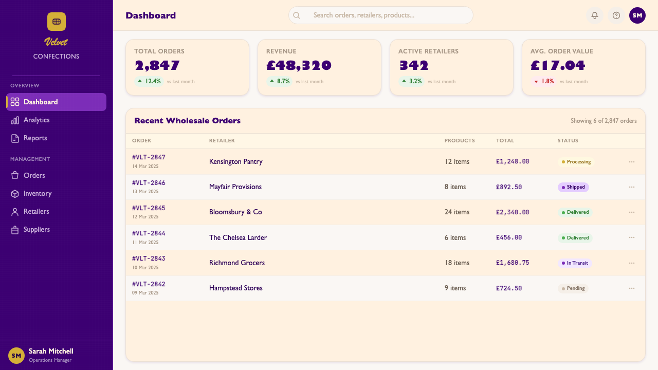
For web interfaces, the style is best suited to contexts where warmth and occasion matter: gifting platforms, food delivery services, event ticketing, or loyalty dashboards. A pricing page in this mode might use deep violet as the featured tier's background, gold as the call-to-action border or button treatment, and cream as the default page ground. Navigation should be kept typographically simple — the visual richness lives in the content areas, not in the chrome. Dashboard widgets can use rounded card shapes with subtle gold border treatments to echo the cartouche motif without overwhelming the data display. Avoid deploying the full ornamental vocabulary — scroll borders, illustrated vignettes — in functional UI; reserve that register for marketing surfaces.在网页界面中,这种风格最适合温暖感和场合感重要的语境:礼品平台、食品外卖、活动票务或忠诚度仪表板。这种模式的定价页面可能将深紫色用于特色套餐背景,金色用于行动号召边框或按钮处理,奶油色作为默认页面底色。导航应保持字体上的简洁——视觉丰富感在内容区域,而非在界面框架上。仪表板小部件可以使用带有微妙金色边框处理的圆角卡片造型,呼应徽章母题而不压倒数据展示。避免在功能性界面中部署全套装饰词汇——涡卷边框、插图小品——将那个层次保留给营销表面。
For editorial and marketing work, the style has genuine poster-scale authority. A marketing page in the Cadbury register uses full-width violet sections alternating with cream, centered headline type at generous scale, and the milk-splash or product illustration as a central visual anchor. Email campaigns benefit from the style's print heritage: bordered content panels, gold dividers, and a centered layout that reads cleanly in any email client. Packaging mockups and promotional materials for food products can adopt the rounded cartouche and the purple-gold pairing directly. For social cards and digital advertising, the centered symmetry and bold color contrast reproduce effectively at small sizes — the design was, after all, developed in an era when packaging had to communicate from a shop shelf at a distance.在编辑和营销工作中,这种风格具有真实的海报级权威感。吉百利风格的营销页面使用全宽紫色区块与奶油色交替,居中标题字体尺度慷慨,以牛奶飞溅或产品插画作为中心视觉锚点。邮件营销活动受益于这种风格的印刷遗产:有边框的内容面板、金色分隔线,以及在任何邮件客户端都能清晰呈现的居中版式。食品产品的包装模型和促销材料可以直接采用圆润徽章和紫金配色。社交卡片和数字广告中,居中对称和大胆的色彩对比在小尺寸下有效呈现——毕竟,这套设计最初是在包装需要从货架远处传达信息的时代发展起来的。
A common mistake when working in this style is confusing its warmth with permission for visual clutter. Cadbury's packaging achieves its richness through disciplined restraint within a carefully bounded composition — every ornamental element has a position in a hierarchy, and the purple background does the heavy lifting of establishing mood so that the foreground elements do not have to. Designs that add layered textures, multiple illustration styles, competing border treatments, or too many typographic voices simultaneously produce something that reads as nostalgic kitsch rather than as the assured warmth the reference brand achieves. Commit to the centered axis, limit the ornamental vocabulary to one or two recurring motifs, and let the color do its work.在使用这种风格时,常见的错误是将其温暖感混同为视觉杂乱的许可。吉百利包装通过在精心界定的构图内有纪律的克制来实现其丰富感——每个装饰元素在层级中都有其位置,紫色背景承担建立氛围的主要工作,以使前景元素不必如此费力。叠加多层纹理、多种插画风格、相互竞争的边框处理或同时出现太多字体声音的设计,产生的结果会被读作怀旧俗气,而非参考品牌所达到的那种笃定的温暖。坚守居中轴线,将装饰词汇限制在一两个反复出现的母题,让色彩发挥其作用。
See the Cadbury Dairy Milk design system查看 Cadbury Dairy Milk 完整设计系统
Cadbury Dairy Milk — FAQCadbury Dairy Milk · 常见问题
Is Cadbury Dairy Milk's purple a trademarked color, and what does that mean for design work?吉百利牛奶巧克力的紫色是注册商标颜色吗?这对设计工作意味着什么?
Cadbury has successfully registered the specific shade of purple used on its Dairy Milk packaging in several markets, including the United Kingdom and Australia, though legal battles have periodically contested the scope of that protection. For designers, this trademark has no practical bearing on creative work that references or is inspired by the color — trademarks protect commercial use in directly competing product categories, not visual references in design practice. What matters aesthetically is understanding why the color works: it is a warm, fully saturated violet that reads simultaneously as rich and approachable, positioned between the cold blue-violet of corporate dignity and the pink-violet of childhood sweetness. Recreating that emotional register matters far more than matching a precise chip.吉百利已在包括英国和澳大利亚在内的多个市场,成功注册了其牛奶巧克力包装上特定紫色的商标,尽管法律诉讼曾周期性地对该保护范围提出质疑。对设计师而言,这一商标对参考或受该颜色启发的创意工作没有实际影响——商标保护的是在直接竞争产品类别中的商业使用,而非设计实践中的视觉参考。从美学角度,真正重要的是理解这种颜色为何有效:它是一种温暖的、完全饱和的紫罗兰色,同时读来既富贵又亲近,介于企业尊严的冷蓝紫与童年甜蜜的粉紫之间。重现那种情感调性,远比匹配一个精确色卡重要得多。
Can the Cadbury visual language work in dark-mode digital interfaces?吉百利视觉语言能在深色模式数字界面中使用吗?
The historic Cadbury palette is already dark-ground by nature — deep purple is the dominant field, with cream and gold as foreground elements. This makes a direct translation to dark-mode UI more natural than it might be for many other design references. The key consideration is that the purple background must remain sufficiently deep to maintain contrast with cream text and gold accents; if the purple is lightened to accommodate lower ambient brightness, it loses its characteristic richness and begins to read as a generic violet. In practice, a dark-mode Cadbury-inspired interface works best when the background is the truest, deepest purple the display can render, and the foreground elements — type, borders, interactive elements — are rendered in cream, warm white, or gold rather than pure white, which would create too harsh a contrast.吉百利历史色板本质上已经是深色底面——深紫色是主导场域,奶油色和金色是前景元素。这使其直接转化为深色模式界面比许多其他设计参考更为自然。关键考量是:紫色背景必须保持足够深邃,以维持与奶油色文字和金色强调色的对比;若紫色为适应较低环境亮度而被调浅,它将失去其特有的丰富感,开始读来像普通的紫罗兰。在实践中,受吉百利启发的深色模式界面效果最佳的做法是:背景使用显示器能渲染的最真实、最深邃的紫色,而前景元素——文字、边框、交互元素——用奶油色、暖白色或金色呈现,而非纯白——后者会产生过于刺目的对比。
How does Cadbury's style differ from other 'warm heritage' brands like Heinz or Marmite?吉百利的风格与亨氏或马麦酱等其他「温暖传统」品牌有何不同?
All three brands share the broad register of British food heritage — established Edwardian-era packaging conventions, strong single-color fields, and considerable consumer attachment. The differences lie in their dominant hues and compositional logic. Heinz is built around a warm red-tomato red and a distinctive green pickle, with a horizontally banded, label-within-a-label composition that emphasizes product variety. Marmite uses a matte dark brown and a distinctively shaped jar to make the container itself the primary brand asset. Cadbury, by contrast, is defined entirely by its background color — the purple is the brand — and uses a centered medallion composition that implies occasion and gift rather than everyday grocery. Cadbury's vocabulary is the most ornamental of the three, with its cursive lettering and gold foil; Heinz and Marmite are comparatively more utilitarian in their typographic and compositional choices.三个品牌都共享英国食品传统的广泛调性——成熟的爱德华时代包装惯例、强烈的单色底面,以及相当程度的消费者情感依附。区别在于主色调和构图逻辑。亨氏围绕温暖的番茄红和独特的腌菜绿构建,采用横向分层的「标签中的标签」构图,强调产品多样性。马麦酱以哑光深棕色和独特造型的瓶子为核心,使容器本身成为主要品牌资产。吉百利则完全由其背景色定义——紫色即品牌——并使用居中奖章式构图,暗示场合和礼品感而非日常购物。在三者中,吉百利的视觉词汇最具装饰性,其花体字母和金箔;而亨氏和马麦酱在字体排印和构图选择上则相对更具实用性。
Is this style appropriate for premium or luxury positioning?这种风格适合高端或奢华定位吗?
Cadbury's visual language is deliberately not premium in the contemporary sense — it is generous, democratic, and everyday rather than exclusive, restrained, and aspirational. Premium confectionery brands (Lindt, Valrhona, Compartés) typically signal luxury through austerity: dark matte surfaces, minimal color, precise geometric type, and abundant negative space. Cadbury inverts almost every one of those signals: saturated color, warm ornament, cursive type, and centered composition filled to the edges. That said, 'premium' and 'luxury' are not the same thing, and the Cadbury register can work effectively for brands seeking to position themselves as premium-everyday — quality that everyone deserves, rather than quality available only to a few. Think artisan jam, specialty tea, family celebration cakes, or a subscription chocolate service targeting warmth-seeking consumers rather than connoisseurs.吉百利的视觉语言在当代意义上刻意不走高端路线——它是慷慨的、民主的、日常的,而非排他的、克制的、充满向往感的。高端糖果品牌(瑞士莲、法芙娜、Compartés)通常通过简朴来传递奢华:哑光深色表面、极简色彩、精确几何字体和丰富留白。吉百利几乎颠覆了每一个这样的信号:饱和色彩、温暖装饰、花体字、构图充实到边缘。话虽如此,「高端」与「奢华」并不是同一回事,吉百利调性对于寻求「高端日常」定位的品牌可以很有效——每个人都值得拥有的品质,而非只有少数人可及的品质。想想手工果酱、特色茶叶、家庭庆典蛋糕,或面向追求温暖感的消费者而非鉴赏家的订阅巧克力服务。
How do you avoid the style looking like a generic 'chocolate box' pastiche?如何避免这种风格看起来像通用的「巧克力盒」仿制品?
The difference between a convincing Cadbury-inspired design and a generic confectionery pastiche lies in compositional discipline and chromatic commitment. Generic chocolate box design typically deploys multiple ornamental motifs in competition, uses a muddied or imprecise purple (one that drifts toward blue or toward red rather than landing at the warm jewel-toned violet that is the reference), applies gold so liberally that it loses its function as an accent, and allows the centered composition to become merely static rather than confidently balanced. To avoid this: commit to one or two ornamental motifs maximum and use them consistently; ensure the purple is fully saturated and warm in its violet tendency; use gold sparingly and structurally; and keep the centered composition taut by giving every element a clear size relationship to every other. The best Cadbury-inspired work looks inevitable — as if no other composition was possible — rather than assembled.令人信服的吉百利风格设计与通用糖果仿制品之间的区别,在于构图纪律和色彩承诺。通用巧克力盒设计通常同时部署多个相互竞争的装饰母题,使用浑浊或不精确的紫色(向蓝色或红色漂移,而非落在温暖宝石色调紫罗兰的精准点位),将金色应用得如此慷慨以至于失去其作为强调色的功能,并让居中构图变得仅仅是静态而非充满自信的平衡。为避免这些问题:最多承诺一到两个装饰母题并一致地使用它们;确保紫色完全饱和且在紫罗兰倾向上是温暖的;克制而结构性地使用金色;通过给每个元素清晰的尺寸关系来保持居中构图的紧绷。最好的吉百利风格作品看起来是必然的——仿佛没有其他构图是可能的——而非拼凑而成。
Related design styles相关设计风格
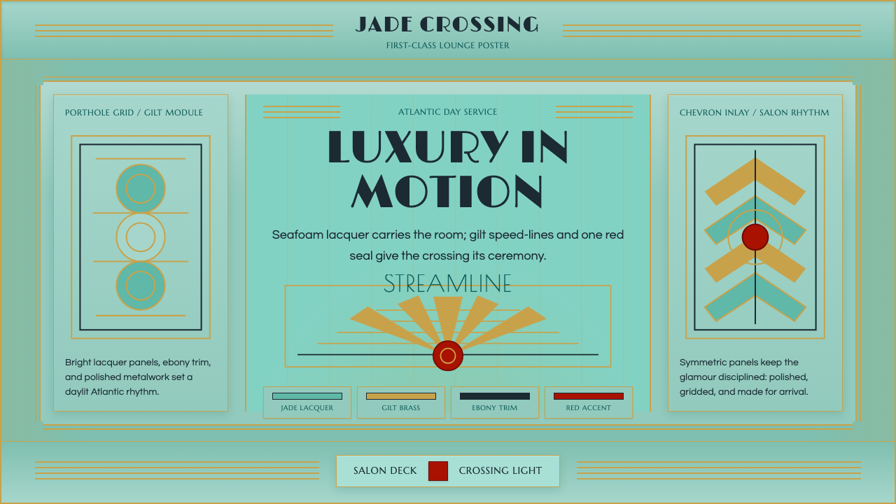 Ocean Liner SeafoamLuxury in motion. Seafoam lacquer, gilt speed-lines, and Deco symmetry frame…流动中的奢华:海沫漆面、鎏金速度线与装饰艺术对称框景。
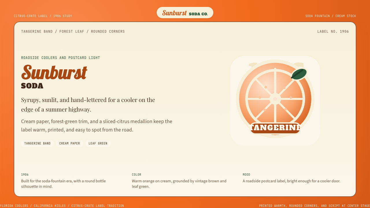 Orange Crush Soda (1906)Syrupy nostalgia. Tangerine, cream, and script make it a postcard label.糖浆般怀旧。橘红、奶油纸与手写体把标签变成明信片。
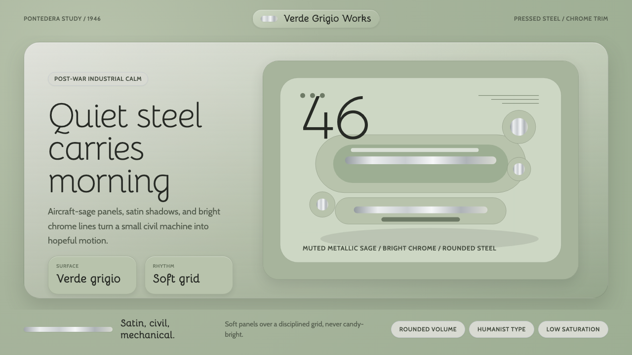 Vespa Mint ScooterHope wears steel. Verde grigio panels and chrome trim keep the optimism restr…希望披着钢板。灰绿面板与镀铬线条让乐观保持克制。
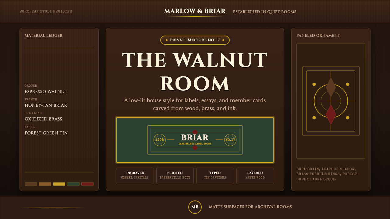 Briar Pipe & TobaccoWarm gloom, precisely aged. Brass rules and Cinzel capitals sit on espresso w…温暖幽暗而考究:黄铜细线与Cinzel大写落在浓咖胡桃木上。
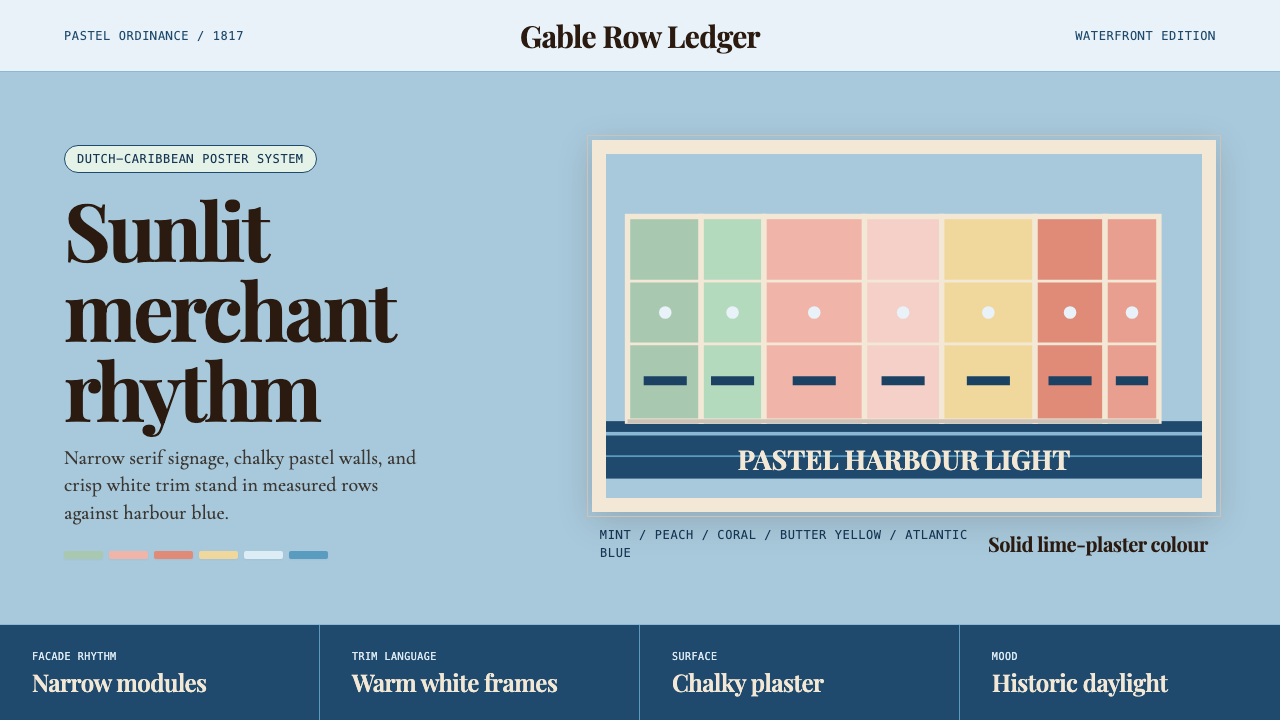 Curaçao Handelskade PastelPastel order feels sunlit. Coral, mint, and serif gables march across sky blu…粉彩秩序明亮如日照:珊瑚与薄荷山墙排在天蓝底上。
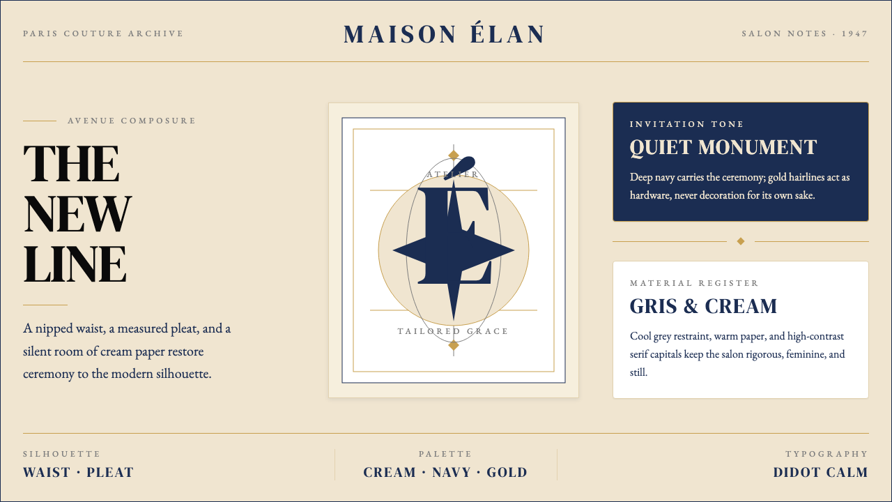 Dior New Look (1947)Couture speaks softly. Cream ground, navy Didot capitals, and gold hairlines…高级订制低声发言:米白底、海军蓝Didot大写与金色发丝线稳住全场。