What is Claymorphism?
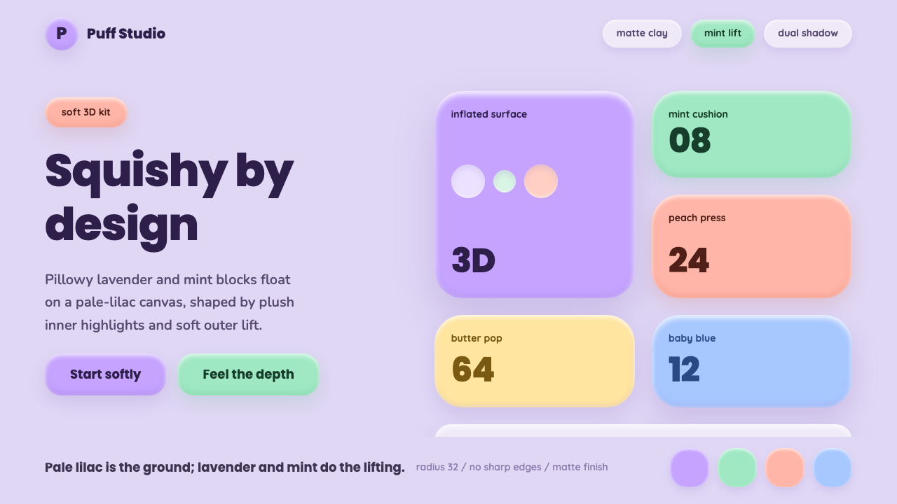
Claymorphism turns interface elements into soft, inflated clay you could almost squeeze — pastel color, matte surfaces, and a shadow trick that makes flat pixels bulge.
Claymorphism in brief
Claymorphism is a soft-3D interface style coined in 2021 by designer Michał Malewicz, describing user-interface elements — buttons, cards, icons — rendered to look like rounded, matte clay pressed into shape rather than flat rectangles printed on glass. Its identifying trick is a paired shadow: one shadow sits inside the shape, one sits outside, and together they simulate a rounded, puffy edge without any literal three-dimensional rendering.
The style favors a distinctly tinted canvas — a pale lilac, not the neutral cream or white of most flat-design systems — paired with candy-saturated pastels: lavender and mint as the signature combination, extended by peach, baby blue, and butter yellow. Every surface reads matte, never glossy, which is what keeps the 'clay' impression soft rather than plastic.
Where flat design and the earlier soft-UI trend both kept color roles cool and near-monochrome, claymorphism is warm and playful — chunky rounded lettering, thick and consistent corner rounding on every container, and a general sense that the interface is a toy you could squeeze rather than a surface you merely tap.
Where does Claymorphism come from?
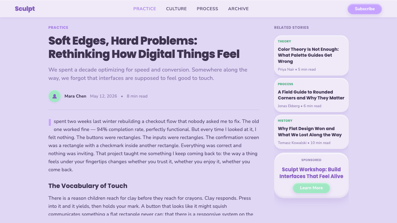
Claymorphism arrived as a named, packaged style in 2021, credited to designer Michał Malewicz, whose write-up on the emerging look gave interface designers a shared vocabulary for a visual trick that had already been circulating informally on design-sharing platforms. Before that write-up, individual designers had been posting soft, pastel, dual-shadowed buttons and cards under a scatter of different names, with no agreement on what to call the technique or how to apply it consistently.
It surfaced directly out of the preceding soft-UI wave — a monochrome trend, sometimes called neo-skeuomorphism or neumorphism, that swept design feeds in 2019 and 2020. That earlier style rendered every element in a single background color lit from one side, producing extruded or pressed-in shapes with almost no color contrast and, notoriously, poor legibility for many real users. Designers loved how satisfying the soft shapes looked in static mockups, but usability critiques piled up quickly once the style reached production interfaces that real people, including people with low vision, actually had to operate.
Claymorphism is best understood as a corrective remix: keep the soft, inflated, light-and-shadow logic that made the earlier trend so visually satisfying, but solve its two biggest problems by reintroducing saturated color for contrast and by exaggerating the roundness and shadow spread until shapes read unmistakably as separate, tappable objects rather than as camouflage against the background. The remix also traded the earlier trend's cold, corporate grays for warm, candy-colored pastels, which shifted the whole register from 'engineered' to 'friendly'.
It landed at a moment when interface design broadly was reacting against years of flat, hard-edged minimalism. Apple's 2020 redesign of its desktop app icons into rounded, layered, gently three-dimensional squircles primed a wider audience for soft-3D shapes, and claymorphism's candy-colored, friendly take on the same instinct spread quickly through app icon design, marketing sites, and mobile onboarding screens in the years that followed. By the mid-2020s the style had become a recurring default for consumer apps that wanted to signal warmth and ease of use at a glance, well beyond the design-community circles where it began.
What defines the Claymorphism look?
Color
Claymorphism runs on a tinted, not neutral, canvas — a candy lilac base rather than cream or white — with lavender and mint as its defining pairing and peach, baby blue, and butter yellow as supporting accents. Every hue sits at a saturated, matte pastel intensity; nothing reads glassy or metallic.
Dual shadow
The signature technique is a paired shadow: one soft shadow cast outward from the shape and a second, softer shadow set inward near one edge, together simulating a rounded, puffy cross-section. Unlike a single drop shadow, this pairing reads as volume rather than as a flat object floating above a background.
Shape and rounding
Corners are rounded aggressively and consistently — buttons, cards, icons, and input fields all share the same generous curvature, so nothing in the interface reads as a sharp rectangle. The overall silhouette of any component approaches a soft blob or pillow rather than a geometric box.
Surface finish
Every surface is matte, not glossy — there is no specular highlight, no glass reflection, no metallic sheen. The matte finish is what keeps the style reading as clay or dough rather than as plastic, rubber, or glass, and it is essential to the tactile, squeezable impression the style is built to produce.
Typography
Lettering favors chunky, rounded geometric letterforms that echo the same soft-edge logic as the shapes around them — no thin hairline strokes, no sharp terminals. Type is treated as another soft object on the canvas rather than as a neutral, invisible carrier of information.
Icons and illustration
Icons and small illustrative elements are built from the same puffy, rounded vocabulary as the containers that hold them, often rendered as tiny clay-like three-dimensional objects rather than flat line glyphs. This consistency — container, icon, and type all obeying the same soft-3D rule — is what separates a fully realized claymorphic interface from one that merely borrows the color palette.

Who shaped Claymorphism?
Malewicz is the designer credited with naming and popularizing claymorphism in 2021, publishing an influential write-up that diagrammed the dual-shadow technique and gave the emerging trend a shared vocabulary among interface designers. His framing positioned the style explicitly as a friendlier successor to the monochrome soft-UI trend that had dominated design feeds the two years prior.
Also called neumorphism or soft UI, this monochrome trend swept design-sharing platforms in 2019 and 2020, rendering every interface element in a single background color lit from one side to produce extruded or pressed-in shapes. Its near-total lack of color contrast made many real-world interfaces built in the style difficult to read, and claymorphism emerged directly as an answer to that weakness.
A broader design-culture wave, running parallel to and overlapping with claymorphism, in which flat icons, illustrations, and interface elements across app ecosystems were re-rendered with rounded volume and gentle three-dimensional shading. Apple's 2020 shift to layered, rounded desktop app icons is one widely visible example of the same underlying instinct toward inflated, tactile shapes.
A parallel movement in consumer app design toward warm, candy-colored, approachable visual language, used especially in wellness, fintech, and onboarding-heavy products aiming to feel less clinical than earlier flat-design systems. Claymorphism's pastel palette and squeezable shapes fit naturally within this broader push toward interfaces that feel welcoming rather than authoritative.
How do you use Claymorphism today?
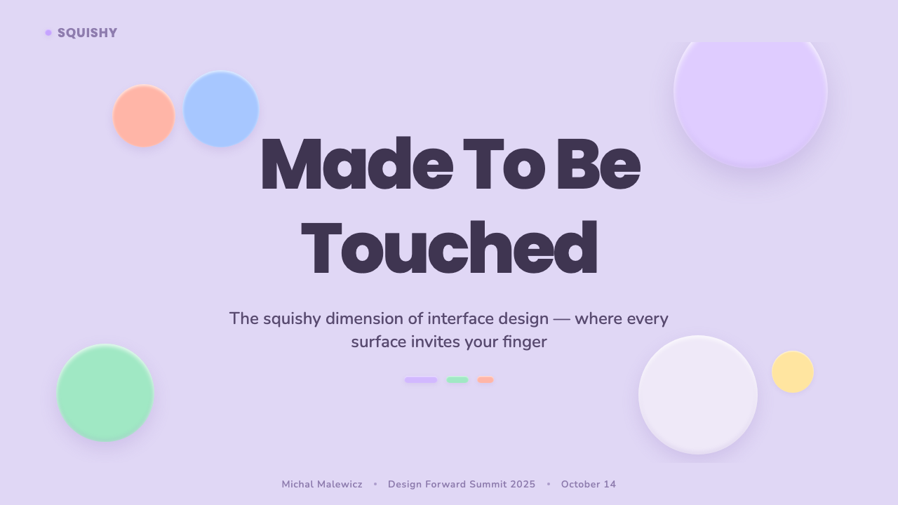
On a presentation cover slide, claymorphism reads best as a single oversized clay-shape hero object — an icon or abstract blob rendered with the dual-shadow technique — floating on a tinted lilac field, with the title set in rounded type beside or beneath it. Content slides should limit themselves to a handful of pillowy card shapes per screen; stacking too many soft-shadowed containers at once flattens the illusion, because the eye can no longer tell which shadows belong to which object. Data slides work well as rounded pill-shaped bars or soft circular progress rings rather than sharp rectangular bar charts — the data becomes another set of clay objects rather than a technical chart dropped onto a friendly background.
In dashboards, claymorphism suits status tiles, toggle switches, and summary cards better than dense data tables — the style communicates warmth and simplicity, not information density, so it works best when a screen has relatively few, relatively important numbers to show. Pricing pages benefit from rendering each plan as its own soft clay card, with the recommended tier given a slightly more pronounced shadow and rounding to read as physically closer to the viewer. Buttons should be large, rounded, and matte, with the dual shadow doing the work that a hover-state color change might do in a flatter system.
For marketing pages and app landing pages, claymorphism performs well in hero sections and feature-highlight blocks, where a small number of large, friendly clay-rendered objects can carry the entire visual load. It is less suited to long-form editorial reading, where dense body text sitting against a tinted, saturated background can fatigue the eye faster than the neutral grounds typical of reading-focused layouts; when the style is used for article pages, the safest approach is to reserve the clay treatment for illustrative accents and keep the reading column itself close to a plain, low-saturation surface.
The most common misapplication is treating claymorphism as rounded corners plus a soft shadow — a single shadow, or two shadows too similar in size and direction, collapses the illusion back into ordinary flat design with rounded corners. The dual-shadow relationship, and the commitment to a tinted rather than neutral canvas, are what make the puffiness read as physical volume rather than as decoration. A second frequent mistake is applying the treatment to every element on a screen at once, including body text containers and full-width backgrounds; the style reads best when the puffy clay effect is reserved for a limited set of interactive objects, leaving the surrounding canvas comparatively calm.
Because the style descends from a soft-UI trend that was criticized for poor contrast, designers applying claymorphism should keep text and icon contrast independent of the shadow effects — shadows should describe shape, not carry the entire burden of separating an element from its background. Pairing saturated pastel fills with sufficiently dark text, rather than relying on shadow alone, keeps a claymorphic interface both distinctive and legible. Motion, when used, should be gentle and springy rather than mechanical, since an object that looks squeezable should also feel squeezable when it responds to a tap.
Claymorphism — FAQ
Is claymorphism the same as neumorphism?
No, though they are closely related. Neumorphism (sometimes called neo-skeuomorphism or soft UI) is the earlier, monochrome trend from 2019–2020 that rendered every element in one background color lit from a single side, which made many real interfaces hard to read. Claymorphism, named in 2021, is best understood as a corrective sequel: it keeps the soft, extruded logic but reintroduces saturated pastel color and exaggerates the rounding and dual-shadow effect so that shapes remain clearly legible against their background.
Why does claymorphism use a tinted lilac background instead of white?
A neutral white or cream ground tends to flatten the dual-shadow illusion, because there is very little visual difference between the background and a lightly shadowed edge. A tinted canvas — pale lilac being the signature choice — gives both the inner and outer shadows something to visibly push against, which is part of what makes claymorphic shapes read as genuinely puffy rather than merely rounded.
Does claymorphism work in a dark interface?
The style is built around light, matte pastel surfaces and a light-toned canvas, so it is most at home in bright, cheerful contexts rather than dark-mode interfaces. A dark adaptation is possible but requires care: the dual-shadow trick depends on visible contrast between a shape and its ground, and on dark backgrounds the softness that defines claymorphism can read as murky rather than tactile unless the pastel fills are kept bright enough to still pop forward.
What kinds of products suit claymorphism, and which don't?
It suits consumer-facing products where warmth, playfulness, and approachability are the priority — habit trackers, wellness apps, kids' products, casual games, and onboarding flows. It is a poor fit for data-dense professional tools, financial dashboards handling serious sums, or any context where users expect a neutral, authoritative tone; the squeezable, toy-like quality that makes claymorphism inviting elsewhere reads as unserious in those settings.
How is claymorphism different from ordinary rounded flat design?
Rounded flat design uses curved corners purely as a stylistic softener on an otherwise flat surface, usually with a single conventional drop shadow if any shadow at all. Claymorphism specifically requires the paired inner-and-outer soft shadow, aggressive and consistent rounding across every component, and a matte, tinted color system — remove any one of those three and the result reads as generic rounded UI rather than as claymorphism proper.
Related design styles
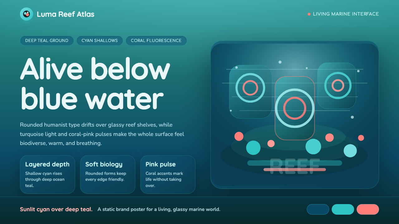 Great Barrier ReefAlive under deep teal. Quicksand curves, cyan glow, and coral-pink pulses bui…
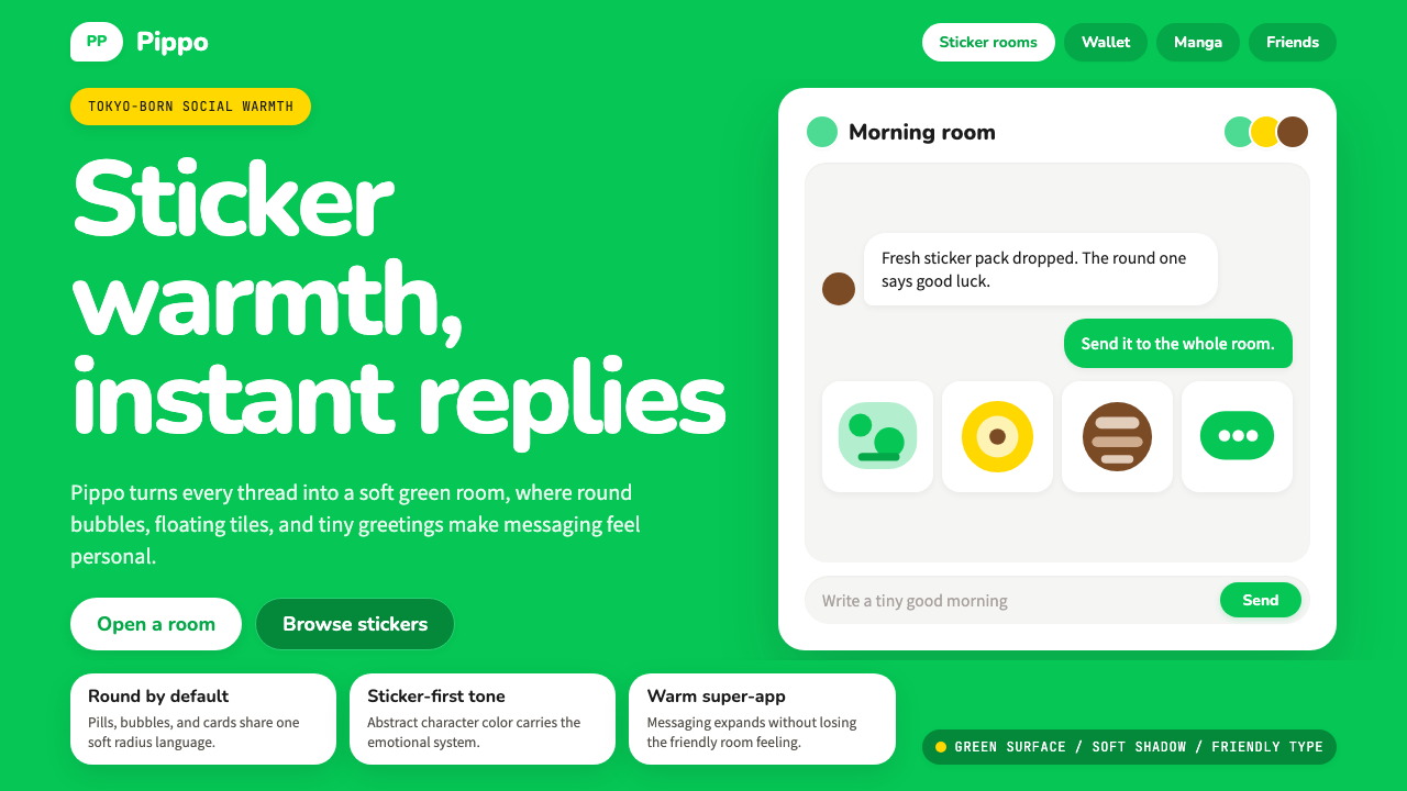 LINE Messenger GreenChat feels like a sticker. Bright green, pill bubbles, and rounded Nunito kee…
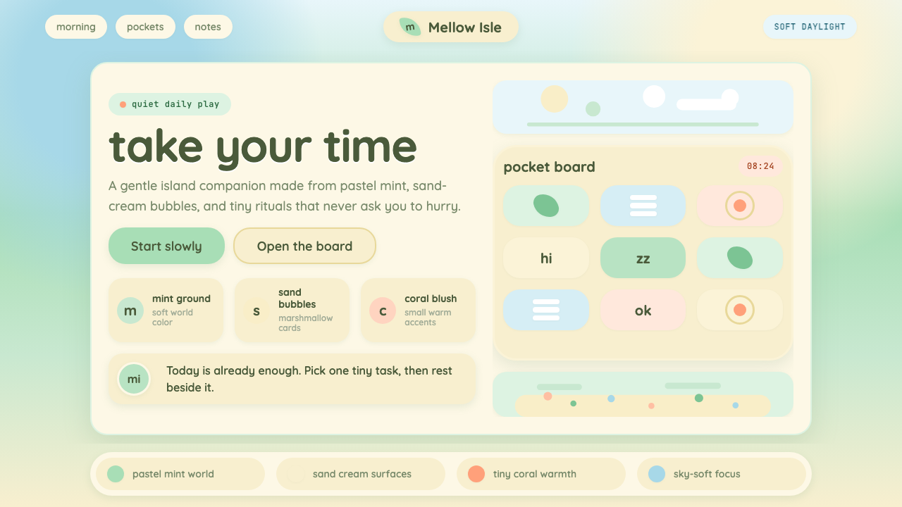 Animal Crossing — New HorizonsNo pressure, only daylight. Mint fields and sand bubbles soften every edge.
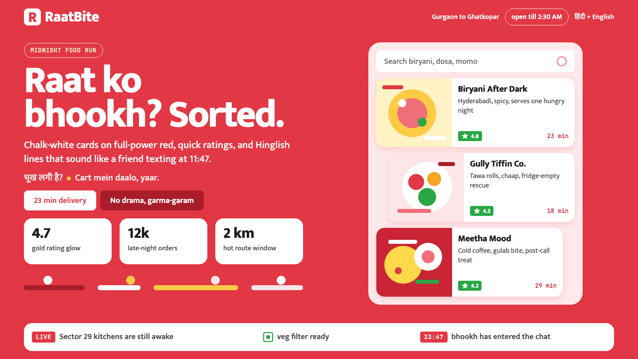 Zomato India DeliveryOwns the midnight scroll. Saturated red, Mukta Hinglish, white cards and gold…
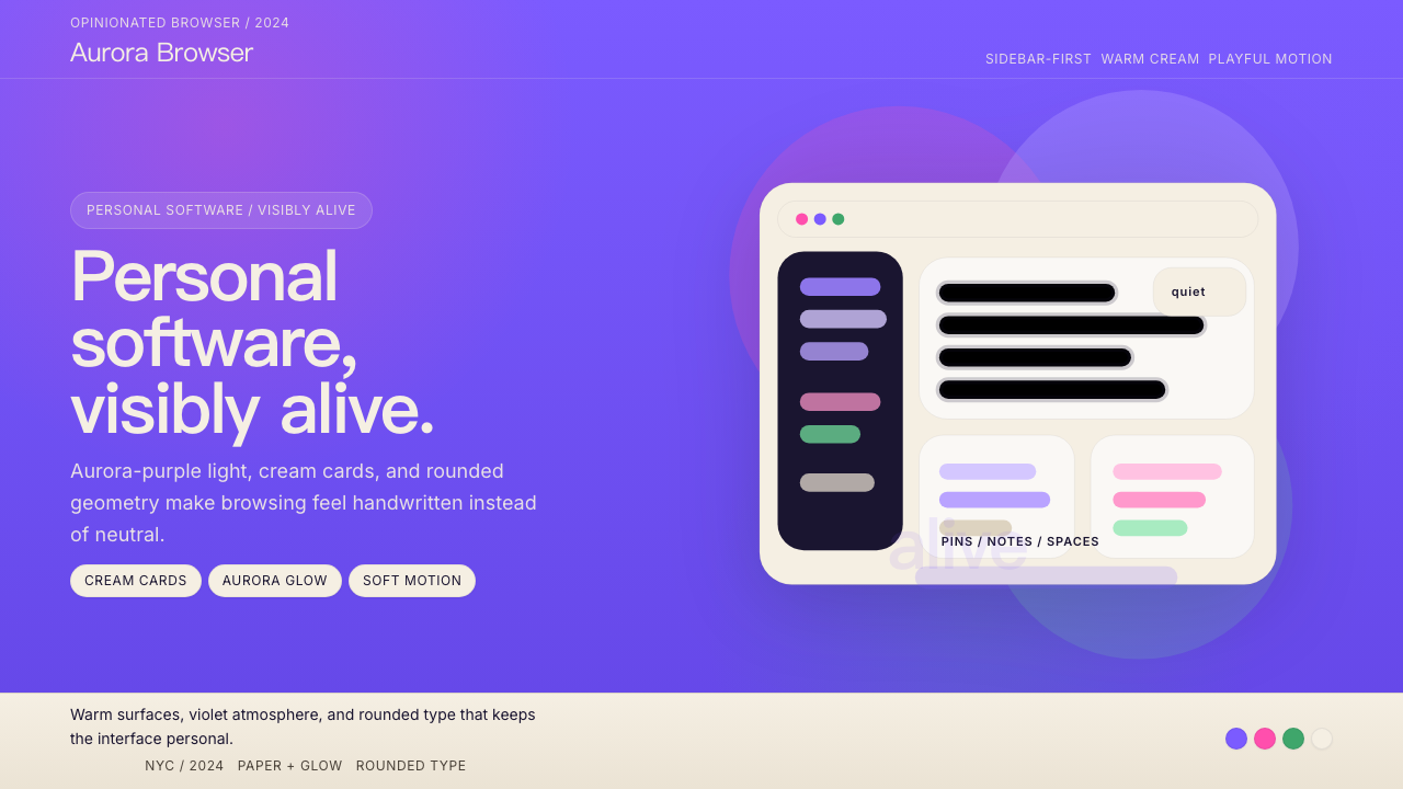 Arc BrowserPersonal software, visibly alive. Aurora purple glows over cream cards and ro…
 Calm App Purple MeditationWhispers at bedtime. Dusk-purple gradients, cream serif type, and dawn-pink w…