What is Mexican Pulquería Mural?
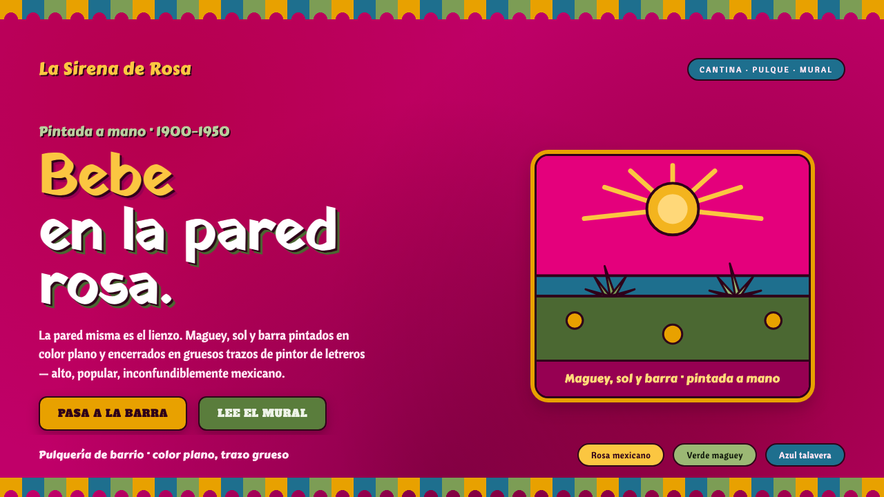
Mexican Pulquería Mural turns the wall into a celebration: hot rosa-mexicano plaster, maguey green, marigold, folk imagery, and lettering made to be seen across a crowded room.
Mexican Pulquería Mural in brief
Mexican Pulquería Mural is the painted visual language of the working-class pulquería and cantina: a wall saturated with vivid Mexican pink becomes the ground for scenes of charros, sirenas, maguey fields, and other direct, cheerful folk subjects. The image does not pretend to open onto an illusionistic world. It announces itself as paint on plaster, with flat areas of strong color, decisive outlines, and a sense that every mark was made by a human hand standing in front of the wall.
Its power comes from popular visibility rather than refinement. Anonymous sign-painters and folk muralists gave these spaces an identity that was immediate from the street and legible inside a lively room. A painted name, a character, a field of maguey, and a band of ornament work together as one public surface. The mural is not a separate artwork framed away from daily life; it is the painted skin of the establishment and part of its atmosphere.
When adapted for contemporary design, the system keeps that loud, handmade logic. Rosa-mexicano is the emotional ground; maguey green, talavera blue, and marigold create contrast and rhythm. Papel-picado trim frames the composition, while heavy folk lettering carries the message without becoming polished, neutral, or corporate. The goal is not a generic Mexican-themed decoration. It is a screen that feels painted, social, local, and unapologetically visible.
Where does Mexican Pulquería Mural come from?
The style belongs to Central Mexico, especially the Mexico City world of pulque bars and cantinas. Its golden period is identified with 1900–1950, when the urban pulquería and its painted-wall mural tradition were a visible part of working-class social life. In this context, the wall was not neutral architecture waiting for a logo. It was a communicative surface: a place for imagery, naming, mood, and recognition to meet in one durable field of paint.
The subjects named by the tradition explain its tone. Charros, sirenas, and maguey fields place familiar figures and local associations directly in view. They are not treated as delicate symbols requiring private interpretation. They are broad, friendly visual signals, rendered to hold attention in a public setting. Maguey is especially important because it anchors the imagery in the material and cultural world associated with pulque, while the sirena and charro bring theatrical character and narrative charm to the wall.
The makers were often anonymous cantina sign-painters and folk muralists rather than a single canon of named designers. That anonymity matters to the style. Its authority does not depend on a signature or an institutional theory; it comes from repeated, practiced acts of painting signs and scenes for real establishments. Diego Rivera documented this mural tradition, preserving a record of a visual culture whose force was collective, popular, and deeply tied to place.
The broader sources named for the system are Mexican folk art, pulquería mural painting, cantina sign-lettering, and the rosa-mexicano tradition. Together they produce a vocabulary unlike a formalized brand system. Color, lettering, figures, and trim are allowed to feel exuberant and slightly irregular because their job is to animate a wall, not disappear into a neutral interface. A faithful contemporary use should preserve that connection between decorative abundance and public communication.
What defines the Mexican Pulquería Mural look?
Painted Wall Ground
Rosa-mexicano functions as more than an accent. It is the plaster-like ground that establishes heat, immediacy, and a sense of place before any content appears. Surfaces should feel broad and painted rather than glossy or weightless. The background is an active participant in the composition, capable of carrying lettering, figures, borders, and small imperfections without becoming a passive field.
Popular Palette
Maguey green, talavera blue, and marigold are used as assertive companions to the Mexican-pink ground. Their relationship should feel festive and clear, not carefully muted into a luxury palette. Each color needs a visible job: green can connect imagery to maguey, blue can open a contrasting field, and marigold can pull attention toward a title, emblem, or key detail. The palette is loud because the setting is social.
Hand-Painted Folk Lettering
Typography should behave like sign-painting, not a polished corporate wordmark. Heavy folk lettering carries an uneven, bodily confidence: letters may feel individually drawn, compactly packed, or slightly emphatic in their outlines. Readability remains essential, but smoothness is not the aim. The words should look as if they belong to the wall and share the same pigment, energy, and public voice as the mural around them.
Folk Figures and Scenes
Charros, sirenas, and maguey fields provide a direct pictorial vocabulary. They work best as broad, flat motifs with bold outlines rather than as detailed realism. A figure can greet, frame, point, or simply make the space feel inhabited; a field can establish rhythm behind information. The imagery should retain naive charm and narrative generosity, avoiding sleek illustration styles that turn folk subjects into generic lifestyle assets.
Papel-Picado Frame
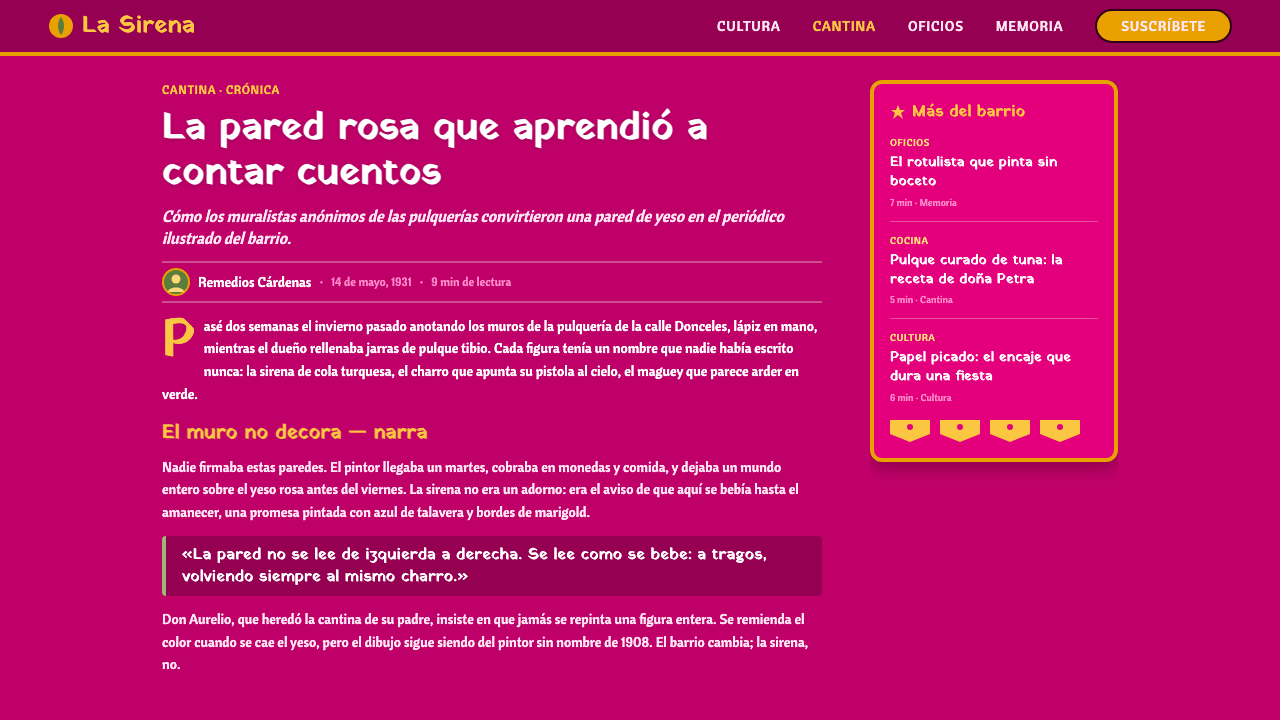
Papel-picado trim gives the system a festive edge and makes the composition feel like a dressed public wall. Use it as a framing device, a divider, or a canopy-like band rather than a texture spread everywhere. Its repeated cutout rhythm is most effective when it creates a clear boundary around the louder central material. The trim should feel celebratory and handmade, never like a sterile repeating pattern.
Flat Color and Bold Outline
The mural language depends on flat, saturated areas of paint and strong hand-painted outlines. Depth comes from overlap, scale, framing, and the contrast between adjacent color fields, not from polished rendering. This keeps the image graphic and public-facing: a scene can be understood quickly, and a title can hold its ground against visual activity. Small irregularities are evidence of making, not errors to erase.
Who shaped Mexican Pulquería Mural?
Rivera is named as the artist who documented the pulquería mural tradition. Within this style’s history, that role matters because it recognizes painted cantina walls as a visual culture worth recording, rather than treating them as disposable background decoration. His connection provides a documented bridge between the anonymous public mural world and the wider history of Mexican art.
Anonymous cantina sign-painters are central makers of the tradition. Their work joined naming, advertising, ornament, and scene-painting on the same wall, producing visual identities for actual social spaces. The style’s expressive lettering and bold outlines should be understood as the result of this practical craft tradition: signs needed to speak clearly, attract attention, and belong to the character of the cantina.
Folk muralists supplied the scenes, figures, and exuberant painted atmosphere associated with the pulquería wall. Their contribution is not a single authored visual formula but a popular language of flat saturated color, direct imagery, and visible handwork. Contemporary designers should treat that collectivity with care: the value lies in preserving the mural’s openness and local character, not in extracting isolated motifs as exotic decoration.
How do you use Mexican Pulquería Mural today?
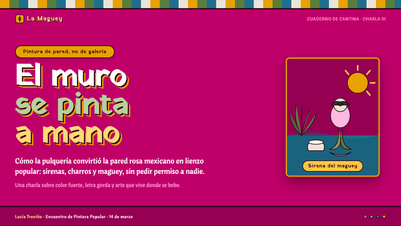
For presentation covers, build the page as a painted sign rather than a minimal title card. Let the rosa-mexicano wall establish the field, then give the title a dominant piece of hand-painted folk lettering. A charro, sirena, or maguey motif can occupy an edge or corner, while papel-picado creates a celebratory boundary. Keep the message short enough that the image still reads as one public mural rather than a collection of slide furniture.
On content slides, use the visual language to organize information without exhausting the viewer. A broad color field can hold the section title, while flat outlined motifs separate topics or mark recurring categories. Body copy needs calmer room than the cover, so treat folk imagery as framing and punctuation rather than a constant backdrop behind every paragraph. The strongest content slides alternate lively painted areas with quieter reading zones, preserving the mural’s energy while allowing the material to be understood.
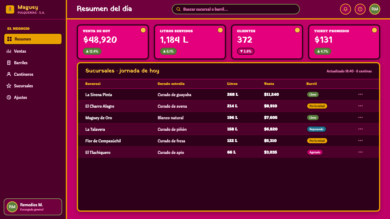
For data slides, turn charts and diagrams into part of the painted system. Use maguey green, talavera blue, marigold, and the pink ground to distinguish meaningful groups, and reinforce categories with hand-drawn-looking outlines or small folk markers. Avoid making a data display ornamental for its own sake: labels must remain plain enough to scan, and the color choices must stay consistent across the presentation. The desired result is an infographic that feels at home on a cantina wall while still behaving as evidence.
For web interfaces, this style suits dashboards, event pages, menus, booking flows, and pricing pages that benefit from warmth, character, and immediate category recognition. Use the mural language most strongly in headers, navigation bands, promotional blocks, and milestone states. Panels for detailed tasks should remain spacious and readable, with color and folk illustration reserved for hierarchy, calls to action, and memorable navigation moments. A dashboard can feel festive without making every operational decision look decorative.
For editorial and marketing work, treat the page as a sequence of painted announcements. A feature story can begin with a large folk-lettered headline, then move through sections framed by maguey fields, sirenas, or papel-picado bands. Campaign pages can use bold mural scenes to establish mood and reserve the clearest color contrast for the next action. The common mistake is to make everything equally loud: too many competing colors, decorative borders, and illustrated figures erase hierarchy. Choose one visual lead per section, let the lettering remain handmade, and leave enough unoccupied wall for the composition to breathe.
Mexican Pulquería Mural — FAQ
Is Mexican Pulquería Mural simply a Mexican color palette?
No. The palette is inseparable from the painted-wall setting, folk imagery, sign-lettering, and cantina context. Rosa-mexicano, maguey green, talavera blue, and marigold become meaningful when they work together as a public mural language. Using the colors alone, especially in a sleek interface with generic imagery, loses the handmade and working-class character that gives the system its identity.
Should every layout include charros, sirenas, and maguey fields?
No. These are a vocabulary, not a mandatory checklist. A single maguey field, a cropped sirena, or an implied painted scene may be enough to establish the connection. The crucial decision is whether imagery helps the message and strengthens the sense of a painted cantina wall. Repeating every motif on every screen turns a generous folk language into visual noise.
Can the style work for serious information such as pricing or analytics?
Yes, if the expressive material is assigned a clear role. Folk lettering can establish section identity, the palette can distinguish categories, and mural borders can mark transitions. But the information layer must remain legible and consistent. The style should make a pricing page or dashboard more memorable and welcoming, not conceal comparisons, labels, or decisions beneath decoration.
How should papel-picado be used without becoming a cliché?
Use it as architecture for the composition. A trim can frame a headline, divide a long page, or signal an arrival point in a flow. It is most convincing when it gives the central content a festive boundary and then recedes. Treating it as a continuous decorative wallpaper weakens both its handmade quality and the hierarchy of the page.
What is the most common failure when adapting this style for screens?
The most common failure is polishing away the mural. Designers may keep the bright colors but replace hand-painted outlines and folk lettering with generic, corporate smoothness; or they may add so many motifs that the interface stops communicating. A successful adaptation keeps the wall-like ground, visible handwork, direct pictorial voice, and strong hierarchy in balance. It should feel made for people gathering in a real place, not assembled from decorative shortcuts.
Related design styles
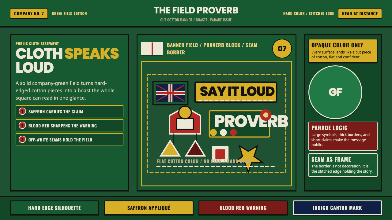 Asafo Fante Flag AppliquCloth speaks loud. Deep green field, saffron appliqué, hard seams, bold prove…
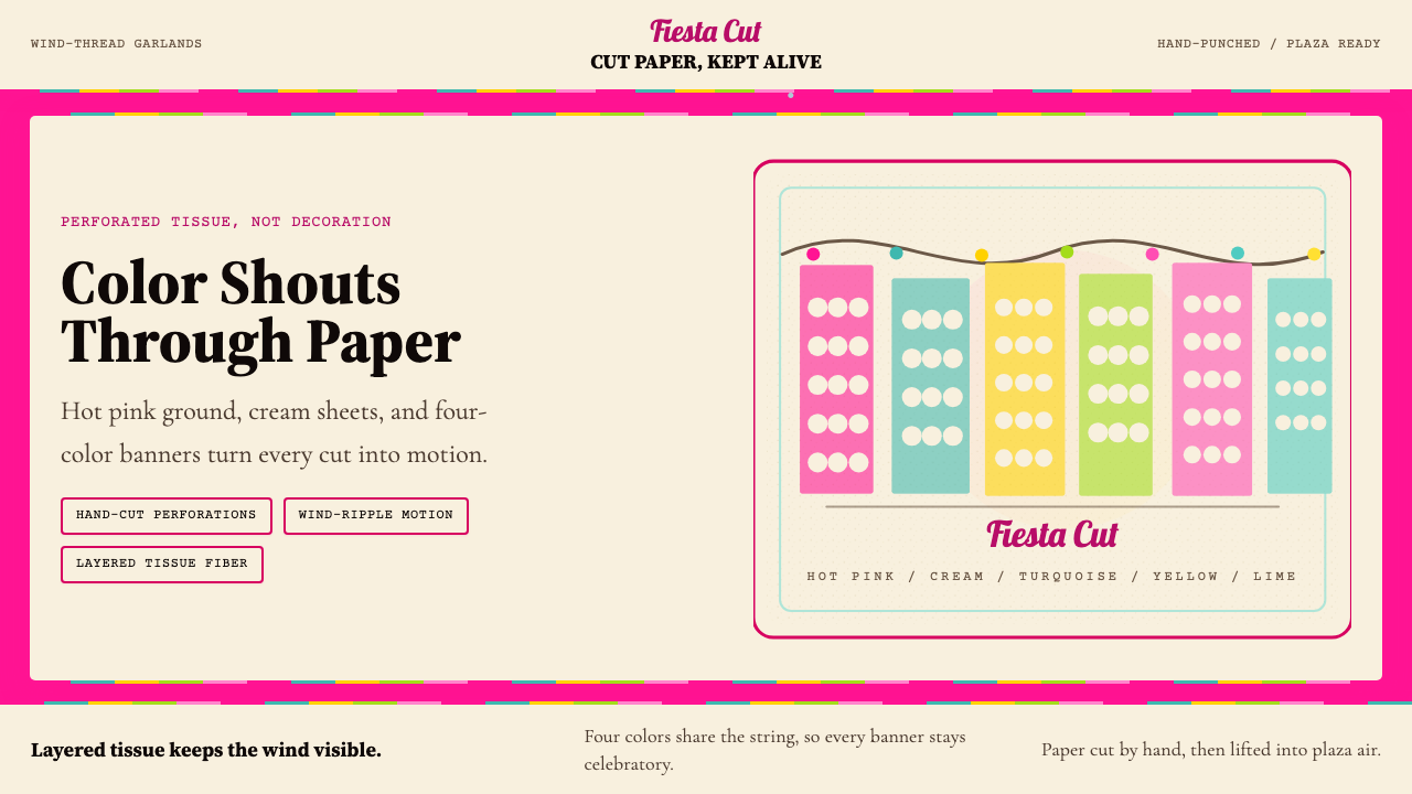 Mexican Papel Picado TissueFiesta cut paper. Hot pink, turquoise, yellow banners and hand-cut perforatio…
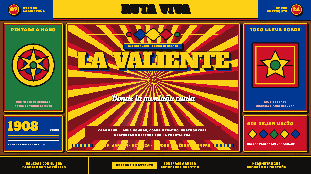 Colombian Chiva BusNothing is left unpainted. Flag-yellow rules, slab lettering and black keylin…
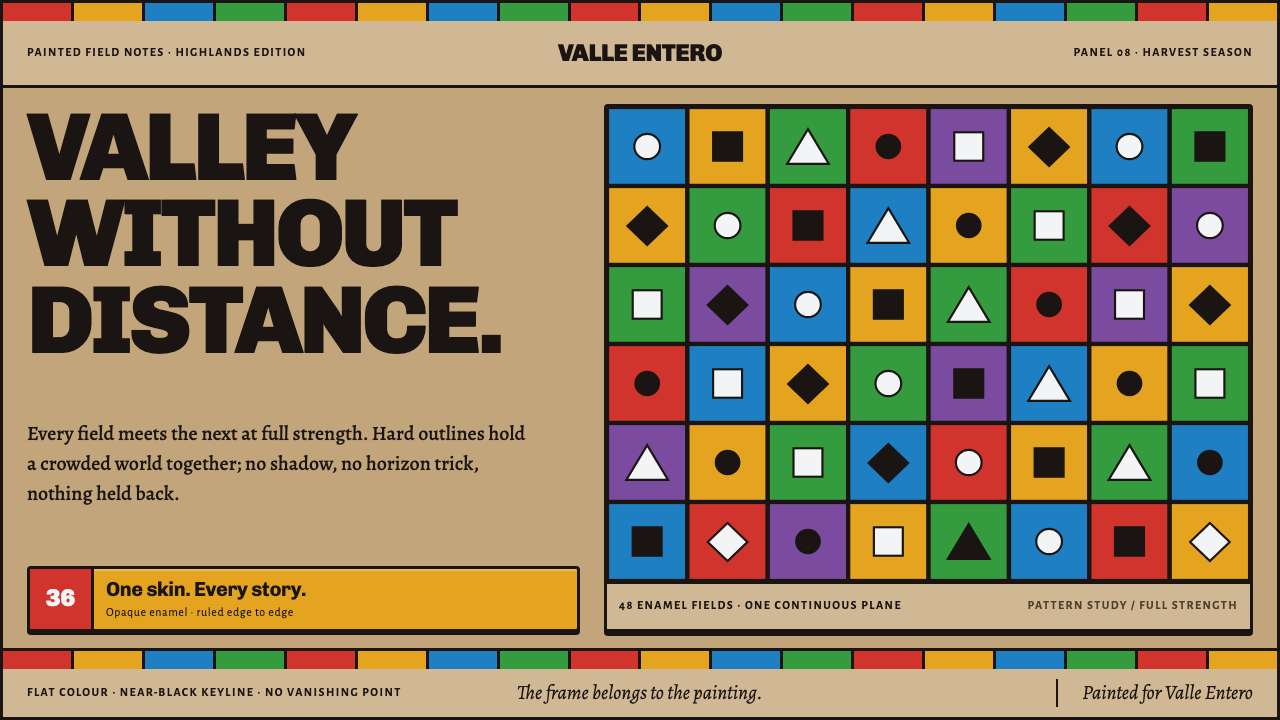 Tigua Sheepskin PaintingA whole valley at full volume. Saturated enamel fields lock together with nea…
 Lao Luang Pho (Bun Bang Fai Rocket)Festival thunder rises. Cobalt sky, Caveat banners, orange rosettes, and gold…
 Asmat Bisj Ancestor PoleCeremonial vertical force. Lime-white figures rise from dark wood with red-oc…