What is Meituan?
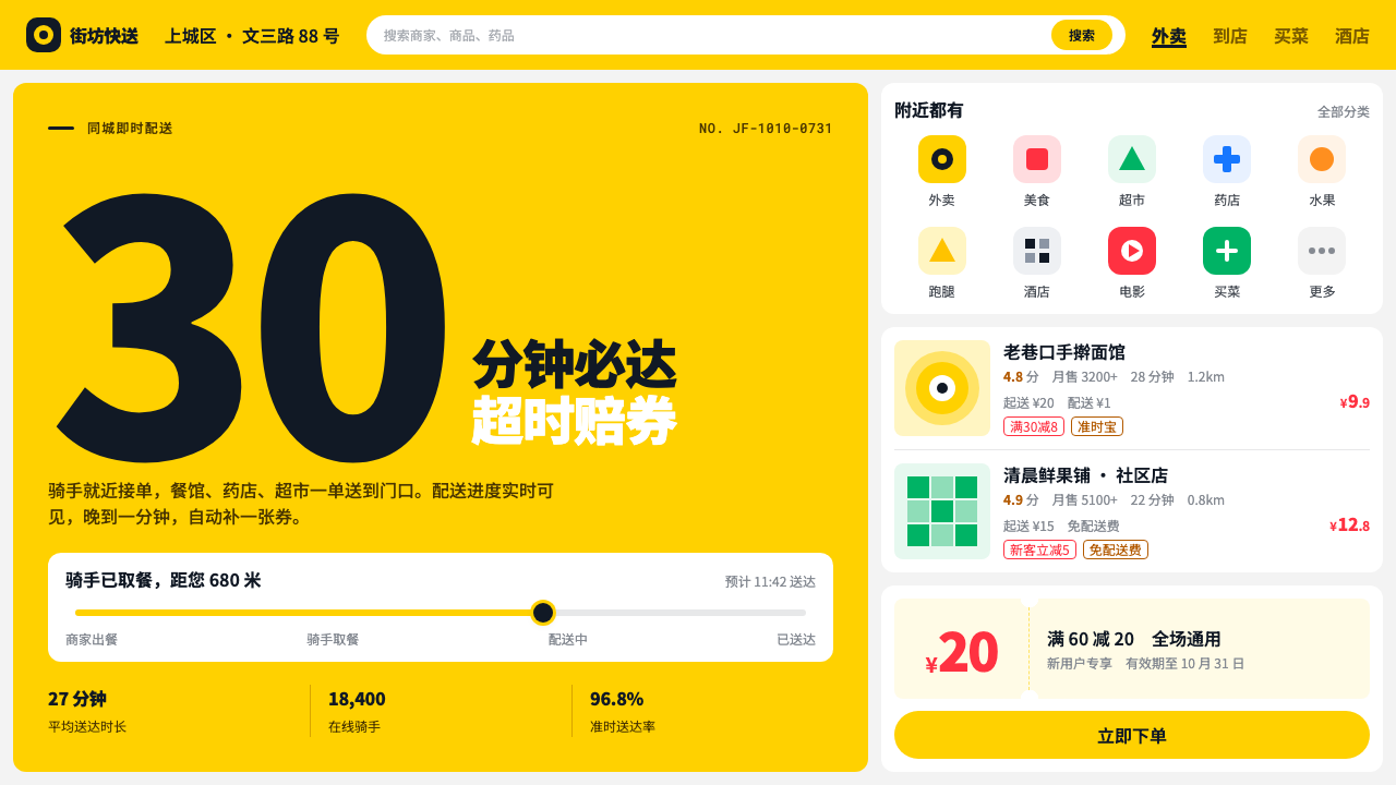
Meituan's look is the yellow of Chinese daily life: a delivery rider's helmet, a pill-shaped order button, and white cards stacked tight on a grey page.
Meituan in brief
The Meituan style is the interface language of a Chinese local-services super-app. It is built around a single saturated yellow, often called kangaroo yellow, set against a light grey page on which white cards stack closely: merchants, coupons, orders. The yellow appears in the app header, in the pill-shaped order button, and, away from the screen, on the helmets and insulated boxes carried by riders on every street.
It is an interface designed for throughput rather than display. Instead of generous whitespace and a single hero, it offers a five-column grid of entry icons, merchant rows with a thumbnail on the left and several lines of facts on the right, and prices set in heavy tabular numerals with a small yen sign before them. Rating, monthly sales, delivery time and minimum order all sit in tight, scannable lines.
The governing rule is that yellow marks what you tap and everything else stays quiet. Information lives inside white cards, hierarchy is built from weight and grouping rather than decoration, and the brand color is used as a signal rather than as wallpaper. That discipline is why the style stays legible even when the screen carries a very large amount of information.

Where does Meituan come from?
The style starts with the company. Meituan launched in March 2010 in Beijing, founded by Wang Xing, and Wang Huiwen is also named among its key figures. It arrived in the middle of what is often called the Chinese online-to-offline boom, when a wave of internet companies tried to connect screens to physical businesses such as restaurants, cinemas, shops and services. Group buying, coupons and local listings were the first form of that idea, and they explain why the interface is so organized around merchants, vouchers and orders.
The delivery business is what turned the brand color into a street-level sight. The Waimai takeout service adopted its kangaroo yellow from 2013, and the rider in a yellow helmet carrying an insulated box became one of the most recognizable figures of urban China. The color therefore carries two meanings at once: it is an interface signal on the phone and a physical presence in the city, and each reinforces the other.
Later the company consolidated its identity. On 13 June 2019 it moved to a group-wide yellow identity, which it continues to use. This shift brought many separate services under one visual banner, in line with the way platform companies increasingly act as a single entry point for food, groceries, travel, entertainment and more. The design system that follows from it has to be modular and dense, because a single screen may need to host very different kinds of content without losing coherence.
In design-history terms, the style belongs to the super-app tradition and to the platform delivery economy, where the key measure of a good screen is how quickly a user can find, compare and order. It is a pragmatic descendant of the dense, list-driven interfaces that developed in Chinese mobile products, and it contrasts with the airy, whitespace-led design associated with many Western consumer apps. The two approaches answer different questions: one asks how little a screen can say, the other how much it can say clearly.
What defines the Meituan look?
Color
One saturated kangaroo yellow does nearly all the brand work. It fills the header, the primary order button and small highlights, and it stays out of the body of the page. The ground is a light grey that makes white cards read as raised surfaces, and text is dark and neutral. Because yellow is rationed, it works as a clear signal: wherever you see it, something can be tapped.
Stacked white cards
Content is organized into white cards sitting directly on the grey ground, each representing a merchant, a coupon or an order. Cards are stacked close together with only thin separation, so the page reads as a continuous feed rather than a set of isolated panels. Rounded corners are mild, and elevation is minimal; the grouping is carried by color contrast between white and grey.
Entry grid
Near the top sits a five-column grid of category entries, each an icon with a short label. It acts as the app's table of contents, letting the user jump to food, groceries, entertainment or other services in one tap. The regular rhythm of the grid gives the screen an immediate structure and makes a very wide range of services feel organized.
Merchant rows
Each merchant row pairs a thumbnail on the left with several lines of facts on the right: name, rating, monthly sales, delivery time, minimum order and delivery fee. The rows are dense but disciplined, with the name set heavier and the supporting details lighter. A user can compare many merchants in a single scroll without opening any of them.
Tabular price numerals
Prices are set in heavy numerals with equal-width digits, preceded by a smaller yen sign. Equal-width digits keep columns of prices aligned so they can be compared by eye, and the heavier weight makes the number the most prominent thing in its row. The smaller currency sign stays out of the way while still marking the amount as money.
Pill-shaped actions
Primary actions such as ordering or claiming a coupon use fully rounded, pill-shaped buttons in the signature yellow with dark text. The shape is friendly and easy to hit with a thumb, and its color separates it from the white and grey content around it. There is typically one such button per decision, which keeps the next step unambiguous.

Who shaped Meituan?
Founder of Meituan, which launched in Beijing in March 2010. His company grew from group buying and local listings into a broad platform, and the interface language of this system reflects that history: merchants, coupons and orders organized for fast decisions.
Named as a key figure in the company's early years. His involvement belongs to the period when Meituan was establishing itself during the Chinese online-to-offline boom, the context that shaped the density and practicality of its interface.
Not an individual but a collective, and arguably the most visible carrier of the brand. The yellow helmet and insulated box turn the interface color into a physical presence in the street, which is why the shade feels so tied to daily urban life.
How do you use Meituan today?
On slides, the Meituan style suits operational and product-review decks: weekly business reviews, merchant onboarding, campaign summaries and logistics updates. A grey page with stacked white cards lets you present several related facts without competing headlines, and a single yellow band or title bar anchors each slide. Use the five-column grid idea for agenda or category overviews, with each cell carrying an icon and a short label.
For data slides, the tabular numerals and card grouping are a natural fit. Put each metric inside its own white card, set the number heavy and the label light, and use yellow only for the figure or trend you want the audience to act on. Because columns of equal-width digits align, comparison tables stay clean, and a small currency sign can sit in front of values without crowding them.
In web and app interfaces, the style is built for local services, food and grocery delivery, coupon and voucher pages, booking flows and order tracking: anywhere many items compete for a quick decision. Keep merchant rows consistent so users can learn their shape, keep the primary action as the only yellow pill on a decision area, and avoid adding extra colors to category tags, which would dilute the signal.
In editorial and marketing work, the look is useful for promotions that need to feel immediate and everyday: a coupon announcement, a seasonal food campaign or a city-wide offer. Yellow header bands, card-style content blocks and heavy price numerals translate well to posters and social images. The tone is practical and friendly rather than luxurious, so it works best when the message is about convenience and value.
The most common mistake is to treat the style as an excuse to paint everything yellow. The system depends on yellow being rare enough to mean something; a page that is yellow throughout loses its signal and becomes tiring to read. Another error is to copy the density without the discipline: packing in rows without consistent weight, alignment and grouping produces clutter instead of throughput. Keep the grey ground, the white cards and the ordering of information in each row, and the density will feel intentional.

Meituan — FAQ
Why is Meituan yellow so recognizable?
Because it exists both on screens and on streets. The Waimai takeout service adopted kangaroo yellow from 2013, and riders in yellow helmets carrying insulated boxes made the color part of the urban landscape. In 2019 the group moved to a single yellow identity, so the same hue now ties together the app, the packaging and the people delivering the order.
How is this different from a whitespace-led Western app style?
Whitespace-led styles ask how little a screen can say and rely on a single hero and generous margins. The Meituan style asks how much a screen can say clearly: it uses entry grids, compact merchant rows and tabular prices, and relies on card grouping and weight for hierarchy. Both are legitimate; they answer different needs, and the Meituan approach suits browsing and comparing many items quickly.
Can I use it for something other than delivery?
Yes. Any interface with many comparable items and a clear primary action fits: local services, booking, coupons, order tracking, internal operations dashboards and campaign recaps. It is less suited to brand-led storytelling or calm reading pages, where its density and signal-yellow logic would work against the content.
Why are the prices set in heavy tabular numerals?
Equal-width digits keep prices aligned in columns, so users can compare them at a glance, and the heavier weight makes the amount the first thing the eye lands on in a row. The smaller yen sign stays secondary while still marking the value as money. It is a small typographic decision that carries much of the interface's decision-making speed.
How many yellow elements should a screen have?
As few as possible. Yellow should mark the header and the actions or highlights that matter most, and everything else should be white, grey and dark neutral text. If a screen has several competing yellow areas, the user no longer knows where to tap, which defeats the purpose of the signal.
Related design styles
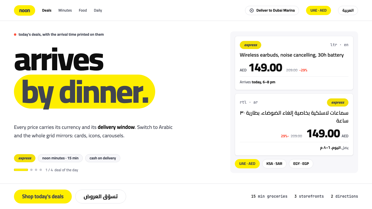 noonYellow as a sticker, never a wash. Slate Cairo on a lozenge chip, grid mirror…
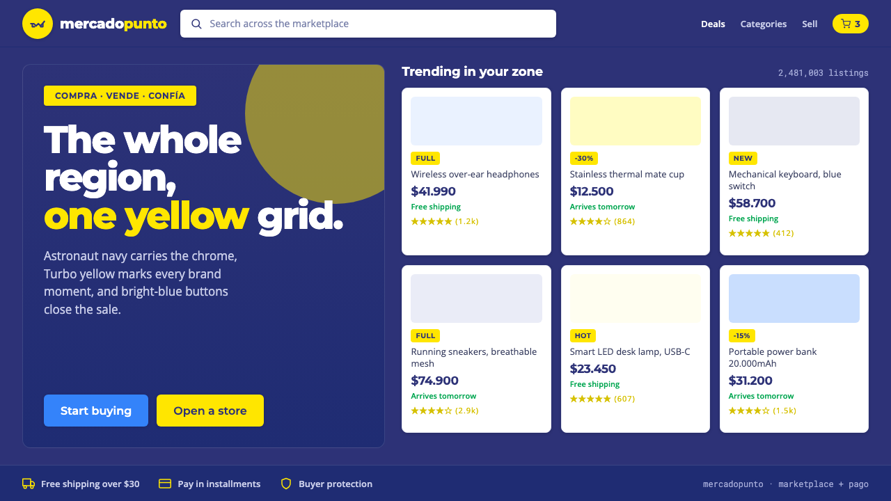 Mercado Libre YellowLatin America's marketplace energy. Turbo yellow brand moments, blue CTAs on…
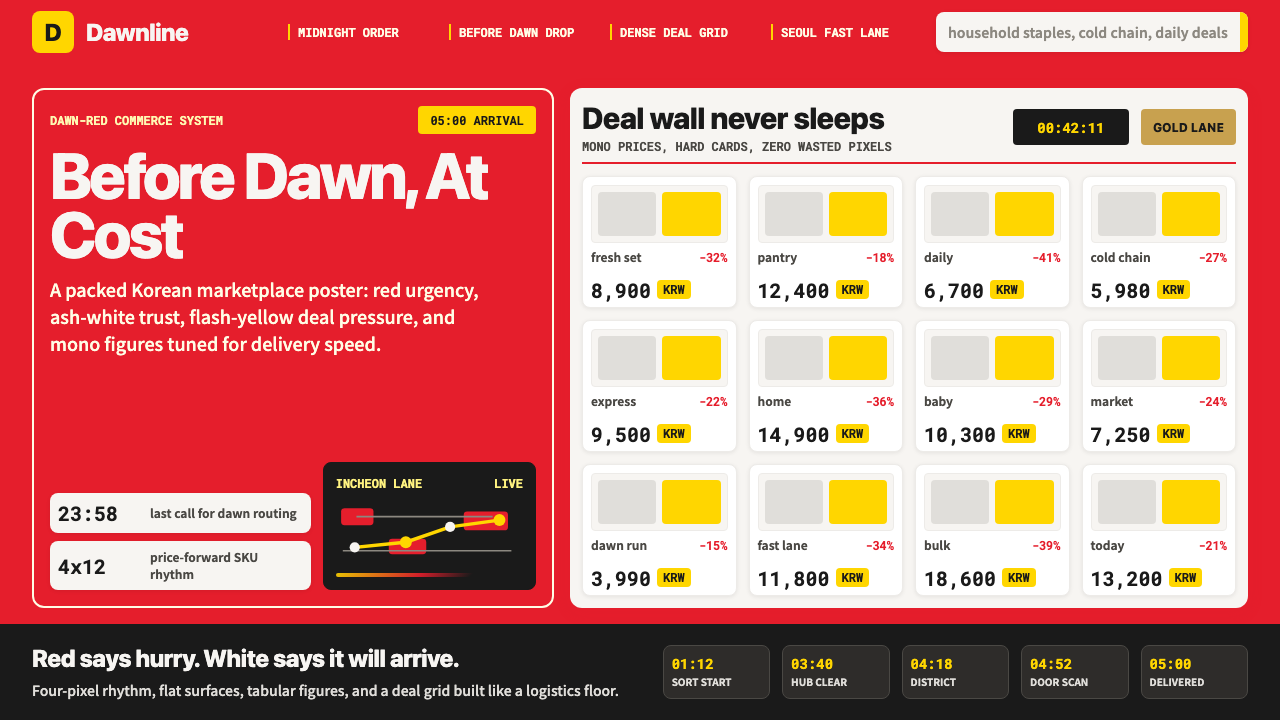 Coupang Rocket DeliveryUrgency made trustworthy. Rocket red, flash yellow, mono prices and packed gr…
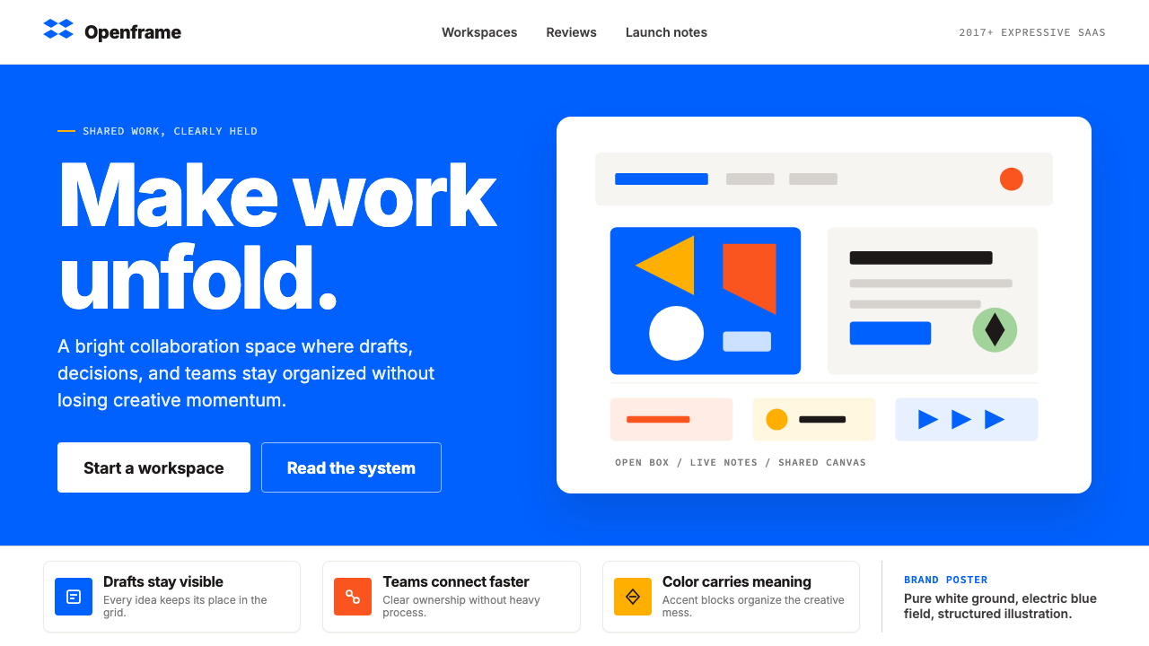 Dropbox ModernFriendly SaaS gets loud. Electric blue and Sharp Sans drive a structured geom…
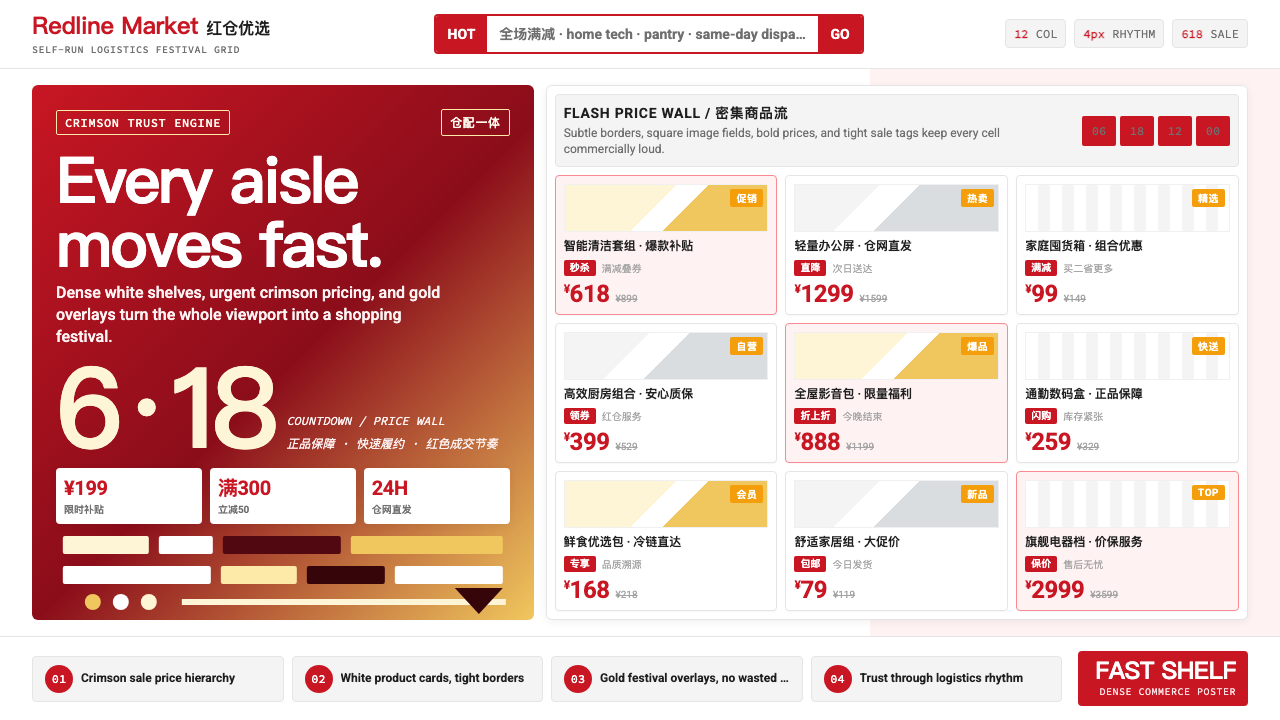 JD.com (京东)Urgency earns trust. Deep red prices pack a white 12-column grid with gold fe…
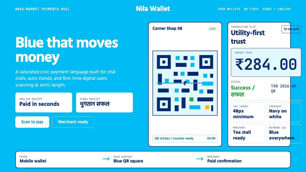 Paytm Indian FintechTrust at street scale. Saturated blue, Hind numerals, and QR grids make payme…