What is noon?
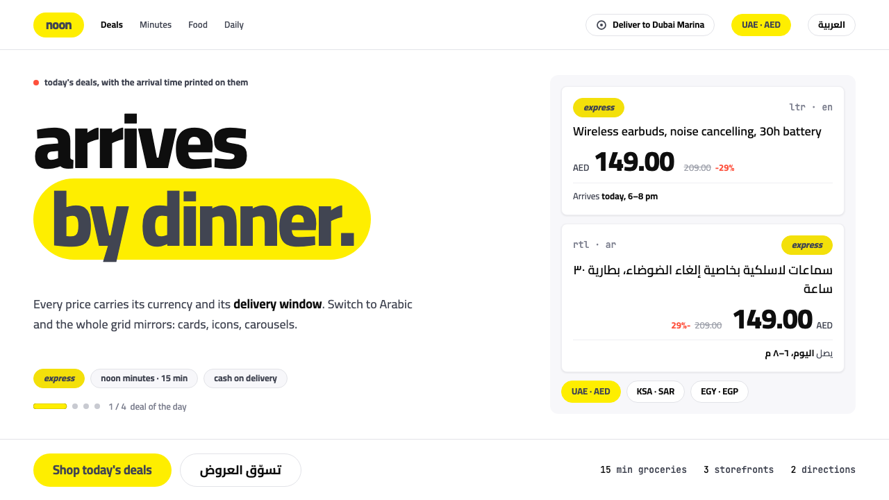
noon uses yellow as a sticker, never a wash: a white page, a lozenge chip carrying a lowercase wordmark, slate-navy type, and a grid that mirrors cleanly for Arabic.
noon in brief
The noon style is the interface language of the Gulf's home-grown online marketplace. It is recognisable at once: a white page, a bright yellow lozenge in the corner holding a lowercase wordmark, and slate-navy type set on top of the yellow in place of black. Yellow is a small, deliberate object, closer to a sticker on a parcel than to a coloured background.
The second defining feature is that the system is built to run in Arabic and English at once. Gutters, icons, prices and carousels all flip for right-to-left reading. The country switcher sits in the header beside the address picker as a control that people really use, and every product card shows a price with its currency code and a delivery window, because in Dubai and Riyadh the question of when something arrives is part of its price.
Taken together, the style describes a retail interface that is practical, local and bilingual by design. It is not a Western template with an Arabic translation added afterwards. The layout was imagined as mirrored from the beginning, and that single decision shapes the grid, the spacing, the alignment of numbers and even the direction in which a carousel moves.

Where does noon come from?
noon launched in 2017 from Dubai in the United Arab Emirates, with storefronts in Saudi Arabia and Egypt as well. The source dates the story from 2016, when the platform was announced, to 2017, when it launched. Its founder is named as Mohamed Alabbar, chairman of the property developer Emaar, and the Public Investment Fund appears among the key figures, reflecting the scale of the ambition. The comparison implied by the source is the American global marketplace: a regional competitor designed to understand the Gulf customer better than a foreign platform could.
That regional purpose explains the visual choices. A Gulf shopper moves between countries, currencies and two scripts, so the header carries a country switcher and an address picker, and prices always show a currency code. The delivery window is displayed next to price because speed of arrival is a purchase factor. Later products added to the platform, noon Food, noon Minutes and noon Daily between 2021 and 2023, extended the same thinking to fast grocery and meal delivery, and the interface language had to hold up for quick, repeat purchases as well as considered ones.
The source names three traditions that the style belongs to. The first is Gulf super-app commerce, where a single brand tries to cover shopping, food and everyday delivery in one habit. The second is bidirectional Arabic and Latin interface design, the craft of making two scripts and two reading directions share one layout without one looking secondary. The third is quick-commerce delivery UI, which puts time promises and clear stock and status information at the centre of each card.
Faraz Khalid and the Indian Type Foundry are named among the key figures besides Alabbar and the Public Investment Fund. The foundry is a type design house, and its inclusion reflects how important lettering is to the style: a lowercase wordmark and a typeface that handles Arabic and Latin together are the visual basis of the brand. The origin therefore combines business backing, regional need and typographic craft, and the interface carries traces of all three.
What defines the noon look?
Yellow as a sticker
Yellow appears in small contained shapes: the logo chip, a badge, a highlighted promotion. It is never spread across a page as a background wash. This keeps the brand colour vivid and quick to spot, and it keeps the large white areas calm enough for product images and prices to stand out.
Lozenge chip
The signature shape is a lozenge, a rounded oblong that carries the lowercase wordmark and echoes in chips, tags and small buttons. A single repeated form is what ties many different retail components together, so a cart badge and a delivery tag feel related at a glance.
Slate-navy type
Text set on yellow, and much of the text on white, uses a slate navy rather than pure black. It reads softer and more modern, and it makes the yellow feel warmer by contrast. The type is plain and legible, chosen to carry prices, names and delivery windows quickly rather than to express personality.
Mirrored grid
In Arabic the whole grid mirrors: gutters, icon direction, alignment of prices and the direction of carousels all flip. This is a design rule, not a stylesheet afterthought. Components are built with start and end rather than left and right, so the Arabic page is a first-class page.
Price, currency and delivery
Every product card shows a price with its currency code and a delivery window. This pair of facts is treated as the core of the card, set close together and in clear type. The convention suits a region where shoppers compare across countries and where arrival time is part of what they pay for.
Header controls
The country switcher sits in the header next to the address picker, treated as a working control instead of a footer afterthought. The UAE, Saudi Arabia and Egypt storefronts are one tap away. This placement shows that location is central to the shopping experience.

Who shaped noon?
Named in the source as the founder-chairman associated with noon, which launched from Dubai in 2017.
Listed among the key figures of the style as part of the people behind the platform.
Named in the source as a key backer, reflecting the scale of the regional marketplace project.
A type design house listed among the key figures, tied to the importance of lettering, wordmark and bilingual typography in the look.
How do you use noon today?
For slides, the noon style gives a clear way to open a presentation: a white cover, a small yellow lozenge as the only colour moment, and a navy title below it. Content slides can use the sticker idea, placing one yellow chip on a key figure or call-out while the rest stays white. For data slides, display value and currency or unit together, in the way a product card pairs price with currency code.
For web and app interfaces, the style fits localised e-commerce, quick delivery, marketplaces and any product with prices and arrival times. Build components with logical start and end rules so that mirroring costs nothing. Put the country and address controls in the header, show the delivery window beside the price, and use the lozenge for tags and secondary buttons. A pricing page for a service can follow the same card pattern, with currency stated explicitly.
For editorial and marketing pages, use yellow only in small items, such as a badge on a campaign banner, and let photography and white space do the rest. Seasonal sale pages work best when the yellow chip highlights the offer and the slate-navy type states the terms plainly. Bilingual campaign pages should be designed in both directions at the same time rather than translated at the end.
The style is also a good model for multilingual consumer products beyond retail: food ordering, travel, ticketing or banking in regions where two scripts coexist. What it teaches is that bilingual quality is a layout question, not a translation question.
The most common mistake is to flood the page with yellow, which turns a sticker into a wash, reduces contrast for the navy type and makes the product images fight the background. A second mistake is building in left and right instead of start and end, so the Arabic version needs a pile of overrides. Finally, avoid dropping the currency code or the delivery window to save space; these two facts are what shoppers in this market expect to see first.

noon — FAQ
What is the noon design style?
It is the interface language of the Gulf marketplace noon: a white page, a yellow lozenge chip with a lowercase wordmark, slate-navy type, product cards that show price with currency code and a delivery window, and a layout that mirrors fully for Arabic.
Why is yellow used like a sticker?
Keeping yellow in small contained shapes makes the brand colour vivid and easy to spot while leaving large white areas calm. A full yellow background would lower the contrast of the navy text and make product images compete with the page.
How does the grid work for Arabic and English?
The grid is designed to mirror. Gutters, icon direction, price alignment and carousel direction all flip for right-to-left, and components are defined by start and end rather than left and right. Arabic is therefore a full version of the interface, not a patch.
What kinds of products suit it?
Localised e-commerce, quick delivery, marketplaces, food ordering and other consumer products where prices, currency and arrival time matter and where more than one script is in use. It is less suited to brands that need a dark, moody or highly decorative look.
Where does the style come from?
From noon, announced in 2016 and launched in 2017 in Dubai, with Saudi and Egyptian storefronts and later noon Food, noon Minutes and noon Daily. It belongs to Gulf super-app commerce, bidirectional Arabic and Latin interface design and quick-commerce delivery interfaces.
Related design styles
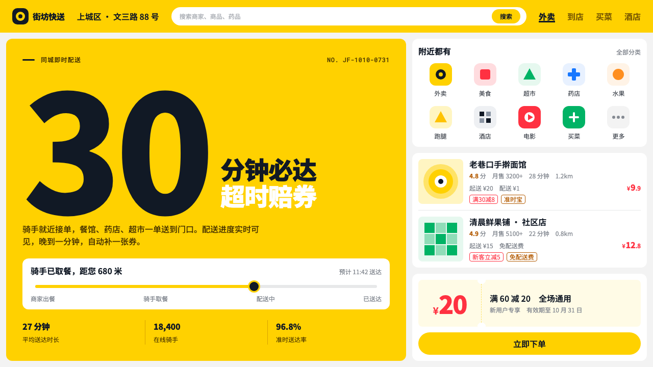 MeituanThroughput over display. Kangaroo yellow on grey, stacked white cards and hea…
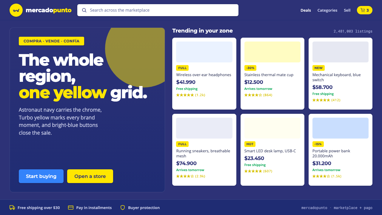 Mercado Libre YellowLatin America's marketplace energy. Turbo yellow brand moments, blue CTAs on…
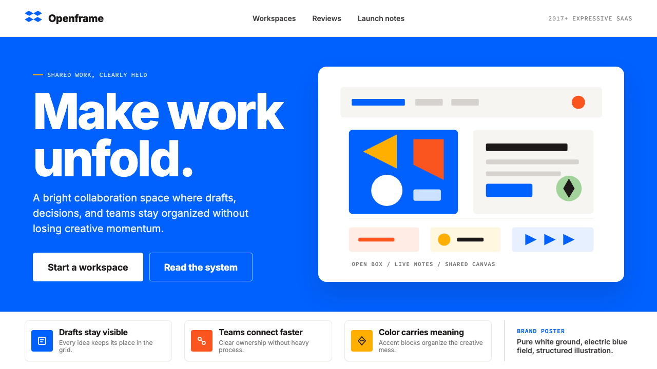 Dropbox ModernFriendly SaaS gets loud. Electric blue and Sharp Sans drive a structured geom…
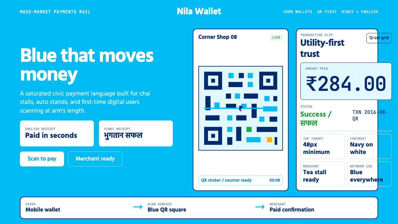 Paytm Indian FintechTrust at street scale. Saturated blue, Hind numerals, and QR grids make payme…
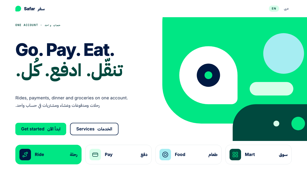 CareemNo page without the green. Flat green planes cropped by the edge, Arabic and…
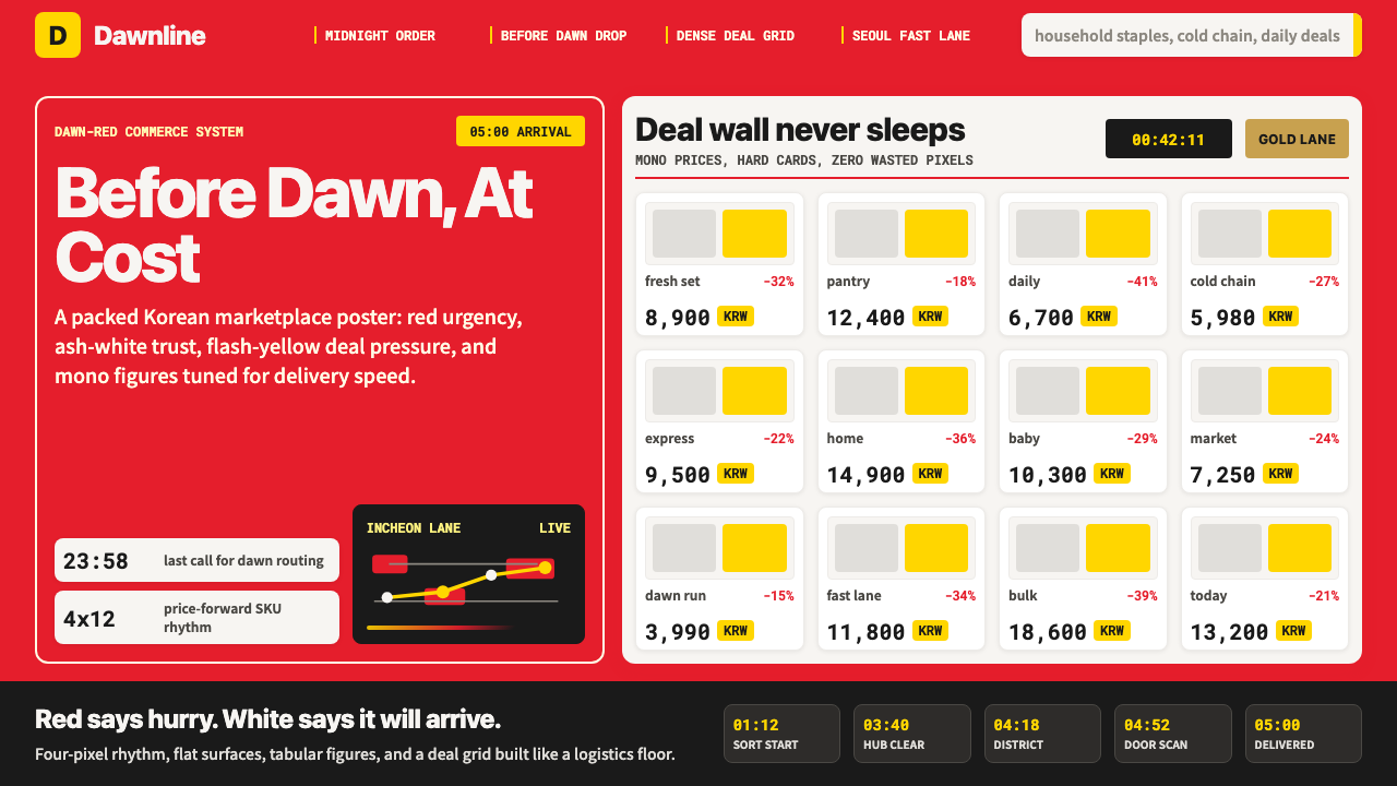 Coupang Rocket DeliveryUrgency made trustworthy. Rocket red, flash yellow, mono prices and packed gr…