What is Careem?
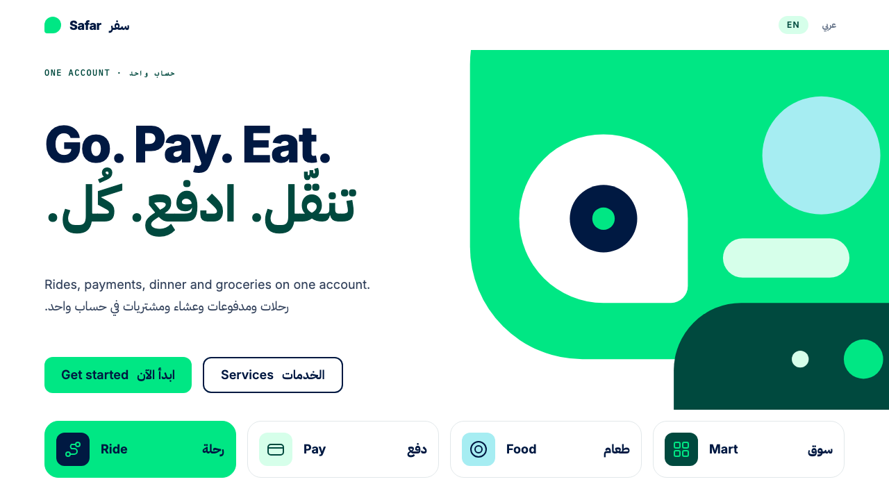
Careem built a super-app brand on a single rule, never compose without green, and let flat colour, cropped shapes and two scripts of equal weight do the rest.
Careem in brief
The Careem style is the visual language of a Dubai-born super-app. A white ground carries large flat fields of core Careem Green, shapes with softly rounded corners run off the edge of the page, and white counter-shapes are cut out of the green. Forest Green and Midnight Blue supply the darks for text and heavy surfaces, and Arabic and Latin scripts share every headline at the same size. It is built for a company whose one account opens rides, payments, food and quick delivery, and whose users read in two writing systems.
Its governing rule is short and absolute: never make a composition without core Careem Green. The rule does the work a logo usually does. Whatever a screen, poster or advertisement is selling, the green says whose it is before a single word is read. Because the green is applied as a flat plane rather than a gradient or a tint, it behaves like a surface in the physical world, something you stand in front of, not a decoration laid over the layout.
What keeps the system from feeling like a plain green template is its handling of shape. Forms are cropped by the page edge, so they read as pieces of a larger world, and white shapes are carved out of the green so that negative space becomes a drawing element in its own right. The overall tone is friendly, bold and local: confident enough for a payments screen, warm enough for a food order. The shapes never fight the content; they frame it.

Where does Careem come from?
Careem began in Dubai in 2012 as a ride-hailing service, founded by Mudassir Sheikha, Magnus Olsson and Abdulla Elyas. Over the following years it widened from rides into Careem Pay, Careem Food and Quik, a quick-delivery service, all behind a single account. That trajectory, from one service to an everything app for the Gulf, is the engine of the style: a brand that has to stay recognisable across half a dozen different products needs a rule simple enough to apply to all of them. Because the product is used daily and often in a hurry, the visual system has to stay legible from a moving car, a crowded pavement or a quick glance at a lock screen.
In 2019 Uber acquired Careem, yet the brand was kept intact rather than folded into its buyer's. That decision matters visually, because the green and its logic carried on as an independent regional identity instead of being replaced by a global system. The current super-app look, dating from roughly 2020 to 2024, belongs to that period of an acquired but separate brand consolidating its services under one roof.
Super-app consolidation is the first movement behind the system. When many services share one account, interface design has to prevent the product from feeling like a pile of mini-apps. A strong single colour, a shared shape language and one typographic approach make a ride, a payment and a grocery order feel like rooms in the same building. The brand rule about green is, in practice, an interface-integration rule.
The second movement is bilingual Arabic and Latin interface design, which is a discipline of its own. Arabic is written right to left in a connected cursive script; Latin runs left to right in separate letters. Matching them in one headline means balancing different proportions, different densities and a mirrored reading direction. Gulf tech branding adds a third influence: a regional confidence in which Arabic is not a translation layer on top of an English product but a first-class script, equal in size and in position. Typefaces chosen for such interfaces therefore need matching Arabic and Latin designs with comparable stroke contrast and weight, so that neither script looks lighter or louder than the other.
What defines the Careem look?
Core Green as Rule
Every composition contains core Careem Green, applied as a flat, saturated field rather than a tint, gradient or outline. Large areas are encouraged. The green is the brand's signature in the way a logo is for other companies: if it is missing, the page is not Careem. Tints are avoided; when a lighter green seems necessary, it is better to reduce the area than to dilute the colour.
Supporting Darks
Forest Green and Midnight Blue carry the dark values: text, dark surfaces, footers and heavy blocks. Forest Green stays inside the green family, while Midnight Blue offers a cooler counterweight. Because the darks are tinted toward brand hues, even text-heavy screens feel like Careem rather than a generic interface.
White Ground and Counter-Shapes
The page is white, and white also appears inside the green as cut-out shapes: a gap shaped like a letter, a window, a path. These counter-shapes let a flat field read as an illustration without introducing a new colour or texture, so the picture and the background stay one material.
Cropped, Soft-Cornered Forms
Shapes have softly rounded corners and are cut off by the edge of the page or panel. Cropping implies continuation, so a single panel suggests a city or a route instead of a boxed graphic. Nothing floats politely in the middle of a safe margin; forms reach for the edge.
Equal Bilingual Headlines
Arabic and Latin share every headline at the same nominal size, and neither is a subtitle or a footnote. Layouts are designed to mirror for right-to-left reading, with alignment, directional icons and sequence order flipped together rather than only the text. Parity is the visible statement of who the product is for.
Flat Depth
Depth is built from overlap, cropping and contrast between planes, not from blur or glow. This keeps screens quick to read on a phone held in bright sun, and it keeps the green honest as a surface. Layers are few and each one is clearly distinct from the next.
One Family, Many Services
Rides, Pay, Food and Quik each need their own character but share one parent. The system lets them differ in content and illustration while keeping the same green, the same corner softness and the same bilingual headline structure, so moving between services never feels like switching apps.

Who shaped Careem?
Co-founder of Careem and the executive most associated with its growth from a ride-hailing start-up into a regional super-app. His tenure spans the 2012 launch, the widening into payments and food, and the 2019 acquisition after which the brand kept its own identity.
Co-founder at the 2012 launch in Dubai. The founding team's choice to begin with ride-hailing created a daily-use habit on which later services such as Pay, Food and Quik could build, and that habit is what the brand's single-colour discipline protects.
Co-founder alongside Sheikha and Olsson. Together the founding trio stand behind a brand rule, never compose without green, that has survived both rapid product expansion and a change of ownership, which is unusual durability for a visual rule.
How do you use Careem today?
The Careem style transfers best to products that bring several services under one account, or that must serve readers in two scripts. Its rules are about proportion and presence: how much green, how much white, how much of a shape is cropped. Get those three right and the details forgive a lot. Onboarding sequences can use one cropped green shape per step so that progress feels like a route being drawn.
On slides, a cover can be a full-bleed green field with a white counter-shape and a headline set in both languages at the same size. Content slides sit on white with the green used for one dominant block, dark text in Forest Green or Midnight Blue, and cropped shapes at the margins to carry visual interest. Data slides benefit from flat bars in green with a darker companion series, labelled in both scripts wherever the audience needs it.
For apps and dashboards, use a white interface with a clear green primary action, service tiles that share one shape language, and large, readable type. Mobility, delivery, payments, booking and local-services products are natural fits. Always test the layout mirrored: right-to-left versions should be designed, not auto-flipped, with icons and progress indicators that imply direction reversed deliberately. Service tiles can each carry a small white counter-shape icon on a green or dark ground so that the set reads as one family.
In campaigns, posters and onboarding material, let one large green plane own the composition, crop the supporting shapes and use short bilingual headlines. The style is built for outdoor and mobile contexts where a message has seconds to land. Photography works best when it sits inside a cropped shape or beside a green field, not floating loose on white.
A frequent mistake is demoting the green to a small accent on a grey interface, which removes the one thing the brand requires. Another is treating Arabic as a smaller line under the English headline; the point of the style is parity. A third is stacking tints, gradients and drop shadows on top of the flat green, which turns a confident plane into a generic app skin.

Careem — FAQ
What is a super-app design system, and how does this one differ?
A super-app design system has to make many services feel like one product. This one does it with colour first: a single green rule, applied as a flat plane across rides, payments, food and delivery. Many systems rely on a shared component library; Careem's relies on a shared posture toward colour, cropping and bilingual layout that can be recognised before any component is seen. In practice, that means a new service can launch without needing a new visual identity.
Why insist that every composition contains the green?
A single non-negotiable element is easier to enforce across dozens of teams and hundreds of surfaces than a long list of preferences. The green works like a signature: it makes unfamiliar layouts recognisable at a glance, and it lets designers experiment freely with everything else without losing the brand.
How should Arabic and Latin be set side by side?
Give them the same nominal size and a shared baseline logic, then adjust optically, because the two scripts have different proportions and Arabic often needs slightly more room. Build separate right-to-left layouts rather than flipping a left-to-right one, and mirror alignment, reading order and directional icons together. Never present one script as a subtitle of the other.
Does the style work with dark interfaces?
It is primarily a white-ground system, but Forest Green and Midnight Blue provide real dark values for headers, cards and full dark screens. In a dark layout the rule still applies: a flat field of core green must appear somewhere in the composition, or the result will read as a generic dark theme rather than Careem.
Can it be used outside the Gulf?
Yes, wherever a product combines several everyday services or serves a multilingual audience, whether in Arabic and Latin or in another pair of scripts. The bilingual principle of equal size and equal position travels well. What does not travel is borrowing the green without the cropping and counter-shape logic, which produces a pastiche.
Related design styles
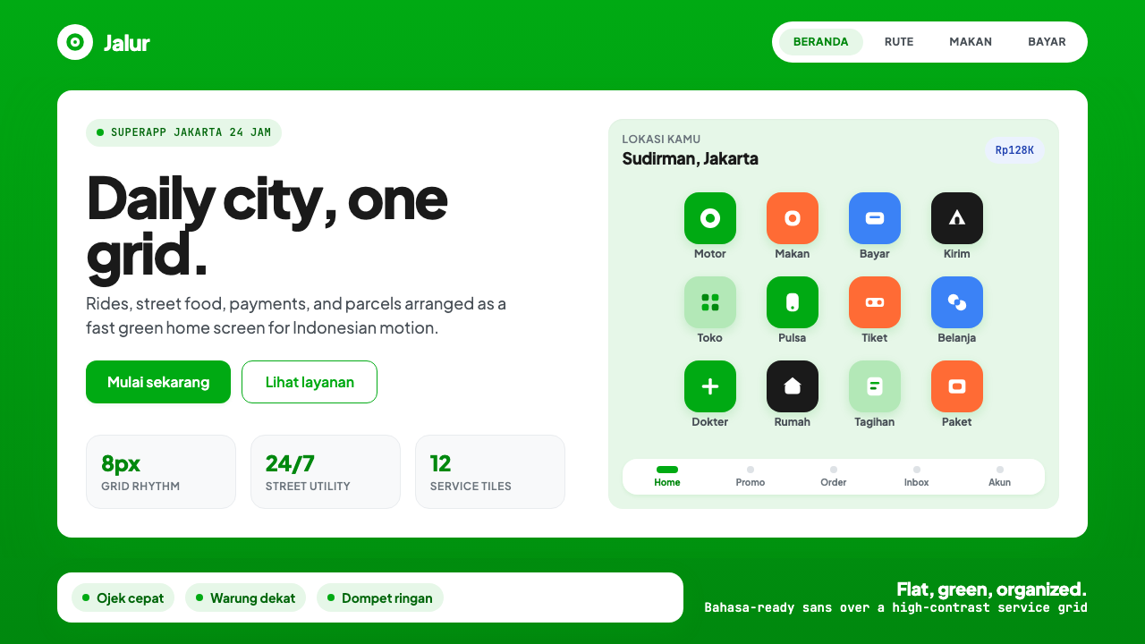 Gojek SuperappCity speed, ordered. Electric green tile grid turns rides, food, and pay into…
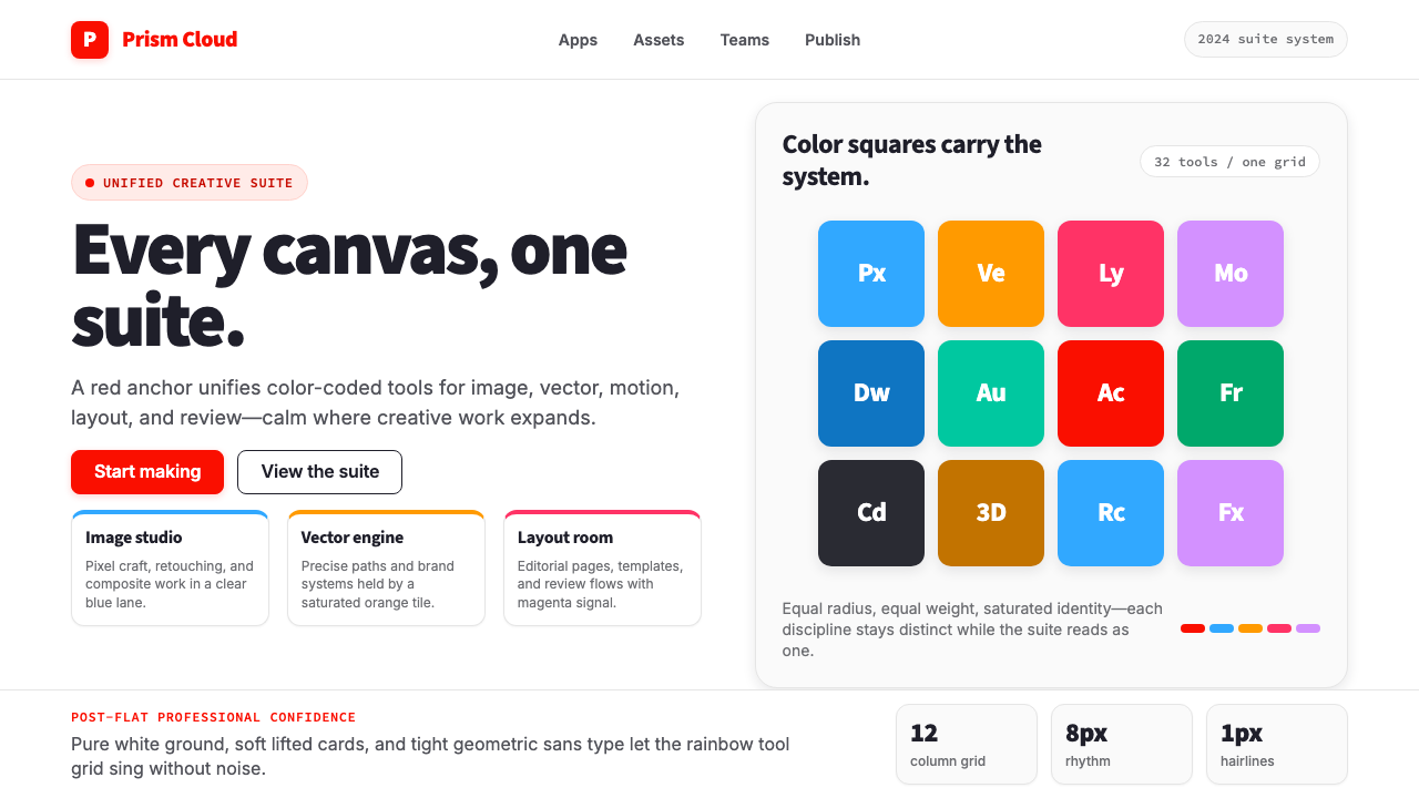 Adobe Creative CloudUnified, not uniform. Red anchor, white space, and saturated app tiles organi…
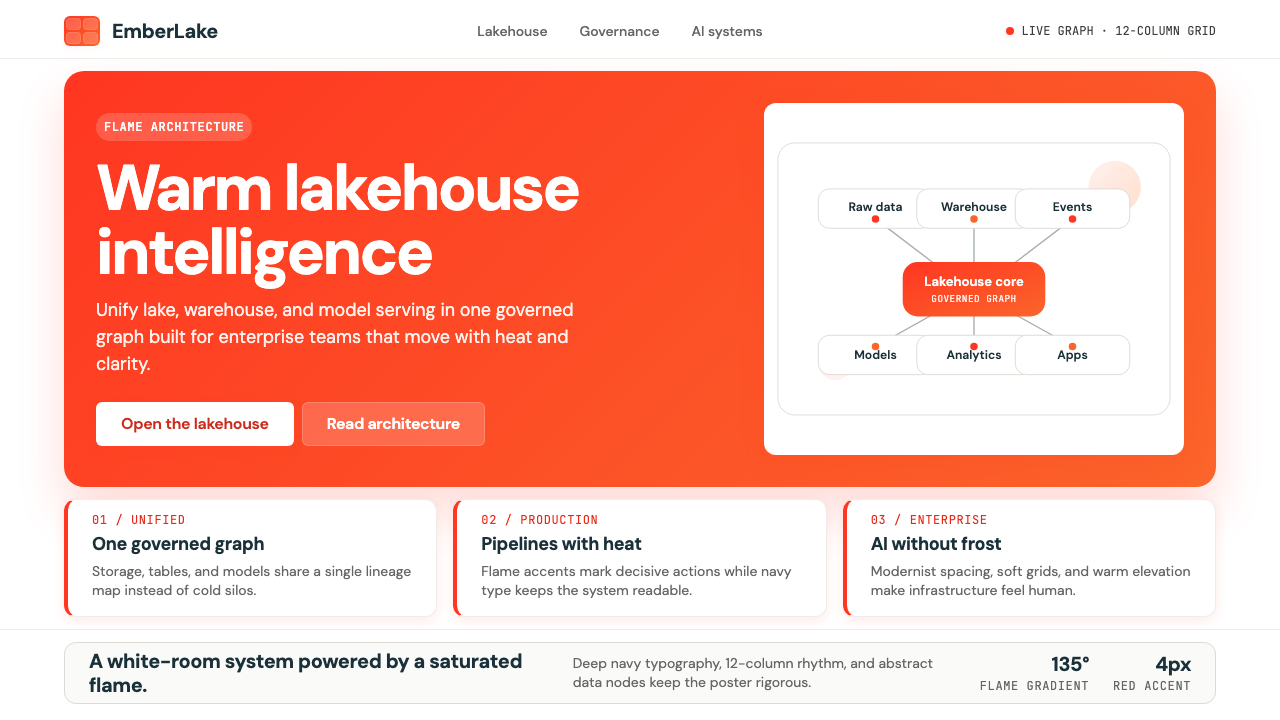 Databricks LakehouseWarm enterprise confidence. Flame red-orange gradients meet DM Sans and clean…
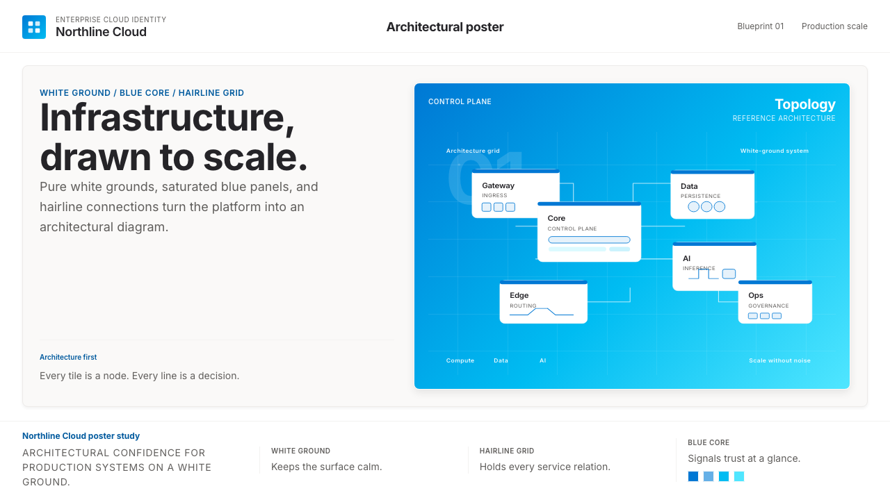 Microsoft AzureEnterprise calm, sharply diagrammed. White ground, saturated blue, hairline l…
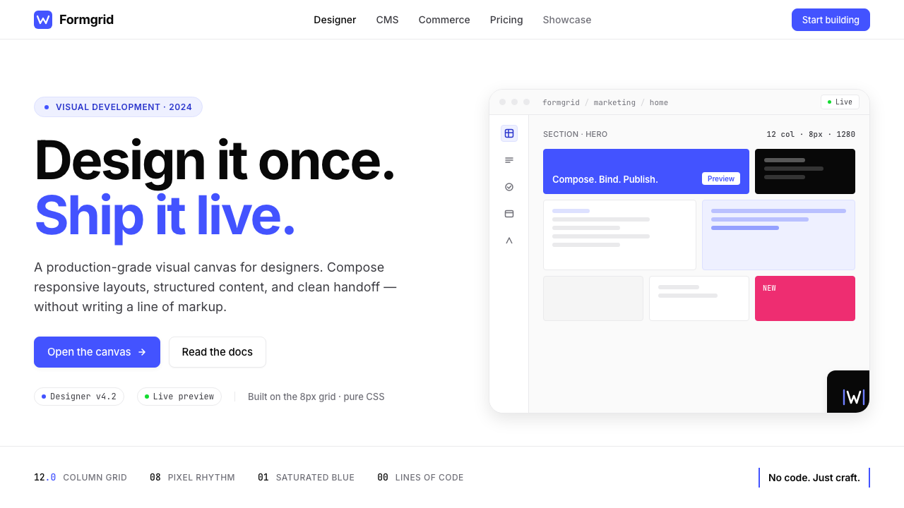 Webflow No-CodeA designer's tool, dressed like one. Saturated electric cobalt on pure white,…
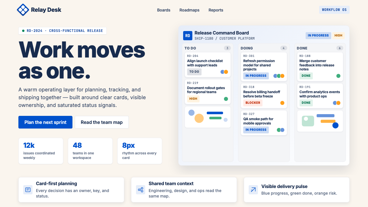 Atlassian Jira BlueWarm enterprise teamwork. Saturated blue cards on cream make status feel huma…