What is Mercado Libre Yellow?
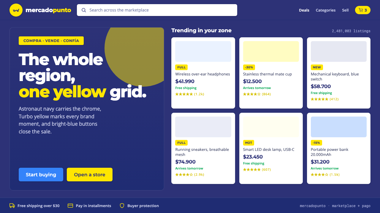
Mercado Libre Yellow turns marketplace intensity into a system: deep navy for trust, yellow for recognition, blue for action, and white for the things being sold.
Mercado Libre Yellow in brief
Mercado Libre Yellow is the visual language of a Latin American marketplace built around speed, density, and familiarity. Its signature pairing is a bright Turbo yellow handshake logo against a deep Astronaut navy field, surrounded by compact product grids, dark interface chrome, bright-blue actions, and white product cards. The result feels less like a boutique storefront than a busy, highly organized digital market.
The palette is functional rather than evenly decorative. Navy establishes the canvas and gives the interface a stable, trustworthy frame. Yellow appears in brand moments — the logo, selected highlights, and moments of recognition — but does not carry the entire page. Blue is reserved for clickable actions and forward movement, while white gives products a clean surface on which price, image, and information can be read.
The style's energy comes from controlled accumulation. Many products, labels, controls, and signals can coexist because their jobs are separated by color, surface, and position. Geometry stays clean, edges stay decisive, and the interface remains saturated rather than muted. It is retail design with the confidence of a payments platform: practical, busy, and reassuringly legible.
Where does Mercado Libre Yellow come from?
MercadoLibre was founded in Argentina in 1999, with its headquarters in Buenos Aires and its ambition expressed across the Latin American marketplace. That origin matters to the style. Mercado Libre Yellow does not present commerce as a quiet luxury experience; it presents it as an active regional network in which many needs, sellers, products, and decisions meet in one place.
The visual system developed alongside the company’s later expansion from mobile commerce into fintech through Mercado Pago. From the 2010s onward, the marketplace and payments relationship made the palette feel especially purposeful: navy could frame a dependable service environment, blue could signal an action or transaction, and yellow could preserve the unmistakable memory of the brand across changing digital contexts.
Its design lineage belongs to several connected movements named in the source material: Latin American e-commerce, the marketplace-and-payments super-app, dense-grid retail UI, and mobile commerce. These are not merely technological categories. Together they require a visual language that can accommodate discovery, comparison, purchase, and payment without losing the feeling of one coherent service.
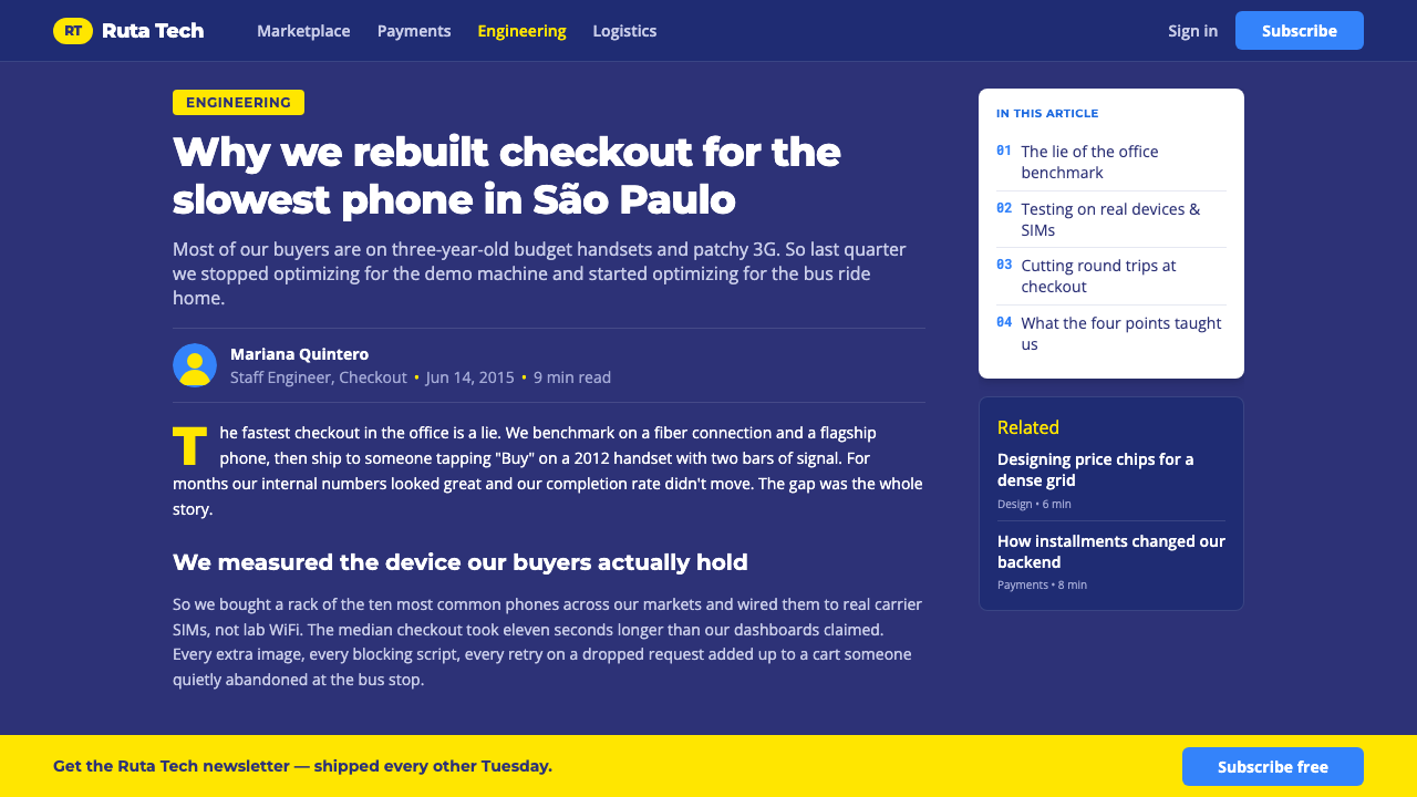
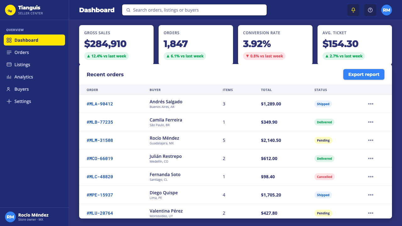
The resulting style is therefore built around hierarchy under pressure. A page may contain a dense assortment of products, but the dark chrome defines the frame, white cards separate merchandise, yellow identifies the brand, and blue clarifies what can happen next. The system's identity comes from this division of labor. Remove the navy and the yellow loses its anchor; make everything yellow and the brand signal becomes noise; remove the blue and action loses its dedicated voice.
What defines the Mercado Libre Yellow look?
Navy Canvas
The authentic ground is deep Astronaut navy, not yellow. Navy surrounds the marketplace, frames navigation, and gives the bright identity color enough contrast to remain vivid. It also creates the visual seriousness needed for payments and account functions, keeping the overall experience grounded even when the product field becomes crowded.
Turbo Yellow
Yellow is the recognition device. It belongs to the handshake logo, brand moments, selected highlights, and signals that should feel unmistakably Mercado Libre. Because it is bright enough to read as cream when used broadly, it works best as a concentrated accent against navy or white rather than as a continuous page surface.
Action Blue
Bright blue carries interaction. Calls to action, purchase paths, and forward-moving controls should be visually distinct from brand decoration, so blue gives the user a clear operational cue. Its presence makes the interface feel active and transactional without asking yellow to perform every communicative role.
White Product Cards
White is the display surface for merchandise. Against the navy frame, a white card reads as a discrete object: a product image, title, price, and supporting information can be scanned without competing with the surrounding brand field. Repeated cards create order through rhythm, while their shared surface keeps a varied catalog visually coherent.
Dense Retail Grid
The grid is compact and information-rich, reflecting the reality of a marketplace with many competing offers. Density should feel organized rather than cramped: aligned cards, consistent image treatment, clear spacing between groups, and strong separation between navigation, commerce, and account functions. The grid is the engine of discovery.
Geometric Clarity
Forms are straightforward, modular, and easy to repeat across a large service. Corners, containers, buttons, and product cells should read as deliberate units instead of expressive ornaments. The visual language gains authority from repetition: the same shapes and surfaces return often enough to make a complex marketplace feel dependable.
Who shaped Mercado Libre Yellow?
Marcos Galperín is named among the key figures in the origin of Mercado Libre Yellow. His inclusion belongs to the founding-era story of an Argentine company that grew into a pan–Latin American marketplace, giving the style a clear geographic and entrepreneurial point of reference.
Hernán Kazah is part of the key-figure constellation attached to the style’s origin. In the article’s design history, his name represents the founding context behind a marketplace identity whose visual system had to serve regional scale, mobile commerce, and the accumulation of many products and transactions.
Stelleo Tolda is identified in the source material as another key figure in the style’s origin. His place in the story helps situate Mercado Libre Yellow within the company’s longer movement from marketplace toward a connected mobile and payments experience.
How do you use Mercado Libre Yellow today?
Mercado Libre Yellow transfers well when the design problem involves assortment, action, and trust. Its core method is to assign each visual resource a job: navy establishes the service frame, yellow marks identity, blue directs behavior, and white isolates the merchandise. The style becomes convincing when this hierarchy remains consistent across every surface rather than appearing only in a logo or a decorative accent.
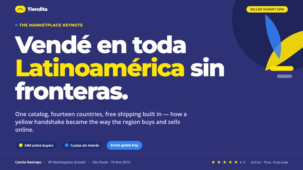
For presentation slides, use navy as the cover field and let a concentrated yellow brand moment create immediate recognition. Content slides should behave like organized retail interfaces: strong navigation, compact information blocks, white surfaces for examples, and blue reserved for decisions or calls to action. Data slides benefit from the same logic. Charts, labels, and comparison areas should be separated by surface and color so the slide feels information-rich without becoming visually indiscriminate.
For web interfaces, the style is especially natural for marketplace dashboards, catalog management, checkout flows, and pricing pages. Keep the surrounding chrome dark and stable, place products or plan details on white cards, and use blue for the next operational step. Yellow can identify the service, selected states, or a memorable promotional moment, but it should not compete with the action layer. Dense layouts need visible grouping so abundance reads as choice rather than clutter.
For editorial and marketing work, treat the page as a market announcement with a dependable frame. Navy sections can hold dense information, white blocks can carry product stories or comparison content, and yellow can punctuate headlines, badges, or brand-led moments. Marketing compositions should feel energetic without becoming celebratory decoration: the strongest effect comes from a clear offer, a recognizable yellow signal, and a blue path toward action.
The common mistake is making yellow the entire identity surface or using blue and yellow interchangeably. That collapses recognition and interaction into one undifferentiated signal. Another mistake is copying density without structure: a crowded grid of uneven cards, inconsistent imagery, and competing accents feels chaotic rather than marketplace-like. Preserve the navy frame, keep cards coherent, and let every color answer a different question.
Mercado Libre Yellow — FAQ
Should the page background be yellow?
Usually no. The signature yellow is bright enough to read as cream when spread across a page, so the more authentic canvas is Astronaut navy. Yellow is strongest as a concentrated brand accent against navy or white. Using it everywhere removes the contrast that makes the handshake logo and other brand moments immediately recognizable.
Why should blue be reserved for calls to action?
Blue gives interaction its own visual voice. If yellow handles the logo, highlights, promotions, and buttons alike, the user cannot distinguish brand recognition from an available next step. Bright blue creates a separate operational signal, which is especially useful in a dense marketplace or a connected payments experience.
Can this style work with a light canvas?
It can, but the navy partner color should remain structurally important. White product cards already form the light display surface, while navy provides the surrounding frame and yellow supplies recognition. A page that replaces the navy field with an undifferentiated light background may retain the colors but lose the contrast, depth, and trust-building relationship that defines the style.
How do you keep a dense product grid from feeling chaotic?
Density needs repeated rules. Align product cards, keep their internal treatment consistent, separate groups clearly, and maintain a strong distinction between navigation, commerce, and account functions. Let white carry merchandise, navy carry the frame, and blue carry action. When every layer has a stable role, abundance reads as organized choice.
What kinds of products suit Mercado Libre Yellow best?
The style is strongest for marketplaces, retail tools, catalogs, dashboards, pricing experiences, and services connected to payment or mobile commerce. It supports products that need to communicate range, speed, and dependable action. It is less naturally suited to experiences whose central value is quietness, softness, or sparse presentation, because its identity depends on energetic density and clear transactional signals.
Related design styles
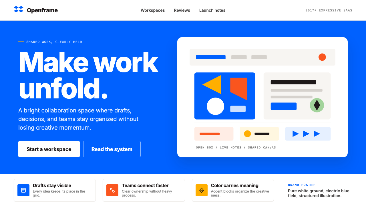 Dropbox ModernFriendly SaaS gets loud. Electric blue and Sharp Sans drive a structured geom…
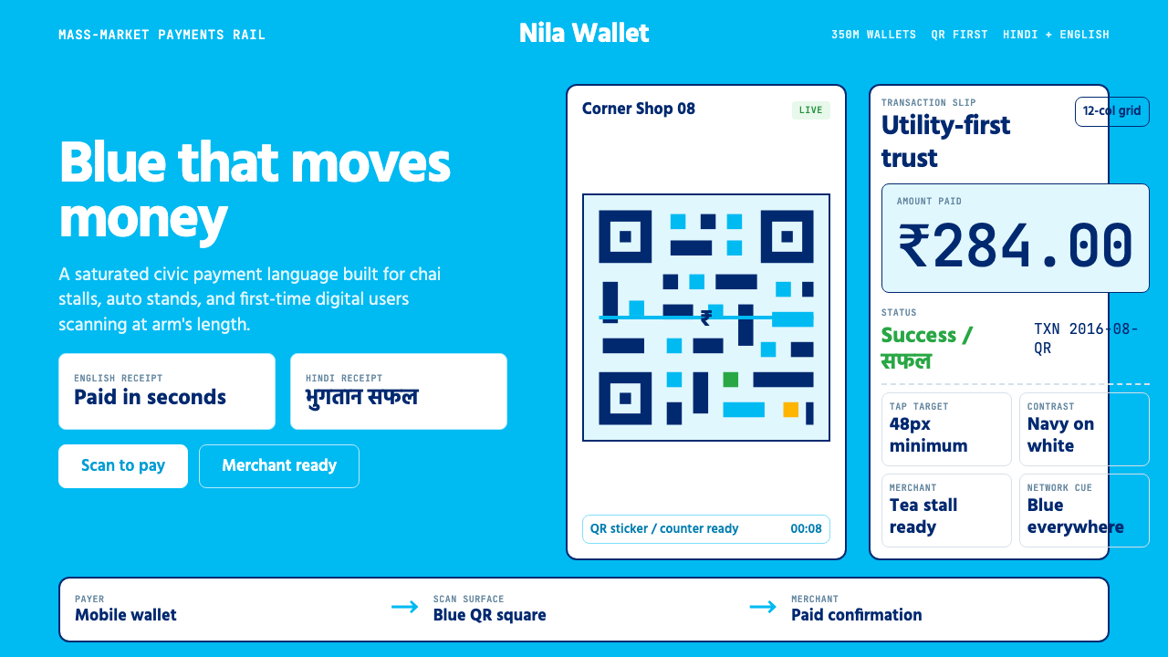 Paytm Indian FintechTrust at street scale. Saturated blue, Hind numerals, and QR grids make payme…
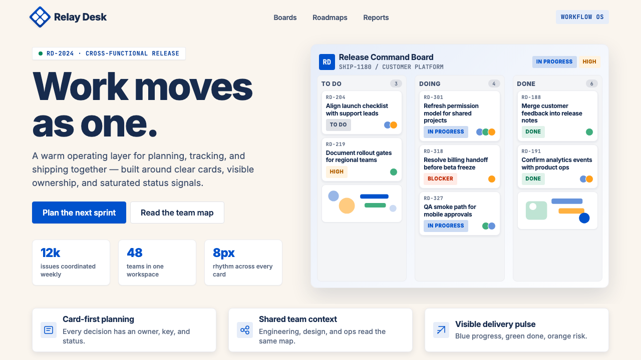 Atlassian Jira BlueWarm enterprise teamwork. Saturated blue cards on cream make status feel huma…
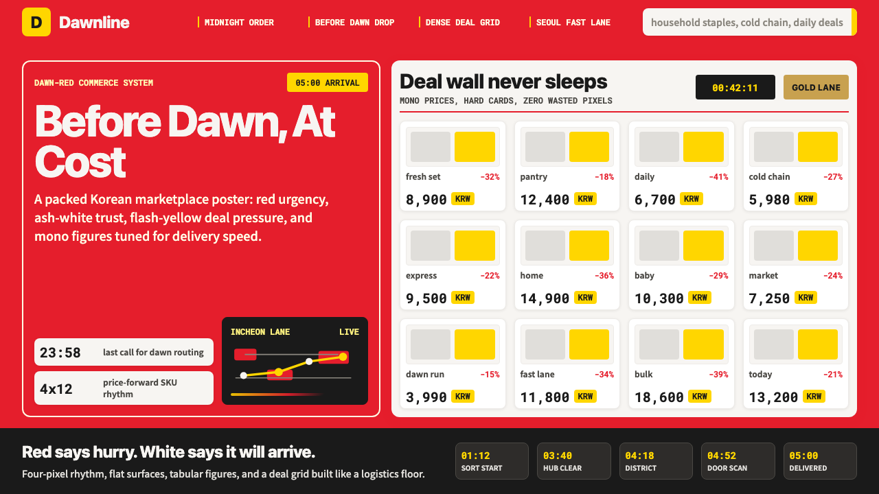 Coupang Rocket DeliveryUrgency made trustworthy. Rocket red, flash yellow, mono prices and packed gr…
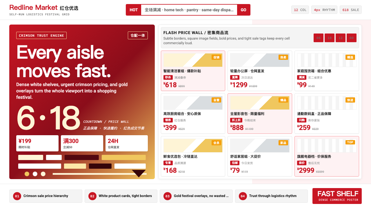 JD.com (京东)Urgency earns trust. Deep red prices pack a white 12-column grid with gold fe…
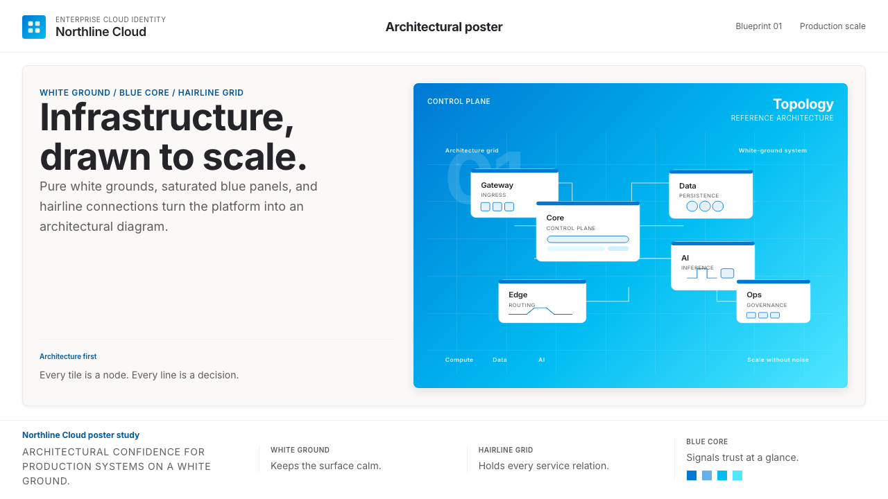 Microsoft AzureEnterprise calm, sharply diagrammed. White ground, saturated blue, hairline l…