What is Arcology Section Drawing?
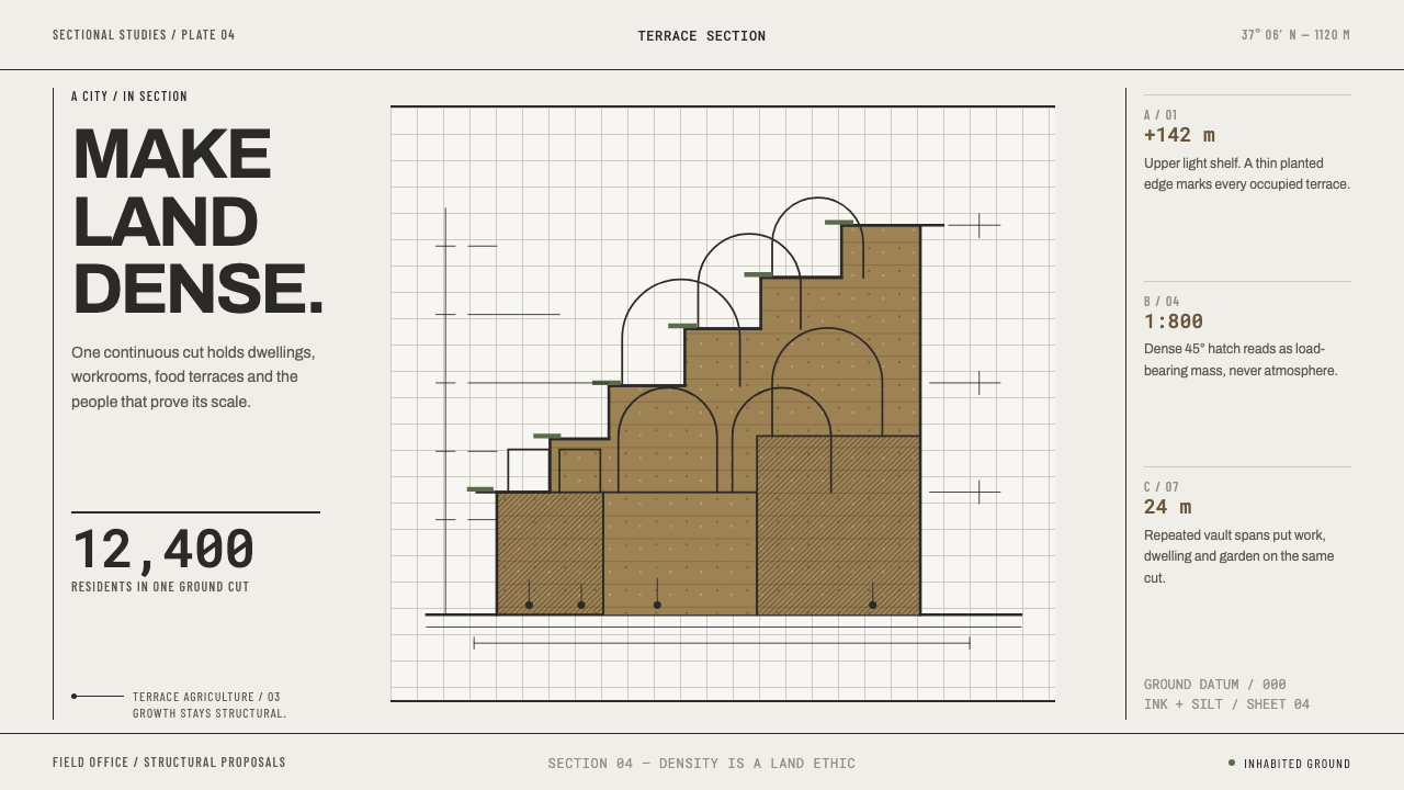
Arcology Section Drawing renders a whole city as one cut-open section: black ink line on white stock, hatching for shade, tiny inhabitants for scale, and silt ochre borrowed from the desert concrete that was actually poured.
Arcology Section Drawing in brief
Arcology Section Drawing is a visual language drawn from the city drawings of the architect Paolo Soleri, who invented the word arcology, a fusion of architecture and ecology. Soleri drew cities the way an engineer draws a machine: as one enormous section, cut open so that every level can be read at once. Dwellings, farms and workshops are stacked inside a single continuous structure, and hundreds of tiny human figures prove that the thing is inhabited.
The look is built from a few disciplined ingredients. Graphite and technical pen on drafting paper, reproduced as black line on white stock, carry the argument. Hatching, rather than tone or gradient, does the shading, so density of line is density of shadow. Half-domes, vaults and stacked greenhouse terraces recur as a family of forms. Against this monochrome the style allows earth tones, a silt ochre in particular, but they are never decoration. They are the colour of material.
That material comes from a real place. The tilt-up concrete panels at Arcosanti, Soleri's built experiment in the Arizona desert, are cast in silt from the Agua Fria riverbed, so the buildings carry the desert's own colour. The style translates this into a page where line makes the claim, hatch gives it weight and the ochre simply says what the structure is made of. The overall impression is of a proposition about how people should live together, drawn with unusual clarity.
Where does Arcology Section Drawing come from?
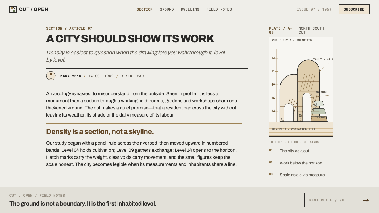
Paolo Soleri's central idea was that a city should be compact in every direction, so that the land around it can be left alone. Density, in this view, is a land ethic rather than a problem to be managed. He gave the idea a name, arcology, and drew it again and again as a single, three-dimensional structure in which living, farming and working are layered together. This stance, a conviction that dense design could be the more ecological choice, is where the style gets its seriousness.
The drawings reached a wide audience in 1969, when MIT Press published Arcology: The City in the Image of Man. The images in that book were made in graphite and technical pen on drafting paper and printed as black line on white stock, which is why the style looks like a plan sheet and not like a painting. Recurring half-domes, vaults and terraced greenhouse platforms give the cities a recognisable vocabulary, and in nearly every drawing small figures stand at the same scale as the architecture. Without them it would be sculpture, not a city.
Soleri also built. Arcosanti, begun in 1970 near Mayer in the Arizona high desert, is still occupied, and his earlier base at Cosanti in Paradise Valley belongs to the same story. At Arcosanti the tilt-up concrete panels are cast in silt from the Agua Fria riverbed. The silt gives the concrete its ochre, and casting leaves a visible pattern of horizontal bed lines when the panels come out of the form. The colour of the style therefore does not come from a palette chosen on a screen but from the ground that was dug up and poured.
The work belongs to the 1960s and 1970s world of megastructure and visionary architecture, and to the period's ecological utopianism, when large single-structure cities were drawn as serious proposals. Soleri had apprenticed under Frank Lloyd Wright, and his respect for built form that answers its landscape descends partly from that experience. Where many visionary drawings of the era treated the megastructure as spectacle, Soleri's treated it as an argument, and the style keeps that difference: its images are meant to be read, not just admired.
What defines the Arcology Section Drawing look?
One Cut-Open Section
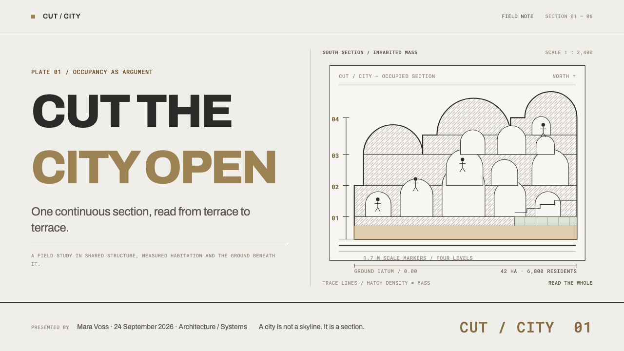
The organising idea is a single large section in which every level can be read at once. In layout terms, this means showing a system as a whole instead of hiding it behind menus: tiers, programmes and relationships are all visible, stacked in one continuous structure. The page is closer to a diagram of how something works than to a sequence of separate scenes, and the reader is invited to scan across it rather than step through it.
Ink Line and Hatch Density
Line does the arguing and hatch density does the shading. Outlines are clean, drawn in black as from a technical pen, and darker areas are produced by packing more lines together rather than by filling with tone. There are no gradients and no soft shadows; depth is a matter of how closely the strokes sit. This gives the style a graphic crispness that survives reproduction, whether on a screen, a slide or a plain print.
White Stock
The ground is white, like the stock on which MIT Press printed the drawings in 1969. It is not tinted or textured. The whiteness is a working surface that lets line be the only thing that speaks, and it keeps the page open and legible even when a drawing is very dense. Panels and sections are marked off by line, not by tinted backgrounds, which means the layout stays light however much information it carries.
Silt Ochre
The one signature colour is silt ochre, a dry, sandy yellow-brown that comes from the concrete cast in Agua Fria riverbed silt at Arcosanti. It is used as a fill for material and ground rather than as a decorative accent, and it sits in the same family as other earth tones that the structure might plausibly take. Colour here means substance: it tells you what a surface is made of, and it never shouts.
Tiny Inhabitants
Small human figures appear throughout, drawn at the same scale as the architecture. They are what make the structure a city, and they set the measure by which everything else is read. In practice, a layout in this style should keep some sign of human scale in view: a small figure, a tiny annotation, an everyday object. Without it, the drawing becomes a sculpture and the interface becomes a monument.
Domes, Vaults and Terraces
Half-domes, vaults and stacked greenhouse terraces recur as the style's formal vocabulary. Curved shells give an apse-like emphasis, arches and vaults frame spaces, and stepped terraces describe tiers of growing and living. Reused as graphic motifs, these shapes provide rhythm: rounded openings against stepped rows, and curves against the strict horizontals of a layout.
Bed Lines and Strata
When the cast concrete panels leave their forms they carry horizontal bed lines, a record of how they were made. The style turns that into a layered, banded structure: horizontal strata, repeated courses and sections stacked like geological layers. It creates a steady horizontal rhythm that lets a dense page feel orderly, and it quietly reinforces the idea that the picture shows how a thing was built.
Who shaped Arcology Section Drawing?
Soleri coined the word arcology and spent his career drawing and building the idea. His drawings, made in graphite and technical pen, present whole cities as single readable sections, and Arcosanti in the Arizona desert, begun in 1970 and still occupied, is the built experiment. For this style he is the origin of everything: the cut-open section, the recurring domes and terraces, and the insistence that density can be an ethic.
Colly Soleri was Paolo Soleri's wife and long-time partner in the work at Cosanti and Arcosanti. Her place in the lineage is a reminder that the style comes from a lived project, a place where people worked and stayed, not from a single draughtsman at a desk. The inhabited quality of the drawings, with their many small figures, reflects that collective, ongoing effort.
Soleri apprenticed under Wright, and Wright's belief that architecture should grow from its site and materials is an ancestor of the earth-toned, material-minded side of this style. The connection explains why the ochre here is a statement about substance and not a trend colour. Soleri, however, took the idea toward density and the single-structure city, a very different scale from Wright's.
Cooper was a leading designer at MIT Press in the years when Soleri's drawings were published there. Her name belongs to the printed side of the story: the way these city sections reached readers as black line on white stock. She is a reminder that the style is as much about reproduction and page design as about the drawings themselves.
How do you use Arcology Section Drawing today?
Arcology Section Drawing works best for subjects that are about systems, density and how things fit together: urbanism, sustainable architecture, land and housing initiatives, research, ecological and community projects. Treat the layout as a drawing sheet. Decide what the single section is, make sure every level can be read, and let line carry the argument before any colour is added.
For presentation slides, a cover can be a large black-line drawing of a section, a stacked structure with small figures, on white, with a plain title set beside it. Ochre appears as the fill of one material or block. Content slides use bands and tiers with fine leader lines to labels, so that a process or a hierarchy is shown as a cut-through rather than a bullet list. Data slides suit hatching: bar or area charts shaded with line density rather than flat fills, a single ochre series to mark the one that matters, and labels set like drawing annotations.
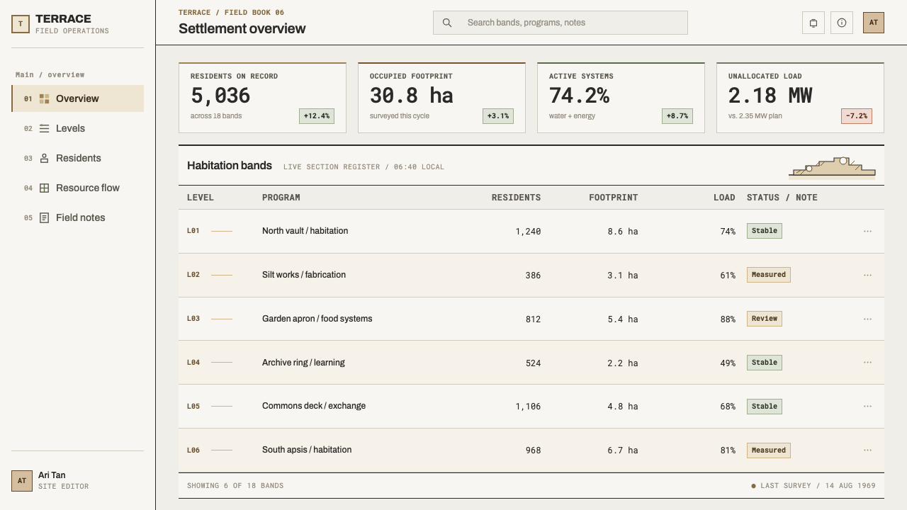
For web interfaces, the style suits dashboards and structure-heavy tools where seeing the whole system matters: infrastructure maps, planning tools, portfolio overviews and knowledge bases. Use white surfaces, black linework and hatching for density or intensity in place of heat-map gradients. Keep tiers visible rather than hidden in nested menus. A pricing page can read as a stack of levels in one section, with ochre marking the recommended tier and small figures indicating who each level is for.
For editorial and marketing work, the style gives long essays and reports an air of serious proposal. Section drawings make strong hero images, and captions behave like annotations on a plan. Content about land use, housing, ecology or community-building feels at home here, and the combination of black line and earth tone is memorable without being loud. Keep text columns plain and let drawings do the visual work.
The most common mistake is to use the ochre as a generic terracotta accent and ignore everything else. The style is line first, and colour is only the material. A second mistake is shading with soft gradients or glows, which dissolves the crisp logic of hatch. A third is drawing the structure with no people in it, which turns a city back into sculpture, or going the other way into neon science-fiction, which loses the drafting-sheet sobriety. Finally, avoid hatching so dense that the section can no longer be read.
Arcology Section Drawing — FAQ
What does arcology mean?
It is a word coined by Paolo Soleri, combining architecture and ecology. It describes a dense, compact, three-dimensional city in which housing, farming and work are integrated in one structure so that the surrounding land can remain open. In this design style, the idea shows up as a cut-open section where every level is visible, and as a general preference for layouts that show a whole system rather than separate parts.
Why is the colour so limited?
Because colour is treated as material, not decoration. The drawings are black line on white stock, and the only distinctive colour is the silt ochre of the concrete cast in Agua Fria riverbed silt at Arcosanti. A broader palette would break the logic of the style, in which line makes the argument and colour simply tells you what the structure is made of. If more colour is needed, stay with earth tones that could plausibly belong to the ground.
How do I shade without gradients?
Use hatching: parallel lines whose spacing is closer where an area should look darker and wider where it should look lighter. This is how the original drawings did it in technical pen. On screens you can build the same effect with fine repeating line patterns or with thin rules, and you can use it for charts and diagrams as well as illustrations. The key is that tone comes from line density, never from a smooth fade.
Is this a futuristic, sci-fi style?
It comes from the visionary architecture of the 1960s and 1970s, so it has a forward-looking ambition, but its manner is that of a technical drawing, not of a film poster. It is sober, linear and explanatory. Glowing surfaces, neon colours and chrome are the opposite of what it does. The future here is argued with a section and a drawn crowd, not dazzled with effects.
What content suits this style best?
Content in which a whole system has to be understood: planning, housing, ecology, infrastructure, community projects, research and long-form explanations. It is a particularly good fit when the subject is about density, layers and how parts depend on each other. It is a poor fit for fast, playful, consumer-facing products where a drawn, explanatory manner would feel heavy.
Related design styles
 Data Humanism (Lupi)Data feels authored. Near-black fields carry serif notes and categorical hand…
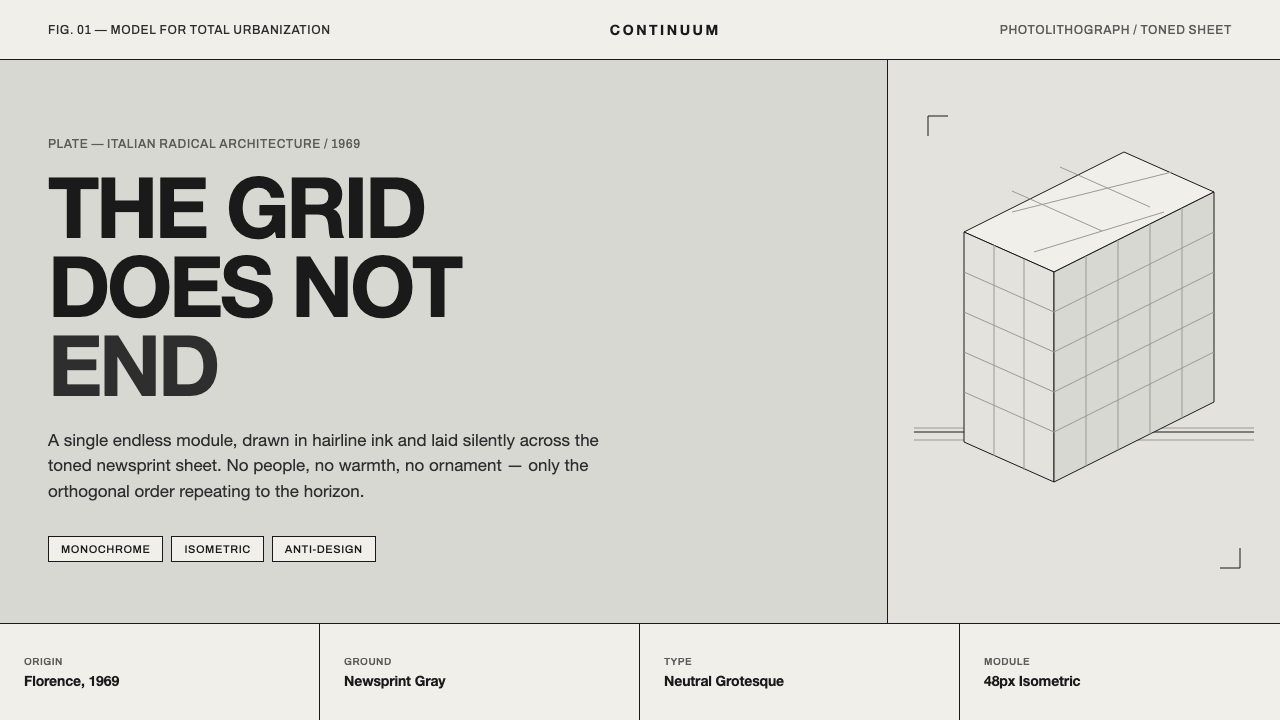 Superstudio Continuous MonumentThe grid does not end. Hairline black isometric ruling on toned newsprint-gra…
 Bubble Chamber TracksPhysics becomes calligraphy. Cyan-white spirals glow on true photographic bla…
 Chaotic AcademiaThe productive mess of a real scholar. Coffee rings, marginalia, post-its hal…
 Cybernetic 1968 (Stafford Beer)Mission-control severity. Charcoal panels, orange buttons, cyan readouts, hex…
 GRAV Op-Kinetic (1960)Vertigo by calculation. White line fields on black, with red and yellow as co…