What is Chaotic Academia?什么是 Chaotic Academia?
Chaotic Academia is the productive mess you actually live in — coffee rings, margin scribbles, and half-finished essays that somehow cohere into brilliance.混沌学院风是你真正生活其中的创造性混乱——咖啡渍、边注涂鸦,以及那些不知怎么就能自圆其说的半成品论文。
Chaotic Academia in briefChaotic Academia 速览
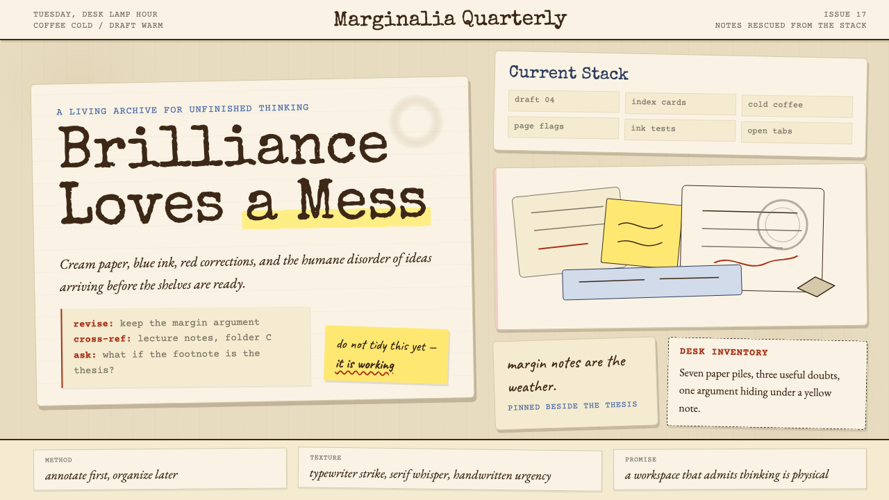
Chaotic Academia is the messy-desk branch of the internet's academic aesthetic family tree. Where Dark Academia broods in candlelit gothic libraries and Light Academia basks in airy Mediterranean sunlight, Chaotic Academia captures something more honest: the productive disorder of a real working scholar. The visual vocabulary includes cream paper stained by coffee rings, margin annotations layered in two or three ink colors, sticky notes obscuring half the monitor, stacks of open books with dozens of loose slips marking half-read chapters, and a desktop that looks catastrophic from a distance but maps a coherent intellectual system up close.混沌学院风是互联网学术美学家族中「乱桌子」的那一支。暗黑学院风在烛光哥特式图书馆中沉思,明亮学院风在通透的地中海阳光里徜徉,而混沌学院风捕捉的是更诚实的东西:真实工作中学者的创造性混乱。它的视觉词汇包括:咖啡渍染过的奶油色纸张、叠压着两三种墨水颜色的边注、遮住半个屏幕的便利贴、翻开放着数十枚书签的书堆,以及那张远看一团糟、近看却映射着完整知识系统的桌面。
The aesthetic does not romanticize mess for its own sake. It insists that the mess is evidence — proof of genuine intellectual labor as opposed to the performative tidiness of a study space staged for a photograph. A highlighted, dog-eared paperback with handwritten queries in the margins tells a richer story than a pristine hardcover spine arranged for visual effect. Chaotic Academia privileges the working copy over the display copy, the annotation over the original, the process over the finished artifact.这种美学并非为混乱而浪漫化混乱。它坚持认为,混乱本身就是证据——证明了真实的智识劳动,而非那种为拍照摆拍的表演性整洁。一本满是高亮、折角、页边手写疑问的平装书,比一本摆在书架上装饰用的精装书脊讲述着更丰富的故事。混沌学院风优先选择工作副本而非展示副本,选择批注而非原文,选择过程而非成品。
Visually, the style layers warm neutrals — aged cream, parchment, sepia, dusty taupe — with the saturated punctuation of ink: deep forest green, burgundy, cobalt, and the orange-amber of a highlighter dragged across a passage. Type is mixed without apology: a mechanical typewriter face sits beside a flowing cursive hand, which sits beside a serif body text family. Photographs, diagrams, index cards, and manuscript pages coexist in compositions that feel collaged rather than designed. The overall effect is dense, warm, and intellectually alive.在视觉上,这种风格将温暖的中性色叠层——陈旧的奶油色、羊皮纸色、棕褐色、灰扑的暖棕——与墨水的饱和感并置:深林绿、酒红、钴蓝,以及荧光笔划过文字时留下的橙琥珀色。字体毫无歉意地混用:机械打字机字体与流畅的手写体并肩,手写体旁边又是一款衬线正文字体。照片、示意图、索引卡与手稿页在同一画面中共存,整体感觉像是拼贴而非设计。最终呈现出的效果是密集的、温暖的、充满智识生命力的。
See the Chaotic Academia design system查看 Chaotic Academia 完整设计系统
Where does Chaotic Academia come from?Chaotic Academia 从何而来?
The academic aesthetic family — Dark Academia, Light Academia, and their offshoots — emerged from Tumblr's obsessive micro-taxonomy culture in the mid-2010s, a period when the platform's users were cataloguing the internet's visual inheritance into ever-finer named subcategories. Dark Academia crystallized first, drawing on gothic literary imagery, prep-school uniforms, and the romantic melancholy of nineteenth-century European scholarship. Chaotic Academia was named on Tumblr around 2020 as an explicit counter-proposal: what if the aesthetic acknowledged that real intellectual work is disorderly, that the scholar's desk is not a stage set but a working surface?学术美学家族——暗黑学院风、明亮学院风及其衍生变体——在2010年代中期从Tumblr的强迫症式微分类文化中涌现,那个时代平台用户热衷于将互联网的视觉遗产归类进越来越细的命名子范畴。暗黑学院风率先结晶,汲取了哥特文学图像、私立学校制服,以及十九世纪欧洲学术传统的浪漫忧郁。混沌学院风大约于2020年在Tumblr上得名,作为一个明确的反提案:如果这种美学承认真实的智识工作是无序的,学者的桌子不是布景台而是工作台,会怎样?
TikTok's short-form curation amplified the movement from 2021 onward, particularly through the study-with-me genre — videos in which creators film themselves working at cluttered desks for hours, offering ambient company rather than instructional content. These videos normalized the visible mess as a form of intellectual authenticity. The cluttered background — piles of books, scattered notes, a cold half-drunk mug — became a deliberate aesthetic signal rather than an accidental backdrop, distinguishing 'real studying' from the aspirationally ordered aesthetics that had dominated the study-space genre.2021年起,TikTok的短视频策展放大了这场运动,尤其是通过「一起学习」这一内容类型——创作者将自己在杂乱书桌前工作数小时的过程录制下来,提供的是氛围陪伴而非教学内容。这些视频将可见的混乱正常化,使其成为一种智识真实性的形式。那些杂乱的背景——书堆、散落的笔记、已经凉透的半杯咖啡——成为刻意为之的美学信号,而非偶然的布景,将「真正的学习」与此前主导学习空间题材的、充满抱负感的整洁美学区分开来。
The movement drew visual authority from archival photographs of actual intellectual workspaces. Umberto Eco's apartment in Milan, documented in photographs, was legendary for its labyrinthine floor-to-ceiling shelves and the dense sediment of papers, letters, and objects that accumulated across decades of use. Susan Sontag's elaborate index-card systems — she maintained thousands of cards cataloguing ideas across her entire working life — offered a model of productive disorder that was systematically chaotic rather than randomly messy. The annotated manuscripts of Beat Generation writers, with their marginal revisions, pasted-in additions, and multi-colored underlining, provided another visual precedent for the layered, time-accreted surface that defines the style.这场运动的视觉权威来自真实知识分子工作空间的档案照片。翁贝托·艾柯位于米兰的公寓因其迷宫般的顶天立地书架而闻名,那些照片记录了数十年积累下来的厚重沉积物——文件、信件与各类物件。苏珊·桑塔格精心维护的索引卡系统——她用数千张卡片在整个职业生涯中记录想法——提供了一种有序混沌而非随机杂乱的高效无序模型。垮掉派作家的批注手稿——密密麻麻的边注修改、粘贴的附加内容、多色下划线——则为这种风格所标志的层叠、时间沉积的表面提供了另一个视觉先例。
The timing of Chaotic Academia's peak, roughly 2021 to 2024, was not accidental. It coincided with an anti-perfectionism backlash in online culture — a widespread fatigue with the curated, optimized, and performance-ready aesthetics that dominated social media in the preceding decade. Dark Academia had already romanticized scholarly life, but its imagery remained aspirational and theatrically composed. Chaotic Academia went a step further by refusing to clean up before the camera arrived. In this sense, it belongs to a broader cultural current that values visible process, visible labor, and visible imperfection over polished presentation — the same current that valorizes in-progress sketchbooks over finished illustrations and draft manuscripts over published editions.混沌学院风巅峰期(大约2021至2024年)的出现并非偶然。它与网络文化中的反完美主义浪潮同步——人们对过去十年主导社交媒体的、经过策展与优化的表演性美学产生了普遍疲倦。暗黑学院风已经将学术生活浪漫化,但其图像依然充满抱负感且戏剧性地构图完美。混沌学院风更进一步,拒绝在镜头到来前收拾房间。从这个意义上,它属于一股更宏观的文化潮流——这股潮流将可见的过程、可见的劳动与可见的不完美,置于精打细磨的呈现之上,正如它推崇进行中的草图册胜过完成稿、推崇手稿草稿胜过出版版本。
Hannah Arendt and Susan Sontag function as patron figures not because they endorsed any aesthetic category, but because their intellectual personas — fiercely independent, voluminously note-taking, working across multiple unfinished projects simultaneously — embody the disposition the aesthetic celebrates. The Chaotic Academia figure is not the aristocratic scholar of Dark Academia, aloof and perfectly lit; she is the working intellectual, mid-thought, surrounded by the material evidence of her thinking.汉娜·阿伦特与苏珊·桑塔格作为庇护神式人物发挥作用,并非因为她们认可了任何美学范畴,而是因为她们的知识分子形象——思想高度独立、笔记无处不在、同时推进多个未完成项目——体现了这种美学所颂扬的精神气质。混沌学院风的主角不是暗黑学院风中那位超然世外、灯光完美的贵族学者;她是工作中的知识人,思绪涌动,四周环绕着她思考过程的物质证据。
What defines the Chaotic Academia look?Chaotic Academia 的视觉特征是什么?
Warm Neutral Grounds温暖的中性底色
The palette begins with aged paper tones — cream, parchment, sepia, and dusty warm grey — rather than clean white. These grounds carry the suggestion of time elapsed, of surfaces that have been lived on and worked upon. The warmth is not decorative; it signals authenticity, the difference between a fresh page and a page that has been part of a process. The ground color is the aesthetic's emotional foundation: it makes everything placed on top of it feel weighted by the seriousness of real intellectual work.调色板从陈旧纸张的色调开始——奶油色、羊皮纸色、棕褐色、灰扑的暖灰——而非洁净的白色。这些底色承载着时间流逝的暗示,暗示这是被生活、被工作过的表面。温暖感并非装饰性的;它是真实性的信号,区分一张崭新的页面与一张已经参与过某个过程的页面。底色是这种美学的情感基础:它让铺陈其上的一切都因真实智识劳动的严肃性而显得有分量。
Layered, Multi-Ink Annotation多墨水分层批注
The defining mark of Chaotic Academia is visible annotation: margin notes, underlines, circled passages, bracketed sections, and handwritten responses to the printed text. These marks appear in multiple ink colors — a first reading in pencil, a second in blue ballpoint, a third in red pen, passages re-highlighted in orange or yellow — producing a visual stratigraphy of intellectual engagement over time. The layering is not mere decoration; it is a readable record of a mind returning repeatedly to the same material.混沌学院风最具标志性的特征是可见的批注:边注、下划线、圈出的段落、括起的部分,以及对印刷文字的手写回应。这些标记以多种墨水颜色呈现——铅笔的第一次阅读、蓝色圆珠笔的第二次、红笔的第三次,再加上橙色或黄色荧光笔的重新标注——形成了一套随时间积累的智识介入视觉地层学。这种层叠并非纯粹的装饰;它是一个思维反复回到同一材料上的可读记录。
Mixed and Colliding Type混用与碰撞的字体
Where a clean typographic system insists on a single typeface family, Chaotic Academia embraces the mix. A mechanical typewriter monospace face, a flowing cursive hand, a traditional serif body text family, and a rubber-stamp display face may coexist within the same composition. The logic is archival rather than designed: a real document accumulates type from multiple sources — printed books, handwritten notes, typed drafts, stamped dates — and the collision of these voices is part of its authenticity. The mix should feel found rather than assembled.整洁的排版系统坚持使用单一字体家族,而混沌学院风则拥抱混用。机械打字机等宽字体、流畅的手写体、传统衬线正文字体与橡皮章展示字体,可以在同一构图中共存。这种逻辑是档案性的而非设计性的:一份真实的文件从多个来源积累字体——印刷书籍、手写笔记、打印草稿、盖章日期——而这些声音的碰撞正是其真实性的一部分。混合感应当像是被发现的,而非被刻意拼凑的。
Ephemera and Found Objects印刷品与发现物件
Sticky notes, index cards, library-card envelopes, pressed leaves, ticket stubs, bookmark ribbons, rubber bands, and paper clips are as much a part of the aesthetic as the books themselves. These ephemera serve two functions: they are organizational tools — marking places, holding associations, flagging questions — and they are visual texture, interrupting the surface of a page or screen with the physical evidence of a working system. In digital applications, this quality is evoked through collaged image layers, torn-paper edge masks, and translucent card overlays.便利贴、索引卡、图书馆借阅卡信封、压制的叶片、票根、书签绸带、橡皮筋与回形针,与书籍本身一样,都是这种美学的组成部分。这些印刷品与物件承担双重功能:它们是组织工具——标记位置、保持关联、标注疑问——同时也是视觉质感,以工作系统的物质证据打断页面或屏幕的表面。在数字应用中,这种品质通过拼贴图层、撕裂纸张边缘遮罩与半透明卡片叠加来唤起。
Warm Ink Accent Colors温暖的墨水强调色
Against the warm neutral ground, accent colors arrive as saturated ink tones rather than bright digital primaries: deep forest green, dark burgundy, cobalt or navy, the orange-amber of a highlighter, the muted teal of an old fountain pen fill. These colors feel absorbed rather than applied — the difference between dye soaking into paper fiber and paint sitting on a surface. They punctuate without overpowering, and their variety reads as natural accumulation rather than color-system design.在温暖的中性底色上,强调色以饱和的墨水色调呈现,而非明亮的数字原色:深林绿、暗酒红、钴蓝或海军蓝、荧光笔的橙琥珀色、旧款钢笔吸满墨水时的暗青色。这些颜色感觉像是被吸收进去的,而非被涂抹上去的——染料渗入纸张纤维与颜料浮在表面之间的差异。它们点睛而不压倒全局,其多样性读起来像是自然积累,而非色彩系统设计。
Density and Productive Clutter密度与创造性杂乱
Chaotic Academia resists the white space and breathing room that minimalist design has accustomed many designers to treat as mandatory. Compositions are dense: margins are colonized by notes, backgrounds are layered with overlapping documents, and no surface remains empty for purely aesthetic reasons. The density is not carelessness — it is intentional fullness, the visual argument that intellectual richness produces material richness. A layout that feels cluttered by minimalist standards reads as thrillingly alive within this aesthetic system.混沌学院风抵制极简主义设计使许多设计师习以为常的空白与呼吸空间。构图是密集的:页边被笔记占领,背景由相互叠压的文件构成,没有任何表面因纯粹的美学原因而保持空白。这种密度不是漫不经心——它是刻意的充盈,是「智识丰富产生物质丰富」的视觉论点。在极简主义标准下感觉杂乱的布局,在这套美学系统中读来却令人振奋地充满生命力。
Time-Accreted Texture时间沉积的质感
The style prizes surfaces that show their age: paper that has yellowed slightly at the edges, ink that has faded unevenly, coffee-ring stains whose edges are a deeper brown than their centers, tape that has gone amber with age. In digital work, this temporal texture is invoked through grain overlays, paper texture fills, imperfect hand-drawn borders, and the deliberate imprecision of collaged edges. The goal is not distress for distress's sake, but the suggestion of a surface that has been part of an ongoing, living intellectual life rather than produced for a single presentation.这种风格珍视那些显露岁月痕迹的表面:边缘略微泛黄的纸张、不均匀褪色的墨水、圆心比边缘颜色更浅的咖啡圈、随时间变成琥珀色的胶带。在数字作品中,这种时间质感通过颗粒感叠加、纸张纹理填充、不完美的手绘边框,以及拼贴边缘刻意的不精确性来唤起。目标不是为作旧而作旧,而是暗示这是一个参与过持续、鲜活智识生命的表面,而非为单次演示而生产出来的。
See the Chaotic Academia design system查看 Chaotic Academia 完整设计系统
Who shaped Chaotic Academia?谁塑造了 Chaotic Academia?
The Italian semiotician and novelist maintained one of the most celebrated working libraries in living memory — floor-to-ceiling shelves labyrinthine enough that he reportedly gave visitors a map. Documented photographs of his Milan apartment became canonical visual references for Chaotic Academia, illustrating how an extreme density of books, manuscripts, and accumulated objects can constitute not disorder but a highly personal organizational logic. His essay on the anti-library — the idea that unread books are more valuable than read ones because they represent future knowledge — became a philosophical touchstone for the aesthetic's embrace of productive incompleteness.这位意大利符号学家与小说家维护着当代记忆中最著名的工作藏书室之一——层层叠叠的书架据说需要为访客提供地图。他米兰公寓的档案照片成为混沌学院风的标志性视觉参照,展示了书籍、手稿与积累物件的极度密度如何构成的不是混乱,而是高度个人化的组织逻辑。他关于「反图书馆」的文章——未读的书比已读的书更有价值,因为它们代表着未来的知识——成为这种美学拥抱创造性未完成状态的哲学基石。
Sontag maintained an elaborate system of index cards across her entire intellectual life, cataloguing quotations, ideas, and observations on thousands of individual cards organized by theme, date, and association. This system — systematic in structure, chaotic in volume — embodies the paradox at the heart of Chaotic Academia: rigorous intellectual method producing a surface that looks, from outside, like productive disorder. Her annotated books, many held in the archives of the UCLA library, show dense layers of underlining, marginal commentary, and cross-referencing that make the annotation itself a form of secondary intellectual production.桑塔格在整个智识生涯中维护着一套精心设计的索引卡系统,在数千张按主题、日期与关联组织的卡片上记录引文、想法与观察。这套系统——结构上严格,体量上混沌——体现了混沌学院风核心的悖论:严格的智识方法产生出从外部看起来像是创造性混乱的表面。她的批注书籍,许多收藏于加州大学洛杉矶分校图书馆的档案中,呈现出密集的下划线、边注评论与交叉参照层叠,使批注本身成为一种次级智识生产形式。
Arendt's working style — characterized by simultaneous engagement with multiple unfinished projects, extensive correspondence, dense marginal annotation, and a thinking process explicitly tied to the physical act of writing and rewriting — embodies the disposition Chaotic Academia celebrates. Her photograph at her desk, surrounded by papers and an ashtray, became one of the most circulated images in the aesthetic's online communities. She represents the figure of the working intellectual who thinks through writing rather than before it, whose desk surface is a map of the mind's current state.阿伦特的工作方式——同时推进多个未完成项目、大量通信、密集边注,以及明确与写作和反复修改的身体行为捆绑在一起的思维过程——体现了混沌学院风所颂扬的精神气质。她坐在被文件和烟灰缸包围的书桌前的照片,成为这种美学网络社群中流传最广的图像之一。她代表的是通过写作而非在写作之前进行思考的工作知识人形象,其桌面是思维当前状态的地图。
The unnamed, collective authorship of Tumblr's academic aesthetic taxonomy deserves acknowledgment as a cultural force. From roughly 2014 onward, Tumblr users developed an increasingly fine-grained vocabulary for visual subcultures, distinguishing Dark Academia from Light Academia, then generating Chaotic Academia as a descriptive category for the aesthetic of productive disorder that the former two elided. This community practice — naming aesthetics to make them discussable, shareable, and reproducible — is itself a form of folk design theory, and Chaotic Academia would not exist as a coherent aesthetic without the naming infrastructure that Tumblr culture built.Tumblr学术美学分类社群的匿名集体著作权值得被承认为一种文化力量。大约从2014年起,Tumblr用户为视觉亚文化发展出越来越精细的词汇,区分暗黑学院风与明亮学院风,继而将混沌学院风作为一个描述性类别生产出来,用以指称前两者所回避的创造性混乱美学。这种社群实践——为美学命名使其可讨论、可分享、可复现——本身就是一种民间设计理论,而没有Tumblr文化所构建的命名基础设施,混沌学院风就不会作为一种连贯的美学而存在。
The manuscript pages of Allen Ginsberg, Jack Kerouac, William S. Burroughs, and their contemporaries provided an early visual precedent for the layered, annotation-dense surface that defines Chaotic Academia. Kerouac's scroll manuscript of On the Road, Ginsberg's heavily revised drafts of Howl with their inter-linear insertions and marginal alternatives, and Burroughs's cut-up collages — these documents treat the page as an active, accumulating surface rather than a neutral carrier for finalized text. Archival photographs of Beat writer workspaces, circulated widely through literary culture and later through online aesthetic communities, established the association between intellectual seriousness and visible working disorder.艾伦·金斯堡、杰克·凯鲁亚克、威廉·S·巴勒斯及其同时代人的手稿页,为混沌学院风所标志的层叠、批注密集的表面提供了早期视觉先例。凯鲁亚克的《在路上》卷轴手稿、金斯堡《嚎叫》大量修改的草稿——插行增添与边注替代词密密麻麻——以及巴勒斯的剪切拼贴:这些文件将页面当作一个主动积累的表面,而非已完成文本的中性载体。垮掉派作家工作空间的档案照片,通过文学文化、后来又通过网络美学社群广泛传播,确立了智识严肃性与可见工作混乱之间的关联。
How do you use Chaotic Academia today?今天怎么用 Chaotic Academia?
Chaotic Academia is one of the more demanding styles to apply deliberately, because its authority depends on the appearance of the undeliberate. A composition that looks too designed — too symmetrical, too color-coordinated, too precisely aged — defeats the aesthetic's essential argument. The skill is in controlled looseness: every apparently spontaneous element is in fact chosen, but chosen to produce the effect of accumulation rather than arrangement. The designer's role is closer to that of a curator or archivist than an art director.混沌学院风是刻意应用起来难度较高的风格之一,因为它的权威性依赖于看起来不刻意的效果。一个看起来设计感过强的构图——过于对称、过于色彩协调、过于精确作旧——会破坏这种美学的核心论点。技巧在于有控制的松弛感:每一个看似自发的元素实际上都是被选择的,但选择的目的是产生积累的效果而非排列的效果。设计师的角色更接近策展人或档案员,而非美术总监。
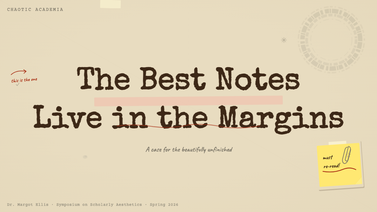
For presentation slides, Chaotic Academia works best when it is allowed to break the conventions of presentation design rather than simply texture them. A cover slide benefits from a collaged composition: layered paper grounds, a title set in a mix of typefaces as though the slide were a pinboard, decorative ephemera — a coffee-ring watermark, a sticky-note overlay — placed to interrupt the surface without obscuring the information. Content slides should resist the clean grid; instead, treat each slide as a working page with a dominant text zone and margins that can hold annotations, pull quotes, or index-card style call-outs. Data visualization can adopt a hand-drawn or typewriter quality — bars and lines that look sketched rather than generated — which reinforces the working-draft atmosphere without sacrificing legibility.在演示文稿中,当混沌学院风被允许打破演示设计的惯例而非仅仅为其增添质感时,效果最佳。封面幻灯片受益于拼贴构图:叠层纸张底色、仿佛这张幻灯片是一块公告板般混用字体排列的标题,以及打断表面却不遮挡信息的装饰性物件——咖啡圈水印、便利贴叠加层。内容幻灯片应当抵制整洁的网格;取而代之,将每张幻灯片当作一张工作页处理,有一个主要文本区和可以容纳批注、摘引或索引卡式提示框的页边。数据可视化可以采用手绘或打字机质感——看起来像草绘而非生成的柱条与折线——在不牺牲可读性的前提下强化工作草稿的氛围。
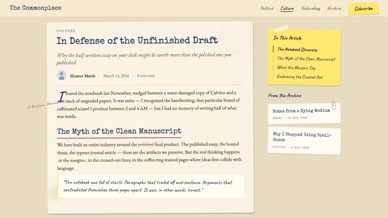
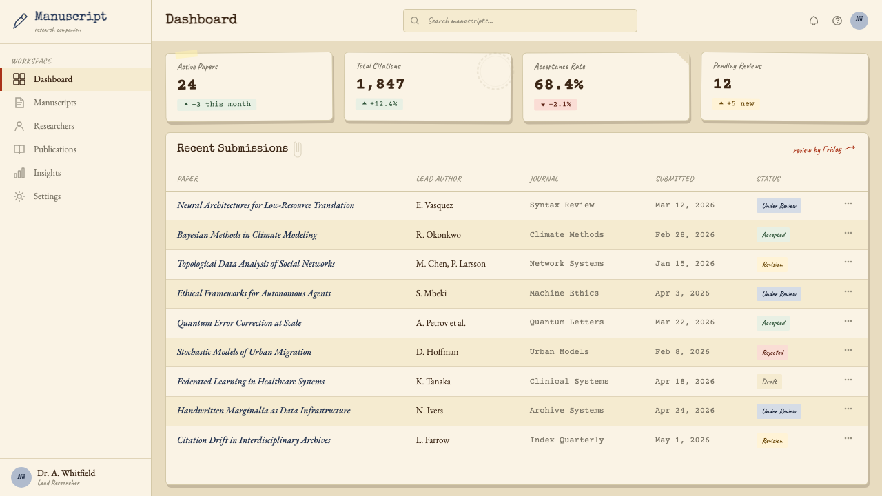
For web interfaces, the style suits editorial platforms, personal portfolios, note-taking or knowledge-management applications, and academic or research-adjacent products where the work itself is the primary value proposition. The implementation approach: use a warm off-white or light parchment background rather than pure white, introduce paper texture through a subtle overlay, set body text in a traditional serif typeface, and allow visual elements to break the grid slightly — a sidebar annotation that intrudes a few units into the main column, a pull quote that sits at a slight angle, a header that appears to have been stamped rather than typeset. Interactive states can invoke ink behavior: hover effects that look like underlines drawn by hand, focus states that suggest a pen circling an input field.对于网页界面,这种风格适合编辑平台、个人作品集、笔记或知识管理应用,以及学术或研究邻近型产品——在这些场景中,工作本身是核心价值主张。实现方式:使用温暖的米白色或浅羊皮纸色背景而非纯白,通过细微叠加引入纸张纹理,用传统衬线字体排列正文,并允许视觉元素轻微打破网格——略微侵入主栏的边注、以小角度偏转的摘引、看起来像被盖章而非排版的标题。交互状态可以模拟墨水行为:看起来像手绘下划线的悬停效果、暗示钢笔正在圈住输入框的焦点状态。
For editorial and marketing work, the aesthetic supports long-form content formats particularly well: journal-style articles, newsletters, reading lists, and research reports. The style provides a ready-made visual argument that the content has depth, that it rewards careful reading, and that it comes from a tradition of serious intellectual engagement rather than content-marketing optimization. Marketing pages can use the style to differentiate a product positioned around knowledge, learning, or creative process — a writing tool, an educational platform, an academic publisher's consumer-facing presence. The key is maintaining the density and warmth that give the style its authority; a Chaotic Academia marketing page that is too sparse or too clean loses its signal entirely.对于编辑与营销内容,这种美学特别适合长篇内容格式:期刊风格文章、电子报、阅读列表与研究报告。这种风格提供了一个现成的视觉论点:内容有深度,值得仔细阅读,来自严肃智识参与的传统,而非内容营销优化的产物。营销页面可以用这种风格区分一个以知识、学习或创作过程为定位的产品——写作工具、教育平台、学术出版商面向消费者的呈现。关键是维持赋予这种风格权威性的密度与温暖感;一个过于稀疏或过于整洁的混沌学院风营销页面会彻底失去它的信号。
A common mistake when applying this style is mistaking it for the Dark Academia palette and treating the brown-and-cream base as the entire aesthetic. Chaotic Academia's critical differentiator is not color but layering and accumulation — the suggestion of time passing across a surface. A composition in warm neutrals with clean organization is not Chaotic Academia; it is warm minimalism. The style requires visible process: multiple overlapping layers, type that appears to have been added at different moments, at least one element that seems to have been physically attached rather than designed. Designers who apply it without the layering typically produce something that feels vintage rather than intellectually alive.应用这种风格时最常见的错误是将其误认为暗黑学院风的调色板,把棕色与奶油色的基调当作这种美学的全部。混沌学院风的关键差异点不是色彩,而是层叠与积累——时间流逝于表面上的暗示。一个用温暖中性色组织整洁的构图不是混沌学院风,那是温暖极简主义。这种风格需要可见的过程:多个相互叠压的层次、看起来在不同时刻添加上去的文字、至少一个看起来像是被物理附着而非被设计进去的元素。不加入层叠地应用这种风格的设计师,通常会生产出一个感觉复古而非充满智识生命力的结果。
See the Chaotic Academia design system查看 Chaotic Academia 完整设计系统
Chaotic Academia — FAQChaotic Academia · 常见问题
How is Chaotic Academia different from Dark Academia?混沌学院风与暗黑学院风有何不同?
Dark Academia and Chaotic Academia share an academic subject matter and a preference for warm, aged tones, but they differ fundamentally in emotional register and visual logic. Dark Academia is theatrical and aspirational: it curates the romantic image of scholarly life — gothic libraries, candlelight, moody portraiture, the beautiful sorrow of intellectual pursuit. Its compositions are deliberately staged and emotionally heightened. Chaotic Academia is anti-theatrical: it refuses the staging in favor of the working reality, prioritizing the visible mess of genuine intellectual labor over any curated image of what scholarship should look like. The distinction is the difference between a photograph of a scholar at a desk and a photograph of the desk after the scholar has left.暗黑学院风与混沌学院风共享学术题材和对温暖陈旧色调的偏好,但两者在情感基调和视觉逻辑上有根本差异。暗黑学院风是戏剧性的、充满抱负感的:它策展的是学术生活的浪漫图像——哥特式图书馆、烛光、情绪化的肖像画、智识追求中美丽的忧郁。它的构图是刻意布置的、情感上被拔高的。混沌学院风是反戏剧性的:它拒绝布景,偏向工作现实,将真实智识劳动的可见混乱置于任何关于学术应当是什么样子的策展图像之上。两者的区别,是学者坐在书桌前的照片与学者离开后书桌的照片之间的区别。
Can Chaotic Academia work in a clean digital interface without actual texture?混沌学院风能在没有实际质感的干净数字界面中发挥作用吗?
It can, but only partially, and it requires a clear-eyed decision about which aspects of the aesthetic to prioritize. The warmth of the palette — off-white backgrounds, ink-tone accents, serif typography — can be applied in a clean, texture-free interface and will produce something warm and readable without being visually demanding. What gets lost is the layering and time-accreted quality that gives the style its strongest signal. A clean Chaotic Academia-derived interface reads more as 'warm editorial' or 'scholarly serif' than as Chaotic Academia proper. If the product context makes heavy texture inappropriate — a productivity tool, a data-dense dashboard — the warm editorial variant is a defensible choice. Just be honest about what the style is actually delivering.可以,但只能部分实现,且需要对优先保留哪些美学方面做出清醒的决定。调色板的温暖感——米白色背景、墨水色调强调色、衬线字体排印——可以在干净、无质感的界面中应用,产生温暖可读而视觉上不过分繁复的结果。失去的是赋予这种风格最强信号的层叠与时间沉积品质。干净的混沌学院风衍生界面读起来更像「温暖编辑风」或「学术衬线风」,而非真正的混沌学院风。如果产品场景使得厚重质感不适合——生产力工具、数据密集型仪表板——温暖编辑风变体是合理的选择,只需诚实面对这种风格实际上在传递什么。
Is there a risk of the style looking messy rather than productively chaotic?这种风格有没有看起来只是杂乱而非创造性混沌的风险?
Yes, and this is the central execution challenge of the style. The difference between productive chaos and plain mess is legibility of system: in an authentic Chaotic Academia composition, a viewer can sense — even if they cannot articulate — that the disorder has an underlying logic, that the accumulation is the product of a mind at work rather than inattention. This requires that the primary hierarchy of information remain clear regardless of the surrounding density, that every layered element can be traced to a plausible reason for its presence, and that the chaos operates within a consistent tonal and textural range. Disorder that fails all three tests reads as mere carelessness. The discipline of the style is knowing exactly how far to push the density before it tips from alive to unreadable.是的,这是这种风格执行上的核心挑战。创造性混沌与普通杂乱之间的区别是系统的可读性:在真实的混沌学院风构图中,观看者能够感受到——即使无法言明——混乱有其潜在逻辑,积累是一个运转中的思维的产物,而非疏忽大意。这要求信息的主要层级在周围密度之中保持清晰,每个叠加元素都能追溯到其存在的合理原因,且混沌在一致的色调与质感范围内运作。未能通过这三项测试的混乱读起来只是粗心大意。这种风格的自律在于精确判断密度可以推进到哪里,在从充满生命力到无法阅读之间的临界点之前止步。
What kinds of products or brands should avoid this aesthetic?哪些类型的产品或品牌应该避免这种美学?
Chaotic Academia is poorly suited to contexts where speed, precision, and transactional efficiency are the dominant values. A financial platform, a logistics dashboard, a healthcare application, or an e-commerce checkout flow all depend on the user's immediate trust that the system is under control and that important information will not be obscured. The style's density and deliberate imprecision actively undermine these needs. Similarly, brands positioned on cleanliness, hygiene, or physical wellness — food products, personal care, medical devices — rely on an aesthetic language of order and clarity that Chaotic Academia directly contradicts. The style is strongest where the product's value is tied to depth, process, learning, or creative work; it is weakest where the product's value depends on speed, precision, or the reassurance of perfect order.混沌学院风不适合速度、精准与交易效率是主导价值的场景。金融平台、物流仪表板、医疗应用或电商结算流程,都依赖用户对系统处于掌控之中、重要信息不会被遮挡的即时信任。这种风格的密度与刻意的不精确性会主动破坏这些需求。同样,以清洁、卫生或身体健康为定位的品牌——食品产品、个人护理、医疗设备——依赖混沌学院风直接矛盾的秩序与清晰的美学语言。这种风格在产品价值与深度、过程、学习或创作工作挂钩时最为有力;在产品价值依赖速度、精准或完美秩序的安慰感时则最为薄弱。
How do you age a digital composition without it looking like a cliché vintage filter?如何为数字构图增添岁月感,而不让它看起来像是陈腐的复古滤镜?
The distinction lies in specificity and restraint. Vintage filters apply aging uniformly across an image — the same vignette, the same grain, the same color shift applied to everything simultaneously. Authentic time-accreted texture in Chaotic Academia is local and varied: a coffee ring appears in a specific corner because something was placed there, a margin annotation is heavier on one page than another because that page received more attention, an edge is torn rather than cropped because something was physically removed. To evoke this digitally, apply texture selectively rather than globally, introduce imperfections at specific points of visual interest rather than across the entire surface, and ensure that each aging element can be rationalized as the trace of a specific action rather than the application of a filter. The goal is archaeology, not antiquing.区别在于特殊性与克制。复古滤镜将老化均匀地应用于整张图像——同样的暗角、同样的颗粒感、同样的色偏同时施加于所有内容。混沌学院风中真实的时间沉积质感是局部的、多样的:咖啡圈出现在特定角落,因为有东西曾被放在那里;边注在某一页比另一页更厚重,因为那一页受到了更多关注;边缘是撕裂的而非裁切的,因为有什么东西被物理地移除了。要在数字作品中唤起这种效果,需要选择性而非全局性地应用质感,在特定视觉兴趣点而非整个表面引入不完美,并确保每个老化元素都能被解读为特定行为的痕迹,而非滤镜的应用。目标是考古,而非做旧。
Related design styles相关设计风格
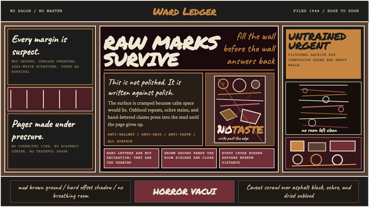 Art Brut (Dubuffet, 1948)Rawness crowds the frame. Mud brown, oxblood marks, and hand scrawl erase the…粗粝填满画面:泥棕底、牛血红刻痕与手写体挤压边缘。
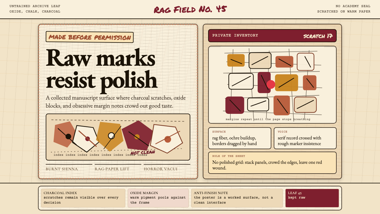 Art Brut (Dubuffet)Polish is refused. Bone-cream paper, earth pigments, scratched borders, dense…拒绝精致。骨白纸、大地颜料、刮痕边框和密集页边。
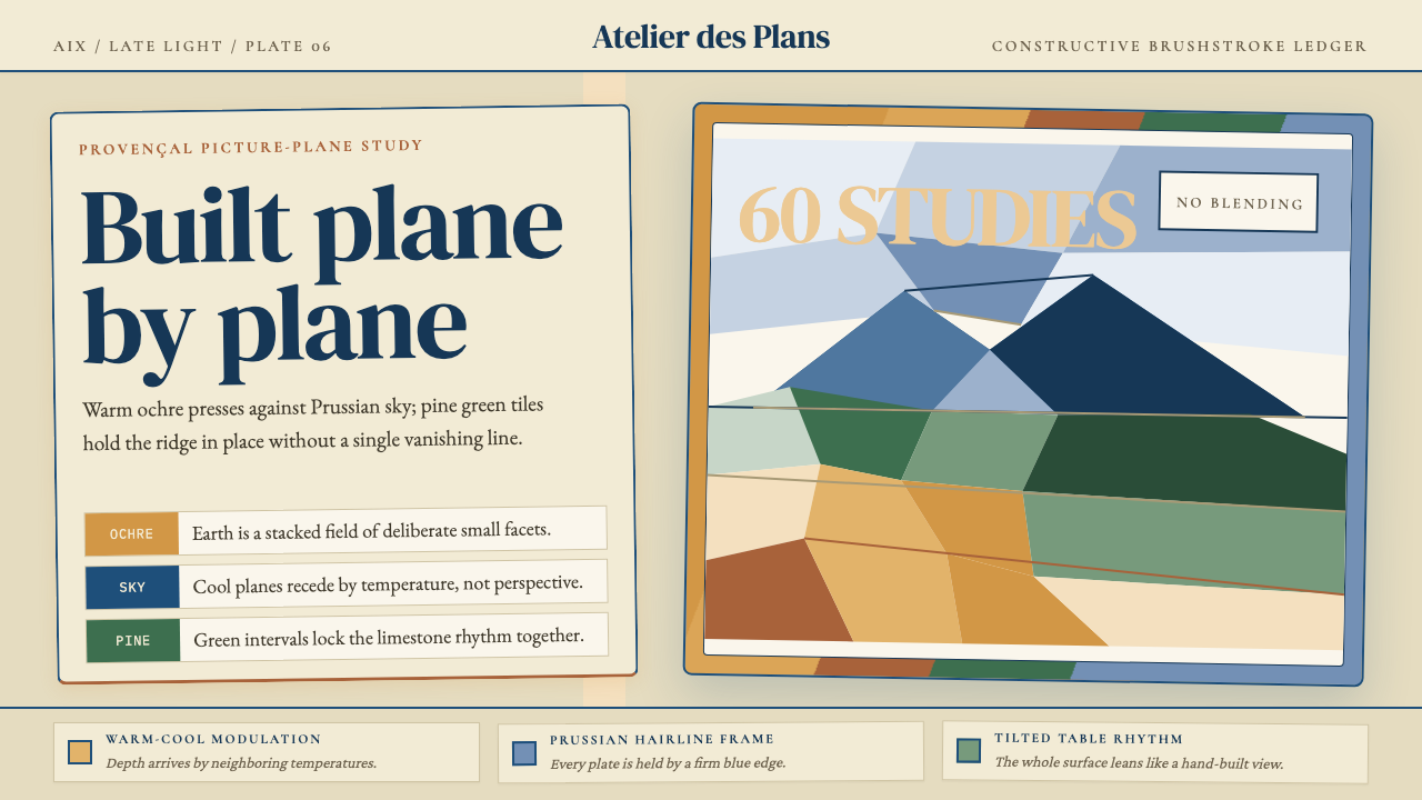 Cézanne — Mont Sainte-VictoireBuilt, not blended. Ochre, Prussian blue, and pine facets tilt into a constru…不描摹,只建构:赭黄、普鲁士蓝与松绿小色面倾斜成山。
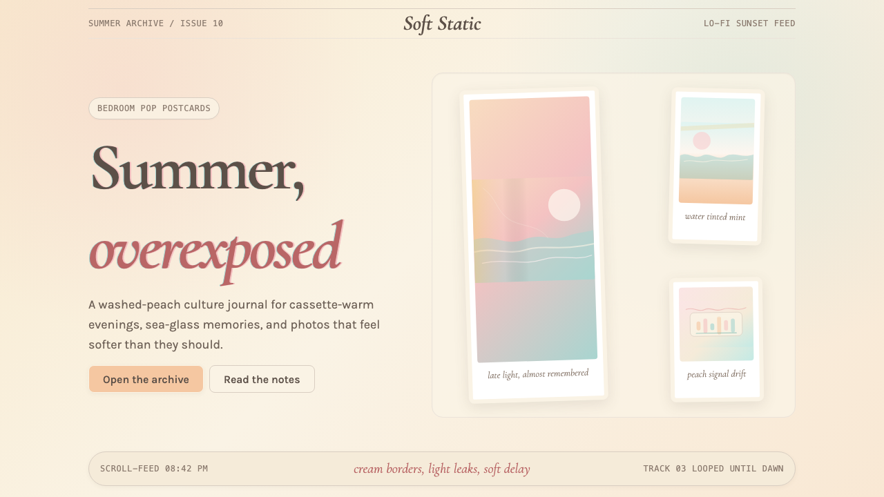 Chillwave TumblrA summer that never happened. Cream Polaroids, washed peach, and turquoise li…从未发生的夏天:奶油宝丽来、褪色蜜桃与松石漏光。
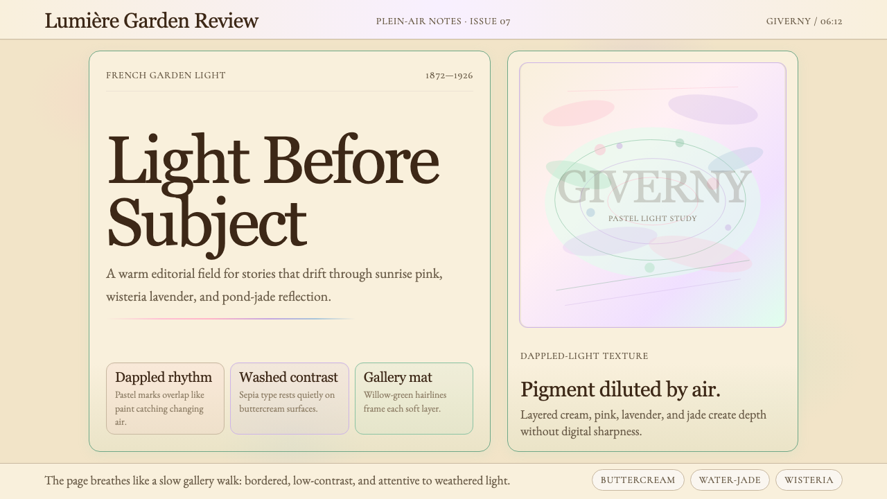 Claude Monet ImpressionistLight becomes the subject. Buttercream, pastel dapples, and Cormorant serif s…光成为主题。奶油底、粉彩斑点与Cormorant衬线柔化画面。
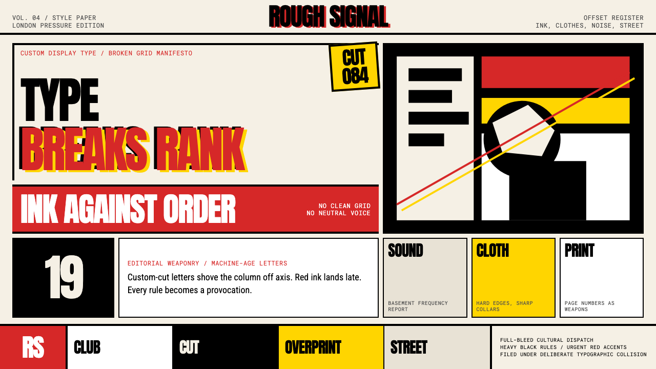 Neville Brody The FaceType mutinies on paper. Cream stock, black rules, urgent red overprint, broke…文字在纸上叛变:奶油纸、黑粗线、急促红色套印和破碎网格。