What is Superstudio Continuous Monument?
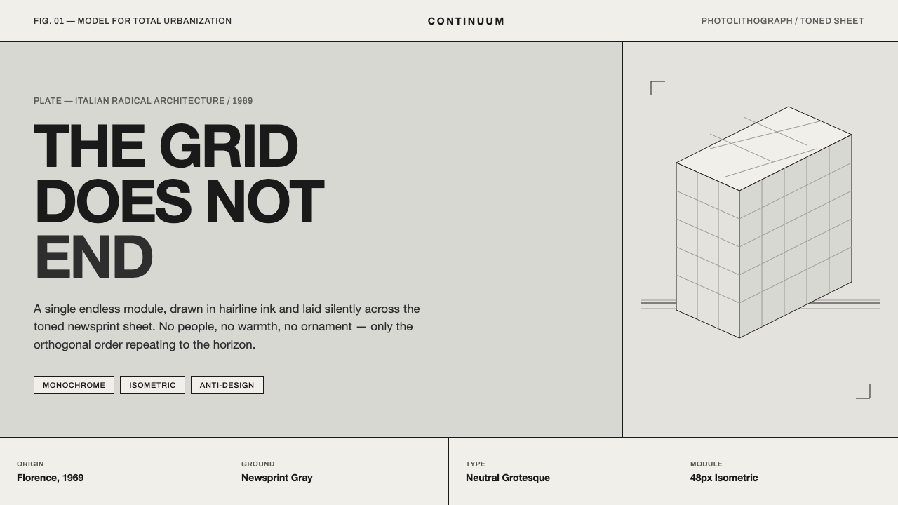
Superstudio’s Continuous Monument turned the endless grid into a calm architectural threat: a black isometric lattice stretching over every landscape, leaving no room for escape or ornament.
Superstudio Continuous Monument in brief
Superstudio’s Continuous Monument is a defining image of Italian radical architecture, conceived in Florence in 1969 and developed through the early 1970s. It imagines an endless white-and-black gridded megastructure collaged across real landscapes. The result is less a conventional building than a total visual proposition: architecture extended until it becomes a continuous condition.
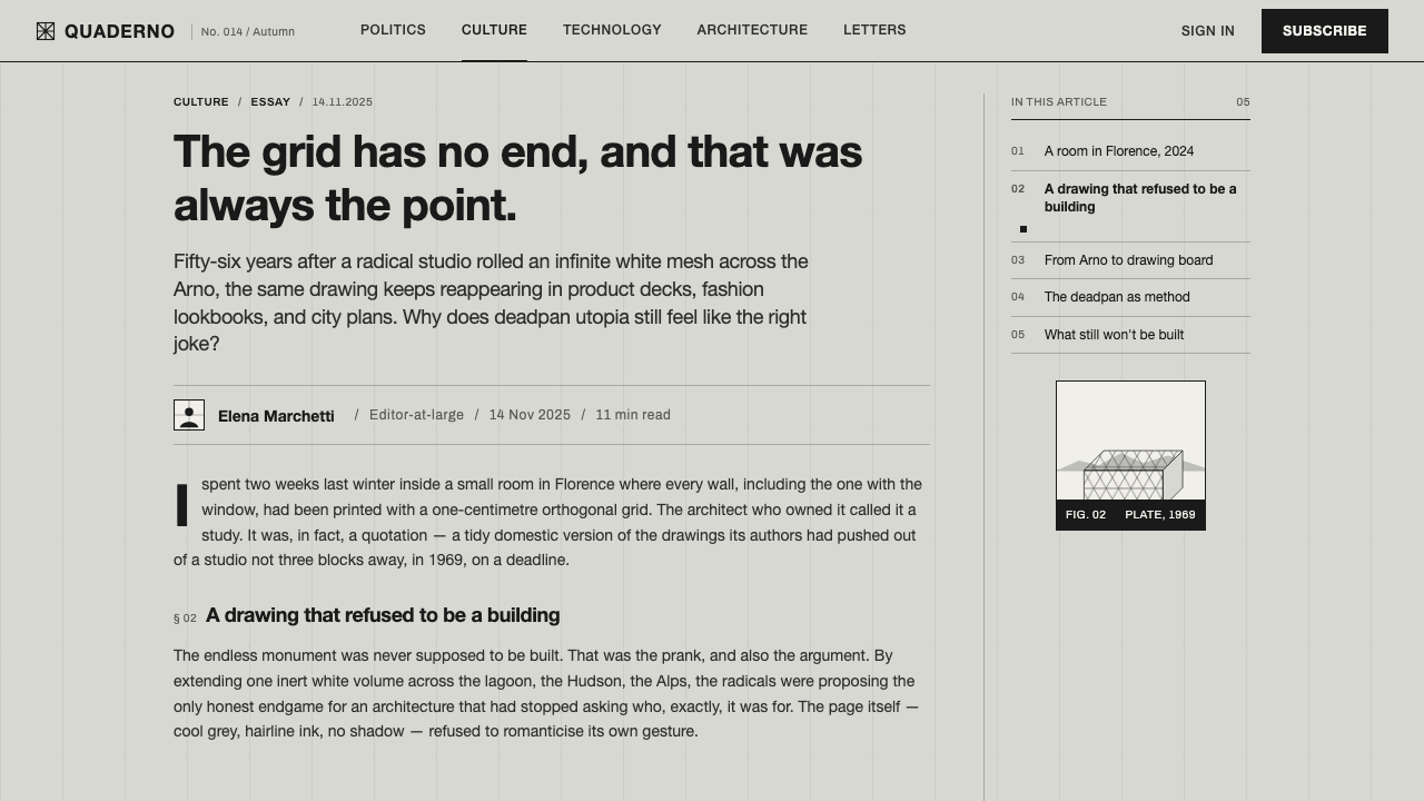
Its visual language is deliberately deadpan. Hairline black ruling sits on toned newsprint-gray or archival-paper grounds, forming a fine isometric grid whose order appears to continue beyond the frame. Helvetica grotesque captions remain flat, compact, and emotionally neutral. The image feels like a photolithograph: cool, printed, controlled, and resistant to decorative atmosphere.
As an interface style, Continuous Monument extracts that silent infinity into a disciplined system of panels, rules, captions, and monochrome surfaces. It balances utopia and dystopia without resolving the tension. The grid promises total order, yet its endlessness can feel impersonal and oppressive. Nothing is softened to make the system friendlier; the severity is the point.
Where does Superstudio Continuous Monument come from?
The project belongs to Florence’s culture of Italian Radical Architecture and is associated with Superstudio, with Adolfo Natalini and Cristiano Toraldo di Francia named among its key figures. Its historical position is defined by a refusal to treat architecture only as the production of useful objects. The image instead uses architecture as a conceptual instrument for questioning total order, repetition, and the shape of the built environment.
Continuous Monument also sits within anti-design and conceptual or paper architecture. These labels matter because the work operates through an idea rendered as an image. The gridded megastructure does not need to be built in order to exert architectural force. Its power comes from the collision between an abstract, perfectly ordered system and the irregular reality of landscapes over which that system is placed.
The collage is central to the project’s meaning. A continuous black-and-white grid is not shown in isolation; it is superimposed on real scenery, making the contrast between constructed order and existing terrain impossible to ignore. The landscape gives the monument scale and consequence, while the monument turns the landscape into a field governed by an apparently neutral rule.
The contemporary design system translates this conceptual image into interface terms. Toned gray grounds become the field, hairline black rules become the primary structure, isometric panels become the spatial vocabulary, and flat Helvetica captions provide the voice. The translation preserves the source’s printed, archival character and its deliberate refusal of warmth, flourish, and visual excess.
What defines the Superstudio Continuous Monument look?
Monochrome Field
The palette is restricted to black and toned newsprint-gray. Gray carries the atmosphere of archival paper rather than a polished digital surface, while black provides every rule, caption, and structural mark. The absence of chromatic accent makes hierarchy depend on position, density, contrast, and repetition.
Hairline Ruling
Lines are fine, continuous, and structural. They should read as ruling on a printed plate, not as expressive illustration. Their restraint allows the grid to recede and advance at once: quiet enough to support information, persistent enough to make the whole composition feel governed.
Isometric Geometry
Isometric construction replaces ordinary perspective with a measured, diagrammatic space. Panels, surfaces, and directional divisions appear to belong to one continuous system. The geometry should feel extendable beyond the visible frame, as if every edge continues into an architectural field that has no final boundary.
Deadpan Typography
Helvetica grotesque captions are flat, compact, and unadorned. Typography behaves like an annotation layer rather than a theatrical voice. Clear hierarchy comes from scale, placement, and density, while the type remains emotionally neutral enough to preserve the work’s conceptual distance.
Printed Toning
The gray ground should feel toned, fibrous, and slightly historical, recalling archival paper and photolithographic reproduction. This is not a decorative texture applied on top of a digital layout. It is the visual field that makes the black grid feel printed, physical, and quietly persistent.
Utopian Severity
The system holds utopian order and dystopian impersonality in the same frame. Repetition suggests universal structure, but the lack of warmth makes that structure feel imposing. Soft decoration, friendly illustration, and ornamental personality would weaken the essential ambiguity.
Who shaped Superstudio Continuous Monument?
Adolfo Natalini is named among the key figures connected with Superstudio and the Continuous Monument. His place in this article is less that of a conventional stylist than of an author within Italian Radical Architecture, where architecture becomes a vehicle for conceptual propositions. The system’s severe grid, endless extension, and tension between landscape and megastructure belong to that intellectual territory.
Cristiano Toraldo di Francia is also identified as a key figure of Superstudio. The visual system draws from the project’s collective language: black ruling, isometric order, paper-based presentation, and a megastructure imagined beyond ordinary architectural limits. His association helps place the style within Florence’s radical and conceptual design culture.
Superstudio is the collective name attached to Continuous Monument and the broader visual proposition it represents. The collective’s importance here lies in treating architecture as an image capable of reorganizing the world conceptually. The interface adaptation keeps that collective authorship visible through a system that is impersonal, repeatable, and larger than any single decorative gesture.
How do you use Superstudio Continuous Monument today?
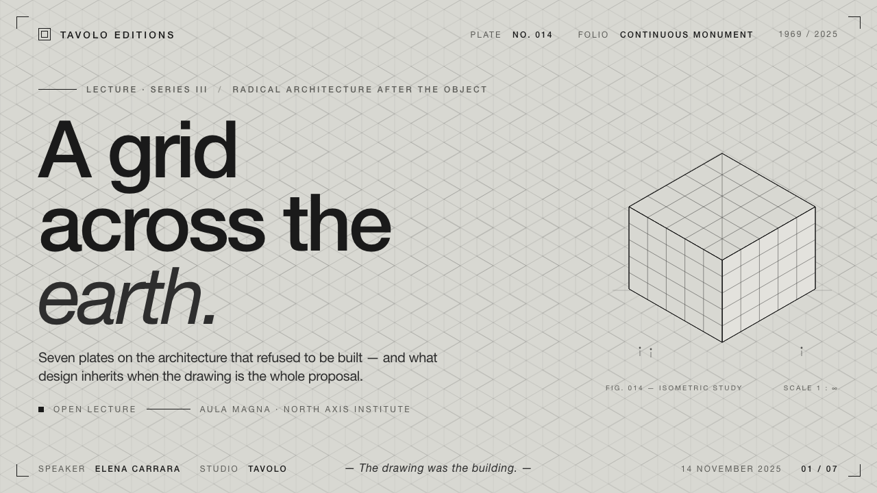
For presentation slides, use the cover as an architectural field: toned gray paper, a restrained black isometric construction, and a deadpan Helvetica title placed as though it were a caption on a technical plate. Content slides should let rules organize reading rather than decorate the page. Data slides can treat charts, tables, and metrics as gridded surfaces, with contrast and position carrying hierarchy in place of color. The grid should appear capable of continuing beyond the slide edge.
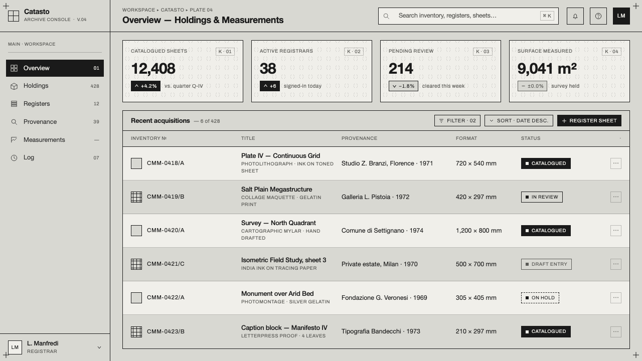
For web interfaces, the style suits dashboards, analytical tools, and pricing pages that need authority without visual warmth. Build information into ordered isometric panels, use hairline rules to separate states and categories, and keep captions compact and factual. Pricing tiers can be distinguished through spatial arrangement, tonal contrast, and the density of their supporting information. Interactive emphasis should remain within the black-and-gray system so that the interface does not break its conceptual frame.
For editorial and marketing work, treat each page as a printed architectural plate. Articles can pair narrow text blocks with expansive ruled fields, captions, and landscape imagery interrupted or overlaid by the continuous grid. Marketing pages can use the monument’s striking contradiction: a calm archival ground carrying a structure that feels impossibly large. The tone is strongest when copy remains precise and declarative rather than conversational or sentimental.
A common mistake is to use the grid as a decorative pattern while allowing the rest of the design to behave like a friendly contemporary interface. Bright accent colors, soft shadows, rounded visual language, expressive display type, and ornamental imagery all dilute the source. Another mistake is making every line equally loud. The system depends on quiet structure, selective density, and enough empty gray field for the grid to feel endless rather than merely crowded.
Superstudio Continuous Monument — FAQ
Is Continuous Monument simply a minimalist grid style?
No. Its reduction is conceptual as much as visual. The grid represents an architectural proposition about total order and endless extension, while the toned paper and deadpan typography preserve the character of a historical image. A generic minimalist interface may remove elements for clarity; Continuous Monument makes the governing system itself the subject.
Can this style use accent colors?
The supplied system is defined by strict black-on-gray monochrome, so color should not be treated as a casual enhancement. Adding chromatic accents changes the visual logic and weakens the archival, photolithographic reading. If a product requires color for meaning or accessibility, it should be introduced as a deliberate functional exception rather than as decoration.
How should imagery be handled?
The source image collages the gridded megastructure over real landscapes, so imagery should remain spatially consequential rather than ornamental. A photograph or landscape can act as the terrain beneath the system, while the grid provides the imposed architectural order. Cropping, captions, and overlays should preserve the sense that the structure continues beyond the visible frame.
What kinds of products suit the style best?
It suits products that value conceptual authority, architectural order, and analytical clarity: dashboards, cultural platforms, research tools, presentations, and editorial systems. It is less suitable when the product depends on warmth, softness, playfulness, or intimate emotional expression. The style’s lack of warmth is not a defect, but it must align with the product’s intended character.
Related design styles
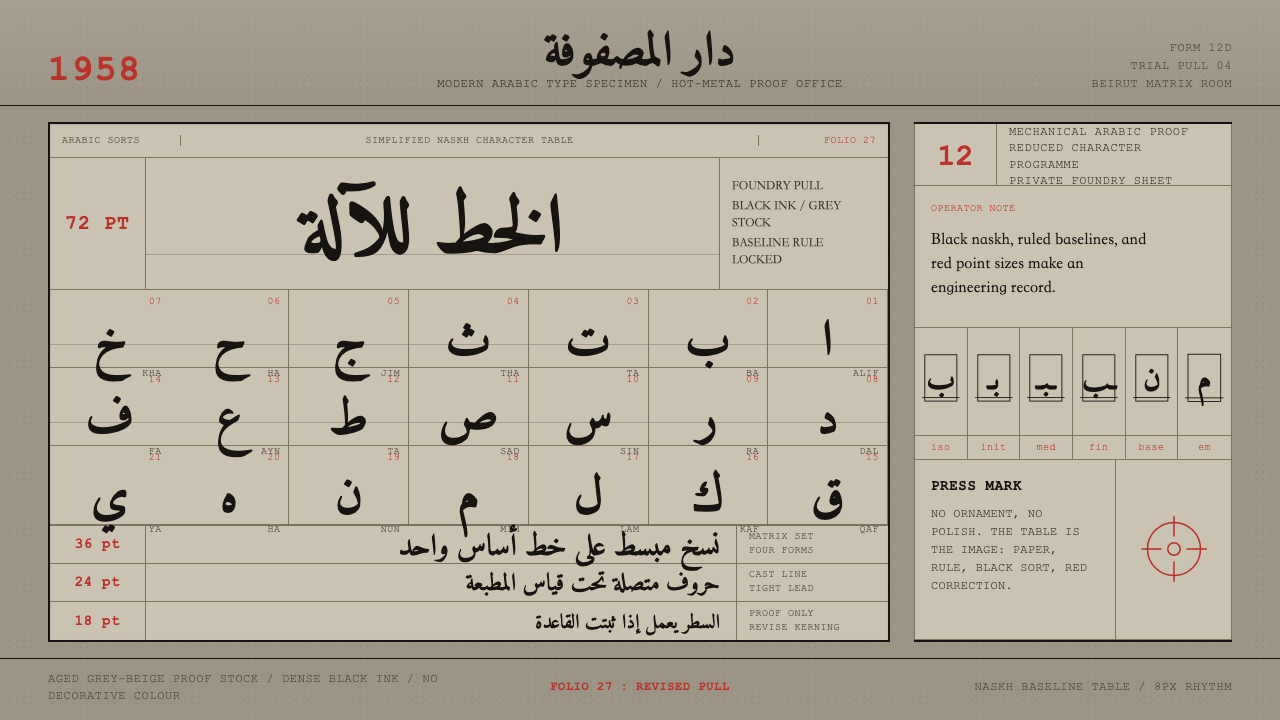 Modern Arabic Type SpecimenDry proof-sheet gravity. Black naskh grids on aged grey-beige, cut by red fol…
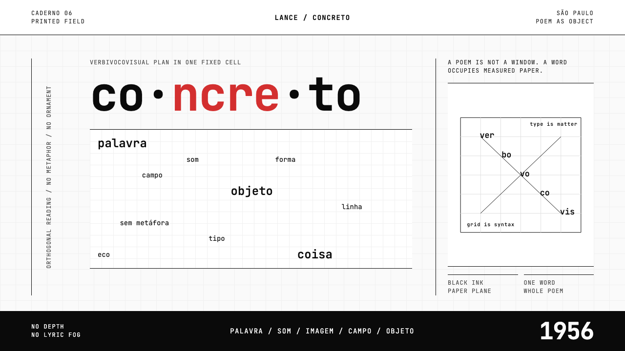 Brazilian Concrete PoetryWords become objects. Monospace cells, black-white paper, one cadmium red rup…
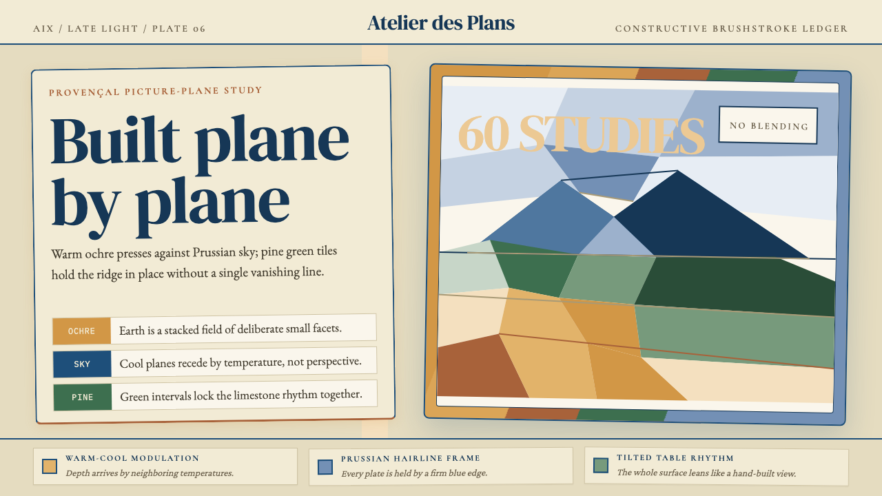 Cézanne — Mont Sainte-VictoireBuilt, not blended. Ochre, Prussian blue, and pine facets tilt into a constru…
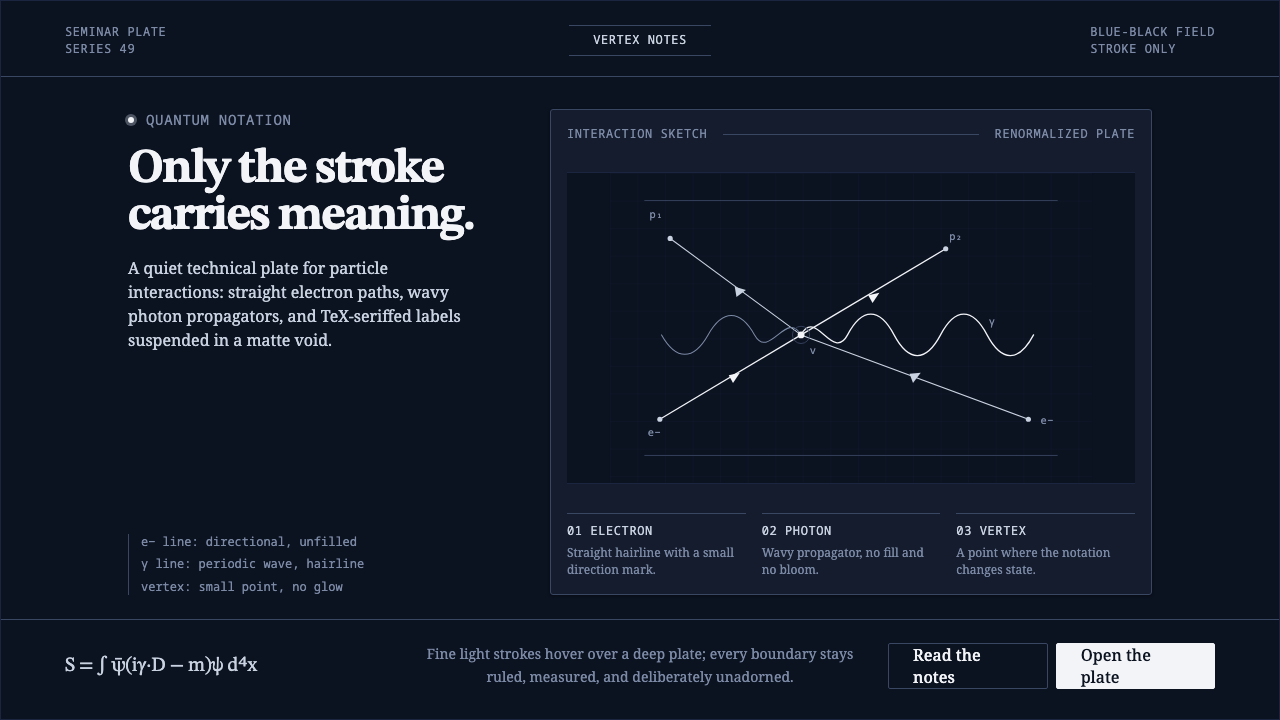 Feynman Diagram QEDMeaning reduced to strokes. Pale QED lines and TeX serif type float on blue-b…
 Op Art (Riley / Vasarely)Perception is engineered. Black-white grids and primary signals make static g…
 Sol LeWitt ConceptualInstruction becomes art. Mono certificates face wavering graphite grids in fo…