What is Orbital Solar Relay?
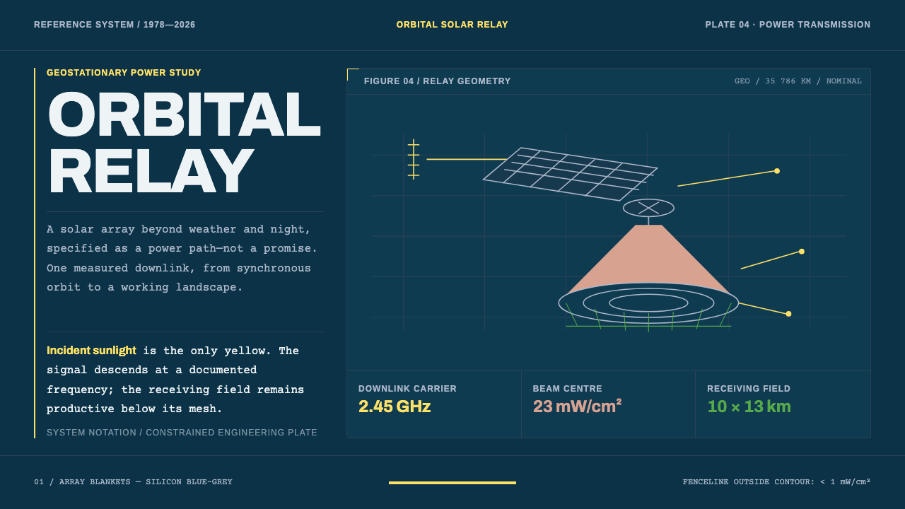
Orbital Solar Relay rebuilds a 1970s engineering plate: single-weight axonometric drawings and bold report headings on deep orbital navy, with yellow reserved for sunlight and beam power.
Orbital Solar Relay in brief
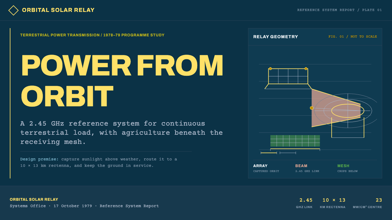
Orbital Solar Relay is a design style drawn from the technical documentation of space-based solar power: the idea of collecting sunlight in orbit and beaming it to the ground as microwaves. It follows the way the concept has been drawn since 1978, in single-weight axonometric figures and engineering plates set onto the deep navy of orbital night.
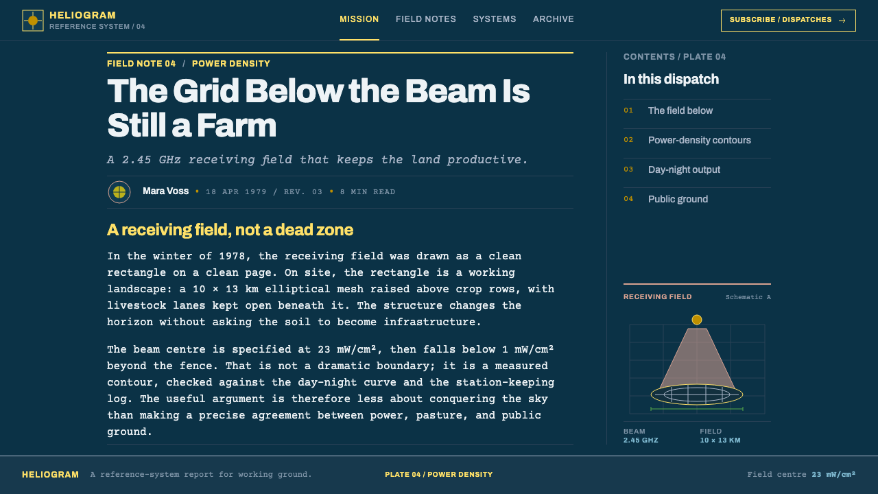
The style is deliberately unglamorous. Its content is specific, technical and numbered. A microwave beam at 2.45 gigahertz arrives at an elliptical receiving antenna roughly ten by thirteen kilometres across, with power density of about twenty-three milliwatts per square centimetre at the centre of the beam and under one outside the fenceline. The receiving antenna, called a rectenna, is a semi-transparent mesh held up on posts, so crops keep growing and livestock keep grazing beneath it.
Typography does most of the work. Headings take the heavy, Helvetica-style hierarchy of a US federal reference report; body copy takes the even, slightly uneven look of typewritten text, as if typed on an IBM Selectric. Yellow belongs to incident sunlight and beam-power callouts, while the solar arrays themselves stay silicon blue-grey, as they do in the 1970s concept paintings. There are no death rays and no showy 3D renders, only a serious engineering document.
Where does Orbital Solar Relay come from?
The idea of collecting solar power in orbit and sending it to Earth is usually traced to Peter Glaser, who put forward the concept in 1968. The attraction was simple: in orbit, sunlight is uninterrupted by night, cloud and atmosphere, so a collector there could in principle supply energy around the clock. The difficulty was equally simple. Everything depended on structures of enormous size, on launching mass cheaply, and on moving power safely through space and air without a cable.
The drawing language that this style rebuilds belongs to the US Department of Energy and NASA's Satellite Power System programme, which ran from 1977 to 1980 and whose Reference System Report appeared in October 1978. A reference system, in engineering usage, is a baseline design: one agreed configuration against which alternatives are measured. The report that described it was a typical late-1970s federal technical document, with numbered figures, tables, bold headings and typewritten text set in a clean grid. The concept paintings produced alongside the programme show enormous arrays of silicon cells in blue-grey, a transmitting antenna, and an unobtrusive ground station.
Microwave power transmission engineering supplies the second pillar of the look. Sending energy by beam requires a transmitting antenna in orbit and a rectifying antenna on the ground, and the design problem is as much about safety as efficiency: the beam must be strong enough to deliver useful power yet weak enough outside a fenced zone to be harmless. That is why callouts on these plates insist so strongly on numbers and boundaries. The style inherited the habit of putting the safety case on the drawing itself.
After decades of dormancy the concept has returned. From 2022 to the present, renewed attention in the United States and Europe has put space-based solar power back on the agenda, with John Mankins associated with earlier NASA concept studies and Sanjay Vijendran with recent work in Europe. These were studies and reference designs, not hardware in service. That is part of the style's character: it is the visual language of a plan carefully worked out on paper, not of a finished machine.
What defines the Orbital Solar Relay look?
Orbital Navy Ground
The ground is a deep, slightly blue navy, the colour of orbital night in a printed plate. It is flat and matte, with no stars scattered across it and no glow. Its job is to be the sheet on which everything else is drawn, so it stays quiet and dark enough for thin lines and small type to read clearly.
Single-Weight Axonometric Line
Drawings are axonometric, with parallel edges and no perspective convergence, and they are rendered in one line weight throughout. Structures are shown by outline, with no fills for shading and no gradients for volume. The effect is a drawing meant to be measured rather than admired, and it reads as diagram first and picture second.
Federal-Report Headings
Headings follow the heavy grotesque hierarchy of a US government technical report: bold, plain, confident, set in a clear ladder of sizes with generous space above. There is no display flourish. The tone is institutional and trustworthy, a voice that has nothing to prove and a great many figures to present.
Typewriter Body
Body copy is set in a typewriter face, with the slight unevenness of spacing preserved rather than corrected, as if typed on an IBM Selectric. It gives the page a documentary warmth and a sense of paperwork, and it separates running text from the bold headings and the drawings. Paragraphs are kept short so that the monospaced rhythm stays comfortable.
Yellow Means Power
Yellow has a strict meaning: incident sunlight and beam-power callouts. It never appears as decoration or as a generic accent. This rule makes the colour carry information, so that a reader can find every flow of energy in a diagram by scanning for yellow alone. Outside those uses, the palette stays blue-grey and pale.
Silicon Blue-Grey Arrays
The solar arrays are rendered in the grey-blue of silicon cells, just as the 1970s concept paintings show them. This colour is a historical fact of the genre, not a stylistic choice to be brightened. It keeps the arrays cool, technical and slightly muted, so that the yellow of the sunlight reads clearly against them.
Numbers on the Plate
Every figure carries its labels, callouts and measured values, and the content is specific rather than suggestive. Fence lines, beam centres and dimensions are all written on the drawing. For a designer, the principle is that annotation is part of the picture: an unlabelled diagram is incomplete here, and a labelled one is the whole point.
Who shaped Orbital Solar Relay?
Glaser is the engineer usually credited with proposing the solar power satellite in 1968. His name anchors the genre's starting point and the ambition behind it: collect sunlight where it never sets and send it down. The visual style that grew out of the idea inherits his framing, in which the concept is argued through diagrams and numbers rather than through spectacle.
Mankins is associated with later NASA concept studies of space-based solar power. His place in the reference set stands for the continuity of the idea after the first programme ended: the same basic architecture of orbital collection, microwave transmission and ground receiving, revisited with newer technology.
Vijendran is associated with recent European work on space-based solar power, part of the renewed interest running from 2022 to the present. He represents the contemporary revival of the subject, which makes the 1978 look newly relevant: the old plates are being redrawn for a new audience who needs the same clarity about sizes, powers and safety.
How do you use Orbital Solar Relay today?
Orbital Solar Relay is a style for communicating technical seriousness. It suits any content that needs to feel measured, evidence-based and institutional, and it works because it refuses spectacle. Its strengths show most in documents, diagrams and data-heavy surfaces.
On presentation slides, covers work as engineering title plates: a deep navy field, a bold report-style heading, a small typewritten subtitle and one single-weight axonometric figure at one side. Content slides use the typewriter face for short notes and the bold heading ladder for structure, with numbered figures. Data slides are the style's home ground: chart axes in thin blue-grey lines, series in pale tones, and yellow reserved for the one quantity that represents energy or power.
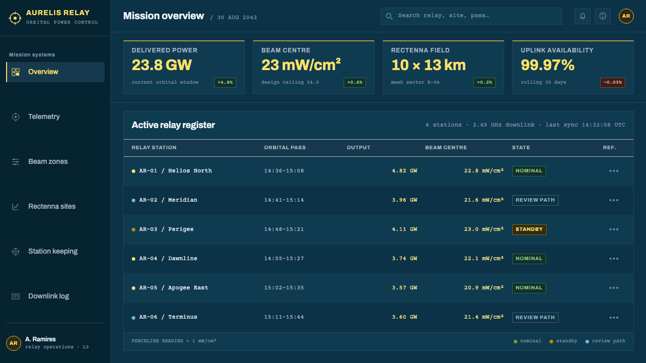
In web interfaces, the style suits documentation sites, infrastructure and energy dashboards, research portals, status pages and developer tools for hardware, space or grid systems. Keep the navy ground, use bold headings for hierarchy, put callouts in the typewriter face, and mark live power or throughput values in yellow. Buttons and inputs should be flat outlines. Pricing and plan tables work well when presented like an engineering parameters table, with labelled rows and plain values.
For editorial and marketing work, the style fits whitepapers, investor and policy briefings, technical journalism, explainers about energy and space, and brands that want to project competence over hype. Layouts should look like pages of a reference report: numbered sections, captioned figures, running heads and wide margins. The tone is one of showing the working, which makes claims feel earned rather than asserted.
The common mistake is turning the style into science fiction. Glowing beams, lens flares, neon gradients, rounded futuristic type and glossy 3D renders all contradict its premise, since the whole look depends on engineering restraint. Another is using yellow as a general highlight, which removes its meaning; and another is setting long documents entirely in the typewriter face, which tires the eye. Let the headings and the drawings carry the structure, and keep the monospaced text short.
Orbital Solar Relay — FAQ
Is this a science-fiction style?
No. Although the subject is in orbit, the visual language is that of a 1970s federal engineering report: plain drawings, bold headings, typewritten text and measured values. It communicates credibility rather than wonder. Science-fiction treatments such as glow, lens flare and sleek 3D would undermine it.
What is a rectenna, and why does it matter to the look?
A rectenna is a rectifying antenna that converts the incoming microwave beam into electricity. In the reference design it is a semi-transparent mesh on posts, so land beneath it can still be used for crops and grazing. Visually, it explains the style's insistence on openness and safety callouts: the receiving field is drawn as a light grid with the fenceline and power values marked.
Why use a typewriter face for body text, and is it readable?
A typewriter face reproduces the typed pages of a late-1970s report and gives the layout its documentary character. It is readable for short passages, labels and notes, but tiring across long articles because of its even, wide spacing. Keep paragraphs short, keep line lengths moderate, and give long reading to a calmer text setting if the page requires it.
Was space-based solar power ever built?
No full-scale system has been built. The concept was proposed in 1968 and studied in depth by the US Department of Energy and NASA between 1977 and 1980, with the Reference System Report published in 1978. Interest has revived since 2022, particularly in the United States and Europe. The style depicts a studied proposal, not an operating plant.
Can I use yellow as a general accent colour in this style?
It is better not to. Yellow means incident sunlight and beam power, and its value comes from that exclusivity. If you use it everywhere, a reader can no longer trust it as a signal. When you need another emphasis, use weight, size, or a pale blue-grey tint, and keep yellow for the quantities that represent energy.
Related design styles
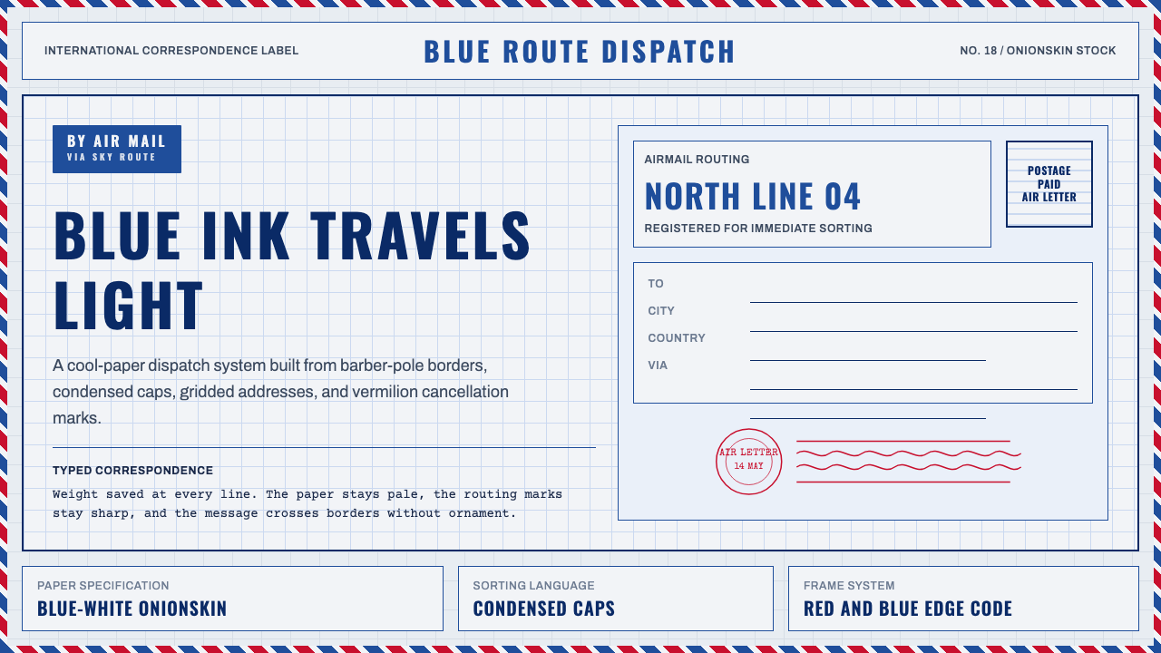 Par Avion Air MailPostal lightness made strict. Onionskin blue, Oswald caps, and red-blue edge…
 Olivetti LetteraEngineered, never styled. Grey-green enamel, precise type blocks and one red…
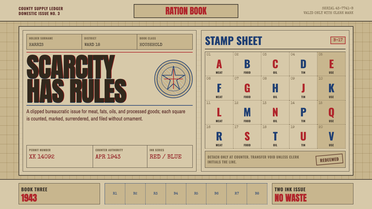 Wartime Ration CouponScarcity made visible. Buff card, red-blue overprint, and perforated grids do…
 Wikipedia (2001)Content needs no ornament. Black serif text, gray hairlines, and blue links e…
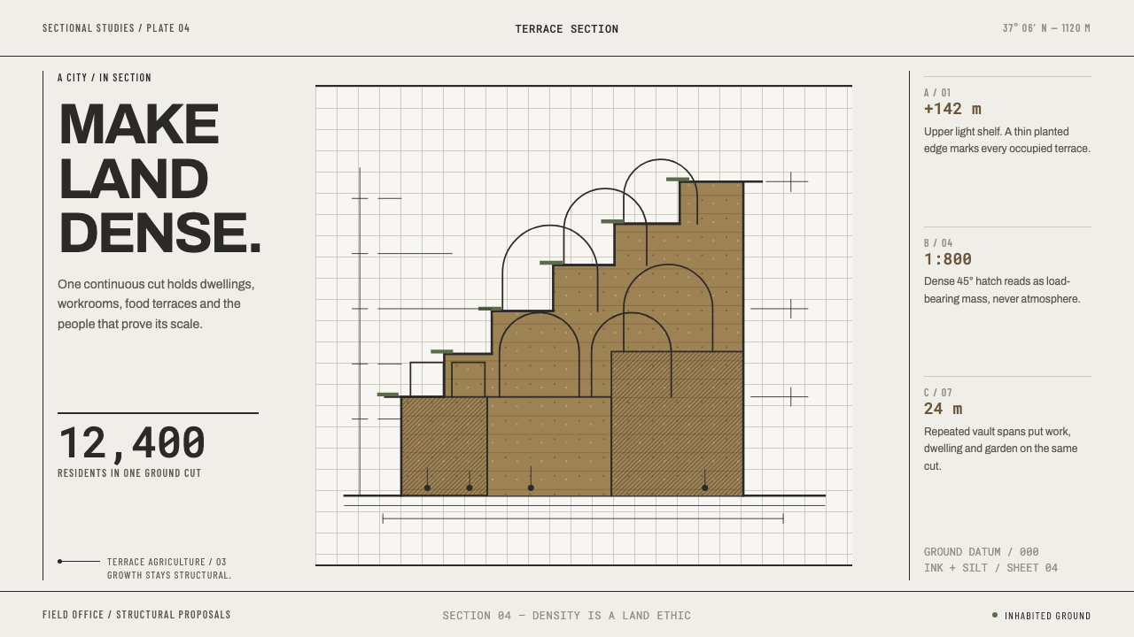 Arcology Section DrawingDensity makes a land ethic. Ink-cut terraces and silt ochre turn a city into…
 Brazilian Bossa Nova Cool 1958Twilight cool. Ocean blue, sand-gold Inter, one black silhouette with LP-slee…