What is Data Humanism (Lupi)?
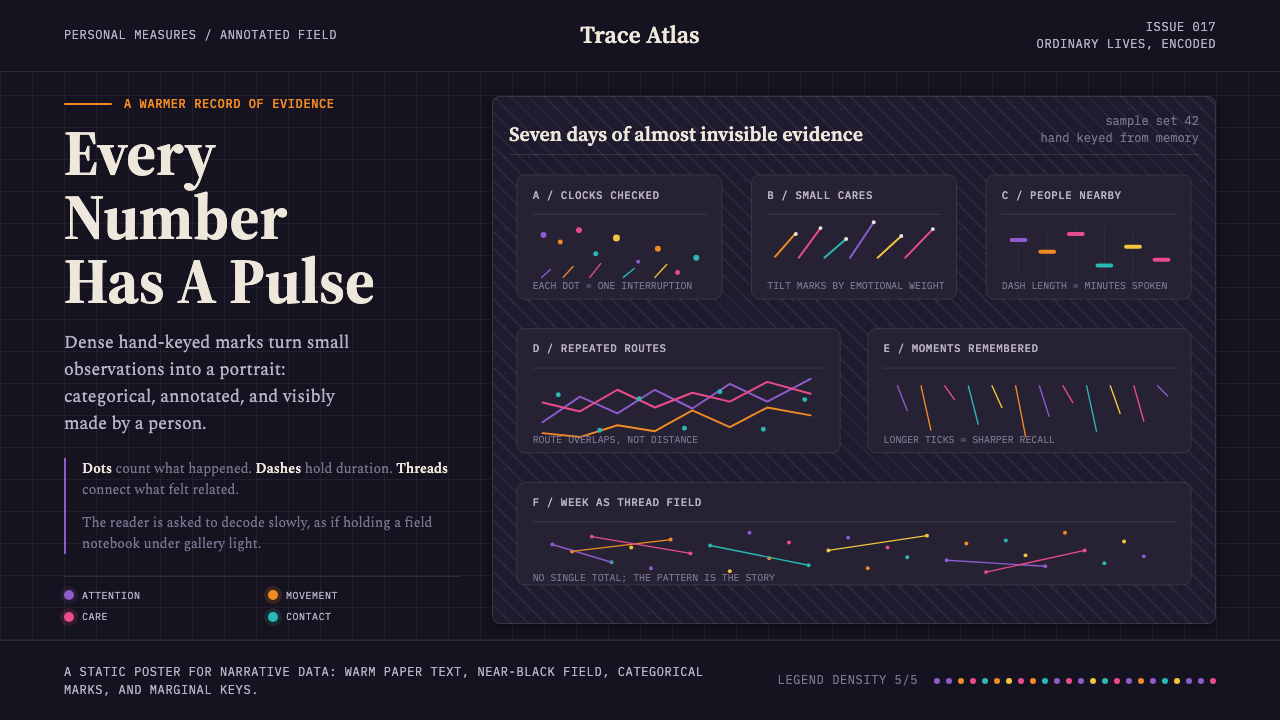
Data Humanism turns measurement into portraiture — dense hand-drawn marks, intimate annotations, and categorical color revealing the people inside the data.
Data Humanism (Lupi) in brief
Data Humanism is Giorgia Lupi's manifesto for a warmer and more human way of seeing information. Instead of presenting data as impersonal evidence delivered by a sterile machine, it treats every dataset as a record of lived experience. Dots, dashes, ticks, brushstrokes, and thread-like lines accumulate across near-black fields, while serif notes explain categories, exceptions, and personal observations. The result feels authored rather than automatically generated.
Its complexity is deliberate. A Data Humanist visualization does not promise instant comprehension from a single glance; it invites attentive reading. Color establishes categories, hand marks encode recurring events, and annotations disclose how the system should be interpreted. Dense information remains legible because each visual distinction carries a defined role. The viewer gradually learns the language of the image, much as one learns to read a map or another person's handwriting.
The style emerged from the editorial information-design practice of Accurat and from Dear Data, the correspondence project created by Giorgia Lupi and Stefanie Posavec. Its central conviction is that data can describe character, habit, memory, and relationship without pretending to be neutral or complete. Drawing becomes a form of interpretation: irregularity signals human presence, annotation acknowledges context, and the finished visualization behaves as both analytical artifact and personal document.
Where does Data Humanism (Lupi) come from?
Data Humanism belongs to contemporary information design and was articulated publicly by Giorgia Lupi in a manifesto published in 2017. Its development spans Western Europe and New York, following the creative context of Accurat and later Pentagram. Rather than proposing another decorative treatment for charts, the manifesto challenged the assumptions behind conventional data display: that information should appear frictionless, detached, and cleansed of the circumstances in which it was collected.
Accurat's editorial work provided an important foundation for this position. The studio context treated visualization as a form of authored communication, capable of carrying narrative, explanation, and visual character alongside analytical structure. In this approach, annotations are not secondary labels added after a chart is complete. They participate in the argument, guiding attention toward categories and relationships while making the designer's decisions visible.
Dear Data, the correspondence between Lupi and Stefanie Posavec, gave the philosophy an especially personal form. The project used hand-drawn data to communicate human experience, turning observation into an exchange between people. Marks could function simultaneously as records, symbols, and traces of the drawing hand. This correspondence demonstrated that information design could be intimate without abandoning rigor, and systematic without suppressing personality.
The manifesto brought these ideas together as Data Humanism: a movement within information design that rejects the sterile dashboard as the default image of knowledge. Its visual language combines near-black grounds, categorical color, serif annotation, and dense handmade notation. Yet its deeper contribution is ethical and editorial rather than merely stylistic. It asks designers to show that data comes from people, is shaped by choices, and becomes meaningful only when interpretation and context are allowed to remain visible.
What defines the Data Humanism (Lupi) look?
Near-Black Field
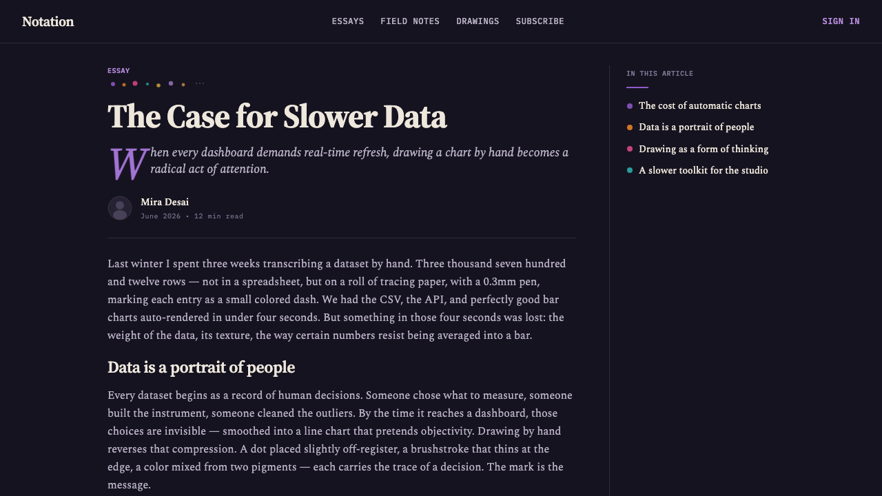
A near-black ground creates the visual depth on which the notation can accumulate. It is less absolute than pure black and therefore feels material, like dark paper, cloth, or a page prepared for inscription. Pale writing and colored marks emerge with clarity, while empty areas become pauses inside an otherwise information-rich field.
Categorical Color
Color functions as a vocabulary rather than atmospheric decoration. Each hue identifies a category, condition, or recurring type of event, allowing dense groups of marks to remain distinguishable. The palette may feel lively against the dark field, but its purpose is disciplined: repeated color builds memory, comparison, and recognition across the visualization.
Hand-Drawn Marks
Dots, ticks, dashes, brushstrokes, and stitched or embroidered lines form the primary graphic language. Their slight irregularities make the recording process perceptible without dissolving the underlying system. A mark should feel made by a person, but it must also repeat consistently enough to support counting, grouping, and comparison.
Serif Annotation
Serif text introduces an editorial and literary voice. Notes identify categories, explain exceptions, and occasionally address the reader with the intimacy of marginalia. The typography should feel composed rather than corporate: authoritative enough to guide interpretation, yet warm enough to coexist with handwriting and visible human variation.
Dense Layering
Information is allowed to gather into intricate constellations rather than being reduced to a few oversized summaries. Density communicates duration, repetition, and the richness of lived experience. Legibility comes from a stable legend, categorical distinctions, and careful annotation, not from removing every detail that requires effort from the reader.
Visible Authorship
The design openly acknowledges that someone selected, classified, drew, and explained the data. Personal notation and editorial commentary replace the fiction of a view from nowhere. This does not excuse inconsistency; instead, it makes the interpretive framework inspectable and turns subjectivity into a declared part of the work.
Who shaped Data Humanism (Lupi)?
Lupi articulated Data Humanism in her 2017 manifesto, arguing for information design that preserves context, complexity, and human character. Her visual language brings categorical systems together with hand-drawn notation and editorial annotation. Through Accurat, Dear Data, and her later connection with Pentagram, she established the movement as both a recognizable aesthetic and a broader position on what data represents.
Posavec collaborated with Lupi on Dear Data, the correspondence project from which the human and personal qualities of the style became especially visible. Their exchange treated everyday observations as material for hand-drawn communication. Posavec's role is central because the project made data visualization reciprocal: not simply a display made for an audience, but a crafted message sent from one person to another.
Accurat supplied the editorial information-design environment in which Data Humanism developed. Its relevance lies in joining analytical organization with narrative and visual authorship. Within this context, a visualization could remain dense, annotated, and distinctive while still communicating categorical structure, providing an alternative to standardized dashboards and impersonal chart conventions.
Pentagram belongs to the later professional context of Lupi's work and the movement's New York dimension. In the source history of Data Humanism, it marks the continuation of an authored, editorial approach within a broader design setting. The association reinforces that human-centered data work is not confined to private drawing; it can operate as a serious language for public communication.
How do you use Data Humanism (Lupi) today?
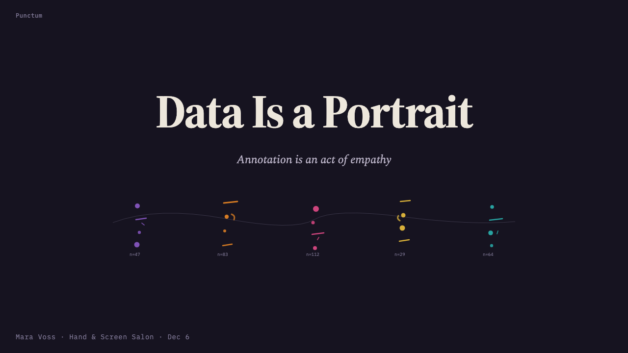
For presentation slides, Data Humanism is strongest when a deck behaves like an unfolding investigation. A cover can place a small constellation of colored marks on a near-black field, paired with a serif title and a brief handwritten or note-like premise. Content slides should preserve generous pauses around dense evidence, using annotations to lead the audience through categories rather than revealing every layer at once. The visual voice should feel researched, authored, and deliberately paced.
Data slides benefit from treating charts as systems of marks rather than polished containers. A timeline may become a trail of ticks and stitches; repeated events may appear as clusters of dots; relationships may be traced with thread-like lines. A stable legend is essential, and the same category must retain the same visual identity throughout the deck. Complexity should accumulate meaningfully, with spoken explanation or nearby notes supporting the viewer's reading.
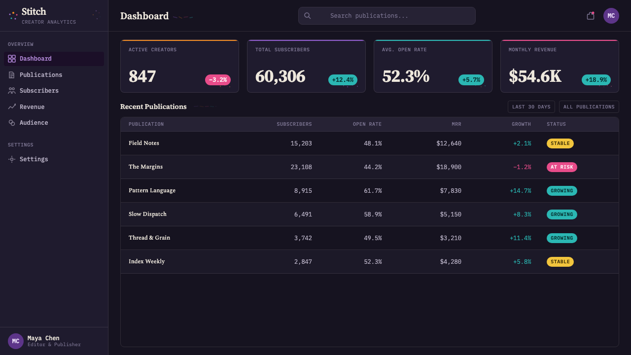
For web interfaces, the style works best in exploratory dashboards, cultural archives, research tools, and personal analytics where interpretation matters as much as rapid status checking. Near-black panels can hold layered data fields, while serif labels and concise annotations explain patterns. Pricing pages require restraint: use the handmade vocabulary to distinguish plans or describe value, but keep comparisons and actions direct. If every control becomes expressive, the interface loses both speed and hierarchy.
Editorial and marketing applications can use the style to turn evidence into narrative. Long-form articles may alternate annotated visual fields with calm reading passages, while campaign pages can build a sequence from observation to pattern to conclusion. Hand marks are especially persuasive when they correspond to real categories rather than serving as decorative confetti. Captions, legends, and marginal notes should reveal why a pattern matters and whose experience it represents.
The most common mistake is copying surface cues while abandoning the philosophy: scattering colorful scribbles over a dark background and calling the result human. Authentic use requires a coherent classification system, visible editorial judgment, and enough explanation for the marks to be learned. Another error is romanticizing irregularity until categories become inconsistent. Human warmth comes from authorship and context, not from careless drawing or avoidable ambiguity.
Data Humanism (Lupi) — FAQ
Is Data Humanism simply a hand-drawn style of data visualization?
No. Hand drawing is one visible expression of the movement, but its defining principle is that data represents human experience and is always shaped by interpretation. A visualization may use dots, stitches, or brush-like marks, yet it becomes Data Humanist only when categories are meaningful, context remains visible, and authorship is acknowledged. Decorative irregularity without an explanatory system reproduces the appearance while missing the argument.
Why does the style often use a near-black background?
The dark field gives pale annotation and categorical color a shared stage, allowing many small marks to remain distinct while creating an intimate, document-like atmosphere. Near-black also feels less mechanically absolute than pure black. It can suggest paper, cloth, night, or an archival surface without committing to literal texture. The background supports density, but it should still contain pauses so that the visualization does not become visually airless.
Does hand-drawn data sacrifice analytical rigor?
It does not have to. The marks may vary slightly in gesture while the encoding rules remain consistent. A clearly explained legend, stable categories, and careful annotation can support rigorous comparison without making every symbol look mechanically identical. Data Humanism separates precision of meaning from uniformity of appearance. Its irregularity records the human act of making, but it does not remove the responsibility to communicate faithfully.
How is Data Humanism different from a conventional dashboard?
A conventional dashboard usually prioritizes rapid scanning, standardized chart forms, and compressed summaries. Data Humanism accepts slower reading when the subject benefits from context, narrative, and accumulated detail. It uses annotation to disclose interpretation and often preserves exceptions that a summary might erase. The two approaches need not be enemies: a functional interface can retain direct status indicators while using Data Humanist views for exploration, explanation, and reflection.
When is Data Humanism a poor fit?
It is a poor fit when users must identify urgent status with almost no interpretive effort, or when dense annotation would obstruct a routine action. The style also fails when the underlying information has no real categorical system and handmade marks are added only for atmosphere. It is most persuasive when the subject concerns behavior, culture, memory, relationship, or another domain in which context and individual variation are part of the meaning.
Related design styles
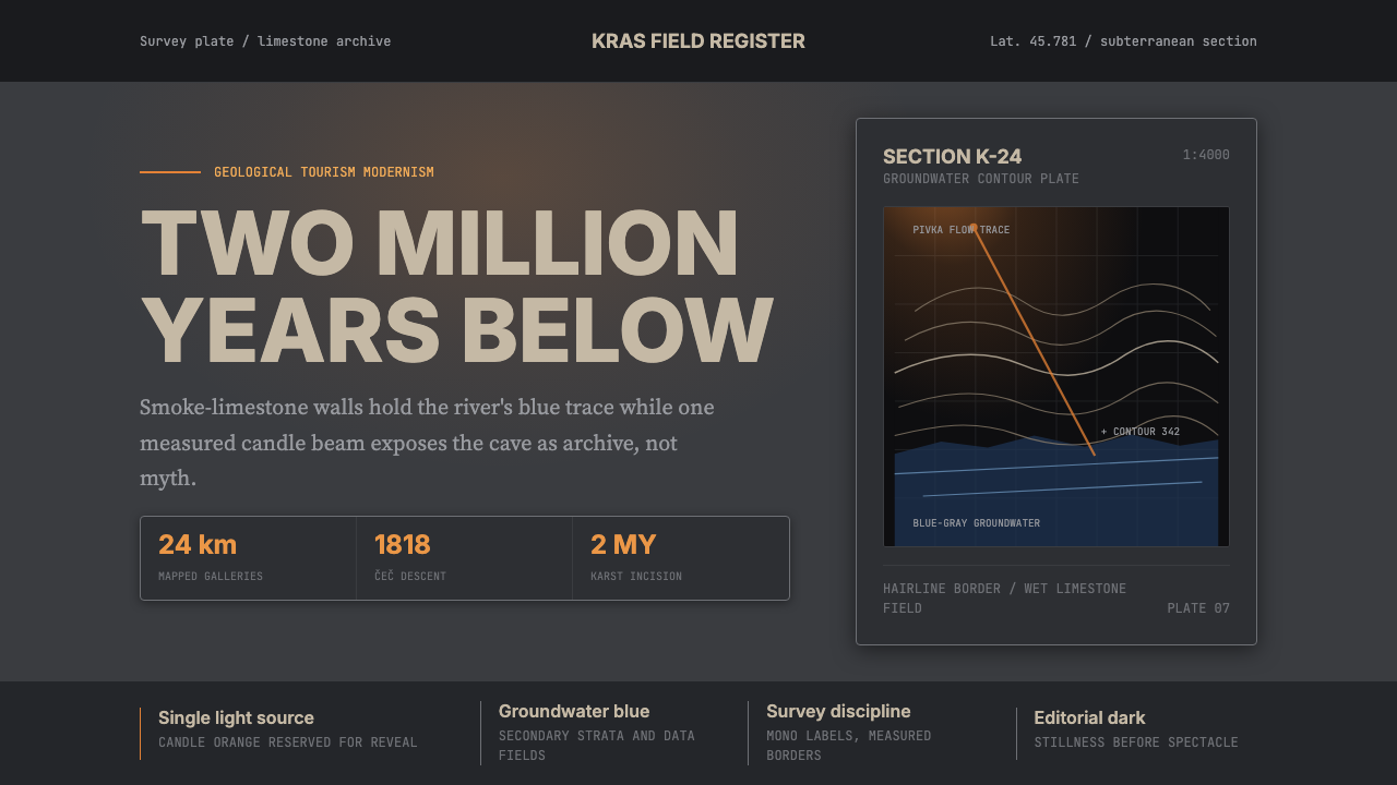 Slovenian Postojna Cave (Karst)Serious geology. Limestone gray, groundwater blue, and Inter type cut by one…
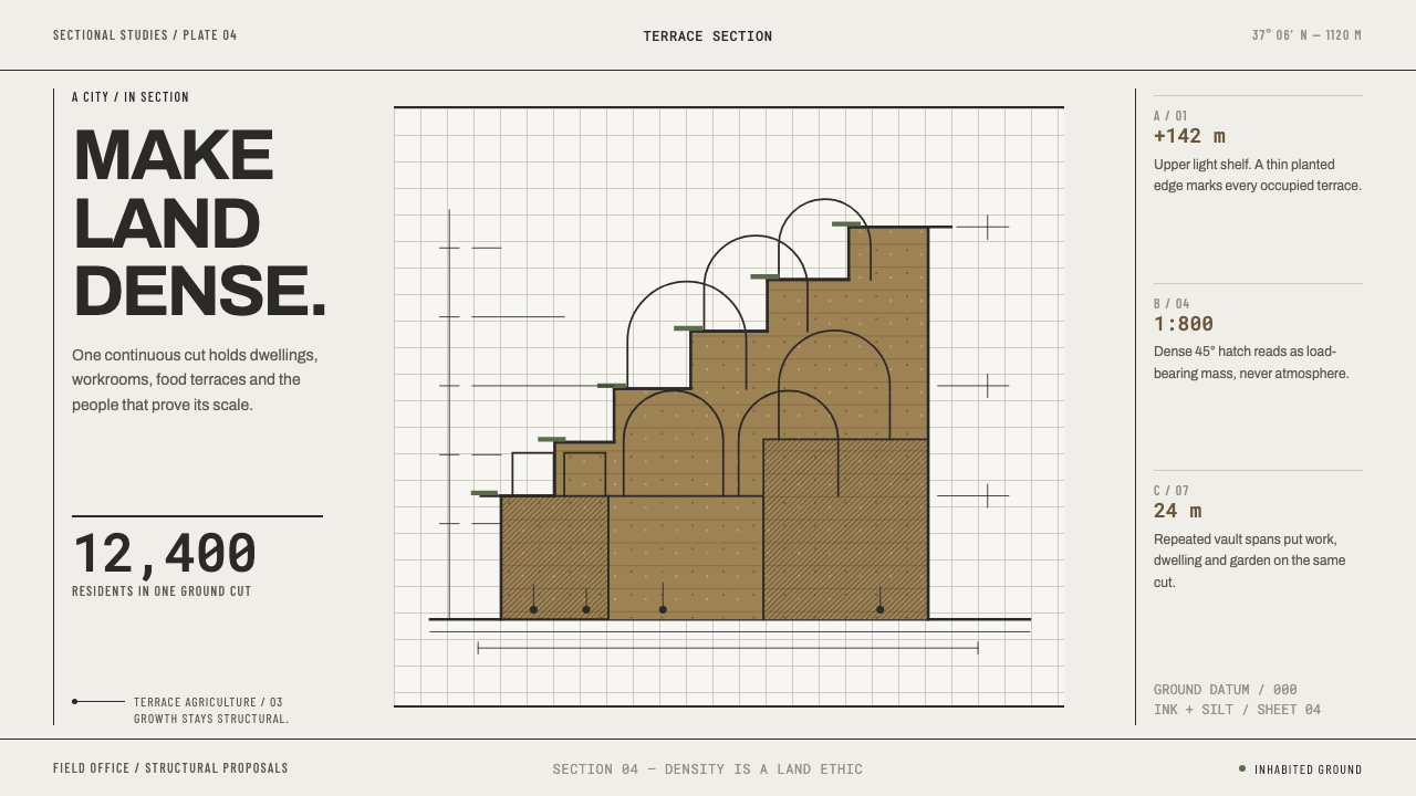 Arcology Section DrawingDensity makes a land ethic. Ink-cut terraces and silt ochre turn a city into…
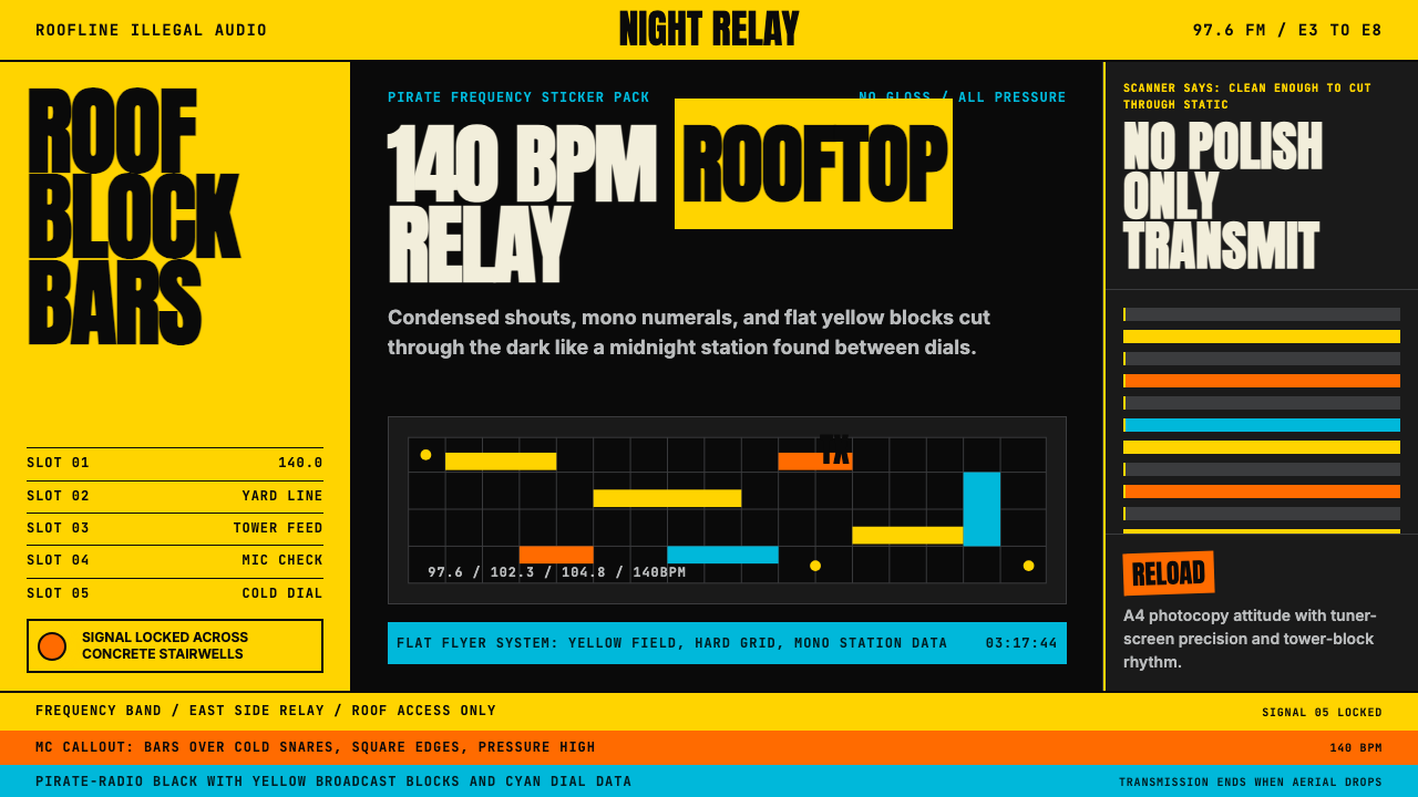 Grime London Pirate Radio (2003)Pirate signal, flat and urgent. Yellow blocks, mono FM numerals, hard flyer g…
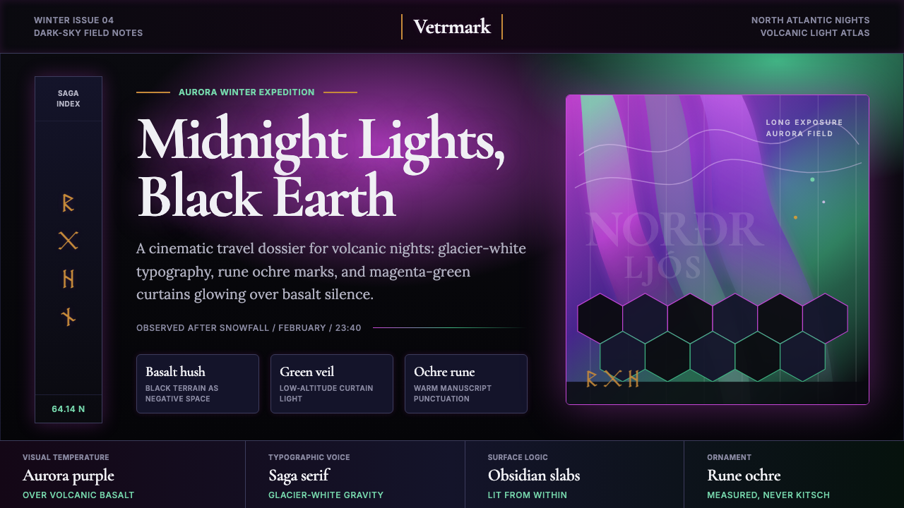 Icelandic Aurora TourismMidnight tourism turns mythic. Basalt black, aurora magenta-green, saga serif…
 Moby-Dick (1851)White space becomes open sea. Ink-navy rules and oxblood bearings pull across…
 Money Heist (La Casa de Papel)Resistance becomes spectacle. Arterial red cuts through graphite grids and ta…