About Data Humanism (Lupi)
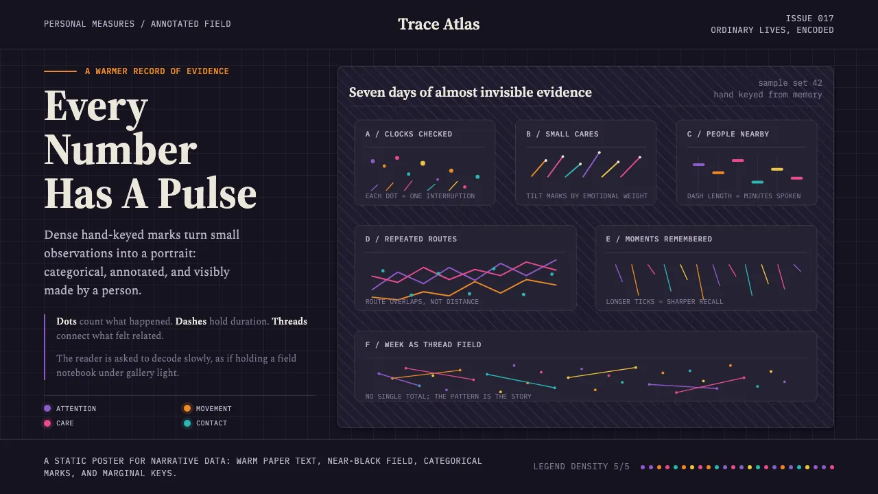
Data Humanism is Giorgia Lupi's manifesto for a warmer, more human way of seeing data. Dense hand-drawn marks — dots, dashes, ticks, brushstrokes, embroidered threads — sit on a near-black field where colour coding makes every category legible.
Born from Accurat's editorial work and the Dear Data correspondence with Stefanie Posavec, the look insists that data is a portrait of people, drawn by hand. It is annotated, categorical, and personal — the opposite of the sterile dashboard.
- Origin
- Western Europe / New York (Accurat, then Pentagram)
- Era
- Contemporary; Data Humanism manifesto published 2017
- Key figures
- Giorgia Lupi · Stefanie Posavec · Accurat · Pentagram
- Movements
- Data humanism · Information design · Hand-drawn data visualization
Data Humanism (Lupi) design spec
Colors
Background
Surface
Primary
Secondary
Accent
Text
Typography
Source Serif 4Headings
SpectralBody
IBM Plex MonoMono
Unlock for 1 credit
The other 11 sections — buttons, cards, spacing, motion, techniques and more — open once you unlock. Download the DESIGN.md or send it to your AI in one click. Unlock once, yours forever.
Sign up nowHave an account? Sign in
Styles similar to Data Humanism (Lupi)
Also inspired by design movements, with a close feel.
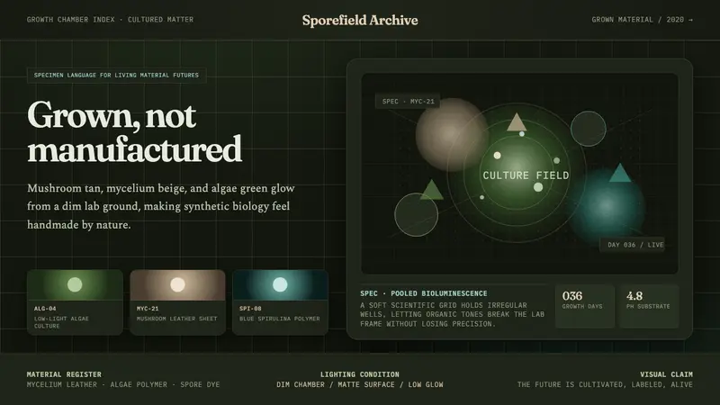 Biopunk GrownLife replaces industry. Algae green glows on chamber dark with serif voice and mono labels.
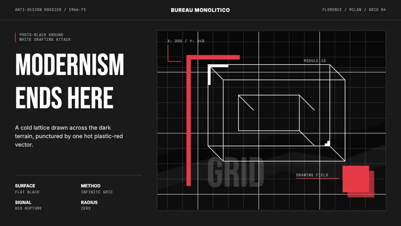 Radical Italian (Archizoom, 1966)Cool rebellion. Photo-black ground, white axonometric grid, one hot red cut.
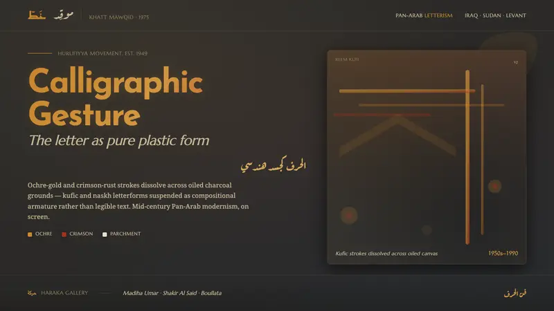 Hurufiyya Letter ArtArabic letters as pure gesture. Ochre and crimson strokes dissolve across oiled charcoal grounds.
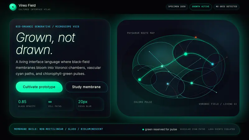 Bio-Organic GenerativeInterfaces feel cultured. Void black, Voronoi membranes, and neon chlorophyll pulses glow.