What is Lettrism?
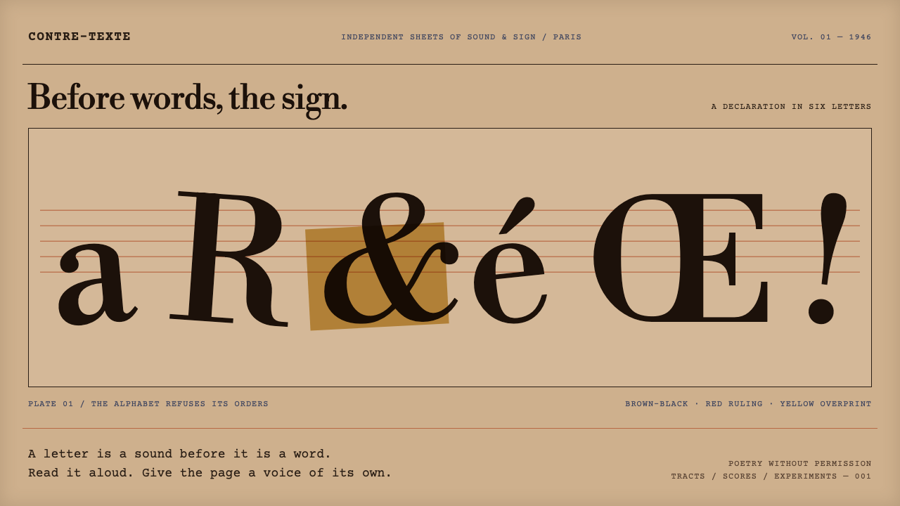
Lettrism rebuilt poetry, painting and the page out of letters and signs alone, and left behind a look of browned paper, crowded glyphs, red staves and yellow overprint.
Lettrism in brief
Lettrism is a Paris avant-garde movement founded in 1946 by the Romanian-born poet Isidore Isou. Its central claim was radical: poetry, music and the novel could be rebuilt from letters and signs rather than from words and syntax. The visual style that grew out of it, called hypergraphics, mixes alphabets, invented glyphs, pictograms and rebus puzzles on a single page, so that the sign comes first and the sentence comes second.
The look is instantly physical. Paper is tan and has gone brown toward the edges, as if it had lived in a bag on the Left Bank for decades. Marks are made in brown-black pen. Beneath them runs a red ruling that resembles a musical staff, and yellow ink is laid on top as a kind of overprint. Letterforms crowd and collide, and pictograms sit beside Latin characters without a hierarchy to separate them.
As a design language, Lettrism is the opposite of tidy. It rewards density, tension and layering, and it treats the grid as an obstacle to be ignored. The system built from it reads like a manifesto page or an archive document: typewriter text for the plain voice, a high-contrast serif for formal titles, and an overall feeling that the page is still being argued over.

Where does Lettrism come from?
Lettrism begins in the immediate aftermath of the Second World War. In 1946 Isidore Isou, a poet who had arrived in Paris from Romania, announced the movement on the Left Bank, in the district of Saint-Germain-des-Prés, where cafés, small publishers and cellar clubs made the neighbourhood a crowded laboratory for new ideas. His claim was that existing art forms had exhausted their materials and that the letter, treated as an object in its own right, could be the starting point for a new poetry, a new music and eventually a new visual art.
The first phase of the movement was literary and vocal. Isou and his followers wrote and performed pieces built from letters and sounds that did not form ordinary words, and this strand later fed into what the source material lists among the movements around Lettrism, sound poetry. The second phase was visual. Hypergraphics extended the idea of the letter into every kind of sign: invented glyphs, pictograms from different writing systems, rebuses and symbols layered together in a single composition, so that a page could be read, looked at and decoded all at once.
Books gave the movement its public face. The source material dates Isou's Gallimard books to 1947, and these presented the movement's ideas through conventional publishing and a formal Didot serif face, which gave the project an unexpectedly respectable skin. In 1950 came the hypergraphic novel Les Journaux des dieux, whose pages are the direct model for this design system: tan paper gone brown at the edges, brown-black pen marks, rebuses and pictograms drawn over red staff-like ruling, and yellow ink overprinted on top. The cheap postwar paper and the improvised pen work are not accidents of style; they are part of the argument that art can start from almost nothing.
A circle of artists carried the movement forward. Maurice Lemaître, Gabriel Pomerand and François Dufrêne are among the figures the source material names beside Isou, and the movement's work extended into hypergraphic prints in the 1960s. Lettrism was never as famous with the general public as some of its neighbours in the postwar avant-garde, but its habit of mixing text, symbol and image, and of treating typography as raw material rather than as a neutral carrier of meaning, has left a long trail through experimental publishing, concrete poetry and graphic design that treats the page as a field of signs.
What defines the Lettrism look?
Browned tan paper
The ground is a tan paper tone that darkens toward the edges, as though the page has aged and been handled. It is not a clean off-white but a worn, slightly stained surface, and it sets the emotional temperature of the whole style: archival, tactile and a little feverish. The aged edges also give the layout a natural frame without needing any border.
Brown-black pen marks
Letters and signs are drawn in a warm brown-black ink rather than pure black, with the hand-made irregularity of a pen. The marks have varying pressure and slightly uneven edges, so that the glyphs feel written or drawn rather than typeset. Anything that has to look like a primary mark on the page, from a large emblem to a decorative letter, takes this ink colour.
Red staff-like ruling
Red horizontal lines run beneath the signs like a musical staff. They connect the movement's interest in sound and music to its interest in the page, and they give the dense glyphs a faint underlying order without becoming a rigid grid. The ruling is a structural device, not a decoration, and it should read as part of the paper rather than as a border added afterward.
Yellow overprint
Yellow ink is laid over the pen work and the red lines, in the manner of a second printing pass. Where it crosses other colours it darkens or warms them, which gives the page layered depth without any shadow or gradient. It is typically used for emphasis, for filled shapes behind glyphs and for the sense that more than one hand has worked on the same sheet.
Rebus and pictograms
Pictograms and rebus puzzles appear alongside letters as equals. A small drawing can stand in for a word, a glyph can be invented for a sound, and the reader is asked to decode rather than to scan. For interface use this means icons, symbols and letters can share the same visual rank, which is a very different attitude from the usual separation of text and illustration.
Courier and Didot
Body text is set in Courier Prime, echoing the mimeographed tracts that circulated in the Left Bank in the movement's early years. Formal titles borrow a Didot-style serif, taken from the look of Isou's 1947 Gallimard book, with strong contrast between thick and thin strokes. The two faces represent the two sides of the movement: the rough underground leaflet and the respectable published book.

Who shaped Lettrism?
Isidore Isou was a Romanian-born poet who founded Lettrism in Paris in 1946. He argued that poetry, music and the novel could be rebuilt from letters and signs, and he developed hypergraphics as the visual form of that idea. His 1950 hypergraphic novel Les Journaux des dieux provides the direct model for this design system.
Maurice Lemaître is named in the source material among the key figures of the movement. He belongs to the circle of artists and writers who carried Isou's ideas beyond the founder himself, extending Lettrism across the page, the screen and the stage.
Gabriel Pomerand is another of the key figures listed for the movement. His place in the circle shows that Lettrism was a collective Left Bank project rather than the work of one man, and that its visual experiments with signs and letters were pursued by several hands at once.
François Dufrêne is listed among the key figures and is associated with the sound-poetry strand around Lettrism. His presence reminds designers that the style began as much as a vocal and sonic experiment as a visual one, which is why the red ruling echoes a musical staff.
How do you use Lettrism today?
Lettrism is a difficult, rewarding style to apply because it deliberately works against the clean, aligned interfaces that most products want. Treat it as a voice for content that is experimental, archival or confrontational, and keep it away from places where users need to complete routine tasks quickly. When it fits, nothing else looks quite like it.
For presentation slides, a cover can be built almost as a page from Les Journaux des dieux: a tan, slightly browned ground, a large cluster of hand-drawn glyphs and pictograms in brown-black, a few red staff-like lines running behind them and a patch of yellow overprint. The title can use the Didot-style serif and sit in a clear space among the signs. Content slides should keep the paper and the red ruling but reduce the glyph density, so that the typewriter body text stays readable. Data slides work best when charts are drawn as simple ink marks on the ruled lines.
For web interfaces, the style is best reserved for landing pages, exhibition sites, archives and publishing projects rather than for forms, checkouts or dashboards. Use the tan paper as the page ground, set body text in the typewriter face, and let section headers use the serif. Decorative glyph clusters can act as section markers or backgrounds, but interactive controls need a calmer treatment with clear ink-coloured outlines, so that people can still tell what is clickable.
For editorial and marketing work, Lettrism suits manifestos, small-press catalogues, literary events, music releases and any campaign that wants to sound like a provocation rather than a promise. Layout can be dense and layered, with columns breaking against pictograms and yellow patches highlighting phrases. Print-like touches, such as slightly uneven ink edges and visible ruling, support the archival feeling.
A common mistake is to treat the style as a decorative texture, scattering random letters across a clean layout. The original work is driven by an idea: signs come before syntax, and every mark participates in a system of reading. Another frequent error is to lose legibility by overlaying yellow and red on small body text, or to replace the brown-black ink with pure black and the tan paper with white, which removes the aged, handmade character entirely.

Lettrism — FAQ
What is hypergraphics?
Hypergraphics is the visual branch of Lettrism. It extends the movement's interest in letters to every kind of sign, mixing alphabets, invented glyphs, pictograms and rebuses on one page. The source for this design system is Isidore Isou's 1950 hypergraphic novel Les Journaux des dieux, whose pages combine drawn signs with red staff-like ruling and yellow overprint.
Why does the style use typewriter type for body text?
The typewriter face, Courier Prime, recalls the mimeographed tracts that circulated around the Left Bank in the movement's early years. It gives the plain voice of the page a rough, underground texture and keeps text legible against dense glyphs. Formal titles use a Didot-style serif, so the system carries both the cheap leaflet and the published book.
Can Lettrism be used in a product interface?
It can, with care. It works best on landing pages, archives, exhibitions and publishing projects where the page itself is the content. For forms, tables and routine tools, keep the tan paper and typewriter text but strip back the glyph clusters and overprint, and give buttons and inputs clear ink-coloured outlines so that usability is not sacrificed to atmosphere.
How does Lettrism relate to other avant-garde movements?
It belongs to the postwar Paris avant-garde and is closely tied to sound poetry through figures such as François Dufrêne. Its attention to letters as raw material places it in the same wider family as experimental typography and concrete poetry, though its own tradition is specific: signs first, syntax second, and the page as a layered field of marks.
What is the most common mistake when using the style?
The most common mistake is treating it as a surface texture. Scattering random letters on a clean grid produces a pastiche. The real style has a reason for every mark: aged paper, hand-drawn glyphs, a red ruling that echoes music and yellow overprint that layers meaning. Keep the ink warm, the paper tan and the glyph clusters purposeful.
Related design styles
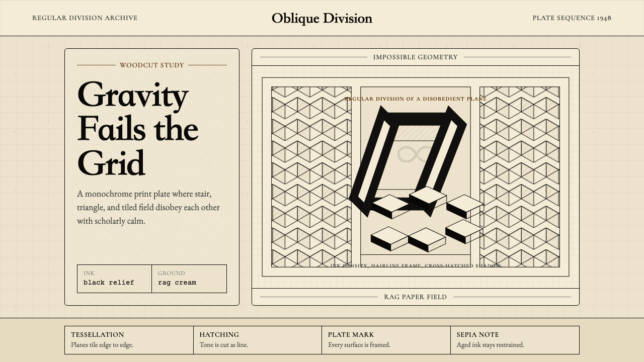 M.C. Escher ImpossibleImpossible calm. Ink-black tessellations and hatching fold cream paper into p…
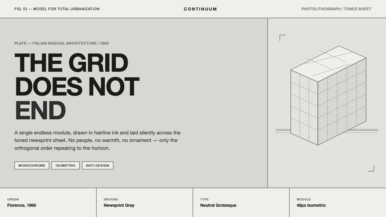 Superstudio Continuous MonumentThe grid does not end. Hairline black isometric ruling on toned newsprint-gra…
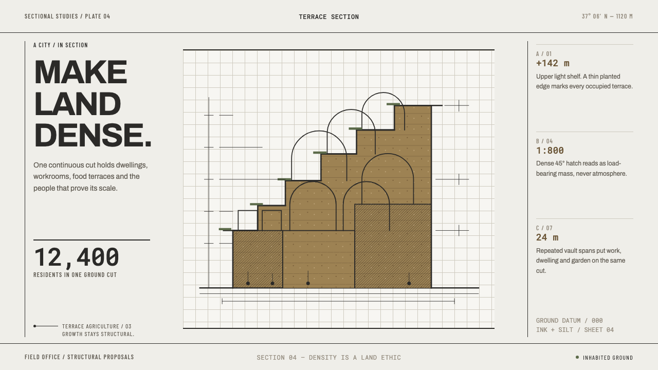 Arcology Section DrawingDensity makes a land ethic. Ink-cut terraces and silt ochre turn a city into…
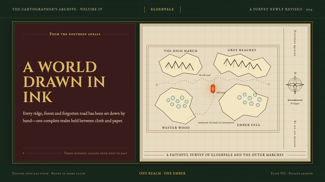 Tolkien Middle-earth (1954)A whole world held in ink. Gilt type and vellum cartography glow against bott…
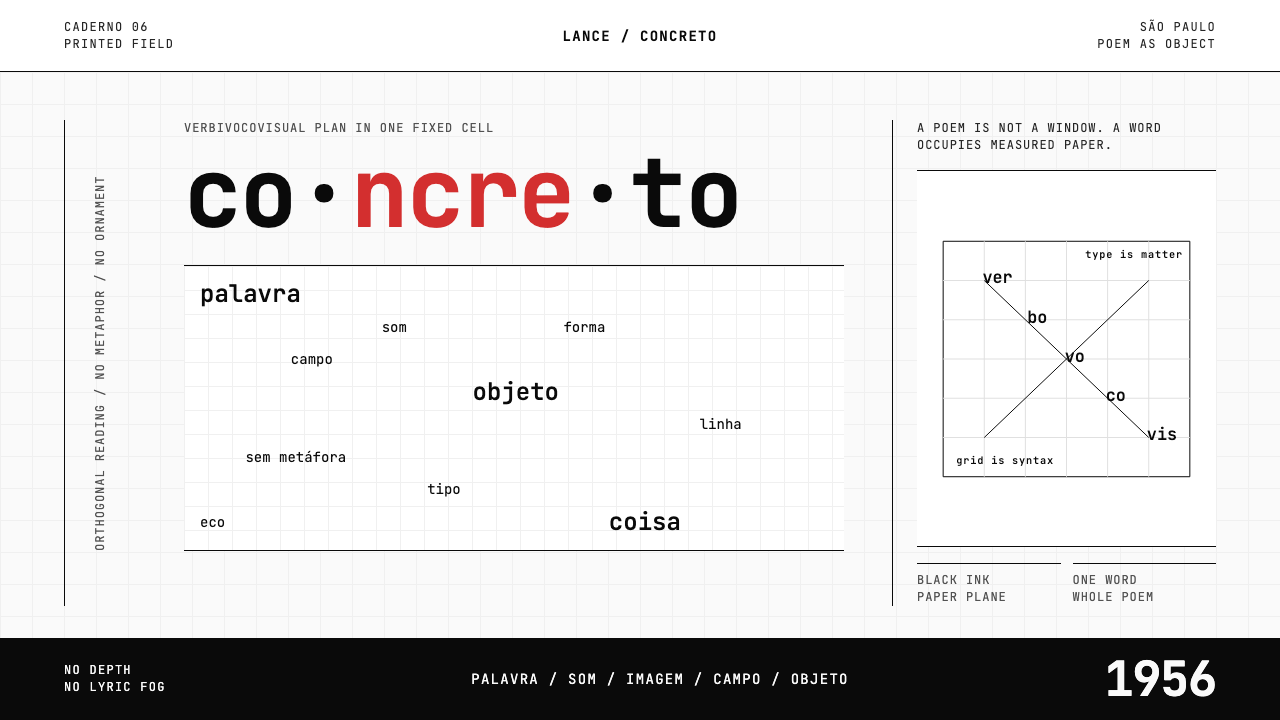 Brazilian Concrete PoetryWords become objects. Monospace cells, black-white paper, one cadmium red rup…
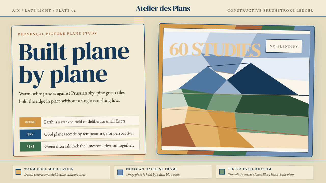 Cézanne — Mont Sainte-VictoireBuilt, not blended. Ochre, Prussian blue, and pine facets tilt into a constru…