What is Tolkien Middle-earth (1954)?
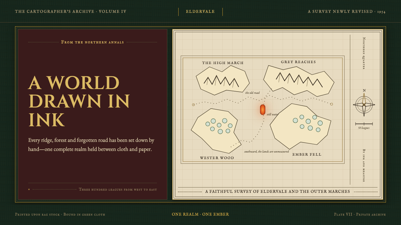
Tolkien Middle-earth holds an imagined continent in ink: gilt lettering, vellum-toned paper, and a solitary ember of fire against deep green cloth.
Tolkien Middle-earth (1954) in brief
Tolkien Middle-earth evokes the first encounter with The Lord of the Rings in 1954: a substantial volume bound in dark book cloth, its title caught in gilt, and its interior world made tangible by a folded pen-and-ink map. This is not a cinematic fantasy language of spectacle. It is a literary one, asking the reader to lean closer, trace a road, decipher a border, and believe that the country beyond the page has its own geography.
Its central visual device is cartography. Mountains are built from hachured marks, forests gather through stippling, and rivers, roads, place names, compass roses, and mileage scales make the page feel surveyed rather than merely illustrated. Decorative cartouches and runic borders add the impression of a written culture with rules that can be gradually learned through looking.
The mood is cool, inky, and scholarly. Deep green cloth, dark linework, and aged-paper grounds establish restraint; gilt provides a ceremonial glimmer rather than broad decoration. Against that reserve, the Eye of Sauron appears as the system's warm interruption: a molten ember that turns darkness into menace. The contrast is small in area but immense in narrative force.
Where does Tolkien Middle-earth (1954) come from?
The style belongs to the period from 1937 to 1955, beginning with The Hobbit and reaching its defining published form when George Allen & Unwin issued The Lord of the Rings across 1954 and 1955. Its setting is Oxford, England, but its visual imagination reaches backward toward old books, handmade maps, and scripts that appear to carry long histories within their marks.
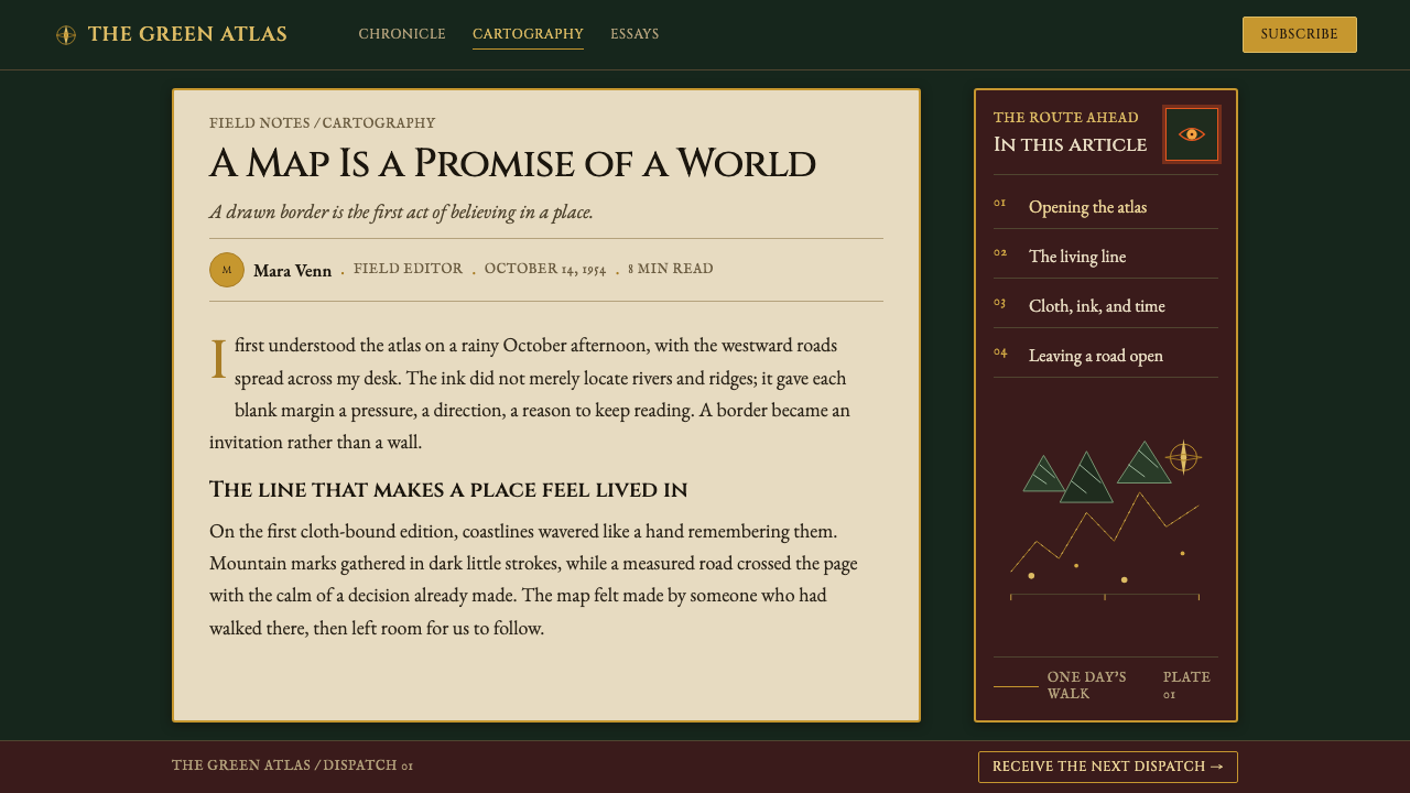
Rather than separating story from artifact, this tradition treats the book itself as part of worldbuilding. Cloth boards, gilt blocking, rag-paper color, fold-out cartography, and careful black ink make the fictional world feel like a recovered document. A reader is not simply shown a setting; they are given a thing that seems to have survived from it.
Three currents meet here: mid-century British literary cartography, invented-language calligraphy, and antiquarian book design. Together they privilege legibility without becoming clinical. Information remains practical enough to navigate, yet every label, border, and landform contributes to the sense that language and geography belong to the same civilization.
J.R.R. Tolkien, Christopher Tolkien, Pauline Baynes, and Rayner Unwin are the key figures named within this world of publication and image-making. Their presence anchors the style in a particular literary culture: one where prose, maps, lettering, publication craft, and the reader's patient attention work together rather than compete for attention.
What defines the Tolkien Middle-earth (1954) look?
Book-Cloth Darkness
The foundation is a deep bottle-green field with the density of old binding cloth. It should feel absorbent rather than glossy, quiet rather than theatrical. Dark grounds give gilt lettering and pale map paper the effect of objects discovered under lamplight.
Gilt as Signal
Gold is a restrained title treatment, not a general luxury finish. It catches the eye like a formal inscription on a treasured volume, establishing importance before the interior opens. Its warmth belongs to the object, while the imagined landscape remains chiefly black ink on aged paper.
Pen-and-Ink Cartography
Line is both image and evidence. Hachured mountains, stippled forests, roads, rivers, and coastlines are assembled from visible marks that preserve the feeling of a hand at work. The map never hides how it was made; its labor is part of its authority.
Scholarly Notation
Compass roses, mileage scales, cartouches, place labels, and border writing make the layout feel studied and navigable. These are not decorative fragments scattered for atmosphere. They imply that the world can be read, measured, and approached through accumulated knowledge.
Runic Mystery
Invented-language calligraphy is most effective at the margins, where it suggests a layer of knowledge just beyond immediate comprehension. The viewer need not decode every mark. The important feeling is that the marks obey a system and reward sustained attention.
The Watching Ember
A single molten orange-red accent, associated with Sauron's Eye, breaks the cool world of green, black, and vellum. Its isolation matters: it reads as a watchful threat because it is not repeated casually. Warmth becomes narrative danger rather than comfort.
Who shaped Tolkien Middle-earth (1954)?
Tolkien is central to the literary world from which this visual language emerges. The style takes its cue from a setting that is encountered through prose, names, maps, and languages, so any faithful application should preserve the sense that visual detail serves a larger written world.
Christopher Tolkien is named among the key figures associated with this period and its Middle-earth legacy. His presence reinforces the style's sense of continuity: the world is not a passing decorative theme, but a body of material sustained through careful transmission.
Pauline Baynes belongs to the named visual and publishing constellation around Middle-earth. Her inclusion is a reminder that this aesthetic depends on illustration and ornament being integrated with literary imagination, rather than treated as separate promotional surfaces.
Rayner Unwin is among the key figures named in connection with the publication era. The association matters because the style is inseparable from publishing craft: its authority comes as much from the designed book, paper, cover, and map as from an isolated fantasy image.
How do you use Tolkien Middle-earth (1954) today?
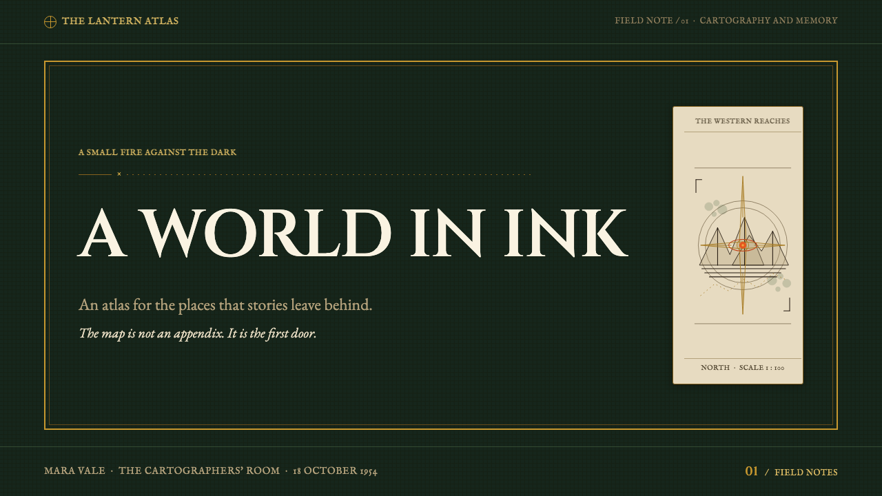
For presentation covers, use the dark cloth-like field as a quiet ground for an ornate but legible title and a fragment of map linework. Let the title feel blocked into the surface rather than floating above it. Content slides should open into pale, paper-like fields where a road, border, or rule organizes reading; keep body copy calm and let marginal notes carry secondary context. On data slides, translate the cartographic logic into routes, territories, landmarks, and carefully labeled reference marks, so information feels explored rather than merely charted.
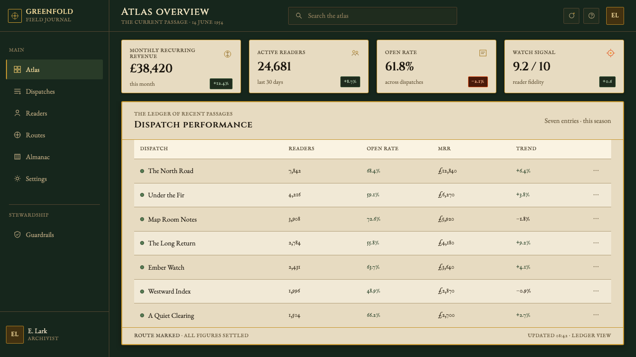
For web interfaces, the style suits knowledge-rich dashboards, archives, reading tools, and pricing pages that benefit from a sense of discovery. Use the dark cover language for entry points, navigation, or major panels, then reserve vellum-like surfaces for dense reading and comparison. Borders should behave like map frames, labels like annotations, and interactions like an invitation to uncover another portion of a document. The ember accent should identify the consequential action, warning, or active state.
For editorial and marketing work, this language is strongest when it frames a product as a world with depth rather than as an urgent commodity. Long-form pages can use map fragments as section thresholds, margin notes for provenance or definitions, and enlarged place-like names for chapter transitions. Campaign material benefits from the contrast between formal gilt-like headings and handmade ink detail, provided the copy stays measured and does not compete with every decorative cue.
The common mistake is turning Middle-earth into generic medieval fantasy: adding indiscriminate fire, crowded heraldry, theatrical weapons, or distressed texture everywhere. The original logic is quieter and more exacting. Its persuasive power comes from disciplined ink, readable geography, aged materials, and a rare warm threat. If every surface glows, burns, or shouts, the watching ember loses its meaning.
Tolkien Middle-earth (1954) — FAQ
Is this style mainly about medieval decoration?
No. Antiquarian details matter, but the governing idea is literary cartography. A convincing result lets maps, labels, borders, and handwriting imply a coherent world. Decoration works only when it feels attached to reading, navigation, publication, or an invented written culture.
Why is the warm accent used so sparingly?
The cool dark-and-ink palette establishes scholarship, age, and distance. The ember associated with Sauron's Eye then becomes meaningful precisely because it interrupts that restraint. Repeating it broadly changes its role from ominous signal into ordinary decoration.
Can the style work without a literal map?
Yes, if the composition retains cartographic habits: deliberate linework, careful labels, framed margins, directional cues, and the suggestion of a document that can be studied. A partial route, a border fragment, or a field of annotations can carry the idea without illustrating an entire continent.
Where does this style struggle in contemporary design?
It struggles when speed, brightness, and frictionless simplicity are the whole brief. A map-like interface asks for time and attention, while antiquarian texture can obscure information if used carelessly. It works best when the product genuinely benefits from depth, provenance, study, and gradual discovery.
Related design styles
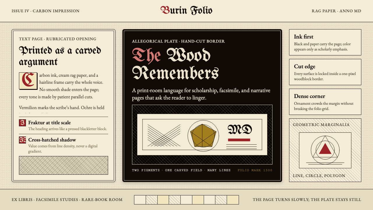 Dürer WoodcutInk remembers everything. Fraktur titles, rag-paper cream, and cross-hatched…
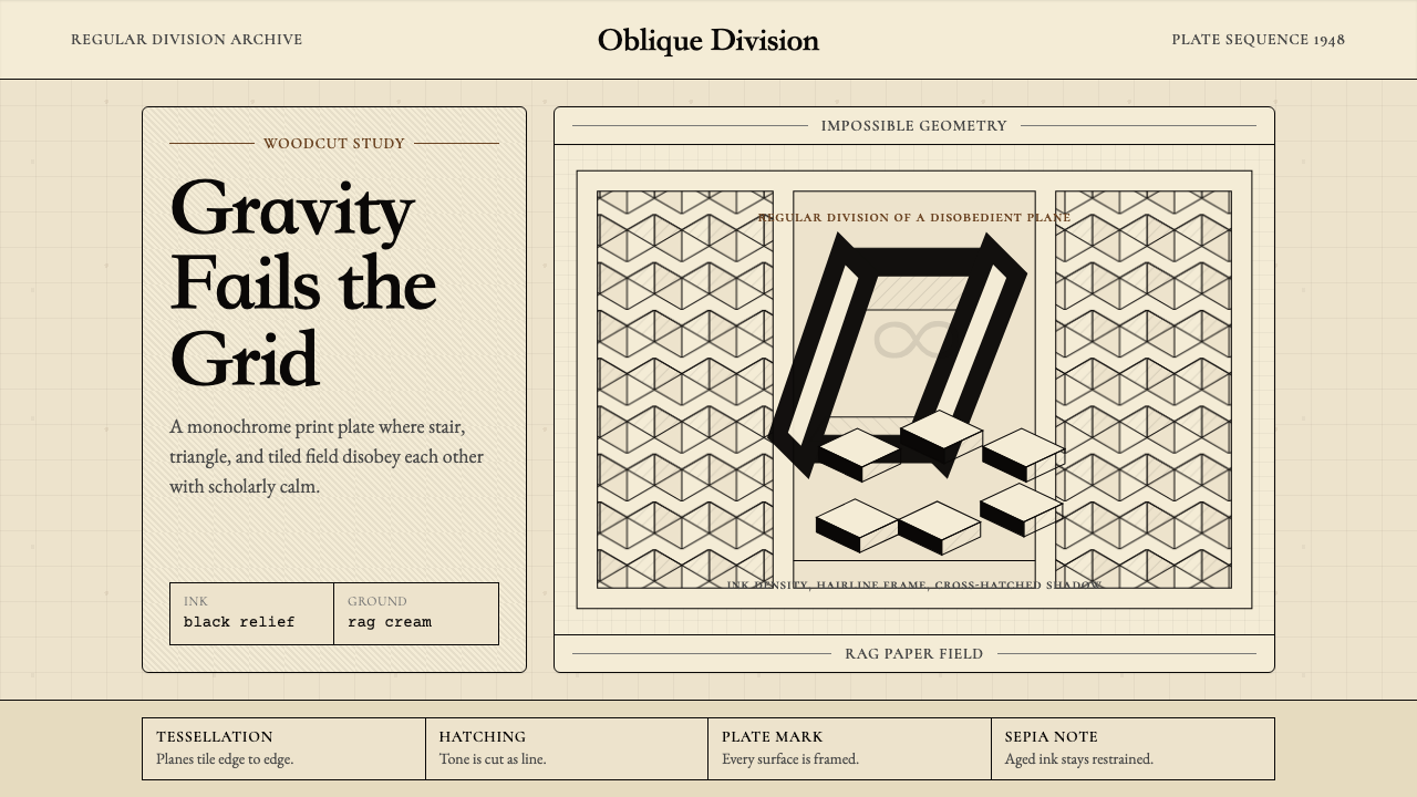 M.C. Escher ImpossibleImpossible calm. Ink-black tessellations and hatching fold cream paper into p…
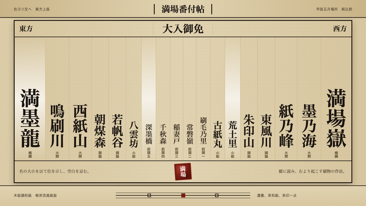 Sumo BanzukeCeremonial density. Sumi columns crowd tan washi; rank-scaled type meets one…
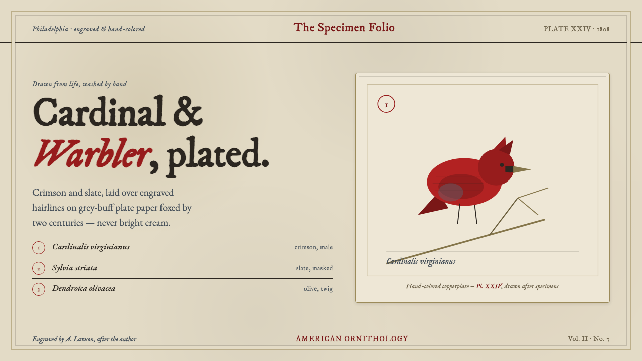 Wilson Ornithology PlateAn 1808 ornithology plate reborn. Cardinal crimson and slate, washed over eng…
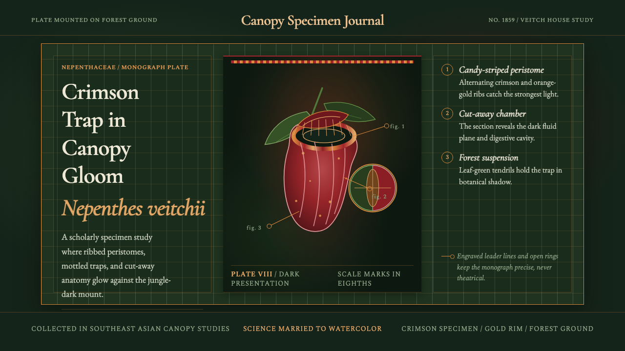 Carnivorous Pitcher PlantBotanical danger glows. Crimson traps and gold rims float on jungle-dark gree…
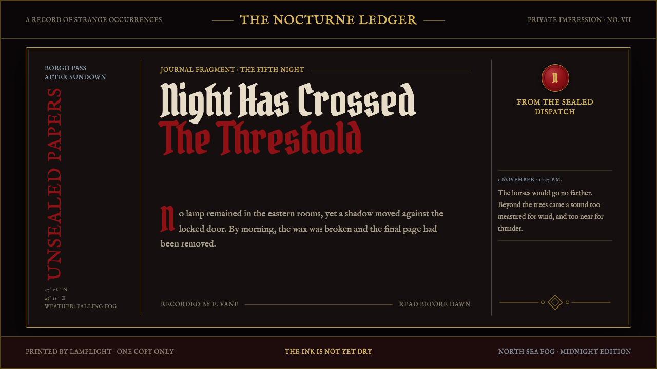 Dracula Gothic (1897)Victorian dread after dark. Blood-red initials and tarnished gilt haunt coffi…