What is MaXhosa Africa?
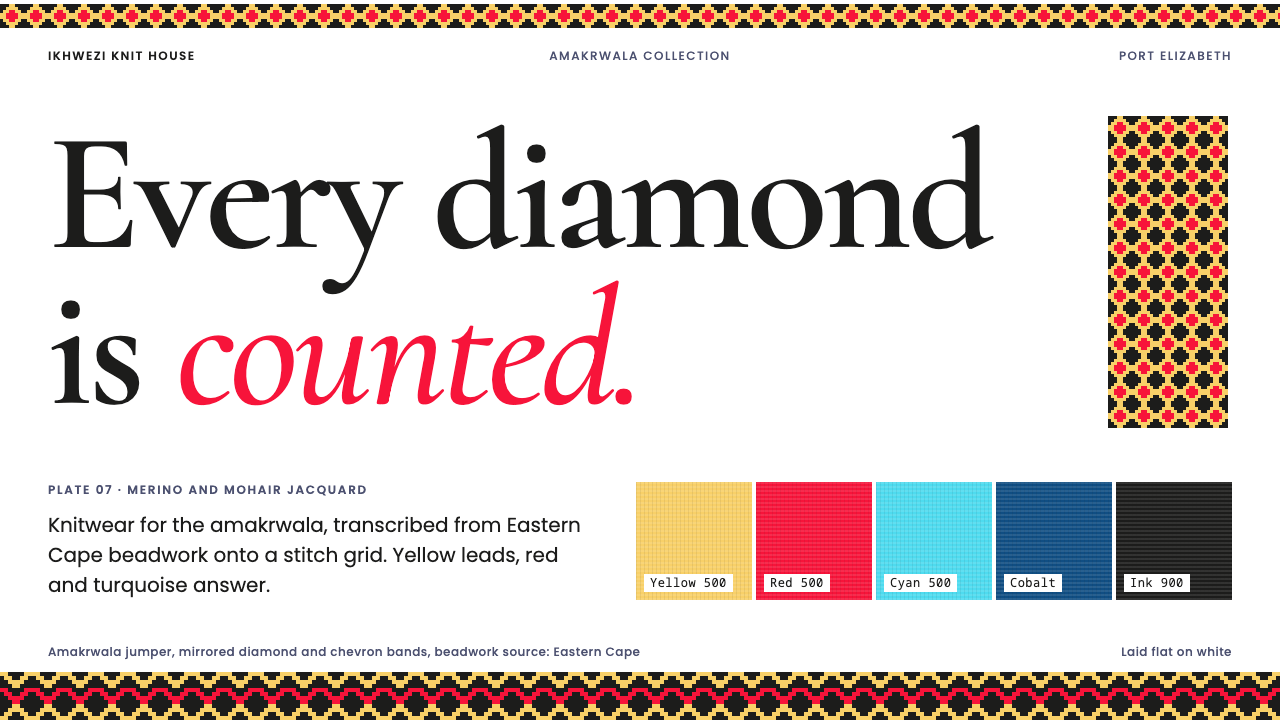
MaXhosa turns Xhosa beadwork into knitwear one stitch at a time: a white ground, jacquard bands of diamonds and chevrons, golden yellow in the lead, and not a single curve.
MaXhosa Africa in brief
MaXhosa is a design language drawn from a South African knitwear house of the same name. It takes Xhosa beadwork, translates it into jacquard knit, and then translates it once more into a visual system for screens and print. Its signature is a white ground carrying flat horizontal bands of diamonds, chevrons and fine stripes, built from straight lines and stepped edges rather than curves, with golden yellow in the lead and red and turquoise answering it.
The governing idea is counting. A bead is a point of colour; a knitted stitch is a point of colour; both live on a grid, and both make shapes by accumulating small squares. The system respects that origin. Every motif sits on an implied stitch grid, every band is flat, and nothing is allowed to soften into a gradient or a curve that the original craft could not have produced. The result looks decorative at first glance and turns out to be strict on closer inspection.
It is also a system with a conscience about credit. Images are never anonymous 'African pattern' wallpaper; each one is attributed to its collection and its technique. That habit of naming the source and naming the method is as much a part of the style as its palette, and it shapes how the layouts read: calm, bright, and quietly proud of how things are made.

Where does MaXhosa Africa come from?
MaXhosa began in 2011 in Port Elizabeth, the South African port city now also known as Gqeberha, as knitwear for the amakrwala. The amakrwala are young Xhosa men newly returned from initiation, a passage into adulthood after which, by custom, they are expected to dress the part. The label's first customers were therefore not casual shoppers but people for whom clothing marked a rite of passage, and that gave the project a seriousness which its later, more international audience inherited.
The founder, Laduma Ngxokolo, approached the commission as a colour problem before he approached it as a pattern problem. He matched the colours of Xhosa beadwork against Pantone chips, bead colour by bead colour, and then had merino and mohair yarn dyed locally to those specifications. This is the origin of the system's discipline: the palette was measured from a craft rather than chosen from a mood. When the design system later insists on golden yellow, red and turquoise as its voice, it is repeating a decision that was first made at the dye house.
The timeline is short and dense. The amakrwala debut collection is placed in the window between 2010 and 2012, with the house itself founded in 2011. A jumper from 2012 was later acquired by the Victoria and Albert Museum in London (museum number T.2433-2021), an institutional recognition that treats the garment as design history rather than as a souvenir. The studios have since reached Johannesburg and Cape Town, but the Eastern Cape source material, the beadwork of its Xhosa artisans, remains the reference point for everything the brand makes.
Three traditions meet in the style, and the source names them plainly: contemporary African luxury knitwear, Xhosa beadwork together with the dress codes of the amakrwala, and jacquard knit pattern design. Jacquard knitting is the technical hinge. It builds a picture from a grid of stitches, so every shape is a staircase and every diagonal is a run of small steps. That is why the diamonds and chevrons of beadwork survive the translation so well, and why curves do not. The design system inherits this logic whole: white ground, flat bands, golden yellow leading, red and turquoise answering, deep blue and near-black holding the foundation down.
What defines the MaXhosa Africa look?
White ground
The page is white, and that single decision does a great deal of work. A white ground lets saturated colour read as a measured fact rather than as atmosphere, it echoes the neutral backdrop of a lookbook or studio wall, and it leaves the knit pattern as the only source of visual weight. Nothing tints the background and no texture is simulated beneath the pattern.
Ranked colour
Golden yellow leads. Red and turquoise answer it, the way a second and third voice answer a first. Deep blue and near-black sit underneath as grounding tones for type, outlines and the heaviest bands. The order matters: the eye should meet yellow first, find red and turquoise as counterpoints, and rest on the dark tones. Giving every hue equal volume is the quickest way to lose the hierarchy.
Horizontal bands
Pattern arrives as flat horizontal bands stacked in layers: diamonds, chevrons and fine stripes, each band a strip of repeat with its own rhythm. Bands can be wide or hairline, dense or open, and the contrast between one band and the next gives a layout its structure. They serve as dividers, headers, footers and frames, doing the work that rules and ornaments do in other systems.
Stitch grid, no curves
Every motif is constructed on a stitch grid, and the system contains no curves. Diagonals are staircases, diamonds are built from stepped squares, chevrons are runs of offset blocks. This is a rule about honesty to the craft rather than a taste for angularity: a curve is something a stitch cannot do, so the style does not draw one. Rounded corners, circular avatars and soft pill buttons would all contradict the grid.
Flat colour
Surfaces are flat. The bands are flat colour, the grounds are flat, and the system has no use for glows or simulated light, because knitted colour is itself flat: one yarn colour per stitch. Depth, where it exists at all, comes from layering one band against another or from photography of the garment, never from a pretend light source.
Credit lines
Every image is credited to its collection and technique. In layout terms that means captions are not an afterthought: a small, plain line naming the collection and the knitting technique sits with each picture. It is a tone-setting detail, closer to a museum label than to a marketing tag, and it signals respect for both the makers and the tradition they draw from.

Who shaped MaXhosa Africa?
Founder and designer of MaXhosa. He began the house in Port Elizabeth in 2011 for the amakrwala, matched beadwork colours against Pantone chips and had merino and mohair dyed locally to specification. The 2012 jumper later acquired by the V&A is the clearest single object for understanding his method: an inherited visual language rebuilt inside the grid logic of jacquard knit.
The largely unnamed source of the whole system. Their colour combinations and geometric motifs are the material the brand measures, translates and credits. The design system's insistence on attribution is one way of keeping that debt visible, and it is why the captions carry the collection and the technique rather than a decorative slogan.
Not a designer but the original client: young Xhosa men newly back from initiation and expected to dress the part. Their needs set the standard of seriousness for the garments, clothing as a marker of status and passage, and they explain why the style feels celebratory without ever feeling frivolous.
The London museum that acquired the 2012 jumper (T.2433-2021). Included here for its role in recognition rather than invention: the acquisition places a Port Elizabeth knitwear label inside the ongoing history of design, and it explains why museum-label restraint suits the way this style is presented.
How do you use MaXhosa Africa today?
Applying the MaXhosa style well means treating pattern as structure rather than wallpaper. The bands are layout devices, the colours are a ranked hierarchy, and the grid is a rule. Used that way the style suits work that wants to feel celebratory, crafted and confident while staying orderly, and it asks very little of the content except that the content be real and attributable.
For presentation slides, a cover works well with a white page, one wide band of diamonds or chevrons running along the top or bottom edge, the title in dark type, and golden yellow as the leading accent. Content slides should keep text left-aligned and sparse, with a thin band acting as the divider between sections and red or turquoise appearing only to answer the yellow. Data slides suit the style naturally: bars are blocks, so bar charts sit comfortably on the grid, coloured in palette order with square ends, and lines should be drawn as stepped runs rather than smoothed curves. Label them the way the system labels everything, with a plain caption that names what and how.
For web interfaces, dashboards can use a white canvas, one band as a header rule, and square-cornered cards, with golden yellow reserved for the primary emphasis and red and turquoise for secondary or status colour, never relying on colour alone to carry meaning. Pricing pages can set the tiers as columns separated by narrow bands, with the featured tier marked by yellow and rectangular buttons throughout. Navigation should be typographic and quiet. Keep the patterned bands decorative so that they never compete with controls or text.
For editorial and marketing work, the style behaves like a lookbook. Product photography sits on white, captions credit the collection and technique, section breaks are bands, and campaign pages alternate full-width bands with generous plain space. It is a natural fit for fashion, textiles, craft retail, hospitality, cultural institutions and any story about heritage that is told by the people who carry it, provided the credit lines stay in.
The common mistake is to treat the pattern as generic 'tribal' decoration: filling every surface, scaling motifs to arbitrary sizes, softening them with curves or gradients, or inventing patterns that do not sit on a grid. A second mistake is dropping the attribution, because captions and credits are part of the system rather than a legal afterthought. A third is giving all the hues equal weight, which erases the lead of golden yellow and turns an ordered system into a confetti of colour.

MaXhosa Africa — FAQ
Is the MaXhosa style the same thing as Xhosa beadwork?
No. Xhosa beadwork is the living craft tradition that the brand draws on; the MaXhosa style is a translation of it into jacquard knit and then into a screen and print system. In the translation the beads become stitches, the motifs become stepped geometry on a grid, and the colours are measured from beadwork with Pantone chips and re-dyed in merino and mohair. The design system is therefore best understood as a respectful, credited reading of a tradition, not as the tradition itself.
Why does the style avoid curves entirely?
Because the craft cannot make them. Jacquard knit builds an image out of a grid of stitches, so diagonals are steps and diamonds are staircases. The system follows the same constraint on purpose: a style whose entire argument is that its patterns are counted stitch by stitch would contradict itself if it introduced a smooth curve. In interface terms this means square or very slightly stepped corners, rectangular buttons and no circular decorations.
Which colour should lead in a layout?
Golden yellow. In the system's order, yellow leads, red and turquoise answer it, and deep blue and near-black ground everything. A reliable approach is to give yellow the single most important element on each screen or page, let red and turquoise appear in smaller amounts as counterpoint, and keep text and outlines in the dark tones. If all hues appear at the same volume the hierarchy disappears.
Can the style work on a dark background?
It is designed around a white ground, which is what lets the saturated bands read as measured colour. A dark inversion is possible, but it changes the character: the white that mirrors a studio wall disappears and the bands stop looking like knit on a neutral field. If a dark version is needed, let near-black take the role of the ground, keep golden yellow in the lead, and keep the bands flat and unshaded so the stitch-grid logic survives.
What kinds of products and stories suit this style?
It suits products and stories where craft, heritage and celebration go together: fashion and textiles, craft retail, hospitality, cultural institutions, ceremony and gifting. It is less comfortable with data-dense, utilitarian interfaces where bright bands add noise, and it should not be applied as an exotic skin to content that has no connection to the tradition. The attribution habit is a good test: if you cannot credit the source of the pattern or the method, the style is probably the wrong choice.
Related design styles
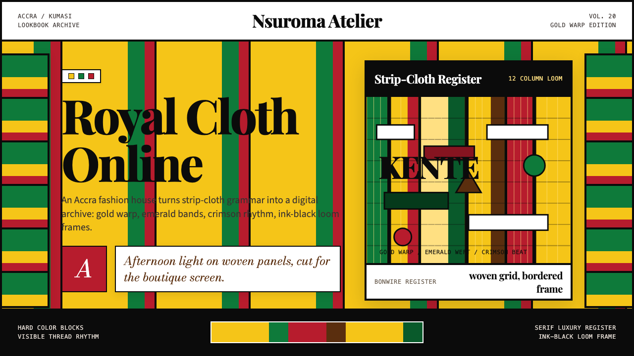 Ghana Kente Fashion 2020Royal cloth, digitized. Kente-gold grid, emerald bands, crimson stripes, seri…
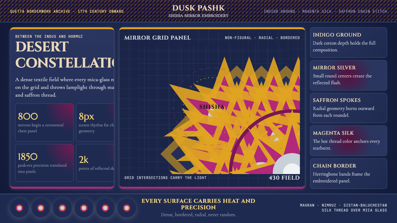 Balochi Mirror Embroidery (Shisha)Desert light made dense. Indigo grids flash with magenta, saffron, and mirror…
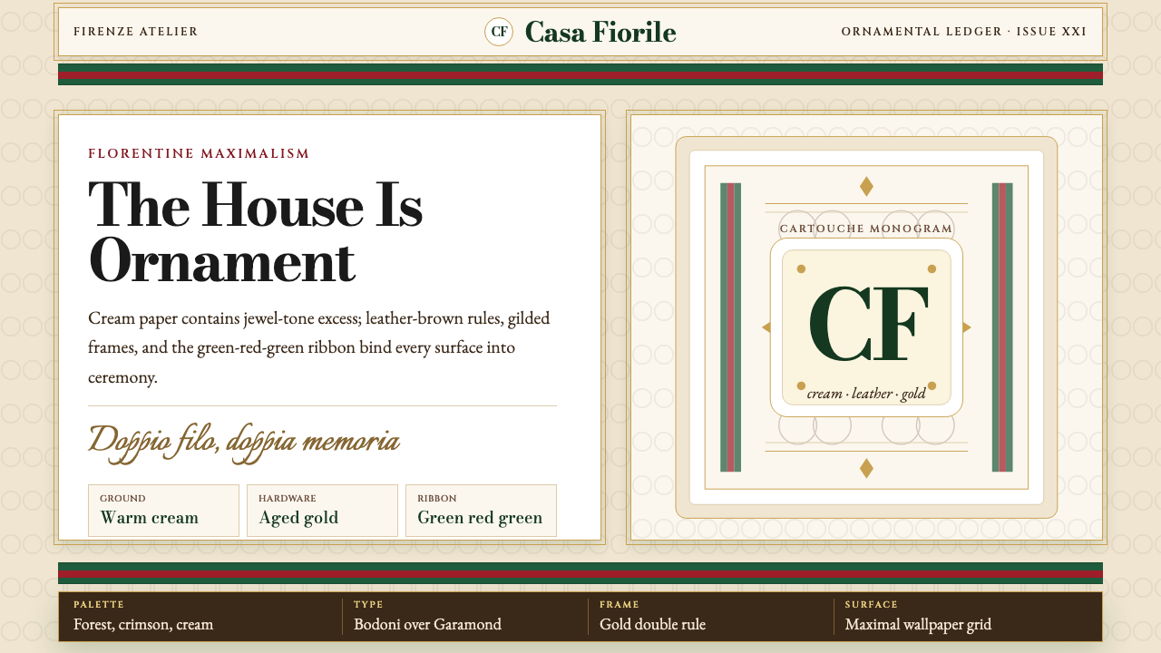 Gucci Double-GOrnament rules here. Bodoni on cream, framed by green-red-green and gold hard…
 SephoraBlack is the stage. White 45° stripes and restrained gold foil make cosmetics…
 BLACKPINK (2016 Debut Era)Couture hits at full volume. Hot pink, show-black and Bodoni lock onto a spot…
 Danish Skønvirke SilverThe drawing is done in shadow. Amarante on soft silver, with amber held in bi…