What is Mastodon Fediverse Elephant (2017)?
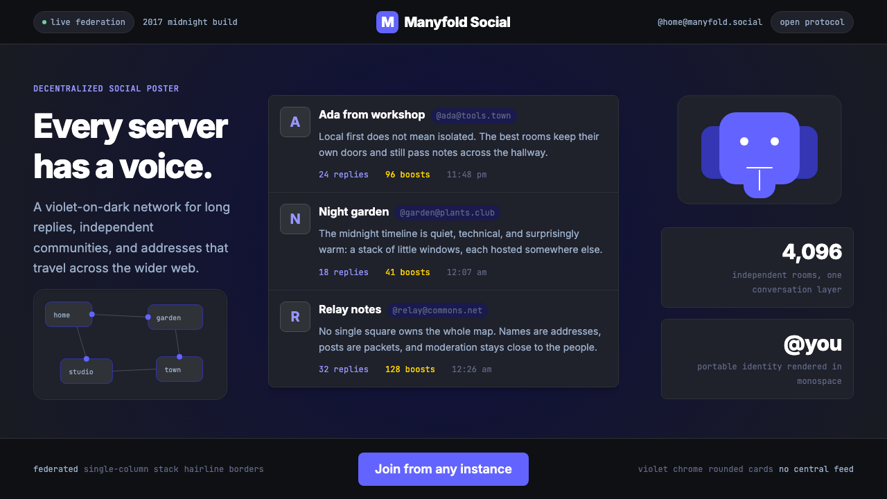
Mastodon's design speaks the language of the decentralized web — deep violet surfaces, rounded post cards stacked in a generous column, and a friendly cartoon elephant that makes federation feel like a community rather than a protocol.
Mastodon Fediverse Elephant (2017) in brief
Mastodon Fediverse Elephant is the visual language of the open-source social network Mastodon and the broader Fediverse ecosystem it anchors. Born in Germany in 2016 and refined through years of community-driven iteration, it is one of the rare design systems that grew out of an explicitly political position: a rejection of surveillance capitalism, algorithmic feeds, and platform monopoly. The aesthetic carries that stance without being combative — it feels principled, not hostile.
The system is built around deep dark surfaces, a signature violet accent that reads as both technical and approachable, and a layout philosophy centered on a single generous column of rounded post cards. Monospace typography appears wherever domain names, usernames, or instance addresses need to be legible — a typographic signal that whispers you are in a networked, technical space without shouting it. Everything is legible, nothing is flashy.
What distinguishes Mastodon's aesthetic from generic dark-mode design is its warmth. The violet is never cold; the rounded corners are never perfunctory. The mascot — a friendly cartoon elephant — appears as a recurring motif throughout the interface, softening what could otherwise feel like an austere hacker aesthetic. The result is a design that feels subcultural and technical yet genuinely welcoming to newcomers.
Where does Mastodon Fediverse Elephant (2017) come from?
Mastodon was created by Eugen Rochko, a young German developer who launched the first version in late 2016 while studying and working in Jena. Rochko was disillusioned with the direction of Twitter — its increasing centralization, inconsistent API policies, and growing hostility toward third-party clients — and wanted to build a social network that was structurally incapable of becoming a monopoly. His solution was federation: rather than one company running one server, anyone could run a Mastodon instance, and all instances could talk to each other through the ActivityPub protocol, which became a W3C standard in 2018.
The early visual identity was shaped by a community aesthetic that drew from multiple traditions: the dark, information-dense layouts of developer tools, the friendly cartoon illustration culture of open-source projects, and a deliberate contrast with Twitter's corporate blue. The choice of violet as the primary brand color was both a practical and a symbolic departure — enough visual distance from any incumbent social network to signal something genuinely different. The elephant mascot, illustrated in a rounded, approachable style, was contributed by illustrator David Revoy, whose work in the open-source illustration community (he is best known for the Pepper and Carrot webcomic) gave the mascot a warmth that cartoon corporate mascots rarely achieve.
The technical underpinning — ActivityPub — was co-designed by Christine Lemmer-Webber, a developer and activist whose advocacy for the open social web predated Mastodon and helped lay the conceptual groundwork for the Fediverse as a whole. ActivityPub defines how servers in the federation communicate: how a post on one instance appears in the timelines of followers on another, how replies, boosts, and favorites propagate across instance boundaries. This protocol's architecture — decentralized, opt-in, with no single authority — shaped the design in ways that are not always visible: the emphasis on instance identity (your handle always includes your instance domain), the lack of global trending topics, and the prioritization of chronological feeds over algorithmic ranking.
Renaud Chaput, who joined as a lead developer and later became engineering lead, oversaw significant interface refinements in the years following Mastodon's 2022 surge in popularity — when hundreds of thousands of users joined in the weeks after Elon Musk's acquisition of Twitter. That surge stress-tested the design system and pushed it toward greater polish and accessibility. The contemporary interface reflects those refinements: tighter visual hierarchy, more deliberate use of the violet accent, and responsive layouts that work across mobile and desktop without sacrificing the dense, timeline-first philosophy that defines the experience.
What defines the Mastodon Fediverse Elephant (2017) look?
Violet Accent System
Violet is the single defining hue of the Mastodon design system, appearing across interactive elements, focus rings, highlights, and brand moments. It is warm enough to feel inviting on dark surfaces without veering into the corporate blues or aggressive reds that dominate competing platforms. The accent is used with discipline: it marks actionable or interactive elements, signals the current user's activity, and provides the emotional warmth that keeps deep dark surfaces from feeling cold or inhospitable.
Deep Dark Surfaces
The canonical Mastodon interface is built on a rich, near-black dark background — not a pure black, but a deep, slightly warm neutral that reads as the night sky of a digital space. Cards and elevated surfaces sit at subtle levels above this base, creating a layered depth without gradients. The darkness is not a dark mode as an afterthought; it is the native mode, the natural home of the aesthetic, and everything in the system is designed first for this environment.
Rounded Card Layout
Posts in Mastodon are presented as individual rounded cards stacked in a single generous column. The roundness is not decorative filler — it is a character statement. Where other platforms present posts as raw rows in a flat list, Mastodon gives each post a contained, considered shape with clear breathing room between entries. The single-column layout prioritizes depth of reading over breadth of scanning, suited to the longer-form posts that Mastodon's generous character limit encourages.
Monospace Instance Typography
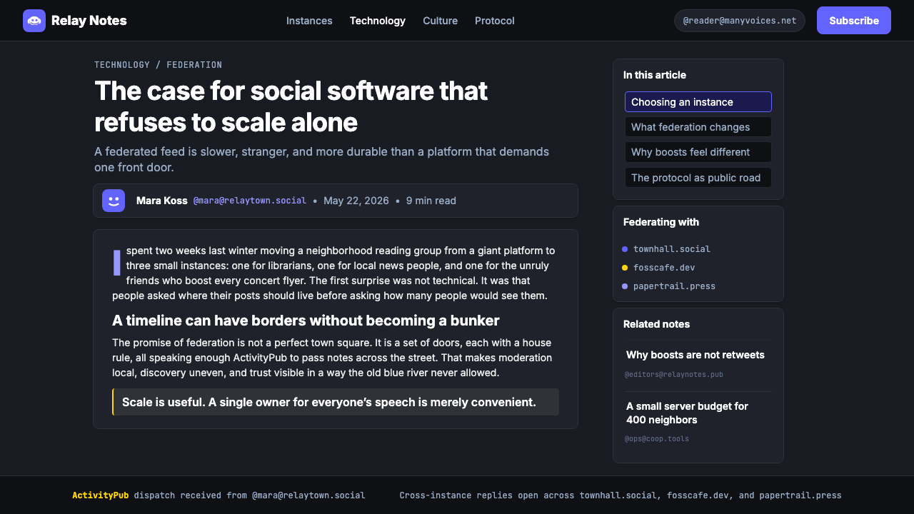
Domain names and instance addresses are rendered in monospace type throughout the interface. This typographic choice is both functional and expressive: monospace ensures that domain strings align predictably and are easily machine-parsed by the eye, while also signaling the technical, networked nature of the identity system. Your handle on Mastodon always includes the instance domain — @[email protected] — and the monospace treatment makes this dual structure legible at a glance, marking federated identity as a first-class design element rather than a technical footnote.
Friendly Mascot Culture
The cartoon elephant mascot — round, gentle, immediately recognizable — permeates the Mastodon visual identity in ways that distinguish it from corporate design systems. It appears at loading states, empty states, onboarding moments, and error screens: anywhere the interface needs to communicate with the user in a human register. This mascot culture draws from open-source illustration traditions, where character and personality are used to make technical tools feel less alienating. The elephant's presence keeps the system grounded in community warmth even as the underlying architecture becomes more complex.
Information-Dense Timeline
Mastodon's layouts pack substantial information into the timeline without sacrificing legibility. Each card contains the avatar, display name, instance handle, timestamp, post content (with optional content warnings), media attachments, and action row — all within a contained card that does not feel crowded. This density is not the result of cramming; it is achieved through consistent spacing rhythm, well-chosen type sizing, and clear visual hierarchy that guides the eye from identity to content to action without deliberate thought.
Accessible Interaction States
Mastodon's design places deliberate emphasis on visible focus states and accessible interaction affordances — partly because the project has strong roots in communities that prioritize accessibility, and partly because the ActivityPub federation model naturally attracts users with diverse needs and assistive technologies. Focus rings using the violet accent are visually prominent rather than hairline-subtle. Hover states, loading indicators, and confirmation toasts are all built to communicate clearly without relying solely on color.
Who shaped Mastodon Fediverse Elephant (2017)?
Rochko founded Mastodon in 2016 while still a student in Jena, Germany, writing much of the initial codebase himself. His dissatisfaction with Twitter's governance direction was the direct motivating force behind both the product and its visual identity — the choice to differentiate aggressively from Twitter's aesthetic was personal and principled, not just a branding exercise. He has continued as the project's lead developer and most visible public voice, shaping the design system's evolution through each major release cycle and navigating the explosive growth periods that tested the system's scalability.
Revoy is the illustrator whose work gave Mastodon its elephant mascot and its distinctive cartoon illustration style. A longtime open-source advocate best known for his Pepper and Carrot webcomic — which is created entirely with open-source tools and distributed under a Creative Commons license — Revoy's contribution went beyond a single logo. His illustration philosophy, which combines expressive character design with technical precision and an explicit commitment to free culture, became a template for how open-source software projects can build visual identity through community creative work rather than corporate design contracts.
Lemmer-Webber co-authored the ActivityPub specification that underlies the Fediverse's technical architecture. While her contribution is primarily technical rather than visual, the design implications are profound: by building federation into the protocol rather than onto a platform, ActivityPub made the instance domain a permanent and visible part of user identity, which in turn shaped Mastodon's typographic emphasis on monospace domain display and its interface treatment of federated handles. The decentralization that ActivityPub enables is not just a technical choice — it is the origin of many of the aesthetic decisions that make Mastodon's design distinctive.
Chaput served as engineering lead during the period of Mastodon's most significant mainstream growth, particularly the waves of new users that arrived in late 2022. His work on interface refinement during this period brought greater polish, accessibility improvements, and responsive design maturity to the system. The contemporary Mastodon interface — with its carefully tuned visual hierarchy, refined spacing, and accessible interaction states — reflects the design standards that were established and stabilized under his technical leadership.
Unlike most design systems, Mastodon's visual language evolved through thousands of contributors — instance administrators who built custom themes, developers who created alternative clients (Elk, Ivory, Phanpy, Tusky), and illustrators who extended the mascot vocabulary. This distributed authorship means the design system has more variation and dialectal richness than any corporate design system, and it means that Mastodon's aesthetic identity is genuinely community-owned. The elephant has been redrawn by hundreds of illustrators; the violet has been adapted into dozens of color schemes. What persists across all variations is the underlying sensibility: dark, warm, federated, and friendly.
How do you use Mastodon Fediverse Elephant (2017) today?
The Mastodon Fediverse aesthetic translates well into any context where a dark, community-oriented, technically credible visual voice is appropriate. Applying it effectively means internalizing its core tension: it is simultaneously a hacker aesthetic and a welcoming one, simultaneously dense with information and easy to navigate. Getting this balance wrong — tilting too far toward sterile tech or too far toward decoration — breaks the spell.
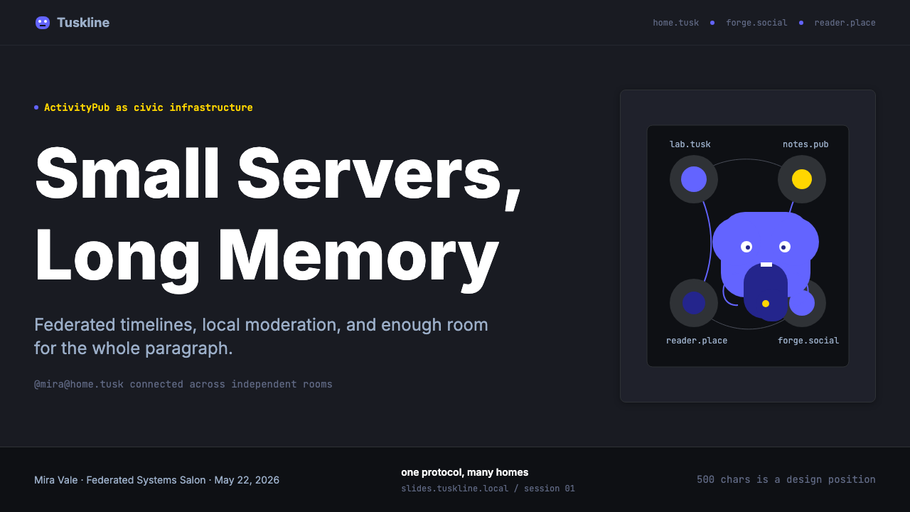
For presentation slides, the system works best when the dark background is committed to fully rather than used as a single accent slide. Cover slides benefit from the violet accent used sparingly as a single glow or highlight against the deep background, with the title in a clean, readable sans-serif at generous size. Content slides should use the card metaphor: each key point in its own contained visual block, with consistent padding and rounded corners creating rhythm. Data slides can lean into the monospace character for labels, axis values, and annotations — it reads as precise and trustworthy without being cold.
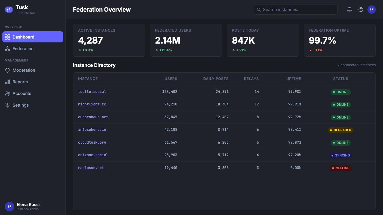
For web interfaces, the style suits developer tools, community platforms, open-source project sites, and any product positioning itself as an alternative to mainstream corporate options. The layout approach: single-column or narrow two-column with generous vertical rhythm, rounded card components for content units, violet reserved for interactive states (hover, focus, active), and careful attention to the spacing between cards so the rhythm never feels cramped. Navigation should be typographic and understated — the visual interest comes from the content, not the chrome.
For editorial and marketing contexts, the system works well for technology-adjacent publications, digital rights organizations, open-source communities, and independent media that wants to signal values alignment with its audience. A campaign or article layout might use the full dark background for pull quotes and feature blocks, shift to a lighter surface for long-form body text (dark backgrounds tire the eye over sustained reading), and use the violet consistently for links, callouts, and interactive elements. The mascot or elephant motif can appear as an editorial illustration device when the context supports it — it works best in small, purposeful doses.
A common mistake when using this aesthetic is deploying the violet too liberally. In the original Mastodon interface, violet is the accent — it marks what you can do or what is yours — and it is surrounded by large areas of neutral dark surface. When violet is used on more than a fifth of any composition, it loses its signaling power and the layout starts to feel like a generic purple-themed design rather than an articulated system. The discipline is restraint: use the deep background to carry the weight, and let the violet do the work of guiding attention.
Mastodon Fediverse Elephant (2017) — FAQ
Is Mastodon's design system the same as generic dark mode?
No. Generic dark mode is typically light mode with the color scheme inverted — the same layouts, the same hierarchy decisions, the same interaction patterns, but with dark backgrounds and light text. Mastodon's aesthetic is native to darkness: the color choices, the spacing, the card elevations, and the violet accent system are all calibrated for a dark-first environment. The warmth of the violet, the specific shade of the deep background, and the rounded card shapes are not accidental — they are responses to the context of reading a federated timeline at night. Applying it well means designing dark-first, not inverting a light design.
Can this aesthetic work for products that are not social networks?
Yes, with the right framing. The core visual values — dark surfaces, violet accent, rounded cards, monospace type for technical identifiers, a friendly character to soften technical complexity — transfer well to developer tools, community platforms, open-source applications, and any digital product that wants to signal independence, trust, and technical credibility without feeling cold or elitist. Products where it would not fit well include consumer retail, food and beverage, children's products, luxury goods, and health and wellness contexts — anywhere the darkness would feel oppressive rather than inviting, or where the community-technical aesthetic conflicts with warmth or aspiration.
How important is the elephant mascot to the overall system?
The mascot is important but not mandatory. In the original Mastodon interface, it appears at emotional pivot points — loading screens, empty states, error moments — where it diffuses tension and communicates warmth. For products deriving from this aesthetic, a character or illustration element in a similar spirit (rounded, friendly, slightly whimsical) can serve the same function without directly copying the elephant. What matters is the underlying principle: a technical aesthetic needs a humanizing counterweight. Products that take the dark surfaces, the violet accent, and the monospace type but omit any warm character element tend to drift toward sterile developer-tool territory rather than the welcoming community space that makes Mastodon's design distinctive.
What makes federated identity a design problem, and how does Mastodon solve it?
In a centralized social network, your handle is a simple name — @username — and the platform is implicit. In a federated network, your handle must include your home instance — @[email protected] — because there is no universal namespace. This is technically correct but potentially confusing for users accustomed to simpler addresses. Mastodon's solution is typographic and behavioral: the instance domain portion of the handle is rendered in monospace and displayed more subtly than the display name, teaching users through repetition that the two-part structure is normal and meaningful rather than a bug. The design makes the architecture visible without making it obtrusive.
How should the violet accent be balanced against the dark background?
The violet works precisely because it is used sparingly against a field of deep neutral. The ratio that the original interface maintains — roughly one part violet to five or six parts dark neutral — is a useful reference. In practice, this means reserving violet for interactive elements (buttons, links, focus indicators, active states) and avoiding it for decorative purposes, background fills, or typographic emphasis. When violet needs to convey different levels of meaning — a primary action versus a secondary one — luminosity and saturation variation do the work, keeping the hue family consistent while creating the necessary hierarchy.
Related design styles
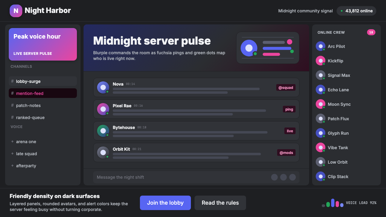 Discord Blurple Server (2020)Midnight server energy. Blurple panels, fuchsia pings, and green status dots…
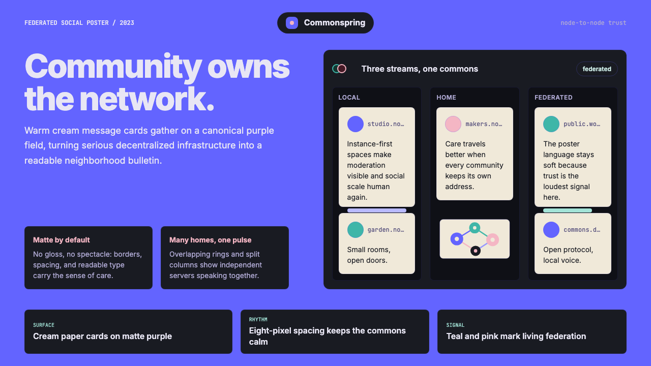 Mastodon FediverseDecentralized warmth. Purple fields and cream toot-cards make federation feel…
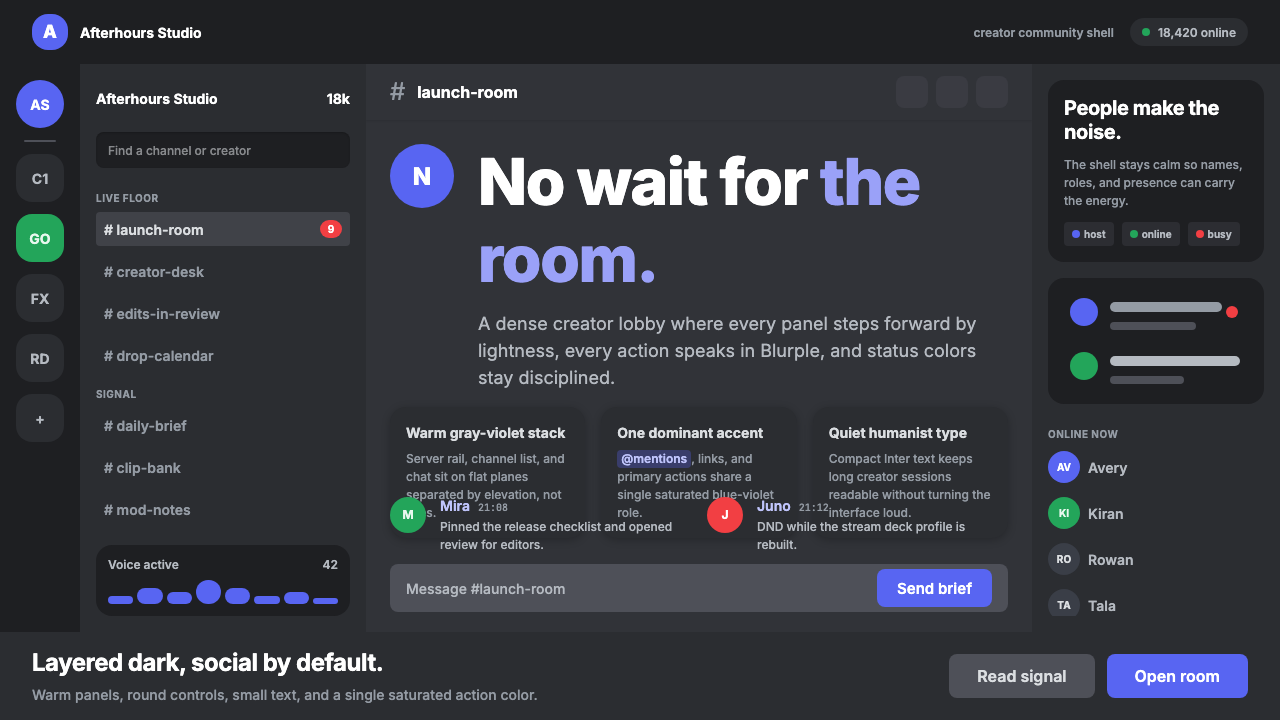 Discord Creator Dark UIQuiet until people speak. Gray-violet planes stack under one Blurple accent.
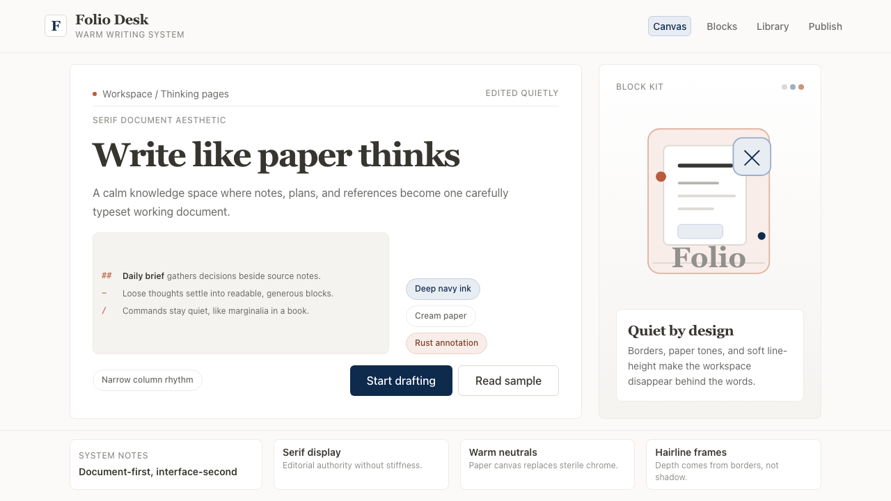 Notion ModernWriting feels papery. Source Serif on warm cream, navy ink, and hairline bord…
 Signal Encrypted MessengerCalm privacy, plainly stated. Cobalt Inter type and white space carry the tru…
 TikTok 2024Attention vibrates. Near-black feed, cyan-magenta offsets, and vertical frame…