What is Discord Creator Dark UI?
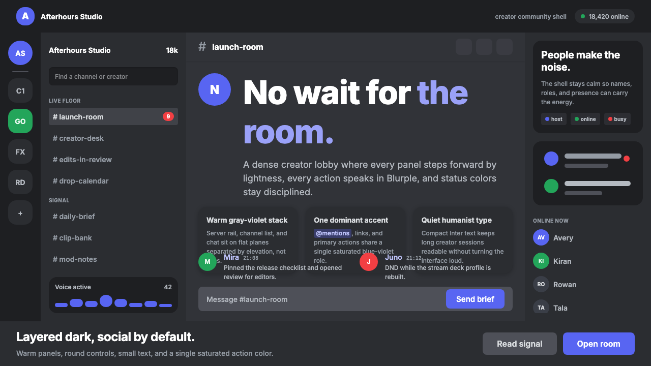
Discord Creator Dark UI turns restraint into hospitality — warm gray-violet planes recede, one Blurple accent guides action, and the community becomes the brightest thing on screen.
Discord Creator Dark UI in brief
Discord Creator Dark UI is the visual language of Discord’s desktop dark theme, a chat environment used across millions of gaming and creator communities. Its structure is immediately legible: a narrow server rail leads to a channel sidebar, which opens into the main chat surface. These regions do not compete for attention. They are arranged as adjacent warm gray-violet planes, distinguished by restrained shifts in lightness and elevation rather than conspicuous borders, shadows, or decorative framing.
The system is dark-mode-first rather than a light interface mechanically inverted. Muted surfaces reduce background noise, while the signature Blurple is reserved for primary actions, active links, and moments that require decisive attention. Green and red have narrower roles as status signals. This disciplined allocation makes color functional: the user learns that Blurple invites action, while green and red report conditions rather than decorate the page.
Its personality comes from the balance between softness and density. A clean humanist sans keeps conversation readable, generous rounding makes controls feel approachable, and quiet lighter overlays reveal hover states without interrupting the surrounding discussion. The interface can hold servers, channels, messages, links, and status information at once, yet it remains visually subdued. Nothing is designed to outperform the people speaking.
Where does Discord Creator Dark UI come from?
Discord Creator Dark UI belongs to the global internet era of community and creator chat platforms. Discord was founded in San Francisco by Jason Citron and Stanislav Vishnevskiy, and its dark theme has been central to the product and brand from 2015 onward. That starting point matters: the interface was shaped around sustained conversation among gaming and creator communities, where many channels, identities, and messages must remain accessible without turning the surrounding application into a continuous visual announcement.
Its design lineage joins three related currents: modern flat UI, dark-mode-first product design, and the community chat platform. From modern flat UI comes the preference for clear planes, direct controls, and the rejection of ornamental depth. From dark-mode-first design comes the careful use of neighboring dark tones rather than a single undifferentiated black field. From community chat comes the layered spatial model of server rail, channel navigation, and conversation surface. The result is not flatness without hierarchy, but hierarchy created through subtle surface relationships.
The dark theme developed as an enduring product language rather than a temporary visual treatment. Warm gray-violet replaced the colder impersonality of pure neutral darkness, giving the environment enough character to be recognizable while preserving long-session quietness. Blurple became the concentrated expression of brand and action, allowing most of the interface to remain subdued. Status colors were kept semantically narrow, protecting the accent system from becoming a miscellaneous palette.
Since 2022, the GG Sans type direction has reinforced the interface’s humanist character. Typography does not introduce a second visual spectacle; it supports names, channels, messages, links, and controls with a consistent conversational voice. Across the continuing evolution of the product, the core composition remains stable: nested community spaces, warm dark planes, restrained state changes, rounded interaction surfaces, and a single saturated accent. Its continuity comes from preserving these relationships rather than freezing every component in one historical form.
What defines the Discord Creator Dark UI look?
Layered Dark Planes
The server rail, channel sidebar, and chat area form a sequence of warm gray-violet surfaces. Separation comes from small shifts in lightness and perceived elevation, not from prominent outlines or theatrical shadows. Each plane has a distinct navigational role, yet all belong to one continuous environment. This tonal layering makes a dense application understandable without chopping it into visually isolated boxes.
Single Blurple Accent
Blurple carries primary actions, active links, and the clearest invitations to interact. Its strength depends on scarcity: because surrounding surfaces and typography are comparatively muted, a small appearance can organize attention across an entire view. Repeating several equally saturated accents would weaken this hierarchy and make the interface feel promotional rather than conversational.
Status Color Discipline
Green and red are not general-purpose decoration. They are reserved for status and condition, allowing users to interpret them quickly even in crowded community spaces. This semantic discipline keeps urgency proportional: red does not appear merely to energize a composition, and green is not used as a casual secondary brand color. Their meaning remains stable because their visual territory is narrow.
Humanist Typography
A clean humanist sans gives messages and controls an approachable voice. Letterforms should feel contemporary and efficient without becoming mechanically severe. Hierarchy comes through clear differences among conversation, labels, names, and supporting information, while the family resemblance remains strong. The GG Sans direction since 2022 expresses this preference for readable, social, and distinctly human communication.
Generous Rounding
Rounded controls soften the density of rails, lists, fields, and actions. The curves are generous enough to make interaction surfaces feel friendly, but they do not turn every region into a floating capsule. Rounding belongs mainly to elements that can be selected, activated, or inhabited; the larger layout remains planar. This distinction preserves both warmth and structural clarity.
Quiet Interaction States
Hover and selection states usually appear as restrained lighter overlays on an existing surface. The feedback is visible but does not redraw the component or introduce a new visual material. This is especially important in channel lists and message actions, where frequent pointer movement could otherwise make the interface flicker with competing signals. Interaction feels responsive without becoming restless.
Conversation-First Restraint
Every supporting element is expected to recede behind community activity. Navigation remains accessible, actions remain discoverable, and status remains legible, but none should compete with names and messages for emotional emphasis. The style is therefore not merely dark or flat. It is an attention policy in which the product frame stays quiet until a person speaks or an action genuinely matters.
Who shaped Discord Creator Dark UI?
As a co-founder of Discord, Jason Citron is part of the origin of the platform whose dark theme became central to its identity from 2015 onward. His relevance to the style lies in the creation of a community chat product where the interface must support persistent, many-layered social spaces without overwhelming the conversations that give those spaces value.
Stanislav Vishnevskiy co-founded Discord and belongs to the product’s San Francisco origins. The visual system associated with the platform reflects the demands of community communication: servers, channels, messages, and status information must coexist within a stable spatial model. His place in the platform’s founding history makes him a key figure in the environment from which this dark, conversation-first language emerged.
Modern flat UI provides one of the style’s principal design lineages. It favors direct controls, readable planes, and depth that serves hierarchy rather than imitation of physical materials. In Discord Creator Dark UI, that inheritance appears in the absence of decorative shadows and in the use of subtle surface shifts to explain structure. Flatness becomes an organizational method rather than a rejection of all depth.
Dark-mode-first product design treats darkness as the native environment rather than an alternate color scheme. Its contribution is visible in the careful relationship among warm gray-violet planes, muted text, quiet hover overlays, and concentrated accent color. The system is composed from dark surfaces outward, which gives it greater tonal coherence than an interface produced by simply reversing a light theme.
Community and creator chat platforms supply the functional setting that gives the style its meaning. Their interfaces must support nested navigation, rapid status reading, and sustained message exchange while accommodating many simultaneous communities. Discord Creator Dark UI answers those demands by making the framework persistent but subdued. The recognizable aesthetic follows from the social architecture rather than being applied independently of it.
How do you use Discord Creator Dark UI today?
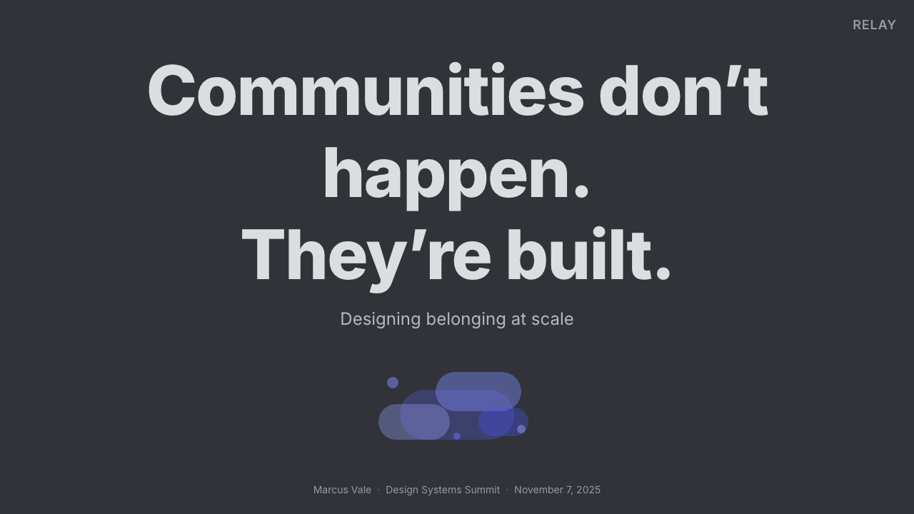
For presentation slides, the style works best when the deck behaves like a calm conversation space. A cover can place the title on a broad warm gray-violet field, with one Blurple action-like accent establishing focus and a darker adjacent plane suggesting navigation or context. Content slides should separate headings, supporting notes, and main material through surface shifts and typographic hierarchy rather than boxes around every passage. Rounded markers may identify speakers, sections, or community roles, but the composition should remain quiet enough for the argument to lead.
Data slides benefit from the same semantic color discipline. Most charts can be built from neighboring muted tones, with Blurple identifying the principal series, selected category, or intended conclusion. Green and red should appear only when the data genuinely describes positive, available, negative, or unavailable states. Tables can use alternating dark planes and gentle row highlighting instead of strong rules. The goal is to make comparison effortless while preventing the chart from becoming brighter than the finding it communicates.
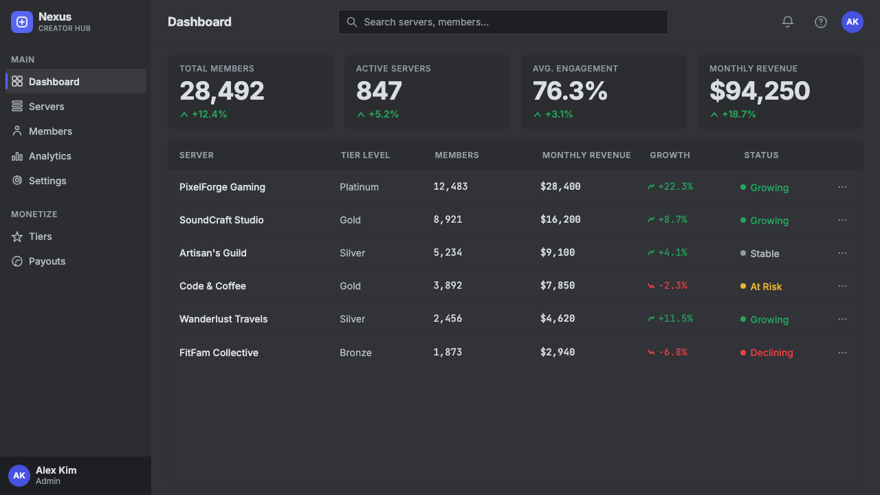
In web interfaces, Discord Creator Dark UI is naturally suited to dashboards, collaborative workspaces, and pricing experiences that contain persistent navigation. A dashboard can translate the server rail into a compact workspace switcher, the channel sidebar into secondary navigation, and the chat plane into the active work area. Pricing pages should keep plans on closely related dark surfaces and use Blurple for the preferred action or selected tier. Rounded controls and restrained hover overlays provide approachability without turning every card into a floating object.
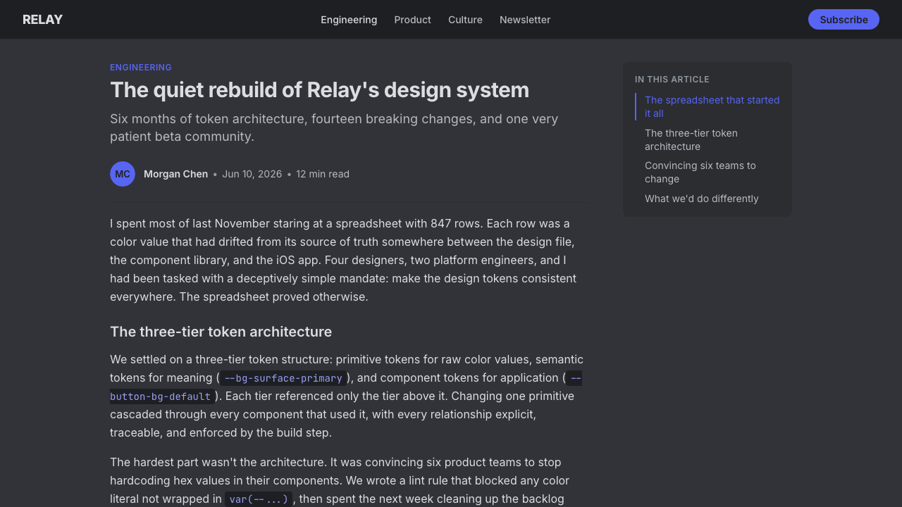
Editorial and marketing applications should borrow the attention logic, not merely the dark palette. An article can place navigation and metadata on slightly deeper planes while giving the reading column the calmest, most open surface. Interviews and community stories are especially compatible because speaker identity can organize the page. Marketing layouts can use Blurple to connect calls to action, links, and selected evidence across sections, while warm gray-violet backgrounds maintain continuity. Green and red should not be recruited as campaign decoration when they are not communicating status.
The most common mistake is making every panel visibly separate and every interaction brightly branded. Heavy borders, dramatic shadows, several saturated accents, and persistent colored highlights destroy the quiet hierarchy that defines the style. Another error is using pure darkness everywhere, which removes the subtle plane relationships needed to distinguish navigation from conversation. A convincing application begins with restrained tonal layering, assigns Blurple one consistent action role, reserves status colors for actual status, and lets content provide the energy.
Discord Creator Dark UI — FAQ
Is Discord Creator Dark UI simply a generic dark theme?
No. A generic dark theme may only replace light backgrounds with dark ones. This style depends on a specific relationship among warm gray-violet planes, nested community navigation, a single Blurple action accent, disciplined status colors, humanist type, generous rounding, and quiet overlays. Removing those relationships leaves darkness but not the recognizable system. Its identity comes from how attention and hierarchy are managed, not from darkness alone.
Why are borders and shadows so limited?
Because the primary structure is already carried by tonal planes. Adding strong borders or shadows would restate every boundary and make the server rail, channel sidebar, and chat area feel like unrelated containers. Subtle changes in surface lightness preserve continuity while still explaining where one function ends and another begins. The restraint also reduces competition around messages, which remain the emotional center of the interface.
Can another brand color replace Blurple?
A related system can substitute another single saturated brand accent, but it will no longer reproduce Discord’s specific identity. The important transferable principle is concentration: one accent should carry primary actions and active links while most surfaces remain muted. Green and red should retain narrow status roles rather than joining the brand palette. If several brand colors receive equal emphasis, the calm conversational hierarchy quickly dissolves.
How should imagery be handled in this style?
Imagery should behave like community content rather than background decoration. Avatars, shared media, and creator material may be vivid because they represent people and conversation, while the surrounding interface remains restrained. Images should sit within clearly understood content regions and benefit from the same generous rounding used elsewhere. Large decorative imagery behind navigation or text would reverse the attention policy by making the application frame louder than the participants.
Where does Discord Creator Dark UI work poorly?
It is less suitable when a product needs every region to feel independent, when several brand colors must compete equally, or when decorative imagery is expected to dominate the experience. Its strengths come from persistent navigation, repeated interaction, and conversation-centered content. A context with little hierarchy or no meaningful status system may gain only a superficial dark appearance. The style works best when quiet structure genuinely helps people remain oriented around shared activity.
Related design styles
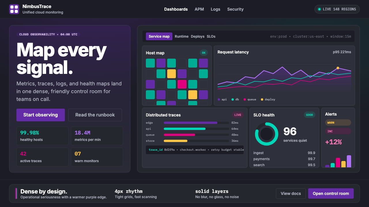 DatadogSerious telemetry, friendly pulse. Purple dark grids pack charts, badges, and…
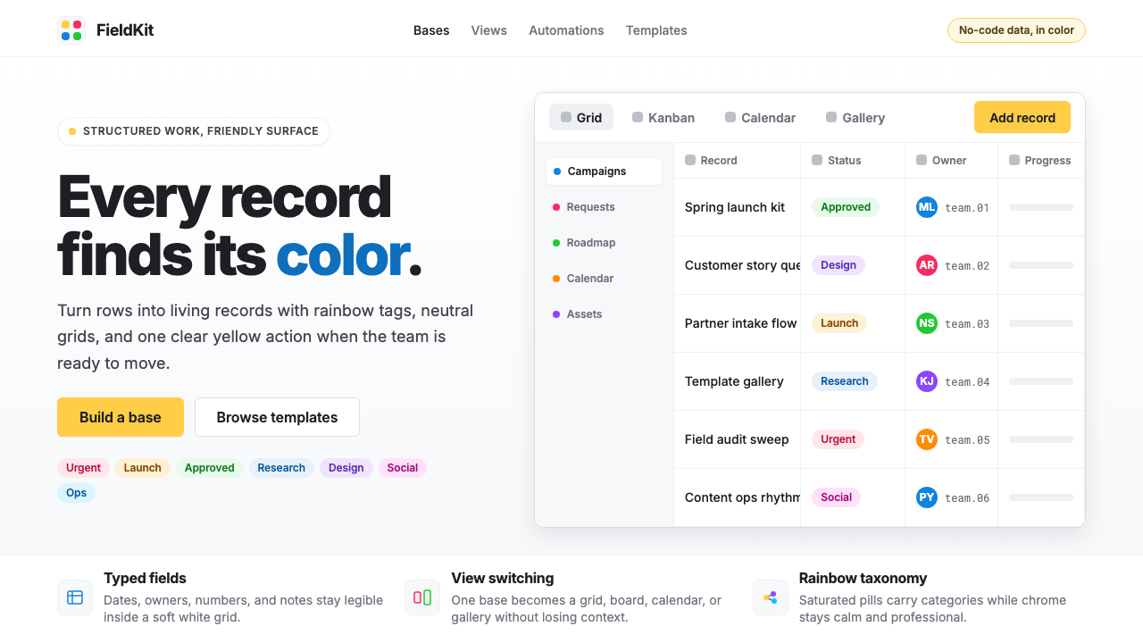 Airtable Spreadsheet-RainbowWork becomes celebratory. Inter grids stay white while rainbow pills and yell…
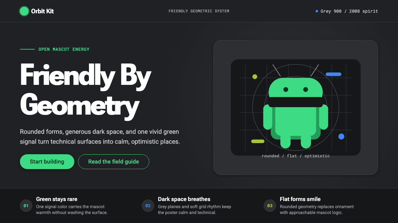 Android Bugdroid GreenFriendly tech, reduced to geometry. Vivid green pops from Grey 900 and rounde…
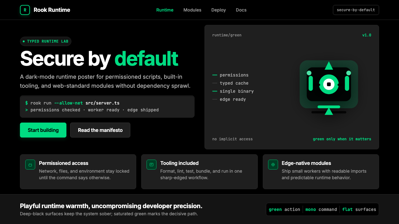 Deno Runtime-GreenWarm precision on black. Saturated green, Inter, and mono code turn security…
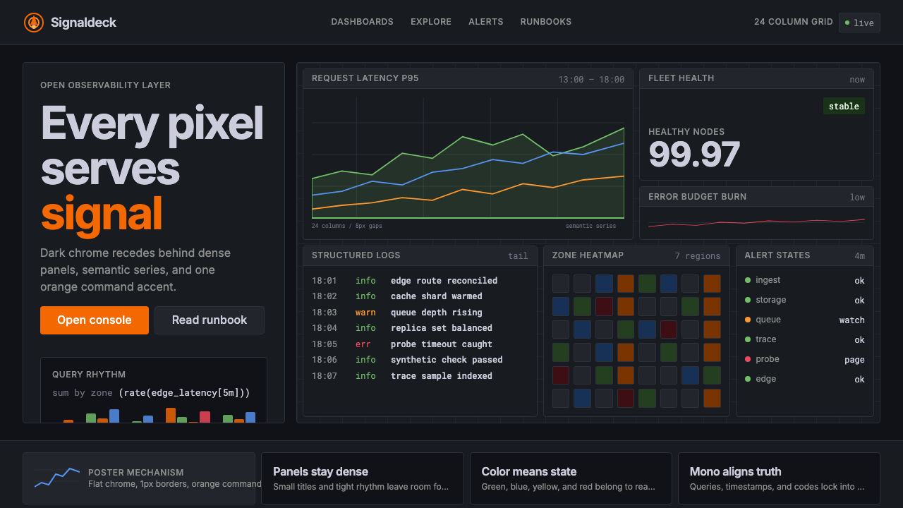 GrafanaData first, chrome last. Orange accent cuts through dense dark panels and sem…
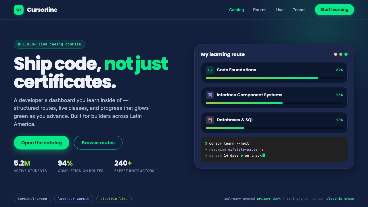 Platzi EdtechA developer dashboard you learn inside. Electric spring-green on teal-navy, w…