What is Platzi Edtech?
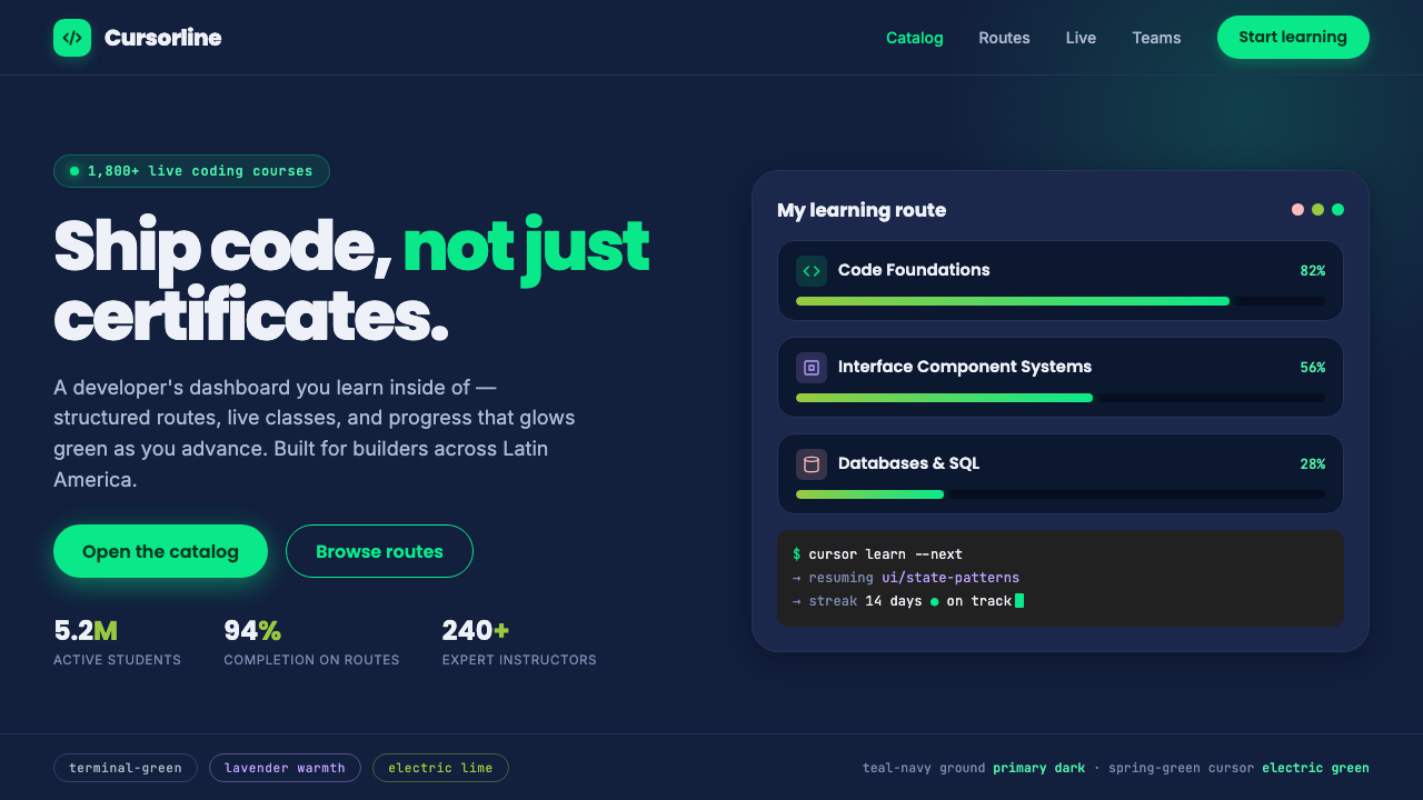
Platzi turns the online classroom into a living developer dashboard — electric spring-green activity on deep teal-navy, softened just enough by lavender and coral to make technical ambition feel welcoming.
Platzi Edtech in brief
Platzi is a pan–Latin American professional online-education platform founded in Bogotá in 2014 by Freddy Vega and Christian Van Der Henst. Its visual identity belongs to the world of code-school learning: practical, high-energy, digitally native, and organized around the feeling that a learner is entering an active workspace rather than a passive catalogue of lessons.
The style can be understood as a developer dashboard brought to life. A deep teal-navy field establishes the atmosphere of a terminal, product workspace, or late-night study session. Electric spring-green acts like an illuminated cursor moving through a course catalogue: it gives the system urgency, progress, and a distinctly technical pulse. The visual language is not austere developer minimalism; it uses warmth to make a demanding subject feel approachable.
Bold rounded geometric headlines sit beside dense interface structures, compact information groups, and dashboard-like controls. Lavender and coral accents interrupt the dominant green-and-navy relationship with moments of friendliness and human emphasis. The result is a style that communicates professional learning through momentum: learners are not merely reading about technology, but visibly moving through it.
Where does Platzi Edtech come from?
Platzi began in Bogotá in 2014, founded by Freddy Vega and Christian Van Der Henst. Its origin sits within Latin American edtech, where professional online learning needs to make specialized knowledge feel available, current, and useful across a broad regional audience. That context matters to the identity: it is built to signal access to serious career-oriented learning without adopting the distance of a conventional institutional classroom.
The platform's visual direction draws on code-school and bootcamp learning culture. Rather than presenting education as a quiet archive, it frames learning as active participation in a technical environment. Dashboard density, navigational cues, and strong hierarchy make the interface feel operational. The learner is positioned less as an audience member and more as someone making progress through a system.
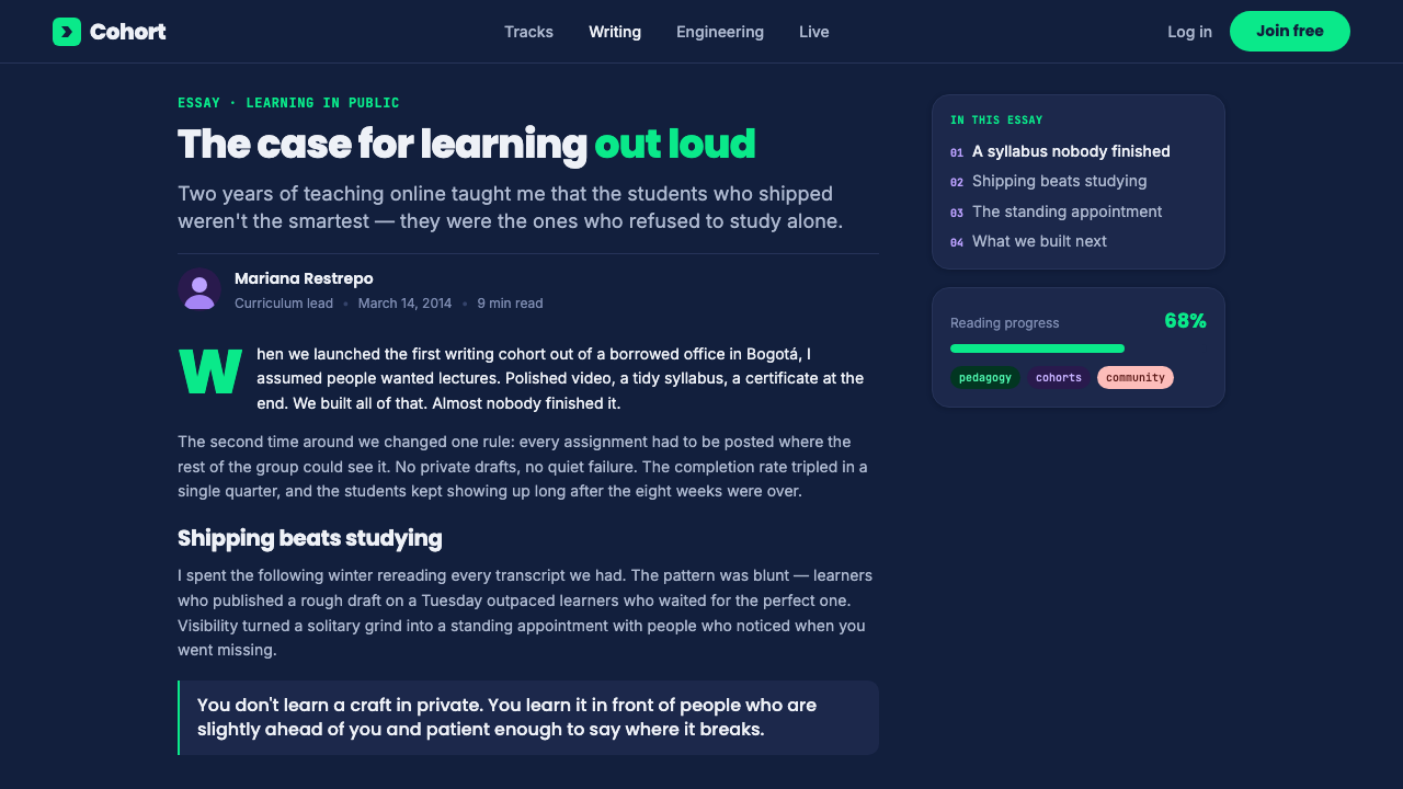
Its current visual expression, associated with the period from roughly 2022 to 2024, combines dark-dashboard product design with bold geometric-sans branding. The dark field gives information a concentrated, screen-native setting; the bright green creates immediate activity and direction. Rounded headline forms prevent that environment from becoming impersonal, introducing an optimistic, accessible voice into a visual language that could otherwise feel purely utilitarian.
The pan–Latin American character is expressed through tone rather than borrowed regional ornament. Lavender and coral warm the technical base, giving the system a social and encouraging presence. This balance is central to Platzi Edtech: the design does not abandon developer credibility for friendliness, nor does it treat friendliness as a decorative afterthought. It makes professional learning look energetic, legible, and inhabited.
What defines the Platzi Edtech look?
Dark Developer Field
Deep teal-navy is the visual environment rather than a neutral backdrop. It recalls terminals, product workspaces, and focused screen time, allowing information to feel concentrated and active. Large dark areas should remain calm enough to support dense learning content rather than becoming decorative darkness.
Electric Spring-Green
Electric spring-green is the system's clearest signal of motion. It behaves like a terminal cursor, drawing attention to progress, active choices, or the next learning action. Its force comes from restraint: when it appears too broadly, it stops reading as energy and becomes visual noise.
Rounded Geometric Headlines
Headlines are bold, rounded, and geometric, giving the platform a confident voice without the severity associated with a purely technical interface. Their shape makes important learning messages feel direct and memorable. The contrast between these generous forms and denser interface text is a key source of hierarchy.
Dashboard Density
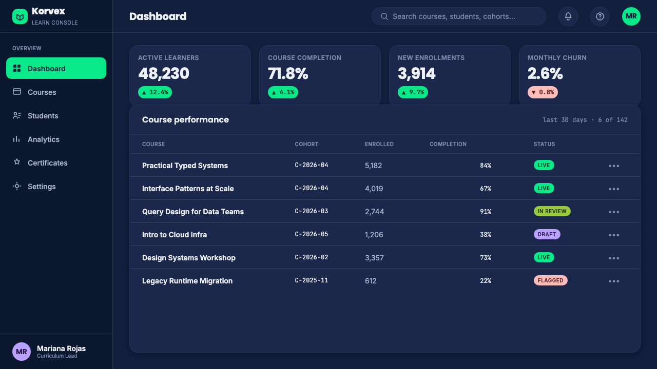
Information is allowed to be dense when that density communicates a working learning environment. Course states, navigation, progress, and related actions can live close together, provided their hierarchy remains clear. The aim is productive richness, not a sparse marketing page pretending to be a learning tool.
Lavender and Coral Warmth
Lavender and coral are support accents that soften the dark technical foundation. They introduce encouragement, personality, and social warmth without displacing green as the active signal. Used selectively, they make the platform feel like a place for people learning together, not only a system processing information.
Friendly Technical Contrast
Platzi's defining contrast is between credible technical structure and an inviting emotional tone. Strong dark surfaces, compact UI, and bright action cues establish competence; rounded forms and warm accents establish welcome. Neither side should overpower the other, because the style depends on their coexistence.
Who shaped Platzi Edtech?
Freddy Vega co-founded Platzi in Bogotá in 2014. Within the platform's public origin story, his role anchors the identity in professional online education rather than in a detached visual trend. The design's energy and technical confidence serve the larger promise of practical learning for people building careers.
Christian Van Der Henst co-founded Platzi alongside Freddy Vega. His place in the founding pair reinforces that the platform emerged from a shared educational project. The identity therefore needs to hold both product clarity and a sense of encouragement: it is designed for learners entering an active professional community.
Platzi itself is the third central figure in this visual system: a Latin American edtech platform whose product experience and brand language are inseparable. Its dark dashboard setting, electric green activity cues, and warm supporting accents make learning visible as a continuing technical practice rather than a static collection of courses.
How do you use Platzi Edtech today?
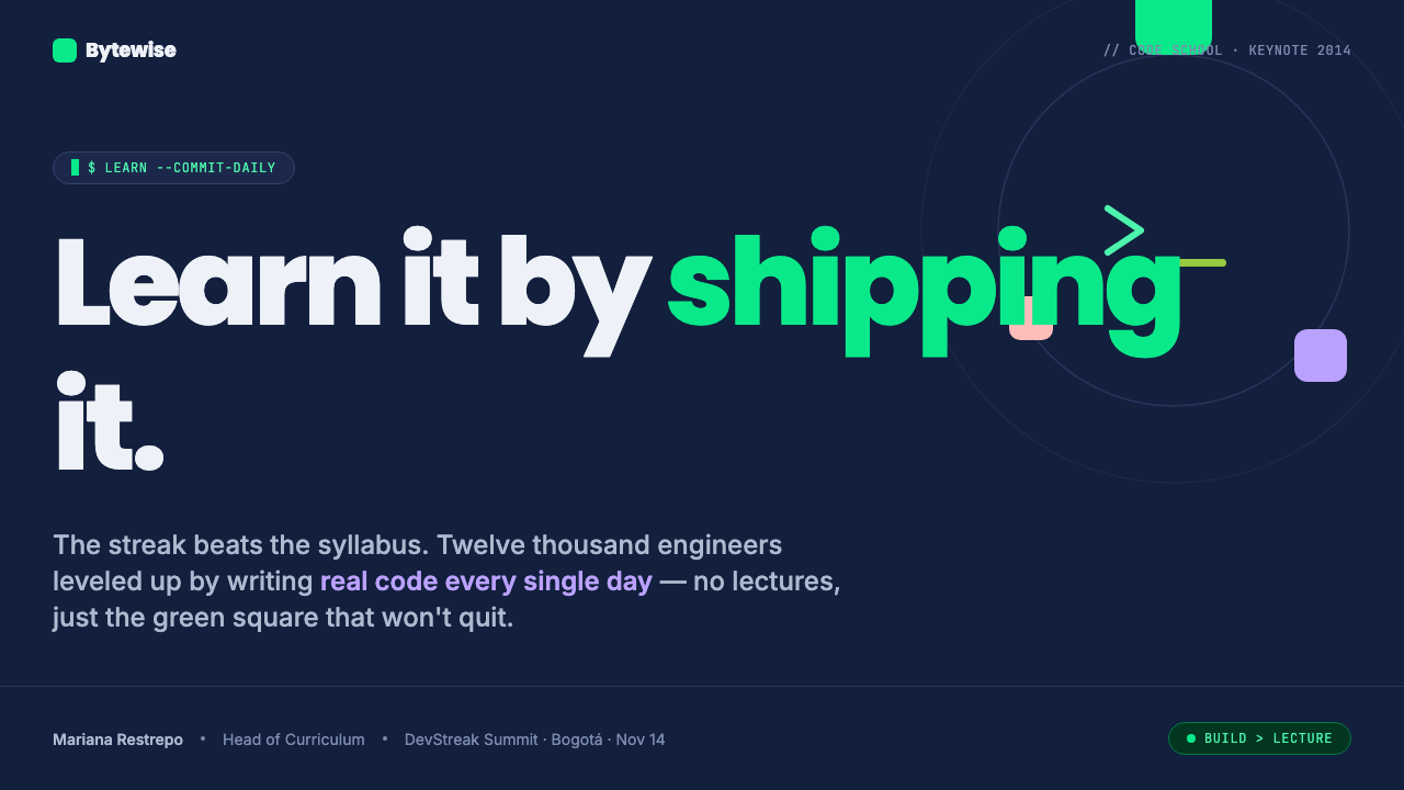
For presentation slides, use the style to make learning, product, or technology topics feel active from the opening page. A cover can place a bold rounded title against the deep teal-navy field, with a concentrated spring-green cue establishing direction. Keep the composition purposeful: the dark environment should frame the idea, while lavender or coral can provide a single humanizing counterpoint rather than competing for attention.
Content and data slides should borrow the logic of a useful dashboard. Group related ideas closely, make progress and priority visible, and use clear visual contrast between major statements and supporting detail. Charts should feel integrated into the interface rather than pasted onto it. Reserve electric green for active values, key movement, or the conclusion a viewer should notice first; use the warmer accents to distinguish secondary stories or collaborative context.
For web interfaces, Platzi Edtech is especially suited to learning dashboards, course catalogues, skill-progress views, and product pages for technical education. Navigation and controls can be dense because the style assumes users are doing work. The dark field should support long periods of attention, while rounded geometric headings help pages retain a clear, optimistic voice. Pricing or plan pages can use the same system by making the decision path unmistakable and keeping decorative material secondary to comparison and action.
For editorial and marketing work, the style works best when the message is about growth, capability, access, or professional momentum. Treat the page as a sequence of learning signals: an emphatic headline, a concise explanation, evidence of what can be explored, and a clear invitation to continue. The technical environment should remain present even in more expressive campaigns, so that the warm accents feel like encouragement inside a code-school world rather than a generic lifestyle treatment.
The common mistake is to copy the dark background and bright green without preserving their roles. If every label, panel, headline, and control glows with the same intensity, the dashboard loses hierarchy and the learner loses direction. Another mistake is to make the interface so severe that lavender, coral, and rounded headline forms disappear. Platzi works because technical precision and emotional welcome are deliberately held together.
Platzi Edtech — FAQ
Is Platzi Edtech only appropriate for programming products?
No, but it is strongest where learning is practical, structured, and career-oriented. Its dashboard logic and developer atmosphere suit technical education naturally, while its warm accents can also support other professional learning contexts. It is less convincing when a product needs a quiet academic mood, a luxury tone, or a highly organic sensory identity.
Why does the style need both spring-green and warm accents?
They perform different jobs. Electric spring-green communicates activity, progress, and technical focus; lavender and coral make the environment feel encouraging and inhabited. Removing the warm accents can make the system feel like a generic developer tool. Letting the warm accents replace green can weaken the sense of active learning direction.
Can the style work on a light background?
A light adaptation is possible, but the deep teal-navy field is central to the developer-dashboard character described by the identity. On a lighter surface, the design should preserve that sense of technical environment through dark structural regions and carefully focused green activity cues. Otherwise it may retain the colors while losing the platform's distinctive atmosphere.
How dense should a Platzi-inspired interface be?
Dense enough to show that the learner has meaningful options, status, and next steps, but never so dense that action becomes ambiguous. Density is useful when it groups a real learning workflow. It is not a reason to add arbitrary panels, badges, or controls that do not help users understand where they are and what to do next.
What is the fastest way to make this style feel inauthentic?
Treating it as neon decoration. The bright green must behave as a purposeful signal, and the dark dashboard must organize real information. When the palette is applied to empty layouts, or when every element receives equal emphasis, the result reads as a superficial gaming or cyber aesthetic rather than a welcoming professional learning environment.
Related design styles
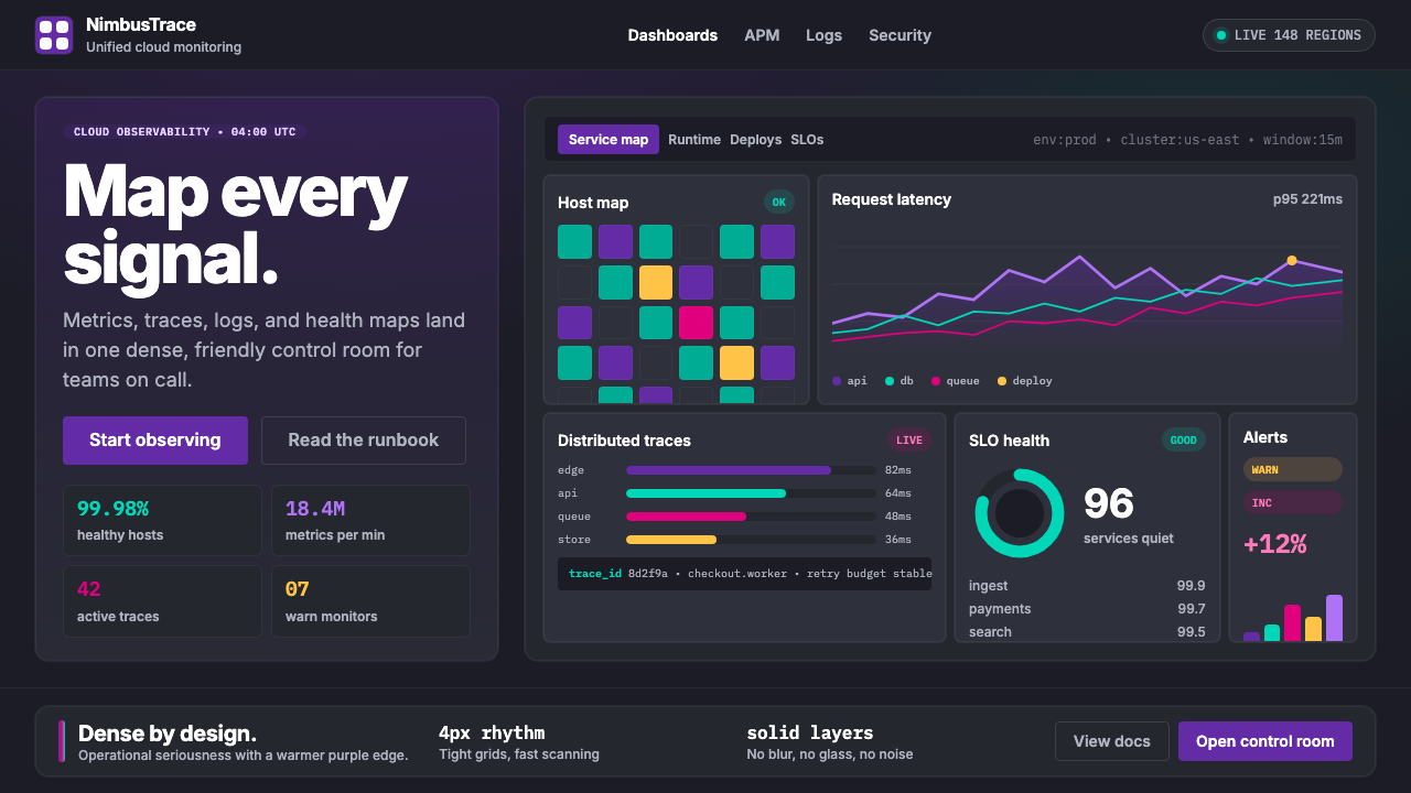 DatadogSerious telemetry, friendly pulse. Purple dark grids pack charts, badges, and…
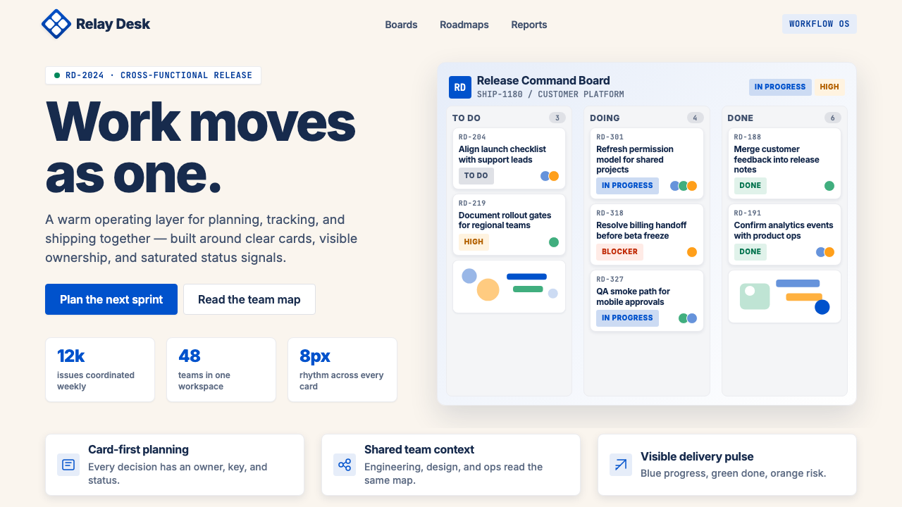 Atlassian Jira BlueWarm enterprise teamwork. Saturated blue cards on cream make status feel huma…
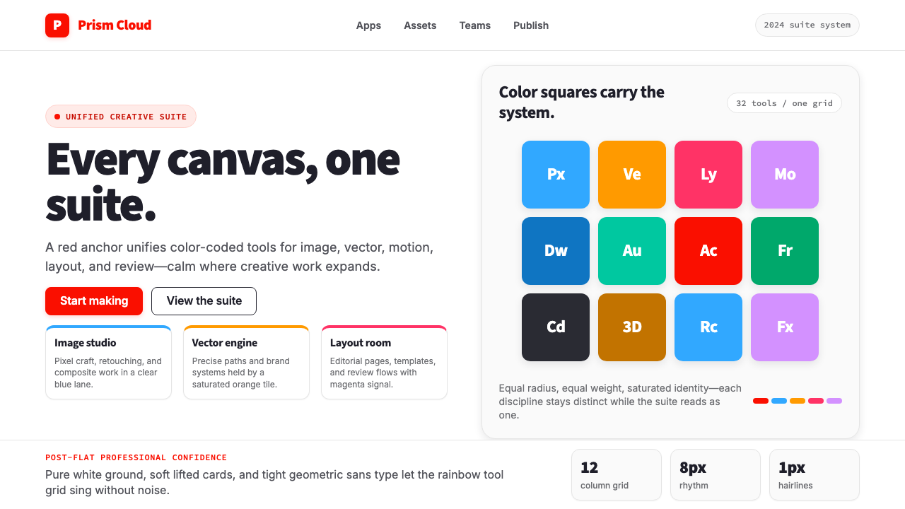 Adobe Creative CloudUnified, not uniform. Red anchor, white space, and saturated app tiles organi…
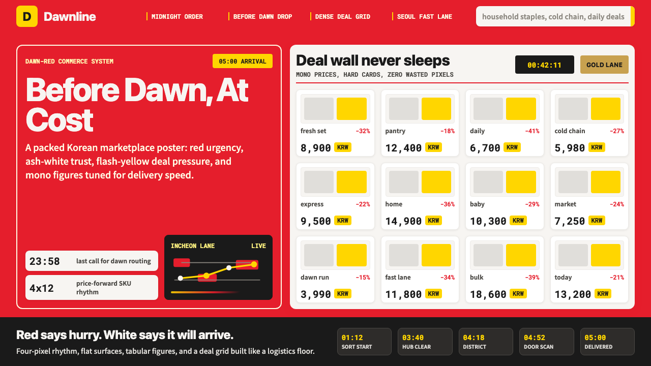 Coupang Rocket DeliveryUrgency made trustworthy. Rocket red, flash yellow, mono prices and packed gr…
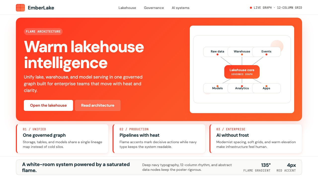 Databricks LakehouseWarm enterprise confidence. Flame red-orange gradients meet DM Sans and clean…
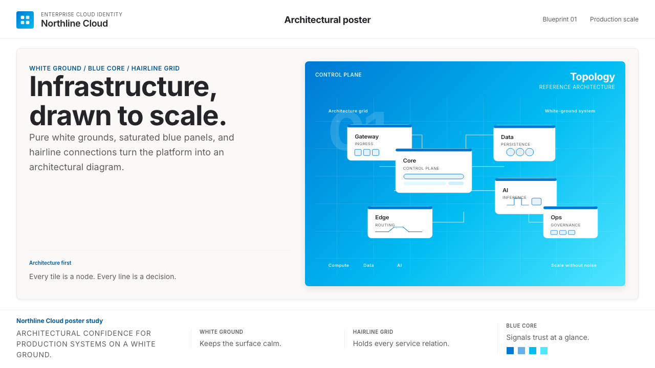 Microsoft AzureEnterprise calm, sharply diagrammed. White ground, saturated blue, hairline l…