What is Māori Kōwhaiwhai Rafter?
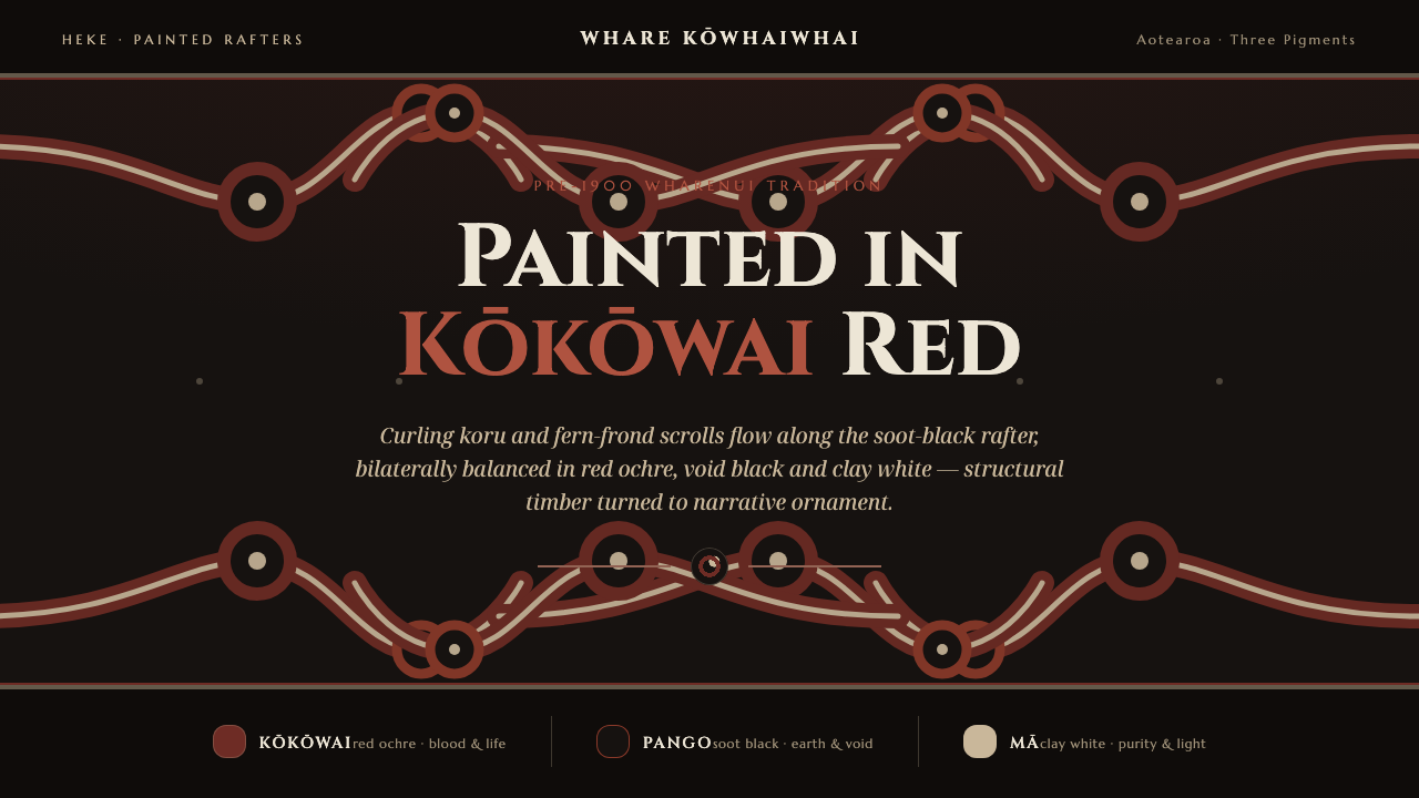
Māori Kōwhaiwhai Rafter turns painted timber into living narrative — kōkōwai-red koru scrolls move in mirrored balance across a soot-black ground, held together by earth, ancestry, and inscriptional type.
Māori Kōwhaiwhai Rafter in brief
Kōwhaiwhai are the painted koru and fern-frond scrolls that flow along the heke, or rafters, inside a Māori wharenui meeting house. Their curling forms follow the timber rather than hiding it, turning architecture into a carrier of story. This design system translates that painted-rafter tradition into a digital language of soot black, kōkōwai red, pale clay grey-white, mirrored balance, and inscriptional serif type.
The palette is small but symbolically charged. Red carries blood and life; black evokes the earth and the void of creation; white suggests purity and light. These colors are not decorative accents selected for contrast alone. They establish a visual cosmology in which the dark ground gives the composition its depth, the red scrolls provide vitality and movement, and the pale marks clarify the rhythm of the pattern.
Visually, the style feels ceremonial, architectural, and bodily at once. Koru forms coil inward and open outward, while paired motifs create balance across the rafter or page. The result is not a loose collection of tribal-looking ornaments. It is a disciplined system in which repetition, symmetry, painted edges, and structural flow allow a surface to feel inhabited by memory.
Where does Māori Kōwhaiwhai Rafter come from?
The tradition belongs to Māori wharenui art in Aotearoa / New Zealand, within the wider cultural region of Oceania. Its roots reach back before 1900 and continue through the painted-rafter practice of the meeting house. In a wharenui, the heke are not neutral construction members. Their painted surfaces participate in the identity and visual narrative of the interior, allowing structural timber to become part of the room’s meaning.
Kōwhaiwhai developed through the use of earth pigments: kōkōwai red ochre, soot black, and a pale clay grey-white. The material language is therefore inseparable from the visual one. The colors belong to the ground, smoke, clay, and bodily life. Against the deep soot-black ground, the red and pale forms read as painted marks rather than simulated light, preserving the directness of pigment applied to wood.
The form language is organized around the koru and the fern frond. Curving lines coil, reverse, and repeat in bilateral balance, producing a rhythm that can extend along the length of a rafter. The pattern does not treat symmetry as static mirroring alone. It uses paired movement to make the surface feel continuous, as though one form answers another across the timber.
The source identifies the tradition’s key practitioners as the tohunga whakairo and heke painters of the wharenui, alongside Wiremu Puke. Their presence matters because the style is not an anonymous decorative formula: it is connected to skilled making, cultural stewardship, and the particular setting of the meeting house. The digital system distills visible principles from that lineage while retaining the sense that ornament is bound to structure, place, and story.
What defines the Māori Kōwhaiwhai Rafter look?
Earth Pigment
The palette is restricted to kōkōwai red ochre, soot black, and pale clay grey-white. Red is the active life-bearing force, black establishes earth and creative darkness, and white opens a field of purity and light. The colors should feel mineral and painted, never glossy, synthetic, or atmospherically blended.
Koru Movement
The koru gives the system its characteristic motion: a line curls inward, turns, and opens again. Forms should feel grown or painted in one continuous gesture, with curves that carry the eye along the rafter or screen. Ornament becomes directional rather than merely pictorial.
Bilateral Balance
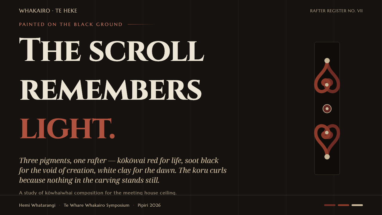
Mirroring is a primary organizing principle. A koru, panel, or title treatment can be answered by its counterpart across an implied centerline. The balance should remain lively rather than mechanically exact, using scale, curvature, and spacing to create a sense of conversation between paired forms.
Rafter Flow
The composition follows the direction of its supporting structure. Long bands, repeated curls, and connected motifs should read as if they belong to a timber member before they belong to a screen. This prevents the style from becoming a pasted border and preserves its architectural origin.
Inscriptional Type
Cinzel supplies the typographic voice: formal, carved-looking, and connected to inscription rather than casual interface chatter. Headings should feel declarative and ceremonial, while supporting text remains restrained enough to let the painted forms carry the strongest cultural and visual charge.
Painted Edge
Edges should retain the evidence of making. Slight irregularity, blunt turns, and visible joins make the motif feel painted onto timber instead of generated from sterile geometry. The digital adaptation can be disciplined, but it should not erase the tactile trace of the hand.
Who shaped Māori Kōwhaiwhai Rafter?
These practitioners are identified as key figures in the wharenui painted-rafter tradition. Their work connects carving, painting, structural timber, and cultural narrative. In the design system, they represent the principle that ornament is not applied after architecture but developed through the material and direction of the building itself.
Wiremu Puke is named as a key figure associated with the Māori Kōwhaiwhai Rafter lineage. His inclusion places the visual language within a living field of Māori making rather than presenting it as an anonymous historical pattern. The system therefore treats its motifs with specificity and restraint.
Although not an individual, the wharenui is an essential cultural figure in the system. It is the meeting house whose interior rafters carry the kōwhaiwhai, giving the pattern its architectural role and narrative setting. Without the wharenui, the motif can be mistaken for surface decoration; within it, painted timber becomes part of collective presence.
How do you use Māori Kōwhaiwhai Rafter today?
For presentation covers, use the rafter idea as the main compositional gesture. Let a deep black field establish gravity, then allow a mirrored red koru structure to enter from opposing edges or frame the title like painted timber. Cinzel works best when the title is treated as an inscription: formal, spacious, and declarative. Pale clay grey-white can clarify supporting information without competing with the red.
Content slides should use the visual rhythm of paired motifs to organize information. A heading can sit within one painted band while its explanation answers from the opposite side, creating balance without making every element symmetrical. Data slides should become symbolic diagrams: red can mark life, activity, or emphasis; black can hold the field and quiet areas; pale grey-white can separate categories and expose the underlying structure.
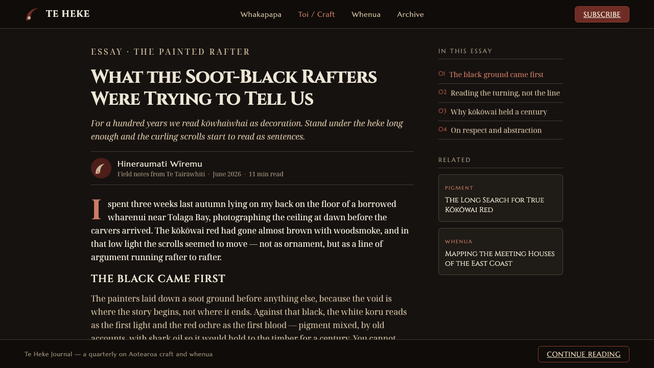
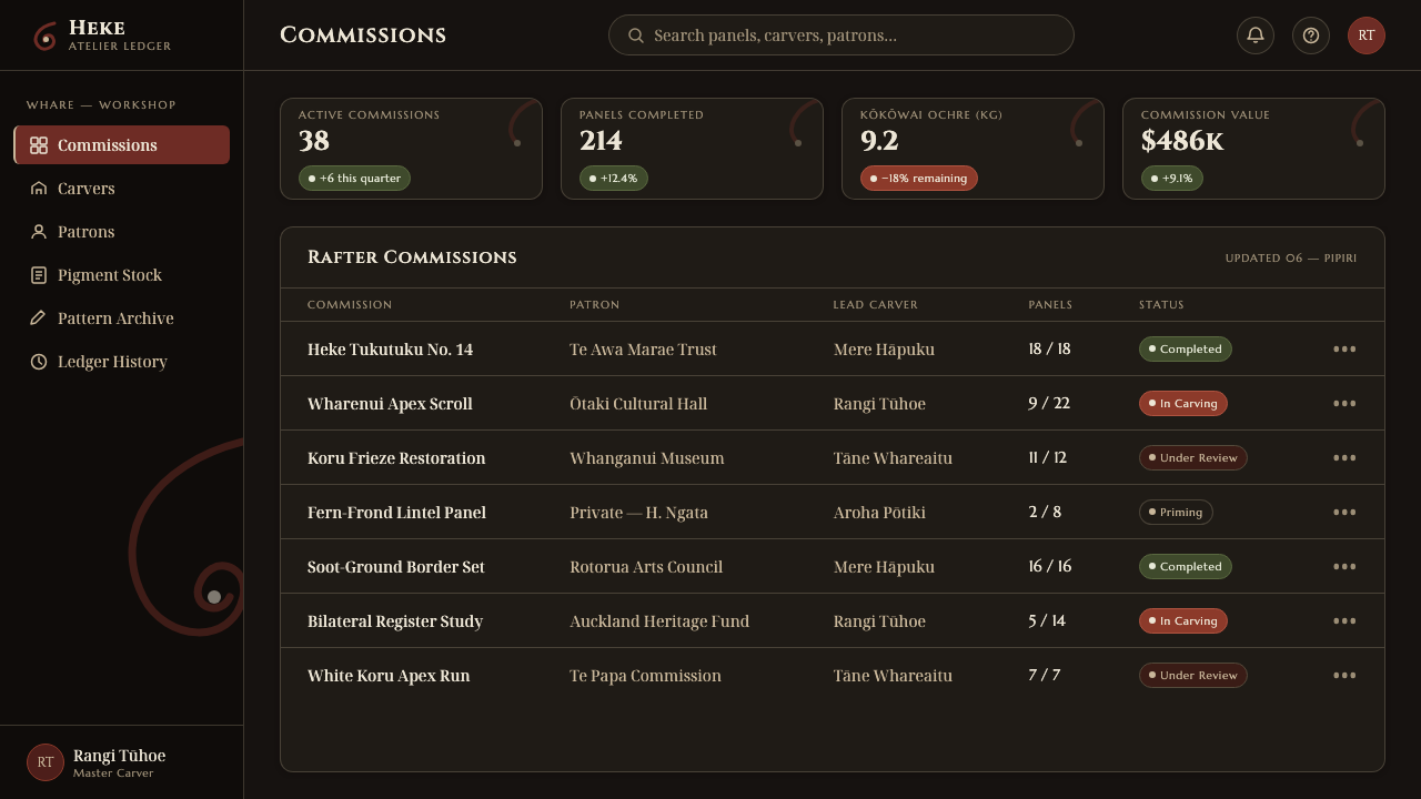
For web interfaces, the system suits dashboards and pricing pages that need authority, continuity, and strong recognition. Use black as the environmental ground, reserve red for active states, selected plans, or important signals, and keep pale grey-white for readable content surfaces. Cards should feel like inset panels or painted boards, with clear borders and deliberate edges rather than soft, floating effects.
Editorial and marketing work can treat the style as a narrative frame. A feature article may begin with an expansive black opening and a red koru gesture, then move into pale text fields organized by strong horizontal flow. Campaign pages can use repeated scroll motifs as section markers, while product stories can connect each chapter to an idea of material, ancestry, place, or movement.
The common mistake is to borrow the black-and-red palette while treating the koru as a generic decorative flourish. Overfilling the page with unrelated curls, adding glossy gradients, or breaking the mirrored rhythm turns a structural tradition into surface styling. The stronger application uses fewer motifs, lets them follow the composition’s direction, and acknowledges that the visual language comes from a specific Māori architectural and cultural context.
Māori Kōwhaiwhai Rafter — FAQ
What does the rafter reference contribute to the style?
It gives the ornament a structural direction. Kōwhaiwhai is associated with painted heke inside the wharenui, so the motif should feel attached to a supporting member and flowing along it. This is why long movement, paired balance, and connected forms matter more than isolated decorative badges.
Why are red, black, and pale grey-white used together?
The combination comes from the earth-pigment language of the tradition and carries symbolic meaning. Kōkōwai red represents blood and life, soot black represents earth and the void of creation, and pale grey-white represents purity and light. The colors should therefore remain purposeful rather than become a broad decorative palette.
Can the style be used without mirrored symmetry?
It can be adapted, but bilateral balance is one of its defining visual principles. If a layout becomes intentionally asymmetrical, retain the sense of response between forms through direction, weight, or repeated curvature. The goal is not mechanical duplication; it is a perceptible relationship between paired movements.
Does this style work for every brand or product?
No. It is strongest when a product can support a sense of place, continuity, materiality, and narrative authority. It may struggle when an interface needs playful neutrality or deliberately generic decoration. Any use should also respect the specific Māori context of kōwhaiwhai and avoid presenting the motif as an interchangeable exotic pattern.
Related design styles
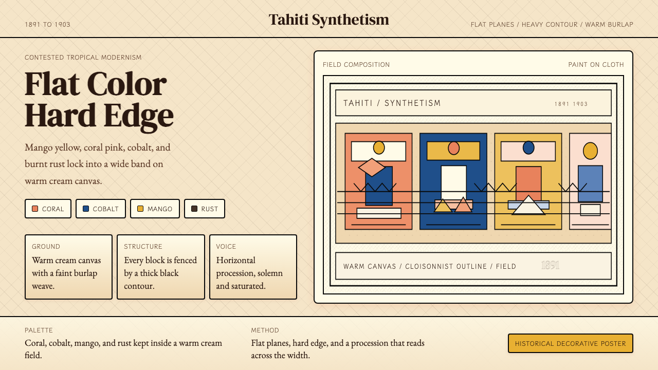 Gauguin — Tahiti SynthetismFlat color, hard edge. Cream canvas, coral, cobalt, and rust lock into a frie…
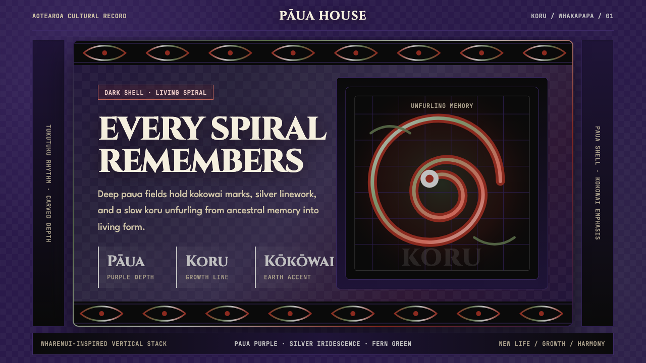 Māori Koru (Aotearoa)Ancestry glows in the dark. Paua purple, kokowai red, and silver koru frame t…
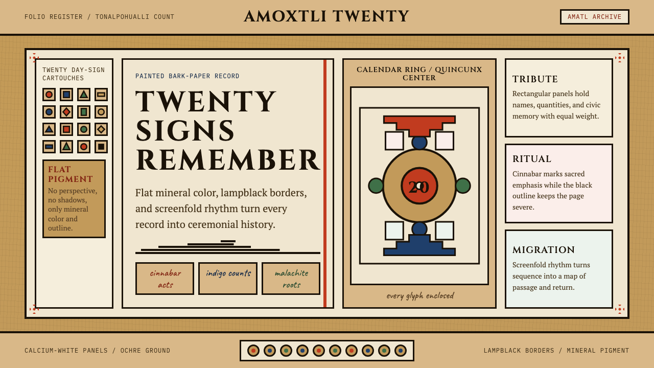 Aztec CodexSacred records stay severe. Ochre amatl ground, Cinzel capitals, black cartou…
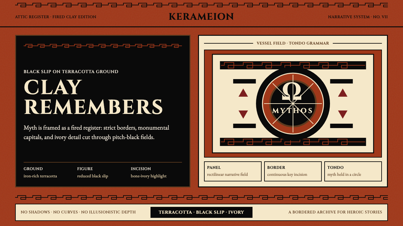 Greek Antiquity (Attic Vase)Myth becomes architecture. Terracotta, black slip, and Greek-key borders fram…
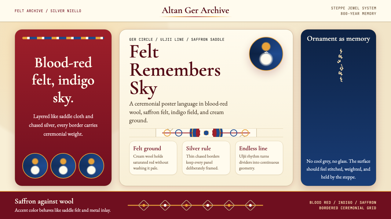 Mongolian Nomadic SteppeSteppe memory in jewel tones. Blood-red felt, saffron, indigo, and bordered u…
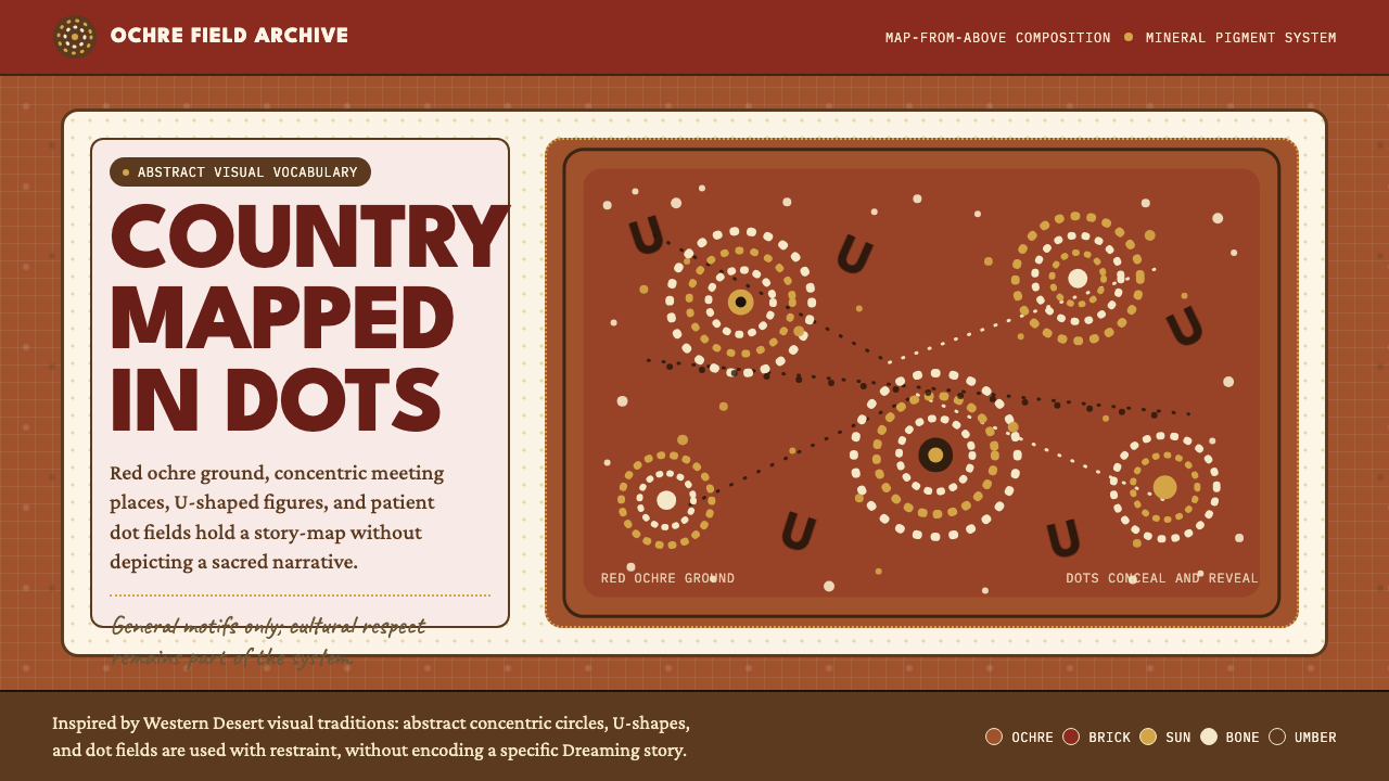 Aboriginal Dot PaintingAncient story-map energy. Red ochre, bone dots, concentric circles, and U-mar…