What is Māori Volcanic Stone?
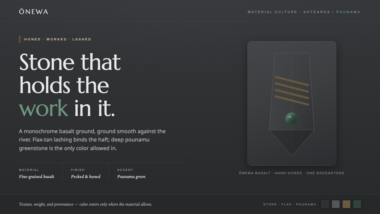
Māori Volcanic Stone lets color emerge only from material: honed charcoal basalt, warm flax-and-wood tan, and a single deep pounamu green.
Māori Volcanic Stone in brief
Māori Volcanic Stone is a dark material-led design language rooted in the traditional Māori toki and adze. Its ground is the true charcoal gray of basalt, specifically the dense, fine-grained Ōnewa lava that Māori toolmakers ground smooth into working stone. The darkness feels geological and substantial rather than digital: the page reads as worked rock, not as a neutral museum wall or a generic black interface.
The palette stays deliberately narrow. Basalt carries the structure and most of the visual field; muted flax-and-wood tan appears through the lashed haft, while deep pounamu green recalls greenstone worked by specialist makers. These accents are not decorative options added for variety. They are material evidence, and their restraint gives them weight.
Everything should feel solid, tactile, and handmade. Surfaces have the quiet sheen of honed natural stone, never the reflective polish of plastic or chrome. Typography, spacing, and composition should support that sense of mass: clear forms, grounded alignments, generous breathing room, and a visual rhythm that feels assembled from durable parts rather than generated by effects.
Where does Māori Volcanic Stone come from?
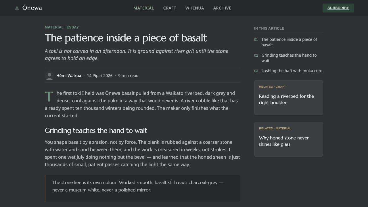
The source of the style is pre-1900 traditional Māori toolmaking in Aotearoa, New Zealand. At its center is the toki and adze tradition: dense, fine-grained Ōnewa lava was ground smooth and shaped into tools. The visual system takes its charcoal ground directly from that worked basalt, preserving the difference between raw darkness and a surface refined through making.
This origin matters because the material is not treated as an abstract color sample. Basalt supplies both hue and behavior: it is dark, dense, grounded, and capable of taking on a tactile sheen when honed. A design derived from it should therefore feel weight-bearing and quiet, with forms that appear placed on a substantial ground rather than floating in empty digital space.
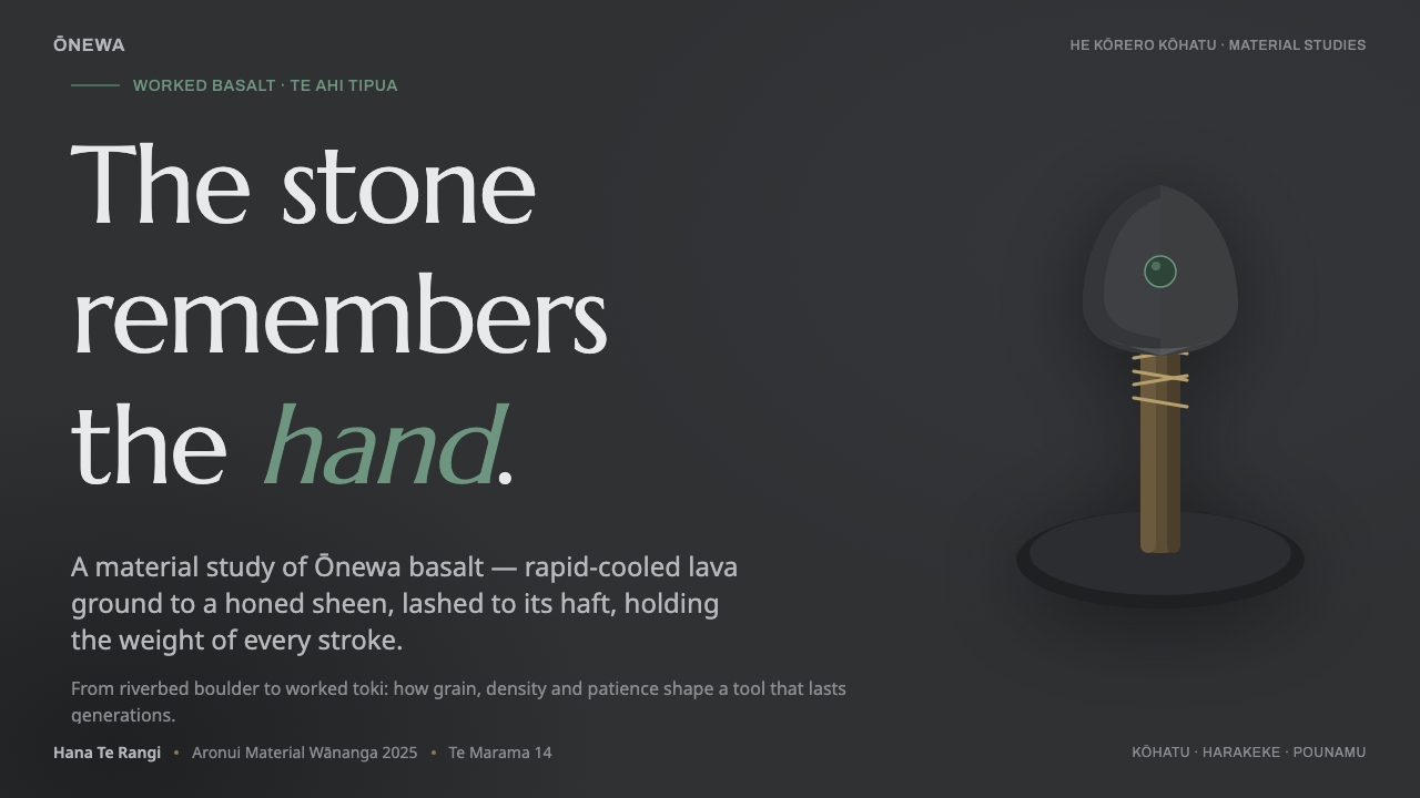
The second material reference is the lashed haft. Flax lashing and wood introduce a muted tan that interrupts the basalt without competing with it. This accent belongs to the construction of the object: it suggests binding, joining, and the visible intelligence of a tool assembled for use. Its warmth should remain earthy and subdued.
The final reference is pounamu, or greenstone, and the workers who shape it. Deep green appears as a controlled signal of worked stone within an otherwise monochrome system. Together, basalt, flax, wood, and pounamu connect the style to Māori material culture, stone toolmaking, lashed-haft construction, and an ongoing practice of greenstone working.
What defines the Māori Volcanic Stone look?
Basalt Ground
The dominant field is charcoal gray drawn from honed basalt, not an arbitrary black. It should feel dense and mineral, with enough tonal depth to suggest a worked stone surface. Near-black type and darker structural elements can sit within the ground, but the overall impression remains geological rather than glossy or electronic.
Material Tactility
Visual surfaces should imply honing, friction, and natural grain without becoming simulated texture. The desired finish is a quiet tactile sheen: present when light catches it, but never mirror-like. Avoid plastic smoothness, chrome reflection, and effects that make the interface feel manufactured by a machine rather than shaped by a maker.
Flax-and-Wood Tan
Warm tan is reserved for the flax lashing and wooden haft reference. It works best as a supporting material cue in labels, bindings, secondary panels, or tactile controls. Its role is connective rather than celebratory, so it should soften the basalt ground without becoming a bright beige or a dominant brand color.
Pounamu Accent
Deep pounamu green is the rare chromatic interruption. Use it to identify a meaningful state, focal detail, or element deserving recognition. The green should feel like a piece of worked stone set into basalt, not like a general-purpose accent scattered across every control. Scarcity is what gives it authority.
Grounded Typography
Typography should be sturdy, legible, and close to the surface. Strong sans-serif forms or restrained humanist forms can work when they maintain clear silhouettes and a sense of physical presence. Hierarchy should come from scale, weight, contrast, and placement rather than decorative type treatments. Letterforms must feel carved, stamped, or carefully set.
Tool-Like Geometry
Forms should be compact, purposeful, and visibly assembled. Rectangular panels, restrained curves, bands, and handle-like extensions can evoke the toki without illustrating it literally. Corners should feel resolved and durable; controls should look like parts that can be grasped, joined, or worked. Empty space acts as the ground around each object.
Constructed Restraint
The system allows very little unrelated ornament. Every visible element should reinforce stone, lashing, wood, or greenstone, or clarify how the composition is used. Borders, dividers, and shadows should be structural and quiet. A successful result feels rich because of material distinction and proportion, not because many effects have been layered together.

Who shaped Māori Volcanic Stone?
Māori carvers and toolmakers are the primary human reference for the style. Their work with Ōnewa basalt establishes the visual values of density, honing, hand-shaped form, and practical construction. The design system honors that logic by treating each surface as made material rather than as a purely decorative color field.
The toki and adze tradition provides the central object vocabulary. Its ground, edge, haft, and lashing suggest a system built from distinct but cooperating parts. The tradition is represented here as a material and formal source, not as a literal illustration requirement.
Pounamu greenstone workers represent the second stone-working reference in the system. Their material contributes the deep green accent, which functions as a deliberate interruption within the basalt monochrome. The accent gains meaning through its limited presence and its relationship to worked stone.
How do you use Māori Volcanic Stone today?
Māori Volcanic Stone is strongest when the entire composition behaves like a crafted object. Begin with the basalt ground, establish a firm typographic hierarchy, and let material cues do the emotional work. Use generous negative space around major elements so the dark field can register as weight rather than clutter. The tan and pounamu accents should be introduced only when they explain construction, state, or importance.
For presentation slides, use the cover as a solitary stone object: a large grounded title, a compact tool-like form, or a single pounamu signal against the charcoal field. Content slides should feel assembled rather than decorated, with clear bands of information and strong alignment. Data slides benefit from restrained diagrams whose bars, markers, or callouts use tan and green sparingly; the chart should read as a durable instrument, not a glowing dashboard.
For web interfaces, the style suits dashboards, operational tools, and pricing pages that need authority and visual weight. Keep navigation and body text quiet against the basalt ground, use tan for secondary structure or connective actions, and reserve pounamu for the most meaningful state or tier. Cards should feel thick and grounded, with tactile surfaces and clear edges. Inputs and controls should appear graspable and assembled, never glossy, chrome-like, or weightless.
For editorial and marketing work, build a strong contrast between dark stone fields and carefully isolated information. A feature article can use a broad charcoal opening, a narrow readable text measure, and side notes that resemble attached tool components. Marketing pages can alternate dense basalt sections with quieter material breaks, using flax-and-wood tan to introduce craft and pounamu green to mark a decisive call to action. Imagery, when present, should support the sense of worked material rather than compete with it.
The common mistake is treating the style as a generic dark theme with green buttons. That loses the material hierarchy. Avoid scattering pounamu green across every interactive state, brightening the tan into cheerful beige, or adding glossy gradients and chrome-like highlights. Also avoid excessive texture: the system depends on the suggestion of honed stone, not a literal rock photograph behind every element. Weight, restraint, and construction must remain visible.
Māori Volcanic Stone — FAQ
Is Māori Volcanic Stone simply a black interface with green accents?
No. Its dark ground is specifically the charcoal gray of honed basalt, and its accent colors come from the flax-and-wood tan of a lashed haft and the deep green of pounamu. The distinction lies in material behavior: surfaces should feel dense, tactile, and worked, rather than flat, glossy, or technologically anonymous.
Why is pounamu green used so sparingly?
Because it represents a distinct worked-stone material within an otherwise monochrome basalt system. If it appears everywhere, it stops reading as a meaningful material interruption and becomes a routine interface color. Its authority comes from being rare, deep, and clearly connected to pounamu greenstone.
Can the style use glossy surfaces or chrome-like highlights?
They should be avoided. The approved material reference is honed natural stone with a tactile sheen, not reflective plastic or chrome. A quiet sheen can suggest a surface polished through use, while mirror-like highlights shift the visual language toward industrial product rendering and away from handmade basalt.
What should typography contribute to the system?
Typography should provide clarity and physical presence. Strong silhouettes, firm hierarchy, deliberate alignment, and calm spacing help type feel set into the stone ground. Decorative lettering or excessive typographic variety weakens the sense that the page is constructed from durable, purposeful parts.
Does the style require literal images of toki, basalt, or pounamu?
No. The system is grounded in their material logic, not dependent on literal illustration. Charcoal density, restrained tan, deep green, tactile surfaces, and tool-like construction can communicate the reference more effectively than repeated photographs. Literal imagery is useful only when it strengthens the sense of worked material and does not turn the interface into a display wall.
Related design styles
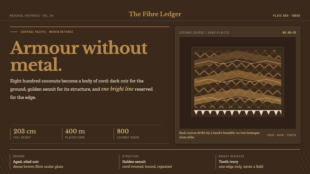 Kiribati Coconut ArmorArmour without metal. Dark coir, golden sennit and one disciplined tooth-ivor…
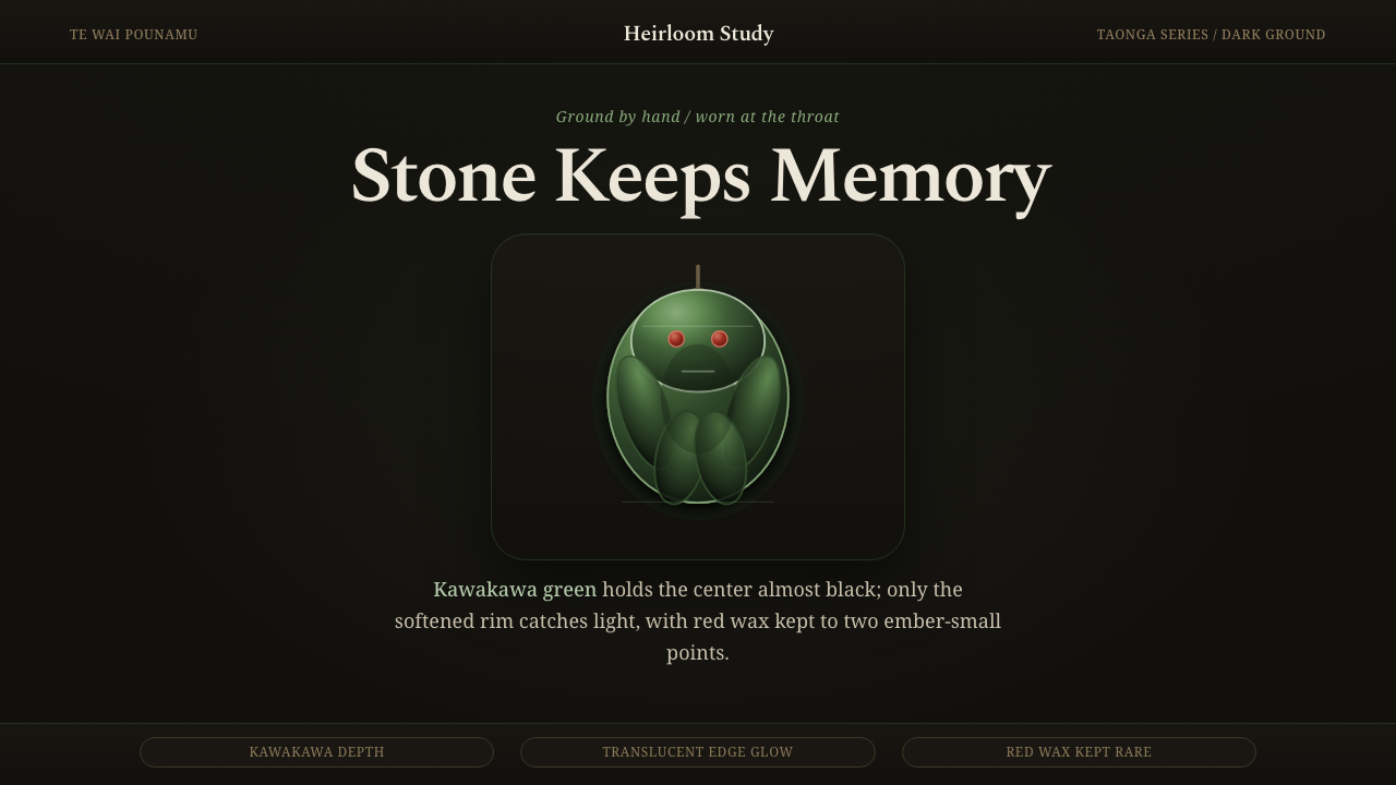 Māori Hei-Tiki PounamuQuiet mana in dark stone. Moss-green pounamu glows at the edge, red wax held…
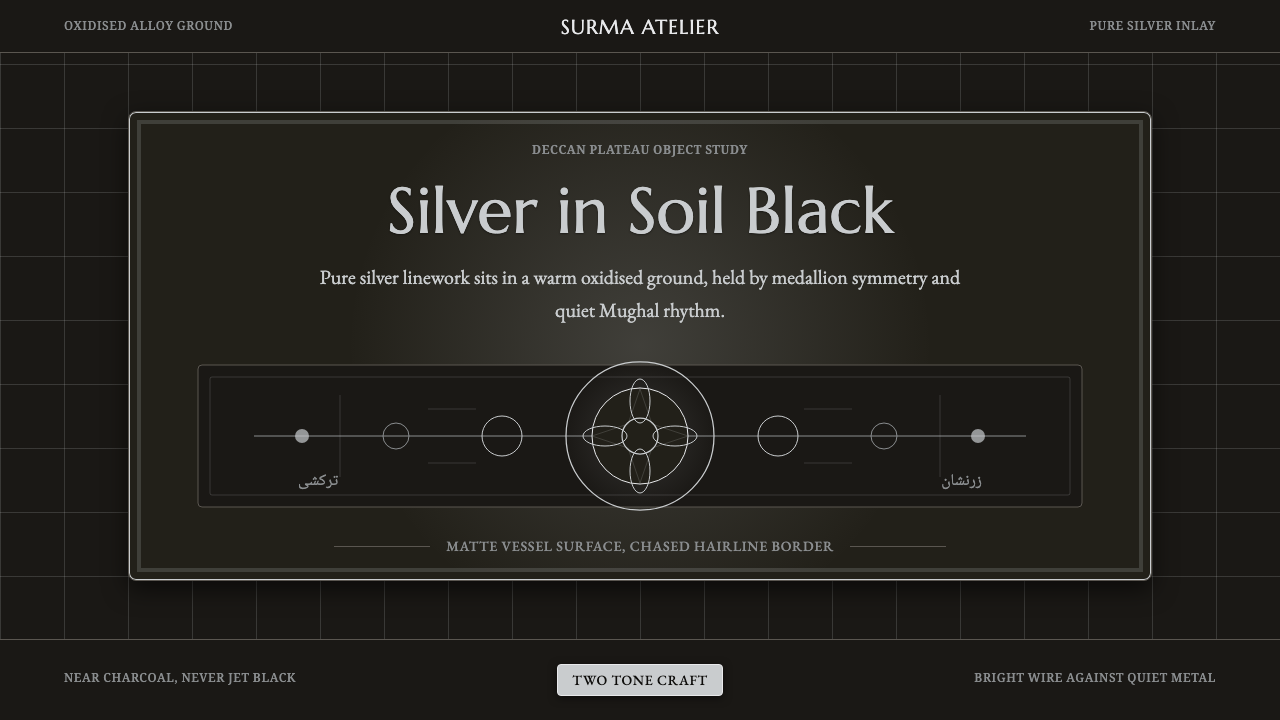 Bidar Bidriware VesselsSoil-black luxury. Crisp silver medallions and hairline borders cut the warm…
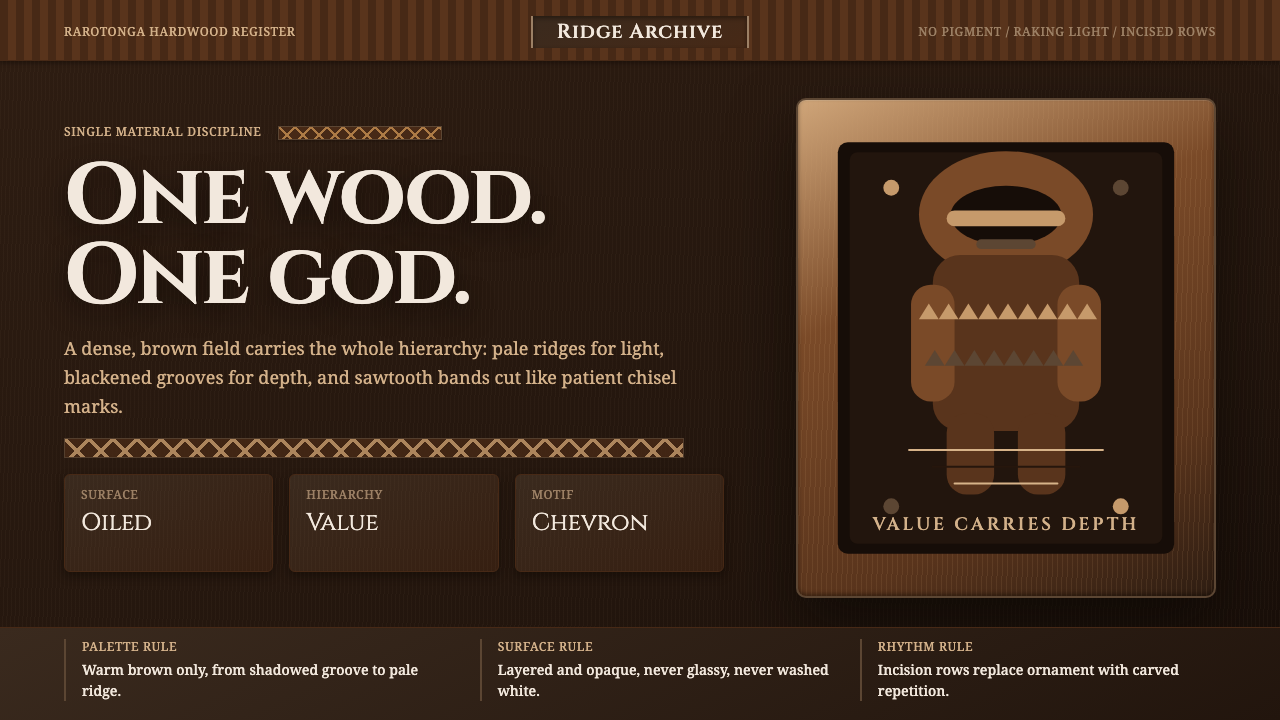 Cook Islands Tangaroa CarvingOne-material gravity. Warm browns, sawtooth rows, and raking light carve hier…
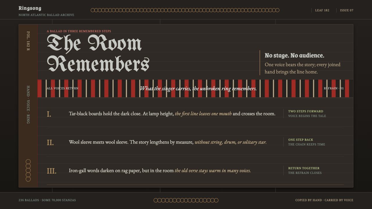 Faroese KvæðiThe room sings as one. Silver type and red refrain bands rule a tar-black man…
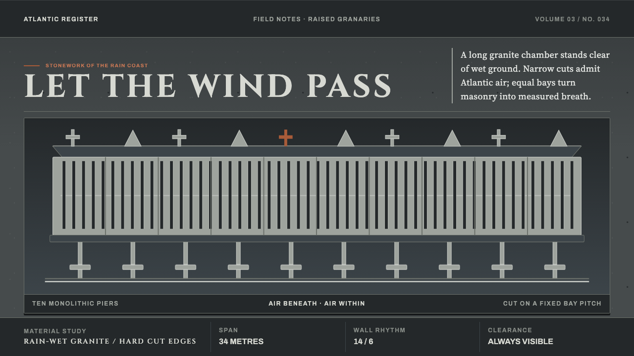 Galician HórreoStone learns to breathe. Wet granite, narrow slits and raised bays conduct At…